10,000 search results
(0.038 seconds)
- Mr Palker by Letterhead Studio-YG,
$35.00 A slab serif Mr Palker and grotesque Mr Palkerson build one superfamily together. These are blank types. In a way even the display ones. Typefaces for newspapers, announcements, cheap advertising and police posters. Mr Palker and Mr Palkerson will turn every language into a fence. And due to six types of faces one can choose what material should the fence be made from — from Thin steel rods to the Black stone blocks. In their simplest appearance Mrs P&P are intended for the solid blank composition in victorian or industrial style. They are quite decent, a bit old-fashioned slab serif and grotesque with closed aperture. All my types have layers. Walker and Palkerson also do. Besides the standard set of symbols, they have 4 add-ons. 1. Alternate glyphs, including unicase ones. 2. Ligatures with A letter. 3. Extra tall small caps. 4. Two-storey ligatures. All this options are intended for the complex composition. The additional letters are rather eccentric as their main function here is to imitate the victorian oddities. Imitate, parody, just not repeat. There are lower-case As and Es in the set in height of small caps and uppercases. They can turn every writing into the unicase. The lower-case A (as well as uppercase and small caps version of it) has deliberately by my taste grown a ludicrous tail. To compensate it I’ve built all the possible ligatures - ад, ал, ая. There are 35 of this ligatures all together. Take a closer look at the Russian letters D, L, K, Ya from the main set as well as their alternates. The additional glyphs are one more comic than the other — on purpose to imitate (not to repeat!) the victorian set. This sets have lowercase numbers. And small caps numbers as well. What a modern typeface without them. They also have an У-letter with a generously curvy tail. As if before the WWI. The Latin of course has alternates as well. It has letters to make the perfect French sound more like the russian provincial version of it. The tails of Js and Ts can be made a little bit more open — or a little bit closed. My favorite feature here, an invention of a kind - extra tall small caps. It allows to compose logos with the small caped uppercases directly from the keyboard. The small caps of this typefaces are usually much taller than the customary ones. This is the kind of small caps that Palker and Palkerson have. More to that, the strokes’ weight and the letters width are corresponded to the uppercases. Just a ready set for making a logo a la 1913 style. With a unicase, one has to mind! One more trick with the tall small caps is a possibility to make them work like lower uppercases. Their height is just in between of lower- and uppercases. Isn’t it great to have an additional set of uppercase working ponies in stock for the case of emergency. And finally — the trademark of Palkers family, two-storey ligatures. They are made in the height of uppercases and turn every writing into an ornament or a puzzle of a kind, while at the same time making them much shorter. Each face has 90 of them. Mainly those are twins: CC, BB, DD and so on. ll this things are for the unhasty compositing, even for lettering. Which means that for the things which are not there you always should have Command+Option+O and some patience. Also — among the two storey ligatures one also can find some belvedere villas. All my types are glasses from the one kaleidoscope. The P&Ps family was preliminary part of the victorian set, which already has 1 Cents and Clarendorf - optionally one can add Costro, Gordoni, Handy, Guardy, Surplus, Red Ring, Red Square, Babaev to the list. And also Sklad, Odessa, Dreamland, Romb, Platinum - here, at Letterhead’s, every second one is victorian. All together our typefaces can allow one to set advertisement of any kind, even the trickiest one, and compose everything, from the coffee place’s menu to the antiquarian magazine.
 - Mr Palkerson by Letterhead Studio-YG,
$35.00 A grotesque Mr Palkerson and slab serif Mr Palker build one superfamily together. These are blank types. In a way even the display ones. Typefaces for newspapers, announcements, cheap advertising and police posters. Mr Palker and Mr Palkerson will turn every language into a fence. And due to six types of faces one can choose what material should the fence be made from — from Thin steel rods to the Black stone blocks. In their simplest appearance Mrs P&P are intended for the solid blank composition in victorian or industrial style. They are quite decent, a bit old-fashioned slab serif and grotesque with closed aperture. All my types have layers. Walker and Palkerson also do. Besides the standard set of symbols, they have 4 add-ons. 1. Alternate glyphs, including unicase ones. 2. Ligatures with A letter. 3. Extra tall small caps. 4. Two-storey ligatures. All this options are intended for the complex composition. The additional letters are rather eccentric as their main function here is to imitate the victorian oddities. Imitate, parody, just not repeat. There are lower-case As and Es in the set in height of small caps and uppercases. They can turn every writing into the unicase. The lower-case A (as well as uppercase and small caps version of it) has deliberately by my taste grown a ludicrous tail. To compensate it I’ve built all the possible ligatures - ад, ал, ая. There are 35 of this ligatures all together. Take a closer look at the Russian letters D, L, K, Ya from the main set as well as their alternates. The additional glyphs are one more comic than the other — on purpose to imitate (not to repeat!) the victorian set. This sets have lowercase numbers. And small caps numbers as well. What a modern typeface without them. They also have an У-letter with a generously curvy tail. As if before the WWI. The Latin of course has alternates as well. It has letters to make the perfect French sound more like the russian provincial version of it. The tails of Js and Ts can be made a little bit more open — or a little bit closed. My favorite feature here, an invention of a kind - extra tall small caps. It allows to compose logos with the small caped uppercases directly from the keyboard. The small caps of this typefaces are usually much taller than the customary ones. This is the kind of small caps that Palker and Palkerson have. More to that, the strokes’ weight and the letters width are corresponded to the uppercases. Just a ready set for making a logo a la 1913 style. With a unicase, one has to mind! One more trick with the tall small caps is a possibility to make them work like lower uppercases. Their height is just in between of lower- and uppercases. Isn’t it great to have an additional set of uppercase working ponies in stock for the case of emergency. And finally — the trademark of Palkerson family, two-storey ligatures. They are made in the height of uppercases and turn every writing into an ornament or a puzzle of a kind, while at the same time making them much shorter. Each face has 90 of them. Mainly those are twins: CC, BB, DD and so on. ll this things are for the unhasty compositing, even for lettering. Which means that for the things which are not there you always should have Command+Option+O and some patience. Also — among the two storey ligatures one also can find some belvedere villas. All my types are glasses from the one kaleidoscope. The P&Ps family was preliminary part of the victorian set, which already has 21 Cents and Clarendorf - optionally one can add Costro, Gordoni, Handy, Guardy, Surplus, Red Ring, Red Square, Babaev to the list. And also Sklad, Odessa, Dreamland, Romb, Platinum - here, at Letterhead’s, every second one is victorian. All together our typefaces can allow one to set advertisement of any kind, even the trickiest one, and compose everything, from the coffee place’s menu to the antiquarian magazine.
 - Isabel by Letritas,
$30.00 Isabel was made out of necessity to create a new font for children and teenagers, that could be enough friendly and versatile for text in words or even easy-to- read long texts. The purpose of Isabel is to combine all the nice and friendly features of the simple letters that the teachers teach to the pupils at primary school, as they starting to learn to read, together with the normal editorial fonts we read every day. In this way it generates a very joyful serif font, or even friendly font, with some conservative aspects. In other words, Isabel is a font that, despite of being a “classic features” typography, is proud to show its innocent and ingenuous elements, this gives to the font a new point of view. The family is composed of 3 parts: the regular version, the italic version and the unicase version. Each one of them has 5 weights, 551 characters and is composed of 208 languages.
 - MFC Memoriam Initials by Monogram Fonts Co.,
$19.95 The inspiration source for Memoriam Initials is the 1934 Book of American Types by American Type Founders. In that specimen book, they had created a sophisticated two color initial design they called “University Initials” which was only available in metal type at 24, 36, and 48 points. This wonderfully detailed initial style is now digitally recreated and revived for modern use. Memoriam Initials is only capable of initial or single letter monograms due to its unique design. The two color aspect of the original design has been preserved and made accessible within all programs. The Capital character slots contain the background color glyphs, and the lowercase slots hold the outline art for the letters. You can choose a color, type a capital letter, then switch to black and type a lowercase letter for the two color effect, or just type a lowercase letter on its own. It’s that easy! Download and view the Memoriam Initials Guidebook if you would like to learn a little more.
 - Romp by Positype,
$30.00 With all ego aside, Romp was designed and influenced by my daughter, Angel. For some time now, she has wanted me to design a font based on her handwriting. But each time I sit down to do it, I run into more that she needs to do and redo. On a recent attempt, I ran into the same situation again. Instead of moving on to something else, I decided to whip out a sumi brush and start making letters...for me, type design is something a little ‘serious’ and never a time to just have fun. This typeface proved that notion wrong—it really was fun. As a result, each letter encouraged another and the design grew...and grew! The happy result spawned 3 separate sets of letters & numerals (small caps and some ligatures too!). Using the beauty of OpenType, these 3 sets have been fused into one, randomly generating font set. If you are using any type of OpenType enabled application, then the Romp Pro typeface is the way to go. They include everything found in the 3 separate variants for each style as well as entirely expanding offering of additional small cap and ligature sets.
 - E-Lie by Shaun C. Kennedy,
$99.99E-Lie is based on the logo for the Portland band E-Lie. Jon Lincicum designed the logo, and then the basic shapes of the principal letters and numbers. He then gave these designs to Shaun Kennedy, who expanded the design, adding punctuation, accented letters, and math symbols. Shaun then compiled the designs into an OpenType font, adding kerning and ligature information. The design is a distinctive, stylistic font excellent for use when you need to grab someone's attention. - Routerline Rough by Viaction Type.Co,
$16.00 Routerline Rough is a script monoline with 4 styles, nice applied in various products. Complete with multilingual characters, ligature and alternate. It is suitable for quote, clothing design, vintage logo, label, poster, packaging design and other designs. File Include (All Styles) : Routerline Rough.otf Routerline Rough.ttf Routerline Rough Slant.otf Routerline Rough Slant.ttf Routerline Rough Bold.otf Routerline Rough Bold.ttf Routerline Rough Bold Slant.otf Routerline Rough Bold Slant.ttf Features (PUA Encoded) : UPPERCASE. LOWERCASE. MULTILINGUAL. PUNCTUATION & SYMBOL. STYLISTIC SET. LIGATURE. I hope you enjoy and thank you.
 - Casler by Letrasupply Typefoundry,
$20.00 Casler Font is a display font designed for any creative project that needs to be stand out. While get inspired by some vintage aphotecary labels, Casler Font wrapped as firm yet unique font display that consists over 1000 glyphs and 26 icon as extras. A terrific combo that gives experimentally mood in classic and modern style. Casler Font is a best thought for any advertisements usage, logos, headlines or headings, book covers and many more. A must have display font collection!
 - Breathine by MJB Letters,
$19.00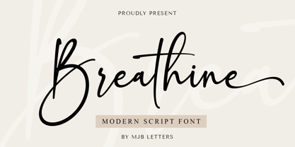 Breathine is a modern script font, with stylish looks that will add a chic elegance to design, perfect for websites, wedding stationery, modern logos, personal branding, social media quotes, and more. Files Included: Works on PC & Mac Simple installations Accessible in Adobe Illustrator, Adobe Photoshop, Adobe InDesign, and even work on Microsoft Word. PUA Encoded Characters – Fully accessible without additional design software. Thank you so much for checking out my shop, and please get in touch if you have any questions!
 - Historya by Atharuah Studios,
$16.00 Introducing Historya; A sweet handwritten font! Bold and cheerful fonts are guaranteed to beautify your designs and products. What's Included: Historya comes with a single font file that includes uppercase, lowercase, numbers, punctuation, and multilingual support. Historya also has alternative letters in each uppercase and lowercase and has a swash that you can access in alternative numbers 1-9. That's it! I hope you enjoy it. You can also say hello to me on Instagram: https://www.instagram.com/atharuah_ Thank You!
 - Tulisans by RGB Studio,
$14.00 Tulisans is a simple sans serif typeface, with semi-rounded edges for a smooth, clean look. It's perfect for logo designs, titles or subtitles, branding, and small amounts of text. Fonts include uppercase alphabet, numbers, and common symbols, and multilingual support. Files Include : Basic Latin A-Z and a-z Numbers Symbols PUA Encode Multilanguage Support Thanks and have a wonderful day, If you have any questions, please get in touch with us Don't forget to check out our other products.
 - Sambosa by Hanzel Space,
$25.00 Sambosa - Modern Serif Font is a stylish font It has both modern look. Comes with Bold and Bold Italic, helps to create stunning logos, quotes, posts, blog posts. branding projects, magazine imagery, wedding invitations, and much more. Containing full set of punctuation and numerals Files for all fonts are included. That's it! If you have any questions at all , feel free to pop me a private message , I'm always more than happy to help you along :) Happy creating! Hanief Studio
 - Lethbridge by Factory738,
$15.00 Introducing Lethbridge a luxury handwritten font with a personal touch. Lethbridge script is ideal for a variety of projects that require a handwritten touch, such as branding and logo designs, wedding invitations and stationery, social media posts and advertisements. Lethbridge Script (Regular, Caps, and Tails) Basic Latin A-Z and a-z Numerals & Punctuation Stylistic Ligatures Multilingual Support for ä ö ü Ä Ö Ü … OTF file format Free updates and feature additions Thanks for looking, and I hope you enjoy it.
 - Mitogen Display by Areatype,
$20.00 Mitogen Display is a very versatile font. Also available Mitogen Signature to help you mix and match it to fit your creative work in harmony. perfect for magazine images, to wedding invitations, to branding, poster design, and more. Files included: Mitogen Display Regular Mitogen Italic Mitogen Signature Numerals & Punctuation Stylistic Alternates & Ligatures PUA Encoded Characters Thanks so much for looking, I really hope you enjoy it and please don't hesitate to drop me a message if you have any issues or queries :)
 - Kalela Slab by Afkari Studio,
$10.00 Kalela Slab is Condensed Slab Serif Font a Modern Condensed Slab serif with solid font files. Suitable for branding, name card, stationary, design title, blog header, Logo, greeting cards, quotes, posters, art quote, typography. Kalela Slab Condensed Slab Serif Font also suitable for your any projects. Iclude: Kalela Slab With 4 Weight; Thin, Light, Regular and Bold Features : – Upper Case & Lowercase (All Caps) – Numerals & Punctuations (OpenType Standard) – Accents (Multilingual characters) No special software is required to use Kalela Slab Condensed Slab Serif Font
 - Tadashi Faux by Twinletter,
$15.00 TADASHI is our newest display font, which was created with the goal of enhancing the appearance of your project in terms of theme harmony, distinctiveness, and differentiation, in order to produce an appealing and targeted look. This typeface is the solution to everything you’ve been searching for and needing. Logotypes, food banners, branding, brochure, posters, movie titles, book titles, quotes, and more may all benefit from this font. Of course, using this font in your various design projects will make them excellent and outstanding; many viewers are drawn to the striking and unusual graphic display. Start utilizing this typeface in your projects to make them stand out.
 - PR-Uncial by PR Fonts,
$10.00 This is our first font, based on Peter's own personal way of writing uncials, The rounded letters of the fourth to eighth centuries. The characters in the caps position are more closely related to the classical Roman forms, and the lowercase position has letters that are the more rounded, medieval forms, at the same size, so they can be freely mixed, for a hand lettered appearance. This typeface is currently used for the titles in the TNT Television show "the Librarians". It was originally designed in 1998, and is now available in Open Type Format.
 - Franzi by Wannatype,
$26.00 The new sans-serif Franzi typeface family – as neutral as can be, but at the same time individual and striking. Its unmistakable character lies in the detail, with no effect pushing itself to the fore. As a wide-running typeface with a relatively large x-height, the typeface family is perfectly suited to small text sizes but, with its elegant details, it leaves nothing to be desired in display applications either. Originally designed with constructed, often rectangular elements, Franzi has gradually been rounded during the development process and is now less hard in order to guarantee optimal legibility. A total of 20 well-developed fonts are available: 10 line thicknesses from hairline to black, each of which can be upright and italic. The italics are softly and elegantly drawn, while the upright characters appear much more severe. The design appeal reveals itself in the two-storey ‘a’ – a tribute to legibility in body copy; however, for those who prefer the geometric in applications, an alternative single-storey ‘a’ is also available. All styles have small caps, superscript and subscript lowercase letters, lining, non-lining and small caps figures, fractions as well as several ligatures, alternative fonts, symbols and arrows. The Latin uppercase letters are also available as discreet swash variants. In addition to the extended Latin alphabet, the typeface family also includes the complete Greek, Cyrillic and International Phonetic Alphabet IPA. Franzi was created as a further development of an order to produce a sign for a therapy practice in Vienna’s Franz-Hochedlinger-Gasse – hence the name, which is more common as an abbreviation for Franziska than as a diminutive for the male name Franz: Franzi is therefore a hybrid typeface name which has female tendencies.
 - Bacterio by Wiescher Design,
$39.50 Bacterio is a typeface I designed for this hulk of a friend of mine who is a kitchen designer. He is huge but has a very delicate feeling for form. One day he said he was trying out something new and if I couldn't make a font for him. Then he showed me the surface design, a hard-plastic covered multilayered wood. The surface design was called "Bacteria" and it looked just like that, only in multicolors. Well here is "Bacterio" the font that looks just like that surface of my hulky friend. Yours very design infected Gert Wiescher
 - Tube Script by Ingo,
$42.00 A font from the tube: an individual handwriting with a slightly wet character. In this case, the “pen” was a tube of black paint. It’s easy to see that you can’t really write “beautifully” with it. Nevertheless, the “Tube Script” is a beautiful, personal handwriting whose clumsy origins are not at all obvious in small font sizes. But if it’s big enough, then all the peculiarities of the paint container misused as a writing implement become apparent. Sometimes the line is very thin and delicate, sometimes it’s just a thick blob meant to represent a letter, depending on how hard the tube was squeezed. A few spills are inevitable. These coincidences of painterly writing are what make this font so appealing. This creates organic forms, random effects, breaks, streaks, where the writer normally determines the form. As such, this font is a great match for anything organic, picturesque, handmade, personal, or even random, unpredictable, or just plain natural. Hundreds of ligatures make the letters appear in a different form each time depending on it’s combination. And more than a hundred alternate characters can be selected using the corresponding OpenType features, thus enabling even more variety in the typeface. This creates the typically restless, extremely varied impression of a really individual script – almost as if it were really handwritten.
 - ITC Aram by ITC,
$29.99Jana Nikolic was finishing her degree program at the Faculty of Applied Arts, in Belgrade, with a final project that would combine her two majors: type and book design. Three stories from William Saroyan's My Name Is Aram would provide the text for the book, to be set in a typeface that Nikolic would design. Nikolic knew something special was happening the moment she put pen to paper. The letters just emerged," she recalls. "I started to explore a few new pens and found one I loved. I was able to make its tip bend with pressure." Like the family Saroyan writes about, the design flowing from Nikolic's pen would be simple but a little quirky. "When there were a whole bunch of little black letters around me," continues Nikolic, "I saw that this was going to be a very interesting typeface family." Nikolic drew Latin and Cyrillic letters, lowercase and capital letters, wide letters and narrow letters. She was surprised at how quickly and easily the design came. "There were no badly written letters," she says. "I hardly had to rework them and they fit together remarkably well." ITC Aram's standard character complement consists of one set of lowercase letters and two sets of capitals: one narrow and the other wide. The wide caps can be used with the standard lowercase, or mixed with the narrow caps for a variation on "cap and small cap" copy. The ITC Aram create the opportunity to mix and combine the letters into playful typographic expressions. Words and sentences that twinkle; text that seems light and alive - one runs the risk of creating work that is both delightful and charming when setting copy in ITC Aram." - Busy Day by PizzaDude.dk,
$16.00 Today has been a busy day. I managed to take the dog for a walk, go for a run, empty the dishwasher, clean the car, vacuum the entire apartment AND make this font! :) The Busy Day font is all about fun and games: it’s playful, whimsical and legible at the same time. I’ve added an Outline version, Inside and the Regular version. They all work well together or as individual fonts - and they all have multilingual support!
 - Machtwerk by Volcano Type,
$29.00Religions are filled with signs and symbols. Some of them, like the the star of David and the Swastika-Rune received other significance during the third Reich. The superimposition of these two shapes creates the basis for this font. Matchwerk is a font, that critically questions and recalls the darkest chapter of our history. - Maison Luxe by FontMesa,
$25.00 Maison Luxe is a revival of a very old font designed in France in or around the year 1820. You may have seen this font in the past under the names of Circus, Roma, Madame and Gillé Classic. As of November 2016 we have changed the name of this font from Gillé Classic to Maison Luxe which means Luxury House in French. For many years Joseph Gillé was credited as the original designer of this font however we've recently been contacted by a type historian in France reporting that he could not find any evidence supporting Joseph Gillé as the designer and to the best of his knowledge an artist by the name of Sylvestre may be the true designer. If you love this classic font then you're sure to enjoy the alternate version also with a matching lowercase available from FontMesa under the name of Home Style. This version of the classic with its squared off shadow is true to the original design where Home Style has diagonal lines creating a cast shadow. New in 2016 for Maison Luxe is a new matching lowercase, an uppercase German Double S (versal eszett), Greek character set, opentype features including case sensitive forms and old style numerals. We know you'll enjoy the new additions to this timeless classic design.
 - Banknote 1948 by Ingo,
$39.00 A very expanded sans serif font in capital letters inspired by the inscription on a bank note Old bank notes tend to have a very typical typography. Usually they carry decorative and elaborately designed markings. For one thing, they must be practically impossible to forge and for another, they should make a respectable and legitimate impression. And in the days of copper and steel engravings, that meant nothing less than creating ornate, shaded or otherwise complicated scripts. Designing the appropriate script was literally in the hands of the engraver. That’s why I noticed this bank note from 1948. It is the first 20 mark bill in the then newly created currency ”Deutsche Mark.“ All other bank notes of the 1948 series show daintier forms of typography with an obvious tendency toward modern face. The 1949 series which followed shortly thereafter reveals the more complicated script as well. For whatever reason, only this 20 mark bill displays this extremely expanded sans serif variation of the otherwise Roman form applied. This peculiarity led me in the year 2010 to create a complete font from the single word ”Banknote.“ Back to those days in the 40’s, the initial edition of DM bank notes was carried out by a special US-American printer who was under pressure of completing on time and whose engravers not only engraved but also designed. So that’s why the bank notes resemble dollars and don’t even look like European currency. That also explains some of the uniquely designed characters when looked at in detail. Especially the almost serif type form on the letters C, G, S and Z, but also L and T owe their look to the ”American touch.“ The ingoFont Banknote 1948 comprises all characters of the Latin typeface according to ISO 8859 for all European languages including Turkish and Baltic languages. In order to maintain the character of the original, the ”creation“ of lower case letters was waived. This factor doesn’t contribute to legibility, but this kind of type is not intended for long texts anyway; rather, it unfolds its entire attraction when used as a display font, for example on posters. Banknote 1948 is also very suitable for distortion and other alien techniques, without too much harm being done to the characteristic forms. With Banknote 1948 ingoFonts discloses a font like scripts which were used in advertising of the 1940’s and 50’s and were popular around the world. But even today the use of this kind of font can be expedient, especially considering how Banknote 1948, for its time of origin, impresses with amazingly modern detail.
 - Wurstwagen NF by Nick's Fonts,
$10.00The pattern for this typeface was suggested by a poster for beer, designed by German artist Ludwig Hohlwein around 1920. The plump curvy serifs suggested a great complement to beer, hot dogs, and thus the name translates roughly to “weiner wagon.” Prosit! Both versions of this font include the complete Latin 1252 and CE 1250 character sets, with localization for Romanian and Moldovan. - Eastman Grotesque by Zetafonts,
$39.00 Designed in 2020 for Zetafonts by Francesco Canovaro and Andrea Tartarelli with help from Solenn Bordeau and Cosimo Lorenzo Pancini, the original Eastman typeface family was conceived as a geometric sans workhorse family developed for maximum versatility both in display and text use. The original wide weight range has been complemented with three more additional widths, to give you maximum control over the appearance of text in your page. While Eastman Compressed and Eastman Condensed behave as space-saving condensed families, Eastman Grotesque adapts the family design style to humanist proportions. All share a solid monolinear design and a tall x-height that makes body text set in Eastman extremely readable on paper and on the screen. Influenced by Bauhaus ideals and contemporary minimalism, but with a nod to the pragmatic nature 19th century grotesques, Eastman has been developed as a highly reliable tool for design problem solving, and given all the features a graphic designer needs - from a wide language coverage (thanks to over one thousand and two hundred latin, cyrillic and greek characters) to a complete set of open type features (including small capitals, positional numbers, case sensitive forms). The most impressive feature of all Eastman fonts remains the huge choice of alternate characters and stylistic sets that allows you to fine-tune your editorial and branding design by choosing unique, logo-ready variant letter shapes. Don’t want to lose too much time with the glyphs palette? Use the Eastman Alternate weights, thought for display use and presenting a selection of some of the more eye catching & unusual letter shapes available for the family.
 - Gothic Tuscan One by HiH,
$12.00 Gothic Tuscan One is a all-cap condensed gothic with round terminals and decorative “tuscan” center spurs. It was first shown by William H. Page of Norwich, Connecticut among his wood type specimen pages of 1859. Gothic Tuscan One exemplifies the strength of decorative wood types: large, simple type forms that provide the visual boldness sought by advertisers of the Victorian period. While our marketing has gotten so very sophisticated, there is always a place for simple, visually strong typeface. Although about 14 miles inland, Norwich lies at the head of the Thames River. The river is both wide and deep, and therefore was not bridged in the early 20th century. From the 17th century until then, if you wanted to get from Groton on the west bank to the whaling port of New London on the east bank by land, you had to had to go by way of Norwich. Because of its size, the Thames is navigable all the way from Norwich to New London. Docks were built in Norwich around 1685 and the city became Connecticut’s 2nd largest port by 1800. With the construction of the Norwich & Worcester Railroad in 1835, Page could easily ship his wood type north by rail or south by coastal schooner. Included with our font, Gothic Tuscan One, are two 19th century printer’s ornaments of sailing ships similar to those that sailed up the Thames to Norwich. There is also a more contemporary glyph of a whale, looking quite pleased that the only whaling ship left in Connecticut is the Charles W. Morgan, permanently moored at Mystic Seaport. Reference: Moon’s Handbooks, Connecticut 2nd Edition (Emeryville CA 2004). Gothic Tuscan One ML represents a major extension of the original release, with the following changes: 1. Added glyphs for the 1250 Central Europe, the 1252 Turkish and the 1257 Baltic Code Pages. Added glyphs to complete standard 1252 Western Europe Code Page. Special glyphs relocated and assigned Unicode codepoints, some in Private Use area. Total of 332 glyphs. 2. Added OpenType GSUB layout features: pnum, ornm and dlig. 3. Added 330 kerning pairs. 4. Revised vertical metrics for improved cross-platform line spacing. 5. Redesigned mathamatical operators 6. Included of both tabular (std) & proportional numbers (optional). 7. Refined various glyph outlines. Please note that some older applications may only be able to access the Western Europe character set (approximately 221 glyphs). The zip package includes two versions of the font at no extra charge. There is an OTF version which is in Open PS (Post Script Type 1) format and a TTF version which is in Open TT (True Type)format. Use whichever works best for your applications.
 - Hebrew Gothic Std by Samtype,
$59.00 This is a modern font inspired in Avant Garde Gothic Latin font. There are 8 ligatures and You can type the Nekudot in them This font is for logos, covers and small texts This font has the modern Hebrew punctuation: Shevana, Kamatz Katan, Dagesh Hazak, and Cholam Chaser.
 - Reborn 190 by Wontenart,
$20.00 is a font from the sans serif family that is bold and bold and has character, an update from the previous “Akira Monoletter” font. This font was made to support the languages of countries that require a dialogue arrangement of letters that have special marks. thus forming this special font. thank you
 - Roma by Canada Type,
$29.95 Tom Lincoln's award-winning type design work since the 1960s has been one way or another of expressing his fascination for the Roman majuscules inscribed at the base of the Trajan Column in Rome. This time he has really outdone himself by bringing us Roma, a definitive, contemporary, mature sans serif expression of those majuscules. With Roma, Lincoln is not satisfied with simply creating a proper "Trajan Sans". He goes on to make it a family of four weights, with built-in small caps and oldstyle figures, then he really goes to town with the options he makes available for shading and multi-color settings. Precise renderings of the Roma capitals are provided in different fonts that can function individually or be layered atop each other for two- or three-color treatments. The Roma family comes with extended language support that spans the majority of Latin-based languages. For more information on the design, complete character sets, technological features, and print tests, consult the accompanying PDF.
 - Alda by Emigre,
$59.00 The original idea for Alda came from exploring an alternative approach to generating different typeface weights by adapting the characteristics of physical objects. I was interested to find out how far this could be pushed before the letters became a parody of what they referenced. Initially I took this treatment very literally, with the boldest weight expressing the tension of bent steel, and the lightest being as spineless as a rubber band. This allowed me to infuse each weight with unique characteristics, where the bold is robust and angular, and the light is delicate and soft.
 - Badly Stuffed Animal by PizzaDude.dk,
$17.00 I have seen my share of badly stuffed animals. Most of them via pictures, but also on vacations here and there. They all had this really bad handcraft vibe, but at the same time some really ordinary and kind of cute looks. I did my best to capture this look and feeling in my Badly Stuffed Animal font: clumsy letters made with a blobbly pen, with naive and irregular lines - and the conclusion is something super useful for a project that needs an organic handmade look!
 - FF Neuwelt by FontFont,
$50.99 FF Neuwelt™, from Jens Gehlhaar, is open, inviting, highly legible, and strikingly handsome. Combining the straightforward clarity of a geometric sans with a welcoming warmth, FF Neuwelt’s eight display and text weights, vast range of alternates and extended character set, make for a family with few limitations. While grounded in a solid geometric sans serif foundation, Gehlhaar has drawn a large suite of alternate characters that infuses FF Neuwelt with softened, and ultimately easy on the eyes, humanistic shapes and proportions. Alternative cursive italic forms and a choice of round or square punctuation are also available at the click of a mouse. FF Neuwelt is spaced for sizes larger than 16 point, while FF Neuwelt Text has more open letterspacing to set perfectly at sizes smaller than 16 point. In addition, five key lowercase characters were drawn with more legible shapes. The result is that FF Neuwelt adapts from text to larger sizes and one stylistic mien to another with ease and grace. FF Neuwelt is a natural for interactive design, performing well on both large digital displays and small screens. Counters are generous and apertures are open, making them a perfect choice when setting text as microcopy or in short blocks where quick and accurate comprehension is the goal. Even the heaviest weights translate well to on-screen reading. FF Neuwelt also speaks with authority in large sizes on big screens. Equally at home in print environments, FF Neuwelt is a perfect choice for long-form text, captions, editorial, packaging, point-of-purchase design – as well as extensive branding projects. Its many choices of alternative characters make for a design that draws the reader in, without overpowering the message. Although he has drawn typefaces in addition to FF Neuwelt, Gehlhaar is primarily a filmmaker. Directing commercials with style and grace, his work includes spots for Nissan, Apple, Emirates Airlines and Microsoft. As a creative director, Gehlhaar has worked on a broad range of projects for Coca-Cola, MTV, EPSN, Volkswagen and more.
 - Anna Clara by Trial by Cupcakes,
$29.00 Anna Clara can be dressed up or down, as fancy as you wanna be. On its own, it’s an organic script, with the fine hairlines, thick swells, and slightly undulating baseline found in modern casual calligraphy. Add swashes, and Anna Clara becomes a bit more playful and festive. Each capital letter has a flourished alternate—great for displays or headings, or to add emphasis to a particular section of text. For OpenType-aware software users, Anna Clara also features ten pairs of swashes that can be added to the beginning or end of any lowercase letter, for a custom flourished look. Illustrator and InDesign users can access extra swashes and banners by using the glyph panel. Photoshop users: These characters can be accessed via the “Ornaments” feature in your OpenType panel - try non-numeric punctuation marks and accents for swashes. For banners, type catchwords followed by an asterisk. “Asterisk asterisk” will produce a blank banner that you can use to create your own. Included catchwords are “and”, “at”, “by”, “for”, “from”, “of”, “the”, “to”, “with”, "l'", “le”, “la”, “el”, “et”, and “y”. Roman numerals can be used in the “Ornaments” feature by typing their respective keyboard characters “I”, “II”, “III”, etc. - followed by an asterisk. An ampersand (&) followed by one or two asterisks produces two special “and” characters.
 - Neue Latein by Spirit & Bones,
$33.00 This sans serif font carries the flair and mood our Schneidler Latein font family. The calligraphic appearance and the human sound are evident thanks to the preservation of some significant broad edged pen elements. The forms are reduced to the subtle level where they are simplified, but the essence still remains. The expressive and artistic expression of the Schneidler Latein continues to work like a background melody. Together they build a superfamily that works perfectly in combination with each other. More weights will follow soon.
 - Tomato by Canada Type,
$22.95Tomato is the digitization and quite elaborate expansion of an early 1970s Franklin Photolettering film type called Viola Flare. This typeface is an obvious child of funk, the audio-visual revolution that swept America and put an end to the art nouveau period we now associate with the hippy era. Funk is of course little more than jazz with a chorus and an emphatic beat. Nevertheless, it became the definition of cool in the 1970s, thanks to blaxploitation movies with excellent soundtracks like Shaft and Superfly. Funk began as a commercial audio experience, then later expanded its signature to cover everything, from design to fashion to the later birth of disco, which is really a further simplification of funk. Funk had very strong and unique typographical elements, particularly a kind of titling with an essentially western, wooden core that suddenly changed and flared in unexpected areas until a very individual brand was achieved. Everything that can be tacked on to the alphabet was used towards that individuality. Things like curls, swirls, swashes, ligatures were always plentiful in funk, sometimes giving the titling a specific gender, sometimes bulging, sometimes speeding, sometimes fading in the distance, sometimes doing nothing but crazily aligning with other design elements, but the result was always a fascinating creature that seemed to invariably want to dance and have fun. Tomato was built in exactly that spirit. The original film type certainly had enough swashes and curls to be an unmistakable funk font in itself, but our further expansion of it cements it and makes it the definite font for the genre. With as many as 12 different possibilities for some letters, the designer's choices for a titling set in Tomato are virtually limitless. The Postscript and True Type versions of Tomato come in five fonts, including two fonts for alternates, one font for ligatures, and one font for swashes. These are split into two affordable packages. The entire family package is also available at an even more affordable price, and includes complimentary Cyrillic, Greek, Turkish, and Central European versions of Tomato. A Tomato Pro OpenType version is also available. It is a single font that includes over 650 characters, glued together with extensive programming for convenience of use in OpenType-friendly applications, where you can watch the letters morph and dance as you push the buttons and change the options of your OT palette. Now you know which font will come to mind when someone says the word "funky". - Bidena by Twinletter,
$18.00 Introducing Bidena, the perfect script font for those looking to add a touch of elegance and sophistication to their designs. With its unique and stylish curves on each character, Bidena is perfect for all kinds of projects that require a touch of sophistication and class. This font features stylistic set alternates and ligatures that add an extra element of style and creativity to your work. Its flowing lines and intricate details create a stunning and memorable impression that is sure to leave a lasting impression on your audience. Bidena is perfect for any design project, from wedding invitations to branding and advertising materials. Its unique and versatile style makes it the perfect choice for designers who want to add a touch of personality and character to their work. So whether you’re creating a logo, a product label, or a poster, Bidena is the perfect script font that is sure to help you make a statement and stand out from the crowd. Try it out today and see for yourself just how unique and versatile Bidena can be! What’s Included : - File font - All glyphs Iso Latin 1 - Alternate, Ligature - Simple installations - We highly recommend using a program that supports OpenType features and Glyphs panels like many Adobe apps and Corel Draw so that you can see and access all Glyph variations. - PUA Encoded Characters – Fully accessible without additional design software. - Fonts include Multilingual support
 - HWT Etta by Hamilton Wood Type Collection,
$24.95 HWT Etta is a fun display typeface that has two styles: East and West! Its two variations ensure you have maximum wood type swagger in every display size that you might want. This fresh design takes a cue from the wild design experimentation that was happening in the heyday of mid 19th Century wood type—but filtered through 1960s photo-type sensibilities and served up for today’s design needs. Etta West is a decorative inline style and the Etta East is a whimsical reverse contrast style. They live together harmoniously, with their own specific flavors. Practically speaking, both styles are intended for display use, so use them big and use them proudly! Set your XXL size titles in West and your L to XL size types in East. As different as they might look at first, both fonts share a common DNA—Don’t be shy about using them together. The HWT Etta font is part of the Hamilton Wood Type and Printing Museum’s Type Legacy Project. In keeping with the project, Etta is named after Etta Shove Hamilton, who was J.E. Hamilton’s wife and the company’s first bookkeeper.
 - Exelancer by Popskraft,
$19.00 We are proud to present the futuristic Excelancer font. This font was inspired by passion for space stories. The uniqueness of this font lies in the rare combination of a wibrant style of decorative capital letters and perfectly balanced lowercase charachters that read well in any massive text. Thus, you get a universal font kit with which all the tasks of futuristic design are solved. However, this font will become a decoration not only for fantastic stories, but also for everything related to technology, development, progress and even sports. In short, this is the pure energy of the future!