10,000 search results
(0.034 seconds)
- Teutonia by HiH,
$10.00 How can Teutonia be called “Art Nouveau” with all those straight lines? It seems like a contradiction. In fact, however, Art Nouveau embraces a rather wide variety of stylistic approaches. Five well-known examples in the field of architecture serve to illustrate the range of diversity in Art Nouveau: Saarinen’s Helsinki Railroad Station, Hoffman’s Palais Stocklet in Brussels, Lechner’s Museum of Applied Arts on Budapest, Mackintosh’s Glasgow School of Art and Gaudi’s Sagrada Familia in Barcelona. Only the last fits comfortably within the common perception of Art Nouveau. Whereas Gaudi would avoid the straight line as much as possible, Macintosh seemed to employ it as much as possible. The uniting factor is that they all represent “new art” -- an attempt to look things differently than the previous generation. Even when they draw on the past -- e.g. Lechner in the use of traditional Hungarian folk art -- the totality of the expression in new. Teutonia clearly shows its blackletter roots in the ‘D’ and the ‘M.’ Roos & Junge of Offenbach am Main in Germany produced Teutonia in a "back-to-basics" effort that has seen many quite similar attempts in the field of topography. In 1883, Baltimore Type Foundry released its Geometric series. In 1910, Geza Farago in Budapest used a similar letter design on a Tungsram light bulb poster. In 1919 Theo van Doesburg, a founder with Mondrian and others of the De Stijl movement, designed an alphabet using rectangles only -- no diagonals. In 1923 Joost Schmidt at Bauhaus in Weimer took the same approach for a Constructivist exhibit poster. The 1996 Agfatype Collection catalog lists a Geometric in light, bold and italic that is very close to the old Baltimore version. Even though none of these designs took the world by storm, they all made a contribution to our understanding of letterforms and how we use them. Teutonia is compact and surprisingly readable at 12 points in print, but does not do as well on the screen. Extra leading is suggested. Four ligatures are supplied: ch, ck, sch and tz. The numerals are tabular.
 - Typical Pro by Typicaltype,
$25.00 Get ready for a modern spin on your typographic projects with the Typical Pro Sans Serif Font 9 Weight. This font offers a clean, grotesk feel that is perfect for any technical or heading design. Its contemporary design makes a perfect choice for projects with a modern flair. With clean lines, tight letter spacing, and a classic sans serif style, this font is sure to bring a unique edge to any project. Enjoy the perfect mix of texture and proportion with this modern font. Get ready to take your typography to the next level with Typical Pro Sans Serif Font 9 Weight. Typical Pro Sans Serif Font is a grotesk typeface of modern design, with technical precision and a clean finish. Its 9 weight offers clear and refined letters that provide perfect legibility for headlines and other text styles. Its line height is consistent and balanced, making it suitable for producing high-impact visual messages. Its modern, straightforward letterforms give projects an air of sophistication, while retaining a firm technical backbone. With nine different weights, it is the perfect choice for any heading or label that requires a strong, contemporary look.
 - Pristine Pro Slab by AZCRTV Studio,
$23.00 Meet Pristine Pro, the epitome of elegance and precision in typography. This Slab Serif font, meticulously developed with a humanistic touch, promises unparalleled sophistication for your projects. Its 18 versatile font families, ranging from Thin to Black, offer a tailored solution for every design need. Explore the seamless blend of clean lines and firm structure that defines Pristine Pro. This font isn't just a typeface; it's a statement of modernity and style. With support for 89 international languages, including English, French, Spanish, and German, Pristine Pro caters to a global audience, ensuring your designs communicate effectively worldwide. Desire perfection in your designs? Pristine Pro delivers. Craft compelling branding, striking posters, or editorial layouts with confidence. Its immaculate precision and extensive language support empower your creativity. Your desire for flawlessness finds its match in Pristine Pro, promising visuals that captivate, leaving a lasting impression on any audience. Ready to elevate your designs? Take action now. Download Pristine Pro and witness your creativity flourish. Unleash the power of clean Slab Serif typography with international appeal. Dominate the digital space, ensuring your projects rank high and capture attention. Seize this opportunity and transform your designs into timeless masterpieces.
 - FF Sizmo by FontFont,
$50.99 FF Sizmo™ is available in two flavors. One is an honest, industrial strength, somewhat condensed, sans serif family. The other builds on the first, and is a display design with horizontally connecting baseline strokes. The five weights of basic the FF Sizmo typefaces are ideal for print and digital projects. Character spacing is generous, counters are open and apertures are wide and clear. Banners, navigational links, sub heads, and short blocks of contextual copy are natural on-screen uses for the design. Print projects from branding to way-finding also fall easily into FF Sizmo’s range of applications. The “line” versions of FF Sizmo can be arresting stand-alone typefaces – or distinctive complements to the basic roman and italic designs. In either instance, the line designs make powerful statements in headlines, subheads, posters and cover art. OpenType® fonts automatically insert beginning, middle or ending line element characters into the copy. Drawn by Verena Gerlach, both designs were inspired by the same source, a commercial signage system that enabled quick and easy copy changes. “The idea for the typeface,” explains Gerlach, “is a housing complex index board, on which movable white plastic capital letters were fixed by a thick line to the wooden board. This line is an important part of the font’s appearance.”
 - Corpid by LucasFonts,
$49.00 The name Corpid derives from “Corporate Identity” — which is what this family of low-contrast sans-serifs was made for. Corpid was originally commissioned by Studio Dumbar in the Netherlands as a corporate typeface for the Dutch Ministry of Agriculture, Nature Management and Fishing. The font was designed to replace the existing standard typeface (a well-known business-like sans-serif) to provide the organization with a unique and strong identity. Although it was designed to fit strict technical requirements, Corpid has a personality all of its own. This was in part a result of what Luc(as) calls “creating tension” between the inner and outer curves of each character. “I tend to put a little more diagonal contrast into fonts than is the case in most neutral sans serif fonts. This brings a certain humanistic touch to the typeface. Much more subtle here than in Thesis – but although it is almost invisible, it is still palpable.” Corpid was gradually expanded into a five-weight, three-width family. The new Corpid SemiCondensed has double functionality. It is a no-frills, compact headline font that offers optimum legibility in sizes from small to huge. It is also a great space-saving text typeface for magazines, newsletters or annual reports: economic, versatile, and provided with several different numeral sets. In this OpenType type version, all weights come with Small Caps. With its wealth of numeral styles and complete character sets (including Central European) the Corpid family is now well equipped to tackle the most complex of typographic tasks.
 - Brass by HiH,
$8.00 The Brass Family has a lineage that extends into English history. About five hundred years ago a devout, but anonymous Englishman gave glory to the God he worshipped by designing the capital letters and decorations of these two fonts. Originally recorded in The History Of Mediaeval Alphabets And Devices by Henry Shaw (London 1853), they are described by Alexander Nesbitt in his Decorative Alphabets And Initials (Mineola, NY 1959) as “Initials and stop ornaments from brasses in Westminster Abbey.” I wish I could say I remember seeing them when I was there, but that was forty-two years ago and all I remember was seeing the tomb of Edward the Confessor. One definition of “stop” as a noun is a point of punctuation. I have heard people from the British Isles speak of a “full stop” when referring to a period. Some may remember a 19th century form of communication called a telegram being read aloud in an old movie, with the use of the word “stop” to indicate the end of a sentence or fragment. A full dozen of these stop ornaments are provided. They occupy positions 060, 062, 094, 123, 125, 126, 135, 137, 167, 172, 177 & 190. The Brass Family consists of two fonts: Brass and Brass Too. Both fonts have an identical upper case and ornaments, but paired with different lower cases. Although the typefaces from which the lower cases were drawn are both of modern design, both are interpretations of the textura style of blackletter in use in England when the upper case and ornaments were fashioned for the Abbey. Brass is paired with Morris Gothic, which matches the color of the upper case quite well. Brass Too is paired with Wedding Regular, which is distinctly lighter than the upper case. I find it very interesting how each connects differently. The resulting fonts are unusual and most useful for evoking an historic atmosphere.
 - ITC Lubalin Graph by ITC,
$40.99 ITC Lubalin Graph® was initially designed by Herb Lubalin and drawn to fit the requirements of typographic reproduction by Tony DiSpigna and Joe Sundwall in 1974. Its underlying forms are those of Lubalin's previously released ITC Avant Garde Gothic, but its shapes were modified to accommodate large slab serifs. Its condensed weights, which include small caps and oldstyle figures, were later additions by Helga Jörgenson and Sigrid Engelmann in 1992. The family, with its generous x-height and overall tight fit has come to represent the typographic style of American graphic design in the 1970s. The typeface is at home when paired with mid-century modern design and spare sanses or more traditional text faces from the period. ITC Lubalin Graph covers four weights in its condensed width from Book to Bold, and five weights in its normal width.
 - Borex by Twinletter,
$17.00 Introducing Borex, the ultimate font for all your sport racing needs. With its bold and dynamic letterforms, it captures the excitement and energy of the race track. And with four unique variations, including regular, slant, and taper styles, you can customize your designs to fit the tone and theme of your project. Not to mention, the font also comes equipped with alternate characters and unique ligatures to add an extra touch of creativity. So rev up your designs with Borex and get ready for the finish line! What’s Included : - File font - All glyphs Iso Latin 1 - Alternate, Ligature - Simple installations - We highly recommend using a program that supports OpenType features and Glyphs panels like many Adobe apps and Corel Draw so that you can see and access all Glyph variations. - PUA Encoded Characters – Fully accessible without additional design software. - Fonts include Multilingual support
 - Aure Jane by Aure Font Design,
$23.00 Aure Jane defines grace under fire. These clean, sans-serif forms engage the reader with a subtext of trust. Jane’s excellent legibility will stand up under almost any typographic challenge, bringing confidence to text and titles, and clarity to astrological expressions and chartwheels. Jane is an original design developed by Aurora Isaac. After more than a decade in development, 2018 marks the first release of the CJ and KB glyphsets in regular, italic, bold, and bold-italic. The CJ glyphset is a full text font supporting a variety of European languages. A matching set of small-caps complements the extended lowercase and uppercase glyphsets. Supporting glyphs include standard ligatures, four variations of the ampersand, and check-mark and happy-face with their companions x-mark and grumpy-face. Numbers are available in lining, oldstyle, and small versions, with numerators and denominators for forming fractions. Companion glyphs include Roman numerals, specialized glyphs for indicating ordinals, and a variety of mathematical symbols and operators. The CJ glyphset also includes an extended set of glyphs for typesetting Western Astrology. These glyphs are also available separately in the KB glyphset: a symbol font re-coded to allow easy keyboard access for the most commonly used glyphs. In addition to Aure Jane’s versatility as a text font, Jane can enhance the message of other designs. Aure Jane pairs well as an innocuous foil to any decorative font; Aure Sable, for example, will shine all the more beside Jane’s sensible utility. The witty highlights of Aure Brash will sparkle against Jane’s practicality. Give Aure Jane a trial run! You may discover a permanent place for this font family in your typographic palette. AureFontDesign.com
 - Engria by Eclectotype,
$40.00 Engria is a type family of four weights with corresponding italics that treads the fine line between sans and serif. There are serifs, of a sort, inspired by the brush. Not the marks made by a brush, but the actual splayed shape the bristles make when clamped together. Wedge-like chunks that resemble engraved forms, as the name Engria hints at. But it also has the appearance of a stressed, flared sans. This mixed approach lends a unique voice. Highly legible at text sizes, as indeed it is optimized for, Engria does however shine at display sizes thanks to its characteristic details – flared stems, angular counterforms, rugged ink traps and fluid curves. (I would recommend tracking it a little tighter at larger sizes.) Engria started life way back in 2014, and has been worked and reworked tirelessly to get to this finished product. My intent was to really push the idea of the white shapes being as important, if not more so, than the black. Engria is equipped for typographically demanding applications, boasting as it does an array of OpenType features, including small caps, automatic fractions, stylistic sets, various figure styles, arrows, case sensitive forms and more. It will make a very useful addition to your typographic arsenal, with a flare (ahem) for editorial work, but the individuality for packaging, branding, and logo work.
 - ITC Panache by ITC,
$29.99Typefaces, like most other works of art, provide a small window into the personalities and sensibilities of the artists who create them. ITC Panache not only provides this window, it is also aptly named. Mr. Edward Benguiat the dreator of ITC Panache, has all the dash, verve (and panache) hinted at in the design, Creative, capable and prolific, Ed Benguiat has drawn hundreds of exciting and popular typeface designs. Benguiat's design goal was to create a sans serif typestyle that is versatile, utilitarian - and distinctive. We think he has succeeded admirably. ITC Panache's three weights mix exceptionally well to complement each other or provide emphasis where necessary. Extensive testing at text sizes and design fine-tuning has produced a typeface family which is remarkably homogenous and consistent in color. Text set in ITC Panache is inviting without dissapointment. It is exceptionally easy to read, even in long text blocks of copy or small point sizes. When set in larger sizes or used for headlines, ITC Panache's character traits becomes more apparent and pronounced to the reader. They help to create graphics with distinction and style. Big or small. a little or a lot. it's hard not to use ITC Panache well. If you could pigeonhole ITC Panache, it would probably be classified as a stressed sans", but this would not completely describe, or do justiceto, the design. There is a slight contrast in stroke weight, which becomes more pronounced as the familiy weight increases; but there is a more to distinguish ITC Panache from ather sans serifs. Perhaps most obvious is its high waist and correspondingly slight condensation of the top half of the "round" capitals. Both of these traits link ITC Panache with the sensuous forms of art nouveau creations. In contrast are the typicall old style "e" found in designs like Cloister and ITC Berkeley Old Style, and the two storied "g" common to the early 20th century sans serif designs. The capital "A" even has the cupped top found in Caslon designs. Part of the beauty of ITC Panache is that all of these seemingly unrelated desig traits are melded into a design of exceptional continuity." - Steak by Sudtipos,
$59.00 Here I am, once again digging up 60-year sign lettering and trying to reconcile it with the typography of my own time. The truth is I've had this particular Alf Becker alphabet in my sights for a few years now. But in the typical way chaos shuffles the days, Buffet Script and Whomp won the battle for my attentions way back when, then Storefront beat the odds by a nose a couple of years ago. Nevertheless, revisiting Alf Becker’s work is always a breath of fresh air for me, not to mention the ego boost I get from confirming that I can still hack my way through the challenges, which is something I think people ask themselves about more often as they get older. You can never tell what may influence your work, or in this case remind you to dig it out of dust drawers and finally mould it into one of your own experiences. On my recent visits to the States and Canada, I noticed that quite a few high-end steak houses try their best to recreate an urban American 1930s atmosphere. This is quite evident in their menus, wall art, lighting, music, and so on. The ambience says your money is well spent here, because your food was originally choice-cut by a butcher who wears a suit, cooked by a chef who may be your neighbour 20 minutes from downtown, and delivered by a waitress who can do the Charleston when the lights dim and who just wouldn't mind laughing with you over drinks at the bar later. So Steak is just that, a face for menus and wall art in those places that see themselves in the kind of jazzy, noirish world where one-liners rule and exclamation points are part of a foreign language. As is usual with my lettering-inspired faces, there is very little left of the original Alf Becker alphabet. Of course, the challenges present in bringing typographic functionality to what is essentially pure hand lettering gives the spirit of the original art a hell of a rollercoaster ride. But I think that spirit survived the adventure, and may in fact be even somewhat magnified here. This font is over 850 glyphs. It’s loaded with ligatures, swashes, ending forms, alternates, ascender and descender variations, and extended Latin language support. Steak comes in 3 versions. According to your taste you can choose Barbecue, Braised or Smoked. It’s up to you!
 - Hudson NY Pro by Arkitype,
$15.00 It's here and it's a major upgrade to Hudson NY. Weight variations and alternate glyphs were some of the requests that were being received for Hudson NY and these have all been taken care of in the Pro Edition of Hudson NY. Hudson NY Pro still comes in Regular, Serif and Slab styles now with completely re-drawn glyphs, there are now six weights as well as italics for each style. Some of the additional features included in the Pro Edition is Small Caps, Stylistic Sets and Alternate Glyphs. Hudson NY is now loads more versatile, it is the perfect Display family for sports, beverage and entertainment. Press versions have been dropped in the Pro Edition as these were the lesser used and sluggish fonts of the original Hudson NY family so the focus was to create a cleaner family with more usability options. Each Hudson NY style now also includes a Variable font which saves you the hassle of installing multiple font files.
 - Aragon by Canada Type,
$24.95 Re-introducing the classic mid-1500s Garamond forms for the twenty-first century is never an easy task. But Hans van Maanen makes a fine attempt at just that by remodeling the traditional shapes through a modern lens with stunning results. Aragon is a workhorse family that performs very well in a variety of text sizes, from footnotes and legal copy to lengthy body sets. Its combination of wedge serifs with uniquely tapered stems offers a sturdy Dutch touch that improves legibility altogether, while at the same time the slight stress shift to the top half of the characters makes the immersive reading experience very open and comfortable. The Aragon family comes in a standard two-weight set with corresponding italics, a roman small caps font with its own italics, and very attractive initials for display uses. All fonts come in the usual popular formats, and include a glyph repertoire that covers Western, Central and Eastern European languages, as well as Turkish and Welsh/Celtic.
 - Lust Didone by Positype,
$49.00 Lust Didone’s character set was expanded as well during the redraw and update, the Italics were separated and reimagined anew from the universal italics in the original offering. Lust Didone also includes the new Fine optical size with complementing Italics for each size as well. And, yes, more swashes. The Lust Collection is the culmination of 5 years of exploration and development, and I am very excited to share it with everyone. When the original Lust was first conceived in 2010 and released a year and half later, I had planned for a Script and a Sans to accompany it. The Script was released about a year later, but I paused the Sans. The primary reason was the amount of feedback and requests I was receiving for alternate versions, expansions, and ‘hey, have you considered making?’ and so on. I listen to my customers and what they are needing… and besides, I was stalling with the Sans. Like Optima and other earlier high-contrast sans, they are difficult to deliver responsibly without suffering from ill-conceived excess or timidity. The new Lust Collection aggregates all of that past customer feedback and distills it into 6 separate families, each adhering to the original Lust precept of exercises in indulgence and each based in large part on the original 2010 exemplars produced for Lust. I just hate that it took so long to deliver, but better right, than rushed, I imagine.
 - Baby Garland by Rotterlab Studio,
$14.00 Baby Garland is a beautiful script font with a modern and elegant feel. It has a classy look that can be used for logos, branding, invitations, stationary, cards, wedding designs, social media posts, and any other design that requires a handwriting touch. This font is PUA encoded which means you can access all glyphs and swash easily! It features varied base lines, fine lines, beautiful flying machines and incredible alternatives. Thank you
 - Umidus Font by Softulka,
$10.00 Umidus font - Trippy wavy liquid decorative font, which works perfectly for bold titles, Festival posters, as a graphic element for bright T-shit or hoodies, or even backgrounds! This weird and ugly font likes an experiment with spacing and different deformation. Please, don't hold back on your bold modern ideas! ------------------- You will receive: - 3 OTF files (3 font styles: plane black, transparent outline, black with highlights) - ATTENTION! font comes WITHOUT any photos, textures, or effects.
 - Baby Master by Sulthan Studio,
$8.00 Baby Master is a cute and fresh font created by our font designer Pig Master. It is equipped with upper and lower case letters and is completed with punctuation and multi-lingual support. Baby Master has two separate styles, along with additional separate doodle and swash files. This cute Baby Master can be used for various purposes such as titles, logos, correspondence, wedding invitations, letterheads, signage, labels, bulletins, posters, badges, Branding, greeting cards, and more.
 - Laythis by Gatype,
$14.00 Laythis - Modern Signature Font. It comes with an elegant and modern style that is perfect for making any design stand out! This font is perfect for branding, wedding invitations, magazines, mugs, business cards, quotes, posters and more. Here's what's included: Laythis. OTF Help Files Laythis Type Features: Uppercase - Lowercase Numbers & Punctuation Encoded PUAs Perfect for Headlines, Logotypes, Signs, Posters, Letterheads, T-Shirts and more. Hope you enjoy with our Fonts Thank you
 - Spindrift by Ahmad Jamaludin,
$17.00 Spindrift - Incredibly versatile, making it a perfect fit for various projects. Whether you're working on a cover magazine, brochure, logo, headline, or quotes, this font adds a touch of personality and flair. It shines as a stand-alone display font and effortlessly enhances short paragraphs or content. Featured: Spindrift Main File Unique Alternates and Ligatures Instructions (Access special characters, even in circuit design) Letters, numbers, symbols, and punctuation Multilingual Support Thank you!
 - Mozziano by Mostardesign,
$15.00 Created in 2010 by Olivier Gourvat, Mozziano is an elegant cross between geometric and round shapes. Its post-retro style opposes also fine and thick lines. This font can be used for very short texts however it is particularly effective for headlines in larger point sizes so that its details are emphasized. Mozziano best used in experimental designs. Mozziano contain an extensive character set that includes support for Central and Eastern European languages.
 - Kota Datoma by Alcode,
$23.00 Kota datoma an luxury and unique calligraphy font. Carefully designed to work together in harmony that makes it perfect for wedding media, book covers, greeting cards, logos, branding, business cards and certificates, even for any design work that requires unique, formal or luxury. Try Kota datoma, enjoy the richness of OpenType features and let her fun and elegant excitement make you happy and enhance your creativity! You can use this font very easily. Included Multilingual Support And Special Ligatures Your download will include OTF format files. If you do not have programs that support OpenType features like Adobe Illustrator and CorelDraw X Versions, you can access all alternative flying machines using Font Book (Mac) or Character Map (Windows)
 - Andit by Papermode Co,
$20.00 Andit is an unique calligraphy font. Carefully designed to work together in harmony that makes it perfect for wedding media, book covers, greeting cards, logos, branding, business cards and certificates, even for any design work that requires classics, formal or luxury. Try Andit, enjoy the richness of OpenType features and let her fun and elegant excitement make you happy and enhance your creativity! You can use this font very easily. Included multiligual support and special ligatures Your download will include OTF format files. If you do not have programs that support OpenType features like Adobe Illustrator and CorelDraw X Versions, you can access all alternative flying machines using Font Book (Mac) or Character Map (Windows)
 - Concrete Thick by Sohel Studio,
$16.00 Concrete Thick Modern Retro Bold Serif . That has a unique style & luxurious look. is great for logos, editorial, web design, craft projects, shirts, decor, wedding invitations, packaging, stickers, social media, quotes, magazines and more!. The unique sharp serifs mixed with thin strokes give off a bold mid century architectural vibe. Concrete Thick features: · 4 Weights font (Regular,Oblique,Bold,Thin) · Uppercase And Lowercase · Numerals & Punctuation · Accented characters · Multilingual Support · Unicode PUA Encoded While using this product, if you encounter any problem or spot something we may have missed, please don't hesitate to drop us a message. We'd love to hear your feedbacks in order to further fine-tune our products. Thanks and have a wonderful day
 - Spiderpies by Lucky Type,
$14.00 Introducing Spiderpies, a brush script that is modern, free-style, free-flowing, friendly and organic.Can be used for various purposes - Branding, Happy New Year, Logos, Greeting Cards, Wedding Stationery and Quotes. Files included : Spiderpies OTF Spiderpies features : Basic Latin A-Z and a-z Numbers Symbols To enable the OpenType Stylistic alternates, you need a program that supports OpenType features such as Adobe Illustrator CS, Adobe Indesign & CorelDraw X6-X7, Microsoft Word 2010 or later versions And this Font has given PUA unicode. There are additional ways to access alternates/swashes, using Character Map (Windows), Nexus Font (Windows), Font Book (Mac) or a software program such as PopChar (for Windows and Mac).
 - Aenos by Product Type,
$17.00 Aenos is a retro condensed display font, ideal for creating eye-catching titles and headlines that appear strong, unique, and clean. Its bold, sturdy appearance works well with medium or large font sizes while maintaining legibility. The Aenos font is also enriched with optional ligatures and Alternate. So use this font right away to make your project stand out. What’s Included : - File font - All glyphs Iso Latin 1 - Ligature, Alternate - We highly recommend using a program that supports OpenType features and Glyphs panels like many Adobe apps and Corel Draw, so you can see and access all Glyph variations. - PUA Encoded Characters – Fully accessible without additional design software. - Fonts include Multilingual support Thank you for your purchase!
 - Granite Falls by Pen Culture,
$17.00 Introducing Granite Falls, a captivating modern font that effortlessly blends elegance with contemporary style. With its sleek lines and refined letterforms, this font brings a touch of sophistication to any project. The carefully crafted characters maintain a perfect balance between simplicity and uniqueness, making it ideal for a wide range of design applications. Whether it's branding, logos, headlines, or social media graphics, Granite Falls adds a modern and trendy flair. What will you get: Granite Falls SVG file I really hope you enjoy it – please do let me know what you think, comments & likes are always hugely welcomed and appreciated. More importantly, please don’t hesitate to drop me a message if you have any issues or queries. Thank you
 - Koo Koo Puff by astroluxtype,
$20.00 Does the world really need one more vernacular pop culture typeface? We here, at astroluxtype shout a resounding yes! Sure, at myfonts.com, you can find the apex of fine font design that will have your mind and eyes burst with joy at the level of sophistication and craftsmanship they exhibit- Koo Koo Puff Light Condensed and Regular Condensed are not one of those fonts. But if kooky goofy is your thing, we're selling it at the astroluxtype booth. Koo Koo Puff Regular Condensed is the companion font to Koo Koo Puff Light Condensed. Both fonts includes an upper and lowercase glyph set. Regular Condensed has a different upper and lowercase “O” from the original Koo Koo Puff Light Condensed. Spacing metrics are looser, as well. The font is not a match for Light Condensed, it is a separate font. Both are headline display faces, for optimum usage it is recommended to be set at 48 points or larger in size. Look to astroluxtype’s Sugarbang ! as the first in a series of fonts inspired by vintage product packaging, Koo Koo Puff is the second release in the Cerealboxx series. The third font is in the fridge getting cool now, watch for it in the future. Rave on you design genius.
 - Fazeta Sans by Adtypo,
$32.00 Fazeta Sans is a perfect companion to serif typeface Fazeta. Two light weights were added, so the complete typeface consist of 14 fonts (7 weights + matching italics). The fine gradation lets you choose perfect weight for any type of project. Every font have 1140 glyphs – just like the serif version and contains the same features, so use and combining of whole typeface is very comfortable. Also fixed kerning allows better comfort for eyes by reading and shortens the length of the text. I tried to preserve sharp and cold impression from serif version, but some straight lines had to be curved due to the natural limitation of sans typefaces (for example the upper arch of “f” is shaped more smooth). However it keeps extremely open form. A little playfulness was left at the end of letters “k, K, and R”, but if you want, this can be eliminated by using a rigorous SS01 feature. Serifs were here transformed into a small yaw from main stroke and so enlive the monotony of sans kind of types. Also slight cutting the top of the letters helping to surprisingly vivid final impression. Fazeta Sans is therefore suitable for wide range of type sizes – from small marginalies to huge poster sizes. To see more please check the PDF specimen.
 - ITC Astro by ITC,
$29.99ITC Astro is the typeface that proves you can get your work done while watching cartoons. “It all started as a series of doodles while I was watching The Jetsons,” recalls Sasa Petricic. “The show's impossibly simplistic vision of the twenty-first century cried out for a font that fit into that world -- a world where everyday objects can carry far more fun and personality than they should.” ITC Astro is the first commercial typeface design from Petricic, whose “day job” is working as a reporter for the Canadian Broadcasting Corporation. Petricic has filed stories from across Canada and around the world for CBC's flagship evening newscast, The National. His reports have also appeared on CNN and BBC Television. Petricic's work as a correspondent and video journalist have taken him to six continents, covering everything from famine and genocide in Africa to the war in Iraq. With such serious matters filling the hours of Petricic's day as a journalist, it's not hard to see why he conceived Astro as a welcome blast of whimsy. “As I began to draw the design,” he says, “I decided that every part of Astro should be a cartoon character unto itself.” Each character has its own baseline shadow (or coaster, or circular antigravity generator, depending on how you look at things). The angular caps dance jauntily, rocking from left to right, while a suite of companion small caps provide backup. The end result is a design quite unlike any other, with surprising charm and versatility. ITC Astro comes in a two-weight family of White and Black. - AdamGorry-Lights - Personal use only

- AdamGorry-Inline - Personal use only

- Lucemita - Personal use only

- Effexor - Unknown license

- M Kai PRC by Monotype HK,
$523.99 M Kai is a design inspired by the popular Kaiti developed in contemporary China. MKai adopts many features of Kaishu, one of the many Chinese writing scripts and calligraphic style. Yet writing style and constructions have been well-unified to meet quality as typeface. Its strokes has relatively heavier stroke beginning and finishing, as well as thinner middle part. It is catered for fine print with little conglutination. Its medium weight makes it more visible at distance and pretty versatile in use. Zhonggong are tightly built with ample character spacing for good individual character recognition. It is best suited for formal body text, set upright (non-slanted), non-condensed.
 - Accia Moderato by Mint Type,
$39.00 Accia Moderato is a contemporary serif typeface with moderate contrast and large x-height. It will become a great choice for primary body copy. The font family contains 8 weights from Thin to Extra Bold, with matching true italics. It supports extensive language support including Cyrillic, as well as numerous OpenType features such as small caps, ligatures, several sets of figures, case-sensitive punctuation, ordinals. Accia Moderato is a member of Accia Type System. It encompasses five typefaces ranging from sans-serif to expressive serif, giving you the possibility to create sophisticated cohesive designs. Accia Type system consists of Accia Sans, Accia Flare, Accia Piano, Accia Moderato, and Accia Forte.
 - Dx Gaster by Dirtyline Studio,
$29.00 Dx Gaster is a high-contrast Serif family with a strong impact and elegant typeface. Dx Gaster offers a wide variety of combinations for you to create with. Dx Gasters multiple alternates and swashes can add extra spice to your designs. A Strong sharp typeface specially designed for beautiful titles. Dx Gaster comes with elegant style, strength, and contrasts, with features an extended Latin character set of 404 glyphs covering over 86 languages. Casta is ready to be like a top model on the design catwalk, making your projects look classic but contemporary, finely tuned but assertive, and elegant as the best luxury fashion.
 - Yom Tov by Jonahfonts,
$42.00 YomTov is a whimsical hebrew font. Traditional in design with a free spirit and slightly bounced. Hebrew alphabets contain 22 Hebrew letters along with five final letters which are automatically activated when used in Applications such as Apple Pages® and MicroSoft Word®. The Hebrew Letters do not contain cantillation marks very much used in everyday modern Hebrew. Designed with acomplete latin font that mirror the Hebrew letterforms. Latin lower-case letters have been replaced with smaller caps. You may also be interested in my other Hebrew fonts, NEWMARK Hebrew, HEBRON Hebrew, PAGEANTRY Hebrew and a Hebrew Script font KOMUNIDAD Script. YomTov requires OpenType-aware software.
 - Boyscotte by Trim Studio,
$13.99 Boyscotte Handwritting font, a elegant mix beauty and masculine font, its crafted to deliver the simple style it self, and brings mature on design style, Boyscotte also have 3 different weight, so you can easily combine and adjust the design theme with it Its perfectly suited for crafter and graphic artist to complete their design such as invitation, advertisement, poster, logo, birthday, product sign, magazine, book, and many more! even so contains All Standard glyphs and punctuations --- File Include: - Boyscotte Regular - Boyscotte Medium - Boyscotte Bold Thank you for let us be your design partner, If you have any questions please don't hesitate to drop me a message
 - GRINdS by Omotu,
$22.00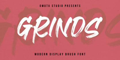 SEPHIRO! A handwritten display brush font. SEPHIRO font is suitable for branding, logotype, apparel, T-shirt, Hoodie, product packaging, quotes, flyer, poster, book cover, advertising, etc. Whats Include? Opentype support Multilingual support PUA encoded Features: Uppercase, lowercase, numerals, punctuations, and ligatures Accessible in the Adobe Illustrator Glyphs panel, or under Stylistic Alternates in the Adobe Photoshop OpenType menu, Adobe InDesign, Corel Draw, even work on Microsoft Word TTF, OTF, and WOFF files Please message me if you're unsure of any language support. Thanks for looking, and I hope you enjoy it! Please don't hesitate to drop me a message if you have any issues or queries.


