3,515 search results
(0.026 seconds)
- Ruzicka Freehand by Linotype,
$29.99In 1935, Rudolph Ruzicka approached W.A. Dwiggins at Linotype in the USA and handed him six typeface design sketches. These later led to the typeface family now known as Fairfield. The sketch called Script’ was forgotten until 1993, when sketches and designs were found in Ruzicka’s archives. Ruzicka Freehand was originally a more flowing calligraphy typeface which Ruzicka later developed into this strong and unusual form. The typeface is designed in two weights and their matching italics. The figures are clear, only just indicating the handwritten style in the italic forms, and combine into light and harmonic lines of text. Ruzicka Freehand gives texts a private and personal character and is suitable for middle length texts and headlines. - Roclante Display by FoxType,
$12.00 Roclante Display is a Brand New Elegant Typeface with a powerful font family. It has a dependable and uncompromising style, with controlled letterforms and modern touches. It looks amazing in logos, magazines, and movies. Roclante Font would be perfect for branding, headlines, Captions, paragraph, and posters. The various weights allow you to experiment with a wide range of applications. It's created to make an impression without sacrificing its beauty and readability. It's shown a clean, minimalist, warmth, quirky, yet still purposed to be versatile The Typeface includes Six Weights - UltraLight, Light, Normal, Medium, DemiBold, & Bold. All offer wide language support, upper and lower cases, numerals and extended punctuation. Thank you for taking the time to look into the font.
 - Sica Condensed by dooType,
$30.00 The Sica Family was designed in order to address issues related to technology, while maintaining humanistic forms. Thus, a font with square shapes emerged, but with smooth curves and slightly rounded terminals making it friendly. The family has three widths – condensed, normal and expanded – each of them with six weights and their respective italics, resulting in 36 fonts. With particular details and open shapes that increase legibility, it can be used for both text compositions as well for display sizes. It has 774 glyphs, covering more than 50 languages, as well as ligatures, lining, oldstyle, tabular and proportional figures, fractions, superiors, inferiors, and small caps, all of them accessible through OpenType features.
 - Kaleko 205 by Talbot Type,
$19.50 Kaleko 205 is inspired by the classic, geometric sans-serifs such as Gill Sans, but has shallower ascenders and descenders for a more compact look. It’s a well-balanced, versatile, modern sans, highly legible as a text font and with a clean, elegant look as a display font at larger sizes. It includes old style non-aligning (lower case) numbers, both proportional and tabular as well as accented characters for Central European languages. The Kaleko 205 family comprises of six weights, and is closely related to Kaleko 105. The most notable differences between the two variations, are the two-storey lower case a and g in Kaleko 205, where they are single-storey in Kaleko 105.
 - Woolworth by The Northern Block,
$32.95 Woolworth is a modern sans serif font inspired by the grotesque designs of the late 19th century. Each letter has been developed with careful attention towards balance and purity of form, creating a clean, functional and optically correct typeface. These handcrafted details make a warm personality throughout the design without any single character being too overwhelming. It's a contemporary grot typeface fully equipped to tackle a wide variety of text setting scenarios. Woolworth is now available as version 2.0 (2022). Details include six weights and italics, over 600 characters with alternative lowercase a, e, g, and basic punctuation. Open type features include seven variations of numerals, small caps, ligatures, and language support covering Western, South and Central Europe.
 - Karmaline by Mysterylab,
$9.00 Karmaline is a six-weight sans serif font family with a unique and expressive design. This font has some intriguing special features such as subtly tapered topheavy vertical strokes and selected wedge-shaped horizontal strokes. It is evocative of designs from Switzerland, Germany, and the Netherlands in the period spanning 1900 – 1930, but with thoroughly modern features like high legibility at small sizes, even inter-character weight and flow, and a high x-height. You'll find Karmaline's semi-condensed width to be useful for both strong headlines and for comfortable copyfitting in narrow column widths. This font also works very well when adding layered shadow and highlight effects, and is a great choice for logos.
 - Dvarlin Staves by Sins,
$37.48 Dvarlin Staves is a collection of 512 rune glyph's divided into six font family's. The three main font's are Root, Caber and Bole, while Remnant, Branch and Blossom are taller versions of the main set. They all come in four weights: Light, Regular, Semibold and Bold. As well as a Italic and a Slant style for the purpose of adjusting letters on a curved line. It also features codex:437 glyph set and an extended array of letters and corner alternatives, including the default runic glyph's. The collection stands at 72 styles that contains a total of 36 864 glyph's. For extra supporters consider gifting some Staves away to a crafty friend.
 - Silverland by FontMesa,
$49.00 Silverland is a revival of an old type font from the Bruce Type Foundry of New York, the original font from 1874 included uppercase only plus 22 end caps. This 21st. century version has been expanded to include many more decorative end caps plus new lowercase, small caps, italic, italic small caps, swash, swash small caps and gothic version. Approximately six months of painstaking work has gone into making this font family over the last 22 months. The OpenType versions of Silverland include between 230 and 370 kerning pairs each setup as auto ligature replacements, you will need an application such Adobe CS products in order to take advantage of this OpenType feature.
 - Qi by Cory Maylett Design,
$14.98 Qi is a display sans-serif inspired, in part, by the art deco typefaces sometimes seen on old signs along rural American backroads. Unlike these signs, Qi is new, fresh, a little bit quirky, and not at all in need of repair or a fresh coat of paint. The family is comprised of six distinct fonts with more on the way. With an entire set of Central and Western European (and, of course, American) glyphs, plus a bunch of alternates and ligatures, Qi could be the perfect display face for your next sign, poster, newsletter, headline or, well, most anything else. Hey, the lowercase alone makes these fonts well worth the price.
 - Silverland Gothic by FontMesa,
$49.00 Silverland is a revival of an old type font from the Bruce Type Foundry of New York, the original font from 1874 included uppercase only plus 22 end caps. This 21st. century version has been expanded to include many more decorative end caps plus new lowercase, small caps, italic, italic small caps, swash, swash small caps and gothic version. Approximately six months of painstaking work has gone into making this font family over the last twenty two months. The OpenType versions of Silverland include between 230 and 370 kerning pairs each setup as auto ligature replacements, you will need an application such Adobe CS products in order to take advantage of this OpenType feature.
 - Neue June by Matt Chansky,
$21.00 Four years of development imbue Neue June with its uniquely crafted high x-height, enabling designers to literally and figuratively elevate layout designs. In today’s highly competitive brand marketplace, readability across communication platforms and memorability go hand in hand towards target audience retention. Neue June comes in six weights, from elegant thin to full-bodied emphatic bold, plus italics. You’ll find a robust selection of highly refined multilingual glyphs. In addition to a suite of ligatures, there are a number of extra characters, such as the estimated symbol, the number sign, and directional arrows. When the creative direction calls for sophisticated and memorable tactics—leverage the versatile 385 glyph count for big messages and easily consumable body copy.
 - Oksana Sans Compressed by AndrijType,
$33.00 Oksana Sans Compressed is the most skinny part of Oksana Sans font family, but still it retains most features of this humanist sans serif. The Compressed version is designed to get most of your page and fill a minimum space with maximum information. It can be useful in multiple columns typesetting — like magazines, newspapers or business documentation. Oksana Sans Compressed could be a good minor companion for other Oksana fonts as well. It has six weights from Thin to Heavy plus free and funny Fat Compressed Italic face, supports Western, Central European, Baltic Latin and Slavic Cyrillic codepages. Old-style digits, some ligatures, alternative characters and modern currency signs are also included.
 - Mermer by Jana Orsolic,
$35.00 Mermer font family is a contemporary take on Roman capitals in six weights. The font name is the Serbian word for marble, and the inspiration for its creation comes from chiseled street signs in Istria. With lowercase and Cyrillic added, it gets a broader range of usages. Mermer is bold and versatile, can be both sporty and high fashion, looking sharp in more than 40 languages. Thin is thorny and Heavy feels like a block of concrete. Make it LOUD by setting it in large sizes and choosing Mermer Heavy for posters, magazine headings or logos, or you can make it cosy and friendly setting it smaller in Mermer Regular for menus, book covers, invitations or business cards.
 - Sica Expanded by dooType,
$30.00The Sica Family was designed in order to address issues related to technology, while maintaining humanistic forms. Thus, a font with square shapes emerged, but with smooth curves and slightly rounded terminals making it friendly. The family has three widths – condensed, normal and expanded – each of them with six weights and their respective italics, resulting in 36 fonts. With particular details and open shapes that increase legibility, it can be used for both text compositions as well for display sizes. It has 774 glyphs, covering more than 50 languages, as well as ligatures, lining, oldstyle, tabular and proportional figures, fractions, superiors, inferiors, and small caps, all of them accessible through OpenType features. - Posterman by Mans Greback,
$59.00 Posterman is a cool sans-serif typeface. With tall letterforms in a grotesque appearance, this legible typography is a lettering for neo-classic headline or clean logotype. The Posterman font family consists of Regular, Bold and Black, and each weight as Italic, totalling in six styles. The font is built with advanced OpenType functionality and has a guaranteed top-notch quality, containing stylistic and contextual alternates, ligatures and more features; all to give you full control and customizability. It has extensive lingual support, covering all Latin-based languages, from Northern Europe to South Africa, from America to South-East Asia. It contains all characters and symbols you'll ever need, including all punctuation and numbers.
 - Zeta by Roy Cole,
$34.00 Zeta was developed by Roy Cole, the British typographer and book designer. It is his second typeface family, completed in 2006, and comprises six fonts. As with his other typeface families - Lina, Colophon and Coleface - Zeta is a sans-serif typeface, particularly notable for its fluidity and strong legibility. Whilst the proportions of Zeta are derived from classical models, the letter forms themselves are totally modern in concept. For example, when used for blocks of text little line spacing is needed to achieve good readability. Zeta is conceived as an easy reading typeface presenting an up-to-date impression wherever it is utilized. Due to its origins it really comes into its own when used for book design.
 - Stepford by Joanne Marie,
$10.00 A typographic playground Stepford is a versatile semi-serif boasting 6 styles - regular and italic, sketch and italic and outline and italic. It includes 231 glyphs, ligatures and multilingual support. These six styles make it the perfect display typeface for any kind of project. Absolutely sweet for editorial design - mainly headers and sub-headers but can also be used for body text too. This typographic trio is based on the vintage 50’s and 60’s style scripts and modernised for the present day. It’s another powerful typeface to add to your arsenal of design assets that command attention. That’s what design is all about! For regular updates and freebies follow me on Instagram at joannemarie_cm
 - Inkston by Fenotype,
$35.00 Inkston is a hand drawn font collection of six different types and several versions and a set of extras. All the fonts are drawn using the same grid and scale so that they play together well. Inkston Extras is a set of pictograms, swashes, ornaments and catchwords designed to support the font. Inkston fonts work nice as they are yet they’re equipped with OpenType features to give you even more tools to customise your design. Try combining any two or more of the fonts for impressive results. Purchase the whole collection for the best price and go crazy with the possibilities! Inkston collection will go for anything from cute to artisanal to streetwise hand lettering style.
 - AI Wood by Alphabets,
$17.95These six faces are interpreted from examples shown in Rob Roy Kelly's "American Wood Types" They are not merely scanned copies, but have been redrawn from scratch with various optical adjustments. Kelly points out that the true glory of the American Wood Types are the negative spaces, which are, in their dynamic active forms, the antithesis of the anemic flimsy letters produced by type foundries in the 19th century. The Alphabets Wood Types are designed with digital manipulation in mind. Stretch, curve and distort at will! These designs were released prior to similar revivals from Adobe. Each font has two full alphabets (one full height, one smaller) and numerals. However, certain points and accents will not be found. - Typesetter Ornaments JNL by Jeff Levine,
$29.00 The pages of vintage type foundry catalogs yield so much wonderful type design and artwork. Found within their pages are hundreds of classic text and display faces alongside delicately engraved cuts as well as print shop borders, ornaments and embellishments. These books are treasure troves of their respective times, and Typesetter Ornaments JNL preserves some of that art in digital form. Redrawn from this source material are twenty-six basic design elements that include corner pieces, end pieces, pointing hands, spot illustrations and other designs. Also included are old style parentheses, brackets, an Rx (prescription symbol), two cent signs and a few extra elements located on the number keys and their caps shift counterparts.
 - TG Frekuent Mono by Tegami Type,
$30.00 TG Frekuent Mono a new modern geometric sans serif with monospaced style. This typeface is made with precise calculations so that it displays a beautiful and modern appearance. Besides this new typeface is also equipped with six different styles, ranging from ultra light to extra bold plus variable font. This typeface also has various alternative characters that can be used according to the needs in the design. Alternative characters that exist in this type of font have a touch of script typeface so that it makes the alternative character of this type of letter a little quirky and different but still fits well with the combination of modern main characters. And supports approximately 100 languages.
 - Mancunium by K-Type,
$20.00 Mancunium is a sans serif family with a contemporary monolinear character, though designed with the iconic proportions of Roman capitals in mind. In addition to reliable romans, the typeface includes proper, optically corrected italics. Also, uniquely, a set of ‘vertalics’ that contain the more script-like glyphs of the italics with angled stem terminals, but which are unslanted and upright in aspect, and without the slight narrowing of the italics. Each font includes a full complement of Latin Extended-A characters and additional oldstyle numerals. Mancunium is sold in two collections – a Regular/Bold package and a Light/Medium package. Each package contains six fonts - two romans, two italics, and two vertalics.
 - Kamerik 105 by Talbot Type,
$19.50 Kamerik 105 is inspired by the classic, geometric sans-serifs such as Futura and Avant Garde, but has shallower ascenders and descenders for a more compact look. It's a versatile, modern sans, highly legible as a text font and with a clean, elegant look as a display font at larger sizes. It includes old style non-aligning (lower case) numbers, both proportional and tabular and accented characters for Central European languages. The Kamerik 105 family comprises of six weights, and is closely related to Kamerik 205. The most notable differences between the two variations, are the single-storey lower case a and g in Kamerik 105, where they are two-storey in Kamerik 205.
 - Coleface by Roy Cole,
$34.00 Coleface was created by the British typographer Roy Cole, completed shortly before his death in 2012. It comprises six fonts: Coleface 30, 60, 90 and the italics 33, 66, 99. As with his earlier typeface families - Lina, Zeta and Colophon - Coleface is a highly-readable sans serif typeface that offers significant flexibility in terms of its potential uses. Roy Cole studied typographic design under the tutelage of Emil Ruder at the Gewerbeschule in Basel, at a time when typographic history was being made through the creation of a style that epitomized modernity. Consequently the principles of order, simplicity and legibility, fused with experimentation, became a hallmark of his practice, as exemplified in his last font Coleface.
 - Sica by dooType,
$30.00The Sica Family was designed in order to address issues related to technology, while maintaining humanistic forms. Thus, a font with square shapes emerged, but with smooth curves and slightly rounded terminals making it friendly. The family has three widths – condensed, normal and expanded – each of them with six weights and their respective italics, resulting in 36 fonts. With particular details and open shapes that increase legibility, it can be used for both text compositions as well for display sizes. It has 774 glyphs, covering more than 50 languages, as well as ligatures, lining, oldstyle, tabular and proportional figures, fractions, superiors, inferiors, and small caps, all of them accessible through OpenType features. - TyfoonSans by Fontforecast,
$18.00 TyfoonSans is a clear, modern, versatile font family of six weights plus matching italics, excellently suited for both display and text. It is designed by Fontforecast in 2013. A very complete character set supports a wide range of languages. OpenType features such as five numeral styles, fractions and both standard and discretionary ligatures, make TyfoonSans well equipped for professional typography. In addition to the design possibilities of TyfoonSans, there is TyfoonScript, a handwritten family of three weights built on the same metrics. When combining TyfoonSans and TyfoonScript, design possibilities become endless. Two font families that blend perfectly and are always found in successive order in your font list thanks to their family name.
 - Toxic Brew by PizzaDude.dk,
$15.00 The Toxic Brew font was initially designed to be a Halloween font, but I guess it turned out not so scary in the end. But maybe you can use it for something scary anyway? I've added several versions, and they mix very well
 - Moycen by Muksal Creatives,
$10.00 Introducing Moycen font is the perfect blend between bold, modern and feminine. It's strong yet soft, urban and high fashion. The hard lines with subtle rounded edges gives it a perfect mix of contemporary typography and classic design. Versatile is an understatement.
 - Crayon Hand by Letters&Numbers,
$28.00 In absence of oil pastels, charcoal, crayons or time, Crayon Hand is a quick fix to happy type setting. It comes in regular and bold. Enjoy! Crayon Hand is extended, containing West European diacritics making it suitable for multilingual environments and publications.
 - Sweet Tea PW by Patty Whack Fonts,
$24.00 Sweet Tea is a thin, handwritten and simplistic font reminds me of the simple, yet serene days on the front porch swing with a Summer breeze. Sipping an ice cold glass of sweet tea on a hot, sunny day -- there's nothing better.
 - My Aunt Celia by Quadrat,
$25.00 My Aunt Celia was designed as a quaint, quasi-elegant display face using caps and small caps. The family consists of two fonts: regular and alternate which, between them, provide many special swash characters, tall caps and ligatures for lively, quirky, mixed settings.
 - Invictus by Fargun Studio,
$14.00 Introducing Invictus hand-painted brush font! With FOUR hand-painted character sets and SWASHES which can be mixed up, lowercase or uppercase. Invictus character are great for logos, name tag, handwritten quotes, product packaging, merchandise, social media, greeting cards and many more.
 - Heathtop by Warnetype,
$6.00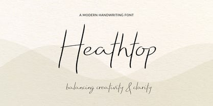 A modern handwritten script font that balances creativity with clear legibility that contains upper & lowercase characters, all punctuation and numerals. Designed so the text reflects stylish natural handwriting, with ligatures and carefully kerned characters mixed with unjoined letters for a contemporary feel.
 - Quorga by Nirmana Visual,
$19.00 Quorga is a modern Aesthetic Serif font that is both memorable and stylish. It's a mix between a classic serif and a futuristic sans serif. This font is perfect for fashion related branding or editorial design and displays both masculine and feminine qualities.
 - Urban Philosopher by Umbra95,
$28.00 Urban Philosopher is a experimental font, its kind of mix of vintage typography with 80 s grunge. The font have a little messy and dirty texture, which gives it a little "horror" effect. The font includes almost all letters of the Latin alphabet.
 - Roble by Latinotype,
$26.00 Roble is a Slab Serif Font, from a mix between Andes and Sanchez, following a harmony with both fonts one sans and one serif with a fresh and dynamic result. Roble is a family of 16 display fonts 8 weights plus italics.
 - Farmer by SparkyType,
$19.00The OpenType version of Farmer contains two sets of slightly different upper-case letters. The alternate version is accessible as Titling Caps in OpenType feature enabled software. Mixed and matched they create a strong and persuasive headline, logo or For Sale notice. - Loyolliams by Eyad Al-Samman,
$5.00 “Loyolliams” is my first designed Latin typeface which has special meanings and unforgettable memories for me. The font's name, Loyolliams, consists of two mixed syllables stand for two different names. The first syllable is derived from the name “Loyola” and the second syllable is derived from the last five letters of the name “Williams.” These two names are related to “Concordia University”—located in Montreal in Canada—where I studied at a short academic term and spent in a very special period of my life in the late 2005. This renowned Canadian academic institution was created following the 1974 merger of “Loyola College” (1896) and “Sir George Williams University” (1926). This conglomeration formed “Concordia University” and the name Concordia itself was taken from the motto of the city of Montreal, Concordia salus (meaning ‘well-being through harmony’). This font comes in two different weights; light and regular. “Loyolliams” is a square, geometric, techno, and modern font. It is suitable for T-shirts, books' covers, websites’ addresses, advertisement light boards, and titles in technical, artistic, and other types of magazines and signboards. “Loyolliams” can be used also in posters, surfaces of electrical and electronic tools, digital devices and chips, geometrical machines, trucks, tractors, calculators, mobile phones, watches, laptops, personal computers, power equipments, digital cameras, technical magazines, and other digital and electronic tools. This fonts can be effectively used in titles especially when its uppercase and lowercase letters are mixed together and when it is used in its italic mode. "Loyolliams" is suitable for writing and printing small textual paragraphs in cards, magazines advertisements, and also posters. The main characteristic of "Loyolliams" Typeface is its non-curve style in most of its alphanumeric letters. The characters are deliberately designed to have only angular and square shapes.
 - Otsuki Sama by Julmeme,
$19.00 Otsuki-Sama is a sophisticated mix between a serif and sans serif font design. Its elegant balance between heavy contours and subtle lines gives it a modern yet very rich look. Applicable for any type of graphic design, especially for headlines, posters and magazines.
 - Queensby by Uncurve,
$18.00 Queensby is a unique modern serif font with tons of alternates, to use in such place as headlines. You can mix and match to find something different. Queensby is perfect for advertising, magazines, editorial, posters, branding, logo type, headers, titles, packaging, displays and more.