5,385 search results
(0.021 seconds)
- Landmark by Oporto Design,
$29.90 Landmark is a modern bold font that mix rounded and square angles.
 - Blank Manuscript by Aah Yes,
$14.95Blank Manuscript allows you to produce sophisticated musical scoresheets even on basic Word Processors - anything from simple plain staves to complex full-page orchestral scores of your own design, to write in the notation yourself. The basic stuff is really easy and straightforward, but there's some quite advanced things you can do as well. So Copy and Save these Instructions. • The main stuff is simple and tends to follow the initial letter. Treble, Bass and Alto clefs are on upper case T B A (there are more clefs, below). The 5 Lines for the clefs are on L or l. • A small v will give a small vertical line (like a bar line) and a Big U will give a Big Upright - these can start or end a line or piece. • Time Signatures - type the following letters: Think of W for Waltz and it's easy to remember that 3/4 time is on W. Then from that they go up or down together like this: V=2/4 W=3/4 X=4/4 Y=5/4 Z=6/4 Compound Times are on H I J K like this: H=3/8 I=6/8 J=9/8 K=12/8 Common Time and Cut Common symbols can be found on semi-colon and colon respectively (all begin with Co- ). 2/2 3/2 are on lower case a and b, 7/4 and 7/8 are on lower case c and d, 5/8 is on small k (think POL-k-A) • Flat signs are on the numbers. Flat signs on LINES 1 to 5 are on numbers 1 to 5. Flat signs on SPACES 1 to 5 are on numbers 6 to 0 (space 1 being above line 1, space 5 being above the top line of the stave). Sharp signs are on the letters BELOW the long-row numbers. Which is q w e r t for the sharp signs on Lines 1 to 5, and y u i o p for sharp signs on spaces 1 to 5. Doing it this way means it works the same for all clefs, whether Treble, Bass, Alto, Tenor or any other. Sharp and Flat Signs always go in this order, depending on how many sharps or flats your key signature requires: Treble Clef Sharps t i p r u o e Flats 3 9 7 4 2 8 6 Bass Clef Sharps r u o e t i w Flats 2 8 6 3 1 7 = Alto Clef Sharps o e t i w r u Flats 7 4 2 8 6 3 1 • Guitar Chord Boxes are on G and g (G for Guitar) Upper Case G has a thick line across the top Lower case g has an open top, for chords up the fretboard TAB symbols are available: Six-string Tablature is on s & S for Six. Four-string Tablature is on f & F for Four. (Lower case has the "TAB" symbol on it, Upper Case has just the lines to continue.) Five-string tablature, is on lower case "j" (as in BAN-j-O) and of course L or l will continue the 5 lines. •RARE CLEF SIGNS including Tenor Clef, are on various punctuation marks, i.e. dollar, percent, circumflex, ampersand & asterisk, above the numbers 4 to 8. NOTE: The important symbols were kept on the letter and number keys, which are fairly standard all over, but some of the less important symbols are on various punctuation keys, which in different countries are not the same as on my keyboard. If it comes out wrong on your system, all I can say is it's right on the systems we've tried, and they'll be in here somewhere, probably on a different key. CLOSING THE ENDS OF THE LINES and BAR-LINES is done with the 3 varieties of brackets - brackets, brace and parentheses - Left/Right for the Left/Right end of the line. Parentheses L/R () which are above 9, 0 give a clef with a small vertical upright (the same as a bar line). Brace L/R and Brackets L/R (both on the 2 keys to the right of P on my keyboard) will close off a staff line with tall upright bars. Brace gives a double upright - one thick, one thin. Brackets give a single tall upright. A Big Upright is on Big U, (Big U for Big Upright) and a small vertical line is on small v (small v for small vertical). The Big Upright is the maximum height, and the small vertical is exactly the same height as a stave. And there's a tall upright Bar, on Bar (which is to the left of z on my keyboard, with Shift,) which is the same height as the bar on upper case U but twice as broad. • There's a staff intended for writing melodies, which is a little bit higher up than an ordinary treble clef giving a space underneath to put lyrics in - on m and M for Melody line. Lower case has the Treble Clef on, Upper case M has just the higher-up staff lines with no clef. (Use mMMMMMMM etc.) However this clef will be in the wrong place to put in sharp and flat signs, key signatures and so on, so if you use this clef you'll have to write the sharps, flats and key signature yourself. There's also a clef that's smaller (less tall) than the ordinary clef, but with the same horizontal spacing so it will align with other standard-sized clefs - on slash (a plain clef) and backslash (with a Treble Clef). • There are some large brackets for enclosing groups of staves, such as you'd use on large orchestral scores, on Upper Case N O P Q R, which can aid clarity. N and O on the left, Q and R on the right. P is a Perpendicular line to be used on both sides to increase the height of the enclosure, in this way but with the staff lines in between: N Q P P P P P P O R OTHERS —————————————— • Repeat marks are on comma (left) and period/full stop (right). • Hyphen is left as a sort of hyphen - it's a thin line like a single staff line, with the same horizontal spacing as ordinary staff lines - in case you want to draw a line across for a Percussion Instrument, or a Title or Lyric Line. • Space is a Space, but with HALF the width or horizontal spacing as ordinary staff lines, so 2 space symbols will be the same width as a clef symbol or line. • Grave (to the left of 1 on the long row, or hold down Alt and type 0096 then let go) gives a staff line that is one eighth the width of an ordinary staff line. • If you want manuscript in a clef and key which requires a flat or sharp sign in the space underneath the 5 lines, they’re on = equals and + plus . SYMBOLS • Many of these symbols will only be useful if you have worked out in advance which bars will need them, but they are here in case you've done that and wish to include them. • Symbols for p and f (piano and forte) are on 'less than' and 'greater than' < > (above comma and full stop) and m for mezzo is on Question, next to them. They can be combined to make mp, mf, ff, pp, etc. These signs -- and other signs and symbols like Pedal Sign, Coda Sign and so on -- can be found on various punctuation mark keys, including above 1, 2, 3 in the long row, and others around the keyboard. There's a sort of logic to their layout, but in different countries the keys are likely to give different results to what is stated here, so it's probably best to just try the punctuation and see if there's any you might want to use. (But on my keyboard a Coda sign is on circumflex - because of the visual similarity. Pedal sign is on underscore. A "Sign" symbol is on exclamation mark.) They were only included in case you really need them to be printed rather than handwritten. • However, a Copyright symbol is deemed necessary, and also included are a "Registered" symbol and a TradeMark symbol. They are found in the conventional places, and can be accessed by holding down ALT and typing 0169, 0174 or 0153 respectively in the numberpad section and letting go. • Staff lines with arco and pizz. above are on capital C and D respectively ---C for ar-C-o. • An empty circle above a staff line (to indicate sections by writing letters A, B, C or 1,2,3 inside for rehearsal marks) is on n. The actual signs for an A, B, C and D in a circle above the staff line can be produced by holding down ALT and typing 0188, 0189, 0190 and 0191 respectively and letting go. • The word "Page", for indicating page numbers, is on the numbersign key. • The two quotes keys, (quote single and quote double) have symbols representing "Tempo is", and "play as triplets", respectively. • INSTRUMENT NAMES There's a whole lot of Instrument Names built in (over a hundred) which can be printed out above the clef, and you do it like this. Hold down Alt and type in the given number in the numberpad section, then let go. For Piccolo it's 0130, for Flute it's 0131, Cornet is on 0154, Violin is on 0193, and the numbers go up to over 0250, it's a fairly complete set. There's also a blank which is used to align un-named clefs on 0096. Put them at the very beginning of the line for the best results. Here they are: WOODWIND Piccolo 0130 Flute 0131 Oboe 0132 Clarinet 0133 Eng Horn 0134 Bassoon 0135 Soprano Sax 0137 Alto Sax 0138 Tenor Sax 0139 Baritone Sax 0140 Saxophone 0142 Contrabassoon 0145 Recorder 0146 Alto Flute 0147 Bass Flute 0148 Oboe d'Amore 0149 Cor anglais 0152 Pipes 0241 Whistle 0242 BRASS Cornet 0154 Trumpet 0155 Flugelhorn 0156 Trombone 0158 Euphonium 0159 Tuba 0161 French Horn 0162 Horn 0163 Tenor Trombone 0164 Bass Trombone 0165 Alto Trombone 0166 Piccolo Cornet 0167 Piccolo Trumpet 0168 Bass Trumpet 0170 Bass Tuba 0171 Brass 0172 VOICES Vocal 0175 Melody 0176 Solo 0177 Harmony 0178 Soprano 0179 Alto 0180 Tenor 0181 Baritone 0182 Treble 0183 Bass 0197 (see also PLUCKED STRINGS) Descant 0184 Mezzo Soprano 0185 Contralto 0186 Counter Tenor 0187 Lead 0206 BOWED STRINGS Strings 0192 Violin 0193 Viola 0194 Cello 0195 Contrabass 0196 Bass 0197 Double Bass 0198 Violoncello 0199 Violin 1 0200 Violin 2 0201 Fiddle 0252 PLUCKED STRINGS Harp 0202 Guitar 0203 Ac. Gtr 0204 El. Gtr 0205 Lead 0206 Bass 0197 Ac. Bass 0207 El. Bass 0208 Slide Gtr 0209 Mandolin 0210 Banjo 0211 Ukelele 0212 Zither 0213 Sitar 0214 Lute 0215 Pedal Steel 0216 Nylon Gtr. 0238 Koto 0239 Fretless 0244 KEYBOARDS + ORGAN Piano 0217 El. Piano 0218 Organ 0219 El. Organ 0220 Harpsichord 0221 Celesta 0222 Accordion 0223 Clavinet 0224 Harmonium 0225 Synth 0226 Synth Bass 0227 Keyboards 0228 Sampler 0249 PERCUSSION and TUNED PERCUSSION Percussion 0229 Drums 0230 Vibes 0231 Marimba 0232 Glockenspiel 0233 Xylophone 0234 Bass marimba 0235 Tubular Bells 0236 Steel Drums 0237 Kalimba 0240 OTHERS Harmonica 0246 Mouth Organ 0247 FX 0251 Intro 0243 Verse 0245 Refrain 0248 Chorus 0250 un-named 0096 (this is a small spacer stave for aligning clefs without a name) ALSO copyright 0169 registered 0174 TradeMark 0153 Rehearsal marks 0188-0191 (giving A, B, C, D in a circle, an empty circle is on n ) Clef signs for Treble Bass Alto without any staff lines 0253-0255 An Alphabetic List of all signs: a 2/2 time b 3/2 time c 7/4 time d 7/8 time e sharp sign, centre line f Tab sign for 4-string tab g Guitar Chord Box, no nut h half-width stave I sharp sign, third space up j Tab sign for 5-string tab k 5/8 time l Lines - 5 horizontal lines for a stave m Melody Clef - a standard clef but placed higher up, with Treble sign n Stave with an empty circle above o sharp sign, fourth space up p sharp sign, space above stave q sharp sign, bottom line r sharp sign, fourth line up s Tab sign for 6-string tab t sharp sign, top line (fifth line up) u sharp sign, second space up v vertical line (bar-line) w sharp sign, second line up x Fretboard, four strings y sharp sign, first space up z Fretboard, five strings A Alto Clef B Bass Clef C “arco” above stave D “pizz.” above stave E Double Vertical Lines F Four Horizontal lines (for 4-string tab) G Guitar Chord Box with nut H 3/8 time I 6/8 time J 9/8 time K 12/8 time L Lines - 5 horizontal lines for a stave M Melody Clef - a standard clef but placed higher up, plain N Bounding Line for grouping clefs - top left O Bounding Line for grouping clefs - bottom left P Bounding Line for grouping clefs - Perpendicular Q Bounding Line for grouping clefs - top right R Bounding Line for grouping clefs - bottom right S Six Horizontal lines (for 6-string tab) T Treble Clef U tall, thin Upright line V 2/4 time W 3 / 4 time X 4/4 time Y 5/4 time Z 6/4 time 1 flat sign, first line up (the lowest line) 2 flat sign, second line up 3 flat sign, third line up 4 flat sign, fourth line up 5 flat sign, fifth line up (the top line) 6 flat sign, first space up (the lowest space) 7 flat sign, second space up 8 flat sign, third space up 9 flat sign, fourth space up 0 flat sign, space above stave - Quasar by VP Creative Shop,
$12.00 Introducing the delightful Quasar sans serif font – a true gem in the world of typography! With its clean and modern design, Quasar brings a touch of elegance to any project. This font family consists of not one, but six distinct weights, offering you a versatile range of options to choose from. Whether you're aiming for a bold and impactful statement or a more subtle and refined look, Quasar has you covered.
 - Antique Stencil Borders JNL by Jeff Levine,
$29.00 Antique Stencil Borders JNL collects twenty-six vintage border designs from various sources for complementing copy set in stencil lettering or in stand-alone decorative projects. NOTE: The purchase of this font does NOT include license to replicate the designs as commercial products for resale. To do so, a Derivative Products License must be obtained by contacting Jeff Levine. Contact information is found within the End User License Agreement.
 - Prozac by Barnbrook Fonts,
$30.00 Throughout the history of typography there have been countless attempts to simplify the alphabet. In the early 20th century, modernist designers experimented with reducing the alphabet to basic geometric shapes. Prozac pushes this utopian experiment further by reducing the roman alphabet to just six shapes. These shapes are then flipped or rotated to make up the 26 letters of the alphabet. Prozac is available without prescription in lite and max versions.
 - Surimi by JCFonts,
$24.00 Surimi is a condensed display typeface available in six styles. Designed to stand out with its low crossbars and its unicase alternates, this cool little family will be great for titling and logotypes. The fonts include diacritics for western European langages, tabular and proportional figures, and 4 stylistic sets : ss01 : unicase alternates (A,E,W,Y) ss02 : alternate lowercase g ss03 : alternate lowercase l ss04 : alternate W and w
 - Quache by Mans Greback,
$29.00 Quache is a flexible sans-serif, created by Måns Grebäck between 2018 and 2020. It has unique, stylish curvatures and is clear, legible and sharp with open letter forms. The font family consists of six weights and four widths, totaling in 28 main styles: Thin, Light, Regular, Bold, Black, Heavy and Condensed, Normal, Expanded, ExtraExpanded It supports Latin-based languages, and contains numbers and all symbols you'll ever need.
 - Karol Sans by Type-Ø-Tones,
$60.00 Karol Sans is the perfect companion for Karol, without being a literal translation of it. It has its own personality and offers a wider range of six weights and their italics which gives it added versatility. It has all the indispensable OpenType features for a text typeface like Small Capitals, different sets of figures, fractions and many others. The character set supports Latin, Central European, Baltic and Turkish languages.
 - Decima Mono Round by TipografiaRamis,
$39.00 Decima Mono Round – another addition to the Decima fonts family. Decima Mono Round is a modern monospaced condensed sans serif family with classic geometric design, built in three weights and six styles. The letterforms in roman style are techno (engineered) in appearance, while italics remind one of elegant handwriting balanced with Roman geometry. The typeface is released in OpenType format with extended support for most Latin languages, as well as Cyrillic.
 - Bambino by Mindburger Studio,
$29.00 Bambino Font Family is a typography project by Milos Mitrovic and affiliates. Bambino has an influence of 1920s Futura-like fonts and art deco look and feel. Combining its vintage character with clean geometric form and organic flow, Bambino is shaped to fit modern aesthetics. There are 12 fonts (six weights with italics) included in the family. Bambino weight range spreads from almost hairline lightness to extreme bold style.
 - Brodaers Expanded by Trustha,
$17.00 Brodaers Expanded is a display sans serif font. With the initial concept of the inner shape, made round. Comes in six styles, which makes it easier for the project you are working on, as well as alternative glyphs as an attractive option. Brodaers Expanded is an expanded version of Brodaers typeface. It comes with 400+ glyphs, which also include multilingual languages. Brodaers is perfect for headlines, branding, and many more.
 - Kathleen Sans by ActiveSphere,
$30.00 Kathleen Sans is a geometric sans-serif display font and works best in text and display applications, such as posters, headline, magazine, logos, titles, product branding, corporate branding and publishing. The Kathleen Sans font family has three weights: Light, Regular, and Bold, each available in italic, making a total of six styles. Each style has a full upper and lower-case, accents, punctuation and a selection of monetary symbols.
 - Noa by Linotype,
$29.99The Danish designer Nina Lee Storm designed Noa for use on television and computer screens during the late 1990s. She began her six-member type family with the creation of bitmap fonts, developing their print outlines only secondarily. Noa’s letters exhibit a tall x-height, coupled with very short ascenders and descenders. Storm is proud to report that her typeface also looks very “Danish.” Why don't you give it a try? - Cell Block 6 by Enrich Design,
$24.95The concept for Cell Block 6 is based on the rigid structure and design of modern architecture. It is a structural display font created by Enrich Design. Four of six versions of Cell Block 6 are designed to be used as display fonts in order to uphold their detail. The Solid and Solid Outline versions offer additional versatility and can be used at smaller sizes in a wide range of applications. - FF Dirty Three by FontFont,
$41.99 British type designer Neville Brody created this display FontFont in 1994. The font is ideally suited for music and nightlife and poster and billboards. FF Dirty Three provides advanced typographical support with features such as ligatures. It comes with proportional lining figures. This FontFont is a member of the FF Dirty super family, which also includes FF Dirty Four, FF Dirty One, FF Dirty Seven, and FF Dirty Six.
 - Stamp Of Approval JNL by Jeff Levine,
$29.00Back in the 20th Century B.C. (Before Computers) there was what was known as a "paper" office. Workers used typewriters, correction fluid and a drawer full of rubber stamps. Jeff Levine has taken twenty-six of the common phrases found on those old office stamps and created Stamp of Approval JNL. Use these images as they are, or run them through a filter for a worn or inked-up effect. - Magr by Locomotype,
$18.00 Magr is a modern and powerful sans font designed to elevate your sports team and athletic designs. With its sleek and dynamic appeal, Magr brings a professional touch to your projects, leaving a lasting impression. Unlock your creativity with Magr's six styles and twelve fonts, including both upright and italic options. Stand out from the crowd and make a bold statement with this versatile font that complements your sports-themed materials.
 - BPreplay - Unknown license

- Chorxy by PizzaDude.dk,
$20.00 Crunchy and mildly rounded edges, mixed with an imaginative and romantic flair of elegance. Chorxy has got an almost steady x-height, mixed with various jumpy letters, slightly crazy, yet legible! Comes with fi and fl ligatures. You will need to use OpenType supporting applications to use the autoligatures.
 - Patagon by Latinotype,
$19.00 Patagon is a contemporary Woodtype Sans typeface especially designed for fresh, high impact sentences with a mix of flavoured features. Its upper-case Opentype ornamental alternate glyphs provide great elegant textures adding versatility to the three weight family: condensed, regular & extended. Mix them up for a really cool design!
 - New Clear Era by fontBoy,
$35.00 New Clear Era is part of a large ongoing project investigating classicism and legibility. The regular version is the base font. Numerous permutations will be performed on this underlying skeleton. Also investigated are the ideas of an extended type family, and trying to understand what makes a contemporary legible, serif typeface. The Mix versions combine characters from the Roman and Display to make quirky fonts that can be comfortably used for setting text. Mix One is the most quirky; Mix Three is the least.
 - Juline by URW Type Foundry,
$35.99 Juline has the character like a straight-based robot, mixed with curved letters.
 - Actium by Type Mafia,
$45.00 Actium is a contemporary multilingual sans serif typeface developed to help perfect typography automatically. Type Mafia has focussed on words with odd combinations of capital letters and numbers, such as product names and postal codes such as WD40 and H1N5, jump out of the text. They sit awkwardly together as the numerals have been designed to work with the lowercase, not the uppercase letters – affecting readability.To fix this Type Mafia invented Smart Capo™. Smart Capo™ Smart Capo is a feature that automatically activates once you type an uppercase letter together with a number. When a capital letter is sat next to a numeral, Smart Capo converts the letter to a mid-cap — a contemporary alternative to small caps — and the default old-style numeral to a lining numeral. Actium’s mid-caps and lining numerals have been designed with the same height (between cap and x-height) so they sit comfortably next to each other and fit more harmoniously into text. Smart Capo applies equal attention to capitalised words without any numbers, such as NAVO and USA, and are also automatically set into mid-capitals. Working on its own, Smart Capo saves time and money for the typographer — taking the pain out of text formatting — and makes it a more pleasurable experience for the reader. This feature is made possible by the use of ‘contextual alternates’, an OpenType feature used in modern font software, working with a set of characters specially designed at mid-cap height. By default these changes automatically take place so it doesn't need to be switched on, it will just work. Actium Actium’s design has an unusual diagonal contrast — much more common in a serifed face than in a sans serif — giving it more bite. The typeface looks elegant when set in large sizes and remains very legible when shown in small sizes. The family consists of six weights in two styles, making a dozen fonts. Weights range from light to black in roman and true italic. All fonts are fully loaded with functional elements. Actium boasts an extended Latin character set and with Greek. This means a wide range of Western languages are supported: perfect for use in bilingual publications and packaging. For numerals, each font includes old-style and lining figures in both proportional and tabular widths, with superiors and inferiors. These allow you to select the right set of numbers for the right task.
 - Greatday - Personal use only

- Magdeburg™ - Unknown license

- Rousseau™ - Unknown license

- Crazy Harold - Unknown license

- Goombah by Cool Fonts,
$24.00 Goombah is a cosmic journey to those cheezey cartoons of the early 60's. It can be used for a modern look or a retro look. It comes in 3 styles: regular, outline and generator (which has a filled outline with a space between).
 - Harry sunday by Attype Studio,
$15.00 Harry sunday is a delicate and incredibly distinct handwritten font with 3 stylistic set. Fall in love with its incredibly versatile style and use it to create spectacular designs! What's Included : - ligatures - Beginning & Ending Swash - Multilingual Support --- Hope you enjoy with our font! Attype Studio
 - Rawbeat by Wasabib Type Foundry,
$9.00 RAWBEAT is a Display Font with graffiti style, this font coming with 3 style : Regular, Outline, and Extrude. this font will make your designs or branding stand out and eye catching. 100% hand drawing to get the artistic look and make it more powerfull.
 - Amber by MADType,
$21.00 Amber is a minimal font which is built on a grid of 3x3 squares. It was an experiment to see if I could build legible glyphs out of such a small grid. The 3 weights can be layered over each other to create interesting designs.
 - Bobbin by Typoforge Studio,
$19.00 To design a font Bobbin I was inspired by a You And Me Monthly published by National Magazines Publisher RSW Prasa that appeared from Mai 1960 till December 1973 in Poland. In the Bobbin family, every variety contains 3 alternative characters with automatic replacement.
 - Prego by Tour De Force,
$25.00 Prego is small family with a lot of charm packed in 3 weights – Light, Regular and Bold. High contrasting design combined with simple and elegant shapes equipped with OpenType features (Swashes, Stylistic and Contextual Alternates, Fractions). Supports extended Latin character set and Cyrillic as well.
 - Wall Sign JNL by Jeff Levine,
$29.00 Wall Sign JNL is a sign painter's chamfered sanserif found in an instructional manual from 1905. A popular lettering style of the day, it features an abridged vertical on the G, a flattened right side on the Q and a truncated horizontal on the 3.
 - Drum Rhythm JNL by Jeff Levine,
$29.00 An ad in the May 3, 1928 issue of “The Film Daily” for the movie “Drums of Love” featured extra bold, sans serif hand lettering in an Art Deco style. This is now available as Drum Rhythm JNL in both regular and oblique versions.
 - FF Motive by FontFont,
$29.99 German type designer Stefan Hägerling created this display FontFont in 1995. The family contains 3 weights: Light, Regular, and Bold and is ideally suited for music and nightlife. FF Motive provides advanced typographical support with features such as ligatures. It comes with proportional oldstyle figures.
 - Bartleby by AdultHumanMale,
$20.00 Bartleby is a hand-drawn all caps display font. It has over 300 glyphs and several variations on the standard alphabet with all those €xtra pesk¥ foreign characters too. It is available in 3 weights regular, bold, black and as a family of all three.
 - Plz Script by Outside the Line,
$19.00 Plz Script is a warm and friendly script font that can be used as body copy or for headlines. Great with Architectural Lettering or Plz Print. It can also be found in the book "Indie Fonts 3, a Compendium of Digital Type from Independent Foundries".
 - Raimoo by Tama Putra,
$12.00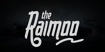 Raimoo is a handwritten typeface. It is suitable for any design needs, branding, cover title, t-shirts, posters and more. The Raimoo typeface includes multi-lingual and currency support, numerals, and punctuations. It comes comes with standard ligatures, stylistic alternates and 3 stylistic sets.
 - Hazel Script by Eclectotype,
$40.00 The design process of this font was rudely interrupted on August 11th, 2015, when my first child, Hazel, was born. Thinking up names for fonts can be tricky, as can thinking up names for babies, so when the font was finally finished, it seemed like a good idea to kill two birds with one stone, and here it is: Hazel Script. Hazel Script is a finely crafted, elegant, connecting script. I wanted to make something unique, and to this end, the contrast in the face is not based on any ductal logic, or the writing of some imagined tool. The thick parts of glyphs are purely aesthetic devices, placed to give the otherwise monoline font an interesting rhythm. The over-sized upper case letters follow a mid-century lettering skeleton, and swash forms can be used judiciously to add spice to the text. Hazel Script works "out of the box" but to really get the best out of it, use OpenType-savvy programs to unlock a world of swashes, alternates, ligatures and the like. In detail, the features are as follows: Swash - alternate forms for many glyphs Stylistic Sets - 1: script r, 2: alternate s, 3: script z, 4 and 5: more swash options, 4,5,6 and 7: access to alternate ampersands (the font boasts six to choose from!), 8: connecting forms for K, L, R, X and Z. Localised forms - ij digraphs for Dutch, and a script lslash for Polish. Standard ligatures - a mixture of ligatures, including the 'percent off' (just type "% off") and a heart that connects to the ends of words (type "<3") Automatic fractions Ordinals - a and o for Spanish etc. but also s,t,r,d,h and n for English 1st 2nd and 3rd etc. Contextual alternates - automatically places special start and end glyphs where necessary. Hazel Script would look great in glossy magazines set large, or would make a slightly unorthodox choice for wedding stationery, birth announcements, letterheads...


