2,372 search results
(0.015 seconds)
- Ray Harts by Maulana Creative,
$12.00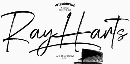 Converon is a decorative cubical display font. With bold sharp edges stroke, fun character with a bit of ligatures. To give you an extra creative work. Converon font support multilingual more than 100+ language. This font is good for logo design, Social media, Movie Titles, Books Titles, a short text even a long text letter and good for your secondary text font with sans or serif. Make a stunning work with Converon font. Cheers, MaulanaCreative
 - Altemus Rays by Altemus Creative,
$11.00 A collection of 174 ray sunray and corner ray designs.
 - Ray Johnson by K-Type,
$20.00 The Ray Johnson font was inspired by the Father of Mail Art. It's based on the block lettering style used by Ray to add the names of his correspondents to their bunny head portraits (the film How to Draw a Bunny is a superb introduction). The font includes blank bunny heads and other Ray Johnson graphics as scalable vector images, and separate bitmap images are also provided as jpegs and gifs.
 - Moon Rays by Epiclinez,
$18.00 Moon Rays is a bold and playful display font, suitable for all children's designs, product packaging, stationary art, apparel designs, and more fun and creative ideas! So what's included: Basic Latin A-Z & a-z. Numbers, symbols, and punctuations Multilingual Support. Accented Characters : ÀÁÂÃÄÅÆÇÈÉÊËÌÍÎÏÑÒÓÔÕÖØŒŠÙÚÛÜŸÝŽàáâãäåæçèéêëìíîïñòóôõöøœšùúûüýÿžß Thank You.
 - Man Ray by Andinistas,
$29.00 ManRay is a photogenic typefamily of 6 fonts designed by @andinistas, with more than 2600 glyphs distributed in 3 Scripts and 3 Caps. Its shapes are ideal for attention-grabbing and for its eloquent character set, each style is presented with three levels of erosion planned with meticulous dotted texture bézier drawing, diagonal texture, and vertical texture pattern. ManRay Script, Script2, Script3 is based on calligraphy made with a fine tip brush and therefore communicates pleasant and attractive ideas. Its capital letters measure three times the height of the lower case and stand out for its artistic curved lines ideal for writing on photos, logos, labels, packaging, posters, covers of food products, spirits, organic teas, etc. In that order, it also offers other expressive alternate letters that activate spontaneously, and each of the three styles is case-infinite with and without Swash, Stylistic, and Titling Alternates. ManRay Caps, Caps2, Caps3 are inspired by calligraphic Roman letters drawn with a brush with a square tip and are equipped with descending flourishes for word start and end. The core of ManRay mixes the ideas of Ed Benguiat and Ross F. George and its name is a tribute to the Dada hero who changed history a century ago by working against the conventions of art and photography.
 - Death Ray by AquaType,
$- A typeface to be reckoned with. It's sharp lines and unruly angles are perfect for concert posters, blackmail, and wedding invitations. Keep punk alive and support your local electro goth band by using Death Ray. Available in only uppercase because all messages that merit Death Ray's use must command that sort of attention. And who said type shouldn't be expressive.
 - Fujita Ray - Personal use only

- Down the Drain - Unknown license

- LCR Rainy Daze - Unknown license

- Wolves and Ruin - Unknown license

- Passenger Train JNL by Jeff Levine,
$29.00 A 1940s travel poster for the Florida East Coast Railway (which then carried passengers but is now a freight line) had the railroad’s name hand lettered in a bold Art Deco sans. This inspired Passenger Train JNL, which is available in both regular and oblique versions.
 - Pain de Mie by PintassilgoPrints,
$24.00 Pain de Mie is a soft font, friendly and sweet, kinda creamy, kinda bubbly. It's an all caps font with 2 different glyphs for each letter: easily access these through the keyboard upper or lower cases keys. Make them cycle with OpenType Contextual Alternates. There's also a handful of drawings to add an extra charm here and there. Reach these via OpenType Ornaments or pick your choices through a glyphs palette. Like a fresh loaf of bread, Pain de Mie goes well in so many ways. Give it a try!
 - Rail Line JNL by Jeff Levine,
$29.00 Rail Line JNL is a font for the railroad enthusiast for making their own model train car emblems. The logos contained in this font are or may be the property of the various rail companies, their assigns and/or successors. Outside of non-profit hobby use or for historical/educational purpose under the Fair Use rules, any commercial application of these logos must be obtained by written permission by the respective logo owner or owners. Jeff Levine fonts provided Rail Line JNL strictly as a hobby font. We assume no liability for the use, misuse or misrepresentation of any of the logos contained within the font file.
 - Rebel Train Goes by Dharma Type,
$14.95 Based on retro vinyl records in the middle of 20th century. There are three other fonts designed by in the same concept. -Word From Radio -African Elephant Trunk -Moon Star Soul -Rebel Train Goes
 - Mule Train JNL by Jeff Levine,
$29.00 Instead of being directly based on classic wood or metal type examples, Mule Train JNL takes a roundabout route in its development. Images of a set of letters and numbers cut from plywood (which in turn were based on a vintage type design) served as the work models. Mule Train JNL is available in both regular and oblique versions.
 - Training Film JNL by Jeff Levine,
$29.00 The title card “Airplane Hydraulic Brakes” in the beginning of a WWII armed services training film had the words "hydraulic brakes" hand lettered in an Art Deco slab serif style. This served as the model for Training Film JNL, which is available in both regular and oblique versions.
 - Rail Bum JNL by Jeff Levine,
$29.00 Morris Fuller Benton's Hobo [designed in 1910] is one of a number of fonts which have been so over-used that many designers shy away from it altogether. However, Jeff Levine had often wondered what the design might look like it given a serif treatment. The result is Rail Bum JNL, named for the hobos and transients who hitched along on freight cars to ride the rails across the country during the years when trains were the mainstay of American transportation.
 - Train Of Thought by Pesic,
$29.00 Train of thought is a decorative font based on vintage and retro posters of the 19th and 20th centuries. Contains all Latin and Cyrillic glyphs. It is very modern, and it is intended for the use of creating logos and T-shirt designs as well as highlighting the essential elements on billboards, magazines, etc. Today's digital designers can use these stencil patterns to embellish text set in other alphabet stencils or by themselves to evoke the feeling of rustic Americana. Train of the thought is extremely detailed, and looks good in both small and large dimensions. It also contains a set of symbols, which you can use to further emphasize the essential elements.
 - Rail Travel JNL by Jeff Levine,
$29.00 Here’s yet another interpretation of the classic “thick and thin” sans serif lettering most popular during the Art Deco era. This particular design comes to you through the courtesy of a hand lettered 1930s travel poster from the Pennsylvania Railroad. Some capitals are much wider than others, while the lower case ‘i’ is somewhat truncated. Rail Travel JNL is available in both regular and oblique versions.
 - Main Feature JNL by Jeff Levine,
$29.00 Main Feature JNL is patterned after the plastic letters found on theater marquees. As an extra bonus, the | (bar) key has the phrase "double feature", the ^ (ascii circumflex) has the word "and" and the ~ (ascii tilde) has the phrase "with" for anyone doing a theater marquee mock-up.
 - Brass Rail JNL by Jeff Levine,
$29.00 Brass Rail JNL is a novelty font, with its name derived from two key components of the source material. It was modeled from examples of vintage small letters stamped out of brass with "rails" above and below each character to fit within a slot. The most likely use of these letters would have been for either decorative initials or small merchandising signs (similar examples of both have been seen in the past). From these few examples comes a typeface with numerals, punctuation and an extended character set.
 - Train Car JNL by Jeff Levine,
$29.00 Hand lettering from the opening credits of Alfred Hitchcock’s “Strangers on a Train” (1951) inspired Train Car JNL, which is available in both regular and oblique versions.
 - Rainy Day Women by Elemeno,
$25.00 - Gain And Reverb by takoliko,
$9.00 Gain and reverb is a awesome raw typeface. Basicly its a serif hand drawn typeface. Inspired by the gain and reverb sound of a guitar and a rock band. It has a little bit rebellion vibe and a handmade touch on the characters. You can add a different weight to create a variation and uniqueness on the letters, make even more look like its a raw hand made design. So enjoy and have a great project with our typeface!
 - Rail Service JNL by Jeff Levine,
$29.00 The extra bold, squared Art Deco sans hand lettering found on a 1940s travel poster for the Pennsylvania Railroad inspired Rail Service JNL, which is available in both regular and oblique versions.
 - Set Fire to the Rain - Personal use only

- Set Fire To The Rain by Kimberly Geswein,
$5.00 This font was drawn with a round marker and is very bubbly and girly.
 - Mail Ray Stuff - Unknown license

- the haine au carre ! - Personal use only

- Happy Brain Creepy Thalamus by TypoGraphicDesign,
$19.00 CONCEPT/ CHARACTERISTICS The base was a head-vein illustration. This served as a design grid. Novel letterforms were sought and found. Hand-drawn analog and digitized later. Experimentally, novel, fresh and an eye-catcher. Completely new insights into the human brain. A font for happy thoughts. ghostly visions, or simply for the next freshen party flyers. APPLICATION AREA The happy, creepy, Horror handmade font »Happy Brain Creepy Thalamus« with many language support would look good at headlines. Magazines or websites, party flyer, movie posters, music Poster, music covers or webbanner. TECHNICAL SPECIFICATIONS Headline Font | Display Font | Handmade Horror Font "Happy Brain Creepy Thalamus" OpenType Font with 283 glyphs, alternative letters and ligatures (with accents & €) & 1 style (regular).
 - Rail Route Stencil JNL by Jeff Levine,
$29.00 Rail Route Stencil JNL is based on a hand-cut paper stencil depicting a logo for the Baltimore and Ohio (B&O) Railroad. The lettering is from the motto encircling an image of the Capitol dome: "Linking 13 Great States with the Nation". This motto was not present on some other versions of the B&O logo.
 - Miniver Air Raid Pro by Open Window,
$19.95 Miniver Air Raid Pro is a close relative of Miniver which was inspired by the titling from the classic movie Miniver. This font packs significantly more punch then its cousin. Give your designs a vintage blast with Miniver Air Raid Pro.
 - Gotham Rail Company NF by Nick's Fonts,
$10.00An Italian travel poster from 1931 provided the inspiration for this attention-getting headline font with a strong architectural feel. The Opentype version of this font supports Unicode 1250 (Central European) languages, as well as Unicode 1252 (Latin) languages. - THINK EXTRA PERSONAL USE - Personal use only

- KG Ray of Sunshine - Personal use only

- Ranger Rays Rocketeers SRF by Stella Roberts Fonts,
$25.00 Ranger Rays Rocketeers SRF was originally a freeware font on Jeff Levine's old site, but needed a lot of reworking and cleanup to be user-friendly. Jeff did all of the fixes and provided this charming retro-style font of space-age dingbats to the Stella Roberts Fonts project. The net profits from my font sales help defer medical expenses for my siblings, who both suffer with Cystic Fibrosis and diabetes. Thank you.
 - KG Ray Of Sunshine by Kimberly Geswein,
$5.00 Teen handwriting with heart accents and unique styling.
 - Wooden Log - Personal use only

- Ornaments of Paris by Outside the Line,
$19.00 The Ornaments of Paris were inspired by a recent trip to Paris. Each tiny Paris icon is distilled from a church, a fence, a doorway, a railing, the Louvre, graphics in a store window, a feeling, a rainy day, a glass of wine... For more of the similar see Fleurons of Paris.
 - Lamenta by Dawnland,
$13.00 All that remains from this once so proud and glorious antiqua are steel skeletons. Destroyed. Distorted. Ruins. The main focus and usage of LamentaX are headlines, posters for event graphics and music/media/game packaging. Lamenta X was revised 2012 and now hold a full character set of basic english/latin letters and west european diacritics!


