3,643 search results
(0.019 seconds)
- AT Bountys by Alandya TypeFoundry,
$18.00 AT Bountys is stylish and beautiful sans serif font with variable file. It will look perfect in photography designs, watermarks, social media posts, advertisements, logos, branding, and various other projects. The main strokes contain small breaks simulating modulated variations on the letterforms, these details are more present on large body sizes. All font versions contain Latin and Cyrillic encoding characters and also ligatures, case-sensitive forms, fractions, oldstyle and finally tabular figures.
 - Grand Central JNL by Jeff Levine,
$29.00Grand Central JNL is named for the most luxurious train depot in the nation—Grand Central Station in New York City. This multi-line Art Deco font is reminiscent of all of the glitz and glamour associated with Manhattan in the 1930s and 1940s. Modeled from Jeff Levine's Parkitecture JNL, its roots go back to the popular typeface best known as Eagle—a lettering design most associated with the NRA posters of the Depression era. - Aliceson by Good Java Studio,
$20.00 Aliceson - Modern Handlettering Aliceson is the perfect font for all your handlettering designs. The main font file is equipped with ordinary characters. Everything is made with the funny brush. So you can be sure they will work well together! It is suitable for you to use in making t-shirt design, quote, label, packaging, logo type, or long writing. Because we have compiled kerning and matrices that are tailored to your needs.
 - Absundo by Kaer,
$19.00 ABsunDO PROJECT is a playful font for your fun and happy design projects. The main idea of this font is a quirky replacement of uppercase and lowercase symbols. Uppercase is heavy and bold, at the same time lowercase is light and narrow. You'll get a playful font for fun advertising, fashion stickers, summer posters, wedding logos, retro sale themes, and much more. Please feel free to request to add characters you need: kaer.pro@gmail.com
 - Blackcurrant by Device,
$39.00 Lively, friendly and fun. Blackcurrant is derived from a poster campaign Rian Hughes designed for the youthful Japanese woman's outfitters, Yellow Boots. The original logo formed the basis of the Black version; the narrower Squash version was added fro the commercial release. The lower case was added two years later due to popular demand. In 2010 the font was further accessorised with extensive ligatures, made possible with the then-new Opentype technology.
 - Chrysa by Christie,
$10.00Chrysa can be used to give a handwritten and child-friendly style in a funky way. - What was the inspiration for designing the font? My everyday need to use a typeface that looks handwritten but is also readable, charming and easy to use. - What are its main characteristics and features? Freedom, sketchiness and readability at the same time. - Usage recommendations It can be used in communication materials where the copy needs to look handwritten. - Overlander by Oakstone Creative,
$6.50 Overland is a strong Art Deco typeface, inspired by the train 'The Overland' that runs in Australia, the font is perfect for headlines, display, branding and much more... even wedding stationary!. It is a bold and dense with an obvious deco inspired background, great for any projects or brands that wear the roaring 20's to 40's on their sleeve. Great for Signage, Wedding stationary, logos, branding materials, business cards, quotes, posters, and more!
 - Adelica Brush by Java Pep,
$11.00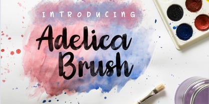 Adelica Brush is made with a handwritten brush. This font is perfect to give your project a fun, feminine, childish, and watercolor effect. Adelica Brush is a solid font. To raise the watercolor effect you must mask it with a watercolor brush or other. Adelica Brush contains: -Uppercase & lowercase -Numeral & punctuation -PUA encoded -Multi-lingual support Thank for using this font, if you have any question don't hesitate to message me at java.indonesian@yahoo.com.
 - Typograph Pro by Aleksandar Aleksandrov,
$19.00 Note: The 'Pro' in the name of this font should not be interpreted as having OpenType features. It has none. What was the inspiration for designing the font? Inspired from the basic shapes like circle, cube and triangle. Closer to basics means more useful in various projects. What are its main characteristics and features? Clean graphic shapes. Usage recommendations: Graphic design, Motion design, 3D, Posters, Magazine covers, Outdoor. See Typograph Pro in action:http://www.amateurmedia.net/typographpro/
 - Sorbet by Adriprints,
$5.00 Sorbet was designed with freshness and youth in mind. Sorbet is a casual, sans-serif font perfect for scrapbooking, teaching, and everyday notes in mind. It is a modest type with lots of potential. What was the inspiration for designing the font? Sorbet was inspired by fresh, casual, handwriting. What are its main characteristics and features? It is legible, sans serif, includes standard encoding (umlauts, etc) Usage recommendations - teaching, everyday, invitations, novelty, scrapbooking
 - Ganelon by Scriptorium,
$12.00Ganelon is a new, original design by Dave Nalle in the style of the Arts and Crafts movement of the late 1800s. It draws on some of the design characteristics of lettering by artists from English and American branches of the movement, with additional original features. Ganelon Lower Case features the main upper case character set of Ganelon, but instead of small caps it has a full set of lower case letters. - Flicking by Ahmad Jamaludin,
$17.00 Introducing FLICKING, a font that's like a groovy time machine to the 60s. With its bold retro script and the added Shadow version, creating that perfect vintage look is a breeze. FLICKING offers two styles: Regular and Shadow, making it versatile for logos, invitations, labels, magazines, books, and even greeting cards. Features: Flicking Main File Has 2 Families: Regular and Shadow Instructions (Access special characters, even in Cricut Design) Simple Installations Thank you, Dharmas Studio
 - Baby Cakes NF by Nick's Fonts,
$10.00This robust, roly-poly typeface is patterned after a 1974 release from the Ludwig & Mayer foundry of Frankfurt am Main named Big Band, and designed by Karlgeorg Hoefer. The type color is even darker than the original, and the result is a delightful face that will definitely attract attention. The PC Postscript, Truetype and Opentype versions contain the complete Latin language character set (Unicode 1252) plus Central European (Unicode 1250) languages as well. - GR Milesons by Garisman Studio,
$23.00 GR Milesons | Artdeco Typeface Milesons is a very interesting font, which has been inspired by Art Deco art. It is formed from very careful lines with stylistic set and ligature features. Milesons has 300+ glyphs consisting of three styles: Milesons One, Milesons Two and Milesons Three. Suitable for any graphic design projects, prints, logos, posters, t-shirts, packaging and applicable for some types of graphic design. Milesons is compatible with any software without any pain.
 - Brotha Script by Khurasan,
$8.00 Brotha Script Font is a fun bold script, fresh and with a modern style . Brotha script font is good for you to apply as the main title of your design work, and for those of you who like thick fonts in the style of calligraphy. This font is very useful then if you don't have it. Brotha Script Font suitable for logos, branding, greeting cards, posters and any design that you create.
 - RainCity by SRS Type,
$35.00 RainCity is a beautiful contemporary sans-serif font with delicate curves. Inspired by the movement of raindrops on the street, we created this font to evoke the excitement of a rainy day in Paris. Using this font will give you an elegant, dynamic, and unique image. RainCity is suitable for a variety of design work such as branding, poster design, and editorial design. It is a display font available in two weights, Regular and Bold.
 - Quebra Ex Condensed by Vanarchiv,
$55.00 Quebra Ex Cn (Extra Condensed) is an extend display sans-serif font family, available with four widths (Extra Condensed, Condensed, Normal and Expanded) and ten weights, italics versions are available. The main strokes contain small breaks simulating modulated variations on the letterforms, these details are more present on large body sizes. All font versions contain Latin and Cyrillic encoding characters and also ligatures, case-sensitive forms, fractions, oldstyle and finally tabular figures.
 - Scradl by Luxfont,
$35.00 Welcome to the world of Scradl - where fonts become the tool of the cutter and the artist at the same time. These letters, as if cut out of paper without preliminary drawings, are rough, angular and full of character. The main font is the canvas for your creativity. Additional variations add a stroke, shadow, or even a sticker effect, creating a harmonious visual interaction. Features: - Multilingual - Kerning - Ability to adapt letters to other languages
 - Spindrift by Ahmad Jamaludin,
$17.00 Spindrift - Incredibly versatile, making it a perfect fit for various projects. Whether you're working on a cover magazine, brochure, logo, headline, or quotes, this font adds a touch of personality and flair. It shines as a stand-alone display font and effortlessly enhances short paragraphs or content. Featured: Spindrift Main File Unique Alternates and Ligatures Instructions (Access special characters, even in circuit design) Letters, numbers, symbols, and punctuation Multilingual Support Thank you!
 - Sigmund PRO by Borutta Group,
$39.00 Sigmund PRO is a visual journey around Poland. The main style is inspired by the Polish road signage typeface – designed by Marek Sigmund. With the increase of weight, Sigmund turns into a geometric display – in the spirit of vernacular typography from the signs of Polish streets. Thanks to this span of styles Sigmund will work both in visual identifications and posters. The family consists of 18 varieties and has many alternative characters.
 - Amfibia by ROHH,
$40.00 Amfibia™ is a soft, flat-sided geometric grotesk family with a lot of character, equipped with tons of ligatures and swashes. Its main function is display use of all kinds, however it is prepared to serve as paragraph text typeface thanks to its 5 widths, giving total amount of 100 fonts. It is crafted for a broad variety design situations - from posters, magazine editorial use, logo design & branding, to web design, user interfaces and mobile applications. Main features: - 5 widths (Narrow, Condensed, Normal, Expanded, Wide), each consisting 20 fonts - 10 weights for each width (from Hairline to Black) - handdrawn, carefully crafted obliques - over 900 glyphs, full of swashes, initial forms, terminals and ligatures - pronounced ink traps and large x-height improving legibility in small sizes as well as adding strong personality to display sizes - flat-sided letter shapes adding vertical rhythm and elegance to narrow widths - extended latin language support - OpenType features (swashes, initials, terminals, standard and discretionary ligatures, stylistic sets, contextual alternates, case sensitive forms, lining, oldstyle and tabular figures, slashed zero, fractions, superscript and subscript, ordinals, currencies and symbols)
 - Binario by Tarallo Design,
$14.99 Binario is a simple and friendly font with three weights and matching obliques. The geometric and modular characteristics of this typeface subtly reference the Art Deco and early modernist periods. It is an ideal choice for achieving a clean, distinctive, and contemporary aesthetic, making it suitable for branding, posters, and screen-based designs. The light weight of Binario is good for body text. The regular weight exudes confidence, making it suitable for both body and heading text. For impactful headlines, the bold weight is superb. The clear weight distinction of this family make it easy to create organized text. Binario was designed in Siena, Italy taking some inspiration from train stations and shop signage. The name Binario means train platform in Italian. Other aspects that informed the design of this font are modularity and efficiency. The interior rounded forms of the letters (counterforms) are based on shape of the Roman arch. Binario has a sibling, Binario Soft. This version has gently rounded stroke ends, which make a softer impression on the page.
 - VTC Bloke by Vintage Type Company,
$19.00 VTC Bloke is a revival of Miller & Richard’s classic metal typeface, ‘Egyptian Expanded’, including the three-dimensional, ‘Open’ style that was later introduced to the family. The roots of this typeface stem from the UK, where William Miller and his son-in-law Richard had their initial foundry in Edinburgh, Scotland. In addition to the beautiful and timeless type designs, the foundry gained a reputation for offering super small type sizes, designed for Bibles, dictionaries, documents, etc. Slab Serifs (or Egyptian Serifs) started to gain popularity in the early 19th century. It’s around this time, due to emerging industrial technologies, and an ever-expanding advertising industry, that type designers started to really experiment with letterforms that could help their clients distinguish themselves from the competitor, and catch people's eyes. The size of posters and advertising space was getting bigger, and bigger, and so was the type. All original letterforms have been re-drawn and cleaned up, with some more modern glyphs and characters added in. VTC Bloke supports Adobe Latin 1 Language Support.
 - Office Visit JNL by Jeff Levine,
$29.00 Dan Hardie, a Miami-based graphic artist and creative consultant at Mutiny, Inc. shared an image he’d spotted online of some interesting signage formerly on the front of the Miami Medical Building. Comprised of hand-cut metal characters (with a thoroughly avant-garde “Art Deco meets Modernist” approach), this instantly became a font design idea unusual and quirky enough to develop as a digital typeface. The end result is Office Visit JNL, which is available in both regular and oblique versions.
 - Deco Francois JNL by Jeff Levine,
$29.00 The 1930s-era French alphabet collection entitled “La Lettre Dans le Decor & La Publicite Modernes” (which somewhat translates to “The Letter in Modern Decor and Advertising”) has page after page of attractive and unusual type interpretations. One particular Art Deco design puts an entirely different spin on the classic “rounded terminals and geometric design”. Unusual character shapes add a fresh new/old take to the “Streamline Movement”. The aptly-named Deco Francois JNL is available in both regular and oblique versions.
 - Eckhardt Freehand JNL by Jeff Levine,
$29.00Eckhardt Freehand JNL is the fourth font based on the lettering of sign painters and show card writers. Jeff Levine has chosen to name this “mini series” of fonts in honor of his friend Albert Eckhardt, Jr., a talented sign man who ran Allied Signs [in Miami, Florida] from 1959 until his passing in 2005. - Lancea by Asenbayu,
$15.00 Lancea is a fancy sharp serif font. Inspired by medieval roman writing combined with the sharpness of a lance, Lancea is packaged in a font that has sharpness in each letter with an elegant shape that has a strong appeal. Lancea also gives it a sophisticated feel with a sleek and clean serif shape. Lancea typography can help you complete various projects such as luxury brand logos, journals, business cards, headline, products, social media posts, web, etc. There is a decorative alternative style feature for uppercase letters. If you are involved in a project that requires fancy and professional writing, Lancea is perfect to assist you in completing it. Thank you!
 - Busted by Canada Type,
$24.95 Busted is the very strange and out-of-character outburst of Bill Troop, a guy who was classically trained in everything, from classical piano and literature to classical photography and type design. As far as we could tell, Bill Troop is the kind of guy whose appearance and voice instantly trigger thoughts of black and white photos, fedoras, and pre-industrial age Europe. A few years ago, he even moved from the United States to England, where it took him less than a week to feel at home and start sounding like a Norwich native. Then something happened and the poor dude just snapped. Busted is the controversial result of the blood rushing to his head. If you know what exactly happened to him, please let us know. Concern, consideration and human interest story aside, Busted is a fascinating thing. It is a set of four interchangeable thick outline fonts where the same letter forms turn from wild to wilder to broken to somewhat clean. Mix them up in a setting and you have words that snarl with a sneer. Life's too short. Take it all with a grain of salt. Scream whenever you feel like it. Busted Pro is a single font combining all four character sets, and rigged with an OpenType pseudo-randomizer in the contextual alternates feature, which you can disable or enable anywhere in your setting for maximum visual shock just the way you like it. Works just as well in PAL or SECAM. Don't be fooled by imitations, and don't get caught with your drawers down.
 - Tipo Movin CDMX by Ixipcalli,
$- La versión propuesta por la SEMOVI (Secretaria de Movilidad) es un estilo más angosto y ortográfico, creadó con la finalidad de aligerar las aplicaciones tipográficas del sistema. Se emplea oficialmente en todas las aplicaciones del sistema de Movilidad Integrada de la Ciudad de México. El creador de la tipografía es Lance Wyman. En esta edición, los tipos minúsculas son una adaptación “no oficial” para el Tipo Movin CDMX, enriqueciendo la tipografía a un estilo visual de altas y bajas, por lo que se prescinde del diseño base como trabajo propio para enfatizar los tipos minúsculas exclusivamente, además de que se han añadido algunos caracteres de acentuación extendiendo su uso a otros lenguajes. Los tipos son una nueva propuesta por Ixipcalli en el presente año 2023. The version proposed by SEMOVI (Secretary of Mobility) is a narrower and more orthographic style, created with the purpose of lightening the typographic applications of the system. It is officially used in all the applications of the Integrated Mobility system of Mexico City. The creator of the typeface is Lance Wyman. In this edition, the lowercase types are an “unofficial” adaptation for the Tipo Movin CDMX, enriching the typography to a visual style of highs and lows, so the base design is dispensed with as my own work to emphasize the lowercase types exclusively, In addition, some accentuation characters have been added, extending their use to other languages. The types are a new proposal by Ixipcalli in the current year 2023.
 - Alright, picture this: Budmo Jiggler is like the life of a design party, a font that truly knows how to have a good time. Crafted by the talented Ray Larabie, a name synonymous with typeface innovati...
- Well, imagine if a font decided to go on a wild adventure, sipping espresso shots in Paris, rollerblading through the streets of Los Angeles, and then winding down with meditation in a serene Japanes...
- Devama SRF by Stella Roberts Fonts,
$25.00 Devama SRF was designed by Typodermic's Ray Larabie and provided for Stella Roberts Fonts. Available in Regular, Backlash and Forward, this typeface evokes a retro-80s look while still remaining clean and fresh. The net profits from my font sales help defer medical expenses for my siblings, who both suffer with Cystic Fibrosis and diabetes. Thank you.
 - Kalligraphia by Linotype,
$40.99Otto Weisert was a German type founder who ran his own foundry in Stuttgart during the early years of the 20th Century. In 1902, he created Kalligraphia, a cursive Art Nouveau display script face. Kalligraphia has a unique stroke contrast model; the tops and bottoms of its letterforms are thicker than the verticals on its sides. - Deco Power JNL by Jeff Levine,
$29.00 A June 18, 1929 issue of the Hollywood trade paper “The Film Daily” ran an ad for a film called “The Power House”. The film’s title was hand lettered in an extra bold sans serif design with strong Art Deco influences. This is now available digitally as Deco Power JNL in both regular and oblique versions.
 - Hassan by Linotype,
$187.99Hassan is a traditional-style Arabic text face designed by Hassan Sobhi Mourad, an experienced calligrapher and teacher of the art and first produced by the Linotype Design Studio (U.K.) as a PostScript font in 1993. An individual Naskh style, Hassan cleverly combines elegant proportions, echoing an inscriptional Thuluth in its tall vertical stems and deeply rounded final jim and ain. The effect of verticality is enhanced by the tense, reined-in kerning strokes of ra and waw, the well-poised lam-alif, and the compactly drawn ligatures. The broad-band strokes of Hassan Bold smooth some of the angularity and relax the tension apparent in the Light. The traditional-style ligatures are rendered with an easy flow. Because of the economical character count, Hassan Light and Bold text may be headed by the compact titling styles (Hisham, Mariam) as well as designs like Ahmed or Kufi which answer to the inscriptional qualities of Hassan. In addition to other uses, Hassan would be particularly suited to document text-setting. Hassan’s two OpenType weights include Latin glyphs from Janson Text Roman, and Janson Text Bold, respectively, inside the font files, allowing a single font to set text in both most Western European and Arabic languages. The OpenType glyph ranges incorporate Basic Latin and the Arabic character set, which supports Arabic, Persian, and Urdu. The fonts include tabular and proportional Arabic, Persian, and Urdu numerals, as well as a set of tabular European (Latin) numerals. - Action Is, Shaded JL - Unknown license

- Malino by Lafontype,
$25.00 Malino is a humanist sans serif that gives a slightly stiff and strong feel but still presents a harmonious blend. The main characteristic of Malino is the flat shape at the end of the letter (specific : inner side of the letter C, G, J, S, a, c, e, g and s) and still maintain the curvature of the outside (Overshoot) so that empty space ( Open Counter) looks wider and the level of readability produced is much higher.
 - Lovely Melissa by Fontdroe,
$25.00 Lovely Melissa is a new variation of handmade script typeface. Complete your collections of script fonts. This typeface has been enriched with additional alternates characters for a total of 1,372 glyphs. Great for wedding invitations, product designs, and more. Go succeed and enjoy it! Main Features: Titling Alternate Stylistic Alternate Stylistic Set 01-09 Contextual Alternate Ligatures Discretionary ligature Contextual ligature Swash Variant Initial Form Medial Form Terminal Form Capital Space Numerator Proportional Lining Tabulator Oldstyle Superscript Subscript
 - Sequel Rounded by OGJ Type Design,
$35.00 Sequel Rounded is a post-Max Bill font, developed in close cooperation with the Max Bill Georges Vantongerloo foundation in Switzerland. MAX BILL Last universal scholar, most important design teacher of the 20th century: There are superlatives, always very enthusiastic, when the importance of Max Bill is discussed. The trained silversmith studied at the Bauhaus, with personalities such as Josef Albers, Paul Klee and Oskar Schlemmer. He worked as an architect, later as sculptor and designer.
 - Mountain Expedition by Vozzy,
$10.00 Introducing a vintage label font named Mountain Expedition. It contains capital and small characters. The small letters I created to support main design of the capital letters. Therefore the punctuation characters are designed to be used just with the capitals. Also the capital characters have a lot of ligatures. All available characters you can see on the preview. This strong typeface will be good viewed on vintage style posters, t-shirts, greeting cards, logo and more.
