10,000 search results
(0.025 seconds)
- Maferic by Sealoung,
$25.00 Maferic is a combination font consisting of luxury three fonts. Which has uniqueness in each letter and helps you to make your design work look more special. This font is perfect for your designs such as logos, branding, fashion, business cards, social media, and of course many more. Maferic font ready with: Any options to get creative variations (combination of Regular, Italic, and Signature) 3 files format already: .otf .ttf . woff Preview as an inspiration that you can do with Maferic Signature font Ready with Lowercase and Uppercase characters Language Support; All three fonts support English, French, Italian, Spanish, Portuguese, German, Swedish, Norwegian, Danish, Dutch, Finnish, Indonesian, Malay, Hungarian, Polish, Turkish, Icelandic, Slovenian. That's it! I hope you enjoy it, and please don't hesitate to drop me a message if you have any issues or queries. Oh, and come and say hello over on Instagram! www.instagram.com/sealoungfonts
 - Orpheus by Scriptorium,
$18.00In response to many requests for Morpheus, an idea came to us. Why not make a font that looked a bit like Morpheus, but which had more attractive, more consistent character forms, was rendered cleanly and properly spaced and kerned? We took a look at Morpheus and decided to redo the concept from the ground up, replacing some of the amateurish characters, adding a bit of a Celtic look and feel, developing a set of alternate characters and making sure that the design elements were consistent from letter to letter. The result is Orpheus, a font which has the general look and feel of Morpheus, but is a much more complete and fully realized design. In addition, Orpheus is a fully developed font set, with not only regular and bold versions, but with a special customized italic style and a really neat looking heavy weight rough-outlined variant. - Arno by Adobe,
$35.00Named after the Florentine river which runs through the heart of the Italian Renaissance, Arno draws on the warmth and readability of early humanist typefaces of the 15th and 16th centuries. While inspired by the past, Arno is distinctly contemporary in both appearance and function. Designed by Adobe Principal Designer Robert Slimbach, Arno is a meticulously-crafted face in the tradition of early Venetian and Aldine book typefaces. Embodying themes Slimbach has explored in typefaces such as Minion and Brioso, Arno represents a distillation of his design ideals and a refinement of his craft. As a multi-featured OpenType family, with the most extensive Latin-based glyph complement Adobe has yet offered, Arno offers extensive pan-European language support, including Cyrillic and polytonic Greek. The family also offers such typographic niceties as five optical size ranges, extensive swash italic sets, and small capitals for all covered languages. - Myla by Creative Toucan,
$12.00 Myla makes it easier to convey the message in your designs. Use its eastern, old soviet inspired style for awesome display, labeling, clothing, movie screen, posters, movie titles, gigs, album covers, logos, and much more. It comes in 3 styles: Regular, Bold and Black, in 2 variations of regular and italic. Inspired by eastern and soviet traditions, hardworking people and 1960s, Myla is ideal for retro and vintage projects, from clear to rough looking designs. Myla features: Stylistic alternatives Ligatures International characters (Multi-lingual) Punctuation symbols OpenType Features Multilanguage Support: English, Albanian, Danish, Dutch, Estonian, Croatian, Bosnian, Slovenian, Finnish, French, German, Icelandic, Italian, Norwegian, Portugese, Spanish, Swedish with a lot of other languages; see the Full Character List. Note: To access the extra alternate letters, you will need to use the glyphs panel. Many design programs offer this ability, including Adobe Photoshop CC 2015 , Adobe Illustrator, Adobe Indesign.
 - Capraia by CAST,
$45.00 Capraia is a book typeface, with a heavily quirky look when shown at big sizes, and with an irregular but attractive rhythm at text sizes. Capraia Book and Regular are designed specifically for continuous texts: Book meets a current preference of Italian publishers for lighter faces, while the slightly heavier Regular is intended for the wider international market. True to its vocation for publishing, Capraia has a big x-height, medium contrast and wide bracketed serifs. Furthermore, its slightly flattened curves, some unconventional roman letterforms (a, G, Q) and the 'slanted roman' italics, along with design details such as ball terminals, give to the whole family a very contemporary appeal. Originally the design was intended as a tribute to Caslon's Great Primer but at a certain point the designer was enthralled by Baskerville. Capraia is the unpredicted and original result of that intense experience.
 - Frasa by Tokotype,
$39.00 Frasa is a contemporary serif family with characteristics that arise from the charms of Caslon and a touch of transitional style; the design offers distinctive proportions to serve long-running small text and the sturdiness of its own form to help as a headline font. Frasa shows that the family is shaped by the traditions of its ancestors through small details that show the personality of the typeface, such as pointed ball terminals and strong shoulders. The italic weights have their own beauty, which is created to humanize the form based on a stylized and natural cursive style with the aim of emphasizing the text's essential elements. The addition of small caps, old-style figures, ligatures, etc. to this type family satisfies conventional typographic requirements. Frasa typefaces can eventually lead to the use of powerful design tools to create editorial and casual design styles.
 - Rue Display by Winnie Tan,
$29.00 Rue is an organic, casually ornamental, narrow-faced sans serif. It is a display type structured with random traces of calligraphic tendencies. It does not begin with any noble ideals, other than to mediate between the muse of imagination and the act of realization. The spirited and exploratory design is the materialization of a feeling about fonts as a family of organisms taking on a life of its own, in work and play. Rue is the epitome of vanity and indulgence which seems to purpose itself well in aesthetics, wellness and botanicals. Its whimsical quality also suggests applications in the form of gifts and ornamentation. In retrospect, Rue was conceived as a typeface, used as an image and discovered as an ornament. It comes in 5 weights of light, regular, medium, semibold and bold, and their matching italics. Rue Display was published in 2010 by TypeTogether. http://www.behance.net/gallery/Rue/373854
 - Racer, created by the visionary designer onezero, is a font that embodies dynamism, speed, and elegance. Its design is inspired by the high-speed world of racing, capturing the essence of motion and ...
- Rosart and Fleisch Hi Res by California Type Foundry,
$129.00 This font is not just historic, but classy, timeless, and in its current form, a modern classic. The original Titling Caps and icons Jacque François Rosart painstakingly carved, now meticulously digitized to be a true, accurate, and complete representation of the original designs. You can get the fully matching family with "ALL", or choose the set that meets your immediate needs: Zodiac and Constellations - The Stars Have Aligned into a Great Font So what's your sign? Whatever it is, R&F has it, and in so many ways! Pictograph, symbol, constellation and picto-constellation are all included. Constellations are useable even in scientific and education settings: based on current star charts and matched to Bayer designations, these stars shine both in design and accuracy! Includes Rosart's original moon and sun faces. Faces for the planets to match those for the sun and moon. Rosart's symbols for the planets. Astrology symbols including, Rosart’s pictographs for the twelve signs. Constellations of the Zodiac from precise star charts. Precise small star shapes, so you can design other constellations. Pinwheel, saltires, asterisks, solid stars, and even the Christmas star. Dave Lawrence, "Each symbol was carefully designed to match the main font." Alchemy Symbols - Turns A Design into Gold From labeling your cupboard of magical ingredients to getting one step closer to the golden goose, these rare alchemical symbols are a treasure trove of possibilities. Including: classic symbols for elements combinations medicinals chemistry mathematical symbols Includes music symbols for titling, as well as Verse and Response symbols. Seasons - Symbols to Keep Things Organized Throughout the Year Classic weather stylings, including old fashioned lightning and an eclipsing moon with the four-o'clock shadow. Map Markers Religious Symbols Phases of the moon. Pointing symbols: fingers, arrows, triangles, with circles Matching Italics CAL's Dimension Slant™ Instead of sloping all the pictures and drawings to an even slant, a multidimensional approach was used. And each symbol was evaluated and crafted individually. Pro World1 Font The pro world font contains all of these: Latin Standard set Rosart's original backwards X alternate. Alternate U shape. In the italic: swash variants for the J, Q, and Y. Proportional Lining (default), proportional old style, small caps figures. CAL Dimension Slant, for dynamic italics Includes Rosart's original moon and sun faces, along with additional faces for each planet. Rosart’s symbols for the planets and pictographs for the twelve signs of the zodiac. Constellations of the Zodiac along with small star shapes. Large stars, pinwheel, saltires, asterisks Symbols for chemistry Medicine Music symbols Mathematical symbols Pointing symbols like the finger, acorn, arrow and triangle. Geometrical shapes. Plus these more: Latin Pro character set for central European languages and Turkish. Rare kerns for Polish, Czech, Slovakian and others. Ligatures needed for some central European orthographies. Lowered German Umlauts for better line spacing. Cyrillic uppercase and small caps for eastern Europe, southern Europe, and Russia, with kerning. Rosart’s original Greek uppercase and small caps, but also tonos for monotonic Greek. Vietnamese, which has been kerned. Pinyin, including a special form of the Ü so that titles can be set closer. Numbers: A set of stacking (nut) fractions, along with very elegant automatic fractions A large set of currency symbols in lining, old style, small caps, denominator and numerator sizes. Our first Retail Pricing Feature: (ss03 + ss04) Just turn on the feature and type $1.99 and Rosart will do the rest. Ampersand alternates. Numerator sized musical sharp and flat symbols. Dave Lawrence, “From the moment I saw these letters I knew I had to make this typeface. What I didn’t know was that I would end up drawing most of Rosart’s special symbols... But it was too hard to resist."
 - Ameche Pisa by Bogusky 2,
$15.00Outline drop-shadow italic font - RosarGrad by Ingrimayne Type,
$9.95 RosarGrad is a simple but elegant calligraphic face with six style: plain, italic, medium, medium italic, bold, and bolditalic. It was inspired by hand lettering on a graduation picture from the late 1960s.
 - Segoe TV by Microsoft Corporation,
$39.00The Segoe™ TV font family was originally developed for MSNTV. Segoe TV italic was designed with attributes for improved legibility on TV screens. Segoe TV italic includes the Latin-1 character set. - Ring Stag by Ochakov,
$14.00 It's important to realize that each of us is unique. I wish Ring Stag will emphasize it. Single but ready for anything. The new Ring Stag is bolder, more dynamic and masculine. New addition to the big family called Ring!
 - FF TradeOne by FontFont,
$30.99 Italian type designer Fabrizio Schiavi created this display FontFont in 1994. The font is ideally suited for music and nightlife and poster and billboards. FF TradeOne provides advanced typographical support with features such as ligatures. It comes with proportional lining figures.
 - Grunge Decay by Okaycat,
$29.50 Grunge Decay is an urban font with a unique look. It creates a rugged and unusual feel to with its own character & stylization. Grunge Decay is extended, containing West European diacritics and ligatures, making it suitable for multilingual environments & publications.
 - Atenea Egyptian by Eurotypo,
$28.00 Atenea Egyptian is a Slab serif, inspired in humanistic typeface references. It is a contemporary style based on high contrast and modular proportion with stylized rhythms. Atenea Egyptian includes standards and discretional ligatures, small caps, fractions, old style and lining numbers.
 - FF Mulinex by FontFont,
$41.99 Italian type designer Alessio Leonardi created this display FontFont in 1994. The font is ideally suited for music and nightlife. FF Mulinex provides advanced typographical support with features such as ligatures and case-sensitive forms. It comes with proportional lining figures.
 - Gallery Serif by Elvina Studio,
$17.00 Modern & sophisticated font with ligatures. Font files; Upper/lowercase, numbers, punctuations, ligatures & alternates; 7 bonus logos (AI). Language support: English, German, French, Spanish, Italian, Danish, Finnish, Portuguese, Swedish, Norwegian, Dutch, Indonesian, Luxembourgish, Icelandic, Cornish, Hungarian, Filipino, Romansh, Slovenian, Estonian, Polish, Turkish.
 - Kondo by Surplus Type Co,
$18.00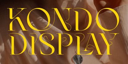 Kondo is a highly stylized serif font that features elegant looping details in the uppercase characters. This makes it a perfect choice for creating branding and logo designs with it's huge selection of custom ligatures. Add Kondo to your collection today!
 - FF GeäbOil by FontFont,
$30.99Italian type designer Fabrizio Schiavi created this display FontFont in 1995. The font is ideally suited for music and nightlife and poster and billboards. FF GeäbOil provides advanced typographical support with features such as ligatures. It comes with proportional oldstyle figures. - Kitsch by Zetafonts,
$39.00 Designed by Francesco Canovaro with help from Andrea Tartarelli and Maria Chiara Fantini, Kitsch is a typeface happily living at the crossroads between classical latin and medieval gothic letterforms. But, rather than referencing historical models like the italian Rotunda or the french Bastarda scripts, Kitsch tries to renew both its inspirations, finding a contemporary vibe in the dynamic texture of the calligraphic broad-nib pen applied to the proportions of the classical roman skeleton. The resulting high contrast and spiky details make Kitsch excel in display uses, while a fine-tuned text version manages to keep at small sizes the dynamic expressivity of the design without sacrificing legibility. Both variants are designed in a wide range of weights (from the almost monolinear thin to the dense black), and are fully equipped with a extended character sets covering over two hundred languages that use latin, cyrillic and greek alphabets. Special care has been put in designing Kitsch italic letterforms, with the broad-nib movements referencing classical italian letterforms to add even more shades to your typographic palette. The resulting alternate letter shapes have also been included in the roman weights as Stylistic Alternates - part to the wide range of Open Type features (Standard and Discretionary Ligatures, Positional Numerals, Small Caps and Case Sensitive Forms) provided with all the 32 weights of Kitsch. Born for editorial and branding use, Kitsch is fashionable but solid, self-confident enough to look classic while ironic enough to be contemporary.
 - HT Profumeria by Dharma Type,
$19.99 HT Profumeria is a monoline and connected font with a thin line and a unique tail. Its simple and retro look is the best script for branding and packaging, but it may also be useful for headlines, publishing and advertising. Holiday Type Project offers retro hand drawing scripts. Inspired by retro script on shopfront lettering, wall paint advertisements in Italy around 1950s. Check out the script fonts from Holiday Type!
 - HT Fiorista by Dharma Type,
$19.99 Fiorista is a pretty brush scrip with thin and curly line. Florists works best for greeting card, wedding ceremony invitation or shop card of fashion or apparel. It could also be used for film, magazines, advertising and websites. Holiday Type Project offers retro hand drawing scripts. Inspired by retro script on shopfront lettering, wall paint advertisements in Italy around 1950s. Check out the script fonts from Holiday Type!
 - Ephemera Shoemakers by Ephemera Fonts,
$30.00 Ephemera Shoemakers is a bold font with spurred serif & medium contrasted, vintage inspiration with letters in all caps. Traditionally this type of decorative font that emerged in Italy, France & England in the nineteenth century were used in large headlines and posters that were closely related to circus shows, carnival or environments of the Far West American. Perfect for signs, posters, handbills and other large format advertising. Ephemera Shoemakers Pdf Specimens
 - HT Tabaccaio by Dharma Type,
$19.99 HT Tabaccaio?is a casual and versatile script. Its very unique kern, loop, and dot makes it unforgettable look. HT Tabaccaio is well-suited for product design, books covers, film posters, branding, magazines, signage and other creative projects. Holiday Type Project offers retro hand drawing scripts. Inspired by retro script on shopfront lettering, wall paint advertisements in Italy around 1950s. Check out the script fonts from Holiday Type!
 - Scrapt Script by Brainware Graphic,
$12.00 ScraptScript is a classic casual script typeface inspired by signpainter and autotechno typography, developed with a little bit bold and contrast on horizontal stroke. Comes with a lot of opentype features, ScraptScript also supports multilingual covering Latin based language (Latin Extended-A & Latin Extended Additional), including Celtic, Sami, Maltese, Turkish, England, USA, Germany, France, Italy, Poland & etc. ScraptScript would be nice on logo design, posters, etc. with any design characteristic.
 - HT Espresso by Dharma Type,
$19.99 The biggest feature of HT Espresso is a mixture of straight line and curve.It is like a cup of espresso with a bite-sized piece of chocolate. You can connect all the letters with thin line and It would attract notice. Holiday Type Project offers retro hand drawing scripts. Inspired by retro script on shopfront lettering, wall paint advertisements in Italy around 1950s. Check out the script fonts from Holiday Type!
 - Swanstone by Zetafonts,
$51.00 Mario De Libero designed Swanstone while investigating XIX Century Old Style typefaces. Designs like Theophile Beaudoire’s Romana (1860) or Miller & Richard’s Modernized Old Style, that re-imagined the classical “Venetian” letterforms adding flared serifs and early Art Nouveau influences. In Italy, one of these fonts was Raffaello Bertieri’s Raffaello, which De Libero used as the starting point of his research in a contemporary retelling of these exuberant and sexily unsettling letterforms.
 - Vivizza by Julia Visht,
$20.00 Vivizza Bold - Modern, classy and elegant! New stylish multifunctional Serif from Julia Visht! Perfect at large and medium size - Vivizza Bold does well from large eye-catching headlines , to medium headings. Two different models of letter spacing for uppercase and lowercase letters! Carefully constructed built-in opentype kerning pairs to ensure impeccable letter spacing throughout the font. Main features: -Ligatures. Set of opentype ligatures allows to make your design truly unique. -Great for web-design, logo creating, modern branding, posters, headers, advertising and so much more. -Multilingual support. English, German, Italian, French, Danish, Norwegian, Swedish, Italian, Spanish, Filipino, Scottish Gaelic,Indonesian, Irish, Swiss German, Portuguese, Finnish. Stylish Serif for Stylish Projects!
 - Galyna Leaffe by Julia Visht,
$20.00 Galyna Leaffe - new elegant script from Julia Visht! Stylish classic for your successful projects! Harmony of classical elements and modern accents makes the font multifunctional. Classy and a little bit curvaceous Galyna Leaffe is a really must-have for your collection! Main features: -Ligatures. Set of 37 opentype ligatures allows to make your design truly unique. -Multyfunctionality. It's perfect for: elegant branding, wedding stationery, book cover designs, classy packaging, album covers, handwritten quotes, greeting cards,typographic designs, wall art, websites, photos, and so much more. -Multylangual support. English, German, Italian, French, Danish, Norwegian, Swedish, Italian, Spanish, Filipino, Scottish Gaelic, Indonesian, Irish, Swiss German, Portuguese. Happy creating!
 - Ardy Mass by Substance,
$12.00 Ardy Mass is a hand drawn and scanned type face available in italic, italic outline, regular & regular outline. Ardy Mass was drawn at a small scale with a fine nibbed black permanent marked pen.
 - Foom by Comicraft,
$19.00 DOCTOR OCTOPUS! BOOM! DOCTOR DOOM! 'SHROOM! DOCTOR EVIL! BA-THROOM! DOCTOR FRANKENSTEIN! KRA-KOOM! Never let it be said that Comicraft does not possess a Varied Vocabulary of Vile Villainy or a Tremendous Thesaurus of Terrible Tinkerers! It's our belief that every Medley of Madmen, every Rogue's Gallery of Ragged Rascals and every Sinister Selection of Scoundrels, Scalliwags and Sick Scientists --even they deserve a Nefariously Notorious Name-Finagling Font to announce their Apocalyptic Arrival. That font is here, towering murderously above the city blocks of Manhattan even as we speak... It's a Despicable Doctor of Dastardly Deeds, it's a Master of Evil Scheming, an Infamous Infidel, your Arch Enemy, your NEMESIS... IT'S THE END OF THE WORLD AS WE KNOW IT! FING... FAN... FOOM!
 - Isle Body by Mans Greback,
$19.00 Isle Body is a high-quality serif typeface family, drawn by Måns Grebäck during 2018 and 2019. It is a sweet font with a casual and calm look, with generous spacing and an even weight, adapted for body texts and small sized type settings. It comes in four weights, each one as italic, totaling in eight styles: Light and Light Italic, Medium and Medium Italic, Bold and Bold Italic, Black and Black Italic. The font family can be used in a combination with a font of a different style, or together with its sister font Isle Headline, also a serif font, which has the same basic structure but more distinct weights and a sharper look. Each style contains ligatures and support for a wide range of languages.
 - Isle Headline by Mans Greback,
$19.00 Isle Headline is a high-quality serif typeface family, drawn by Måns Grebäck during 2018 and 2019. It is a sharp font with a clear and attentive look, adapted for headlines, titles and large type settings. It comes in four weights, each one as italic, totaling in eight styles: Light and Light Italic, Medium and Medium Italic, Bold and Bold Italic, Black and Black Italic. The font family can be used in a combination with a font of a different style, or together with its sister font Isle Body, also a serif font, which has the same basic structure but with a softer look and adapted for body text and smaller type. Each style contains ligatures and support for a wide range of languages.
 - Poem Script Pro by Sudtipos,
$79.00 Poem Script is a mixed collection of interpretations conjuring a late nineteenth century American pen script style. Though not an actual Italian letterform, this style was called “Italian Alphabet” stemming from an old penman’s term for an alphabet where the stress or shades are opposite their normal placement. The American variant followed from the late eighteenth century British hand also confusingly called “Italian Hand,” which itself evolved from some seventeenth century French batarde scripts. It showcases the phenomenal control and mastery of hand skills required to create such ornamental and lively letters centuries ago. Producing the shaded strokes in reversed positions such as this required holding the pen in a position horizontal to the baseline, or the letterforms would have to be written backwards or by rotating the paper at peculiar and extreme angles to achieve the effect. Exotic, elaborate and very attractive, Poem Script contains plenty of variations on each letter and comes with hundreds of calligraphic ornaments. Poem Script received a Certificate of Excellence at the Type Directors Club NY and was selected at the Bienal Tipos Latinos 2012.
 - Allrounder Antiqua by Identity Letters,
$40.00 Timeless Renaissance looks, gently updated. For novels and billboards alike. Allrounder Antiqua is an old-style serif member of the Allrounder superfamily. A timeless typeface based on classical proportions, Allrounder Antiqua is perfectly suitable for advanced book and editorial design well as packaging and branding. True: its main purpose is to set flawless body copy and to generate an evenly textured page—but its refined shapes work fantastically in display applications, too. Some details, such as the small and sharp bowl of the lowercase a, are fully appreciated in large sizes only. If you need a sophisticated serif typeface for packaging, food, fashion, consumer goods, or lifestyle branding, Allrounder Antiqua is up for it. It's also apt as an outstanding corporate typeface, be it for a more conservative venture or the latest hipster start-up. This classy serif typeface comes in four weights with corresponding true italics. Just like its sans-serif counterpart, Allrounder Grotesk, Allrounder Antiqua is equipped with plenty of Opentype Features like small caps, six sets of figures, case-sensitive forms, superiors, fractions and many ligatures. You will find alternate letters with swashes within this extended character set, as well as all the accented glyphs necessary to support more than 200 Latin-based languages. Historical Background The (French) Renaissance-influenced typeface started as Moritz Kleinsorge's graduation project within the "Expert Class Type design" course of the Plantin Institute for Typography, located in the famous Museum Plantin-Moretus in Antwerp, Belgium. There, Moritz Kleinsorge decided to create a revival of Robert Granjon's "Ascendonica Romain", described as "a beautiful face; typical of Granjon's mature style" in the inventory list of available material. "To touch punches and matrices cut by Robert Granjon back in 1567 was an invaluable inspiration", Moritz explains. Over time, the typeface moved away from being a true revival. Rather, it evolved into a Granjon-inspired typeface. That typeface is now available as Allrounder Antiqua. Perfect Pairing: Allrounder Antiqua + Allrounder Grotesk Allrounder Grotesk is the ideal complement to Allrounder Antiqua. They both share common vertical metrics and a common color. This allows you to pair both typefaces within the same layout—even within the same paragraph—without creating visual disruption. Head over to the Family Page of Allrounder Grotesk to get more information about this typeface. Design Trick: Bilingual Design With the Allrounder Superfamily Combining Allrounder Grotesk with Allrounder Antiqua is an ideal approach for bilingual designs, wherein both languages get the same emphasis yet are distinguished with two different typefaces. It's also best practice to set headlines in a different typeface than the body text if they harmonize with each other. Allrounder Grotesk and Allrounder Antiqua provide you with the perfect pair for this purpose.
 - Hunter by Aboutype,
$24.99A redraw of Beton, Bauer, Intertype. with additional weights, shorter x-height and new Italic styles. Roman and Italic share same Roman Caps. Hunter has some text kerning but requires subjective display kerning and compensation. - Cronus - Personal use only

- Palatino Nova Paneuropean by Linotype,
$67.99Palatino® Nova is Prof. Hermann Zapf's redesign of his own masterpiece, Palatino. The original Palatino was cut in metal by August Rosenberger at D. Stempel AG typefoundry in Frankfurt, and released in 1950. Palatino was later adapted for mechanical composition on the Linotype machine, and became one of the most-used typefaces of the 20th Century. Palatino was designed for legibility, and has open counters and carefully weighted strokes. The type was named after Giambattista Palatino, a master of calligraphy from the time of Leonardo da Vinci. Palatino is a typeface based on classical Italian Renaissance forms. A modern classic in its own right, Palatino is popular among professional graphic designers and amateurs alike, working well for both text and display typography. Hermann Zapf and Akira Kobayashi redeveloped Palatino for the 21st Century, creating Palatino Nova. Released by Linotype in 2005, the Palatino Nova family is part of Linotype's Platinum Collection. Palatino Nova includes several weights (Light, Regular, Medium, and Bold), each with companion italics. Four styles (Regular, Italic, Bold, and Bold Italic) have Greek and Cyrillic glyphs built into their character sets. The Palatino Nova family also includes revised versions of Aldus (now called Aldus Nova), as well as two titling weights. The first titling weight, Palatino Nova Titling, is based on Hermann Zapf's metal typeface Michelangelo, including Greek glyphs from Phidias Greek. The heavier titling weight, Palatino Nova Imperial, is based on Sistina. The fonts in the Palatino Nova family support all 48 Western, Central, and Eastern European languages. Additional features: ligatures and historical ligatures, Small Caps, ornaments, and a range of numerals (proportional & tabular width lining and Old style Figures, fractions, inferiors, and superiors)." - Palatino Nova by Linotype,
$50.99 Palatino® Nova is Prof. Hermann Zapf's redesign of his own masterpiece, Palatino. The original Palatino was cut in metal by August Rosenberger at D. Stempel AG typefoundry in Frankfurt, and released in 1950. Palatino was later adapted for mechanical composition on the Linotype machine, and became one of the most-used typefaces of the 20th Century. Palatino was designed for legibility, and has open counters and carefully weighted strokes. The type was named after Giambattista Palatino, a master of calligraphy from the time of Leonardo da Vinci. Palatino is a typeface based on classical Italian Renaissance forms. A modern classic in its own right, Palatino is popular among professional graphic designers and amateurs alike, working well for both text and display typography. Hermann Zapf and Akira Kobayashi redeveloped Palatino for the 21st Century, creating Palatino Nova. Released by Linotype in 2005, the Palatino Nova family is part of Linotype's Platinum Collection. Palatino Nova includes several weights (Light, Regular, Medium, and Bold), each with companion italics. Four styles (Regular, Italic, Bold, and Bold Italic) have Greek and Cyrillic glyphs built into their character sets. The Palatino Nova family also includes revised versions of Aldus (now called Aldus Nova), as well as two titling weights. The first titling weight, Palatino Nova Titling, is based on Hermann Zapf's metal typeface Michelangelo, including Greek glyphs from Phidias Greek. The heavier titling weight, Palatino Nova Imperial, is based on Sistina. The fonts in the Palatino Nova family support all 48 Western, Central, and Eastern European languages. Additional features: ligatures and historical ligatures, Small Caps, ornaments, and a range of numerals (proportional & tabular width lining and Old style Figures, fractions, inferiors, and superiors)."
