10,000 search results
(0.026 seconds)
- Rocksane Display by Andrey Sharonov,
$30.00 Rocksane Display is a modern hybrid font with fantastic decorative uppercase and strong serif lowercase for impressive and powerful look. This typeface works fine in big sizes and more suits for example in short tittles, logotypes, names, movie posters, books and music album covers. Rocksane includes 84 beautiful uppercase alternates except of basic set. You can easy get it with special combination like A1, A2, A3 etc. (This hot keys works with activated Standard Ligatures option). In addition, there are 11 End-swashes which harmoniously underline the words. You can quickly get it by the same way with combination like _1, _2, _3 up to _11 (underscore+number). This features works fine in Adobe Photoshop or Illustrator. You can use Rocksane for following languages: Danish, Dutch, English, Estonian, Faroese, Finnish, French, German, Hungarian, Icelandic, Italian, Norwegian, Polish, Portuguese, Slovene, Spanish, Swedish, Turkish.
 - Boss Balloon by Hatftype,
$15.00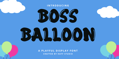 Boss Balloon - Playful Display Font is a font with distinctive handwritten characters perfect for branding projects, logos, wedding designs, media posts, advertisements, product packaging, product designs, labels, photography, watermarks, invitations, stationery, and any project who need handwritten dishes. Features : • Character Set A-Z • Numerals & Punctuations (OpenType Standard) • Accents (Multilingual characters) • Ligature. Multilingual Support : Afrikaans, Albanian, Asu, Basque, Bemba, Bena, Catalan, Chiga, Cornish, Danish, English, Estonian, Faroese, Filipino, Finnish, French, Friulian, Galician, German, Gusii, Icelandic, Indonesian, Irish, Italian, Kabuverdianu, Kalenjin, Kinyarwanda, Low German, Luo, Luxembourgish, Luyia, Machame, Makhuwa-Meetto, Makonde, Malagasy, Malay, Manx, Morisyen, North Ndebele, Norwegian Bokmål, Norwegian Nynorsk, Nyankole, Oromo, Portuguese, Romansh, Rombo, Rundi, Rwa, Samburu, Sango, Sangu, Scottish Gaelic, Sena, Shambala, Shona, Soga, Somali, Spanish, Swahili, Swedish, Swiss German, Taita, Teso, Vunjo, Zulu. There it is. I really hope you enjoy it. Comments & likes are always welcome and accepted.
 - Light Party by Hatftype,
$17.00 Light Party - Groovy Retro Font Style is a font with distinctive handwritten characters perfect for branding projects, logos, wedding designs, media posts, advertisements, product packaging, product designs, labels, photography, watermarks, invitations, stationery, and any project who need handwritten dishes. Features : • Character Set A-Z • Numerals & Punctuations (OpenType Standard) • Accents (Multilingual characters) • Ligature. Multilingual Support : Afrikans, Albanian, Asu, Basque, Bemba, Bena, Catalan, Chiga, Cornish, Danish, English, Estonian, Faroese, Filipino, Finnish, French, Friulian, Galician, German, Gusii, Icelandic, Indonesian, Irish, Italian, Kabuverdianu, Kalenjin, Kinyarwanda, Low German, Luo, Luxembourgish, Luyia, Machame, Makhuwa-Meetto, Makonde, Malagasy, Malay, Manx, Morisyen, North Ndebele, Norwegian Bokmål, Norwegian Nynorsk, Nyankole, Oromo, Portuguese, Romansh, Rombo, Rundi, Rwa, Samburu, Sango, Sangu, Scottish Gaelic, Sena, Shambala, Shona, Soga, Somali, Spanish, Swahili, Swedish, Swiss German, Taita, Teso, Vunjo, Zulu. There it is. I really hope you enjoy it. Comments & likes are always welcome and accepted.
 - Fabulous Party by Hatftype,
$17.00 Fabulous Party - Groovy Retro Font Style is a font with distinctive handwritten characters perfect for branding projects, logos, wedding designs, media posts, advertisements, product packaging, product designs, labels, photography, watermarks, invitations, stationery, and any project who need handwritten dishes. Features : • Character Set A-Z • Numerals & Punctuations (OpenType Standard) • Accents (Multilingual characters) • Ligature. Multilingual Support : Afrikaans, Albanian, Asu, Basque, Bemba, Bena, Catalan, Chiga, Cornish, Danish, English, Estonian, Faroese, Filipino, Finnish, French, Friulian, Galician, German, Gusii, Icelandic, Indonesian, Irish, Italian, Kabuverdianu, Kalenjin, Kinyarwanda, Low German, Luo, Luxembourgish, Luyia, Machame, Makhuwa-Meetto, Makonde, Malagasy, Malay, Manx, Morisyen, North Ndebele, Norwegian Bokmål, Norwegian Nynorsk, Nyankole, Oromo, Portuguese, Romansh, Rombo, Rundi, Rwa, Samburu, Sango, Sangu, Scottish Gaelic, Sena, Shambala, Shona, Soga, Somali, Spanish, Swahili, Swedish, Swiss German, Taita, Teso, Vunjo, Zulu. There it is. I really hope you enjoy it. Comments & likes are always welcome and accepted.
 - Campione Neue by BoxTube Labs,
$24.00 Campione Neue was designed to be a true work horse. It is powerful and versatile thanks to its two styles Sans and Serif. It's perfect for logotypes, sports branding, social media edits, posters, apparel design, magazine headlines, labels and so much more. Campione Neue is spanning from Thin to Black in both Sans and Serif. The Variable Fonts can be used in Adobe Photoshop and Adobe Illustrator and other applications that supports this feature. They make the process of designing more flexible and easy. For those who prefer fixed weight fonts we've included nine weights for each style in the package. Campione Neue comes with a character set supporting most western languages including: Afrikaans, Basque, Breton, Catalan, Danish, Dutch, English, Finnish, French, Gaelic, German, Icelandic, Indonesian, Irish, Italian, Norwegian, Portuguese, Sami, Spanish, Swahili, Swedish and many more...
 - Hail King by Hatftype,
$15.00 Hail King - Playful Display Font is a font with distinctive handwritten characters perfect for branding projects, logos, wedding designs, media posts, advertisements, product packaging, product designs, labels, photography, watermarks, invitations, stationery, and any project who need handwritten dishes. Features : • Character Set A-Z • Numerals & Punctuations (OpenType Standard) • Accents (Multilingual characters) • Ligature. Multilingual Support : Afrikaans, Albanian, Asu, Basque, Bemba, Bena, Catalan, Chiga, Cornish, Danish, English, Estonian, Faroese, Filipino, Finnish, French, Friulian, Galician, German, Gusii, Icelandic, Indonesian, Irish, Italian, Kabuverdianu, Kalenjin, Kinyarwanda, Low German, Luo, Luxembourgish, Luyia, Machame, Makhuwa-Meetto, Makonde, Malagasy, Malay, Manx, Morisyen, North Ndebele, Norwegian Bokmål, Norwegian Nynorsk, Nyankole, Oromo, Portuguese, Romansh, Rombo, Rundi, Rwa, Samburu, Sango, Sangu, Scottish Gaelic, Sena, Shambala, Shona, Soga, Somali, Spanish, Swahili, Swedish, Swiss German, Taita, Teso, Vunjo, Zulu. There it is. I really hope you enjoy it. Comments & likes are always welcome and accepted.
 - Bastille Members by Arendxstudio,
$15.00 Bastille Members - Cool Brusher Font with Swash is a font with distinctive handwritten characters perfect for branding projects, logos, wedding designs, media posts, advertisements, product packaging, product designs, labels, photography, watermarks, invitations, stationery, and any project who need handwritten dishes. Features : • Character Set A-Z • Numerals & Punctuations (OpenType Standard) • Accents (Multilingual characters) • Ligature Multilingual Support : Afrikaans, Albanian, Asu, Basque, Bemba, Bena, Catalan, Chiga, Cornish, Danish, English, Estonian, Faroese, Filipino, Finnish, French, Friulian, Galician, German, Gusii, Icelandic, Indonesian, Irish, Italian, Kabuverdianu, Kalenjin, Kinyarwanda, Low German, Luo, Luxembourgish, Luyia, Machame, Makhuwa-Meetto, Makonde, Malagasy, Malay, Manx, Morisyen, North Ndebele, Norwegian Bokmål, Norwegian Nynorsk, Nyankole, Oromo, Portuguese, Romansh, Rombo, Rundi, Rwa, Samburu, Sango, Sangu, Scottish Gaelic, Sena, Shambala, Shona, Soga, Somali, Spanish, Swahili, Swedish, Swiss German, Taita, Teso, Vunjo, Zulu There it is! I really hope you enjoy it
 - Herolfter by Pixesia Studio,
$19.00 Introducing Herolfter - Modern Bold Display Font Herolfter, a sleek Bold Display Font with a modern edge. This versatile typeface boasts 55 ligatures, allowing you to add a unique touch to your designs. Herolfter is perfectly suited for branding projects, logo, social media posts, advertisements, product packaging, product designs, label, photography, watermark, invitation, stationery and any projects seeking unique taste. FEATURES - Stylistic Alternates - Ligatures - All Caps with Small Caps - Numbering and Punctuations - Works on PC or Mac - Simple Installation - PUA Encoded Characters - Easily accessible without additional design software. - Support Adobe Illustrator, Adobe Photoshop, Adobe InDesign, also works on Microsoft Word - Multilingual Support for 68 languages including Afrikaans, Albanian, Basque, Catalan, Danish, Dutch, English, Estonian, Faroese, Filipino, Finnish, French, Galician, German, Icelandic, Indonesian, Irish, Italian, Malay, Norwegian Bokmål, Portuguese, Spanish, Swahili, Swedish, Zulu Hope you Like it. Thanks.
 - Averes Title Roman by Reserves,
$49.00 Averes Title Roman is a high contrast sans titling typeface available in three weights. It features an array of stylistic discretionary ligatures with corresponding accented variants supporting numerous languages. Features include: Discretionary ligature feature Romanian s accent language feature Dutch IJ language feature Polish kreska language feature Slashed zero Ordinals feature Language: Afrikaans, Albanian, Asu, Basque, Bemba, Bena, Catalan, Chiga, Congo Swahili, Cornish, Danish, Embu, English, Esperanto, Faroese, Filipino, French, Galician, Ganda, German, Gusii, Hungarian, Icelandic, Indonesian, Irish, Italian, Jola-Fonyi, Kabuverdianu, Kalaallisut, Kalenjin, Kamba, Kikuyu, Kinyarwanda, Luo, Luyia, Machame, Makhuwa-Meetto, Makonde, Malagasy, Malay, Maltese, Manx, Meru, Morisyen, North Ndebele, Norwegian Bokmål, Norwegian Nynorsk, Nyankole, Oromo, Polish, Portuguese, Romanian, Romansh, Rombo, Rundi, Rwa, Samburu, Sango, Sangu, Sena, Shambala, Shona, Soga, Somali, Spanish, Swahili, Swedish, Swiss German, Taita, Teso, Turkmen, Vunjo, Welsh, Zulu *Requires an application with OpenType and/or Unicode support.
 - Saverny by HKL Studio,
$21.00 Saverny Script This is a Vintage calligraphy script font that comes with beautiful alternative characters. copper plate mixed calligraphy with handttering style. Designed to convey stylish elegance. Saverny Script has a smooth, clean, feminine, sensual, glamorous, simple, and easy to read typeface. Saverny Script comes with a Clean and Aged version, beautiful upper and lower case, binding and favored by many finishes. It has Multilingual support (West European characters) and works with the following languages: English, Danish, Dutch, Estonian, Finnish, French, German, Hungarian, Icelandic, Italian, Norwegian, Polish, Portuguese, Spanish, Swedish. In my example I show how this script can be used. It's perfect for logos, wedding invitations, alcohol labels, romantic cards and more. Products include: Clean & Aged Script Version Alternative Uppercase & Lowercase Font Style Binders Recommended for use in Adobe Illustrator or Photoshop. Custom features don't work in Microsoft Word.
 - Garamond Classico by Linotype,
$29.99Opinion varies regarding the role of Claude Garamond (ca. 1480–1561) in the development of the Old Face font Garamond. What is accepted is the influence this font had on other typeface developments from the time of its creation to the present. Garamond, or Garamont, is related to the alphabet of Claude Garamond (1480–1561) as well as to the work of Jean Jannon (1580–1635 or 1658), much of which was attributed to Garamond. In comparison to the earlier Italian font forms, Garamond has finer serifs and a generally more elegant image. The Garamond of Jean Jannon was introduced at the Paris World’s Fair in 1900 as Original Garamond, whereafter many font foundries began to cast similar types. Garamond Classico is based on the forms of Jean Jannon, which already displayed characteristics of the Transitional style. - Blacglona by Pista Mova,
$15.00 Blacglona is a calligraphic font with a classic style and a touch of elegance, inspired by Italian women's handwriting and ancient manuscripts. Carefully designed to work harmoniously together they are perfect for wedding favors, book covers, greeting cards, logos, branding, business cards and certificates, in fact for any design work that calls for classic, formal or extravagant. Try Calligraphy Wanted, enjoy the rich features of OpenType and let its elegant fun and joy make you happy and boost your creativity! You can use this font very easily. multilingual support and custom ligatures If you don't have a program that supports OpenType features such as Adobe Illustrator and CorelDraw X Versions, you can access all the alternative glyphs using Font Book (Mac) or Character Map (Windows): And don't hesitate if you have any questions, please contact me: pistamova02@gmail.com Thank you for the purchase!
 - Giggle Laugh by Hatftype,
$15.00 Giggle Laugh - A Groovy Display Font is a font with distinctive handwritten characters perfect for branding projects, logos, wedding designs, media posts, advertisements, product packaging, product designs, labels, photography, watermarks, invitations, stationery, and any project who need handwritten dishes. Features : • Character Set A-Z • Numerals & Punctuations (OpenType Standard) • Accents (Multilingual characters) • Ligature. Multilingual Support : Afrikaans, Albanian, Asu, Basque, Bemba, Bena, Catalan, Chiga, Cornish, Danish, English, Estonian, Faroese, Filipino, Finnish, French, Friulian, Galician, German, Gusii, Icelandic, Indonesian, Irish, Italian, Kabuverdianu, Kalenjin, Kinyarwanda, Low German, Luo, Luxembourgish, Luyia, Machame, Makhuwa-Meetto, Makonde, Malagasy, Malay, Manx, Morisyen, North Ndebele, Norwegian Bokmål, Norwegian Nynorsk, Nyankole, Oromo, Portuguese, Romansh, Rombo, Rundi, Rwa, Samburu, Sango, Sangu, Scottish Gaelic, Sena, Shambala, Shona, Soga, Somali, Spanish, Swahili, Swedish, Swiss German, Taita, Teso, Vunjo, Zulu. There it is. I really hope you enjoy it. Comments & likes are always welcome and accepted.
 - Avallon by Set Sail Studios,
$16.00 Avallon is a wild and playful paintbrush font. With each letter authentically hand painted, Avallon maintains a wonderfully messy texture and realistic strokes. It's the perfect choice for lively & loud display typography. Avallon also contains a full set of alternate lowercase characters in the 'Alt' version. If you wanted to avoid letters looking the same each time to recreate a custom-made style, or try a different word shape, simply switch to this font for an additional layout option. Not only that, Avallon contains a third variation - Avallon All Caps. This is a brand new set of capital letters, designed to pair perfectly with the regular version, and provide you with even more layout options for your text composition. Language Support; English, French, Italian, Spanish, Portuguese, German, Swedish, Norweigen, Danish, Dutch, Turkish, Polish, Finnish, Romanian, Hungarian, Estonian, Filipino, Indonesian, Icelandic, Romansh.
 - Doodler by Umka Type,
$19.00 Doodler - A Handwritten Script Font : Doodler is a carefully crafted display font. It has Extended Latin and Cyrillic characters. It created for poster, web, brand and social media designs. It supports 97 Languages. Including: Belarusian, Russian, Afrikaans, Albanian, Asu, Basque, Bemba, Bena, Breton, Catalan, Chiga, Colognian, Cornish, Croatian, Czech, Danish, Dutch, Embu, English, Esperanto, Estonian, Faroese, Filipino, Finnish, French, Friulian, Galician, German, Gusii, Hungarian, Indonesian, Irish, Italian, Kabuverdianu, Kalenjin, Kamba, Kikuyu, Kinyarwanda, Latvian, Lithuanian, Lower Sorbian, Luo, Luxembourgish, Luyia, Machame, Makhuwa-Meetto, Makonde, Malagasy, Maltese, Manx, Meru, Morisyen, North Ndebele, Norwegian Bokmål, Norwegian Nynorsk, Nyankole, Oromo, Polish, Portuguese, Quechua, Romanian, Romansh, Rombo, Rundi, Rwa, Samburu, Sango, Sangu, Scottish Gaelic, Sena, Serbian, Shambala, Shona, Slovak, Soga, Somali, Spanish, Swahili, Swedish, Swiss German, Taita, Teso, Turkish, Upper Sorbian, Uzbek (Latin), Volapük, Vunjo, Walser, Welsh, Western Frisian, Zulu and more..
 - Pretty Holiday by Hatftype,
$15.00 Pretty Holiday - Playful Display Font is a font with distinctive handwritten characters perfect for branding projects, logos, wedding designs, media posts, advertisements, product packaging, product designs, labels, photography, watermarks, invitations, stationery, and any project who need handwritten dishes. Features : • Character Set A-Z • Numerals & Punctuations (OpenType Standard) • Accents (Multilingual characters) • Ligature. Multilingual Support : Afrikans, Albanian, Asu, Basque, Bemba, Bena, Catalan, Chiga, Cornish, Danish, English, Estonian, Faroese, Filipino, Finnish, French, Friulian, Galician, German, Gusii, Icelandic, Indonesian, Irish, Italian, Kabuverdianu, Kalenjin, Kinyarwanda, Low German, Luo, Luxembourgish, Luyia, Machame, Makhuwa-Meetto, Makonde, Malagasy, Malay, Manx, Morisyen, North Ndebele, Norwegian Bokmål, Norwegian Nynorsk, Nyankole, Oromo, Portuguese, Romansh, Rombo, Rundi, Rwa, Samburu, Sango, Sangu, Scottish Gaelic, Sena, Shambala, Shona, Soga, Somali, Spanish, Swahili, Swedish, Swiss German, Taita, Teso, Vunjo, Zulu. There it is. I really hope you enjoy it. Comments & likes are always welcome and accepted.
 - Marioline Barnard by Asd Studio,
$14.00 Introducing my Marioline Barnard Script, a passionatly crafted fancy script. Marioline Barnard script fully meets my expectations for a script that gives you luxurious vibes as much as casual vibes, elegant but simple, strong but light vibes. Marioline Barnard comes with beautiful uppercase and lowercase alternates (up to 11 level alternates, ligatures include), and swashes. Marioline Barnard has Multilingual support (Western European characters) and works with following languages: English, French, Italian, Portuguese, German, Swedish, Norweigan, Danish, Dutch, Finnish, Indonesian, Filipino, and Malay. Marioline Barnard is modern script font, every single letters has been carefully crafted to make your text looks beautiful. With modern script style this font will perfect for many different project, example: invitations, greeting cards, posters, name card, quotes, blog header, branding, logo, book cover, fashion, apparel, letter, logotypes, wedding invitations, product labels, and clothing product, stationery and more. Thank you.
 - Escritura Hebrew by Vanarchiv,
$21.00 It was my first attempt to drawing a Hebrew alphabet to mach directly with other typeface (Latin) which I already designed. The Latin version is an handwriting display typeface influenced by chancery handwriting from the Italian Renaissance (broad-nib pen). One of the most typographic characteristic is there wavy forms, especially the serifs, where contains some of the main calligraphic references from this font family. The Hebrew script contain reverse contrast, the vertical proportions are more tall and the stroke weight is slightly more strong than latin lowercase to produce a correct visual balance between them, especially on small sizes (text proportions). This Hebrew square book-hand was influenced by Sephardic script style. The Latin characters contains interrupted strokes, the same was made for Hebrew letterforms to transpose correctly the same calligraphic approach between these two different alphabets.
 - Balkiez Hellenistic by Bykineks,
$15.00 Entered into the bykineks culture typeface edition. This 2nd edition typeface is inspired by the meander curves and waves often found in the culture and art of the Hellenistic era. The specifications for this font are bold typeface script, high contrast slope classification, stress axis, and X height. Comes with various alternatives for each upper and lower case letters. small offer a variety of silicates or optimal shapes for a given placement, having binding and sweeping characteristics. Suitable for coffeeshop branding needs, web design, stickers, apparel, invitation cards, and others. Consists of 503 glyphs support Languages : Afrikaans, Albanian, Asu, Basque, Bemba, Bena, Breton, Chiga, ColognianCornish, Croatian, Danish, Dutch, Embu, English, Esperanto, Estonian, Faroese, Filipino, Finnish, French, Friulian, Galician ,Double,Germany,Gusii,Hungary,Inari Sami,Indonesia,Ireland,Italy,Jola-Fonyi,Kabuverdianu,Kalaallisut,Kalenjin,Kamba,Kikuyu,Kinyarwanda,Lithuania,Lower Sorbia,Luo,Luxembourg,Luyia,Machame, Makhuwa-Meetto , Malagasy, Malt Manx, Meru, Morisyen, North Ndebele, Norwegian Bokmål, Norwegian Nynorsk, Nyankole, Oromo, Polish, Portuguese, Quechua, Romansh, Rombo, Rundi, Rwa, Samburu, Sango, Sangu, Sobia ,Shambala , Somalia, Spain , Swahili, Swedish, Swiss German, Taita, Teso, Turkish, Upper Sorbian, Uzbek (Latin) Volapük, Vunjo, Walser, Zulu.
 - Jenson Old Style by ITC,
$29.00In 1458, Charles VII sent the Frenchman Nicolas Jenson to learn the craft of movable type in Mainz, the city where Gutenberg was working. Jenson was supposed to return to France with his newly learned skills, but instead he traveled to Italy, as did other itinerant printers of the time. From 1468 on, he was in Venice, where he flourished as a punchcutter, printer and publisher. He was probably the first non-German printer of movable type, and he produced about 150 editions. Though his punches have vanished, his books have not, and those produced from about 1470 until his death in 1480 have served as a source of inspiration for type designers over centuries. His Roman type is often called the first true Roman." Notable in almost all Jensonian Romans is the angled crossbar on the lowercase e, which is known as the "Venetian Oldstyle e." Jenson Old Style™ was designed by Freda Sack and Colin Brignall for Letraset in 1982. Because of its darkness, this version is best used for display designs that call for a sense of old-world elegance and solidity." - Jantar Flow by CAST,
$45.00 Jantar Flow is a humanist sanserif type family tailored for continuous reading for both printing and screen. With its large x-height and low contrast it also performs very well in captions, side notes, and short paragraphs set in small sizes. Jantar Flow Italic is distinct and readable. Following a proper italic construction, it shows the fun side of the family yet keeps the features of the upright. Jantar Flow – as well as its teammate Jantar Sharp – comes in seven weights from ExtraLight to Heavy, each with accompanying italics. It has a tabular and proportional set of figures in both old style and lining options, and also a special set of hybrid figures sitting between x-height and capitals. Superscripts and subscripts are provided together with a vast collection of diacritics covering all European languages as well as a set of case-sensitive characters. Jantar, the pairing superfamily. ‘Jantar’ is an old Polish name for ‘amber’, a fossilised resin – a substance that is robust and organic at the same time. These qualities somehow reflect the feeling behind the Jantar families, ‘Flow’ and ‘Sharp’. Jantar Flow was designed along with Jantar Sharp. As part of the Jantar superfamily these two faces are perfectly paired: though not based on the same skeleton, they share the same design parameters and the same character set, but each one works independently with its peculiar features. Designed for publishing for print and web, as well as for branding, the Jantar superfamily was inspired by common font pairings of the digital age like Helvetica/Times or Verdana/Georgia. Jantar Flow and Jantar Sharp communicate with individual yet complementing voices, just like two trained acrobats can perform alone but also know well how to perform together.
 - Verdana Pro by Microsoft,
$40.00 The Verdana typeface family was designed specifically to address the challenges of on-screen display. Verdana was originally designed by world-renowned type designer Matthew Carter, and tuned for screen display by the leading TrueType hinting expert, Tom Rickner. The Verdana fonts are unique examples of type designed specifically for the computer screen.The Verdana family received a major update in 2011 as a collaboration between The Font Bureau, Monotype Imaging and Matthew Carter. The original Verdana family included only four fonts: regular, italic, bold and bold italic. The new and expanded Verdana Pro family contains 20 fonts in total. The Verdana Pro and Verdana Pro Condensed families each contain 10 fonts: Light, Regular, Semibold, Bold and Black (each with matching italic styles).Verdana exhibits characteristics derived from the pixel rather than the pen, the brush or the chisel. The balance between straight, curve and diagonal were meticulously tuned to ensure that the pixel patterns at small sizes are pleasing, clear and legible. Commonly confused characters, such as the lowercase i j l, the uppercase I J L and the number 1, have been carefully drawn for maximum individuality - an important characteristic of fonts designed for on-screen use. Another reason for the legibility of the Verdana fonts on the screen is their generous width and spacing.Designed by David Berlow and David Johnathan Ross of the Font Bureau, with typographic consultation by Matthew Carter, the new Verdana Pro includes a variety of advanced typographic features including true small capitals, ligatures, fractions, old style figures, lining tabular figures and lining proportional figures. An OpenType-savvy application is required to access these typographic features. The expanded weights and completely new condensed range of fonts provide designers with an expanded palette of typographic options for use in print and on-screen, in both small text sizes and headlines.
 - Aanaar by Letterjuice,
$66.00 This typeface comes from a self initiated project called Sápmi, which aims to contribute to keep a group of minority languages alive through solving issues in the education environment. This re-thought edition takes the name of Aanaar and joins our library with a bigger character set and two new weights which complete the typeface providing a big typographic palette as well as adding stylistic two-story a and g for more advanced readers as well as to enable the typeface to be used in other environments. The typeface was originally designed for children’s text books. Analysing kid’s typeface design, we identified some important problems and solved them within the boundaries we had. The main concern in a typeface which will be used by children is letter recognition, as they have not yet fully develop their reading skills. For example, letters like “a” and “g” share a very similar structure in this particular kind of typefaces, where the only distinctive part is the descender of the “g”. It is known that the lower part of the letter is the less important feature when reading, therefore we decided to make a clear distinction between them by having an “a” with a spur on the top right. This also helped distinguishing “a” and “o”. Children typefaces usually have one story “a”, making “a” usually too close to “o”. Additionally we moved the joint in “a” upwards and narrowed very slightly the “a” to make sure they cannot be mistaken. More generally, the x-height is fairly tall and the typeface has a bit of movement which give it a good rhythm helping moving along nicely when reading. Aanaar consists of 5 weights (Light, Regular, Medium, Bold and Black) plus two Italics (Light Italic and Italic).
 - Anteri Signature by Mans Greback,
$59.00 Anteri Signature is a beautifully crafted handwriting font that exudes a cute and feminine charm. With its cursive calligraphy style, this font brings a delightful touch to your creative projects, making them feel personal and inviting. Ideal for personal branding, stationery, greeting cards, and social media posts, Anteri Signature is a versatile font that adds a heartwarming and elegant touch to your designs. The font is characterized by its swash alternates, allowing you to create a truly customized and unique typographical experience. Use underscore _ anywhere in a word to make a swash. Example: Love_letter Features available when downloaded: Use multiple underscores to make longer underlines. Use % at the end of any word to make a swash letter. Example: Scrap__book% Write # before or after any word to make a tail letter. Example: #cuteness# The Anteri Signature font family includes four high-quality styles to suit various design needs: Regular: The perfect balance of elegance and playfulness Bold: A stronger, more assertive presence for impactful designs Italic: Adds a touch of whimsy and flair to your text Bold Italic: Combines the assertiveness of bold with the expressive nature of italic Built with advanced OpenType functionality, Anteri Signature ensures top-notch quality and provides you with full control and customizability. It includes stylistic alternates, ligatures, and other features to make your designs truly unique. The font is built with advanced OpenType functionality and has a guaranteed top-notch quality, containing stylistic and contextual alternates, ligatures and more features; all to give you full control and customizability. It has extensive lingual support, covering all Latin-based languages, from Northern Europe to South Africa, from America to South-East Asia. It contains all characters and symbols you'll ever need, including all punctuation and numbers.
 - Andron 2 by SIAS,
$44.90 The sister fonts Andron 2 English and Andron 2 Deutsch provide a groundbreaking new possibility to render literature text bodies in a sophisticated traditional and yet modern way of type. In German typographic history there has once been a long-lasting struggle called the Frakturstreit (the blackletter quarrel). It was about wether German text ought to be composed in blackletter or rather in Roman type, a question upon which even Goethe, Schiller and other period celebrities got grey over time. However, blackletter type remained alive and has just recently seen an astonishing renaissance. This is not about a blackletter revisionism or some ‘mixture’ concept arguably bridging the gap between either worlds. Andron 2 English and Andron 2 Deutsch offer a new approach to circumvent that old antagonism. As for the lowercase letters I applied certain features of blackletter type onto the glyphs – but entirely abandoned the principle of the broken stroke as such. The result is a lowercase alphabet in the classical Andron style which may be considered an attractive alternative for text in English, German or even other languages. So it’s no longer entirely about choosing between ‘modern’ Roman or ‘ancient’ blackletter only. Andron 2 English Regular and Andron 2 Deutsch Regular feature the same lowercase glyphs but differ in the majuscules (Andron 2 English has normal Latin capitals). ++++ 2012 + NEW! +++ In response to its growing popularity we now present five new fonts as part of the Andron 2 series. Andron 2 English is completed by an Italic and a Bold font. Andron 2 Deutsch now contains three interesting alternative fonts: Italic, Scriptive and Laendlich. Last but not least – A new set of wonderful classical typographic ornaments is part of the Italic and Scriptive fonts. – You can also purchase these ornaments separately as “Andron Ornamente”.
 - Entropic Brush by Mans Greback,
$59.00 Entropic Brush is a striking fat brush font that boasts a wild and rustic charm. Its decorative display style makes it perfect for logotypes, headlines, and other eye-catching design elements. The font's heavy, oak-like strokes and thick brush texture give it a bold and distinctive character. Ideal for projects that require a strong, natural presence, Entropic Brush is a versatile font that adds a sense of raw energy and untamed beauty to your designs. Its unique aesthetic makes it a great choice for branding materials that need to convey a sense of rugged, organic elegance. With hundreds of swashy and decorative alternates, Entropic brush is sure to give you a customized appearance – like a truly hand-drawn paintbrush design. Use characters _ ¤ # after any word to make a swash. Example: Spline_ Sonic¤ Brush# Use multiple _ ¤ # to make swashes of different lengths. Example: Superhuman______ (Download required.) The Entropic Brush font family includes four high-quality styles to suit various design needs: Regular: A bold statement with a natural, rustic appearance Bold: An even heavier presence for more impactful designs Italic: Adds an expressive, dynamic touch to your text Bold Italic: Combines the assertiveness of bold with the energy of italic Built with advanced OpenType functionality, Entropic Brush ensures top-notch quality and provides you with full control and customizability. It includes stylistic alternates, ligatures, and other features to make your designs truly unique. The font is built with advanced OpenType functionality and has a guaranteed top-notch quality, containing stylistic and contextual alternates, ligatures and more features; all to give you full control and customizability. It has extensive lingual support, covering all Latin-based languages, from Northern Europe to South Africa, from America to South-East Asia. It contains all characters and symbols you'll ever need, including all punctuation and numbers.
 - Teramo by ROHH,
$29.00 Teramo™ is daring, sharp and dynamic. Its personality is derived from asymmetry and movement. It is a contemporary serif family full of modern design elements playing with proportions of works of XV and XVI century masters such as Francesco Griffo or Claude Garamond. The family features four optical sizes. Display sizes feature extreme stroke contrast and are intended for fashion, lifestyle, cosmetics, magazine, business, hi-tech and advertising use. Text styles are created for all kinds of body copy — long and short paragraphs, books and websites in any modern design context. They are crafted to be elegant and legible, featuring more generous spacing and scrupulous kerning. Display weights are designed as modern, extraordinary variations on didone style. Teramo’s letterforms are merging classical proportions and precise, contemporary details such as asymmetric serifs, sharp edges and unconventional glyph shapes. Another important factor constituating Teramo’s personality is an angled axis, unusual for didone families and giving the typeface much more organic and dynamic feel. Teramo features a lively true italics strongly related to cursive handwriting. The italic styles imply movement, energy and fluency, introducing a new color to paragraph text, as well as being a powerful and interesting standalone display type. The family introduces additional titling letter variations for headlines and display uses, such as sharp and modern lowercase “y” or uppercase alternates for better all caps typography. Teramo consists of 56 fonts in 4 optical sizes - 28 uprights and their corresponding true italics + 2 variable fonts. It has extended language support as well as broad number of OpenType features, such as case sensitive forms, standard and discretionary ligatures, titling alternates, contextual alternates, lining, oldstyle figures, slashed zero, fractions, superscript and subscript, ordinals, currencies and symbols.
 - PG Gothique by Paulo Goode,
$30.00 This is my addition to a long line of traditional gothic typefaces. As you can probably tell, PG Gothique is inspired by classics such as Trade Gothic, News Gothic, Franklin Gothic, Alternate Gothic, and Gothic Gothic. Well, maybe not the last one... But Paulo, we have all those already, why would we want to add PG Gothique to our collection? This typeface has many subtle design nuances that differentiates itself from its historical influences. Also, this is possibly the most comprehensive Latin gothic font family released to date. It has 99 fonts that cover pretty much every style you could ever need, and if you do require more, this family is available as a single variable font that covers all the weights and widths in between. PG Gothique is designed to handle a multitude of applications, from branding projects, to titles, body text, user interfaces, and film poster credits. This type family has a style that will suit the purpose. There are 99 fonts in this family, ranging from Thin to Ultra weights across six widths in both roman and italic*. Activate Stylistic Set 1 and you will get the alternate slab serif-style capital “I” that offers improved legibility when placed adjacent to a lowercase “l”. PG Gothique has an extensive character set that covers every Latin European language. If you would prefer PG Gothique as a single variable font, please choose PG Gothique Variable. Test drive PG Gothique today – both the Regular and Italic fonts are offered as a free download. See full details and hi-res examples at https://paulogoode.com/pg-gothique Key features: 9 Weights 6 Widths 99 Fonts Small Caps Old Style Figures European Language Support (Latin) 600+ Glyphs per font *Compressed weights do not include italics.
 - Harri Text by Blancoletters,
$39.00 Harri Text is more than an extension of Harri. It shares its origin, a certain flavour and a great deal of its idiosyncrasies, but while Harri is an uppercase-only typeface intended for display uses, Harri Text is conceived as a text type family, including a new extra-light weight, italics, small caps and other additions that make it suitable for editorial purposes. As its predecessor Harri Text addresses several concerns regarding the dualism neutrality vs. idiosyncrasy, or in other words, how local features meet global design in the context of a modern society (as is the case in the Basque Country in recent times). The origin of Harri Text —vernacular Basque lettering for the most part— is full of idiosyncrasies and peculiarities that, while giving them its special character, may hinder readability in some cases. The default set in Harri Text tones its essence down a little bit. It is still present, although less obstrusive. Stylistic sets 1, 2 and 3 are a chance to recover gradually this essence modifying some characters —specially the characteristic design of letter A– for those who seek a more local flavour. Stylistic set 4, on the other hand, does the opposite job, this is, removes asymmetrical serifs and other small details in order to create a more neutral atmosphere. Any traces to its origin are this way diluted resulting in a crisp and clean incise variant. Stylistic set 6 is available in the italic styles. It provides a more fluid and cursive flavour to some letters in case a calligraphic mood is desired. Harri Text comes with 1054 glyphs in its character set (1078 in the italics) with support for more than 220 languages.
 - Aure Zeritha by Aure Font Design,
$23.00 Aure Zeritha emotes the unassuming charm of fairytale romance. The modestly adorned forms of this decorative serif font engage the reader with a subtext of innocence. Zeritha brings an ingenuous romance to text and titles and a guileless promise of adventure to astrological expressions and chartwheels. The breadth of typographic textures revealed in its bold and italic forms is given depth by the charm of its small-caps and the delight of its curly alternates. Zeritha is an original design developed by Aurora Isaac, first released in the LP glyphset in 2011. After more than a decade in development, 2018 marks the release of the CJ and KB glyphsets, available in regular, italic, bold, and bold-italic. The CJ glyphset is a full text font supporting a variety of European languages. A matching set of small-caps complements the extended lowercase and uppercase glyphsets. Supporting glyphs include standard ligatures, four variations of the ampersand, and check-mark and happy-face with their companions x-mark and grumpy-face. Numbers are available in lining, oldstyle, and small versions, with numerators and denominators for forming fractions. Companion glyphs include Roman numerals, specialized glyphs for indicating ordinals, and a variety of mathematical symbols and operators. The CJ glyphset also includes an extended set of glyphs for typesetting Western Astrology. These glyphs are also available separately in the KB glyphset: a symbol font re-coded to allow easy keyboard access for the most commonly used glyphs. Aure Zeritha stands its own as a text font, but for extended text, try pairing Zeritha with its distant cousin, Aure Declare. Use Zeritha where the fairytale romance is needed; use Declare for tight text and practical contrast. Give Aure Zeritha a trial run! You may discover a permanent place for this font family in your typographic palette. AureFontDesign.com
 - A10 STAR Black by Mogtahid,
$90.00 As a former typographer / lino and calligrapher, Abdallah NASRI had recourse to the nature of the idea of an "INTERCHANGEABLE" collection for types who in reality offer a police collar parallel to the complex typeface of the variable. Our fashion is outlined by a simple calculation defined by superimposed geometric circles where we used only its ¼ to fill the need for the angles of each of our letters. Always with the idea of having in the same allocated space, the same letter nested as many times as fat example from Hairline to Ultrabold. It was in this way that I was able to obtain a large number of styles, with a very interesting kerning which prompted me to extend the font to other languages with +1000 characters and +600 glyphs. I have always been treasured by the all in "1". I assure you that I sought to obtain the maximum of Visibility for a use S / Titling TV, WEB Pages and Typography Typo; once the difficult thing was done, I was rewarded by a font that has countless typographic openings for the world of graphics with 10 styles of weights in hand, and again I am happy to have personalized the charm of each letter by new details; I do not regret the time spent on thinking about it so that it is useful and at the same time pleasant as a working tool, finally profitable in all sectors and more multilingual, without forgetting that it is a family of inter change c ' is to say: All the types occupy the same height of the body and it is their fats which differs in the same space width of each of the letters, therefore no interference in spacing. Here, an additional alternative, a participation of a septuagenarian in the service of the love of modern digital typography. • TEST: At 50% screen in a body of 12 pixels, the A10 STAR Alphabet subjected to a test, has a clear Readability / Visibility. • P.S: A10 STAR integrates Diacriticism in all its forms. Texte d'origine : Abdallah NASRI a eu recours en étant ancien typographe/lino et calligraphe à la nature de l'idée d'une collection "INTERCHANGEABLE" pour les types qui en réalité offre un collier de police parallèle à la fonte complexe du variable. Notre mode est esquissé par un calcul simple défini par des ronds géométrique superposés où on a utilisé seulement son ¼ pour garnir le besoin des angles de chacune de nos lettres. Toujours dans l’idée à avoir dans le même espacement alloué, la même lettre imbriquée autant de fois de graisse exemple du Hairline à Ultrabold. C’est de cette manière que j’ai pu obtenir un grand nombre de styles, avec un crénage très intéressant ce qui m’a incité à étendre la police à d’autres langues avec +1000 caractères et +600 glyphes. J’ai toujours été prisé par le tout en « 1 ». Je vous assure que j’ai cherché à obtenir le maximum de Visibilité pour une utilisation S/Titrage TV, Pages WEB et Maquette typo ; une fois le difficile fait, j’ai été récompensé par une police qui possède d’innombrable ouverture typographique pour le monde du Graphisme avec comme atout en main 10 styles de graisses, et encore je suis content pour avoir personnalisé le charme de chaque lettre par des détails nouveaux ; je ne regrette pas le temps passé dessus à réfléchir pour qu’il soit utile et à la fois agréable comme outil de travail, enfin profitable tous secteurs confondus et en plus multilingue, sans oublié que c’est une famille d’inter change c’est-à-dire : Tous les types occupent la même hauteur du corps et c'est leurs graisses qui diffère dans un même espace largeur de chacune des lettres, donc aucune interférence dans l’espacement. Voilà, une alternative supplémentaire, une participation d’un septuagénaire au service de l’amour de la typographie numérique moderne. • TEST : A 50% d'écran dans un corps de 12 pixels, l'Alphabet A10 STAR soumise a un test, présente une nette Lisibilité / Visibilité. • P.S : A10 STAR intégre la Diacritique dans toutes ses formes.
 - The Mage 1999 font, designed by Dieter Schumacher, is a captivating typeface that transports its audience back to the edge of the 20th and the dawn of the 21st century, encapsulating the essence of a...
- Maestro by Canada Type,
$24.95 Out of a lifelong inner struggle, Philip Bouwsma unleashes a masterpiece that reconciles classic calligraphy with type in a way never before attempted. Maestro takes its cue from the Italian chancery cursive of the early sixteenth century. By this time type ruled the publishing world, but official court documents were still presented in calligraphy, in a new formal style of the high Renaissance that was integrated with Roman letters and matched the refined order of type. The copybooks of Arrighi and others, printed from engraved wood blocks, spread the Italian cancellaresca across Europe, but the medium was too clumsy and the size too small to show what was really happening in the stroke. Arrighi and others also made metal fonts that pushed type in the direction of calligraphy, but again the medium did not support the superb artistry of these masters or sustain the vitality in their work. As the elegant sensitive moving stroke of the broad pen was reduced to a static outline, the human quality, the variety and the excitement of a living act were lost. Because the high level of skill could not be reproduced, the broad pen was largely replaced by the pointed tool. The modern italic handwriting revival is based on a simplified model and does not approach the level of this formal calligraphy with its relationship to the Roman forms. Maestro is the font that Arrighi and his colleagues would have made if they had had digital technology. Like the calligraphic system of the papal chancery on which it is modelled, it was not drawn as a single finished alphabet, but evolved from a confluence of script and Roman; the script is formalized by the Roman to stand proudly in a world of type. Maestro came together on screen over the course of several years, through many versions ranging widely in style, formality, width, slant, weight and other parameters. On one end of the spectrum, looking back to tradition it embodies the formal harmony of the Roman capitals and the minuscule which became the lower case. On the other it is a flowing script letter drawing on the spirit of later pointed pen and engravers scripts. As its original designers intended, it works with simple Roman capitals and serifs or swash capitals and baroque flourishes. The broad pen supplies weight and substance to the stroke which carries energy through tension in balanced s-curves. Above all it is meant to convey the life and motion of formal calligraphy as a worthy counterbalance to the stolid gravity of metal type. The Maestro family consists of forty fonts distributed over two weights. The OpenType version compresses the family considerably down to two fonts, regular and bold, each containing the entire character set of twenty fonts, for a total of more than 3350 characters per font. These include a wide variety of stylistic alternates, ligatures, beginning and ending letters, flourishes, borders, rules, and other extras. The Pro version also includes extended linguistic support for Latin-based scripts (Western, Central and Eastern European, Baltic, Turkish, Welsh/Celtic, Maltese) as well as Greek. For more thoughts on Maestro, its background and character sets, please read the PDF accompanying the family.
 - Sebino Soft by Nine Font,
$25.00 Sebino Soft family is a rounded version of Sebino. It is a neutral sans-serif type family with 9 weights, from thin to black, with corresponding italics. Sebino Soft has a large x-height with open apertures which make texts more legible at small sizes. Each font includes OpenType Features such as Proportional Figures, Tabular Figures, Numerator, Superscript, Subscript, Case-Sensitive, Denominators, Scientific Inferiors, Ordinals, Ligatures and Fractions. Sebino Soft will make your artworks better with its clean & clear shapes.
 - FF Holmen by FontFont,
$41.99 Danish type designer Per Jørgensen created this serif FontFont in 2007. The family has 5 weights, ranging from Regular to Bold (including italics) and is ideally suited for book text, festive occasions as well as editorial and publishing. FF Holmen provides advanced typographical support with features such as ligatures, small capitals, case-sensitive forms, fractions, and super- and subscript characters. It comes with a complete range of figure set options – oldstyle and lining figures, each in tabular and proportional widths.
 - Faber Sans Pro by Ingo,
$42.00 A classic-modern sans serif appearing in two forms — ”standard“ and a ”stylistic alternate“ with uncial script-orientated characters which give the font a completely different ”look.“ Faber Sans is a sans serif in the classic-modern style of type creations of the early 20th century — godfathered by Futura from Paul Renner and Gill Sans from Eric Gill. Unlike classic sans serifs, Faber Sans includes a ”true“ italic. Faber Sans Pro will perfectly pair with the accompnying Roman Faber Serif Pro.
 - Neue Yokarto by Kereatype,
$17.00 Introducing our new exploration Neue Yokarto, another vintage-inspired font pairing between Script and Slab Serif, with the additional effects Normal and Spurs, including italic styles. Developed from various references such as vintage signage, logos, badges, and old-fashioned graphics, Neue Yokarto is an all-caps font, meticulously crafted with a highly ornamental taste. Neue Yokarto is perfect for various display purposes. You can use this font for posters, labels, logos, signboards, T-shirts, book covers, decorations, merchandise, and more!
 - ITC Atelier Sans by ITC,
$29.99ITC Atelier Sans began as one of Curtis's renovations. His goal was to create a monoline design with Art Deco “sensibilities,” but without the geometric precision and relatively small x-height of faces like Futura or Kabel. Gentle curves and suggestions of serifs create a crisp, clean and open face that is at once sleek, sensuous and still affable. Available as a two-weight family with complementary italics, ITC Atelier Sans is another successful and usable revival from Nick Curtis. - ABC Idea by Alphabets by Chileans (A.B.C.),
$18.00 ABC Idea is a contemporary geometric sans full of opentype features in Regular, Bold and very "fast" Italic. The design is an experimental fusion or mix between Humanist, Geometric and Grotesque models. The fine drawing in all letters and signs has precise ink traps to highlight contrast jus like lettering and calligraphy does, then ABC Idea re-creates this exquisite graphic details into the digital world. Designed by Miguel H. Montoya Fonts in Use Images by letargo.cl Magazine. Art Direction by studioprado.cl
 - Kahlo Rounded by Latinotype,
$25.00 Kahlo Rounded is a new version that plays hipster style with a Latin flavor. It was inspired by the strong influence of Mexican decorative elements as you can see in the set of ornaments and patterns. Kahlo Rounded has four weights and italics, initial capital letters, some alternate characters and ending. It works well for magazine headlines, posters, logos, cosmetics packaging, advertising etc. Salud! Languages include: Basic Latin, Western European, Euro, Catalan, Baltic, Turkish, Central European, Romanian and Pan Africa Latin.