10,000 search results
(0.049 seconds)
- Leidener by Talavera,
$40.00 This font family is inspired by printed work made by the Elzevir family back in the XVIIth century at Leiden (NL). They worked with material from several type designers, but further investigations sends us to the tracks of one in particular: Robert Granjon. Granjon italics were way ahead of his time, making some really beautiful signs like swashy ampersands and minuscule v letters. This font also contains old style figures in the same fashion as they were printed, like the flipped number 8 and open forms in 6 and 9. This is as much a revival as an original design, because of their weights bold and heavy (both with italics) that were inspired on some titles. In this font you can also find a lot of ligatures, small caps, diacritics and even a fleuron for each weight and variation. Leidener came up from two books: Constantini Imperiatoris (1611) and Exercitationum Mathematicarum (1657), printed by Louis and John Elzevir on their Leiden Workshop, back in the day.
 - Corporative Sans Round Condensed by Latinotype,
$26.00 Corporative Sans Rounded Condensed is the narrowed version of Corporative Sans Rounded that offers high performance when using for text, what makes it the perfect match for Andes Rounded. The font works well at both display and small sizes. Corporative Sans Rounded Condensed is the perfect choice for logotypes, posters, signs, branding, packaging and so on! Corporative Sans Rounded Condensed comes with Latinotype’s standard set of 350 characters, making it possible to use the font in 128 different languages. Corporative Sans Rounded Condensed provides users with a wide range of characters and weights for every project. By combining different variants, designers can achieve the best results. The family consists of 32 fonts: a basic family that includes 8 weights plus italics and an alternative family of 8 weights with matching italics as well. Corporative Sans Rounded Condensed was created by Latinotype Team and developed by Elizabeth Hernández and Rodrigo Fuenzalida, under the supervision of Luciano Vergara and Daniel Hernández.
 - Apparel by Latinotype,
$35.00 Inspired by the MacFarland series in the 1912 ATF catalog, Apparel is a typeface that shares similar functional characteristics with Times New Roman and Caslon fonts yet it has its own personality: A great choice for high-impact design. Apparel is a contemporary, classy and fresh serif typeface with a laid-back attitude that best suits your design needs. Its medium-large x-height makes it ideal for headlines and brand identity design. Apparel also includes a version, with a greater contrast between thick and thin strokes, for use in even larger sizes. The font comes with italic styles which can be used individually or in combination with the upright variant. Moderately slanted italics are also available as OpenType Stylistic Alternates. Each font style supports more than 200 Latin-based languages, as you would expect from Latinotype fonts. Apparel also includes a basic Cyrillic set, old style & lining figures, fractions and alternates, among other OpenType features.
 - Dossier by Tabular Type Foundry,
$29.99 Dossier is a monospaced serif face that originates in Dwiggins's designs for typewriter. It has a soft and casual personality and comes in 8 weights and matching italics, making it ideal for text typography, package and advertisement design. Dossier is an adaptation of William Addison Dwiggins's unfinished typewriter faces. He worked with multiple typewriter manufactures including Underwood, Remington Rand, and IBM, but none of them were finished. He left a number of intriguing drawings which are now kept at the Boston Public Library. You could see in the drawings that Dwiggins was also interested in exploring designs of varied width. Toshi Omagari decided to combine these materials to make a cohesive family: the upright was taken from a drawing of monospaced lowercase for an unknown client, and the italic was from the work he did for Underwood which he called "Aldine". Toshi added narrower and wider alternates in the same way Dwiggins devised.
 - Aptifer Slab by Linotype,
$39.00 Aptifer Sans and Aptifer Slab are two 21st century typeface families created by Mårten Thavenius. Each family has seven weights, in roman and italic respectively, making 28 font styles in total. A heritage from two design traditions can be seen in Aptifer. One is the robust American gothic typefaces, like M. F. Benton’s, from around 1900. This is combined with the openness and legibility that comes from the humanist tradition. The sans serif part of the family, Aptifer Sans, is designed without excessive details disturbing the reading. Its sibling Aptifer Slab with its wedge slab serifs is more eye-catching but still suited for text settings. The italics fit well into the text flow of the roman. They are a bit narrower than the roman and have cursive characteristics. Both Aptifer Sans and Aptifer Slab are highly legible typefaces and can be used both in print and on screen. Featured in: Best Fonts for PowerPoints
 - Velino Text by DSType,
$55.00 Velino is the most recent of our premium typefaces. The serif version comes in two packages with three widths: Velino, Velino Condensed, and Velino Compressed. The display package contains high-contrast typefaces, with a modern flair—very feminine but with plenty of character, especially designed for fine print in big text sizes. The text package was designed for any running text. Its proportions and colors make it the ideal for text, even in very difficult conditions such as newspaper printing. We also designed the perfect companion to this enormous type system: Velino Poster, a slab serif typeface with only one weight and its respective italic, but with plenty of muscle, for every time some extra strength is needed, such as setting very big text, magazine covers or newspapers’ special sections. Finally, we designed Velino Sans and Velino Sans Condensed to perfectly match the weight and proportions of Velino, all with matching italics.
 - Charpentier Classicistique Pro by Ingo,
$41.00 An unconventional classicistic Roman typeface This Roman typeface has a livelier effect than is typical of the epoch of classicistic style. In the lower case letters, an echo of the smoother forms of historically early scripts is identifiable. Typical of a classicistic Roman typeface are the emphasized and clear contrast in the weight of the strokes, the fine serifs and the accentuation of the vertical bold stem. Charpentier Classicistique is pleasantly legible. Its effect is much less harsh than other classicistic fonts. The pointed forms of M and N are uncommon. At 30°, the italic version of Charpentier Classicistique is unusually strongly slanted. The italic lower case letters refer, in part, to English handwriting, which also falls under classicism. Especially the curves show forms influenced by writing. Charpentier Classicistique supports all European languages including Turkish, Greek and Russian. It includes lots of ligatures, also discretional ones, as well as tabular figures and cap-height figures.
 - Extra Old by Mans Greback,
$59.00 Extra Old is a vintage serif typeface. With heavy strokes and miniscule serifs, this classic font family is the perfect lettering for a headline to emit genuine quality. Why not use Extra Old for a traditional logo or balanced product label. Created with pride and care, this type has the optimal appearance of a classic vintage logo but for a modern setting. The font family consists of Regular and Italic, as well as Bold and Bold Italic. Also included are the font styles Coaster and Floria Corner, two typefaces for beautiful decorative elements, combining with the lettering. The font is built with advanced OpenType functionality and has a guaranteed top-notch quality, containing stylistic and contextual alternates, ligatures and more features; all to give you full control and customizability. It has extensive lingual support, covering all Latin-based languages, from Northern Europe to South Africa, from America to South-East Asia. It contains all characters and symbols you'll ever need, including all punctuation and numbers.
 - Pusia by ROHH,
$40.00 Pusia is a versatile font family with a lot of character and warmth. It is a professional, contemporary sans serif with original letter forms, friendly and dynamic feel. Its subtle curved shapes and attention to details give Pusia a very distinctive look. Its proportions and optimized kerning make it a very clean and legible in all sizes. Pusia is a great choice for all kinds of design work, both print and on-screen. It is perfect for display use in headlines, advertising, logo design and branding as well as long and short paragraphs of text. Pusia consists of 20 fonts - 10 weights and their corresponding italics. It has extended language support including cyrillic and true italics, as well as broad number of OpenType features, such as small caps, case sensitive forms, ligatures, stylistic alternates, contextual alternates, lining, oldstyle, tabular, small cap and circled figures, slashed zero, fractions, superscript and subscript, ordinals, currencies and symbols.
 - Scala Sans Pro by Martin Majoor,
$49.00 The award-winning Scala family (1990-1993) is a worldwide bestseller and has established itself as a ‘classic’ among digital fonts. It was one of the first serious digital text fonts to support small caps, ligatures and different set of numbers. In fact Scala and Scala Sans (1990-1993) are two workhorse-like typefaces sharing a common form principle: the skeletons of both Scala and Scala Sans are identical, therefore they can be combined perfectly. Where many of the modern sans serifs (like Helvetica and Univers) have rather ‘closed’ letter shapes, the same elements in Scala Sans are much more ‘open’. This greatly improves legibility, especially in the smaller point sizes. The italic of Scala Sans is not a slanted version of the roman, but rather a ‘real’ italic. Another part of Scala is very popular among its users: Scala Hands, containing more than one hundred decorative hands and pointers, is included in the Scala fonts and is a free bonus.
 - Lucida Grande Mono by Monotype,
$50.99 Lucida Grande Mono is a humanist, sans-serif, monospaced font with a large x-height, clear letterforms, and space-saving economy. Its easy reading qualities make it legible for printing and screen displays even down to small sizes. Lucida Grande Mono matches the weight, vertical proportions and look of Lucida Grande but with fixed-width functionality that has made its design popular in a wide range of practical applications, including programming, terminal emulation, and typewriter styling for business or personal correspondence on-line or print. Lucida Grande Mono is part of the Lucida superfamily of fonts from Bigelow & Holmes. Lucida is highly regarded for legibility and its extensive range of type styles. The Lucida Grande Mono has four fonts: Regular, Italic, Bold and Bold Italic. Each font has 685 glyphs and supports the W1G character set. This includes Latin, Greek and Cyrillic alphabets to support many languages in Europe, the Americas, and worldwide.
 - Corporative Sans Rounded by Latinotype,
$26.00 Corporative Sans Rounded is the rounded version of Corporative Sans. Its curved terminals provide it with a marked personality and distinctive traits, but turn it into a friendly face at the same time. The font works well at both display and small sizes. Corporative Sans Rounded is the perfect choice for logotypes, posters, signs, branding, packaging and so on! Corporative Sans Rounded comes with Latinotype’s standard set of 350 characters, making it possible to use the font in 128 different languages. Corporative Sans Rounded provides users with a wide range of characters, weights and widths for every project. By combining different variants, designers can achieve the best results. The family consists of 32 fonts: a basic family that includes 8 weights plus italics and an alternative family of 8 weights with matching italics as well. Corporative Sans Rounded was created by LatinotypeTeam and developed by Elizabeth Hernández and Rodrigo Fuenzalida, under the supervision of Luciano Vergara and Daniel Hernández.
 - Secca by astype,
$42.00 Secca is a fresh and versatile typeface series. With its workhorse qualities, Secca is perfectly suited for a wide range of applications - especially where legibility and economy are important factors. Secca is rooted in the tradition of early German Grotesk typefaces, but is tailored for the needs of today, with a wide language support and many typographic features and extras. » pdf specimen « The core family comes in nine weights from Thin to Ultra Black plus another three Hairline weights - each with italics, small caps and italic small caps. While the weights from Light to Bold perform well in text sizes, the more extreme styles give extra freedom for Headlines & Signage. For setting tables and charts, Secca offers tabular figures, fractions, currency signs and mathematic operators which share the same fixed width throughout the entire range of weights. This special feature is called “weight duplexing” and is a time saver for designers of annual reports and other figure-heavy texts.
 - Cordel Interior by Ana Cordel Interior Font,
$15.00 Cordel Interior family draws inspiration from covers of 'cordel literature’, - small booklets of popular story-poems that played an essential role on the folk-popular cultural life of Brazil. Printed in coarse paper, usually with an woodcut illustration and lettering in the front, these booklets were sold on the streets, in marketplaces and town squares, hung in a cord - therefore the name ‘cordel’.
 - Amorphic by Ali Güzel,
$11.00 Chrome Balance is an experimental bitmap font created by photographing hand-modeled play dough and adding a chrome effect. It has a unique and dynamic look and is designed to accompany bold and simple designs such as album covers, posters etc.. The vector version of the same form has also been converted to the vector format, font named Amorphic. IG: algzl
 - Quartz Grotesque by Hustle Supply Co,
$18.00 Quartz was originally published on the shop Font Forestry, but they are planning on closing - So now Quartz will live on Hustle Supply Co. Quartz is a minimalist All-Caps Sans Serif typeface that comes in 7 different weights. It's perfect for projects looking for that minimalist / clean aesthetic. Quartz includes regular, oblique, thin, bold & outlined versions. Western European Characters are included. Thanks!
 - Fidelia Script by Melli Diete,
$59.00 Fidelia – OpenType-Pleasure and fun treasure. 3 options in each weight – All in one! Fidelia is a dynamic & modern headline script typeface. You can dive with her into the miracles of Open Type Waters, or simply use the glyphs palette of your layout program the choose between every variation. Fidelia has many alternate letters, ligatures, fleurons, ornaments & ampersands for typographic variety. Play!
 - Starburst by Resistenza,
$49.00 Starburst is a gestural light script, created initially with an oblique nib for Copperplate and pencil. The idea was to interpret a real expressive energetic and gestural calligraphy, playing with pressures and angles following always a very dynamic flow. Rhythmical and full of grace, Starburst is the best fusion between calligraphy and typography. Every stroke has been sketched first by Giuseppe Salerno.
 - HUGS by Chank,
$99.00 HUGS is a font inspired by children at play and explorative good-natured spirit. With a bit of a bounce and a whole lotta whimsy this headline font has a hand-drawn charm and a wiggly lightheartedness. Originally created for a great American diaper company for use in coupons and packaging, HUGS also translates nicely to the screens of modern devices.
 - Arthaus by John Moore Type Foundry,
$24.95 Arthaus is a typeface family inspired by Herbert Bayer letter study for an universal alphabet, this version is built on a rigorous geometrical basis as originally planned by this master of the Bauhaus in 1927. Arthaus comes in 4 weights and one outline version. Ideal for creating posters and brands is a treat for anyone who deals with graphic design.
 - Heidar by Craft Supply Co,
$17.00 Unveil the Bold Elegance Serif Font – Where letters stand strong, strokes exude confidence, and design speaks with authority. Elevate your creations with this typographic powerhouse that turns words into captivating stories. This typeface is ideal for greeting card, packaging, brand identity, poster, or any purpose to make your art/design project look eye catching and trendy. Feel free to play with this typeface!
 - Hotdogger by Eurotypo,
$24.00 Hotdogger is a family of cursive brush fonts, presented in two weights and completed with a sans serif font and an useful pack of graphics to play with. These fonts are specially designed for meal packaging and labels, advertising posters, lettering logos or whatever you may be looking for in expressive works.. Hotdogger contain full OpenType features and support CE languages.
 - Claytonia by Letterhend,
$16.00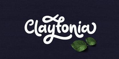 Claytonia is a bold script typeface which is simple yet casual. Made by hand written with many opentype features that you will like. This font is perfect as a logo, quotes, apparel design, wedding invitation, and many more. You can play with the ligatures, stylistic alternate, swash, etc to create your own customized lettering. This font will also support multi languages.
 - Allegretto Script by My Creative Land,
$18.00 A modern calligraphy typeface with a playful yet elegant style, inspired by Mozart’s “Rondo Alla Turca” and his other compositions played with allegretto tempo. The font contains more than 1000 glyphs. Each letter in the typeface has few different swashes that can be accessed via glyphs panel of your opentype-aware application such as Adobe Illustrator, Adobe InDesign, MS Word.
 - Recipe for a lovely day by PizzaDude.dk,
$16.00 Originally I planned to call this font “pegefinger” which is index finger in danish. Due to the obvious reason that I drew the letters using my “pegefinger” :) Most letters mimic a loose (perhaps even childish) handwriting, but the legibility is never out of hand. I’ve added 5 different versions of each lowercase letter, and they automatically changes as you type!
 - Chiller by ITC,
$40.99Chiller is the work of British designer Andrew Smith, a chaotic, reckless fun font. Although the ink blots and stray strokes might look undisciplined, the forms of this typeface were carefully planned and it is surprisingly legible even in small point sizes. Chiller is equipped with a number of alternate characters as well as illustrations and almost guarantees eye-catching graphics. - Lined by Oscar Pastarus,
$18.00The Lined font started out with some scribbles - playing with lines and making shapes fold, underlap and overlap, eventually evolving into letters. This is a display/ornamental font and it was made in 2009, it's meant for decorative use and not in large bodies of text. For example it does well used as a headline font. It is proportionally spaced and uppercase only. - Ameda by Craft Supply Co,
$15.00 Introducing Ameda: A modern, stylish sans-serif font with high contrast that radiates sophistication. Elevate your designs with Ameda's attention-grabbing style, infusing an exhilarating flair into your creative projects. This typeface is ideal for greeting card, packaging, brand identity, poster, or any purpose to make your design project look eye catching and trendy. Feel free to play with this typeface!
 - Mo' Funky Fresh by ITC,
$29.99Mo' Funky Fresh is the work of New York designer David Sagorski. It is an all capital typeface which includes a set of alternative capitals, compatible symbols and lively illustrations. Mo' Funky Fresh brings to mind sunny days, tiki bars, surfboards and cool drinks and is a great choice for headlines requiring a vital, energetic look. - Banja by Typogama,
$19.00 Banja is a single weight, non connecting script typeface filled with vitality. Designed for branding and editorial design, this dynamic style is filled with a selection of swash letters and ligatures to add even more variety and choice for layouts. Banja includes a full extended latin character set that covers most european languages including Turkish, Icelandic or Polish.
 - Actium by Type Mafia,
$45.00 Actium is a contemporary multilingual sans serif typeface developed to help perfect typography automatically. Type Mafia has focussed on words with odd combinations of capital letters and numbers, such as product names and postal codes such as WD40 and H1N5, jump out of the text. They sit awkwardly together as the numerals have been designed to work with the lowercase, not the uppercase letters – affecting readability.To fix this Type Mafia invented Smart Capo™. Smart Capo™ Smart Capo is a feature that automatically activates once you type an uppercase letter together with a number. When a capital letter is sat next to a numeral, Smart Capo converts the letter to a mid-cap — a contemporary alternative to small caps — and the default old-style numeral to a lining numeral. Actium’s mid-caps and lining numerals have been designed with the same height (between cap and x-height) so they sit comfortably next to each other and fit more harmoniously into text. Smart Capo applies equal attention to capitalised words without any numbers, such as NAVO and USA, and are also automatically set into mid-capitals. Working on its own, Smart Capo saves time and money for the typographer — taking the pain out of text formatting — and makes it a more pleasurable experience for the reader. This feature is made possible by the use of ‘contextual alternates’, an OpenType feature used in modern font software, working with a set of characters specially designed at mid-cap height. By default these changes automatically take place so it doesn't need to be switched on, it will just work. Actium Actium’s design has an unusual diagonal contrast — much more common in a serifed face than in a sans serif — giving it more bite. The typeface looks elegant when set in large sizes and remains very legible when shown in small sizes. The family consists of six weights in two styles, making a dozen fonts. Weights range from light to black in roman and true italic. All fonts are fully loaded with functional elements. Actium boasts an extended Latin character set and with Greek. This means a wide range of Western languages are supported: perfect for use in bilingual publications and packaging. For numerals, each font includes old-style and lining figures in both proportional and tabular widths, with superiors and inferiors. These allow you to select the right set of numbers for the right task.
 - Mr Gabe by Leksen Design,
$- Check out Mr Gabe in motion! Mr Gabe is a typeface designed to dance. Not that it’s a flamboyant display face, but that it has a liveliness, especially in its heavier weights, that dances across the page. And the letters include a selection of exuberant flourishes that can be used to kick up a ruckus or make a sweeping gesture. Mr Gabe is a high-contrast serif typeface with vertical stress, a “modern” face in traditional type terms. Even in the regular weight, the contrast between thick and thin strokes is very obvious. Designer Andrea Leksen has given many of the lowercase letters ball terminals, teardrop shapes that make Mr Gabe seem decorated even when most of its letter forms are conservative. If you need more bells and whistles, or perhaps revolving mirror balls and dancing shoes, you can explore the font’s collection of ornaments and decorative borders. Mr Gabe comes in four weights, from Regular to Black, with italics for each. Each font includes over 57 ligatures, 31 illustrations and borders, small caps and proportional oldstyle numerals.
 - Core Slab M by S-Core,
$25.00 Core Slab M is the serif companion to Core Sans M (Text family of the month. May, 2013). This font family has open and square letter shapes, and overall rounded finishes and serifs provide a soft and friendly appearance but also it is strong in headline. Simple and modern shapes with a tall x-height make the text legible and the spaces between individual letter forms are precisely adjusted to create the perfect typesetting. Core Slab M Family consists of 2 widths (Condensed, Normal), 7 weights ExtraLight, Light, Regular, Medium, Bold, ExtraBold, Heavy), and Italics for each format. Combination fonts such as Core Slab M Ice, Berg and Iceberg are also available. Each font includes support for Superiors and Inferiors, Fractions, Tabular numbers, Arrows, Box drawings, Geometric shapes, Block elements, Mathematical operators, Miscellaneous symbols and Opentype Features such as Proportional Figures, Tabular Figures, Numerators, Denominators, Superscript, Scientific Inferiors, Subscript, Fractions and Standard Ligatures. We highly recommend it for use in books, web pages, screen displays, and so on.
 - FS Lola by Fontsmith,
$80.00 L-O-L-A Like the subject of the Kinks’ song, FS Lola is a little bit of both – a font with a rare combination of masculine and feminine. The font was inspired by the song, which itself was inspired by the night the Kinks’ manager spent dancing drunkenly in a Soho club with a beautiful woman... Or so he’d thought, until her stubble started to show halfway through the evening. Masculine/feminin Phil Garnham’s experience in designing FS Lola was similar to the one related by Ray Davies. Setting out to create a sans serif font, he realised along the way that he was actually dealing with a semi-serif. He went with it, though, and produced a font with the best masculine and feminine qualities: hard edges and corners tempered by shapes of softness and generosity, the outcome of what Phil calls an “organic” design process. “Initially, my designs were very graphic and hard but not very distinctive. By printing and redrawing the letters in pencil I achieved a softer and friendlier alphabet with a strong personality.” Broad Lola, as you’d expect, is very broad-minded. Available in five weights with italics – and fluent in central European languages – FS Lola offers a confident combination of feminine softness and male steeliness to any kind of design. As the song says, “It’s a mixed-up, muddled-up, shook-up world... except for Lola.
 - Sánchez Niu by Latinotype,
$- Sánchez Niu is a redesign of Sánchez—one of the first font families by Latinotype designed in 2011. In the typedesign industry the terms ‘nova’, ‘neue’, ‘next’, ‘new’ are often used to refer to a typeface that has been modified in different ways: redesign, technical readjustments, greater number of characters, etc. At Latinotype we are now starting to use the word ‘niu’ to refer to these kinds of typefaces. Niu is an adaptation of the original word ‘new’, i.e., we have adapted this English word to the phonology and spelling of our own language but keeping the original meaning. Race mixing, diversity, change and adaptation are part of the essence of Latin American culture and, at Latinotype, we are all constantly expressing these elements in everything we do. Latin Power! This new version includes improvements that make it work well with longer text. Such improvements have not had a major effect on the look of the font, though. We have adjusted the original proportions and added a number of new characters as well as OpenType features such as small caps, oldstyle figures, tabular numbers and stylistic alternates. Sánchez Niu contains a set of 720 characters that support 219 languages. The font is well-suited for long text, headlines and logotypes, and it has been optimised for web usage. Sánchez Niu comes with two free fonts—Regular and Regular Italic! Corrections, digital editing and review by César Araya, Rodrigo Fuenzalida and Alfonso García.
 - Soccerboy by Chank,
$99.00 1977 was a good year for soccer. Attendance for the North American Soccer League (NASL) grew 33%, to 13,000 per game. Brazillian soccer legend Pelé played his final match, kicking for both the New York Cosmos and Santos of Brazil. And a soccerboy named Charlie was crowned with the nickname Chanky. In honor of his soccer hero Pelé, Charlie insisted the neighbor kids call him Chelé. They laughed at him and called him Chanky after Spanky from the Little Rascals. As he grew into his manhood, he became Chank the internationally renowned font designer. Chank created this font Soccerboy, as filtered through the artistic eyes of his 1977 childhood. It's a tri-line font, hand-drawn in Chank's signature cartoon whimsy. Soccerboy encourages play with color and alternate characters. Create coloring effects yourself using layers and the magic wand and paint bucket tools in Adobe Photoshop or Illustrator.
 - Cíclope by Andinistas,
$19.95 Cíclope is a typeface family designed by Carlos Fabián Camargo in 2012 and used to write the headlines. Its idea is based on an army of stone soldiers that with their size and strength cause earthquakes. Under this concept he obtained stencil and sans serif letters with monstrous shapes and torn counterforms. Its usefulness as well as readability consists in imitate rocks with scars and cracks. For that reason, Cíclope family has three sizes, each with their respective italics distributed at different levels of corrosion. In addition, each file contains 260 glyphs useful for designing words and phrases with systematically eroded treatments for advertisement material. Thus Cíclope works as a raw material in the exploration of new graphic design. Finally, Cíclope concept has grotesque, geometric and humanistics letters roots that seem disastrous but each and every detail has been planned with high definition drawing. Most importantly, it expresses a big amount of grunge style with cracked edges and medium contrast between thin and thick strokes. In that sense, the writing seems impaired and special for design of logos, posters, flyers, brochures and worn, crusty or demolished graphic design.
 - MARIAMNE by Type Innovations,
$39.00 MARIAMNE is an original design by Alex Kaczun. It is an elegant, modern and traditional interpretation based on and modeled after his successful "Contax Pro" and "New Age Gothic" typeface series. As such, it has generous proportions with clean, crisp lines—ideally suited for easy reading and long lines of copy. Alex felt that the skeleton for "Contax" was perfectly suited to transform the design into a modern version of 'old-style', somewhat reminiscent of German Black Letter. Numerous modifications where made to the body proportions, stems and shapes. True 'old-style' serifs and unusual 'cross-strokes' where added for a touch of distinction. The 'cross-strokes' where added at exactly visual mid-point on the overall heights. This gives the typeface a romantic, female-like quality to the overall design. Strong, yet delicate. Visually stimulating in appearance and function. The result is a truly unique transitional and modern design. Unlike other typefaces, MARIAMNE incorporates uniform stems throughout the capitals, lower case and figures. This gives the design a uniform appearance in overall color and strength. There is a perfect visual balance between inter-letter spacing, stem weights and proportions. The accents are equally large, bold and command attention. This font includes a large 'Pro' character set, which supports most Central European and many Eastern European languages. As a result, the design is ideally suited for display copy as well as text composition. In the near future, Alex plans to expand the typeface series to include a light and heavy weight, along with true italics.
 - Transport New by K-Type,
$20.00 Transport New is a redrawing of the typeface designed for British road signs. In addition to the familiar Heavy and Medium weights, Transport New extrapolates and adds a previously unreleased Light weight font originally planned for back-lit signage but never actually applied. Version 3.0 of Transport New features significant improvements including numerous outline and spacing refinements, and a full complement of Latin Extended-A characters. Also, to align Transport New with the 2015 release of Motorway, the other typeface used for UK road signage, Italic fonts for all three weights have been added. Originally designed by Jock Kinneir and Margaret Calvert beginning in 1957 and first published on the Preston bypass in 1958, the original Transport font has subtle eccentricities which add to its distinctiveness, and drawing the New version involved walking a tightrope between impertinently eliminating awkwardness and maintaining idiosyncrasy. The Grotesk roots of the glyphs were investigated and cheekily fine-tuned – uncomfortably close terminals of characters such as 5, 6, C, G, and e were shortened, the S and s were given a more upright aspect and their protruding lower terminals tucked in, overly wide glyphs like the number 4 were narrowed, and some claustrophobic counters were slightly opened up. The question mark was redesigned and parentheses given some stroke contrast. The x height was edged fractionally even taller. The Heavy font is actually more of a Bold, and the Light is pretty much a regular weight, but the original nomenclature has been retained for old times’ sake.
 - Oksana Text Narrow by AndrijType,
$33.00 Oksana Text Narrow is Oksana Text, narrower by 25%. Cyrillic and Latin, with real italics and swashed initials in six weights, is always slender.