10,000 search results
(0.125 seconds)
- Old Letterhand by JOEBOB graphics,
$24.00 'Old letterHand' is a very legible handwritten script font, created with a fine brush pen. The font was made with old style lettered ads in mind but it is has a modern look. It features a couple of ligatures, alternate characters and a few swashes for you to play around with. Related fonts are fourHand and blackHand.
 - Horsefeathers by Patricia Lillie,
$29.00Play a while with Horsefeathers, and you'll find yourself feeling kind of a combination of giddy and up. a lively, animated font that draws attention in short bursts yet has remarkable balance in longer text blocks, even at smallish point sizes. And that can be said for all three styles: Regular, Bold, and the aptly-named Horsefeathers Buzzsaw. - Rose Colored by Letterhend,
$12.00 Rose Colored is a Handwriting Script which is beautifully crafted with feminine touch. This font is perfect as a logo, quotes, apparel design, wedding invitation, and any design needs especially for a girly / feminine theme. You can play with the ligatures, stylistic alternate, swash, etc to create your own customized lettering. This font is also support multi language
 - Quagey by Craft Supply Co,
$20.00 Quagey - Psychedelic Typeface: Where letters dance with vibrant, kaleidoscopic energy. It's not just a font; it's an electrifying visual experience, making your message unmissable, like a psychedelic journey. This typeface is ideal for greeting card, packaging, brand identity, poster, or any purpose to make your design project look eye catching and trendy. Feel free to play with this typeface!
 - Jackazz by Typogama,
$19.00 Jackass is a wacky four weight display design that plays with a randomization feature to offer a large range of layout solutions for each word. With added ligatures and a selection of number styles, this typeface is a funky solution that will constantly surprise! Included in the family are two complimentary dingbat fonts, Chickenz and Framez.
 - Cookie Powered by PizzaDude.dk,
$15.00 Tall, thin, grid, legible and handmade! What's not to like?! The font was made using a squared paper as a base for the lines. However, I managed to keep the free spirit of the handmade look, despite the guides. Play around with the 4 different versions of each letter and the swashes to make your text stand out!
 - Party Doodles Too by Outside the Line,
$19.00 Party Doodles Too is the companion font to the popular font Party Doodles. 29 fun icons including a tray of champagne glasses, appetizers, balloons, pinwheel, stork with a baby, ace of hearts playing card, top hat and tunes, dice, bowling ball and pins, gifts, party umbrellas, cakes, cupcakes, ice cream, lollipop, drinks, corkscrew, noise makers, banners and candy.
 - ASTRALYS by Cerri Antonio,
$37.00 Astralys is a linear decorative font, works very well as a type of identity logo, poster and 3d works. It continues the tradition of precedent Xova but with a hard linear impact. Its interesting to note that with it its possible to play with straight corners to create endless couplings geometric styles and beyond. Caps only fonts.
 - Euripedes JNL by Jeff Levine,
$29.00 The Greek-influenced hand lettering on a 1930s WPA (Works Progress Administration) poster for the Federal Theater presentation of "Trojan Incident" inspired Euripedes JNL. The play was based on Homer and Euripedes, and was presented at the off-Broadway St. James Theatre (which opened in 1927 at 246 W. 44th Street on the site of the original Sardi's restaurant).
 - Impana by Craft Supply Co,
$15.00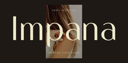 Introducing Impana: A modern sans-serif font that redefines contemporary design. With its sleek lines and versatile style, Impana brings a fresh perspective to modern aesthetics. This typeface is ideal for greeting card, packaging, brand identity, poster, or any purpose to make your design project look eye catching and trendy. Feel free to play with this typeface!
 - Rookie Heat by Bogstav,
$17.00 Based upon classic typefaces such as Bodoni, you might find Rookie Heat familiar. However, the rough outline and handmade look and feel makes it perfect for your craft products. All in all, Rookie Heat is reflecting the beauty of decorative objects. Play around with the swashes for upper- and lowercase to make your designs stand more out.
 - Agneya by Seventh Imperium,
$37.00 Agneya is calligraphy script font, inspired by urban street art. Equipped with opentype features. Stylistic alternates, swash and more 600 glyph. It is make easily to create such as Signpainter logo and various purposes. Just open the Opentype Alternates and choose The alternates that fit best, and you can play with your creation to make your unique designs.
 - Telegram by ITC,
$29.00Telegram is the work of British designer Timothy Donaldson, a casual style influenced by the ball and rod, or atomic, imagery popular during the 1950s. Donaldson called the typeface Telegram because it reminds him of dots and dashes. Telegram is a play alphabet which communicates an almost childlike innocence and is ideal for work directed at younger people. - Groove Town Sans by Dino Feed,
$20.00 Fonts should be living, breathing organisms. Dino Feed wanted to see a font with character, so we created Groove Town Sans. This hand-drawn font has 122 glyphs and is made for Latin-based languages. Play around with the font and make it original; we like to keep everything lowercase. See more @dinofeed on Instagram or at dinofeed.com.
 - Jumping Jess by The Mafia Rabbit Foundry,
$9.99 Jumping Jess is a high quality decorative typeface making use of Stick Figures in various playful jumping poses to depict the letters A-Z. Numbers, symbols and punctuation are composed of elements from the Stick Figure design to visually complement the letters of the alphabet. With a comprehensive set of Ligatures and hundreds of Hand-kerned pairs, Jumping Jess was developed to look great with any string of letters. This font is suitable for greeting cards, sports posters, logos, signage, menus, wedding invitations, product packaging, craft, children's writing, t-shirts, quotes, social media page covers, large format event banners, book covers, magazine title pages and so much more. We highly recommend using an application that supports Open Type features. Ligatures will better display double consonants like "TT" and "LL" and other character combinations like "SH" and "ZY". Ligatures are enabled by default on some applications like Notepad and Photoshop but disabled by default on others like Word and Paintshop. FEATURES Uppercase alphabet 50+ Ligatures, 400+ Kerning Pairs Full range of numbers, symbols & punctuation Comprehensive language support* * ISO-8859-1, ISO/IEC 8859-15, Windows-1252 (e.g. French, German, Polish, Spanish, Italian, Portuguese, Finnish, Norwegian, Swedish, ...)
 - Umba Slab by TypeThis!Studio,
$29.00 The best thing about Umba Slab is its surprise! UMBA Slab is a clean but eye-catching typeface designed by Anita Jürgeleit. It adds an amazing touch to your corporate design and titling by developing a more dynamic shape from thin to bold. It’s especially designed for a wide range of variety and to create a highly recognizable branding and titling. Twenty styles from thin to bold and matching italics help you to create design with a strong essence. Separate styles for alternate and small caps will show up in your font menu, making sure that you always stay aware of the wide range of possibilities of your new favourite font. Finally, for all those who love caps, there are extra caps-only fonts added to the collections. Would you like to see more of how UMBA can improve your design? Let’s get in touch! INSTAGRAM @anitajuergeleit +++ FACEBOOK AnitaJuergeleitTypefaces
 - Armature Neue Sans by fontBoy,
$15.00 Armature Neue Sans is an extension of the original Armature Neue family released in 2010. Like Armature Neue, Armature Neue Sans consists of six weights with accompanying italics. Armature is one result of my interest in typefaces that are constructed, rather than drawn. Although it is basically a monoline design, there are subtle details throughout that compensate for a monoline’s evenness. As with all fontBoy fonts, there are dingbats hidden away in the dark recesses of the keyboard. When I first started designing this face in 1992, I called it Dino - I thought I would name all my fonts after famous pets, so the dingbats for Armature are dinosaurs. To access the alternate characters (closed counter B and R, and others) use Stylistic Set 1 or the glyphs palette in your OpenType-enabled application. Designed by Bob Aufuldish with editing and production by Psy/Ops.
 - Pulchra Desiderio by Valentino Vergan,
$19.00 Pulchra Desiderio which in Latin means “Beautiful Nostalgia” is an elegant resto inspired serif, which comes with a complementary italic version. The typeface is a mix between a vintage and modern look, this unique combination will make your next project really standout. The typeface is also designs to look great in both large and small settings, this makes the typeface great for headlines and editorials. The typeface comes with creative ligatures and alternative characters, this makes it perfect for creating nostalgic and elegant designs such as: mastheads, magazines, feminine logos, wedding invitations, Instagram posts, websites, blog posts, pull quotes, editorials and much more. If you are looking for something modern and nostalgic for you next project, this is the typeface for you. WHAT YOU GET: Uppercase and lowercase letters. Numbers. Punctuation. Ligatures. Alternate characters. Multilingual symbols. I hope you enjoy using the Pulchra Desiderio typeface.
 - Dekapot by Chank,
$49.00A grunge-oriented secret code font, Dekapot Deluxxe has mysterious underlines and accent marks that pop up at seemingly random locations as you type. But these morse-code-like dots and dashes are not random at all, they're simply attached to the preceding letter to make things seem more cryptic than they really are. Get it? Originally released as a Chankstore freefont back in the '90s, Dekapot (translated from the Dutch as "the broken font") has a newly bulked-up character set to add functionality and professionalism to its all caps display nature. These are fresh new versions of this font, made to replace prior versions formerly known as Dekapot Masss and Dekapot Deluxxe. Poke around a bit and you'll find new glyphs for Central Europe and a new Cyrillic character set in there, too. OpenType users get DEKAPOT-PRO with lots of language support. Special Mac PostScript and Windows TrueType is available for the individual Regular or Cyrillic version. - Olivette CF by Connary Fagen,
$35.00 With an extreme stroke contrast and wide, spacious construction, Olivette blends understated minimalism with elegance and expression. Olivette’s fine details shine at large sizes on screen and in print. Olivette CF pairs well with simple typefaces, set at smaller sizes, such as Greycliff CF and Artifex Hand CF. The key is to let Olivette breathe, setting it at large sizes with plenty of open space. All typefaces from Connary Fagen include free updates, including new features, and free technical support.
 - Museo Slab Rounded by exljbris,
$16.50 One of the most friendly Slab Serifs just got even more friendly. Museo Slab Rounded is the latest addition to the Museo font family. It has updated letterforms, spacing and kerning. It can perfectly be combined with Museo Sans Rounded. It comes in six weights with italics, that are not just slanted regulars. Key characters have been changed to give the italics more flow.
 - Poster Hand by HouseOfBurvo,
$9.99 Poster Hand is an informal, casual script that echoes the hand lettering of those ubiquitous signs found all around us. From market stalls to menu boards, we are surrounded by the work of the unknown sign writer. The font comes in three styles, Regular, Italic and Reverse Italic and contains OpenType ligatures and kerning. Latin Extended A supports all western and eastern european latin languages.
 - Galimer by OneSevenPointFive,
$25.00 Galimer is a humanist variable sans serif family. It comes in 18 styles, 9 weights and their corresponding italics. It supports two axis variability - weight and italic. Each of the weights includes support for 80+ languages worldwide. It is packed with powerful opentype features - linked characters, kerning pairs, fractions, superiors, inferiors, etc. Galimer is perfectly suitable for all platforms (desktop, webfont, printing, etc.) Contact - https://forms.gle/VHM7b8FHQiqK8zx9A
 - Ameliana by HandletterYean,
$4.00 Ameliana is an amazing handwritten font, it created by the inspiration of women’s smile. the simplicity of this font tries to resemble that smile which is simple yet beautiful and amazing. Ameliana has a great readability and is perfect for adding a natural look to your designs. This font comes in regular, bold, italic, bold italic style and can be use for multi language.
 - Project Soft by TypeUnion,
$40.00 Project Soft is the more playful version of our 2017 release, Project Sans. The font features the same 10 weights and matching italics but while the Sans version was more structured, the Soft version shows a cheeky side that creates a vast array of potential. The font still features substantial language support as well as specifically designed italics that feature a unique look for certain characters.
 - FF Rosetta by FontFont,
$41.99 Dutch type designer Max Kisman created this display FontFont in 1991. The family contains 4 weights: Regular, Italic, Bold, and Bold Italic and is ideally suited for advertising and packaging, logo, branding and creative industries, poster and billboards, software and gaming as well as sports. FF Rosetta provides advanced typographical support with features such as ligatures and case-sensitive forms. It comes with proportional lining figures.
 - Kegina by Attract Studio,
$19.00 Kegina is a sans serif font family with sharp curves that look clean in a minimalist look. Kegina is equipped with a variety of attractive font alternatives and natural ligature bonds, each version of the Roman style equipped with an Italic style version to produce your extraordinary design needs. Include: 18 Weights (Roman & Italic) 1 Variable Font Replacement & Binding OpenType support Multilingual PUA Encoded.
 - P22 Larkin by IHOF,
$24.95 This lettering style is unusual in that combines aspects of several lettering styles. It is essentially a Germanic Blackletter but with many romanized capital letters and also features an italic slant along with some italic lower case traits. It is evocative of “old world” craftsmanship and early 20th century romanticism. The font was developed based on the logo of the Lakin Company of Buffalo, NY circa 1900.
 - Viking Drink by Fo Da,
$15.00 Viking Drink is a display font derivative from serif family of eight weights ranging from Regular to Bold and matching Italics, which gives it a full range of expression and suitability for advertising, interfaces and corporate design. Viking Drink provides 3 FREE weights ( Regular, Italic and Bold ). It has 17 ligatures that add powerful effect when used for creating logos or headlines. It also supports many languages.
 - Geometrisk by Daniel Brokstad,
$29.00 Geometrisk is a modernist futuristic font combining geometrical outer shapes with rounded inner curves, to create an interesting contrast. The funky italics are created through an offset of the regular type, giving it an almost pixelated look. Well fitting within a cyberpunk world, and an interesting pairing with the standard font. Five different weight and italics of each. Multi-language support. Stylistic alternatives. Designed for headline use.
 - Auxiliary by Wildan Type,
$10.00 Auxiliary is a humanist sans serif font. Make it more interesting and dynamic. Auxiliary is designed for content display and text. Maximizes thickness while maintaining balance in each shape. This is perfect for any type of creative project. Auxiliary come with 4 styles plus Multilingual support.. That is Regular, Italic, Hollow, and Hollow Italic. Makes every project you work on easier, and will certainly be awesome!
 - Phoveus by Youngtype,
$15.00 Phoveus Modern Serif, This professional resource is also powerful because each font has its own magical design. Comes with four versions Regular, Italic, Bold, Bold Italic. You can use it for almost anything like blog headers, posters, wedding elements, t-shirts, clothing, book covers, business cards, greeting cards, branding, invitations and quotes and so on. Feature: Uppercase Lowercase Number Accent (multilingual character) Thank you for your purchase!
 - High Hopes by Ana's Fonts,
$15.00 High Hopes is a quirky handmade serif font with variations that show up "randomly" through contextual alternates, true italics and ornaments. Use this font in designs such as postcards and notes, posters, logotypes, social media posts, branding and packaging. High Hopes includes: Regular font with three contextual alternates for each letter Italic font with three contextual alternates for each letter Ornaments font with swashes and frames
 - Navaja by Andinistas,
$39.95 Very few letter types with the context of grunge style fonts offer hierarchies to differentiate words in sentences or paragraphs. With Navaja I developed a font family that meets this need. This family is useful to organize the information into a hierarchy with an eroded look. Its central idea mixes grotesque, geometric and humanistic letter conventions. This way, Navaja is a grunge-sans with dense proportions to make graphic design with eroded character. Its main purpose appeared when one of my customers asked me for a t-shirt design for a fan club of an important football player. For this reason its starting point were stained and muddy letters characterizing the toughness and coldness of the sport. Over time their glyphs began to imitate the robustness of "wood type & Tuscan Type" widely used in posters in the late nineteenth century. Its purpose was strengthened in a family with 6 members that when mixed they produce mind catching contrast levels ideal for designing T-shirts, stickers, flyers, brochures, posters, billboards, cinema or TV. Therefore its variants are short up and down height X combined with different widths that by working together produce information that radiates outstanding apparently destroyed controlled violence. Navaja Dingbats consists of 52 illustrations useful for frames and textures. In that vein, the origin of each member comes from skeletons of Roman and Italic calligraphy. The low amount of contrast between thick and thin lines matching the contours apparently gnawed but strictly regulated by optical adjustments equating the sum between full and empty areas. Factors such as finishes, shapes and counter internal and external forms are meticulously planned although its scruffy look which strategic arrangements are offset to provide color typographical homogeneous. And in conclusion, I have plans to continue expanding the family with more complete versions in the future.
 - Adelphi PE by Rosetta,
$70.00 Adelphi is a geometric sans, redefined for the northern side of the English Channel. Typographic modernism was a late arrival in Britain — due partly to the Second World War and to the strong local type tradition. This delay provided for fruitful divergence, thus modernism was not adored in quite the same way as it had been in Germany and central Europe. It was instead rethought and repurposed against the backdrop of the bleak British weather and postwar social reform – a continental fashion statement reshaped into a more humanist variant. Likewise, when crafting Adelphi, Nick Job reimagined the constraints that defined the geometric sans as a genre. Whereas other typefaces seem overly bound by the rules, Adelphi feels relaxed and approachable. Elementary square and circular shapes are merely implied. A keen observer may notice that the uncomplicated letterforms occasionally reveal a subtle naïveté associated with early Grotesques. Brunel’s bridges and Harry Beck’s tube map spring to mind alongside the Bauhaus and Futura. But Adelphi is by no means nostalgic! It is a contemporary, comprehensive, and durable system with a pragmatic set of features. These include a wide array of weights, ‘uniwidth italics’, and variable extenders that go from tall and flat in Adelphi Text to short and sharp in Adelphi Display, with default Adelphi standing midway between these two extremes. You can set the extenders to your preference in the all-inclusive variable font or use one of the three static fonts that come packed together, priced as a single font. The pan-European support for Latin, Cyrillic and Greek scripts already makes for a vast character set, but Adelphi takes things a step further by including alternate glyphs to satisfy the DIN1450 legibility norm, a range of ordinals that can be used to create specialist compositions in all three scripts and two kinds of fractions and arrows. Play with the alternates or use it as-is. Either way, this understated beauty will carry you through.
 - Laout Beauty by Twinletter,
$15.00 Laout Beauty playful font is incredibly adaptable in its use for all ages and genders, and it is always acceptable, not to mention the pleasant impression that occurs when you use it, causing your project to immediately capture a lot of attention. Let us wait, let alone utilize this font in your specific project, to capture the hearts of your customers, because this font offers all of your visitors a fun and familiar sensation. This font is perfect for games, sporting events, branding, banners, posters, movie titles, book titles, quotes, logotypes, and more. Start using our fonts for your amazing projects.
 - The Vindest by Skypia,
$15.00 Hello! Let me Introduce you my latest font creation called The Vindest ! The Vindest is a bold retro font with a lot of alternate glyphs. This font is perfectly match for groovy retro and vintage design. The Vindest font is also usable in a wide range of works such as logos, covers, posters, quotes, product packaging, merchandise, social media and much more! Use this font and let your creativity vibing!! Feature : Ligature & Alternate glyphs Multilingual Language Works on PC & Mac Simple installations Accessible in the Adobe Illustrator, Adobe Photoshop, even works on Microsoft Word. Thank you!
 - Bremlin by Grezline Studio,
$23.00 Hello! Let me Introduce you my latest font creation called Bremlin! Bremlin is a bold retro font with a lot of alternate glyphs. This font is perfectly match for groovy retro and vintage design. Bremlin font is also usable in a wide range of works such as logos, covers, posters, quotes, product packaging, merchandise, social media and much more! Use this font and let your creativity vibing!! Feature : - Ligature & Alternate glyphs - Multilingual Language - Works on PC & Mac - Simple installations - Accessible in the Adobe Illustrator, Adobe Photoshop, Adobe InDesign, even works on Microsoft Word. Thank you! Grezline Studio - Akhmad Reza Fauzi
 - Blank Manuscript by Aah Yes,
$14.95Blank Manuscript allows you to produce sophisticated musical scoresheets even on basic Word Processors - anything from simple plain staves to complex full-page orchestral scores of your own design, to write in the notation yourself. The basic stuff is really easy and straightforward, but there's some quite advanced things you can do as well. So Copy and Save these Instructions. • The main stuff is simple and tends to follow the initial letter. Treble, Bass and Alto clefs are on upper case T B A (there are more clefs, below). The 5 Lines for the clefs are on L or l. • A small v will give a small vertical line (like a bar line) and a Big U will give a Big Upright - these can start or end a line or piece. • Time Signatures - type the following letters: Think of W for Waltz and it's easy to remember that 3/4 time is on W. Then from that they go up or down together like this: V=2/4 W=3/4 X=4/4 Y=5/4 Z=6/4 Compound Times are on H I J K like this: H=3/8 I=6/8 J=9/8 K=12/8 Common Time and Cut Common symbols can be found on semi-colon and colon respectively (all begin with Co- ). 2/2 3/2 are on lower case a and b, 7/4 and 7/8 are on lower case c and d, 5/8 is on small k (think POL-k-A) • Flat signs are on the numbers. Flat signs on LINES 1 to 5 are on numbers 1 to 5. Flat signs on SPACES 1 to 5 are on numbers 6 to 0 (space 1 being above line 1, space 5 being above the top line of the stave). Sharp signs are on the letters BELOW the long-row numbers. Which is q w e r t for the sharp signs on Lines 1 to 5, and y u i o p for sharp signs on spaces 1 to 5. Doing it this way means it works the same for all clefs, whether Treble, Bass, Alto, Tenor or any other. Sharp and Flat Signs always go in this order, depending on how many sharps or flats your key signature requires: Treble Clef Sharps t i p r u o e Flats 3 9 7 4 2 8 6 Bass Clef Sharps r u o e t i w Flats 2 8 6 3 1 7 = Alto Clef Sharps o e t i w r u Flats 7 4 2 8 6 3 1 • Guitar Chord Boxes are on G and g (G for Guitar) Upper Case G has a thick line across the top Lower case g has an open top, for chords up the fretboard TAB symbols are available: Six-string Tablature is on s & S for Six. Four-string Tablature is on f & F for Four. (Lower case has the "TAB" symbol on it, Upper Case has just the lines to continue.) Five-string tablature, is on lower case "j" (as in BAN-j-O) and of course L or l will continue the 5 lines. •RARE CLEF SIGNS including Tenor Clef, are on various punctuation marks, i.e. dollar, percent, circumflex, ampersand & asterisk, above the numbers 4 to 8. NOTE: The important symbols were kept on the letter and number keys, which are fairly standard all over, but some of the less important symbols are on various punctuation keys, which in different countries are not the same as on my keyboard. If it comes out wrong on your system, all I can say is it's right on the systems we've tried, and they'll be in here somewhere, probably on a different key. CLOSING THE ENDS OF THE LINES and BAR-LINES is done with the 3 varieties of brackets - brackets, brace and parentheses - Left/Right for the Left/Right end of the line. Parentheses L/R () which are above 9, 0 give a clef with a small vertical upright (the same as a bar line). Brace L/R and Brackets L/R (both on the 2 keys to the right of P on my keyboard) will close off a staff line with tall upright bars. Brace gives a double upright - one thick, one thin. Brackets give a single tall upright. A Big Upright is on Big U, (Big U for Big Upright) and a small vertical line is on small v (small v for small vertical). The Big Upright is the maximum height, and the small vertical is exactly the same height as a stave. And there's a tall upright Bar, on Bar (which is to the left of z on my keyboard, with Shift,) which is the same height as the bar on upper case U but twice as broad. • There's a staff intended for writing melodies, which is a little bit higher up than an ordinary treble clef giving a space underneath to put lyrics in - on m and M for Melody line. Lower case has the Treble Clef on, Upper case M has just the higher-up staff lines with no clef. (Use mMMMMMMM etc.) However this clef will be in the wrong place to put in sharp and flat signs, key signatures and so on, so if you use this clef you'll have to write the sharps, flats and key signature yourself. There's also a clef that's smaller (less tall) than the ordinary clef, but with the same horizontal spacing so it will align with other standard-sized clefs - on slash (a plain clef) and backslash (with a Treble Clef). • There are some large brackets for enclosing groups of staves, such as you'd use on large orchestral scores, on Upper Case N O P Q R, which can aid clarity. N and O on the left, Q and R on the right. P is a Perpendicular line to be used on both sides to increase the height of the enclosure, in this way but with the staff lines in between: N Q P P P P P P O R OTHERS —————————————— • Repeat marks are on comma (left) and period/full stop (right). • Hyphen is left as a sort of hyphen - it's a thin line like a single staff line, with the same horizontal spacing as ordinary staff lines - in case you want to draw a line across for a Percussion Instrument, or a Title or Lyric Line. • Space is a Space, but with HALF the width or horizontal spacing as ordinary staff lines, so 2 space symbols will be the same width as a clef symbol or line. • Grave (to the left of 1 on the long row, or hold down Alt and type 0096 then let go) gives a staff line that is one eighth the width of an ordinary staff line. • If you want manuscript in a clef and key which requires a flat or sharp sign in the space underneath the 5 lines, they’re on = equals and + plus . SYMBOLS • Many of these symbols will only be useful if you have worked out in advance which bars will need them, but they are here in case you've done that and wish to include them. • Symbols for p and f (piano and forte) are on 'less than' and 'greater than' < > (above comma and full stop) and m for mezzo is on Question, next to them. They can be combined to make mp, mf, ff, pp, etc. These signs -- and other signs and symbols like Pedal Sign, Coda Sign and so on -- can be found on various punctuation mark keys, including above 1, 2, 3 in the long row, and others around the keyboard. There's a sort of logic to their layout, but in different countries the keys are likely to give different results to what is stated here, so it's probably best to just try the punctuation and see if there's any you might want to use. (But on my keyboard a Coda sign is on circumflex - because of the visual similarity. Pedal sign is on underscore. A "Sign" symbol is on exclamation mark.) They were only included in case you really need them to be printed rather than handwritten. • However, a Copyright symbol is deemed necessary, and also included are a "Registered" symbol and a TradeMark symbol. They are found in the conventional places, and can be accessed by holding down ALT and typing 0169, 0174 or 0153 respectively in the numberpad section and letting go. • Staff lines with arco and pizz. above are on capital C and D respectively ---C for ar-C-o. • An empty circle above a staff line (to indicate sections by writing letters A, B, C or 1,2,3 inside for rehearsal marks) is on n. The actual signs for an A, B, C and D in a circle above the staff line can be produced by holding down ALT and typing 0188, 0189, 0190 and 0191 respectively and letting go. • The word "Page", for indicating page numbers, is on the numbersign key. • The two quotes keys, (quote single and quote double) have symbols representing "Tempo is", and "play as triplets", respectively. • INSTRUMENT NAMES There's a whole lot of Instrument Names built in (over a hundred) which can be printed out above the clef, and you do it like this. Hold down Alt and type in the given number in the numberpad section, then let go. For Piccolo it's 0130, for Flute it's 0131, Cornet is on 0154, Violin is on 0193, and the numbers go up to over 0250, it's a fairly complete set. There's also a blank which is used to align un-named clefs on 0096. Put them at the very beginning of the line for the best results. Here they are: WOODWIND Piccolo 0130 Flute 0131 Oboe 0132 Clarinet 0133 Eng Horn 0134 Bassoon 0135 Soprano Sax 0137 Alto Sax 0138 Tenor Sax 0139 Baritone Sax 0140 Saxophone 0142 Contrabassoon 0145 Recorder 0146 Alto Flute 0147 Bass Flute 0148 Oboe d'Amore 0149 Cor anglais 0152 Pipes 0241 Whistle 0242 BRASS Cornet 0154 Trumpet 0155 Flugelhorn 0156 Trombone 0158 Euphonium 0159 Tuba 0161 French Horn 0162 Horn 0163 Tenor Trombone 0164 Bass Trombone 0165 Alto Trombone 0166 Piccolo Cornet 0167 Piccolo Trumpet 0168 Bass Trumpet 0170 Bass Tuba 0171 Brass 0172 VOICES Vocal 0175 Melody 0176 Solo 0177 Harmony 0178 Soprano 0179 Alto 0180 Tenor 0181 Baritone 0182 Treble 0183 Bass 0197 (see also PLUCKED STRINGS) Descant 0184 Mezzo Soprano 0185 Contralto 0186 Counter Tenor 0187 Lead 0206 BOWED STRINGS Strings 0192 Violin 0193 Viola 0194 Cello 0195 Contrabass 0196 Bass 0197 Double Bass 0198 Violoncello 0199 Violin 1 0200 Violin 2 0201 Fiddle 0252 PLUCKED STRINGS Harp 0202 Guitar 0203 Ac. Gtr 0204 El. Gtr 0205 Lead 0206 Bass 0197 Ac. Bass 0207 El. Bass 0208 Slide Gtr 0209 Mandolin 0210 Banjo 0211 Ukelele 0212 Zither 0213 Sitar 0214 Lute 0215 Pedal Steel 0216 Nylon Gtr. 0238 Koto 0239 Fretless 0244 KEYBOARDS + ORGAN Piano 0217 El. Piano 0218 Organ 0219 El. Organ 0220 Harpsichord 0221 Celesta 0222 Accordion 0223 Clavinet 0224 Harmonium 0225 Synth 0226 Synth Bass 0227 Keyboards 0228 Sampler 0249 PERCUSSION and TUNED PERCUSSION Percussion 0229 Drums 0230 Vibes 0231 Marimba 0232 Glockenspiel 0233 Xylophone 0234 Bass marimba 0235 Tubular Bells 0236 Steel Drums 0237 Kalimba 0240 OTHERS Harmonica 0246 Mouth Organ 0247 FX 0251 Intro 0243 Verse 0245 Refrain 0248 Chorus 0250 un-named 0096 (this is a small spacer stave for aligning clefs without a name) ALSO copyright 0169 registered 0174 TradeMark 0153 Rehearsal marks 0188-0191 (giving A, B, C, D in a circle, an empty circle is on n ) Clef signs for Treble Bass Alto without any staff lines 0253-0255 An Alphabetic List of all signs: a 2/2 time b 3/2 time c 7/4 time d 7/8 time e sharp sign, centre line f Tab sign for 4-string tab g Guitar Chord Box, no nut h half-width stave I sharp sign, third space up j Tab sign for 5-string tab k 5/8 time l Lines - 5 horizontal lines for a stave m Melody Clef - a standard clef but placed higher up, with Treble sign n Stave with an empty circle above o sharp sign, fourth space up p sharp sign, space above stave q sharp sign, bottom line r sharp sign, fourth line up s Tab sign for 6-string tab t sharp sign, top line (fifth line up) u sharp sign, second space up v vertical line (bar-line) w sharp sign, second line up x Fretboard, four strings y sharp sign, first space up z Fretboard, five strings A Alto Clef B Bass Clef C “arco” above stave D “pizz.” above stave E Double Vertical Lines F Four Horizontal lines (for 4-string tab) G Guitar Chord Box with nut H 3/8 time I 6/8 time J 9/8 time K 12/8 time L Lines - 5 horizontal lines for a stave M Melody Clef - a standard clef but placed higher up, plain N Bounding Line for grouping clefs - top left O Bounding Line for grouping clefs - bottom left P Bounding Line for grouping clefs - Perpendicular Q Bounding Line for grouping clefs - top right R Bounding Line for grouping clefs - bottom right S Six Horizontal lines (for 6-string tab) T Treble Clef U tall, thin Upright line V 2/4 time W 3 / 4 time X 4/4 time Y 5/4 time Z 6/4 time 1 flat sign, first line up (the lowest line) 2 flat sign, second line up 3 flat sign, third line up 4 flat sign, fourth line up 5 flat sign, fifth line up (the top line) 6 flat sign, first space up (the lowest space) 7 flat sign, second space up 8 flat sign, third space up 9 flat sign, fourth space up 0 flat sign, space above stave - Selfie Neue Rounded by Lián Types,
$29.00 INTRODUCTION When I started the first Selfie back in 2014 I was aware that I was designing something innovative at some point, because at that time there were not too many, (if any) fonts which rescued so many calligraphy features being at the same time a monolinear sans. I took inspiration from the galerías’ neon signs of my home city, Buenos Aires, and incorporated the logic and ductus of the spencerian style. The result was a very versatile font with many ligatures, swashes and a friendly look. But… I wasn’t cognizant of how successful the font would become! Selfie is maybe the font of my library that I see the most when I finally go out, (type-designers tend to be their entire lives glued to a screen), when I travel, and also the font that I mostly get emails about, asking for little tweaks, new capitals, new swashes. Selfie was used by several renowned clients, became part of many ‘top fonts of the year’ lists and was published in many magazines and books about type-design. These recognitions were, at the same time, cuddles for me and my Selfie and functioned as a driving force in 2020 to start this project which I called Selfie Neue. THE FONT "Selfie for everything" Selfie Neue, because it’s totally new: All its glyphs were re-drawn, all the proportions changed for better, and the old and somehow naive forms of the first Selfie were redesigned. Selfie Neue is now a family of many members (you can choose between a Rounded or a Sharp look), from Thin to Black, and from Short to Tall (because I noticed the feel of the font changed notoriously when altering its proportions). It also includes swashy Caps, which will serve as a perfect match for the lowercase and some incredibly cute icons/dingbats (designed by the talented Melissa Cronenbold) which, as you see in the posters, make the font even more attractive and easy to use. You'll find tons of alternates per glyph. It's impossible to get tired with Selfie! Like it happened with the old Selfie, Selfie Neue Rounded was thought for a really wide range of uses. Magazines, Book-covers, digital media, restaurants, logos, clothing, etc. Hey! The font is also a VF (Variable Font)! So you can have fun with its two axes: x-height and weight, in applications that support them. Let me take a New Selfie! TECHNICAL If you plan to print Selfie Neue VF (Rounded or Sharp), please remember to convert it to outlines first. The majority of the posters above have the "contextual" alternates activated, and this makes the capitals a little smaller. I'd recommend deactivating it if you plan to use Selfie for just one word. Use the font always with the "fi" feature activated so everything ligatures properly. The slant of the font is 24,7 degrees, so if you plan to have its stems vertical, you may use Selfie with that rotation in mind. THANKS FOR READING