2,709 search results
(0.029 seconds)
- Filou by Volcano Type,
$19.00Filou is a genuine bastard inspired by three different typefaces. It consists of three weights: "Regular", "Medium" and "Extra" which can be easily mixed together. - That by Suomi,
$30.00 This is That: a family of four weights with roman and true italics, and also with chiselled medium weight, and Irregular variant for, well, variety.
 - DraftWerk by The Northern Block,
$16.70 A minimal rounded typeface inspired by architecture and furniture detail drawings. The idea was to develop a font that would showcase precise radius corners at large formats and would also downsize to produce stylish body text. Details include 4 weights, a complete character set, manually edited kerning and Euro symbol.
 - Pipo by bb-bureau,
$65.00 Pipo is a minimalist rounded tubular and stencil font in 5 weights (Thin, Light, Regular, Medium & Bold) — many symbols and cleverly ligatured! language: all latin glyphs
 - BB book A by bb-bureau,
$65.00 bb-book A — breaking rules typeface Expressive book serif (triangular and curved) kicking up weight, width and contrast — in 4 styles: light, regular, medium and bold.
 - Valentine by profonts,
$51.99 Valentine is another brand-new profonts script typeface family with versions in light, light italic, medium and medium italic, supplied in the new OpenType Pro font format. Valentine contains about 1.100 glyphs for every weight, covering the complete Latin character set (West, East, Baltic, Turkish, Romanian), and a huge number of handmade ligatures, character combinations and alternates to make it a perfect OpenType Pro connecting script. Valentine is a very distinguished, elegant and versatile script font.
 - Aseel by MAKYN,
$40.00 Aseel is a contemporary and legible typeface. It is intended to work well in the context of information and signage design. It also works well as a body text typeface as it is characterized by open counter forms and a large x-height. It is based on the Naskh calligraphic structure and has a medium stroke contrast. The letters are condensed to fit more information per line and it exists in three weights, regular, medium and bold.
 - Daleant by Maculinc,
$15.00 The new beautiful and attractive Serif Font comes with a unique alternative in each Uppercase, This Font is available in Uppercase and Lowercase Complete with Numbers, Punctuation, Alternate and Ligatures. Daleant Serif Font is available in the family of Light, Light-Italic, Regular, Italic, Medium, Medium-Italic, Semi Bold, Semi Bold-Italic, Bold, Bold-Italic. Alternatives and Ligatures in this font are only available in uppercase letters, Add alternatives to make sentences more unique and interesting.
 - Florensans by Milan Pleva,
$18.00 Florensans is an all caps display sans serif typeface in elegant & modern style with ligatures, special alternative glyphs and old style figures. The Florensans family contains three weights: Light, Regular and Medium. Florensans is ideal for headlines, headers, logos, labels, packaging, postcards, presentations, magazines, invitations, etc. Features: 3 Weights - Light, Regular and Medium Basic latin alphabet A-Z 64 Ligatures & Alternates 56 Accented characters Numbers, Punctuation, Currency, Symbols, Math symbols & Diacritics Old style figures Enjoy Florensans!
 - Sure, imagine for a moment that the Shadowed Serif font by J. Fordyce attended a high school reunion. It would be the character that managed to age remarkably well, maintaining an elegant yet bold ap...
- Keymer Thug by Talbot Type,
$19.50Talbot Type Keymer Thug is a display face available in three weights, it is a distressed variation of Keymer Radius . Its textured look brings a characterful, time-worn quality. Keymer Thug features an extended character set to include old style numerals, accented characters for Central European languages and bespoke characters in the italic. - Kimono Kong - Unknown license

- Homework Dashed by DAAZ,
$9.00 Homework Dashed font was specially conceived/designed for teaching cursive writing. This resource allows tutors and parents to create worksheets for individual or class teaching. Associated with the Homework font, students can learn and exercise their handwriting abilities. All capital letters, excluding I, F, T and P, link to any following small letter: the sequence of the previous letter stroke always follows the angle of the initial stroke of the subsequent letter. This, in the real world, means that words built with the font can be handwritten without having to lift the pen from the paper (except to cross t and f and dot i and j) or interrupt the writing flow. All the letters are base aligned and all small letters have the same ‘x’ height. Homework Dashed font is a tool with which teachers and tutors can create repetitive alphabetical writing exercises that can be printed on lined sheets.
 - 799 Insular by GLC,
$38.00 This font was inspired from the so called "Insular Style" Latin script used in Celtic monasteries (Ireland, Scotland—with the well known Book of Kells—and England) from the late 6th to 9th, before the Carolingian "Caroline" (look at our 825 Karolus). It was a regular script, rounded, written slowly, used mainly for specially meticulous books, with a very few ligatures. The rarely-used capitals consisted of enlarged lowercases, but, on the other hand, there was numerous historical initials. The Titling style in this familly allows to two-color decorated letters to be created, using OTF Titling feature or copy and paste technique. We have created the font as to be adapted for contemporary users, differentiating between U and V, I and J, which has not any relevance for ancient Latin scribes, and naturally with Thorn, Oslash, Lslash, K,W... The specific Celtic "y" is added as an historical alternate.
 - Fascinate Pro by Stiggy & Sands,
$29.00 A soft Art Deco inspired typestyle with panache The Fascinate Pro Family, which includes both Regular & Inline styles, began as a nod to Art Deco yesteryear and typefaces like Broadway, yet they have an exaggerated x-height and softness that give them a friendly yet sophisticated vibe. Even with their high contrast weighting, the Fascinate Pro family is cleanly legible at small sizes, while the Inline style is better visible at larger display sizes. See the 5th and 6th graphics for a comprehensive character map preview. OpenType features include: - Full set of Inferiors and Superiors for limitless fractions. - SmallCaps feature. - Oldstyle (default) and Standard Tabular figure sets. - A small collection of Standard Ligatures. - A Stylistic Alternates feature for an alternate lowercase i and j style. Approx. 581 Character Glyph Set: each style of Fascinate Pro comes with a glyph set that includes standard & punctuation, international language support, and additional features.
 - The Country Blues by Vintage Voyage Design Supply,
$10.00 The Country Blues it's a cool fancy font family inspired by the good old vinyl records / movie covers, bowling and golf aesthetics and good old Rock'n'Roll melodies such as "Runaround Sue" was. The sans comes in five widths from light to black. Each letter has a stylistic alternate to get your typography more individuality. Especially it looks good with all caps and bouncing baseline. But it still good with normal block texts with straight line. The script has also stylistic alternates for each capitals and some lowercase features as awesome underlined 'g'/ 'j' / 'y' or special 't' with long stroke. All these fonts come as Clear or Raw (roughen) style if you want to add some "Horror" mood. As a dessert you'll get the graphic font with a lot of vintage sign shapes. 78 graphic elements total. The PDF graphic navigation file is include. Multilingual.
 - Linotype Gianotten by Linotype,
$29.99 It took the Italian designer Antonio Pace more than five years to create Linotype Gianotten™, a successful new interpretation of the classic Bodoni types. To re-draw the 200-year-old characters for the world of modern digital technology, Pace studied Giambattista Bodoni's original punches at the Bodoni Museum in Parma. He felt that previous Bodoni interpretations were not well suited for body texts, so he focused his study of Bodoni's "Manuale Typografico" on the types made specifically for text sizes. Consequently, his Bodoni has strong hairlines, rounded transitions and shorter, fluted serifs - elements that help to achieve readability by providing an overall tranquil effect. This contemporary, highly readable family is an excellent choice for text settings in books, newspapers, and magazines. Incidentally, the name Gianotten has nothing to do with Bodoni, but was chosen by Pace and Linotype to honor Dutch typographer, Henk W. J. Gianotten."
 - Blythe by Scholtz Fonts,
$19.92 Blythe is a stylish and contemporary handwriting font that captures the elegant hand of the 50s with the immediacy of handwriting fonts such as Affable. There are many handwriting fonts out there, many of which border on being grungy and irregular. This font combines beauty with individuality and panache. Blythe is characterized by dramatic ascenders and descenders (found on characters such as f, g, h, j etc) and it may be necessary to increase the line-spacing a little in some applications to accommodate these features. Suggestions for use: -- wedding stationery -- greeting cards -- valentines day mediaa -- beauty product media -- lingerie tags -- women's magazine pages -- classical music media -- award certificates The font is fully professional: carefully letterspaced and kerned. It contains over 235 characters - (upper and lower case characters, punctuation, numerals, symbols and accented characters are present). (It has all the accented characters used in the major European languages).
 - ITC Posterboy by ITC,
$29.99If you are looking for a friendly type design that jumps off the page, ITC Posterboy might be for you. Although not quite a script, the font displays strong brush-stroke overtones. The design's inspiration, according to designer Chester Wajda, came from the window-poster lettering in my neighborhood grocery store." The slight top-heavy quality of the design is most noticeable in characters like the 'F,' 'G,' and 's.' ITC Posterboy also has a charming sense of naïveté which is most evident in letters like the cap 'S' and 'J' and lowercase 'f'' and 'g.' ITC Posterboy is a brilliant display design that adds spark and charm to the most mundane display copy. A multifaceted artist, Wajda has been an art director, multimedia and print designer, illustrator, cartoonist, animator, writer, typographer, and infographic designer. ITC Posterboy is his second typeface created for ITC." - Battle Scarred by Comicraft,
$19.00 We know what you're thinking... This is not a new font, just an old one with a few bullet holes in its helmet, dirt on its shins and some carbon scoring on its breastplate. You're thinking this is like a variant cover by Joe Madureira or J. Scott Campbell -- handsome and rugged on the outside but weak and effete on the inside. Well, my fine, font-finagling friend, you'd be Dead Wrong! This really is an All-New, All-Different, All Star, Ultimate Collectable, from the Comicraft House of Ideas! Our Dynamic Duo -- Johnny Comicraft and Ferran 'Nuff Said have brought you another winner from the Silver Age of comic book lettering. It’s a little worse for wear, we admit it, but wouldn't you be after three rounds with the Justice League of Avengers Assembled?!? See the families related to Battle Scarred: Battle Cry & Battle Damaged .
 - Regulator Nova by Device,
$39.00 A high lower-case x-height geometric sans with open counters, Regulator Nova is extremely legible at text sizes and in extended settings while the range of weights also make it suitable for headlines. The stoke terminals are all cut at close to 90 degrees, lending a sharp precision to the characters. Alternate versions of the g, j, r, w, K, R, W, # and ampersand are available in both upright and italic, and can be toggled on and off in the Opentype panel or the Glyphs palette. Clean, elegant and legible, Regulator Nova has a classical proportions based on a circumscribed circle and square, and shares structural similarities to early sans serifs such as Rudolf Koch’s Kabel, while adopting more British forms for the M and R. Regulator Nova is an extension and reworking of Regulator, now with extra weights, reweighed italics, Opentype-savvy alternates and a full European character set.
 - Acarau Display by Tipogra Fio,
$30.00 Acarau is a 6 fonts display typeface with high reverse contrast—since from Roman capitals and calligraphy, usually Latin alphabet letters have thiner horizontal steams and thicker verticals, these features being optical or visual—quite adequate for logos, headlines and posters. Moreover, the style of the typeface is inspired by Italics form factor: lowercase letters having less strokes to make their shapes; A has one story; E has one stroke shape, such as K, G, Y and Z; F has a descent. To give it more calligraphic feeling, there is contrast for uppercases as well, this is very perceived by the diagonal letters like A, K, M, N, V, W, X, Y and Z. J also has a descent. Q and R have natural swashes, but they have alternates in case the costumer want to go for more usual forms—including accent marked letters. Acarau is a 12 months project, the contrast for uppercases were increasing as the process was made. In the middle it is found suitable blend the letter shapes with the history of Brazilian music from the 70’s and 80’s, since the font has a tropical, warm, spicy and nostalgic feeling. Songs from bands and singers that emerged on Rio de Janeiro like Paralamas do Sucesso, Cazuza, Lulu Santos and Kid Abelha bring the beach accent and rhythm that this font has. OpenType features complement the set, which has Multi-Lingual support for a comprehensive Latin set, including Vietnamese—meaning more than 640 glyphs: Case-Sensitive forms, so symbols can properly align to uppercase letters; Ligatures, to better reading for z_y and L_I, and style for s_s, w_w_w; also for ease arrows and punctuation typing; Stylistic Set 1: two story a—including accent marked letters; Stylistic Set 2: two story g—including accent marked letters; Stylistic Set 3: diagonal (usual) z—including accent marked letters; Stylistic Set 4: flower i and j dots; Contextual alternates; Terminal forms, for R and Q; Ordinals.
 - FS Split Sans by Fontsmith,
$80.00 Quirky and irregular FS Split is no ordinary typeface. Its irregular proportions make it unique, with round letters appearing wide, and straight letters narrow. Other quirks include its eclectic crossbars – the uppercase ‘A’ has an unusually low bar, while the bar on ‘G’ is particularly long. The uppercase has many interesting features in fact, including large counters, closed terminals on certain letters like ‘J’, and a cap-height that lines up with ascenders. The lowercase also holds surprises – the dots on ‘i’ and ‘j’ are unusually large, and some characters, such as ‘g’, feature double-storey counters. An extreme but stylish italic The italic versions of FS Split Sans and Serif are particularly striking. While similar in style to their upright, Roman versions, they take on a larger-than-usual 18-degree angle, making the forward-slant more dramatic. Although the main purpose of any italic is to help words and phrases stand out, this unique execution helps to make the italic variants of FS Split stylish fonts in their own right – they would work brilliantly on magazine covers, in titles and headlines, pull quotes, and even used commercially in logos and corporate branding. Serif and sans: a split personality FS Split Sans and Serif have their differences but also their similarities, contrasting and complementing each other perfectly. This ‘love hate’ relationship inspired the name of the typeface family, and means the two variants provide a versatile, typographic palette for use in graphics and branding. While its proportions are similar to the sans, the serif has a bigger contrast between its weights of bold, regular and light, bracketed serifs, and different styles of terminals, some being straight and others ball-shaped. FS Split Sans has more subtlety and simplicity, with a smaller weight contrast, less flamboyant terminals, and more consistent counter sizes. The two variants are distinct yet alike, so can be used successfully either in isolation or together.
 - FS Split Serif by Fontsmith,
$80.00 Quirky and irregular FS Split is no ordinary typeface. Its irregular proportions make it unique, with round letters appearing wide, and straight letters narrow. Other quirks include its eclectic crossbars – the uppercase ‘A’ has an unusually low bar, while the bar on ‘G’ is particularly long. The uppercase has many interesting features in fact, including large counters, closed terminals on certain letters like ‘J’, and a cap-height that lines up with ascenders. The lowercase also holds surprises – the dots on ‘i’ and ‘j’ are unusually large, and some characters, such as ‘g’, feature double-storey counters. An extreme but stylish italic The italic versions of FS Split Sans and Serif are particularly striking. While similar in style to their upright, Roman versions, they take on a larger-than-usual 18-degree angle, making the forward-slant more dramatic. Although the main purpose of any italic is to help words and phrases stand out, this unique execution helps to make the italic variants of FS Split stylish fonts in their own right – they would work brilliantly on magazine covers, in titles and headlines, pull quotes, and even used commercially in logos and corporate branding. Serif and sans: a split personality FS Split Sans and Serif have their differences but also their similarities, contrasting and complementing each other perfectly. This ‘love hate’ relationship inspired the name of the typeface family, and means the two variants provide a versatile, typographic palette for use in graphics and branding. While its proportions are similar to the sans, the serif has a bigger contrast between its weights of bold, regular and light, bracketed serifs, and different styles of terminals, some being straight and others ball-shaped. FS Split Sans has more subtlety and simplicity, with a smaller weight contrast, less flamboyant terminals, and more consistent counter sizes. The two variants are distinct yet alike, so can be used successfully either in isolation or together.
 - Anthro by Studio Few,
$24.00 Tall X-Height, Angled Terminals and Medium Contrast, Anthro is a UI font designed with personality. Concieved as a hybrid between Grotesk & Humanist, Anthro pairs legibility with character.
 - Ron by Brainware Graphic,
$12.00 Ron is a vintage medium block typeface, a classic and bold display font with a cool vibe. Use it to add a smart feel to any design project.
 - Juggler by Jonahfonts,
$25.00 Juggler is a medium-line font suitable for work requiring a friendly style. Ideal for packaging, also suitable for special invitations, birthday cards, posters, ads and book jackets.
 - Arcle by The Northern Block,
$12.80 A modern geometric typeface with precise radius detailing. Each character has it’s own unique subtleties and style variations, with careful adjustment you can create dynamic page layouts. The elegant curves are best demonstrated using the lighter weight at large scale. Details include 5 weights, a complete character set, manually edited kerning and Euro symbol.
 - Bonnet Grotesque Nr by astype,
$42.00 Since the release of Wood Bonnet Grotesque No.4 the font became popular for packaging and adverts. But the font styles were limited to one worn and one clean font in a medium weight only. Bonnet Grotesque Nr [Narrow] will fill this gap. It’s based on Wood Bonnet Grotesque No.4 but slightly modernized with sharp corners. Some letters need more space now – so tracking is not the same. The Medium family style shares the same weight as the wood font version.
 - Linotype Feltpen by Linotype,
$29.99Linotype Feltpen is part of the Take Type Library, chosen from the contestants of Linotype’s International Digital Type Design Contests of 1994 and 1997. This fun font was designed by the Swedish artist Lutz Baar with clear, light forms. The spontaneous, even letters seem to have been written with the felt pen from which the font takes its name. Linotype Feltpen is available in two weights, regular and medium, both suitable for short and middle length texts and medium for headlines as well. - Axeo by Asritype,
$13.00 Axeo is a freeform serif typeface. With more than 500 glyphs for each cut, Axeo supporting wide Latin Base Languages. The font structures is sans-serif typeface. Then, the fonts is made into serif (serifed) using rhombus and adapted/modified rhombus (before remove overlaps) placed on its appropriate positions. This fonts is released first, while the sans-serif is being in process. There are 10 fonts; 5 weight in normal width: Light, Regular, Medium, Bold, and Black; and 4 in semi-condensed: Light, Regular, Medium, Bold and Black, too. The fonts has some minor character variations, all are sets in SS01.There are also standard and discretionary ligatures, arrow, some geometric shapes and ornaments. With its sansserif structure, the Medium, Bold and Black fonts is playful with text effect in various applications such MS Word, CorelDraw or others to enhance the appearance. Its serif form will make unique enhancements. Thus, the fonts is suitable for Branding, logos, cards, advertisements, banners, display and more; for the main texts or its companions. While the light, regular and medium fonts can also be used as description text, card text, note, caption and longer non-formal texts or other usages.
 - Gothico Antiqua by MADType,
$21.00 Gothico Antiqua is the result of grunging up one of my early sans-serif type designs. It strangely works very well and looks authentic at small to medium settings.
 - Chrimbo by Seemly Fonts,
$12.00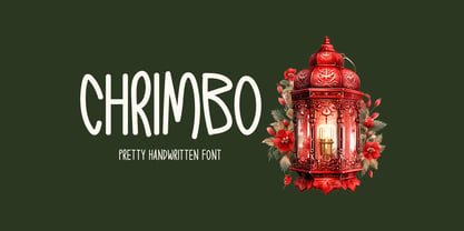 Chrimbo is a handwritten font that radiates warmth and charm. Its distinct style adds a unique touch to an array of design possibilities, allowing your creative ideas to flourish.
 - ReadySteadyGo by Volcano Type,
$19.00 ReadySteadyGo is a display font that refers to the look of stadium tracks. The font was actually created for Sports Bible, a book about sportswear, published by Sportswear International.
 - Lucidity by DogHead Studio,
$20.00 Lucidity is a condensed, handwritten font with emphasis on texture and default wide spacing. This makes it a versatile font for display, medium amounts of text, and T-Shirts.
 - Pantra by Nicolas Deslé,
$19.90 Pantra is a minimal and clear geometric sans. Pantra is clear, approachable, and effective in both headings and paragraphs and comes in 4 weights: light, regular, medium and bold.
 - Butcher by RodrigoTypo,
$25.00 Butcher is a Rough font with 2 styles, a medium and a black to play with the weights, it contains the Greek and Cyrillic alphabet, special for action titles
 - Jazz Age by Studio K,
$45.00 Jazz Age is inspired by the Golden Age of Jazz, the Twenties and Thirties. Think Scott and Zelda Fitzgerald, cocktails, flappers and the whole Art Deco thing. Oh, and don't forget the radios, by which I mean old Bakelite valve or tube radios with their grilles and fretwork. This font is a celebration of them too.
 - Ducatus by Scriptorium,
$12.00We wanted to make an ultra-thin, tall font with a rough, hand-drawn look and ended up with more than we bargained for. To get the font we wanted we started by developing a source font for the basic letter shapes and we ended up with a whole bunch of variations of the basic style. Thus was born the new Ducatus family of fonts, starting with Ducatus Light which developed into the Medium and Heavy versions, and the Medium weight was ultimately used as the basis for the Ducatus Rough font, which was the goal of the project in the first place. Ducatus Rough was created by modifying Ducatus Medium in Photoshop using Gallery Effects and several other filter packages, and then redoing the outlines from scratch in Fontographer. A lot of work, but the result is just what we wanted. - Berona by Alex Camacho Studio,
$15.00 Berona font family is a variable geometric sans serif with a modern display purpose. The dynamic sharp edges makes it ideal to be used in a medium and big scale.
