3,401 search results
(0.02 seconds)
- Boston by Latinotype,
$29.00 Designed by Daniel Hernández and Paula Nazal with digital editing by Elizabeth Hernández. Corrections and review by Alfonso García and Rodrigo Fuenzalida. Boston is a slightly rounded-edged typeface, which is inspired by “Trenda”—a geometric sans serif based on the uppercase of “Trend”(a Latinotype font, released in 2013, that was very well received). This new typeface comes with a wider character set that offers a complete family of uppercase and lowercase in different weights. Boston is a versatile, easy-to-use, functional display font with a strong personality, especially its uppercase, which makes the designer’s work easier. Boston’s lightest and heaviest variants are ideal for display use while its middle weights work well with short and mid-length texts. This typeface has been designed especially for corporate projects, logotypes and publishing. Boston comes in 8 weights, ranging from Thin to Heavy, and includes matching italics as well as small caps and alternates. The family contains a 634-character set that supports 206 different languages.
 - Shopping Script by Roland Hüse Design,
$15.00 Shopping Script is designed after and inspired by my handwritten shopping list that was originally a lot less stylish, I have written each words multiple times to achieve the organic and natural flow with a bit spaced out style. This font is an existing work of mine that came in only one weight. Now I added multiple weights I as well as expanded and condensed instances, along with a weight and width variable font file that can be set to anything in between Thin Condensed to Heavy expanded. There are standard ligatures for it, jt, ll and tt, stylistic alternates for uppercase "A" and lowercase "e". For lowercase r and s there are contextual/initial variants when they are first letter of a word. A guide of open type features and how to activate them is available at https://drive.google.com/file/d/1q4j4X8ZntqgEUB8gUmflUNtmlX4IVQBq/view?usp=sharing Most latin based languages are covered from Western European to Eastern.
 - San Jose by Graffiti Fonts,
$19.99 The San Jose type family provides an array of variants representing a simplified, bay area slant on traditional Chicano American street scripts. The styles in this set can be used in all caps for the most authentic appearance or in a more typographically traditional small caps format. This set also includes latin supplement support and a robust character set in six styles. 3 Stroke variants: Regular, Rough & Bold each have a leaned back, traditional slant variant.
 - Dirty by SoftMaker,
$10.99 SoftMaker is offering its Dirty font family in 8 variants.
 - Otsuki Sama by Julmeme,
$19.00 Otsuki-Sama is a sophisticated mix between a serif and sans serif font design. Its elegant balance between heavy contours and subtle lines gives it a modern yet very rich look. Applicable for any type of graphic design, especially for headlines, posters and magazines.
 - Tubby by Suomi,
$19.00 Tubby came about when I made a book with Cooper Black as a headline font. I started playing with heavy forms, and as a result was Tubby. It has a fat and friendly feel, and with swash italics it is fairly versatile in use.
 - Assai by Type Matters,
$23.90 A very heavy headline only typeface which should be typeset at rather large type sizes due to its fine counters. It’s the ideal typeface for building a brick-wall out of letters. Surprise is in the details, so play it loud and big! It’s fun.
 - Hubba by Green Type,
$19.00 Hubba is a modular geometric typeface. Its heavy weight is excellent for headlines and display. There is a plain, oblique, and opposite oblique styles. The variable version will give you the opportunity to be more free in design and not limited to standard styles.
 - Walden by Fenotype,
$35.00 A heavy serif font with a handmade feel, Walden gives a hearty impression. Despite its rustic appearance, Walden is perfectly adaptable to contemporary use, wherever a bit more character is needed. Decidedly kept simple, these three weights with matching italics is all you need.
 - Spleach by PizzaDude.dk,
$20.00Spleach is a splendid mix of comic text, grafitti and unicase letters - as always, the pizzadude way! The letters are heavy and black, but still light enough to funk up your text! You will need to use OpenType supporting applications to use the autoligatures - Plak by Linotype,
$40.99 Plak is a typeface originally created by famous German designer Paul Renner in 1930. Paul Renner is also the designer of the Futura typefaces. Like Futura, Plak is a sans serif design. But its unique qualities include its heaviness, and its un-geometric lowercase a.""
 - Boyish & Weird by Rachel White Art,
$16.00 Say hello to Boyish & Weird! (I actually don't know what boyish is, but I do like how that word looks with these letters.) I had a lot of fun making this weird little font. It has oval cutouts, heavy lines, and plenty of whimsical details.
 - Dutch Courage by Comicraft,
$29.00Developed by Comicraft's Dutch Masters to give DC's BATMAN & ROBIN ADVENTURES a crisp, clean, Art Deco look, all four pints of DUTCH COURAGE are available as one font family. Please refrain from operating heavy machinery within one hour of partaking of these intoxicating fonts. - Donut Derby by Rachel White Art,
$16.00 Donut Derby is a playful, hand lettered caps font. It's got smooth lines, a heavy weight, and cute curves. Mix lower and upper cases for a more authentically hand-lettered look. Includes 5 ampersand alternates, because I like to have lots of options for ampersands. :)
 - Kestrel Script by Alan Meeks,
$45.00 Originally designed in 1985 and released by Letraset for dry transfer Lettering, Kestrel has, until now, never been digitized. The face now has been completely re-drawn and digitized for all formats. It is a heavy formal script similar in form to Commercial Script.
 - Chrimbo by Seemly Fonts,
$12.00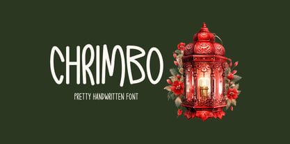 Chrimbo is a handwritten font that radiates warmth and charm. Its distinct style adds a unique touch to an array of design possibilities, allowing your creative ideas to flourish.
 - Moucha by Vibrant Types,
$41.00 Moucha is a geometric superfamily that received the German Design Award 2024 for its multitude of variants. Find a vintage and a modern variant and play with all the proportions in between. The variable font is your typographic toolbox with the perfect sans-serif match for your favorite serif. It supports 619 Latin, Cyrillic and Greek languages. How it works: All variants share the same round characters while rectangle-based characters vary in width. Do you want a dynamic classic look with a narrow ‘n’ and uppercase proportions like you know from prototypes like Futura®? Or do you prefer a homogenous contemporary look? Use Moucha X for the exact middle or bubble up your own variant!
 - Grauna by Typeóca,
$40.00 Graúna is Typeóca’s first ‘serious typeface’. The idea was to produce a revival of Block Heavy, removing the ‘rough’ texture from its outline. Though other revivals existed, most of them approached the Block family as a whole, leaving aside the idiosyncrasies that make the Heavy weight so unique. In the early stages of its development, however, we realized that a lot of its quirkiness is only possible precisely because of the ‘rough’ texture we were trying to remove. That way, we started going further and further away from the original model, and thinking about the typeface in its own terms, resulting in an impactful yet friendly sans serif, ideal for logos and short titles.
 - Mermer by Jana Orsolic,
$35.00 Mermer font family is a contemporary take on Roman capitals in six weights. The font name is the Serbian word for marble, and the inspiration for its creation comes from chiseled street signs in Istria. With lowercase and Cyrillic added, it gets a broader range of usages. Mermer is bold and versatile, can be both sporty and high fashion, looking sharp in more than 40 languages. Thin is thorny and Heavy feels like a block of concrete. Make it LOUD by setting it in large sizes and choosing Mermer Heavy for posters, magazine headings or logos, or you can make it cosy and friendly setting it smaller in Mermer Regular for menus, book covers, invitations or business cards.
 - Reverie OT by District,
$20.00 Reverie is a cheerful band of letters that bounce across the page and get together to create words in four weights. Generous spacing and a modest x-height project an airy typeface that's open but not frail. Quirky without being too whimsical. Use the regular weight for surprisingly readable text or put the light and heavy weights to use for decorative headlines and titles. Reverie OT is the follow-up to the popular Reverie. This version comes loaded with new features: ligatures, small caps, swash caps, a larger numeral set, more language glyphs, and a fourth, heavy weight. This all adds up to a vastly more functional and flexible family of fonts.
 - Churchward 69 by BluHead Studio,
$25.00 Churchward 69 is a ten weight typeface family originally designed during the late 1960’s by the late type designer Joseph Churchward. From the extremely condensed Regular weight to the outlandishly heavy Ultra Black, this square sans serif makes an audacious statement. Even the Italics are extreme at their 17 degree angle! Churchward 69 includes 5 weights, Regular, Bold, Extra Bold, Black, and the gorgeous Ultra Black, and their italics. Joseph sure knew how to draw heavy weights! All members of the Churchward 69 family have OpenType features, including proportional and tabular figures, unlimited fractions, superior and inferior figures, and ordinals. Each font also has an extensive character set to support many western European languages.
 - Monolith Pro by Gravitype,
$12.90 Monolith Pro is a futuristic heavy display that steals the show. This typeface is inspired by the popular Kubrick’s movie 2001: a space odyssey, from which the iconic monolith scene. The glyphs, in fact, have been designed to fill the rectangular shape, with the addition of minimal inlays to differentiate them consistently. While the uppercase is perfect for impactful headings and titles, the lowercase completes the main headline masterfully - but can also stand out alone due to its own distinguishable personality. The family includes 4 styles: regular, italic, outline and outline italic, to give more dynamism and sense of lightness when needed, in contrast with the heavy weight. Multilingual support is available.
 - Monaly by Nathatype,
$29.00 Monaly is a display serif font. Designed with large, heavy letters, Monaly is a display font that makes a bold statement. Each letter is meticulously crafted with strong, confident serifs that lend a sense of grandeur and sophistication to your design projects. The artistic flair of Monaly is evident in its carefully balanced letterforms, which blend tradition with a contemporary edge. The font's heavy weight adds a sense of weightiness and substance, making it a reliable choice for conveying authority in your designs. Monaly fits in headlines, logos, posters, flyers, invitations, branding materials, print media, editorial layouts, and many more designs. Find out more ways to use this font by taking a look at the font preview.
 - Freitag Display by Zetafonts,
$39.00 Probably as a reaction to the pragmatism of modernist design, the seventies saw an explosion of buoyant, vivacious typography. Psychedelia fueled a return to the melting, lush shapes of Art Nouveau while Pop culture embraced the usage of funky, joyful lettering for advertising, product design and tv titling. New low-cost technologies like photo-lettering and rub-on transfer required new fonts to be expressive rather than legible, pushing designers to produce, bubbly, high-spirited masterpieces, where geometric excess and calligraphic inventions melted joyfully. Freitag is Cosimo Lorenzo Pancini's homage to this era and its typography. His starting point was the design of a heavy sans serif with humanist condensed proportions, flared stems and reverse contrast, that generated both the main family, and a variant display subfamily. The main typeface family slowly builds the tension and design exuberance along the weight axis - a bit like our desire for the weekend increases during the week. In Light and Medium weights the font shows a more controlled, medium-contrast design, tightly spaced for maximum display effect. The Book weight follows the same design but uses a more relaxed letter spacing to allow usage in smaller sizes and short body copy. As weight increases in the Bold weight the style becomes more expressive, with a visible reverse contrast building up and culminating in the Heavy weight with his clearly visible "bell bottoms" feel. In the display sub-family the design is pushed further by introducing variant letterforms that have a stronger connection to calligraphy and lettering. Also, the weight range becomes a optical one, with weights marked as Medium, Large, XLarge, as bringing the contrast and the boldness to the extreme creates smaller counterspaces that require bigger usage sizes. Another important addition of the display sub-family is the connected italics that sport swash capitals and cursive letterforms, developed with logo design and ultra-expressive editorial design in mind. To balance the extreme contrast in the XL weight, contrast of punctuation is reduced, creating a rich, highly-dynamic texture wherever diacritics and marks are used in the text. The full family includes 16 styles + 4 variable fonts, allowing full control of the design over its tree-hugging design space. All 20 fonts share an extended latin charset with open type features including case sensitive forms, single and double story variants and alternate glyphs. According to its creator, "Freitag is the typeface that sounds like an imaginary Woodstock where on the stage with Jimi Hendrix with Novarese, Motter, Excoffon and Benguiat playing onstage with Jimi Hendrix". Jeepers creepers!
 - Glimmer by Device,
$29.00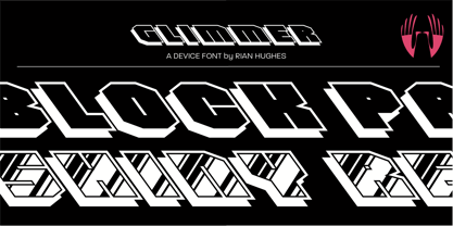 A backslanted outline font with a drop shadow and a glossy variant.
 - Sabon eText by Linotype,
$34.99 A clear and enjoyable reading experience hinges on the legibility of text copy, especially when reading on screen. This is why Monotype has developed the eText collection of fonts specifically tailored for the text-heavy display environments of e-readers, tablets, mobile devices, and the Web.
 - Amasis eText by Monotype,
$49.00A clear and enjoyable reading experience hinges on the legibility of text copy, especially when reading on screen. This is why Monotype has developed the eText collection of fonts specifically tailored for the text-heavy display environments of e-readers, tablets, mobile devices, and the Web. - VolumeFour by Ryan Corey,
$10.00 VolumeFour is a heavy, geometric sans-serif display face inspired by the custom lettering which adorns Black Sabbath's groundbreaking "Vol 4." Its bold forms and naturally tight spacing evoke the era which spawned such classics as "Snowblind" and "Supernaut", bringing this aesthetic to a contemporary audience.
 - Neue Helvetica eText by Linotype,
$42.99 A clear and enjoyable reading experience hinges on the legibility of text copy, especially when reading on screen. This is why Monotype has developed the eText collection of fonts specifically tailored for the text-heavy display environments of e-readers, tablets, mobile devices, and the Web.
 - Mistral by Linotype,
$40.99 Mistral is a loose running script based directly on the handwriting of its designer, Roger Excoffon. His goal was to create a typeface with a true handwritten style, but in this case, the writing looks as though it were done with a brush or heavy felt tip.
 - Dante eText by Monotype,
$29.99 A clear and enjoyable reading experience hinges on the legibility of text copy, especially when reading on screen. This is why Monotype has developed the eText collection of fonts specifically tailored for the text-heavy display environments of e-readers, tablets, mobile devices, and the Web.
 - Ysobel eText by Monotype,
$99.00A clear and enjoyable reading experience hinges on the legibility of text copy, especially when reading on screen. This is why Monotype has developed the eText collection of fonts specifically tailored for the text-heavy display environments of e-readers, tablets, mobile devices, and the Web. - Alt Ayame Long by ALT,
$10.00 A long version of my Ayame font. Ayame is a display font which looks great on posters, logos, and titles. Ayame Long is a 2-weight family with a heavy retro look. Works great with the regular version of Ayame you can check out the original.
 - AT Move Bulky by André Toet Design,
$39.95 BULKY is the 19th Font of André Toet. It’s Unusual, it’s Heavy, it’s Irregular, it’s Rough, it’s Stripy, it’s Angular, it’s BULKY. But it has character and extremely useful for headings, posters and even logotypes. Just-Use-It! Concept/Art Direction/Design: André Toet © 2017
 - Antebas by Lafontype,
$35.00 Antebas is a sans serif family with a geometric touch. Available in 16 styles from Thin to Heavy and it's matching italics. OpenType features such as fractions, ordinal, superscript, subscript, numerators, denominators and tabular figures are available. besides Latin letters, Antebas also supports Cyrillic and Greek letters.
 - Princetown by ITC,
$40.99Richard Jones designed Princetown, an all caps font with strong, geometric letterforms, in 1981. Princetown's design was inspired by college and university sportswear, with its blocky forms and heavy outline. The Princetown font is an excellent choice for any work associated with sports or collegiate life. - Volante by Hindia Studio,
$12.00 Volante is a gorgeous condensed sans serif typeface that comes with various stylistic alternates and discretionary ligatures. It comes with multiple weights, from thin to heavy, with 3 extra outline styles. This is perfect to sweeten up your headlines, branding visual identity, editorial, poster, and etc.
 - Palatino eText by Linotype,
$103.99 A clear and enjoyable reading experience hinges on the legibility of text copy, especially when reading on screen. This is why Monotype has developed the eText collection of fonts specifically tailored for the text-heavy display environments of e-readers, tablets, mobile devices, and the Web.
 - Mister Twiggs by Type Innovations,
$39.00 Mister Twiggs is a comtemporary modern sans created by the American type designer Alex Kaczun. There are absolutely no curves in this elegant typeface. It has sharp corners with extra tall capitals and a narrow waistline. Mister Twiggs comes in 3 flavors: regular, thin and heavy.
 - Linotype Didot eText by Linotype,
$50.99 A clear and enjoyable reading experience hinges on the legibility of text copy, especially when reading on screen. This is why Monotype has developed the eText collection of fonts specifically tailored for the text-heavy display environments of e-readers, tablets, mobile devices, and the Web.