9,924 search results
(0.018 seconds)
- Aegipti 7 by 2D Typo,
$28.00 Aegypti 7 is a digital revival of Font No.7 or Egyptian Narrow - a Soviet display face cast for hand composition. I settled on the 12pt version as a basis for my digital version, as larger sizes added too much contrast to an otherwise quite orderly slab serif. The Soviet Font No.7 itself was based on an older Semi-Egyptian narrow cut before the revolution.
 - Agafia by ParaType,
$25.00 Agafia handwriting script is based on the hand of Agafia Karpovna Lykova - the last member of the Old Believer family lived like an hermit in the Khakass taiga. The face is developed for the new book on the history of Lykov's family by Lev Cherepanov. It's built in OpenType format with a contextual substitution of letterforms and specific ligatures. Designer - Gennady Fridman. Released by ParaType in 2009.
 - Yardbird Numerals by Coniglio Type,
$9.95Yardbird, insinuating prison numerals, was lifted from a wooden block print poster press, that would have indeed besides providing dates for the local carnival would have just as easily ink-chucked them over the backs of those denim blues. Part of Market LTD, a collection of limited faces, mostly alpha-numeric and some just plain numeric, used primarily in retail and display situations and titling. - Seaside Resort NF by Nick's Fonts,
$10.00Lettering on a 1933 booklet about certain facilities in Italy -- can you guess what they might be? -- by the Bertarelli Design Studio of Milan inspired this decidedly different and engaging monocase face. If you're looking for something that says "casual elegance," this is it. This font contains the complete Latin language character set (Unicode 1252) plus support for Central European (Unicode 1250) languages as well. - Bazoo Tow NF by Nick's Fonts,
$10.00Here's a faithful rendering of the slightly quirky, but thoroughly yeomanlike headline face Basuto, designed by Stanley Baxter and released by the Stephenson Blake Type Foundry in 1927. Bold, brassy and a little sassy, this one will perk up your headlines fer sure. Both versions include the complete Latin 1252, Central European 1250 and Turkish 1254 character sets, as well as localization for Moldovan and Romanian. - Microgramma by Linotype,
$40.99Following to Swiss design principles, Alessandro Butti and Aldo Novarese designed the Microgramma font for the Nebiolo typefoundry in 1952. Microgramma is wide, almost like an extended" font, and it has the typical look of 1950s industrial design. The font has been immensely popular as a display face ever since its original release. Use it in large sizes to help get your message across to readers." - Airy by ParaType,
$25.00Airy is in fact a very light-minded summer font without any serious design concept. It is a collection of hand-drawn letters that with the help of OpenType features allow you to get a lace texture with mutable structure. Together with the font you also get a bonus — a set of naive pictures that you normally draw on the margins of your sketchbook. - Hilton Serif by Juraj Chrastina,
$39.00 There is something special about thin fonts. On one side there is the sensitive, charming and warm touch, on other side they are uncompromising, thoroughgoing. Here the contrast can't hide the clear shapes. Hilton Serif and Hilton Sans are a pair of highly legible, subtle and elegant sans-serif and semi-serif display faces. The quality of spacing and kerning are ensured by Igino Marini.
 - Cover Charge JNL by Jeff Levine,
$29.00 Although less prevalent today, a cover charge was added to better class night clubs of the 1930s and 1940s to discourage patronage by people of questionable social graces. The general idea was that the lower strata of society (meaning the "average Joe" or "hoi polloi") would balk at paying an extra fee just for entrance to a place of good entertainment and fine dining.
 - Diogenes by Ludwig Type,
$45.00 Diogenes is an elegant and crisp text typeface. While the skeletons of the individual characters are distinct and strong, the serifs are fine and sharp. This is especially true for the capitals with their comparatively strong horizontal strokes. The graceful appearance of Diogenes makes it an ideal choice for books, newspapers, and magazines, both at small text sizes and display sizes. See also this minisite.
 - Poodle Pusher NF by Nick's Fonts,
$10.00In his book, Brushstroke and Freestyle Alphabets, Dan X. Solo called this fabulous fifties face Maidstone Script. Somewhat less willowy than the original, this version is still righteously retro, and takes its name from a collision between a poodle skirt and pedalpushers, two fifties fashion statements. The Opentype version of this font supports Unicode 1250 (Central European) languages, as well as Unicode 1252 (Latin) languages. - Dream Away by Resistenza,
$39.00 A handwritten font with long conections and small aperture and counter, a graceful and fresh rhythm to catch the eye attention. This script family is based on italian “bella scrittura”. The letterforms have been careful designed to grant this typeface with an effortless sense. Check the Opentype features window and discover an extended set of swashes to help you to give emphasis to the message.
 - Sovereign Display by G-Type,
$46.00 Sovereign Display is a decorative all caps headline face in one style with small caps on the lower case positions. Thin horizontal crossrules underpinned by a heavier solid shadow give the typeface a prominent three dimensional appearance and an air of formal distinction. Ornate and iconic, Sovereign Display is perfect for certificates, manuscripts, titling or anything requiring a more sombre, elaborate or engraved slab serif style.
 - Hybrid by ParaType,
$30.00 Designed for ParaType in 1999-2003 by Manvel Shmavonyan. This is a low-contrast serif typeface with large x-height and small square cove serifs. For use for text and display typography. Due to its open letterforms and big number of styles the face is a good companion to open humanist Sans. Hybrid design was awarded special prize at Kyrillitsa'99 international type design competition.
 - Magdalene Sans by Greater Albion Typefounders,
$10.00 Magdalene is a classically designed sans-serif face for the 21st century. It's designed to offer clear and immediately legible lettering for signage and poster use which still has a touch of character and elegance about it. Magdalene is also ideal for the display of web pages and legible text on small LCD panels. Use Magdalene to combine traditional design attributes with modern technology.
 - Kolkata Hotelroom by Hanoded,
$10.00 Hotel rooms in Kolkata don't top the list of 'luxurious habitations'. They are dingy, fly-ridden, dirty and noisy. But if you look really hard, you will find traces of long gone grandeur. This font is all of the above and more: it is sloppy and messy, it spikes and sags, but it does give your designs that extra oomph you are looking for.
 - ITC Bauhaus by ITC,
$40.99 ITC Bauhaus was designed by Edward Benguiat and Victor Caruso in 1975. They based it on a prototype face drawn by Herbert Bayer in 1925 while he was teaching at the Bauhaus School in Dessau, Germany. ITC Bauhaus has simple geometric shapes and monotone stroke weights. The rounded, open forms and quirky geometric gyrations of ITC Bauhaus will make contemporary graphic designs look both fun and stylish.
 - Mehriban Outline by Michael Browers,
$25.00Mehriban Outline is a revisit of Mehriban, Michael Browersí most successful text face that was originally released in 2006. Mehriban & Mehriban Outline are deconstructivist revivals inbred from Michael Browers' previous work: Formasi and Disjecta. Formasi characters were morphed with their Disjecta counterparts, and in some cases with previously unpublished letterforms from Disjecta's concept stages, resulting in a grunge font with its own unique swagger. - Tapir by HVD Fonts,
$26.00 Searching for the Exceptional Designing Tapir was driven by the search for a display typeface which is doing something different than the rounded and bouncy fun faces – the letterforms should stand out with a slight touch of weirdness, creating attention and recognizabilty. A big character set, optimized spacing & kerning and lots of features make Tapir a good choice for professional usage between games, toys and skateboards.
 - Pringle & Tweed by Nicky Laatz,
$16.00 Stylish and unique, Pringle & Tweed is a new handwritten font with a graceful nuance.It’s gentle curves and natural lettering make it distinctive and elegant. To make your lettering look truly unique, Pringle and Tweed comes with a comprehensive set of double letter ligatures , and a set of stylistic alternate lowercase letters in it's opentype features. Pringle and Tweed includes a slanted version for an extra elegant feel.
 - Magica by K-Type,
$20.00 MAGICA is a book and display face that is both distinctive and legible – clear letterforms and a generous x-height make Magica a good choice for text or titles. The typeface has elegantly chamfered serifs and a confident, vivacious character that is equally suited to formal and informal usage. Magica is available in three weights – Regular, Medium and Bold – each supplied with a free italic.
 - Garth Graphic by Monotype,
$29.99Released by the Compugraphic Corporation in 1979, the Garth Graphic font family is based on a design by John Matt from the 1960's, reworked by Renee LeWinter and Constance Blanchard. Garth Graphic was named after Bill Garth, a founder of Compugraphic. A fairly strong old style face suitable for text setting; the heavier weights and condensed forms are most used for display work. - Fyne Fish NF by Nick's Fonts,
$10.00The pattern for this face was designed by Will Bradley in 1894 for the cover of Inland Printer magazine, and was licensed the following year to American Type Founders. Its classic lines and condensed footprint make this typeface a natural for elegant and inviting headlines. All versions of this font include the Unicode 1250 Central European character set in addition to the standard Unicode 1252 Latin set. - Hera Big by Lucas Sharp,
$40.00 Hera Big is a type family in eight weights & 16 fonts. The family explores the motion and fluidity of the ball serif, in an evolution from its previous identity as a counterpart to the slab serif. Informed by great fat-faces from Figgins to Lubalin, but never deferring to precedent by default, Hera is a fresh mix of originality and organic form, never sacrificing function for beauty.
 - Alma by Sudtipos,
$69.00 From the technical hand of Alejandro Paul and the creative jungle in the mind of Angel Koziupa, comes a wild-natured script. Alma may appear slightly weathered, but still maintains a sharp and determined face. The casual strokes are at times pointed, yet ultimately playful. Released in OpenType format to expand possibilities of use with lots of alternates when used with OpenType-aware applications such as AdobeCS.
 - Granville by Greater Albion Typefounders,
$14.95 Granville, is inspired by traditional British (and transatlantic) shop signage. It's an elaborate confection, drawing on Roman and Blackletter influences and is ideal to give any project an instant Victorian feel. Granville is offered in Regular, Condensed and Expanded widths as well as an oblique form and a yet more decorative 'Grand' form. These faces are especially suitable for posters, period advertising, Chapter headings and signage.
 - P22 Peanut Pro by IHOF,
$39.95 Peanut is a face full of bounce and playfulness but is based on the traditions of the long revered Roman minuscule. The letters are unique in that they imply “youth” without relying on cliché child-like letterforms. Peanut and Peanut Sans come in a ‘Salted’ style which features many alternate letterforms. Both the Salted and regular styles are combined into in the Pro fonts.
 - Renard Moderne NF by Nick's Fonts,
$10.00Twentieth Century Poster, designed by Sol Hess for Lanston Monotype in the 1940s, provided the inspiration for this family of faces. Although, historically, the design falls outside the time period normally considered the Art Deco era, its sensibilities are pure Art Moderne. Both versions of this font contain the Unicode 1252 (Latin) and Unicode 1250 (Central European) character sets, with localization for Romanian and Moldovan. - Film Crew JNL by Jeff Levine,
$29.00It's not a new idea, but it's always a fun one... a typeface comprised of 35mm film frames. Film Crew JNL is Jeff Levine's version, utilizing his Koehler Sans JNL as the lettering inside the frames. The lesser and greater keys have solid black frames for end caps or word spacing, and there's an alternate pair of frames with clear centers on the brace keys. - Lusta by Device,
$29.00 Lusta plays with the interchangeability of an inline and an outline, negative and positive space. Often one single character will epitomise the design of a font, and here the S served as the conceptual starting point. The inline/outline was then applied to sans and serif variants, and extended into a multi-line prisma and an offset layered shadow version, probably inspired by Face Photosetting’s Stack.
 - Signature Present by Fikryal,
$23.00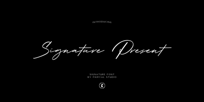 Signature Present – Signature Font is a meticulously crafted typeface that exudes elegance and sophistication. This font is designed to add a touch of personal flair and exclusivity to your projects, making it an ideal choice for various creative endeavors. With its exquisite strokes and graceful curves, Signature Present embodies the art of calligraphy, making it perfect for adding a luxurious and handwritten feel to your designs.
 - ITC Benguiat by ITC,
$40.99 A roman face designed in the early 1980s by Ed Benguiat for ITC, ITC Benguiat shows a strong Art Nouveau influence. As with ITC Korinna, the stress of the ITC Benguiat font family occurs in the upper half of each capital. This distinctive typeface is particularly useful for display and advertising work. ITC Benguiat® font field guide including best practices, font pairings and alternatives.
 - Hilton Sans by Juraj Chrastina,
$39.00 There is something special about thin fonts. On one side there is the sensitive, charming and warm touch, on other side they are uncompromising, thoroughgoing. Here the contrast can't hide the clear shapes. Hilton Sans and Hilton Serif is a pair of highly legible, subtle and elegant sans-serif and semi-serif display faces. The quality of spacing and kerning ensured by Igino Marini.
 - Transcendental JNL by Jeff Levine,
$29.00 At first glance, Transcendental JNL looks like a 1960s or 1970s-era "Hippie" type face, hence its "love generation" name. However, the actual inspiration comes from a piece of sheet music from the early 1900s with Art Nouveau influences. It is often proven that what goes around certainly does come around in art, fashion and lettering. Transcendental JNL is available in both regular and oblique versions.
 - Box Office by Device,
$29.00 Designed originally for the BBC's listings magazine "Radio Times", this dingbat font has been extended to include the US rating as well as the UK ones and a selection of symbols for use on DVD film packaging and satellite listings. The font used is Paralucent, and an ideal accompaniment. Note: the icon for sexual content comes in two versions, one with genitalia and one without.
 - Veneribe by Greater Albion Typefounders,
$10.95 Veneribe -the Venerable face- is an experiment in what many today might call 'grunge', though we at Greater Albion would probably prefer to talk of rustic (or if we're feeling really old-fashioned rustick) charm. It's a derivative of our Clementhorpe family, and aims to combine a battered antique look with the charm of that decorative Roman family. Regular and oblique forms are offered.
 - East India Company NF by Nick's Fonts,
$10.00Put the kettle on and break out the biscuits. This no-nonsense stencil face is a faithful recreation of Tea Chest, released by the Stephenson Blake Type Foundry in 1939. Its bold strokes and slender profile retain their freshness, even seventy-plus years on. Both versions include the complete Latin 1252, Central European 1250 and Turkish 1254 character sets, as well as localization for Moldovan and Romanian. - ITC Liverpool by ITC,
$29.99Fat, bold, and comfortably bulbous; that's ITC Liverpool, designed by Kevin Bailey. The letterforms are soft and mildly eccentric, characterized by tiny counters that shift around from letter to letter like the highlights on cartoon eyeballs. Some of Liverpool's letters are reminiscent of display lettering from the '30s, yet this exuberant face would also be right at home in the '60s. Not for the typographically timid. - Monotype New Clarendon by Monotype,
$29.99The first Clarendon was introduced in 1845 by R. Besley & Co, The Fan Street Foundry, as a general purpose bold for use in conjunction with other faces in works such as dictionaries. In some respects, Clarendon can be regarded as a refined version of the Egyptian style and as such can be used for text settings, although headline and display work is more usual. - Lafleur by Resistenza,
$45.00 Inspired by the iconic Fenoglio-Lafleur Liberty building in the city of Turin, in an area with significant Stile Liberty buildings and New Gothic architecture. Lafleur is a decorative face with a remarkable art nouveau flair from 19th century. Perfect for creative contemporary uses in print and on screen. We recommend it for book covers, packaging, branding, editorial, web, advertising, apparel, purposes are endless.