9,922 search results
(0.068 seconds)
- Silly Treat by PizzaDude.dk,
$10.00 - Butternut by Ryan Keightley,
$19.00 - P22 Canterbury by IHOF,
$49.95 - Behrens Schrift by Solotype,
$19.95A simplified blackletter designed by Peter Behrens, architect and graphic artist who came into prominence around 1900. Issued by Rudhard's Typefoundry, Offenbach A. M., this face was typical of many in the Jugendstil period. Its squarish look works well in Craftsman period layouts. - Newfangle NF by Nick's Fonts,
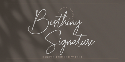
$10.00 - Besthiny Signature by Typebae,
$15.00 - Ratatouille by Jonahfonts,
$40.00 - Magellan by Monotype,
$29.99The Magellan font family is a roman in the Swedish Grace tradition. And since the Swedish language has long words, Magellan is a bit narrower than most romans. Magellan was an honorable prize winner in the Morisawa (Japan) international typeface design competition 1993. - Emmie by Fontmill Foundry,
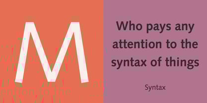
$15.00 - Syntax by Linotype,
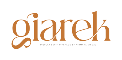
$29.99 - Giarek by Nirmana Visual,
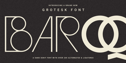
$24.00 - Baroque Grotesk by SilverStag,
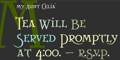
$19.00 - My Aunt Celia by Quadrat,
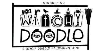
$25.00 - Witchy Doodle by Ake,
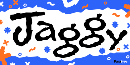
$12.00 - Jaggy by ParaType,
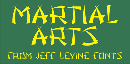
$30.00 - Martial Arts JNL by Jeff Levine,
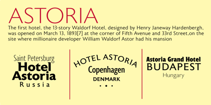
$29.00 - Astoria by Alan Meeks,
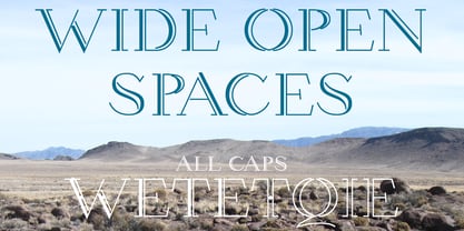
$45.00 - Wetetque by Ingrimayne Type,
$6.95 - Classroom JNL by Jeff Levine,
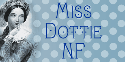
$29.00A set of old die-cut cardboard letters and numbers used by teachers directly on bulletin boards or for tracing was the inspiration for Classroom JNL. In turn, these letters take their cue from typefaces such as Franklin and earlier wood type designs. - Miss Dottie NF by Nick's Fonts,
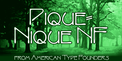
$10.00 - Pique-Nique NF by Nick's Fonts,
$10.00 - Sluggo by Patricia Lillie,
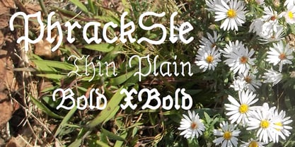
$29.00Sluggo, a loose, 3D-ish face with the look of a slightly sloppy brush line, comes with attitude to spare. Has five styles: Regular, Lefthook, Righthook, Open, and Black--all spaced and kerned so that you can stack them for special effects. - PhrackSle by Ingrimayne Type,
$11.95 - Neon by Monotype,
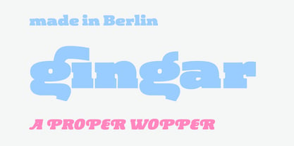
$29.99Neon Extra Condensed was designed by Giulio da Milano and released in 1935. This all-capital typeface is similar to designs released in the early 1990s. The Neon Extra Condensed font is good as a headline face for magazines and book covers. - Gingar by Melli Diete,
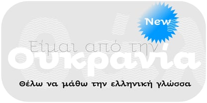
$42.00 - Oksana Greek by AndrijType,
$25.00 - Simeon by astype,
$40.00Simeon is well suited for setting an short and medium amount of text with an historic impression. OpenType features: - over 650 glyphs - Central European faces - stylistic alternates and historical forms - ornaments, signs, zodiac, symbols - proportional & mediaeval numerals - numerators, denominators and fractions - Roman numerals - Surely You Jest NF by Nick's Fonts,
$10.00A late nineteenth-century type specimen catalog from Farmer, Little & Co. yielded this droll little typeface, originally called "Arbor". The distinctive decorations of the face suggested a fool's cap, and thus the font got its current name. And don't call me Surely. - Bruce Old Style by Bitstream,
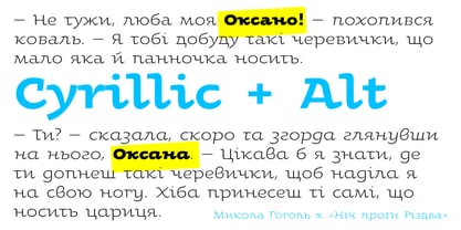
$29.99This is the Bruce Foundry’s Old Style No.20, which was loosely based on the Miller & Richard Old Style. It was recut at Lanston under Sol Hess’ direction in 1909, and survives as the second text face in the Sears Roebuck Catalogue. - Oksana Cyrillic by AndrijType,
$25.00 - Federal Streamliner by Greater Albion Typefounders,
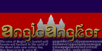
$9.95 - AngloAngkor by Parquillian Design,
$39.00 - La Reyna Catalina NF by Nick's Fonts,
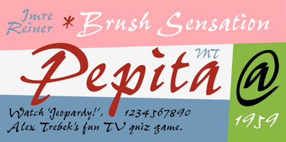
$10.00An unreleased typeface called "Aragón", designed by Enric Crous-Vidal, provided the inspiration for this decidedly retro face. It’s quite useful for distinctive and commanding headlines. Both versions of the font include 1252 Latin, 1250 CE (with localization for Romanian and Moldovan). - Pepita by Monotype,
$29.99 - PhederFrack by Ingrimayne Type,
$9.95 - One Good Urn NF by Nick's Fonts,
$10.00J. M. Bergling, in his 1914 masterwork Art Alphabets and Lettering, offered this face as suitable for all occasions Greek, and we couldn't agree more. Both versions of this font include the complete Unicode 1252 Latin and Unicode 1250 Central European character sets. - Fiasco by ChibaChiba,
$24.95 - Brandegoris by Scriptorium,
$12.00Brandegoris is a set of traditional split-pen capitals with two forms for most of the letters. It is excellent for headers and titles, especially on web pages and also works well as initial characters in combination with a serif text face. - Explora by TypeSETit,
$24.95 - Computer by Monotype,
$40.99Computer is an all-capitals headline font that immediately implies early mainframe computer technology. Although desktop computers and better screen and printer faces have been available for some time, the type style of the Computer font is still used for futuristic topics.
