9,924 search results
(0.061 seconds)
- SF Handwriting by Sultan Fonts,
$40.00 The SF Handwriting font family is designed for educational and printing purposes. It is a carefully crafted font that supports Arabic, Latin, Persian, and Urdu. The font is characterized by its clarity, ease of reading, and visual appeal. It is also convenient to use in small sizes. The SF Handwriting font family includes three weights: Regular, Bold, and Black. The Dotted style is designed with a straight background for printing and overwriting by children or other users.
 - Kiddo by EPtackArts,
$3.00 Kiddo is a whimsical, handwritten font family created for use along side children's media. It pairs nicely with Monterrat and other neat, rounded sans serif fonts. It looks great with brightly colored, soft illustrations to create lively layouts full of movement. The characters are simple and easy to read as to not compete with the semi-inconsistent baselines and stroke weights. The line variations add a lot of character to the typeface that really compliments a good story.
 - Sweet Vusstain by Gatype,
$14.00 Sweet Vusstain is a Serif Display Font with a modern, classy, fun, unique and versatile style. It looks amazing on any screen size and is easy to read in any text size.This font also has tons of unique alternatives and binders that will make for stunning design projects.This will add a fun and friendly touch to any of your projects! This font is PUA encoded which means you can access all the glyphs and sweeps easily and more.
 - Setsuko by Pelavin Fonts,
$20.00 Setsuko finds its origins on the ancient Silk Road, a network of trade routes crossing the continent of Asia, named for the Chinese silk trade which began in the Han Dynasty more than two thousand years ago. Originally designed to brand and package products celebrating the charm and mystery of the Ancient East, the characters in Setsuko are intended to express admiration and respect, not stereotyping or parody hoping to leave room for a designer's creativity and personal interpretation.
 - Big George NF by Nick's Fonts,
$10.00Here’s another gem by Ross F. George from the Speedball Text Book. It was originally entitled simply Bold Display (Modern Alphabets on Parade) and had a graduated spatter pattern. This version omits the pattern, but keeps the bold, brassy lines. Use it whenever you need an unusual and dynamic headline with a strong retro vibe. Both versions include the complete Unicode Latin 1252, Central European 1250 and Turkish 1254 character sets, with localization for Moldovan and Romanian. - Bokar by Pelavin Fonts,
$25.00 I am inspired by imagery that technology has rendered obsolete. I treasure anachronistic packaging and design which has somehow evaded obliteration by focus groups.I especially admire the packaging for A&P coffee brands Eight O'Clock, Red Circle and Bokar whose eccentric yet elegant typography harkens back to an earlier, less complicated era. The font Bokar is my nod of appreciation to those robust and full-bodied blends spared from the bland, tasteless scourge of corporate branding.
 - Mc Cartey by Maulana Creative,
$11.00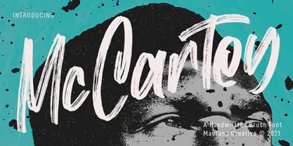 Mc Cartey is a Fancy Handwritten Brush Display font. With raw brush stroke, slanted and fun character with a ligatures. To give you an extra creative work. Mc Cartey font support multilingual more than 100+ language. This font is good for logo design, Social media, Movie Titles, Books Titles, a short text even a long text letter and good for your secondary text font with sans or serif. Make a stunning work with Mc Cartey font. Cheers, MaulanaCreative
 - Argonautica by URW Type Foundry,
$39.99 Argonautica is based on a relict of the future that was left on earth by time-travelling extra-terrestrials. In 1947, an UFO crashed in the New Mexico desert. There were unknown glyphs found on the spaceship which couldn�t be deciphered to date. Based on one of the unknown glyphs, Gabriele Lindemann developed a complete alphabet readable for human beings. Argonautica is particularly suited for colored typography and can be read much better with growing distance.
 - JAF Herb by Just Another Foundry,
$59.00 Herb is based on 16th century cursive broken scripts and printing types. Originally designed by Tim Ahrens in the MA Typeface Design course at the University of Reading, it was further refined and extended in 2010. The idea for Herb was to develop a typeface that has the positive properties of blackletter but does not evoke the same negative connotations – a type that has the complex, humane character of fraktur without looking conservative, aggressive or intolerant.
 - Fattalsfort by Maulana Creative,
$13.00 Fattalsfort is a Handwritten Brush font. With Bold raw brush stroke, slant and fun character with a bit of ligature and swashes. To give you an extra creative work. Fattalsfort font support multilingual more than 100+ language. This font is good for logo design, Social media, Movie Titles, Books Titles, a short text even a long text letter and good for your secondary text font with sans or serif. Make a stunning work with Fattalsfort font. Cheers, MaulanaCreative
 - Brignell Sunday by IB TYPE Inc.,
$40.00 BRIGNELL SUNDAY is an eight font family designed by Ian Brignell. A relaxed, easy-reading companion for any day of the week. A clean, modern, friendly sans serif characterized by an open style with occasionally rounded corners, occasional curved junctures on diagonals and a slightly sloped lower case A. Brignell Sunday was born in 2006 and was inspired by corporate custom font ideas Ian designed for an LG Electronics sub-brand called Best Shop. Extended Latin set.
 - TE HAFS2 Tharwat Emara by Tharwat Emara,
$39.00 Introducing "Te Hafs tharwat Emara" - An Exquisite Arabic Font for the Holy Quran Unveil the beauty and elegance of Arabic calligraphy with "Te Hafs tharwat Emara," a meticulously crafted font designed specifically for typing the Holy Quran. This magnificent typeface pays homage to the rich cultural heritage of Arabic script while embracing modern design elements, resulting in a captivating blend of tradition and innovation. With its unique and enchanting aesthetic, "Te Hafs tharwat Emara" captures the essence of Islamic art and typography, making it an ideal choice for any project related to the Holy Quran. Whether you're designing Quranic verses, Islamic manuscripts, or educational materials, this font will elevate your work to new heights and leave a lasting impression on your audience. The essence of "Te Hafs tharwat Emara" lies in its harmonious balance of form and function. Every letter has been meticulously crafted to ensure legibility and clarity, even at smaller sizes. The thoughtful spacing and meticulous attention to detail make this font a delight to read, enhancing the overall reading experience of the Holy Quran. One of the standout features of "Te Hafs tharwat Emara" is its ornate and intricate calligraphic strokes. Each character is a masterpiece in itself, reflecting the skill and expertise of traditional Arabic calligraphers. The fluidity of the strokes and the subtle curves create a sense of rhythm and grace, evoking a sense of reverence and spirituality. The versatility of "Te Hafs tharwat Emara" allows it to adapt effortlessly to various design contexts. Whether you're working on printed materials, digital platforms, or even signage, this font will maintain its beauty and legibility, ensuring your message is conveyed with utmost clarity and impact. To further enhance its usability, "Te Hafs tharwat Emara" includes a comprehensive set of Arabic ligatures, diacritical marks, and punctuation, enabling you to accurately represent the intricacies of the Arabic language. These thoughtful additions ensure that your typography remains authentic and faithful to the traditions of Arabic script. When it comes to font selection, readability is of utmost importance. "Te Hafs tharwat Emara" has been meticulously optimized for digital and print environments, ensuring exceptional legibility in both mediums. Each character has been carefully tested and refined to guarantee optimal reading comfort, making this font an excellent choice for long passages of text. Moreover, "Te Hafs tharwat Emara" supports a wide range of OpenType features, granting you creative control over your typography. From alternate character forms to contextual alternates, swashes, and ligatures, this font offers a plethora of options to customize and elevate your design. With such flexibility at your fingertips, your creativity knows no bounds. Beyond its technical prowess, "Te Hafs tharwat Emara" is a font with a story. It symbolizes a rich cultural heritage, embodying the devotion and reverence associated with the Holy Quran. Its elegant curves and intricate details evoke a sense of spirituality, making it a perfect choice for projects aimed at preserving and celebrating Islamic traditions. In conclusion, "Te Hafs tharwat Emara" is more than just a font; it is a celebration of Arabic calligraphy, Islamic art, and the beauty of the Holy Quran. With its exquisite design, unparalleled legibility, and versatile application, this font is an invaluable asset for any project related to Islamic typography. Embrace the artistry of "Te Hafs tharwat Emara" and elevate your designs to new heights of beauty and elegance.
 - TE HAFS1 Tharwat Emara1 by Tharwat Emara,
$39.00 Introducing "Te Hafs1 tharwat Emara1" - An Exquisite Arabic Font for the Holy Quran Unveil the beauty and elegance of Arabic calligraphy with "Te Hafs1 tharwat Emara1," a meticulously crafted font designed specifically for typing the Holy Quran. This magnificent typeface pays homage to the rich cultural heritage of Arabic script while embracing modern design elements, resulting in a captivating blend of tradition and innovation. With its unique and enchanting aesthetic, "Te Hafs1 tharwat Emara1" captures the essence of Islamic art and typography, making it an ideal choice for any project related to the Holy Quran. Whether you're designing Quranic verses, Islamic manuscripts, or educational materials, this font will elevate your work to new heights and leave a lasting impression on your audience. The essence of "Te Hafs1 tharwat Emara1" lies in its harmonious balance of form and function. Every letter has been meticulously crafted to ensure legibility and clarity, even at smaller sizes. The thoughtful spacing and meticulous attention to detail make this font a delight to read, enhancing the overall reading experience of the Holy Quran. One of the standout features of "Te Hafs1 tharwat Emara1" is its ornate and intricate calligraphic strokes. Each character is a masterpiece in itself, reflecting the skill and expertise of traditional Arabic calligraphers. The fluidity of the strokes and the subtle curves create a sense of rhythm and grace, evoking a sense of reverence and spirituality. The versatility of "Te Hafs1 tharwat Emara1" allows it to adapt effortlessly to various design contexts. Whether you're working on printed materials, digital platforms, or even signage, this font will maintain its beauty and legibility, ensuring your message is conveyed with utmost clarity and impact. To further enhance its usability, "Te Hafs1 tharwat Emara1" includes a comprehensive set of Arabic ligatures, diacritical marks, and punctuation, enabling you to accurately represent the intricacies of the Arabic language. These thoughtful additions ensure that your typography remains authentic and faithful to the traditions of Arabic script. When it comes to font selection, readability is of utmost importance. "Te Hafs1 tharwat Emara1" has been meticulously optimized for digital and print environments, ensuring exceptional legibility in both mediums. Each character has been carefully tested and refined to guarantee optimal reading comfort, making this font an excellent choice for long passages of text. Moreover, "Te Hafs1 tharwat Emara1" supports a wide range of OpenType features, granting you creative control over your typography. From alternate character forms to contextual alternates, swashes, and ligatures, this font offers a plethora of options to customize and elevate your design. With such flexibility at your fingertips, your creativity knows no bounds. Beyond its technical prowess, "Te Hafs1 tharwat Emara1" is a font with a story. It symbolizes a rich cultural heritage, embodying the devotion and reverence associated with the Holy Quran. Its elegant curves and intricate details evoke a sense of spirituality, making it a perfect choice for projects aimed at preserving and celebrating Islamic traditions. In conclusion, "Te Hafs1 tharwat Emara1" is more than just a font; it is a celebration of Arabic calligraphy, Islamic art, and the beauty of the Holy Quran. With its exquisite design, unparalleled legibility, and versatile application, this font is an invaluable asset for any project related to Islamic typography. Embrace the artistry of "Te Hafs1 tharwat Emara1" and elevate your designs to new heights of beauty and elegance.
 - Ah, FellFel, the font! If fonts were characters at a grand dinner party, FellFel would be that intriguing guest who captures attention the moment they step through the door. You might not find FellFe...
- Mollisa by Aqeela Studio,
$15.00 Mollisa felt equally charming and graceful. Looks great on wedding invitations, thank you cards, quotes, greeting cards, logos, branding, business cards, and any other design that requires a handwritten touch. This font is PUA encoded which means you can access all glyphs and swashes with ease! To activate the Stylistic OpenType alternative, you need a program that supports OpenType features such as Adobe Illustrator CS, Adobe Indesign & CorelDraw X6-X7, Microsoft Word 2010 or later. and there is an additional way to swash, using the Character Map (Windows), Nexus Fonts (Windows), Font Book (Mac) or a software program like PopChar (for Windows and Mac). https://www.youtube.com/watch?v=XzwjMkbB-wQ Thank you for your purchase!
 - Mesquite by Adobe,
$29.00Mesquite is a narrow Tuscan-style typeface designed at Adobe in 1990. Like older Tuscans from the 19th Century, Mesquite has elaborate, creative serif treatments-although the serifs are so unique that it is difficult to call them serifs anymore, they are more like pointy finials. A convex-concave-convex ornamental feature appears on the middle of each vertical and diagonal stroke. Together with the serifs" at the tops and bottoms of each stroke, this feature creates a "tri-band" pattern over text set in Mesquite. Mesquite is not a text face. Aside from its narrowness and decorative qualities, Mesquite has no lowercase. The font's uppercase glyphs have been directly copied and placed in the lowercase range." - Koorkin by Monotype,
$29.99 “I originally drew the primary characters with a felt tip marker, scanned them and then proceeded to noodle on the computer,” says George Ryan of his new typeface, Koorkin. “Over the years, I’ve designed many original typefaces, but Koorkin has become one of my favorites. I’ve worked on hundreds of highly structured text faces. For the most part, the roots of all of them can be found in the handwritten letterforms we learn as children. I enjoy going back to these shapes whenever the opportunity presents itself. ”The happy result of Ryan‘s felt tip marker sketches and his love of simple letterforms is a new family of upright and italic scripts in medium and bold weights.
 - Seconda XtraSoft by Durotype,
$49.00 Seconda XtraSoft is the extra soft companion of Seconda and Seconda Soft. Friendlier, easier on the eye, more informal, more fashionable — but still the refined and reliable Seconda. Seconda XtraSoft’s extra softness comes from the moderate rounding of both the edges and the inner corners of its characters. Seconda XtraSoft has sixteen styles, extensive language support, eight different kinds of figures, sophisticated OpenType features — so it’s ready for advanced typographic projects. For text and display use. When using Seconda XtraSoft in small text sizes, it will be a reliable and legible text face. When using it in big display sizes, it will show its interesting details. For more information about Seconda XtraSoft, download the PDF Specimen Manual.
 - Grande Jatte by The Ampersand Forest,
$35.00 Grande Jatte is a display face with a distinctly horticultural bent. Based on classic Engravers types, its wide proportions and leafy appurtenances make it a great choice for anything that requires an ornate, elegant take on the natural world, from floral shops to herbalists to garden party invitations! Grande Jatte's standard form is an elaborate, open, Leafy design with lots of decorative features for large display use, plus a more functional, Solid design for more legible, ancillary text! Grande Jatte's features include elaborate initial capitals (under the Swash Caps feature), initial and final letterforms in the capitals, a second, more elaborate set of capitals (SS01 feature), and true small caps. Part of The Ampersand Forest's Sondheim Series.
 - Ranelte Deco by insigne,
$5.00 With the original Ranelte, Insigne Design pays tribute to the strong, simple forms of the long-lasting DIN series. Now, Ranelte Deco, a new variant on the classic-inspired font, makes a more specific statement with some unique styles that are clearly contemporary. It’s the type of face that you’ll find adds great value to your high-tech and bleeding edge design uses. Ranelte Deco is designed for title use and posters. Since it’s an experimental display font, there are no OpenType features, but the typeface fully covers Latin-based languages. Remember, even a timeless classic can be reshaped to something beautiful. See how the new style of Ranelte Deco can make your next masterpiece.
 - Aventine by Lunas Type,
$19.00 Introducing, Aventine! A captivating script font that seamlessly blends the allure of handcrafted artistry with a casual and inviting style. This signature font embraces the essence of a natural and cozy ambiance, radiating warmth in every character. Aventine's handmade design showcases the intricate details and delicate imperfections that add a touch of authenticity to your projects. Its flowing curves and graceful strokes evoke a sense of intimacy and personal connection. Whether used in a logo, branding materials, or any creative endeavor, Aventine effortlessly exudes a natural charisma that captures attention and creates a lasting impression. Let Aventine be the embodiment of your unique vision, infusing your designs with an inviting and heartfelt charm.
 - Pumpkinseed by Three Islands Press,
$19.00 The tale of Pumpkinseed began with a bit of hand-printing I noticed on the dinner menu at a local restaurant. I took a menu home for future reference. Several months later, some similar hand-lettering on another dinner menu caught my eye. I became a sort of connoisseur of hand-done menu lettering. After tweaking and adjusting a few of these menu-inspired (uppercase) characters, I placed them -- along with some other designs -- in an online Type in Progress survey. They won. So I finished the caps, drew out the lower case from scratch, created three weights and oblique styles. The result: Pumpkinseed, a full-featured casual hand-lettering face. Comes in Light, Medium, and Heavy.
 - YR Gothic Arabic by Alrefaiy,
$90.00 YR Gothic Arabic font draws inspiration from the Gothic calligraphic style, renowned for its timeless elegance. This style is characterized by a harmonious balance of thick and thin strokes, with a focus on vertical lines. The result is a graceful, fluid letterform, with consistent attention to detail throughout. YR Gothic Arabic font is a sophisticated choice that conveys a sense of refinement and sophistication. With its classic and timeless design, this font is well-suited for various formal applications, such as branding, invitations, and official documents. Its versatility also allows it to be used in a range of other contexts, including advertising and signage, where its sense of elegance and refinement can elevate any design project.
 - Transcribed JNL by Jeff Levine,
$29.00 The term "transcribed" takes on many definitions. In sheet music (the source of this type face design) it means to set down onto paper. In the formative days of radio, and until the advent of the tape recorder, radio stations depended on 16 inch wide recordable discs known as transcriptions. These discs were generally aluminum base with a soft lacquer coating that was cut with a heated stylus. This was the only way a program could be recorded and preserved for later broadcast or copied for syndication. Transcribed JNL is a hand lettered sans in the chamfer style of block lettering, based on vintage sheet music displaying the name and address for Zenith Music Publications.
 - Applbitz by Joey Maul,
$10.00 Applbitz is a set of three pixel style fonts which include a matching set of food related pix fonts. The regular style is a text font, which is optimal at 14 points when used in flash. Applbitz Pix Base and Pix Top are corresponding food related glyphs, with the top providing a bit of detail. These "friendly" pix characters can also be used in flash using some TLC (and snap to pixel grid). They are fun to add your own color combinations, and are great for a variety of food icons. View the PDF file in the gallery for color suggestions. Special note: to dress the hamburger use "{" and "½" (left brace and one-half) from Pix Top.
 - Straight Line by K-Type,
$20.00 Straight Line is essentially an outline Modern, but drawn without any curves whatsoever. Thin horizontals and thick verticals provide the classic look of a Didone, updated and enhanced by clean, minimalist geometry. In addition to the Straight Line font itself, the package includes Straight Line Solid with matching spacing and kerning. The Solid font can be used solo, or layered with the outline font to provide a colour background. Straight Line is an excellent display face for contemporary, eye-catching headings and sub-headings, and the fonts contain a full complement of Latin Extended-A characters. The typeface was inspired by a 1930s experimental alphabet by the British artist, Percy J Smith.
 - Taylor Johnson by Keristyper Studio,
$14.00 Introducing Taylor Johnson Display Font is a handmade font style dance and then traces of life to have a Grungy brush and unique calligraphic shape, the writing style is very natural and simple. This font is good for logo design, Social media, Movie Titles, Books Titles, short text even long text letters, and good for your secondary text font with sans or serif. Featured: Standard Uppercase & Lowercase Numeral & Punctuation Multilingual : ä ö ü Ä Ö Ü ß ¿ ¡ Alternate & Ligature PUA encoded We recommend programs that support the OpenType feature and the Glyphs panel such as Adobe applications or Corel Draw. so you can use all the variations of the glyphs. Hope you enjoy our fonts!
 - Lucid Fantasy by Hipfonts,
$17.00 Lucid Fantasy is an elegant and sophisticated script font that will transport your designs to a dreamlike world. With its flowing, fluid strokes and graceful curves, this font captures the beauty of calligraphy and handwriting in a digital format. Its unique style and attention to detail make it perfect for wedding invitations, greeting cards, and other high-end design projects. Lucid Fantasy's intricate and delicate design will add a touch of luxury and refinement to any project. Whether you're a designer, artist, or creative professional, Lucid Fantasy is the perfect font to elevate your work to new heights. Experience the magic of Lucid Fantasy today and create designs that are truly unforgettable.
 - Savage Sword by Comicraft,
$29.00 Mother of Mitra, Crom’s Devils and other Savage WORDS! The only thing better than one dead Pict is TWO! Or THREE! Or FOUR! And what better than this SAVAGE font to sound the sword strokes of a BARBARIAN BORN?! Hack! Slice! Cut your fiendish foes into pieces with Comicraft’s SAVAGE SWORD and tell your SAVAGE TALES to all and sundry and even those you’ve sundered! BE AWARE! Handle with care and keep some neosporin or other antibacterial cream at hand -- being Savage and filled with Berserker Rage may result in unintended wounds to yourself and your kinsmen. Savage Sword features two sets of automatically alternating uppercase characters, plus support for Western & Central Europe and Vietnamese.
 - Madang by Aiquitype,
$15.00 Introducing Madang Font is a sophisticated fusion of classic elegance and modern flair. With its meticulously crafted letterforms, it exudes a timeless charm that effortlessly captivates the eye. The balance between its refined strokes and contemporary elements encapsulates a sense of versatility, making it a perfect choice for a wide range of creative projects. Whether used in headlines or body text, Madang Font's graceful presence lends an air of distinction and refinement to any design, establishing itself as an essential asset for discerning typographers and designers alike. What’s Include ? 1. Uppercase, Lowercase, Number and Punctutation 2. Ligature and Alternates 3. Multilingual Support 4. Installed on Mac and Windows 5. PUA Encode Enjoy our Font.
 - Country Western Swing by FontMesa,
$30.00Country Western is a revival of the classic William Page font known as Clarendon Ornamented originally designed in 1859 and again in 1877 by Vanderburgh & Wells. This version combines the best of both versions and adds something new. New to this font are the lowercase, italic, swash and script versions plus Greek and Cyrillic character sets. Keeping with the original theme from 1859 Fill fonts are available for the Ornamented and Open faced versions of this font. Greek, Cyrillic, Central and Eastern European characters sets are supported in the Windows TrueType and OpenType formats. The Windows and Mac PostScript Type1 versions of this font, however, do not support Greek, Cyrillic, Central and Eastern European characters sets. - Gyst by phospho,
$30.00 Gyst is a neo-humanist sans-serif typeface that artfully blends the principles of Grotesque and Antiqua. With its classic uprights and the serifs in its true italics, Gyst spans the arc from a modern humanistic sans serif to a captivating calligraphic serif. Contrasting strokes and luscious, on the other hand razor-edged terminals reflect a sense of grace, thriving at the intersection of geometric precision and flourishing sophistication. Made for body text as well a s display use. In any situation, you will find the autonomous cursive posture to be a perfect playmate for the upright. Gyst comes in four upright and italic weights, all equipped with a whole lot Alternates and Ligatures.
 - ITC Drycut by ITC,
$29.99ITC Drycut is the work of Vancouver-based designer Serge Pichii and gives a twist to the tradition of heavy, woodcut-like typefaces. The font includes all the realistic features of a true woodcut, sharp edges, white cut marks and black slivers. The slivers around the edges suggest traces left after awkward movements of a knife, which are often visible on old woodcuts...Folk artists often didn't care much about refining their carvings and the slivers would have been left as long as the letters remained readable." The lower case alphabet is actually small caps proportioned to match the capitals. The letters of ITC Drycut have a slight slant to the right which lends the font a dynamic character." - Top Billing JNL by Jeff Levine,
$29.00Sometimes the simplest ideas yield more than one result. The basic “dot matrix” design of aligned circles that was the basis for Transactive JNL also yielded Zera JNL (connected rings) and Pillow Puff JNL (fluffy and cloud-like lettering). One more design was originally cast aside. A separate file is available for filling in the letters with a colored background, however minute adjustments may be needed due to the fact that each drawing or design software program has its own characteristics and quirks. NOTE: DO NOT purchase the fill font as a “stand alone” type face because of the difference in spacing and alignment. For the dot matrix look in your work, please purchase Transactive JNL. - TradaSerif by Hoftype,
$49.00 TradaSerif is a new addition to the Trada family. Crisp and clear in appearance, it preserves the same formal spirit and the principal structural elements of TradaSans. TradaSerif offers a wide range of styles, from tenderly thin to thundering black. It also affords excellent text qualities and works brilliantly as a distinctive headline face. TradaSerif consists of 20 well-tuned weights and is well-equipped for advanced typography. It comes in OpenType format with extended support for up to 80 languages. All weights contain small caps, ligatures, superior characters, proportional lining figures, tabular lining figures, proportional old style figures, lining old style figures, matching currency symbols, fraction- and scientific numerals, matching arrows, and alternate characters.
 - Gill Sans by Monotype,
$45.99The successful Gill Sans® was designed by the English artist and type designer Eric Gill and issued by Monotype in 1928 to 1930. The roots of Gill Sans can be traced to the typeface that Gill's teacher, Edward Johnston, designed for the signage of the London Underground Railway in 1918. Gill´s alphabet is more classical in proportion and contains what have become known as his signature flared capital R and eyeglass lowercase g. Gill Sans is a humanist sans serif with some geometric touches in its structures. It also has a distinctly British feel. Legible and modern though sometimes cheerfully idiosyncratic, the lighter weights work for text, and the bolder weights make for compelling display typography. - Handel Gothic by URW Type Foundry,
$35.00 The Handel Gothic? typeface has been a mainstay of graphic communication for over 40 years - all the while looking as current as tomorrow. Designed by Don Handel in the mid-1960s, and used in the 1973 United Airlines logo developed by Saul Bass, Handel Gothic was an instant success when released to the graphic design community. Its generous lowercase x-height, full-bodied counters and square proportions make the design highly readable at a wide range of sizes. Handel Gothic's slightly idiosyncratic character shapes gave the face a futuristic look 40 years ago that retains its power today. In addition, its Uncial-like lowercase is instantly identifiable - and unique among sans serif typestyles.
 - Allotropic by The Flying Type,
$24.00 Allotropic is a pretty decorative face with a remarkable art nouveau flair. It loosely draws inspiration from a 1914 untitled alphabet by J.M. Bergling, a then "Modern Alphabet", and from its interpretation by Photo-Lettering, from the sixties. Allotropic comes in two styles, regular and bold, both with extended language coverage, as well as stylistic alternates and a couple of ornaments. It's decidedly a fab choice not only for vintage and retro designs (ça va sans dire!), but also for creative contemporary uses in print and on screen. Play it on book covers, packaging, branding, editorial, web, advertising, apparel, uses are endless. Just give Allotropic a go, let the inspiration flow, and keep on creating!
 - Electro by Thinkdust,
$10.00 Electro’s neon light inspiration gives it an interesting way to draw letters. Every part of this font could be part of a circuit board, with no lines doubling over or tracing the same path. The font stands out by occasionally taking shortcuts, such as in the E and S characters, which make up for many characters having to choose a longer route. Altogether, this constant state of quick then slow creates an unpredictability as of a surge of electricity or lightning bolt. Electro supports a number of languages with glyphs that keep up the electronic theme, and is perfect for party culture or futuristic science fiction. Like electric, this is the perfect font for shocking your audience.
 - Reimbrandt by IKIIKOWRK,
$19.00 Proudly Present Reimbrandt - Art Nouveau Type, created by ikiiko. Reimbrandt is a classic typeface that is a perfect representation of the timelessness and romance of the past, inspired by the beautiful Art Nouveau era. This alluring typeface transports you back to a time when elegance and grace were the norm. This font exudes beauty and romance with its simple, decorative shapes reminiscent of the painstaking craftsmanship of the Art Nouveau era. This typeface is perfect for an vintage vibes, classic & vintage poster layout, fashion look book, book cover, packaging, food & beverages and also good for quotes, or simply as a stylish text overlay to any background image. What's included? Uppercase & Lowercase Number & Punctuation Multilingual Support Works on PC & Mac