9,924 search results
(0.019 seconds)
- Magllin by Flawlessandco,
$9.00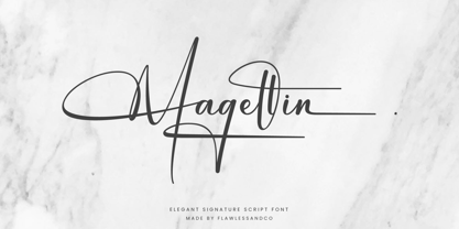 Introducing "Magllin" - An Elegant Signature Script Font. Unlock the allure of elegance and sophistication with "Magllin," an exquisite signature script font that adds a touch of grace and style to your designs. There's some connected letters and some alternates that suitable for any graphic designs such as branding materials, t-shirt, print, business cards, logo, poster, t-shirt, photography, quotes .etc This font support for some multilingual. Also contains uppercase A-Z and lowercase a-z, alternate character, numbers 0-9, and some punctuation. If you need help, just write me! Thanks so much for checking out my shop!
 - Adios Script Pro by Sudtipos,
$99.00 Romantic, decorative Adios Script is one of Alejandro Paul’s most elaborate and technically refined faces to date. Inspired by designs in “how-to” commercial lettering guides of the 1940s, it has been refined and brought into the 21st century through a huge variety of ornate swash letterforms. The lowercase “h” alone offers 43 variants. Hundreds of ornamental ascenders and descenders allow a beautiful interplay of strokes and combinations, while avoiding overlaps or conflicts. Adios Script features a mind-boggling 1,470 characters in total, in OpenType format. Adios Script received a Certificate of Excellence from the Type Directors Club.
 - Monotype Clearface Gothic by Monotype,
$29.99Clearface Gothic first appeared in 1910, designed by Morris Fuller Benton, the world-famously prolific typeface artist. In addition to Clearface Gothic, Benton also designed classics like Franklin Gothic, Century Expanded, and many other types. Clearface Gothic is a sans serif face with light forms displaying the Zeitgeist of the turn of the 20th century. Distinguishing characteristics are the open forms of the a" and "c," the arched "k," and the upward-tilting horizontal stroke of the "e." The relatively narrow typeface, with its open inner white spaces, is extremely legible even in small point sizes. There is no accompanying italic." - Petras Script EF by Elsner+Flake,
$35.00 Petras Script, the first digital script font created by the calligrapher Petra Beiße, has, for many years, met with worldwide success. Now the font is complemented with an alternate character set, which gives designers more flexibility and adds a personal touch to the font. Petra Beiße has resided for a long time in Wiesbaden, Germany, where she is working as a renowned calligrapher. It is rare that any of her scripts are transferred into digital format and sold worldwide as fonts. Because Petras Script became such a huge success, she decided to release Casanova Script Pro.
 - Pen Swan by Great Lakes Lettering,
$40.00 Pen Swan is the latest offering from Jen Maton & Great Lakes Lettering. A Pen Swan is the species of an adult female swan. It is a fitting name as it contains ‘pen’ in the name which is the tool used to draw the letters. Pen swan demonstrates the same grace as the most elegant type of bird in the animal kingdom. It has a rolling gliding quality, as if the letters are waves forming spontaneously from your computer screen. Pen Swan is optimal for any project that needs an elegant touch. Great for Wedding Invites, Stationery, and Decorative prints.
 - Berber by Letterbox,
$50.00 Initially inspired by an untitled typeface from an old hand-lettering book, Berber has been extensively developed over two incarnations to function as a very strong and confident sans. The 2011 Berber revisions have enabled Berber to be used across longer settings as well as its more conventional use on larger applications such as signage. Berber was used as the text face for issue 46 of Eye, the graphic design journal. The typeface now features both king caps and small caps. Extensive additions to the numerals sets and complete opentype sets of international diacritics also extend its usage.
 - Stencil Box JNL by Jeff Levine,
$29.00 The lettering for Stencil Box JNL was found on the packaging of a children's toy stencil set circa the 1940s. Popular for years, Pencil Stencils were a series of "connect the line" stencils where a series of dashed lines were traced from the cutouts and the lines connected to complete pictures of animals or other subjects. Although the packaging itself was often updated to reflect the current times during the life of the product, it was this hand-lettered example of stencil-meets-Art Deco from the 40s that proved worthy of saving as a digital typeface.
 - Monotype Bodoni by Monotype,
$40.99 Bodoni expresses the beginning of the Industrial Revolution; its serifs are flat, think and unbracketed, while the stress is always on the mathematically vertical strokes. Bodoni believed in plenty of white space and therefore descenders are long. The M is rather narrow; in the Q the tail at first descends vertically and the R has a curled tail. The italic, like most continental modern faces, has roman serifs. Monotype Bodoni provides a clear-cut effect due to its simplicity. It reproduces well, particularly in sizes over 12pt. This font is slightly darker than Bauer Bodoni. The contrast makes Monotype Bodoni appear more condensed.
 - Ritz Slab Serif JNL by Jeff Levine,
$29.00 Ritz Slab Serif JNL is a bold display face which shares a lot of similar design traits to Stymie and other similar metal type of the 1930s and 1940s, but in actuality was modeled from only four letters. On the sheet music for the 1937 song "Sweet Varsity Sue" [from the 20th Century Fox Film "Life Begins in College"], there is a picture of the Ritz Brothers - a popular comedy team from 1925 through the late 1960s. The hand lettered name "Ritz" became the basis for Ritz Slab Serif JNL, which is available in both regular and oblique versions.
 - P22 Cusp by IHOF,
$24.95 This typeface was originally inspired by Art Deco lettering. During the development of the letterforms a strick DeStijl grid was imposed. The lowercase letterforms were created with the influences of rave/techno design styles. The result is a distinctly contemporary display font. The P22 Cusp Family contains 4 fonts: P22 Cusp Round, P22 Cusp Round Slant, P22 Cusp Square, P22 Cusp Square Slant. This font was designed as a display font and may be a bit taxing on the eye at smaller point sizes. The P22 Cusp family is licensed exclusively to P22 type foundry/International House of Fonts.
 - Femi SRF by Stella Roberts Fonts,
$25.00 People often come into your life and make a significant impression that lasts a lifetime. Be they friend, family member or relationship partner, such people are rare and endearing. Sadly, we lose many of these individuals before their time. Femi SRF is dedicated to one such person who was in Stella's life and whose memory will live on long past the duration of his mortal existence. Like Femi himself, this typeface offers a touch of bold elegance and discipline. The net profits from my font sales help defer medical expenses for my siblings, who both suffer with Cystic Fibrosis and diabetes. Thank you.
 - Stella Ann by Jukebox Collection,
$32.99 Stella Ann is another great addition to the script fonts of the Jukebox collection. Named after the designer's maternal grandmother, Stella Ann is a beautiful flowing calligraphic style font. It is both bold and strong, yet warm and graceful, just like its namesake. Perfect for wedding invitations, business cards, scrapbooking and much more! Jukebox fonts are available in OpenType format and downloadable packages contain both .otf and .ttf versions of the font. They are compatible on both Mac and Windows. All fonts contain basic OpenType features as well as support for Latin-based and most Eastern European languages.
 - Mramor Pro by Storm Type Foundry,
$52.00 The Mramor family first appeared in the Stormtype catalogue in 1994. The first sketch arose in 1988 through the narrowing of Roman capitals. It has uniform width proportions and, above all, original lower-case letters, unprecedented with Roman Capitals. The text designs are discontinued since they were replaced by the related Amor Serif family (along with its -sans version). Now, Mramor has “only” 10 designs that each include true small caps, Cyrillics and a rich variety of figures, ligatures and alternates. Mramor excels in corporate identity or bottle-label design, also whenever there is a need for a “classic” looking face.
 - EquipCondensed by Hoftype,
$49.00 EquipCondensed is the matching complement for Equip and EquipExtended . With its 16 fonts it extends the Equip family to 48 styles. It not only works superbly as a contrasting face for the ‘normal’ Equip but due to its moderate width, it also performs brilliantly as a space saving typeface. EquipCondensed is very well suited for ambitious typography. The EquipCondensed family comes in OpenType format with extended language support. All weights contain semi-ligatures (design optimized single characters), proportional lining figures, tabular lining figures, proportional old style figures, lining old style figures, matching currency symbols, fraction- and scientific numerals and arrows.
 - ITC Grimshaw Hand by ITC,
$29.99 ITC Grimshaw Hand is based on the handwriting of its British designer, Phill Grimshaw. Warm and lively, this typeface has the look of spontaneous handwriting with a little extra panache. Note the jaunty k, the swooping f, the simply stylish s, and the absolutely zingy cap Q and R. Grimshaw designed this face in 1995, at a time when he was also playing the guitar and mandolin. Handwriting fonts give an air of intimacy to the graphic design of advertising pieces, packaging, invitations, greeting cards - and ITC Grimshaw Hand has the touch of sweet music in its enthusiastic strokes.
 - Galberta by IbraCreative,
$17.00 Galberta, a cutting-edge futuristic font, embodies the essence of tomorrow’s typography with its sleek and innovative design. Its geometric, sans-serif characters seamlessly blend bold, crisp lines and subtle curves, exuding a sense of modernity and minimalism. The font’s minimalist aesthetic is complemented by its distinct fusion of sharp angles and graceful arches, creating a visually captivating harmony. Galberta offers a dynamic and versatile typeface that can effortlessly elevate the aesthetics of any design, from sci-fi movie posters to forward-thinking digital interfaces, making it the embodiment of typographic innovation in the digital age.
 - Lark by Shana Hu,
$20.00 Lark is a modern calligraphic sans inspired by a rich history of broad-edge and translation contrast calligraphy. By combining its sharp geometry with flared curves, Lark exhibits a nice warmth as a display face. Lark was initially conceived as a final project as part of the Type@Cooper West Extended Program's post-graduate certificate program in typeface design, so its journey has benefitted from routine feedback from experienced typeface designers. Comes in Bold, Medium, Regular, and Light weights for both roman and italic, and supports multiple languages including Danish, Dutch, English, French, German, Italian, Portuguese, Spanish, Swedish, and more.
 - Admire Gustavo by Balpirick,
$15.00 Admire Gustavo is a Handbrushed Font. Our handwritten font takes inspiration from the fluidity and uniqueness of human handwriting, ensuring that each letter carries a sense of character and charm. With its graceful curves and delicate strokes, this font adds an intimate and personal feel to your written words. Perfect for creating notes, memos, journal entries, or beautiful quote designs, our handwritten font elevates your messages with a sense of authenticity and warmth. It transforms your ordinary words into a beautiful composition, breathing life into your writing. - also multilingual support Enjoy the font! Feel free to comment or feedback! Thank you!
 - Fendgy by Aiquitype,
$10.00 Introducing "Fendgy - Classy Display Serif Font". Fendgy-Classy Display Serif Font is an elegant and refined typeface that exudes a timeless sophistication. With its meticulously crafted letterforms, this font embodies a perfect balance between classic charm and contemporary design. Its graceful strokes and distinctive serifs make it an ideal choice for luxurious branding, editorial design, and upscale packaging, imparting a sense of refined exclusivity to any project. What's Included? 1. PUA Encode 2. Uppercase, Lowercase, Numerals and Punctuation 3. Ligature Collection 4. Stylistic Alternate 5. Installed on Mac and Windows 6. Language Support : Western Europe 7. Multilingual Support Enjoy Our Font!
 - LTC Jenson by Lanston Type Co.,
$24.95 Jenson Oldstyle was designed by J. W. Phinney of the Dickinson Type Foundry in 1893. Jenson is based on the 'Golden Type' designed by William Morris in 1890 for his private press editions under the imprint of the Kelmscott Press. The original digital Lanston version of this face included a companion Oblique. This remastered set instead features a true italic based on the 1893 ATF italic version as well as a newly digitized Jenson Heavyface based on Phinney's design of 1899. Jenson Italic Pro features alternate lowercase forms based on ATFs then contemporary Cushing Oldstyle Italic.
 - P22 Pooper Black Pro by IHOF,
$39.95 Pooper Black Pro is based on a brush ethic and has an extreme axis that lends a certain amount of speed to the font while the lack of connectors slows it down. The pro version expands on the original and popular Pooper Black with the addition of full Central and Eastern European character sets and plenty of alternate characters for those who have applications that support Opentype features. Almost all of the lower case characters now include an in stroke and out stroke version for greater design flexibility. A wonderful face for packaging, titling, and short bursts of text.
 - Habano ST by Sudtipos,
$39.00 Habano is an eleganty flowing bold script with some very surprising traits. Taking its roots in both the art deco style and the kind of lettering used for pop culture, its minuscules are classy yet obedient, and its majuscules and figures are playfully round and memorable. This contrast in character between cases makes for an appealing display face that can turn simple words into images that are hard to forget. Once again, the unique lettering talent of Angel Koziupa makes itself evident through an alphabet that leaves the memory of its soft touch for long after it is initially perceived.
 - Carslay by Letteralle,
$19.00 Introducing, Carslay. - a captivating font meticulously crafted with a brush pen, bringing forth the essence of clean and natural strokes. Embrace the organic flow of each character, evoking a sense of authenticity and artistic flair. With its charming underline swashes, effortlessly accessed by simply typing "_1" to "_7", Carslay, adds a touch of elegance and sophistication to your designs. Whether you're crafting invitations, quotes, or logos, this font promises to infuse your creations with a seamless blend of grace and originality. Unleash your creativity with Carslay and watch your projects come to life with an enchanting finesse! . Enjoy Designing! Thanks! Letteralle Studios
 - Rattani by Allmo Studio,
$22.00 Rattani the graceful nature of the typeface, along with carefully designed details, allows to use it in large point sizes, for example in magazine layouts, packaging design and in many other ways. Rattani was unapologetically conceived as a display typeface meant to be used large as in magazine openings, drop caps or everywhere there’s a need for elegant impact. Rattani is perfect choice for people looking for clean, modern, minimalist, elegant, beauty design styles. Suitable for almost any graphic designs such as logo, business cards, t-shirt, cover, branding materials, poster, print, photography, thumbnail, gift cards.etc
 - Fling by ITC,
$29.00 Michael Gills, formerly a resident designer at Letraset, created the Fling typeface in 1995. Fling's letterforms are based on the Ronde --or round--script style from France. The design includes intricate and generous capital letters, which are contrasted with a more reserved lowercase letters. This allows for a sophisticated and elegant appearance in text. Fling's letterforms are highly legible for those of a script face, and it is a typeface with many uses. Aside from short amounts of running text, Fling's capital letters serve well as initials. In the Opentype font are extra ligatures and alternative letterforms thatoffer expanded typesetting possibilities.
 - ZionTrain Pro by AndrijType,
$39.00 Originally ZionTrain was built as a (probably first in Cyrillic!) navigation typeface for the Kharkiv identity project and Kharkiv subway and airport navigation systems. We wanted comprehensible, distinctive letterforms, that can help everybody on the way from Babylon to Zion. The project was used in Kharkiv promotion at homeland and abroad, but was rejected by the new government. As a corporate typeface it was used for a few cultural projects. Now it is equipped with Slavic Cyrillic and Monotonic Greek and has special Stencil faces especially for low-budget navigations (don't forget to get your own Stencil Medium for free!).
 - Viable Logic by Twinletter,
$12.00 Viable Logic font, has a neat and clean character new face sans serif fonts, in response to the need for innovative and new designs, for that this sans serif font family has different characters namely bold, thin and regular. This font is simple yet neat and elegant, the design of this typeface gives it a clean, modern look and a unique style to help give it a captivating look when you use it. This font is perfect for strong text with displays for a wide variety of branding, advertising, posters, banners, packaging, news headlines, magazines, websites, logo design, and more.
 - Drumbeat by EdyType,
$60.00 DRUMBEAT, a brand new face from Edy Type, coming to help resolve the necessities of loose scripts in Packaging and Editorial Design. Its' very particular thicks and thins and ups and down, makes it very suitable whenever informalities is required. Used with tiny little characters, enlarged to mammoth sizes or filling a large page with it, would show it’s perfect balance and color, almost as if where hand writen. In fact, a truly different script, a graphologist would declare that is written by a person very sure of what he wants, and besides and best of all, it’s pretty.
 - Neue Augenblick by Harmnessless Type,
$40.00 Neue Augenblick is a modern contemporary Germany-esque grotesk. This Font face carries a powerful mechanical and industrial feel, it is inspired by aesthetic personality of beautiful Panzerkampfwagen and Post-war Brutalist Architectural. There are ten weights, ranging from Thin to Black, each with oblique italics and plenty of alternates. Neue Augenblick comes with attention-grabbing ink traps make it feels more contemporary. Various opentype features from stylistic alternates, multilingual extended latin support, ligatures, discretionary ligatures, fractions, arrows, scientific numerals, catchwords set, icons and more. Neue Augenblick is suited for embrace both maximalism or minimalism design works for designers to play with.
 - Willow by Adobe,
$29.00Willow is an Adobe Originals typeface designed in 1990 by Joy Redick for the Adobe Wood Type series. Willow is a condensed typeface modeled on nineteenth-century wood types known as Clarendons (wood type Clarendons do not resemble the English metal types of that name). Clarendon condensed faces were originally so well-designed that words or a line of display type have an even color that is remarkable for wood types. Taken from proofs of type in the Rob Roy Kelly Collection housed at the University of Texas at Austin, Willow can be used for display work such packaging, advertising, and posters. - Narin by Ahmet Altun,
$19.00 Narin Font Family is a geometric sans design with rounded corners which seems much softer and eye-pleasing even though it still has geometric and straight borders. The family comes in six weights with regular and italic forms. Narin Font Family is legible from very small size to very large ones. It is suitable for letterpress and also long texts. With the small caps, all fonts can be used to create great and gorgeous works like logos, texts, presentations, t-shirts etc. and can be used to create the pressworks such as posters, magazines and books. The word "Narin" means "graceful" in Turkish.
 - Montix by Linotype,
$49.00Montix is a narrow, constructed type family that developed by the German designer Diana Fischer in 2003. With five weights (light, light italic, regular, regular italic, and bold), Montix is a particularly effective small family, especially when used for headline or display purposes. Montix's letterforms have relatively long ascenders and descenders, which compared with its horizontally compact body gives it its unique style. Words or lines of text set in Montix would look best when some amount of white space is left around them. Because of this, the faces are well suited for logos and corporate identity uses. - White Wolf by Match & Kerosene,
$25.00 Set it large... I dare you! 100pt+ is definitely encouraged with this face. White Wolf was created to fill the void for condensed sharp wedge serif fonts. Taking inspiration from other hybrid fonts such as FF Dog, FF Vortex and HI Halfway House, I wanted to create a font that would offer something different for artists looking for a condensed font that has a lot of character. Use it for titles, subtitles, logos, posters, signs and pair it with some heavy wood types or slab serifs and you will be pleased with the attitude White Wolf will bring to your project!
 - Melts Script by Estudio Calderon,
$20.00 Melts Script from Estudio Calderón is a typeface based on Harlow Solid SB from Colin Brignall. It is made by round traces, with a simple design and a slightly “chubby” look. We wanted to propose a new version that works as an alternative of Harlow Solid, with connectors at the same heightand a complementary Font “Melts Sanscript” with sans serif capitals to be combined with lowercase scripts. Specimen Supporting 219 latin based languages, which are spoken in 212 countries. Psssss....It includes alternatives, swashes, ligatures and a version called Glint Glint, especially designed for those who want to highlight their works.
 - Creative Wonder by Balpirick,
$15.00 Creative Wonder is a Modern Handwritten Font. Our handwritten font takes inspiration from the fluidity and uniqueness of human handwriting, ensuring that each letter carries a sense of character and charm. With its graceful curves and delicate strokes, this font adds an intimate and personal feel to your written words. Perfect for creating notes, memos, journal entries, or beautiful quote designs, our handwritten font elevates your messages with a sense of authenticity and warmth. It transforms your ordinary words into a beautiful composition, breathing life into your writing. - also multilingual support Enjoy the font! Feel free to comment or feedback! Thank you!
 - Queen Michelly by Zamjump,
$17.00 Introducing "Queen Michelly" - a Serif font family that's "two-faced" with modern and vintage. If you're using Vintage Retro : Access your OpenType features to access a large selection of alternative fonts and ligatures, pick the font you like from a wide variety of variations to get the vintage look you're looking for. Vary between a light and heavy vintage look based on the number of letters you change. Due to its dual personality, Queen Michelly is a very versatile font, covering a wide variety of projects, from bold magazine images, to wedding invitations, to branding, poster design, and more. Inclouded : - Multilanguage
 - Challwa by Flawlessandco,
$9.00 Introducing "Challwa" - an exquisite and elegant handwritten font that adds a touch of sophistication and refinement to your designs. With its graceful letterforms and refined strokes, Challwa embodies timeless beauty and effortless elegance. There's some connected letters and some alternates that suitable for any graphic designs such as branding materials, t-shirt, print, business cards, logo, poster, t-shirt, photography, quotes .etc This font support for some multilingual. Also contains uppercase A-Z and lowercase a-z, alternate character, numbers 0-9, and some punctuation. If you need help, just write me! Thanks so much for checking out my shop!
 - Janice by Canada Type,
$24.95 Janice is a revival and expansion of a 1960s Mecanorma film type called Putty Bold. It’s thick, flowing, happy and oozes psychedelia. Unlike many art nouveau/hippy faces of the era, this font comes with a lowercase that expands its functionality to quite a few applications, like design aimed at kids and young adults. It’s also one of those fonts that feel right at home being warped, scaled and manually squeezed for packaging and poster design. Janice comes with over 400 glyphs. It contains a few stylistic alternates and support for the majority of Latin languages.
 - Gutknecht by Proportional Lime,
$9.99 Jobst Gutknecht was a highly successful printer in the city of Nuremburg from 1514 to 1542. He published the "Achtliederbuch" (the first Lutheran hymnal, with a whole 4 tunes) and many works by Martin Luther. This font is an accurate "recutting" of the font face Gutknecht used for the body text in his printed works. It has been extended to over 900 glyphs adding hundreds for modern use. It also presents many ancient things like old ligatures such as "tz", a hedera, and alternate style pilcrow for visual interest. And for those conservative types the modern lower case "k" is also available.
 - Bookkeeper JNL by Jeff Levine,
$29.00 Bookkeeper JNL is based on the lighter weight version of R. Hunter Middleton's 'Karnak', produced in 1936 for Ludlow. "Karnak" itself was based on the geometric slab-serif "Memphis", designed in 1929 by Dr. Rudolf Wolf and released originally by the Stempel Type Foundry of Germany. According to Wikipedia, "Karnak" "was named after the Karnak Temple Complex in Egypt, in reference to the fact that early slab serifs were often called "Egyptians" as an exoticism by nineteenth-century type founders." Available in both regular and oblique versions, Bookkeeper JNL serves well as both a headline and text type face.