8,672 search results
(0.029 seconds)
- Xants by Adobe,
$29.00In 1932, Xanti Schawinsky (1904?1979) designed an alphabet that combines two styles: a neo-classic stroke contrast paired with characteristics of stencil lettering. This mix is a child of its time and seems to reflect the Swiss and Italian biography of Schawinski. Luca Pellegrini took on the modern look and re-drew the letterforms, interrupted by subtle spaces where thick and thin strokes meet. Although Schawinsky had already designed a complete alphabet and figures in the early 1930s, Pellegrini took the character set to another level, adding currency signs, mathematical symbols and all kinds of punctuation ? anything needed to set more than just headlines. Xants is a blend of Swiss elegance and exclusiveness with Italian charm and imperfection, a combination that never gets old. - 1495 Bastarde Lyon by GLC,
$38.00 Font designed from this who was used by an unknown printer in Lyon (France) to print the “Conte de Griseldis ” (Griseldis' tale), from Petrarque, inspired by Boccace, in 1495. The original font has a relatively small number of special characters and ligature, for the time. This font includes “long s”, naturally, as typicaly medieval but numerous letters - as accented ones - were added for this version. A render sheet, enclosed with the file, helps to identify them on keyboard. It is used variously in web-site titles, posters and fliers design, editing ancient texts or greeting cards as a very decorative and fine font... This font works at a small size like 9, remaining clear and easy to read on screen, but always better when printed.
 - Mondo News by Untype,
$30.00 Mondo News is a typeface designed to fulfill digital and paper publication editorial needs, its cared equilibrium between slightly condensed proportions and generous «x» height, offers optimum performance without compromising legibility. The modulation of thick and thin strokes in the middle weights is balanced for extensive text reading, while on the heavy weights becomes more dramatic making them ideal for strong headlines. Equipped with 760+ glyphs, support for more than 200 languages, smallcaps, alternates, ligatures, dingbats and plenty of OpenType features, Mondo News modern interpretation of tradition performs excellent both on screen and on paper, satisfy the most demanding editorial needs and will nourish your pages with a convincing and reliable atmosphere. Mondo News is part of the Untype Mondo family typographic system.
 - Nyfors by Linotype,
$29.99Nyfors was a sudden idea. I noticed an ad in a magazine, with some handtexted words. I don't recall what the ad was about, neither the words. When I later on tried to remember how the single characters looked like and began to draw them, the result wasn't bad at all. I am not longer sure that they resemble the characters in the ad, but it doesn't matter. Nyfors is a nice handtexted typeface, whatever its origin. There is a small stream in Tyresö where I live and work, called Nyfors. During some centuries there was a center of small scale industries along it, and they used its water to run their machinery. The typeface has its name from that stream. Nyfors was released in 1995. - Rustle Fighter by IbraCreative,
$37.00 Rustle Fighter - A Handbrush Gaming Typeface. Rustle Fighter is a dynamic and gaming handbrush typeface that packs a punch with its bold and commanding presence. Inspired by the untamed brushstrokes of a skilled artist, Rustle Fighter captures the raw energy and strength of handwritten text. Each letter carries an impressive weight, with its rough edges and uneven lines creating a sense of intensity and ruggedness. Whether used for headlines, logos, or bold designs, Rustle Fighter makes a powerful statement, demanding attention and leaving a lasting impression. With its versatile nature, this typeface effortlessly adds a touch of rebellion and authenticity to any project, making it a go-to choice for designers looking to inject a fierce and artistic flair into their creations.
 - Artifex CF by Connary Fagen,
$35.00 Designed for easy reading of long passages, Artifex CF's smoothed-off serifs help the flow of text without unnecessary visual noise. Artifex's even rhythm and mellow tone make it an excellent option for books, magazines, articles, blogs, captions, and longform texts. A near-upright italic adds emphasis and urgency with elegance. Artifex also doubles as a handsome display typeface, scaling gracefully with charming details revealing themselves at large sizes. Artifex CF pairs nicely with bold, clean sans-serifs, such as Greycliff CF and Visby CF. Artifex also has a sibling typeface, Artifex Hand CF, cut from the same cloth, but with subtle flares in place of the serifs. All typefaces from Connary Fagen include free updates, including new features, and free technical support.
 - Breve Text by DSType,
$50.00 Breve was designed for use in editorial projects. Simple but with enough personality to stand by is own, in a quest for a more forceful and contemporary appearance. All the fonts in Breve superfamily, share the same exact structure, both in terms of anatomy and functionality. The Text versions provide a softer and warm feel to the typographic palette and is intended for use in much longer passages of text, while the Title versions are distinguished by non-descending letterforms, making the titles and headlines much more uniform and interesting. The News version is more classic, with ball terminals and classic proportions, while the Display is, somehow, the set of fonts we had to design: extra-black, ultra-contrasted, proud-display fonts.
 - Stainger by Din Studio,
$25.00 The art of accumulation. Thoughtfully crafted to meet the needs of all users, Stainger unfold new ways of expressing and enhance your design. A font family that portrays simple, serene yet modern style. Stainger comes with 16 different weight, covering light, heavy, italic, and other stylings. It is simple, easy to read, and works equally as well in header and body text. Features: Multilingual Supports Numerals and Punctuations PUA Encoded It is perfectly used for branding, logos, social media quotes, stickers, posters, vintage designs, wall art, merchandise, social media, and many more. Get more inspiration by seeing the preview. Thank you for purchasing premium fonts from Din Studio. If you have any further questions, don't hesitate to contact us. Happy Designing.
 - Harjita by Mantra Naga Studio,
$20.00 Harjita is a Retro Groovy Font inspired by the retro pop style of the 80s-90s by combining a thick serif style and rounded corners so it looks friendly and easy to read. This font is perfect for brand identity needs or other graphic media. This font is also PUA encoded, which means you can easily access all glyphs and opentype features easily. 376 Glyphs 4 Opentype features 9 Ligatures set Support Multilingual for 89 languages We highly recommend using a program that supports the OpenType feature and the Glyphs pane like many Adobe and Corel Draw applications, so that you can view and access all variations of Glyphs. Thanks for your support of our product and using it in your project.
 - Rose Town by Maculinc,
$17.00 Rose Town is a thick typeface with unique angles and is easy to read so that it is comfortable to wear. This font is made with old nuances that are suitable for vintage / retro themed events. You can also use it as logos, badges, badges, packaging, titles, posters, t-shirts / clothing, greeting cards, business cards, and wedding invitations and more. Flowing characters are ideal for making interesting messages to your taste. Mix and match with many alternative characters to fit your project. It would be more interesting if you add Extruded Fonts and alternatives. Alternative characters in this font are divided into several OpenType features such as Stylistic Alternate, Ligature and Ligature Alternate. Mail support: maculinc@gmail.com Thank you! Maculinc
 - Dining Car JNL by Jeff Levine,
$29.00 A 1929 German travel poster espoused the benefits of using a sleeping car with the caption “Wer Schlafwagen reist spart Zeit und Geld” (which translates to “Whoever travels in a sleeping car saves time and money”). Pictured on the poster is a passing train with the name "Mitropa" lettered on the side of a railway car in a bold, stylized font with thin slab serifs. "Mitropa" was an acronym of “Mitteleuropa” (German for Central Europe), and was used by a catering company than ran the sleeping and dining cars of numerous German railways for a good portion of the 20th Century. The lettering was modified and redrawn as Dining Car JNL, which is available in both regular and oblique versions.
 - Kalix by Linotype,
$29.99I have a notation that the summer of 1994, when I worked with Kalix, was a warm one. I had no special typeface in mind when drawing the characters of Kalix, but many typefaces contributed to it, e.g. my own Omnibus from which I borrowed the looks of the smal case g. I think it is a lovely typeface whose use is mainly for books and magazines. Kalix is the name of a northern Swedish town situated along a river called Kalixälven. Its name is of sami origin, *káles, meaning cold. There comes the connection to the warm summer of 1994! But even the Latin word for chalice, calix, has something to do with my choice of name. Kalix was released in 1994. - Breve Sans Text by DSType,
$50.00 Breve was designed for use in editorial projects. Simple but with enough personality to stand by is own, in a quest for a more forceful and contemporary appearance. All the fonts in Breve superfamily, share the same exact structure, both in terms of anatomy and functionality. The Text versions provide a softer and warm feel to the typographic palette and is intended for use in much longer passages of text, while the Title versions are distinguished by non-descending letterforms, making the titles and headlines much more uniform and interesting. The News version is more classic, with ball terminals and classic proportions, while the Display is, somehow, the set of fonts we had to design: extra-black, ultra-contrasted, proud-display fonts.
 - Breve Slab Text by DSType,
$50.00 Breve was designed for use in editorial projects. Simple but with enough personality to stand by is own, in a quest for a more forceful and contemporary appearance. All the fonts in Breve superfamily, share the same exact structure, both in terms of anatomy and functionality. The Text versions provide a softer and warm feel to the typographic palette and is intended for use in much longer passages of text, while the Title versions are distinguished by non-descending letterforms, making the titles and headlines much more uniform and interesting. The News version is more classic, with ball terminals and classic proportions, while the Display is, somehow, the set of fonts we had to design: extra-black, ultra-contrasted, proud-display fonts.
 - Trebuchet MS by Microsoft Corporation,
$49.00Trebuchet™ Family, designed by Vincent Connare in 1996, is a humanist sans serif designed for easy screen readability. Trebuchet Family takes its inspiration from the sans serifs of the 1930s which had large x heights and round features intended to promote readability on signs. The typeface name is credited to a puzzle heard at Microsoft, where the question was asked, 'could you build a Trebuchet (a form of medieval catapult) to launch a person from the main campus to the consumer campus, and how™' The Trebuchet fonts are intended to be the vehicle that fires your messages across the Internet. 'Launch your message with a Trebuchet page'. Character Set: Latin-1, WGL Pan-European (Eastern Europe, Cyrillic, Greek and Turkish). - Rhino by Canada Type,
$24.95This is Canada Type's second Helmut Matheis revival. Rhino is what Matheis did under the name Mobil for the Ludwig & Mayer foundry in 1960. It's an informal text face with some attractive irregularities relating to the traits of handwriting. The influence of the human hand can be clearly seen in letters like the A, J, Q, R, T and pretty much all of the lowercase. Though obviously inspired by and tooled after the human touch, Rhino's functionality extends to even a page or two of text setting. Aside from its functionality, Rhino gives short paragraphs what the classic immersive-reading fonts are not built for: immediate friendliness and natural humility. A few alternates and ligatures are included within the font. - Tyneside by Trequartista Studio,
$25.00 created in 2023, Tyneside is corporate and not too eccentric, but still has a strong character that makes it a the perfect starting point for the new Tyneside text font family. Clarity is very important when displaying a lot of information on the screen. The ranking table is full of names and times and while the display typeface should stand out, the text pieces should be eye-catching and very legitimate. We sharpened the corners, made some shapes easier to read and more modular, clean and sporty overall. We are very satisfied that Tyneside managed to capture the “spirit of sporting enthusiasm” in the personality of the typeface. We hope to create a growing family of typefaces in the future and maintain our partnership
 - Sanity by Popkern,
$- The design of Sanity typeface is modernized by abandoning any characteristics associated with hand writing, such as curved lines or elaborate corner details. The design is based on a rigid geometric grid and radiates confidence with its daring contrasts and provocative style. In large amounts of text the font “Sanity” can be hard to read due to a «dazzle» effect caused by alternating thick and thin strokes, particularly as the thin strokes are hardly visible at small point si es. Due to this quality, the “Sanity” font-family is best suitable for titles or large print advertisements. There are five key stylistic principles taken as a main framework for the creation of the “Sanity”: symmetry, contrast, geometry, artificiality and monospacing.
 - Tati by Wiescher Design,
$33.33I only had this bouncy curve and a photograph of a daily menu (Truite Meunière) I took outside an obscure Paris restaurant when starting the design of this font. But while working on it I suddenly started thinking about Jacques Tati the famous but almost forgotten french director of Les Vacances de Monsieur Hulot, Jour des Fêtes, Mon Oncle, Playtime, Trafic etc. I thought about his bouncy walk and his hilarious ideas. The memories never left me while working on the font, so I decided to name the font after this great French moviemaker who gave me so many happy hours. Since Tati was a very funny character, I gave my characters a funny price. Thank you Jacques Tati, yours Gert Wiescher - Carina Elegant by suhadidesign,
$19.00 Carina elegant classy font Hi ladies and gentlemen! Due to the popularity of the market for modern fonts, I created a serif font that suits your needs. The Carina elegant font is a modern classy elegant serif font. is here to become a market favorite. We made this font look elegant, classy, modern, new style, easy to read, stylish, attractive and easy to use. Carina elegant Font is the right choice for magazine designs, newspapers, fashion, classy designs, beauty, feminine, brand names, branding and other projects. The Carina elegant font is here to enhance the quality of your designs. Follow us for the next classy font creation :) Feature: • Uppercase • Lowercase • Multilingual Support • Numbers and punctuation • Alternatives • Stylistic sets • Ligatures What's included: Carina elegant (OpenType)
 - 1776 Independence by GLC,
$38.00 1776 Independence was designed inspired mainly from the Caslon typeface used by John Dunlap in the night of 1776 July 4th in Philadelphia to print the first 200 sheets of the Congress' Declaration of Independence establishing the United States of America. I just added accented letters and a few others, with respect for the original design. A render sheet,enclosed with font file, help to identify them on keyboard. It can be used as web-site titles, posters and fliers, editing ancient texts, menus or greeting cards as a very decorative font... This font supports as easily enlargement or small size, remaining clear and easy to read from 8 or 9 points to 72 and over. It gives a smart look especially to prints.
 - Brume by Creativemedialab,
$16.00 Brume font is a bold, attractive and beautiful font. "Easy to read, modern and elegant look but stylist", this will be the first words that your client says to your design using this font. Comes with uppercase and lowercase. It has many alternates character with nice curve that you can arrange to create a nice logo lettering, or use it as a display face on a poster and add a few alterations to it to make a beautiful eye catching words. Brume font is best for logo lettering, headlines, product packaging, t-shirt design, wedding theme, poster, book cover, wedding invitation, Christmas and more To access alternate: In Adobe Photoshop go to Window - glyphs In Adobe Illustrator go to Type - glyphs
 - Marlowe by FaceType,
$30.00 If you are looking for a unique typeface with a light and pure elegance, Marlowe will be your choice. Marlowe is the rat pack of fonts: Regular is perfect for headlines and subtitles, while the expressive Escapade, Swirl and Cocktail styles are charming display fonts. All four provide an extended set of capitals, small caps and lower case characters. Please take a close look at the elegant alternate letters for A, E, K, M, N, O, Q, R, W and g – there are even three kinds of ampersands to choose from. Altogether Marlowe offers amazing 25 alternates and 74 discretionary ligatures, while Marlowe Swirl has additional 26 automated ligatures. Make sure you use applications supporting all these lavish OpenType features.
 - Praktika by Fenotype,
$25.00 Praktika Modern grotesk super family Praktika is a multifunctional super family of 40 fonts. It consists of three distinct widths and weights from extra light to extra bold. Conceptually, it is a rendition of the familiar early 20th century European grotesque styles, used in road signage – reimagined to meet the needs of contemporary world. Its design language, however, has been kept decidedly rough and bulky, to achieve a unique-yet-familiar look and feel. Praktika comes with more than a few features, accessible in any open type savvy program. • Built-in small capitals • Both lining and old style numerals, in tabular or proportional form • Superscript and subscript numerals • Many alternate characters For the best experience, purchase the whole family which is available for a good bargain price.
 - Alcuin by Linotype,
$29.99Gudrun Zapf von Hesse designed the first sketches of Alcuin in 1986. The namesake of this typeface was an advisor of Charlemagne and was responsible for the writing reform of the Carolingian era. Alcuin was born in 735 in England, became an abbot in Tours and died there in 804. It was the idea of Zapf von Hesse to develop a modern text type based on the forms of the Carolingian minuscule. To create a text type that is excellent for a wide variety of applications, typical handwritten elements had to be discarded while still retaining the flow and character of handwriting. Alcuin with its strong calligraphic expression may be used in books, magazines, and also in the area of printed office communication. - Kelson by Armasen,
$- The Kelson font family is a Armasen project completed for a graphic design agency in Brazil. The agency had a typeface, but the kerning, spacing, and related features were corrupted or otherwise not working very well. The Armasen team improved the qualities, refined the shapes, and enhanced the font features. Armasen is a group of hard-working, young Brazilian students and type designers focused on creating and developing professional quality typefaces with a distinctive and unique personality. The team is very pleased with the final result and is happy to share the efforts of their work as a FREE FONT for you to enjoy! [edited by John Alexander (jga30328 at gmail dot com) a very appreciative user and admirer of the Armasen team]
 - Appleton by Decade Typefoundry,
$35.00 Back to 1880-1900 when a number of events were coming together, the country was evolving from a local market economy to mass merchandising, rail systems were being built and color lithography was becoming more affordable. The first rail cars full of oranges were being shipped from Southern California to the East - what a treat during a cold winter’s day. Labels were pasted on every fruit crate and these labels had large images of oranges and orange groves. With technological advances in soldered cans, canneries popped up all over the country. In order to market their products many California Canneries pooled their resources to form the California Fruit Canners Assn. in 1899. This font was inspired from that era. Loaded with alternates, swashes, stylistic and multilingual support.
 - AG Bambook by Alexandr Galuzin,
$26.00 AG Bambook- compressed geometric sans serif with the closed forms. Contains 4 fonts. 2 regular and 2 italic. The font is universal and can be used in different directions of graphic design. Internet, printed materials, clothing, logos, posters, labels, navigation and more. Thanks to character compression, you can place a large amount of information in a compressed space. It will read equally well in large and small sizes. A small difference in the width of the glyphs for different styles allows you to change the saturation while maintaining the size of the text block. OpenType: alternate numbers, old-style numbers, arrows, case sensitive forms, superscript and subscript, numerators and denominators. Support: Cyrillic, Cyrillic extended, Latin, Latin Extended (Western European, Central European, South-East), Kazakh.
 - Helina by Balevgraph Studio,
$12.00 The Helina font pack comes with 9 versions, there are 6 elegant handwritten font styles, 2 sans serif fonts and ornaments. You can use and combine as you like according to your project type. There are open type features such as alternate styles, swash and ligatures. We designed this font to look elegant, classy, easy to read, stylish, attractive and easy to use. Helina Font is a great choice for the design of signature logos, quotes, album covers, business cards and many other design projects. This font is PUA encoded which means you can access all of the glyphs with ease! What's Included? 9 OTF font files Uppercase & Lowercase Numbers & Punctuation Ligature, Swashes & Alternate Ornaments Multilingual Support Regular & Italic PUA Encoded
 - Boxed Pro by Tipo Pèpel,
$98.00 Boxed, the best seller of the Tipo Pèpel foundry has been expanded with variable font technology to multiply its creative possibilities, from now on and with a single file, it is possible to control its appearance thanks to three axes with which to modify the weight, the rounding and the the width of the characters. Offering more options to customize the appearance of the text and personalize the headlines. Boxed typography is brightly conceived and designed to look good on small screen devices, but offering also enlightened looks on paper. The semi-modular geometric font shapes seek to be fully responsive to the grid of screen«s pixels to deliver a crisp, fluid reading rate. It offers an extensive set of Latin characters, even the Cyrillic.
 - Alfarn by Adobe,
$29.00Alfarn is based on capital letters that Bauhaus student Alfred Arndt (1898?1976) drew for a poster in 1923, designed to advertise a bakery in Jena, Thuringia. The poster is an example for what we call today ?Bauhaus features?: yellow circle, red square, black bars and an indication of geometric lettering that became so popular in the following years. C�line Hurka carefully analysed Arndt?s lettering and derived two weights in different widths: wide and condensed. She took on the characteristic bars and transformed them into an underlined weight of its own. Hurka also drew perfectly balanced small caps, which make up for a missing lower case. Alfarn captures the spirit of 1920s Bauhaus-influenced posters ? a timeless style quite suitable for contemporary designs. - Faithfull by Black Studio,
$15.00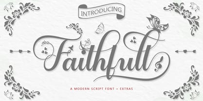 Faithfull is a very easy-to-read Script typeface, getting a touch of bold, classic, and fun Vintage Script fonts, featuring glyphs and opentypes in alternative styles. Can be used for various purposes. such as posters, t-shirts, signboards, logos, news, badges etc. To activate the OpenType Stylistic alternative, you need a program that supports OpenType features such as Adobe Illustrator CS, Adobe Indesign & CorelDraw X6-X7, Microsoft Word 2010 or a later version. Faithfull is coded with PUA Unicode, which allows full access to all additional characters without having any special design software. Mac users can use Font Book, and Windows users can use Character Map to view and copy any additional characters for pasting into your favorite text editor / application.
 - ITC Luna by ITC,
$40.99 ITC Luna is the work of Japanese designer Akira Kobayashi. He turned to the designs of the 1930s for his inspiration for both ITC Luna and ITC Silvermoon. Luna is designed to fill the gap between a pure Art Deco display face and an ordinary text face," says Kobayashi. "It has an Art Deco style but is still fairly easy to read. It can be used in short passages of text. As for individual characters, I especially liked the distinctive O, shaded only on one side. Lowercase a and g are also unusual, but they are somehow legible enough in text matter." And for a finishing touch on his Luna, Kobayashi added the charming moon face as an extra character.
 - Ezekiel by MYSTERIAN,
$9.00 Ezekiel Script is the font become flesh—mythic gesture imposed upon forms of mechanical medium. Typography has changed the internet; our phasing mimetic desires tend toward posture rather than rationale, and the face is a concept that explores that concept. Obviously some reading of McLuhan has infliunced this concept of analysis. The script has ample diacritic extensions, as well as an alternative for the ampersand (characteristic of MYSTERIAN type) and the eszette: an upper and lower case. The upper and lower case alphabets are diverse in that the majuscules do not have linking strokes while the miniscules do. This was the first script that I've made, and great attentiveness was taken to ensure that links were set accurately, and spacing harmonious throughout.
 - Martin Crantz by Proportional Lime,
$9.99 Martin Crantz (or sometimes Krantz) of the three, including Ulrich Gering and Michael Friburger, that set up a press at the Sorbonne in 1470 was likely the fellow who had the technical know how how to cast the type itself, hence the name of this new face that is based on his work. This font has been expanded to meet the demands of modern day use but it also contains a number of specialized glyphs that allow for the recreation of text in the manner of his day with such characters as the -rum abbreviation and other handy Renaissance oddities. Since this face was designed prior to 1501 there is no italic variant in keeping with the spirit of historical accuracy.
 - Royal Glamour by Fikryal,
$22.00 Royal Glamor is a modern serif font with a luxurious and elegant feel. With its thin, bold serif lines, this font can convey a professional and profound impression, while still looking friendly and inviting. The “Royal Glamor” font has a clean, regular Typeform, with symmetrical and proportionate parts. This makes them easy to read and suitable for use with a variety of media types, such as brochures, magazines and logo designs. With the right color, this font can provide a strong contrast effect, giving a design an exclusive and luxurious impression. Perfect for projects that require a serious feel, but are still modern and elegant. Features: Multilingual Support If you have any questions please don’t hesitate to contact me follow my Instagram: @fkryall Thank you
 - Arquitecta by Latinotype,
$26.00 Arquitecta. The humanist typography as a rational project. Since the experimentation from the Bauhaus through modern sans history we looked for a new mix to construct a rational geometric typeface with humanist proportions suitable for text layout and continuous reading. Inspired by American & European hand lettering from the first half of the past century, Arquitecta finds his own space as a great alternative for paragraphs in front of classics like Futura, Kabel or Avant Garde. The family contains 8 upright romans and 8 italics with the following features: - European accents, Old Style Numbers, Numerators & Fractions. - Ink traps to avoid press impressing spots & hinting optimized. - Small X-height with accentuated ascenders y descenders. Upgrade Mar 2023: Contours were corrected and the set was extended to the current Latinotype.
 - Hadigen by Bungletter,
$12.00 Hadigen is a very Beautiful, elegant and unique handwritten font. Expertly designed to be a true favourite, this font has the potential to take your creative ideas to the highest level! This font is PUA encoded which means you can access all the glyphs and sweeps easily! Hadigen is attractive because it is sleek, clean, feminine, sensual, glamorous, simple and very easy to read, thanks to its many luxurious letter connections. I also offer a decent number of style alternatives for all letters. Classic style is very suitable to be applied in various formal forms such as invitations, labels, restaurant menus, logos, fashion, make up, stationery, novels, magazines, books, greeting/wedding cards, packaging, labels or all kinds of advertisements. for your purposes. . . . . . . Thanks & Congratulations on the Design.
 - NewLibris by Hubert Jocham Type,
$39.00 The first version of Libris I designed in London in 1997 when I worked for Frank Magazine. Later Libris was used in the magazine for text and display. In 1999 Libris was chosen as the corporate typeface of Bally Switzerland. I also was involved in the design of the entire branding. NewLibris is the version that was published in my own shop. - What was the inspiration for designing the font? NewLibris is an elegant contemporary easy to read sans serif. It has a wide variety of weights and proportions that are easy to use in corporate branding and magazines. - What are its main characteristics and features? contemporary humanist legible sans serif - Usage recommendations: corporate branding and magazines and other publications
 - Tokyo Taiyaki by Hanoded,
$16.00 In May of this year, I went to Japan with my (then 11 year old) son Sam. It was his dream to visit Japan, probably because of my tall tales, stemming from the time I was a tour guide! Sam really wanted to try all kinds of Japanese delicacies and one day, when walking around Tokyo, we came across a little stall selling Taiyaki. Taiyaki are fish-shaped waffle/cakes with a red bean or sweet potato filling. They are really delicious! This nice ‘oriental looking’ font was made with a broken popsicle stick and Chinese ink. You are now wondering why I always use Chinese ink and not Japanese ink. Well, I have a stash of the Chinese stuff and it’ll last me a lifetime!