10,000 search results
(0.043 seconds)
- Posey by Graphicfresh,
$8.00 Posey is a vintage display family (All Caps) including Regular (Clean), Textured versions as well as Italic versions of each. It's perfect for logos, name card, magazine layouts, invitations, headers, or even large-scale artwork.
 - SkyClad Gothic BB by Blambot,
$20.00A traditional calligraphy-style gothic font with a twist. The uppercase letters were designed for easier readability than typical gothic text. This gothic font can be used in all caps and still be extremely legible. - Sandria Script by Attract Studio,
$12.00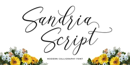 Introducing the latest styles Sandria Script, a sweet calligraphy font, casual and dynamic with a dancing baseline, This font can be used easily and simply, perfect for Branding, Logos, Greeting Cards, Wedding Stationery, Quotes etc.
 - Edmund by Graphicfresh,
$8.00 Edmund is a vintage display family (All Caps) including Textured, Rough & Clean versions as well as Italic versions of each. It's perfect for logos, name card, magazine layouts, invitations, headers, or even large-scale artwork.
 - Speedster by Vozzy,
$10.00 Introducing a vintage label font named Speedster. This strong typeface is perfect for lettering on vintage style posters, t-shirts, greeting cards, logo etc. All available characters and styles you can see at the preview.
 - Mercadillo by Monotype,
$16.99 Mercadillo is a casual script typeface based on the hand painted signs you can see in markets, shops and bars. Comes in 4 different weights (Black, Bold, Regular and Light) and it has OpenType features.
 - Wintery Mix by DP Fonts,
$35.00 Wintery Mix contains a set of small winter and holiday illustrations collected from years of holiday cards I created. A winter scene or greeting can be created with the tap of an 'a' or 'B'.
 - Averta by Intelligent Design,
$15.00 Bringing together features from early European grotesques and American gothics, Kostas Bartokas’ Averta (Greek: ‘αβέρτα’ – to act or speak openly, bluntly or without moderation, without hiding) is a new geometric sans serif family with a simple, yet appealing, personality. The purely geometric rounds, open apertures, and its low contrast strokes manage to express an unmoderated, straightforward tone resulting in a modernist, neutral and friendly typeface. Averta is intended for use in a variety of media. The central styles (Light through Bold) are drawn to perform at text sizes, while the extremes are spaced tighter to form more coherent headlines. The dynamism of the true italics adds a complementary touch to the whole family and provides extra versatility, making Averta an EXCELLENT tool for a range of uses, from signage to branding and editorial design. Take advantage of Averta’s extended OpenType features including alternate glyphs, small caps, fractions, case sensitive forms, contextual alternates, oldstyle and lining (proportional and tabular) numerals, small cap numerals, numerators/denominators, superiors/inferiors, and a variety of symbols. Averta comes in eight weights with matching italics and supports over two hundred languages with an extended Latin, Cyrillic (Russian, Bulgarian, and Serbian/Macedonian alternates), Greek and Vietnamese character set. It ships in three different packages offering different script coverage according to your needs: Averta PE (Pan-European: Latin, Cyrillic, Greek), Averta CY (Latin and Cyrillic), and Averta (Latin and Greek). Averta's Cyrillic have received the 3rd Prize in the 2017 Granshan Awards in the Cyrillic Category.
 - Kontext H by Elster Fonts,
$20.00 Imagine a font that is easier to read the smaller it is – or the further away the text is. There are already many line screen fonts, I wanted to take it to the extreme and use as few lines as possible, while keeping the grid of the fonts metrics. The result is a typeface that lives up to its name. Each individual line makes no sense on its own; individual letters are only recognisable in the context of all associated lines, individual letters are most likely to be recognised in the context of whole words. Attached to a building wall, text would be readable from a great distance and become increasingly difficult to decipher the closer you get to the building. Placed on the ground or on a large flat roof, text would only be readable from an aeroplane or - depending on the size - in Google Earth. Kontext has old style figures, superscript numerals, case-sensitive questiondown and exclamdown and an alternative ampersand, 390 glyphs at all. Use the same value for font size and line spacing to keep the lines in the grid, or change the line spacing in 10% steps. Change the spacing in 100-unit or 25-percent increments increments to keep the grid. The »H« in the font name stands for horizontal (lines). The numbers in the font name refer to the brightness of the background and letters themselves, with the first number describing the background and the second the letters. Starting with »00« (white) to »200« (dark) See also my Family Kontext Dot
 - Kontext V by Elster Fonts,
$20.00 Imagine a font that is easier to read the smaller it is – or the further away the text is. There are already many line screen fonts, I wanted to take it to the extreme and use as few lines as possible, while keeping the grid of the fonts metrics. The result is a typeface that lives up to its name. Each individual line makes no sense on its own; individual letters are only recognisable in the context of all associated lines, individual letters are most likely to be recognised in the context of whole words. Attached to a building wall, text would be readable from a great distance and become increasingly difficult to decipher the closer you get to the building. Placed on the ground or on a large flat roof, text would only be readable from an aeroplane or - depending on the size - in Google Earth. Kontext has old style figures, superscript numerals, case-sensitive questiondown and exclamdown and an alternative ampersand, 390 glyphs at all. Use the same value for font size and line spacing to keep the lines in the grid, or change the line spacing in 10% steps. Change the spacing in 50-unit or 25-percent increments to keep the grid. The »V« in the font name stands for vertical (lines). The numbers in the font name refer to the brightness of the background and letters themselves, with the first number describing the background and the second the letters. Starting with »00« (white) to »200« (dark) See also my family Kontext Dot
 - The Shensie by Soft Creative,
$20.00 Introducing The Shensie. The Shensie Font, is a classic thin font with an italic style. Here you will get beautiful classic fonts. this font is available in several modern swirls that can make your work look elegant, sweet and perfect. With this style, this font would be perfect for logos, branding projects, household designs utensils, product packaging, mugs, quotes, posters, shopping bags, logo, t-shirt, book cover, business card, invitation card, greeting cards, and all your other beautiful projects.
 - TOMO Joseph by TOMO Fonts,
$12.00 Joseph is a slab-serif face designed by TOMO. With a wood type look - letterpress print, this fatty comes in handy when is time to design an informal —yet strong—looking communication piece. Imagine this typeface on a T-shirt, even a mug! Sweet.
 - California Sans by BA Graphics,
$45.00 California Sans designed as a beautiful easy reading text face also works great in Headlines. It also has a matching drawn Italic which makes a great combination for all your needs. Even as a stand alone Italic font it works in so many designs.
 - Woodtype Borders 2 NF by Nick's Fonts,
$10.00 Here’s a workman-like collection of border elements gleaned from the specimen books of various American manufacturers of woodtype from around 1840 to 1885. Refer to the PDF guides for detailed, yet simple, instructions for constructing various border patterns, all with Victorian grace and charm.
 - Imprint by Monotype,
$29.99 In 1912 Gerard Meynell, with J.H. Mason, Ernest Jackson and Edward Johnston, commissioned this large x-height typeface modelled on Caslon’s designs from Pierpont and the Monotype Corporation as the text face for The Imprint, a short-lived magazine about fine printing and typography.
 - Preferred Shares JNL by Jeff Levine,
$29.00 A bold, condensed slab serif face A July 9, 1935 trade paper ad for Paramount Pictures’ 1st quarter film releases sported hand lettering with chamfered slab serifs. This condensed type design is now available as Preferred Shares JNL in both regular and oblique versions.
 - Bistro by Letterhead Studio-YG,
$29.00 Bistro and Hot Sauce have been prepared quickly. In Bistro you will find 10 fine traces from coffee cups, and in HotSauce 10 pleasant-for-eyes stains from sauce. Both fonts are created in the 1998. OpenType revision, with extended Latin characters, made in 2009.
 - Copacabana by Alan Meeks,
$45.00 Copacabana is heavily based on one of my favourite typefaces Goudy Old Style Italic. It is sharper and more clearly defined than Goudy yet still retains it old style characteristics. The face is slightly angled so is basically upright whilst still retaining Italic characteristics.
 - Wolvercote by Greater Albion Typefounders,
$14.50 Wolvercote is one of two new ‘Masthead’ typefaces from Greater Albion. This Victorian inspired face makes the construction of ribbon or cartouche banners and mastheads the simple work of a few moments. Wolvercote is also particularly designed to complement our Wolverhampton and Mexborough families.
 - 9 Months by Tkachev,
$25.00 9 months is a decorative face with two font styles. It would look nice on candy and food package, in children's books and magazines. This work is devoted to the period in my wife's life when she was pregnant during 9 months with our daughter.
 - This Man This Monster by Comicraft,
$19.00 Half Man, Half Monster, Comicraft’s latest variable font hybrid is not only your burly, hard-edged, upfront and blunt buddy, it’s also your rough-hewn, tough and grim, rocky-featured pal! Not just Two-in-One, our latest offering brings together Four Fantastic Faces!
 - Going South by Sakha Design,
$10.00 Going South is a modern and attractive script font! Featuring clean lines and a contemporary feel, each letter is carefully crafted with a bold yet graceful stroke. Perfect for adding a touch of sophistication to any project, from logos and branding to invitations and more.
 - ITC Kick by ITC,
$29.99ITC Kick is the work of California designer Patty King, a bold and energetic brush script. The marked contrast of stroke weight lends the forms dynamism. ITC Kick is a stylish, graceful calligraphy font which will lend headlines a sense of modernity and sophistication. - Grecian by Solotype,
$19.95Our first font of Grecian was so old that it had been cast in a hand mold. Extremely popular face in the nineteenth century, made by many foundries and wood type makers in various widths. Lowercase was added by some foundries in later years. - Bettendorff by Greater Albion Typefounders,
$14.50 Bettendorff is one of two new ‘Masthead’ typefaces from Greater Albion. This 1900’s inspired face makes the construction of ribbon or cartouche banners and mastheads the simple work of a few moments. Bettendorff is also particularly designed to compliment our Spargo and Mexborough families.
 - What A Night JNL by Jeff Levine,
$29.00 The hand lettered title on the cover of the 1934 sheet music for "What A Night" not only acted as a design model for What A Night JNL but also as its namesake. The digital type face is available in both regular and oblique versions.
 - Astoria Sans by Alan Meeks,
$45.00 The Sans serif companion to Astoria. Based heavily on Gill especially in the mid weights and with a consistant series of condensed weights. Designed specifically as a text face it still works very well as a headline font. There are 6 weights with accompanying Italics.
 - Linex Sweet by Monotype,
$29.99Linex Sweet was designed by Albert Boton in the late 1990s. It's a smallish family of three weights; the middle weight has an italic companion face. With its soft corners and slightly quirky head-serifs, Linex Sweet is a friendly design that sees much use. - Woodtype Borders NF by Nick's Fonts,
$10.00 Here's a handy-dandy collection of border elements gleaned from the specimen books of various manufacturers of woodtype from around 1840 to 1885. Refer to the PDF guide for detailed, yet simple, instructions for constructing sixteen different border patterns, all with Victorian grace and charm.
 - Pettiford JNL by Jeff Levine,
$29.00 Within the pages of the Pettingill & Co. (Boston) 1901-02 specimen book is Camelot Old Style – a thin stroke spurred serif typeface with traces of Art Nouveau influence. This had been redrawn digitally as Pettiford JNL, and is available in both regular and oblique versions.
 - Indy Italic by ITC,
$29.00Indy is the work of Chicago-based lettering designer Charles Hughes. The lowercase letters link together to evoke the look of true handwriting and complement a generous and graceful capital alphabet. Indy is a refined handwriting script ideal for anything needing a touch of elegance. - Homage Script by GarageFonts,
$49.00 Graceful, elegant, and at times eccentric, Homage Script was inspired by James Hellmuth’s hand-lettered design for the cover of “Homage to the Alphabet” — a gigantic tome produced in 1980 to provide full-showings of photolettering fonts available for traditional typesetting at Phil’s Photo.
 - Driade by IHOF,
$24.95 Driade is a font family based on personal calligraphic expression. It is exotic but still familiar, readable and graced with a human touch. The “Aged” style features irregularities found in Kothay’s original brush drawings. While the “Lined” pares the letterforms down to their basic forms.
 - French Lettering JNL by Jeff Levine,
$29.00 An example from the vintage lettering book "100 Alphabets Publicitaire" ("100 Advertising Alphabets") provided the inspiration for French Lettering JNL. This stylized Victorian [or Western] type face evokes the era of fanciful lettering design from the late 1800s. Available in both regular and oblique versions.
 - Kallilu NF by Nick's Fonts,
$10.00This extrabold display face takes its design cues from the typeface Thomac, designed by George Piscitelle in the 1960s. Its semiscript styling makes for headlines that get attention. Both versions of the font contain the complete Unicode Latin 1252 and Central European 1250 character sets. - Jackson Park NF by Nick's Fonts,
$10.00Handlettering in an ad from the 1920s for a Chicago engraving company provided the inspiration for this fine, fat, flowing face, full of fun and antique charm. Both versions of this font include the complete Unicode 1252 Latin and Unicode 1250 Central European character sets. - MonsterHand by Resistenza,
$39.00 MonsterHand is our first Ruling Pen made face. This tool is usually used in calligraphy for expressive lettering. Giuseppe Salerno’s hand has been converted into this crazy typeface. This font includes also a set of icons. Check out also Modern Love Slanted Turquoise Nautica
 - Sticky Brash by PizzaDude.dk,
$15.00 Sticky Brash is my laid back kids comic book font - suitable for anything that needs a fresh and quirky attitude, and super legible at the same time. Originally handdrawn, and then manually traced digitally, in order to make those insane clean curves and lines!
 - AMOUR by Cultivated Mind,
$29.00 Amour is a romantic handwritten retro inspired font by Cultivated Mind. This type face includes 4 fonts (basic/thin/ornaments/frames) and four weights. Amour works lovely for stationery, valentine’s day, magazines, weddings, invitations, websites and anytime you would like to express your love.
 - Hot Sauce by Letterhead Studio-YG,
$29.00 Bistro and Hot Sauce have been prepared quickly. In Bistro you will find 10 fine traces from coffee cups, and in HotSauce 10 pleasant-for-eyes stains from sauce. Both fonts are created in the 1998. OpenType revision, with extended Latin characters, made in 2009.