10,000 search results
(0.032 seconds)
- ITC Tickle by ITC,
$29.99When Patricia Lillie was growing up, she thought the coolest thing in the world would be finding her own name listed in a library catalog. The fantasy came true in 1986 when her first children's book was published. Five more followed. The thrill of seeing her work on library shelves hasn't abated, but today, Lillie is just as likely to see one of her typefaces on the cover of a book. She has created several display faces and image fonts. My first typeface designs were based on lettering I'd done while working for a library, doing graphics work for the children's section," she explains. "I currently do a lot of web design, but type is my favorite thing." The Tickles (ITC Tickle and ITC Tickle Too) are Lillie's first ITC typeface releases. "I was playing around with a Sharpie marker one day and liked the way the letters looked," she recalls. "I started redoing the letters from scratch in Fontographer to see what developed, and liked those letters too." ITC Tickle is a bi-form font (with both cap and lowercase letters of the same size) that clearly breaks a typographic rule or two. ITC Tickle Too has the same basic lettershapes, but they've grown clusters of stipples that give a three-dimensional quality to the design. The result is a friendly, offbeat display family that's guaranteed to add a giggle to your work." - ITC Werkstatt by ITC,
$29.99ITC Werkstatt is a result of the combined talents of Alphabet Soup's Paul Crome and Satwinder Sehmi, along with Ilene Strizver and Colin Brignall. It is inspired by the work of Rudolph Koch, the renowned German calligrapher, punchcutter, and type designer of the first third of this century, without being based directly on any of Koch's typefaces. Werkstatt has obvious affinities with the heavy, woodcut look of Koch's popular Neuland, but also with display faces like Wallau and even the light, delicate Koch Antiqua. Brignall began by drawing formal letters with a 55mm cap height, which Sehmi reinterpreted using a pen with a broad-edge nib. “Not an easy process,” says Brignall, “since one of the features of Koch's style is that while it was calligraphic in spirit, most of the time his counter shapes did not bear any resemblance to the external shapes, as they would in normal calligraphy. This meant that Sehmi could not complete a whole character in one go, but had to create the outside and inside shapes separately and then ink in the center of the letters.” The process was repeated, only without entirely filling in the outlines, for the Engraved version. Crome handled the scanning and digitization, maintaining the hand-made feel while creating usable digital outlines. “The collaboration of artisans with particular skills,” says Brignall, “in a modern-day, computer-aided studio environment, seems very much in step with the 'workshop' ethos that Rudolph Koch encouraged and promoted so much.” - ITC Panic by ITC,
$29.99ITC Don't Panic 's distressed shapes and craggy outlines evoke the feeling you get when you're just barely in control of a situation. This is type design on the edge. ITC Panic is further down the emotional track, when you've actually lost control and there is no hope in sight. Thompson says the inspiration for these faces arrived one day in the mail. I received an envelope that looked like it had a rough trip; the type that was stamped on it had a tired, ragged appearance. Ironically, the haggard envelope woke me up. I got excited and wanted to replicate the look as a font of type." Thompson designed ITC Don't Panic, then stood back and looked at it and decided it cried out for a more agitated companion. ITC Don't Panic gave birth to the positively psychotic offspring, ITC Panic. Both are all-cap designs with alternate characters in the unshift position. Creating an authentically disturbed appearance proved to be a challenge for Thompson. "I tried to design agitated characters, but they looked staged. So I tried multiple photocopies, but that didn't work. Eventually, I laser-printed the basic characters, wadded up the lasers, then flattened them out and stomped on them with heavy boots. The end result was scanned and used as the basis for the rest of the design." Thompson's work on web sites and multimedia has influenced his interest in type and typography that transcends the cool, unemotional nature of the computer." - Linotype Aroma by Linotype,
$29.99From the designer, Tim Ahrens... I started designing this typeface about half a year after learning that Frutiger was not a new brand of sweets and that Garamond is not the name of a fragrance. In time it became clear that designing a sans serif must always be considered as a transformation of traditional serifed typefaces instead of deriving it from typefaces that have been derived from others which have been derived from others again. I did not want Aroma to be one of those odourless and tasteless typefaces wich sacrifice a natural feeling and the characteristic shapes of the letters to neutrality. I think that beauty often evolves unintentionally. For example, I am fascinated by the beauty of airfoils, which are actually a careful transformation of a bird's wing. I love their anorganic and abstract shape which still bears the essence and all the complexity of what they are modelled on. This is exactly the formal concept behind Aroma. Many of the outlines are actually parabolics. The small r, for example, consists exclusively of straight lines and parabolics. I decided to give Aroma more stroke contrast than it is usual for sans serif designs. Many strokes are slightly convex, which gives the font an anorganic feeling. The font was intended to have a feel similar to the antiqua. More specifically, it is based on Old Style Faces. The character of those fonts, which were cut during the Renaissance, is still inherent to Aroma. - Celari Titling by insigne,
$- Need for speed? Satisfy it with insigne’s Celari. Take it for a drive and watch how its simple curves, easy lines, and sturdy shapes handle the edges and corners of your projects with smooth and rapid execution. The negative space cuts through the rounded sans serif letterforms of Celari, giving this all-caps typeface a strong impression of dimension and speed. Celari’s organic stroke direction allows you to ease through its gentle turns, too, causing the font to hum around the lines of your project like a V8 engine on an open Nevada highway. The speed and agility of Celari is built for nothing less than a headline. Use the larger-than-life power of this face for any number of oversized applications--mastheads, posters, web headlines, flyers. It provides excellent performance for service-oriented ads where efficiency and quick buyer service are priorities. Customize your ride, too. The OpenType version of Celari includes some serious add-ons to make it your design. The font incorporates discretionary ligatures for some funky combinations and adds in stylistic and contextual alternates for virtually endless possibilities with the characters, ligatures, and composites. Make sure your setup allows for OpenType fonts (Adobe CS suite or Quark) before unleashing the fun of Celari, though. Be confident with your design. Be quick with your message. Again, take Celari for a drive and unleash the strength and velocity of its character in your design. You've been holding back long enough.
 - Confitería by Sudtipos,
$39.00 Confitería is the Spanish word for a shop where sweets and chocolates are made and sold, which sometimes has a tea room. And now Confitería is also a font that brings to mind lettering piped on delicate cakes ... sweet but never sickly. This font captures something of that simple and innocent beauty of traditional confiterías, where good manners will never go out of fashion, menus are elegant and time comes to a standstill to make way for life’s little pleasures. A confitería is a perfect place to share sweet tidbits with a friend or date, eavesdrop on the conversation at the next table, read a book, or just people-watch from the window. I celebrated my last birthday at one. There is one iconic confitería in Buenos Aires that I love more than the rest because, some 60 years ago, it put up its marvellous sign and never took it down. Walking by it is sure to bring a smile to your face. It’s big. Very big. And the lettering in its name is written in a timelessly beautiful vertical script – the most attractive I have ever seen. I joined forces with Sol Matas – who worked with me to update the Montserrat font –to design this geometrical connected font with pleasant, even strokes. It is elegant and saccharine-free. And to top it off, it comes in several flavors. Welcome! What can we get you?
 - PT Serif Pro by ParaType,
$50.00PT Serif Pro is an universal type family designed for use together with PT Sans Pro family released earlier. PT Serif Pro coordinates with PT Sans Pro on metrics, proportions, weights and design. It consists of 38 styles: 6 weights (from light to black) with corresponding italics of normal proportions; 6 weights (from light to black) with corresponding italics of narrow proportions; 6 weights (from light to black) with corresponding italics of extended proportions; and 2 caption styles (regular and italic) are for texts of small point sizes. The letterforms are distinguished by large x-height, modest stroke contrast, robust wedge-like serifs, and triangular terminals. Due to these features the face can be qualified as matched to modern trends of type design and of enhanced legibility. Mentioned characteristics beside conventional use in business applications and printed stuff made the fonts quite useable for advertising and display typography. Each font next to standard Latin and Cyrillic character sets contain alphabet glyphs of title languages of the national republics of Russian Federation and support the most of the languages of neighboring countries. The fonts were developed and released by ParaType in 2011 with financial support from Federal Agency of Print and Mass Communications of Russian Federation. PT Serif family together with PT Sans won the bronze in Original Typeface category of ED-Awards 2011. Design – Alexandra Korolkova with assistance of Olga Umpeleva and supervision of Vladimir Yefimov - Marleen Script by Ingo,
$81.00 An authentic style of feminine handwriting with a pencil Who still writes by hand? And who still writes nicely? What constitutes beautiful handwriting anyway? In Marleen Script nearly 100 stylistic alternates for individual letters and more than 400 ligatures are included. With these options it is finally possible to convincingly simulate the effect of true handwriting with a typeface. So, the form of the single character seldom repeats itself since it is mostly replaced with a ligature; and, with each combination of characters the result is a slightly different form of the individual character. Type set in Marleen Script appears remarkably similar to a text actually handwritten with a pencil. The characters of Marleen Script have intentionally been digitalized as a bit loose and irregular. Stylistic alternates are available for many of the letters, some even with various alternates to choose from, in order to produce a font with a very lively appearance. This typeface also fills a completely different kind of gap: finally, a ”typically female“ font. Spirited capital letters, the tendency toward loops and the obvious inclination toward the left are all common characteristics of ”female scripts.“ The original for Marleen Script was created by Marleen Baumann from Augsburg in the spring of 2010 using a sharp pencil on rough handmade paper. In spite of irregularities, this font is aesthetical. Although most people rarely put forward an effort with their handwriting, in Marleen Script one can see the desire for an attractive form.
 - Numbers With Rings by Typodermic,
$11.95 Numbers with Rings uses an OpenType system that allows you to generate numbers in rings up to 999999. You can even have ringed letters or letter/digit combinations. If your application supports OpenType ligatures, you can type letters or digits on your keyboard, and they’ll automatically squeeze into rings. First, select a ring which can hold the number of digits you want, then type the digits; the rest happens automatically. There’s also a filled ring which can be used to give your ring a colored background. For more details on how Numbers with Rings works, check the PDF guide .
 - Summer Safari JNL by Jeff Levine,
$29.00 Inspired by an image of a 1960s rock and roll concert poster for “The Beach Boys Summer Safari”, this typeface captures the casual, informal lettering of the main headline and makes it available digitally. Evoking sunny days of fast cars, pretty girls and riding the waves, the playfully hand lettered Summer Safari JNL is available in both regular and oblique versions.
 - Elston Pro by Red Rooster Collection,
$60.00 Originally designed by Les Usherwood for a famous European car company, Elston Pro has been completely redrawn and remastered by Steve Jackaman and Ashley Muir. The new Elston Pro family has been fleshed out with a glyph set that is over 40% larger than the original Elston release, and contains all the high-end features expected in a quality OpenType Pro font.
 - Duesenberg NF by Nick's Fonts,
$10.00The 1930s produced many distinctive and stylish autos. One was the Auburn, and this typeface was suggested by a period poster for the make. Another fine car of the time gives the font its name, because “it’s a Duesie!” Both versions of this font contain the Unicode 1252 Latin and Unicode 1250 Central European character sets, with localization for Romanian and Moldovan. - Cabrito by insigne,
$24.00 After my son was born, I found myself reading him a lot of books. A LOT of books. Some were good, some were great, but I found myself wanting to develop something using my skills and interests to make something that only I could make. In short, I realized my son needed to be indoctrinated—I mean, introduced into the wonderfully wild world of fonts. So, I set about to make a board book to teach about typography, called “The Clothes Letters Wear.” You can learn more about the book here. I’ve made the captivating illustrations bright and colorful, and the use of different letter forms makes for a fascinating read to delight ages young and young at heart. And, as an added bonus, this children’s book has a custom designed font. I’m always looking for an excuse to design a new font, and this book created the perfect alibi. Drum roll, please. I now give you … Cabrito (“little goat” en Español). This new serif typeface incorporates the latest research on typographic legibility for children, features to make it—well, extra legible. A little background: studies show that Bookman Old Style is one of the most readable typefaces, and as a consequence or perhaps the reason why, it is used thoroughly for children’s books. This font became my initial inspiration for the typeface. Then, I found more legibility research saying that (brace yourselves) Comic Sans is also very legible for beginning readers, much due to the large x-height and softer, easily recognizable forms. In addition, forms that are closer to handwriting also seem to be more legible. Once I threw all that into my cauldron and stewed it a bit, the result was a pleasantly rounded typeface that includes not-so-strictly geometric, handwriting-inspired forms for the b, d, p, and q. Es guapo! Cabrito’s slender weights are simple and fun, with extras that turn any “bah humbug” into a smile. Add lighter touches to your project with the typeface’s included sparkles or rainbows (not included). Splash a little more color on the page with the firmer look of the thicker weights. Cabrito’s upright variations across all weights are matched by optically altered italics, too, giving you even more variety with the font family. This modern typeface’s bundle of alternates can be accessed in any OpenType-enabled software. The fashionable options involve a significant team of alternates, swashes, and meticulously refined aspects with ball terminals and alternate titling caps to decorate the font. Also bundled are swash alternates, old style figures, and small caps. Peruse the PDF brochure to check out these options in motion. OpenType-enabled applications like the Adobe suite or Quark allows comprehensive control of ligatures and alternates. This font family also provides the glyphs to aid a variety of languages. Cabrito is a welcoming, everyday font family by Jeremy Dooley. Use it to convey warmth and friendliness on anything from candy and food packages to children’s toys, company IDs or run-of-the-mill promotional material. Cabrito’s unique appearance and high legibility make it equally at home in print as it is on a screen.
 - Famous Cars isn't a traditional font that you might find in your computer's font list or through typical font distribution platforms. Instead, the name suggests a creative and imaginative concept lik...
- LHF Equinox by Letterhead Fonts,
$39.00 Classic extended style with jumbo decorative caps.
 - Zyncho by Emboss,
$14.00 Inspired by fortune tellers and tarot cards.
 - Tareto by Intellecta Design,
$13.90Tareto is a drop caps beautiful family - Congratulatory by Dmitriy Shchetinskiy,
$19.00 Congratulatory consist of 36 Cyrillic calligraphic greetings for different events. Greetings are original and handwritten. This font makes it possible to use high quality calligraphy in your projects - greeting cards, certificates, invitation cards, letters of commendation etc.
 - Congratulatory Happy Birthday by Dmitriy Shchetinskiy,
$19.00 Congratulatory Happy Birthday font consist of 36 calligraphic greetings letterings. Letterings are original and handwritten. This font makes it possible to use high quality calligraphy in your projects - greeting cards, certificates, invitation cards, letters of commendation etc.
 - Congratulatory Womens Day by Dmitriy Shchetinskiy,
$19.00 Congratulatory Womens Day font consist of 36 calligraphic greetings letterings. Letterings are original and handwritten. This font makes it possible to use high quality calligraphy in your projects - greeting cards, certificates, invitation cards, letters of commendation etc.
 - Regnum by Artisticandunique,
$10.00 Regnum - Sans serif font family - Multilingual - 24 Style Regnum font family has variable font flexibility, and offers better performance. It has a timeless structure where you can create your modern-elegant or classic design alternatives. Regnum a modern variable Sans serif font family. You will be more free and increase your creativity with the variations you can create in your designs. You can enrich your designs with the combination of strong Black style and Thin style. Its dynamic nature is great for book and magazines, editorial, headlines, websites, logos, branding, advertising and more. This font family can meet your needs in all creative projects, modern and classic. With this font you can create your unique designs. If you have a question, please contact me. Have a good time.
 - KG Fractions by Kimberly Geswein,
$5.00 This font was created with math teachers in mind. It is hard to represent fractions in a way that can print easily in black and white on worksheets or tests. The extra outlines on these shapes are created just for that purpose- so your student can easily identify how many parts are shaded in the image. Blanks are also included so students can color in parts of a whole.
 - Savattera by Prioritype,
$18.00 Introducing a new script font with a beautiful, uniquely elegant and very charming look, you can click it and can be used in your projects such as wedding invitations, quotes, creative posts, clothing product packaging, promotions, video preview images, logos and much more to explore. because it has many cool variations. As a picture you can see the preview above. Features: -Uppercase -Lowercase -Numeral -Punctuation -Multilingual -Alternate -Ligature -Swash Thanks.
 - Rockstage by Mozatype,
$17.00 Rockstage Calligraphy Font is an incredibly distinct, delicate and timeless handwritten font. It looks stunning on wedding invitations, thank you cards, quotes, greeting cards, logos, business cards and every other design which needs a handwritten touch. What’s Included : – Works on PC & Mac – Easy to use ( Installations ) – Easy Convert to webfont – Compabilty Windows, Apple, Linux, Cricut, Silhouette and Other cutting machines Thanks for downloading, and I hope you enjoy it!
 - Natalie Caydence by Grezline Studio,
$12.00 Natalie Caydence is an incredibly distinct, delicate and timeless script font. It looks stunning on wedding invitations, thank you cards, quotes, greeting cards, logos, business cards and every other design which needs a handwritten touch. Feature : - A lot of Alternates ( With a Total of 620+ Glyphs ) - Multilingual Language - Works on PC & Mac - Simple installations - Accessible in the Adobe Illustrator, Adobe Photoshop, Adobe InDesign, even works on Microsoft Word.
 - Ms. Jollie by FadeLine Studio,
$15.00 Ms. Jollie is a new signature font. This font is designed with a monoline and slant style. In this font you will find a style of simple, luxury, and modern. With a style like this, this font will be suitable in use for logos, branding projects, homeware designs, product packaging, mugs, quotes, posters, shopping bags, t-shirts, book covers, name cards, invitation cards, greeting cards, and all your other lovely projects.
 - Under Terror by Sarid Ezra,
$15.00 Under Terror is a rough handwritten font with creepy vibes that will suitable for your next halloween poster. You can use this font for any project especially horror movie poster. With unique lowercase and uppercase, you can combine both to get more handwritten looks. You can access the underline from ligatures, just type underline + number(1-6) in the middle of the text. For example: TeR_2roR. This font also support multilingual.
 - Better Grade by Heinzel Std,
$20.00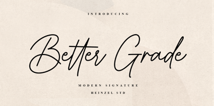 Better Grade is a flowing handwritten font, described by an elegant touch, perfect for your favorite projects. It looks stunning on wedding invitations, thank you cards, quotes, greeting cards, logos, business cards and every other design which needs a handwritten touch. Fall in love with its incredibly distinct and timeless style and use it to create spectacular designs! What's Included : Better Grade Web Font PUA Encoded Multilingual Support
 - Sugar Garden by Soft Creative,
$20.00 Sugar Garden Script is a new modern script font with an irregular baseline. Trendy and feminine style. Sugar Garden looks lovely on wedding invitations, thank you cards, quotes, greeting cards, logos, business cards and more. Perfect for using in ink or watercolour. Including initial and terminal letters, alternates and multiple language support. I made this font very carefully so that each letter looked very unique and had various beautiful alternatives.
 - Tamword by Prioritype,
$18.00 Introducing a new script font with a bold and clear style. Yes you can use this font in your projects and make it even more classy. It can be applied to logos, video previews, crafts, apparel products, packaging, photographer watermarks, and any of your other awesome projects. for an overview you can see some of the previews above. Features: -Uppercase -Lowercase -Numeral -Punctuation -Multilingual -Alternate -Ligature -Swash Thanks.
 - Technical Rounded VP by VP Type,
$24.00 The initial inspiration for the typeface came from examining precisely machined labels on tools of various kinds, from cameras to cars, which need to be perfectly legible at all sizes. Such processes create a distinctly streamlined, clean look that feels both robust and stylish - universal and unique. Technical Rounded VP includes ten diverse styles, offering great versatility. All styles in this family include an extensive Latin character set, the Greek alphabet, multiple sets of numerals, a large set of punctuation marks, and other symbols. With 1120 glyphs in each style, it guarantees full support for all Latin languages. To make the family even more powerful, twenty OpenType features are included, such as multiple vertical positions, diagonal fractional forms, optional slashed zeros, separate old-style and lining figures, small capitals, and contextual alternates. If you are looking for similar typefaces, note that Technical Rounded VP is the soft counterpart of Technical Standard VP. A stenciled version is also available. They can be used either on their own or together seamlessly.
 - Eli 5.0b - Unknown license

- Maassslicer - Unknown license

- Medici Script by Linotype,
$29.99 Medici Script is an elegant calligraphic script. The Medici Script font is ideal for use on invitations, greetings cards and business cards. Medici Script™ is a trademark of Linotype GmbH and may be registered in certain jurisdictions.
 - King Rabbit by ahweproject,
$9.00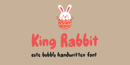 King Rabbit is a cute and bubbly display font, ready to make your designs look great and fun! Use it with confidence on your project designs such as quotes, greeting cards, invitations, posters, business cards, presentations, and more!
 - CLASSIC Line by WAP Type,
$25.00 frontline classic font Font a stylish Font. It’s useful for any Design project. Decal, card, e-card, Good for Logos & Headlines, Poster,Tag design, Newspaper & Magazine Ad Design and many more. True type and Open type font files
 - Bisalir by Aga Silva,
$24.99 Bisalir is a beautiful display font, so you can create beautiful headings or signature looks. Open type features 1000+ glyphs including stylistic alternates so you can fine tune your creations (this option works well also for other languages)
 - Mahally by Forberas Club,
$16.00 Mahally, Some vintage fonts with regular & italic version both with creative and sense of art. Ready for your crafting material as wedding decorative, invitation card, greeting card, T-shirt design, some merchandise, or to make your Branding Product.
 - Spaghetti Western NF by Nick's Fonts,
$10.00One in the series of fonts called Whiz-Bang Wood Type, intended to be set large and tight. Spaghetti Western is a based on an Italian interpretation of a classic ultrabold Western-style face; so, fittingly, the font is named for the genre of “cowboy” film pioneered by Sergio Leone. Both versions of this font contain the complete Unicode Latin A character complement, with support for the Afrikaans, Albanian, Basque, Bosnian, Breton, Catalan, Croatian, Czech, Danish, Dutch, English, Esperanto, Estonian, Faroese, Fijian, Finnish, Flemish, French, Frisian, German, Greenlandic, Hawaiian, Hungarian, Icelandic, Indonesian, Irish, Italian, Latin, Latvian, Lithuanian, Malay, Maltese, Maori, Moldavan, Norwegian, Polish, Portuguese, Provençal, Rhaeto-Romanic, Romanian, Romany, Sámi, Samoan, Scottish Gaelic, Serbian, Slovak, Slovenian, Spanish, Swahili, Swedish, Tagalog, Turkish and Welsh languages, as well as discretionary ligatures and extended fractions. - Virginia by Type Associates,
$31.95 Virginia has a proven track-record. Unashamedly geometric, starkly simple with a touch of art deco/bauhaus/rococo about her, she was the most popular headline face around, at least in my home town in the year of her release circa 1970. That was the year my five-weight design won the inaugural (and only) Lettergraphics International Alphabet design competition and shut out 5000 competitors. Alas, Lettergraphics ceased to trade from its LA studios after the mid-80s and Virginia's two-inch film fonts were left to collect dust on the cutting room floor. Until my recent decision to revive her along with some subtle tweaking, a few additional glyphs and Opentype features, supported by an abundance of kern pairs making Virginia suitable for text or the largest display type.

