10,000 search results
(0.034 seconds)
- French Bistro JNL by Jeff Levine,
$29.00 The 1930s French publication L'Art du Tracé Rationnel de la Lettre was a treasure trove of font revival ideas from the Art Deco era. One example featured a serif typeface with a number of stylized characters. This is now available as French Bistro JNL, in both regular and oblique versions.
 - The Archies Typeface by IKIIKOWRK,
$17.00 Proudly present The Archies Typeface, created by ikiiko. A summer mood typeface that has a vintage style & holiday vibes. This typeface is perfect for an holiday greeting, summer camp poster, vacation title, beach & tropical design, and so much more. What's Included? Uppercase & Lowercase Number & Punctuation Ligature Multilingual support Format File : TTF & OTF Works on PC & Mac Get also a good offer & FREEBIE at our site : www.ikiiko.com Enjoy our font and if you have any questions, you can contact us by email : ikiikowrk@gmail.com
 - Severe by Gerald Gallo,
$20.00 Severe is a clean, contemporary, condensed, geometric font family. There are 2 fonts in the Severe family, Severe Lower Case and Severe Small Caps. The small caps versions has small caps in place of the lower case alphabet. The lower case and small caps versions have the same uppercase alphabet, numbers, punctuation, symbols and miscellaneous characters. In addition to the cap height numbers there are small cap height numbers in each. The Severe fonts are ideal for headlines, titles, branding, small blocks of text or wherever a fresh, contemporary, condensed font is desirable. Severe Lower Case and Severe Small Caps are sold only as a set priced at $20.
 - Ekamai by Eclectotype,
$40.00 This is Ekamai, named after the district of Bangkok I lived in. It is based on Quinella, and was supposed to be a quick and easy reworking of that font into a "tight-not-touching" (rather than overlapping) version. As is often the case with quick and easy things, it turned out to be neither, and the vast majority of glyphs needed to be completely overhauled to fit the new system. This face is deliciously plump face, with lovingly rendered curves and just the right amount of cuteness; perfect for food packaging (of the sweeter variety probably!), logos, magazine headlines and the like. It performs admirably in all caps settings. The numerals are expressive hybrid figures (somewhere between lining and oldstyle). The overall feel is friendly and soft, without being overtly saccharine. Ekamai is equipped with subtle contextual alternates (which I'd recommend leaving on) to help with the tight fit, a handful of discretionary ligatures if that's your thing, and a case feature for all caps settings. The stylistic alternates and stylistic set 1 features simply change the # glyph to an attractive numero. Automatic fractions are included along with wide-ranging language support.
 - TT Mussels by TypeType,
$35.00 TT Mussels useful links: Specimen | Graphic presentation | Customization options About TT Mussels: The TT Mussels font family is the successor of such popular fonts as Bender and TT Squares. At the same time, TT Mussels has a number of fundamental differences that make it a unique font family that stands out from other octagonal typefaces. When designing TT Mussels, we paid great attention to the possibility of imposing large arrays of text, and we can responsibly state that TT Mussels is a rare type of technological text fonts. To go along with the rest, we've created a stencil version of the typeface, in which the location of the incisions changes according to their thickness. In total, the TT Mussels font family consists of 36 faces, which include among other things stylistic alternatives, ligatures, and also implements a broad support for OpenType features: case, frac, ordn, sups, sinf, numr, dnom, onum, tnum, pnum, liga, dlig, salt, ss01. Dynamic contrast is widely implemented in TT Mussels. It is most noticeable in the Black typeface, where the ratio of the thickness of the vertical strokes to the horizontal strokes is approximately two to one. For the Thin typeface, the thickness of the vertical strokes is already consistent with the thickness of the horizontal strokes. You can also find other signs of respect for traditional text fonts in the TT Mussels design, such as the trace of pen movement which is historically typical for antiquas. For example, in the letter M from the Black face, we can first see a thin stroke, then a thick diagonal stroke followed by a thin diagonal stroke, and a finishing bold vertical stroke. As in the case of dynamic contrast, this effect gradually disappears when approaching thin faces. In thick faces, in places such as the “armpits” of the letters MN? or the junctions of the diagonals of WVvw, there are visual compensators that brighten the bold typefaces. As the thickness of typefaces moves from thick to thin, the dimensions and conceptual values of compensators change, and in thin typefaces they completely disappear. TT Mussels language support: Acehnese, Afar, Albanian, Alsatian, Aragonese, Arumanian, Asu, Aymara, Banjar, Basque, Belarusian (cyr), Bemba, Bena, Betawi, Bislama, Boholano, Bosnian (cyr), Bosnian (lat), Breton, Bulgarian (cyr), Cebuano, Chamorro, Chiga, Colognian, Cornish, Corsican, Cree, Croatian, Czech, Danish, Embu, English, Erzya, Estonian, Faroese, Fijian, Filipino, Finnish, French, Friulian, Gaelic, Gagauz (lat), Galician, German, Gusii, Haitian Creole, Hawaiian, Hiri Motu, Hungarian, Icelandic, Ilocano, Indonesian, Innu-aimun, Interlingua, Irish, Italian, Javanese, Judaeo-Spanish, Judaeo-Spanish, Kalenjin, Karachay-Balkar (lat), Karaim (lat), Karakalpak (lat), Kashubian, Khasi, Khvarshi, Kinyarwanda, Kirundi, Kongo, Kumyk, Kurdish (lat), Ladin, Latvian, Laz, Leonese, Lithuanian, Luganda, Luo, Luxembourgish, Luyia, Macedonian, Machame, Makhuwa-Meetto, Makonde, Malay, Manx, Maori, Mauritian Creole, Minangkabau, Moldavian (lat), Montenegrin (lat), Mordvin-moksha, Morisyen, Nahuatl, Nauruan, Ndebele, Nias, Nogai, Norwegian, Nyankole, Occitan, Oromo, Palauan, Polish, Portuguese, Quechua, Rheto-Romance, Rohingya, Romanian, Romansh, Rombo, Rundi, Russian, Rusyn, Rwa, Salar, Samburu, Samoan, Sango, Sangu, Scots, Sena, Serbian (cyr), Serbian (lat), Seychellois Creole, Shambala, Shona, Slovak, Slovenian, Soga, Somali, Sorbian, Sotho, Spanish, Sundanese, Swahili, Swazi, Swedish, Swiss German, Swiss German, Tagalog, Tahitian, Taita, Tatar, Tetum, Tok Pisin, Tongan, Tsonga, Tswana, Turkish, Turkmen (lat), Ukrainian, Uyghur, Vepsian, Volapük, Võro, Vunjo, Xhosa, Zaza, Zulu.
 - Thomson by Linecreative,
$16.00 Thomson is is an Condensed font with a modern look, It's Perfect for branding, logo design, shirts, name card, magazin layout,headers, or oven large scale artwork Thomson offers you: - Upper and Lowercase characters (All Caps) - Stylistic alternates - Numbers and Punctuation - Multilingual Support (Latin Western Europe)
 - Mr Gabe by Leksen Design,
$- Check out Mr Gabe in motion! Mr Gabe is a typeface designed to dance. Not that it’s a flamboyant display face, but that it has a liveliness, especially in its heavier weights, that dances across the page. And the letters include a selection of exuberant flourishes that can be used to kick up a ruckus or make a sweeping gesture. Mr Gabe is a high-contrast serif typeface with vertical stress, a “modern” face in traditional type terms. Even in the regular weight, the contrast between thick and thin strokes is very obvious. Designer Andrea Leksen has given many of the lowercase letters ball terminals, teardrop shapes that make Mr Gabe seem decorated even when most of its letter forms are conservative. If you need more bells and whistles, or perhaps revolving mirror balls and dancing shoes, you can explore the font’s collection of ornaments and decorative borders. Mr Gabe comes in four weights, from Regular to Black, with italics for each. Each font includes over 57 ligatures, 31 illustrations and borders, small caps and proportional oldstyle numerals.
 - Automoto by Device,
$39.00 Automoto is built from a limited number of curved and straight segments that have been flipped and rotated. It has an extensive set of two- and three-letter ligatures that form a triple ribbon resembling a model car racetrack. For clarity, some character combinations were excluded as they proved to be ambiguous in context. The upper- and lowercase characters can be freely intermixed according to taste.
 - Brinar by Hackberry Font Foundry,
$24.95 I've been working on a usable sans serif for body copy since the mid-1990s (though I certainly did not know it at the time). This one works well. It started life back in the mists of time as a scan of an old German font by Carl Fahrenwaldt. It was developed fully as a synergized serif with strong traditional roots and released as Bergsland Pro. Now it finally makes it to where I was headed all along as a sans text font. This is a well modulated humanist, sans serif font family with many OpenType features and over 600 characters: Caps, lower case, small caps, ligatures, swashes, small cap figures, old style figures, numerators, denominators, accents characters, ordinal numbers, and so on. It is designed for text use in body copy. But it also works very well for elegantly stylized display.
 - Direct Mail by Partnrz,
$15.00 Direct mail designers rejoice! Finally, a font family made just for you. Created to be as in-your-face as possible: for use as a primary headline; for dates and phone numbers; and for coupon heads and price points. Tired of kerning numbers for your coupons and prices? Then you'll love this font! All of the kerning has been done for you. (No more spacey 1's!) Designed for a tight kern - just track it in on larger sizes. Instead of standard weights, this font was designed to fit different width needs. Have a long headline, but your client wants it in one line and tall? Use the extra-condensed. Need something really bold for a phone number or price point, but you don't have much height available? Use the fat. And there are two more widths for those in-betweens. And to top it off - you can get them all in an oblique as well.
 - Marking Device JNL by Jeff Levine,
$29.00 Similar to date and numbering stamps, there once was manufactured rotary band stamps with different letter and number configurations that were used for various identification purposes. From a set of vintage bands acquired from a now-closed rubber stamp shop, Marking Device JNL replicates the serif typeface used on these devices.
 - Nameplate JNL by Jeff Levine,
$29.00 Two attractive cast metal door signs reading "Men" and "Ladies" from back in the Art Deco era inspired the idea for Nameplate JNL. The left parenthesis key starts the border decoration, and the right parenthesis key closes it off. Nameplate JNL has just a basic A-Z and numeral set; the letters "floating" within the parallel lines of the border to form complete nameplates, apartment numbers or any similarly encased words. A period, comma, apostrophe and dash are on their respective keys. A small blank space is on the left bracket key, a medium space is on the right bracket key and a large space is on the left brace key. There is a small, complete frame on the right brace key. For names such as "MacDonald" or "McIntyre", the small "ac" is on the colon key and the small "c" is on the semicolon key. No kerning has been applied in order to give the type more of an antique, "mechanically assembled" look.
 - ZionTrain Basic by AndrijType,
$25.00Originally ZionTrain was built as a Cyrillic typeface for public transport navigation system. We wanted comprehensible, distinctive letterforms, that can help everybody on the way from Babylon to Zion. Here, on MyFonts, we present the ZionTrain STD versions with western latin including smallcaps and oldstyle figures in some faces in TrueType format; also western, central, baltic and turkish latin charsets, smallcaps, oldstyle numerals, few alternates, some arrows and fractions in ZionTrain OT OpenType format. - Bishops Stinger by Folding Type,
$9.00 Ouch! Bishops Stinger is a unique isometric display typeface, perfect for bold headlines and logotypes. The blunt serifs and terminals that appear on select letters help ground the faced-paced look. When used for a block of text at smaller sizes the style resembles old script writing but with a retro futuristic twist.
 - Choc by ITC,
$29.99 Choc font is the work of French designer Roger Excoffon, based on the traditions of Japanese brush calligraphy, thick yet graceful. Choc light font was designed by Phil Grimshaw, who had to redraw many times in different weights before finding one that worked as a text face and remained true to the original.
 - Turista Flaca NF by Nick's Fonts,
$10.00This Art Deco-inspired face is based on the Baltimore Type Foundry’s Tourist Extra Condensed. Graceful and elegant, this typeface’s compact design also packs a lot of information into very little space. This font contains the complete Latin language character set (Unicode 1252) plus support for Central European (Unicode 1250) languages as well. - Kurtzberg by Nerfect,
$15.00Kurtzberg was created after the bold type on the splash pages of many of the classic comics of the 'fifties and 'sixties. Thick and chunky and filled with all those symbols basic comic book fonts rarely come with. Kurtzberg is always ready to swing into action when injustice rears its ugly face. - Xavierace by Portograph Studio,
$20.00 Xavierace of a racing-style with sharp lines. Xavierace very suitable for automotive magazine covers, racing game covers, logos & branding, product design, labels, and so on.
 - Chevalier by Linotype,
$29.99 Designed by the swiss Haas'sche Schriftgiesserei, (Haas Type Foundry) Chevalier is a set of shaded capitals and figures, modern face or fat face in design. Ideal for business cards and classical letterheads.
 - Osnova by AndrijType,
$18.75 The common Slavic word Osnova means basis in English. This universal but still distinctive typeface can make a good foundation for any design project. There is the main Osnova version and separated faces Osnova Alt, Osnova Fancy and Osnova Small Caps for Western Latin, Greek and Cyrillic languages.
 - Weedy Beasties NF by Nick's Fonts,
$10.00In Issue Number 84 of Push Pin Graphic, Seymour Chwast offered up this rather odd variant of his own extrablack, superbold in-your-(type)face, Blimp. Not recommended for body copy, but makes interesting and unusual headlines. Both versions of the font include 1252 Latin, 1250 CE (with localization for Romanian and Moldovan). - Sliced Open by ArtyType,
$29.00 This type family is the lighter, more open companion to the eye-catching Sliced volume, a masculine display face with boldly sliced terminals and angles, available in 3 widths. The complete Sliced volume numbers 14 styles, a versatile modern suite of fonts with extended European language coverage, available in OpenType, TrueType & web formats.
 - Harvest Moon NF by Nick's Fonts,
$10.00The letterforms for this unusual display face were inspired by a 1930s ad for Tanguy Crepes, by an uncredited artist. Due to the ornate nature for this font, it has a limited character set, but does include all letters, numbers and punctuation for the Unicode 1252 Latin and 1250 Central European character sets. - Type Warmers JNL by Jeff Levine,
$29.00 The name Type Warmers JNL traces its lineage to small catalog booklets issued by Indianapolis' Cobb Shinn for his line of letterpress cuts; of which a few can be found included within this typeface. Presumably type could "warm up to" these stock illustrations and work hand-in-hand to deliver the message, hence the "Type Warmers" sobriquet. Originally known for illustrating many attractive and comical postcards of the early 1900s, Shinn moved into the field of purchasing stock art and redistributing them as electrotypes or "cuts", the predecessor to today's digital clip art. A number of the cartoons he sold can be found in the Shinn Kickers JNL font.
 - Carousel by ITC,
$40.99Carousel is a fat faces display type designed by Gary Gillot in 1966. Fat faces were offshoots of the modern, or Didone, typefaces that were de rigueur during the early 1800s. These fat faces were among the first typefaces to be used solely for advertising purposes. Naturally, they were always used in larger point sizes, in display functions. Carousel could be called an optimization of these old advertising typefaces. With high x-heights, ultra contrast between thick and thin strokes, and perfectly engineered drawing techniques, Carousel is a highly crafted typeface. Give it a spin in your next advertising campaign! Carousel's fine thin strokes are very graceful in their appearance, and lend a strong, yet soft, feminine feeling to anything they touch.If you like Carousel check out wearing Annlie, another fat face from 1966." - Finocchio by The Ampersand Forest,
$45.00 Finocchio (yes, we know — wink) has the playful, round shapes of a French Ronde with the sharp angles of Italian Futurism. It's a bold, fun, excellent branding face — wherever you need some gusto or brio or forza! Finocchio comes with a large number of ligatures for fluidity. It also comes with a solid, readable set of non-script small caps, so all you need for that sign is one coordinated font! It also comes with loads of fun alternates! Finocchio is made with love in The Ampersand Forest.
 - Azqad by Flawlessandco,
$9.00 Azqad is an elegant Arabic-style font that combines traditional elements with a touch of modernity, with its graceful curves and intricate details. An Original typeface that suitable for any graphic designs such as branding materials, t-shirt, print, business cards, logo, poster, t-shirt, photography, quotes .etc This font support for some multilingual. Modern Sweet Retro that contains uppercase A-Z and lowercase a-z, alternate character, numbers 0-9, and some punctuation. If you need help, just write me! Thanks so much for checking out my shop!
 - Yavome by Arterfak Project,
$26.00 Spread your love with Yavome :) Yavome is a quirky Serif font, with modern experimental shapes. Designed with high contrast and artistic curves, it gives a dynamic impression and graceful movement with additional special characters! Yavome is inspired by medieval typography, developed into an elegant and unique form, making it especially suitable for use in display, branding, logos, and quotes. The font can be used on flyers, posters, stories, invitations, t-shirts, stickers, and more. What you will get: Uppercase Lowercase Numbers & punctuation Symbols Stylistic alternates Ligatures (lowercase) Accented characters. Thank you for all your support!
 - Hostey Script by Letterfreshstudio,
$15.00 Hostey is a stylish and very modern script font. It looks amazing on wedding invitations, thank you cards, quotes, greeting cards, logos, business cards and any other design that calls for a handwritten touch. Features : Ligatures Stylistic sets Basic Latin A-Z and a-z Numbers International Symbols included Punctuation Ligature This font is PUA coded which means you can access all the glyphs and replace them easily! Thank You.
 - Aure Sable by Aure Font Design,
$23.00 Aure Sable embodies the entrancing mistique of an adventurous spirit. The fluid forms of this brush font engage the reader with a subtext of serendipitious happenstance. Sable Regular brings the soft touch of familiarity to text and titles and imbues astrological expressions and chartwheels with an exotic intrigue. The graceful forms of Sable Italic add the flowing touch of a personal comunique. Sable is an original design developed by Aurora Isaac. After more than a decade in development, 2018 marks the first release of the CJ and KB glyphsets in regular and italic. The CJ glyphset is a full text font with an extended set of lowercase and uppercase glyphs supporting a variety of European languages. Additional glyphs include standard ligatures, four variations of the ampersand, and check-mark and happy-face with their companions x-mark and grumpy-face. Numbers are available in lining and oldstyle versions, with numerators and denominators for forming fractions. Companion glyphs include Roman numerals, specialized glyphs for indicating ordinals, and a variety of mathematical symbols and operators. The CJ glyphset also includes an extended set of glyphs for typesetting Western Astrology. These glyphs are also available separately in the KB glyphset: a symbol font re-coded to allow easy keyboard access for the most commonly used glyphs. Aure Sable is engaging as a text font, but its empathic nature radiates against more traditional fonts that provide the perfect foil to Sable's casual persona. Pair Sable with the formal look of geometric fonts such as Aure Jane and Aure Declare to accentuate Sable's heartfelt nature. Give Aure Sable a trial run! You may discover a permanent place for this font family in your typographic palette. AureFontDesign.com
 - Caldicote by Aah Yes,
$12.00Caldicote is a formal and conventional serif typeface, with slightly broadened verticals. The Tab version is the same as the ordinary version, EXCEPT the Tab version has monospaced numerals and zero kerning between numbers - useful where you might like columns of numbers all vertically aligned in a Tabular display. The zip files contain both OTF and TTF versions of the font - install one version only. - Le Mans Classic by Kazer Studio,
$6.00 LE MANS - CLASSIC is a font inspired by vintage motorsport racing. In particular, advertising posters from the 70's. This time period was important as it showcased not only the cars that changed but also the illustrative styles & typography. Features: Offered in 2 Styles - Regular & Compressed Extensive Language support Specialised Kerning on all character combinations Designed by KAZER STUDIO
 - Larky by Alterspieler,
$17.00 Larky is a beautiful and unique modern calligraphy. This font has simple and interesting characters for various design needs. You can use it for embroidery, screen printing, business cards, cutting, branding, and more. Larky has all uppercase and lowercase letters, also has alternatives, multi languages, ligatures, numbers, punctuation.
 - Moresby by Get Studio,
$19.00 Moresby is an aesthetic serif typeface with a sharp shape that is perfect for modern retro design. It comes with unique lower and uppercase plus numbers, punctuation & multilingual letters. You can use it as a logo, badge, insignia, packaging, headline, poster, t-shirt/apparel, greeting card, and wedding invitation.
 - Qartiant by Attype Studio,
$18.00 Qartiant is a stylish sans serif font with clean and neat character. Qartiant gives powerfull messages and the typeface can be successfully used in logos Magazines, Posters, Branding, Websites greeting / wedding cards, packaging, fashion, make up, stationery, novels etc. Include : - Uppercase & lowercase - number & punctuation - Ligature - Multilingual support Happy Designing!
 - Oscarios by Attractype,
$13.00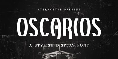 Oscarios fonts is a stylish display font. You can use it in a modern, clean and professional design. This font is perfect for your various projects such as brand identity, technology, business cards, web, stationery, displays, sports and more. Oscarios font contains uppercase, lowercase, numbers, punctuation and multilingual support.
 - Kang Meatball by Midvel,
$15.00 Kang meatball inspired by brush pen calligraphy. Characters shape based on brush pen stroke. Start by making words with brush pen on paper. Some words that have suitable shape are selected to be the initial inspiration for the font design. We draw calligraphy for uppercase, lowercase and number character. After drew Calligraphy character, next process is design digital lettering. We design Uppercase, lowercase, and number character in digital. Add puctuation and ligature characte. There are some style set, endswash and underline swash character that make lettering design more unique. We encoded unique character in Private Use Area (PUA). Kang meatball has 305 characters including uppercase, lowercase, numbers, punctuation, set style, and underscore swash. Kang meatball is suitable for many design. This brush font is suitable for logos, posters, advertising, gift cards, name cards, and T-shirt design. The font is suitable for logos, name cards, and gift cards. Fonts can be combined with visual elements to create posters, advertising, t-shirt designs or book cover designs. Feature : · Uppercase · Lowercase · Number · Punctuation · Multilingual (Accented Letters) · Ligature · Swash · Style set (01-04) · PUA Encoded Characters If you have question or request for any languange glyph, please contact us.
 - Georgia by Microsoft Corporation,
$49.00The European Union (EU) has added numerous members since 2004, increasing significantly the number of languages spoken within its boundaries. To write the thirty or more languages, three alphabets are required: Roman (Latin), Greek, and Cyrillic. The WGL character set supports all EU languages, in addition to Russian, Ukrainian, and Serbian, and Croatian. Current principal languages of the EU include: Basque, Breton, Bulgarian, Czech, Danish, Dutch, English, Estonian, Finnish, Flemish, French, German, Greek, Hungarian, Irish, Italian, Latvian, Lithuanian, Maltese, Polish, Portuguese, Romanian, Scots Gaelic, Slovak, Slovenian, Spanish, Swedish, Turkish and Welsh. - Utah by Monotype,
$92.99The European Union (EU) has added numerous members since 2004, increasing significantly the number of languages spoken within its boundaries. To write the thirty or more languages, three alphabets are required: Roman (Latin), Greek, and Cyrillic. The WGL character set supports all EU languages, in addition to Russian, Ukrainian, and Serbian, and Croatian. Current principal languages of the EU include: Basque, Breton, Bulgarian, Czech, Danish, Dutch, English, Estonian, Finnish, Flemish, French, German, Greek, Hungarian, Irish, Italian, Latvian, Lithuanian, Maltese, Polish, Portuguese, Romanian, Scots Gaelic, Slovak, Slovenian, Spanish, Swedish, Turkish and Welsh. - Frederik by The Northern Block,
$26.95 Frederik is a traditional humanist sans with a modern twist. Fresh and neutral in appearance but equally organic and friendly. Frederik features 10 styles ranging from Thin to Black, plus matching italics. Regular and Medium weights work exceptionally well for small body copy, while Light and Heavy styles work best for display purposes — making Frederik a highly versatile type family, suitable for a wide range of uses. Opentype features include inferiors, superiors, fractions, numero sign, circled numbers, stylistic ordinals, ligatures, numerous arrows including extended length, and support for all Latin and Cyrillic languages.