10,000 search results
(0.026 seconds)
- Shanghai JNL by Jeff Levine,
$29.00 Shanghai JNL is loosely based on the title lettering from “Charlie Chan in Shanghai”, one of the long-running series of detective films featuring the Asian sleuth and his “number one son”.
 - Term - Unknown license

- Frizzed BRK - Unknown license

- Lethargic BRK - Unknown license

- Conduit BRK - Unknown license

- Wobbly BRK - Unknown license

- Impossibilium BRK - Unknown license

- Zenith BRK - Unknown license

- Pascal by GRIN3 (Nowak),
$16.00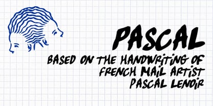 Pascal is a font inspired by handwriting of mail artist Pascal Lenoir.
 - Tunesmith JNL by Jeff Levine,
$29.00 A "tunesmith" is one so nicknamed because the person or persons craft (compose) a song from scratch. When the area of Broadway known as Tin Pan Alley was in its heyday, every music publisher's office would have sounds emanating from the various cubicles of men and women trying for the next big hit. Sheet music was the main source of songwriter's royalties during those days, and to please the general public with a song destined to be a popular piece was a lofty goal. It's then only fitting that the lettering inspired by a 1920s-era piece of sheet music for a song called "Jerry" would be named Tunesmith JNL.
 - Rotundus by dayflash,
$35.99 Rotundus is an elegant sans serif typeface based on geometric shapes. Precise lines and accurate curves with sharp corners are the main characteristics of this fresh and modern font family. While unconventional letterforms give Rotundus its distinctive appearance, a tall x-height and a condensed width provide good legibility and nice readability even at smaller sizes. With its contemporary feel, Rotundus is suitable for almost any type of analogue and digital application. A rounded sibling of Rotundus is available as Rotundus Rounded. The Rotundus font family includes unique letterforms, exclusive ligatures and extensive OpenType features. Rotundus comes in six weights with matching italics.
 - Rotundus Rounded by dayflash,
$35.99 Rotundus Rounded is a rounded sibling of Rotundus, an elegant sans serif typeface based on geometric shapes. Precise lines and accurate curves with soft edges are the main characteristics of this fresh and modern font family. While unconventional letterforms give Rotundus Rounded its distinctive appearance, a tall x-height and a condensed width provide good legibility and nice readability even at smaller sizes. With its contemporary feel, Rotundus Rounded is suitable for almost any type of analogue and digital application. The Rotundus Rounded font family includes unique letterforms, exclusive ligatures and extensive OpenType features. Rotundus Rounded comes in six weights with matching italics.
 - SpillProof by Comicraft,
$29.00Put on your top hat, tie up your white tie, brush off your tails and surrender your serifs at the door! We've popped open a bottle of French Champagne for you, but don't worry, because our latest stylishly handsome, devilishly clever offering doesn't just offer thrills and chills, it’s also Spillproof! So step out and breathe an atmosphere that simply reeks with class and distinction, What a swell font for party invitations, soirees, nightclubs and weddings this is! See the families related to SpillProof: Spills. - Local Brewery by Cultivated Mind,
$29.00 Local Brewery is a vintage inspired font collection that includes six script styles and two sans serif styles. Script styles include a ripple edged, smooth or rough version. The sans serif styles include a ripple edged or rough version. Local Brewery Script comes with lower case y, g and tail alternates. These alternates will give your designs an extra flair and uniqueness. The script and sans serif fonts work exceptionally well together. Use Local Brewery for packaging, magazines, marketing, weddings, beer labels, film and clothing.
 - Postal JNL by Jeff Levine,
$29.00Postal JNL lets you print out initials, words or phrases emulating postage stamps. Although there's a limited character set, it can be used along with Printing Set JNL to match any additional word copy. - Journalistic by E-phemera,
$20.00Journalistic is one in a series of fonts designed for use in creating replica vintage newspapers. It is inspired by the nameplate of a New England newspaper from the 1920s. Its rough character is apparent at headline sizes, and it remains nicely legible at smaller sizes for diplomas and other formal documents. The OpenType font contains a variety of discretionary ligatures and contextual alternates, including the long s and other glyphs for classic German typography. Long s substitution can be achieved through either historical or titling alternate OpenType features. - Gutenberg Gotisch by RMU,
$30.00 Gutenberg Gotisch is a redesign of an inhouse font released by Bauer in 1885, and it is a predecessor of Princess Engraved. So both fonts make a perfect match. The long s can be reached by typing the integral sign or turning the round s into the long s by using the historical OT feature. In this font, you have the possibility to turn I, V, X, L, C, D, and M into Roman numerals by activating the salt feature. Finally I recommend to use both ligature features.
 - Cutout by Adobe,
$29.00Matisse's paper cutouts inspired Gail Blumberg, Adobe art director, to create a typeface of figures. Her biggest challenge: keeping each Cutout design in scale. It's not easy to make a standing figure, like 'Y,' to be the same size as a curled up figure, like 'G,'" Gail says." - Meta Language - Unknown license

- Lila Pro by Eurotypo,
$42.00 Lila Pro has all the advantages of OpenType technology that allows a variety of combinations: standard ligatures, contextual alternates, discretional ligatures, word ending and tails. Specially designed for creating logos for products and packaging, this font can also be used as body text for its good legibility and accurate kerning.
 - Pandtos by dayflash,
$31.99 Pandtos is a clear sans serif typeface based on geometric shapes. Precise lines and accurate curves are the main characteristics of this fresh and modern font family. While unique letterforms constitute Pandtos’ distinctive appearance, extended widths, tall x-heights and clear shapes provide good legibility and nice readability even at smaller sizes. With its contemporary feel, Pandtos is suitable for almost any type of analogue and digital application. The Pandtos font family includes unique letterforms, exclusive ligatures and extensive OpenType features. Pandtos comes in four weights with matching italics.
 - PRONK Clean by wearecolt,
$9.00 Introducing PRONK. By Wearecolt. This is a tall, bold and round display font designed for retro-modern designs. This font is perfect for your next logo design or magazine titles. Taking inspiration from many tall fonts and American number plates i created a display font that would be my 'go to' for a neat tall, bold font. I also wanted something which would be able to take a good amount of treatment like stamp effects and grunge. The PRONK pack includes: .otf and standard webfont file types
 - Rollerscript by G-Type,
$72.00 Rollerscript is, in effect, a more modern version of Olicana whose letterforms were drafted using a nibbed pen and ink. Handwriting tends to change depending on what instrument you're using and with Rollerscript the outcome is decidedly more casual and informal than Olicana, though equally realistic. Pronounced pressure points where characters start, end or join make for a very authentic hand drawn appearance which is enhanced still further through the use of over 100 standard ligatures. Character pairings like ‘tt’ or ‘gg’ in normal handwriting fonts never look natural but in Rollerscript will now automatically change as you type! Rollerscript’s handwriting credentials are given a further boost with the inclusion of multiple underlines and sketched icons, arrows and emoticons. There is an extra stylistic set for alternate styles of cursive r and z. You can also choose between Rough and Smooth styles.
 - Gill Display Compressed by ITC,
$29.99The successful Gill Sans® was designed by the English artist and type designer Eric Gill and issued by Monotype in 1928 to 1930. The roots of Gill Sans can be traced to the typeface that Gill's teacher, Edward Johnston, designed for the signage of the London Underground Railway in 1918. Gill´s alphabet is more classical in proportion and contains what have become known as his signature flared capital R and eyeglass lowercase g. Gill Sans is a humanist sans serif with some geometric touches in its structures. It also has a distinctly British feel. Legible and modern though sometimes cheerfully idiosyncratic, the lighter weights work for text, and the bolder weights make for compelling display typography. Gill Sans is also available as Value Pack for Macintosh, PC or as Hybrid CD with both platforms. - Blackberry Macarons by PeachCreme,
$13.00 Say hello to the Blackberry Macarons Font Trio! Heart-warming Script, Display, and Sans Serif fonts that will brighten your design. Blackberry Macarons Display - includes all caps regular and multilingual letters, punctuation, numbers, and as a bonus the letters A, K, M, Q, R with beautiful swashes to keep your designs attractive :) Blackberry Macarons Script - has all uppercase and lowercase letters, numerals, punctuation, and 42 fancy ligatures as well to add a cheesy flair to your words. Blackberry Macarons Sans - a cute and fun hand-drawn typeface with a little imperfect look that works great to add a handmade touch to your projects. Includes a full set of regular letters, numbers, and punctuation. Sweet and quirky, the Blackberry Macarons Font trio is perfect for recipes, book illustrations, lettering, fun packaging, greeting cards and so much more!
 - Gill Sans MT Greek by Monotype,
$67.99The successful Gill Sans® was designed by the English artist and type designer Eric Gill and issued by Monotype in 1928 to 1930. The roots of Gill Sans can be traced to the typeface that Gill's teacher, Edward Johnston, designed for the signage of the London Underground Railway in 1918. Gill´s alphabet is more classical in proportion and contains what have become known as his signature flared capital R and eyeglass lowercase g. Gill Sans is a humanist sans serif with some geometric touches in its structures. It also has a distinctly British feel. Legible and modern though sometimes cheerfully idiosyncratic, the lighter weights work for text, and the bolder weights make for compelling display typography. Gill Sans is also available as Value Pack for Macintosh, PC or as Hybrid CD with both platforms. - Gill Kayo Condensed by ITC,
$40.99The successful Gill Sans® was designed by the English artist and type designer Eric Gill and issued by Monotype in 1928 to 1930. The roots of Gill Sans can be traced to the typeface that Gill's teacher, Edward Johnston, designed for the signage of the London Underground Railway in 1918. Gill´s alphabet is more classical in proportion and contains what have become known as his signature flared capital R and eyeglass lowercase g. Gill Sans is a humanist sans serif with some geometric touches in its structures. It also has a distinctly British feel. Legible and modern though sometimes cheerfully idiosyncratic, the lighter weights work for text, and the bolder weights make for compelling display typography. Gill Sans is also available as Value Pack for Macintosh, PC or as Hybrid CD with both platforms. - Gill Sans MT WGL by Monotype,
$92.99The successful Gill Sans® was designed by the English artist and type designer Eric Gill and issued by Monotype in 1928 to 1930. The roots of Gill Sans can be traced to the typeface that Gill's teacher, Edward Johnston, designed for the signage of the London Underground Railway in 1918. Gill´s alphabet is more classical in proportion and contains what have become known as his signature flared capital R and eyeglass lowercase g. Gill Sans is a humanist sans serif with some geometric touches in its structures. It also has a distinctly British feel. Legible and modern though sometimes cheerfully idiosyncratic, the lighter weights work for text, and the bolder weights make for compelling display typography. Gill Sans is also available as Value Pack for Macintosh, PC or as Hybrid CD with both platforms. - Gill Sans MT Cyrillic by Monotype,
$67.99The successful Gill Sans® was designed by the English artist and type designer Eric Gill and issued by Monotype in 1928 to 1930. The roots of Gill Sans can be traced to the typeface that Gill's teacher, Edward Johnston, designed for the signage of the London Underground Railway in 1918. Gill´s alphabet is more classical in proportion and contains what have become known as his signature flared capital R and eyeglass lowercase g. Gill Sans is a humanist sans serif with some geometric touches in its structures. It also has a distinctly British feel. Legible and modern though sometimes cheerfully idiosyncratic, the lighter weights work for text, and the bolder weights make for compelling display typography. Gill Sans is also available as Value Pack for Macintosh, PC or as Hybrid CD with both platforms. - Gill Sans MT Infant by Monotype,
$43.99The successful Gill Sans® was designed by the English artist and type designer Eric Gill and issued by Monotype in 1928 to 1930. The roots of Gill Sans can be traced to the typeface that Gill's teacher, Edward Johnston, designed for the signage of the London Underground Railway in 1918. Gill´s alphabet is more classical in proportion and contains what have become known as his signature flared capital R and eyeglass lowercase g. Gill Sans is a humanist sans serif with some geometric touches in its structures. It also has a distinctly British feel. Legible and modern though sometimes cheerfully idiosyncratic, the lighter weights work for text, and the bolder weights make for compelling display typography. Gill Sans is also available as Value Pack for Macintosh, PC or as Hybrid CD with both platforms. - Dimitrina by Evolutionfonts,
$- Dimitrina was created with a simple premise: Can there exist a typeface which features a minimum of sharp angles? And a readable typeface, as well? With these strict rules in mind, the development started. At first the typeface looked more like a script, and some characters ( M G or R, to name a few) still hold traces of a handwritten style which spices the overall taste of Dimitrina. Since the first draft every character was redrawn, and edited several times, for the purpose of making the typeface readable, and distinct at the same time. Estimate for yourself if our goals are achieved, while you observe the three weights which are available exclusively in MyFonts. All of them feature a full set of characters plus cyrillic support. You can also try the regular weight which is offered free.
 - Upton by Halbfett,
$30.00Upton is a modern and condensed sans serif. The initial inspiration for its design came from lettering Wim Crouwel created for a poster design. It also takes some cues from neutral grotesks like Helvetica and Akzidenz. Because of its narrow letterforms, Upton is best applied to headlines and poster-sized typography. Upton’s italics were designed with high-quality compensation for all circles and strokes. Upton ships in two different formats. Depending on your preference, you can install the typeface as two Variable Fonts or use the family’s 14 static OpenType font files instead. Those weights run from Extralight to Extrabold. While the static-format fonts offer a good intermediary-step selection, users who install the Variable Font have vastly greater control over their text’s stroke width. The weight axes in Upton’s Variable Fonts allow users to differentiate between almost 1,000 possible font weights. That enables you to fine-tune your text’s exact appearance on-screen or in print. In its fonts, Upton has several ligatures. That includes optional “discretionary ligatures,” which bring a unique tone to display usage. For instance, the fonts include optional ligatures for the letter combinations “E-T”, “F-l”, “L-E-T-T-E”, “L-E-T-T”, “L-E-T”, “L-E-L-O”, “L-U”, “i-j”. and “m-m”. There are also many alternate glyphs. Stylistic Set 1 substitutes in new forms for “G”, “R”, “a”, “f”, “g”, “i”, “r”, “t”, and “y”. Six more Stylistic Sets have alternates for the “æ”, “g”, “k”, “o”, “K”, “O”, and “Q”. Additional OpenType features activate other useful features, such as fractions, numbers in circles, or symbols. - Linex Sans by Monotype,
$29.99Linex Sweet was designed by Albert Boton in the late 1990s. It's a smallish family of three weights; the middle weight has an italic companion face. With its soft corners and slightly quirky head-serifs, Linex Sweet is a friendly design that sees much use. Several years later, Boton began sketching a new design, based on the original Linex Sweet but with a little more authority and grace. Linex Sans is the result. A mix of crisp angles and soft shapes, this new addition to the extended Linex family is both inviting and elegant. The subtle calligraphic overtones distinguish the design from more traditional sans serif designs. A three-weight family with a complementary italic for the Regular weight, Linex Sans is a versatile communications tool in both text and display sizes. It offers that mix of sophistication and joie de vivre that characterizes the designs of Albert Boton. Boton began his professional career as a carpenter. Fortunately for designers and typographers, he quickly turned from pounding nails to hammering out graphic design and constructing great letterforms as a profession. In his long career, he has created hundreds of distinctive, highly useful and award-winning designs. And even though he is now retired from active business, Boton continues to create fresh, new typeface designs. Add Linex Sans to the list. - Assegai by Scholtz Fonts,
$19.00 Named for the Zulu traditional spear, Assegai evokes the long, slim outline of the weapon, and the strength of the Zulu warrior. The font combines the irregular shapes of tribal African art with the simple, clean elegance of contemporary design. It is especially useful for headings, subheading, for shorter passages and also works as a body font since it has both upper and lower case and is striking and readable.
 - Fletcher Typewriter by Ana's Fonts,
$15.00 Fletcher Typewriter font and extras is an authentic vintage typewriter font, perfect to add an extra retro look to your designs. Use it in long or short texts, in digital collages, branding and packaging, social media posts, logotypes, etc. What you’ll get: 1 font family with 3 weights (regular, bold, black - each weight drawn individually), 2 styles (regular and jumpy); an extra set of stamps, misprints, underlines and overlines.
 - Delvona by Great Studio,
$19.00 Delvona is a contemporary serif typeface, retro styled with a strong personality and a soft look. And also its high contrast and very simple and easily recognizable shape make it very easy to read. Delvona was inspired by the serif typography used in editorial headlines in the 80s. Delvona excels in display settings such as headlines, titles, branding projects, Logo design, packaging, magazine titles, advertisements, short or long text.
 - Glowyts by Maulana Creative,
$11.00 Glowyts is a modern simply casual handwritten font. Inspired by the peoples handwriting letters in the envelope or their notes. Glowyts includes opentype features Many Ligatures. Glowyts support multilingual more than 100+ language. This font is good for logo design, Movie Titles, Books Titles, a short text even a long text letter and any awesome project you create. Make a stunning work with Glowyts handwritten font. Cheers, Maulana Creative
 - We Love Nature Autumn Leaves by kapitza,
$69.00 We really enjoy going for long walks in the park in autumn, and the beautiful colours and shapes of the fallen leaves inspired us to create this font. We Love Nature Autumn Leaves is a picture font consisting of 52 highly detailed, hand drawn illustrations. The illustrations can be used on their own to create beautiful designs, or in combination with other illustrations in the We Love Nature font collection.
 - Fructosa by Typo5,
$14.95This unique type treatment was born after working in a mixture between a pixel based font and a retro logo. With lot of details it looks great a bigger sizes, but you can also apply it to write long sentences or even as body text! This font was chose as the official online font of our favorite band Foo Fighters some time ago, when it was just a work in progress. - Tilda by Etewut,
$30.00 Tilda is a sans serif typeface with big potential. It’s gonna be your daily font, because it perfectly fits to different tasks. Tilda is good as long text but also cool as eye-catch title. This font can be like human ages: childhood, adolescence, youth, adulthood and maturity: stylish THIN, fancy LIGHT, great REGULAR, golden BOLD, brilliant HEAVY And beautiful Isabella Bersellini created illustrations, say her hello! http://www.isabellabersellini.com


