10,000 search results
(0.019 seconds)
- Dante Alighieri by RMU,
$35.00 From the great Schelter & Giesecke collection, Dante Alighieri is a splendid companion to Aldo Manuzio. With its rather condensed characters it makes an ideal body text font even for narrow columns. Dante Alighieri comes with the historical long s and swash letters of H and T. It can be used for all major West and Central European languages.
 - Blicalon by Tanincreate,
$24.00 Blicalon is a geometric sans serif font with modern look and good legibility. Blicalon aims to be a universal, it works great in headlines, short and long texts, high-end branding, logo designs, magazines, product packaging & invitations. It comes in 2 different styles - regular and italic and is equipped with an extended character set, supporting most European languages.
 - Lillyanstar by Maulana Creative,
$12.00 Lillyanstar is a casual handwriting font. It included opentype features Ligature. Lillyanstar support multilingual more than 100+ language. This font is good for logo design, Movie Titles, Books Titles, a short text even a long text letter and good for your secondary text font with sans or serif. Make a stunning work with Lillyanstar font. Cheers, MaulanaCreative
 - FS Siena for Walbusch by Fontsmith,
$80.00Siena is a luxurious type. A modern contrasted sans serif. Over 25 years in the making, FS Siena is tailor made for high-end brands. Sumptuous, elegant and eclectic, a nonconformist typeface with classical roots. It’s been a long time coming, but with its heady mix of elegance and quirky charm, FS Siena is worth the wait. - Metal as in Heavy - Unknown license

- Estencil by RG Hunt Type Design,
$15.00 Estencil was inspired by the use of stencil fonts used as text knocked out of steel plates. Not suitable for long text, it works well for display, signage, and wayfinding applications., maintaining legibility from a distance. It includes the Western European character set, with 251 glyphs.
 - Park Avenue Script by Linotype,
$29.99Park Avenue is a lighthearted contemporary script designed by Robert E. Smith in 1933 for American Type Founders. This unique design has small x-height lowercase letters with very long ribbon-like ascenders. Park Avenue is a good design for occasional pieces such as invitations and menus. - Summertime Breeze JNL by Jeff Levine,
$29.00 The opening title sequence for the 1958 film “The Long, Hot Summer” was hand lettered in a free-form style as if painted with loose paintbrush strokes. This served as the model and inspiration for Summertime Breeze JNL, which is available in both regular and oblique versions.
 - Ozana Pro by Mostardesign,
$99.00 Ozana Pro is a bracketed serif font family adapted to the professional requirements of graphic designers, web designers and mobile app developers. Comprised of 24 styles including 12 styles designed especially for headlines and 12 styles for text and long paragraph design, Ozana Pro is a very versatile family of fonts that can be used in many projects such as editorial design, branding or corporate identity creation, design of posters or logos, the creation of websites or the development of mobile applications. This serif font family, with a resolutely modern aspect, also hides a unique typographic design since it has 2 distinct styles (Roman and Display) which have 2 different optical sizes in order to graphically differentiate the appearance of titles, subtitles and long paragraphs. With this design of glyphs differentiated by the optical size according to the styles, the titles have a very graphic aspect while the long texts have a more classic design in order to keep an optimal readability in all cases. Ozana Pro is also equipped with powerful OpenType features such as case sensitivity, true small caps, ligatures, tabular figures, old styles figures, numbers circled. Ozana Pro is also available as a variable font family.
 - Arsinoe by Paweł Burgiel,
$38.00 Arsinoe is a condensed geometric typeface noted for their unorthodox long ascenders and low x-height. Family consists of five different weights plus two special versions accompanied by their italic version. The Arsinoe type family includes extended Latin characters, ligatures, lining figures, OSF (Old Style Figures), scientific inferiors and many OpenType features. From poster design to editorial layout, Arsinoe is intended for a wide range of uses but use in small sizes are not recommended. Important technical notice: Combining diacritical marks (U+0300, U+0301, U+0303, U+0309, U+0323) are only 'compatibility characters' for codepage 'MS Windows 1258 Vietnamese'. Combining diacritical marks (U+0312, U+0315, U+0326) are only 'compatibility characters' for Czech, Latvian, Romanian and Slovak language. OpenType features 'Mark to Base' and 'Mark to Mark' is not supported. Kerning is prepared as single ('flat') table for maximum possible compatibility with older software.
 - Rival Slab by Mostardesign,
$25.00 A touch of modernism for all kinds of projects Like the rest of the family (Rival Sans and Rival Serif), Rival slab has round shapes with bevelled endings on certain letters such as G, Q or Z. These are the characteristics that make Rival Slab a contemporary cast iron for all kinds of projects. It provides advanced typographical support with features such as case sensitive forms, small caps, ligatures, alternate characters, fractions, slashed zero, circled, pro kerning…It comes also with a complete range of figure set options It comes in 16 weights with corresponding italics and it’s suited for multiple purposes including editorial use, web font, apps, digital ads, ebook, and also for advertising, long text, packaging and branding. As a modern sans serif font family, Rival Sans has true italics to give more style in long texts.
 - Brand SS by Sensatype Studio,
$15.00 Brand is a lovely elegant font for branding and logo design. Based on our experience as a graphic designer who works for a lot of companies, we often are requested to design a logo in a unique style but with an elegant shape. So, we try to brainstorming and create this font to make the idea is going out. This is perfect for BRANDING and LOGO DESIGN. You will get classy, elegant, and certainly unique logos with this font. Brand is also included full set of: All uppercase letters multilingual characters numerals punctuation ligatures collection *) ALL LIGATURE CHARACTERS CAN BE ACCESS USING LOWERCASE TYPE (for example: r+a) Wish you enjoy our font and if you have a question, don't hesitate to drop message & I'm happy to help :)
 - Fabrikat Mono by HVD Fonts,
$40.00 Fabrikat Mono is a type family designed by Christoph Koeberlin. The monospaced Sans Serif family is published by HVD Fonts and consists of seven weights plus matching italics. It is an addition to the popular Fabrikat type family that emphasises its engineering roots. Compared to Fabrikat, the Mono version evens out not only the characters’ variable widths but also its more subtle characteristics: Letters like B and R are counterbalanced, the height difference between caps, ascenders and even “t” are eliminated, while characters like the percent sign together with the stressed punctuation give a nod to typewriter typefaces. The type family is equipped for complex, professional typography with OpenType Features like alternate letters, arrows and an extended character set to support Central and Eastern European as well as Western European Languages.
 - Quizles by Struvictory.art,
$15.00 Quizles is an elegant stencil serif with contrast. The font has classic proportions with bold serifs and fading thin lines. Quizles is easy to use in various design programs or without any program. The font is suitable for modern and vintage typographic compositions, design of books and fashion magazines, branding, packaging and social media design. Also use individual letters to create logos and monograms. The font has extensive language support, it includes English, French, German, Italian, Spanish, Portuguese, Danish, Norwegian, Swedish, Finnish, Estonian, Turkish. Quizles serif includes stylistic alternates for symbols: K, k, O, R. There are also ligatures: tt, ff, fi, gi, oo, ll, ra, ga, ca.
 - Saldo by Larin Type Co,
$15.00 Saldo is a modern and sleek sans-serif font designed for maximum readability and legibility. With its clean and crisp lines, Saldo is perfect for any project that requires a professional and sophisticated look. Its minimalistic design is versatile and can be used in a variety of settings, from business documents to branding and marketing materials. Saldo is a great choice for designers who want a font that is both contemporary and classic. Full alphabet with Uppercase and Lowercase A-z Alternates for uppercase "R, K" Alternates for lowercase "f, k, t, y" Ligatures "ff, fi, ffi" Numbers, fractions Punctuation and symbols Multilingual support
 - Benua by Jehoo Creative,
$19.00 Benua font family, a sleek and modern sans serif font designed with unique curved details at the letters a, d, l, m, n, p, and r. These details give the font a distinctive look and feel, creating a cohesive and harmonious design. Closed apertures and generous spacing of the font provide excellent legibility, making it an ideal choice for both print and digital media. Benua also features small caps, which add a touch of elegance and sophistication to any design project. The font comes in 9 weights, from "Thin" to "Black," each equipped with its own italic version, allowing for a range of emphasis and flexibility in design.
 - Carissa by Just My Type,
$20.00 Everyone likes getting a handwritten letter. At least, they would if anyone still hand wrote letters. We heard a story about a type designer who gets a Christmas card from his niece. He’s been out of touch with her for years and is both delighted and surprised to receive a handwritten note. His first thought is “How sweet; how very nice to hear from her.” His second thought is,”Great font potential; I could use this.” And he did. Carissa has a fresh, spontaneous feel, with a wonderful use of uppercase letters (B and R, etc.) within the lower case. Useful as a personal font or for an off-beat menu...
 - Ritafurey by Device,
$39.00 Ritafurey is an extended sans in seven weights, with characteristic low bowls on the P and R. Modern, sleek and corporate, but with a dash of character. It has been used on tech logos, summer blockbuster movies and Playstation skateboarding games. This new version reinstates the original Unicase versions of the M and N (available through the Glyph palette or Opentype options), adds extensive international character support, redrawn and respaced glyphs, a new Regular weight for better weight flow distribution, and many other additional glyphs. (Note the the new weights differ slightly from the old of the same name, so may change the appearance of existing files.)
 - Eurostile Candy by Linotype,
$40.99Eurostile Candy is a fun spinoff from Akira Kobayashi's Eurostile Next family. As the name implies, it is based on Eurostile but with many striking new features. Most obviously, the corners and joints have been rounded off to give it a more friendly and softer feel. On top of those changes, the main skeleton of many characters have been modified. Any extra strokes have been removed - such as in the a, s, or t - and joints have been simplified to create even more square shapes - like in the n and r. With these contemporary and futuristic-styled alterations, Eurostile Candy is a cool new design great for many display projects. - Binner Poster by Monotype,
$29.99Binner was designed by John F. Cumming in 1898 and is an alphabet with a strongly historic character. It takes the reader back to the early part of the 20th century, when typefaces of this kind could be found in advertisements on houses and posters. The robust figures display a marked stroke contrast. Particularly striking are the high middle strokes of the E and F as well as the wavy connecting stroke of the H. The curves of the R and P extend well into the lower third of the characters. With its robust figures, Binner is best used for headlines in middle and larger point sizes. - Scam by Reserves,
$39.99 Scam is a discordantly eccentric geometric display face with exaggerated, alternating forms. Letters variate in extremes between bold and blacked-out and strictly linear, creating unpredictably unique letter pairings. Stylistically, Scam pushes the boundaries of type-as-image while retaining an acute legibility and refinement, greatly contrasting its aberrant nature. Features include: -Precision kerning -Expanded ligature set (89 unique ligatures, plus alternates) -Alternate characters (D, H, O, P, Q, R, 0, 6, 9, 8, _) -Alternate ligatures -Slashed zero -Full set of numerators/denominators -Automatic fraction feature (supports any fraction combination) -Extended language support (Latin-1 and Latin Extended-A) *Requires an application with OpenType and/or Unicode support.
 - Used Cars JNL by Jeff Levine,
$29.00Used Cars JNL is based on one of the many unique alphabets created by the late Alf R. Becker for Signs of the Times magazine from the 1930s through the 1950s. Special thanks to Tod Swormstedt of ST Media (who is also the curator of the American Sign Museum in Cincinnati, Ohio) for providing the reference material for this design - Roadblock JNL by Jeff Levine,
$29.00 Roadblock JNL is the solidified and slanted version of Patriotica JNL --a stars and stripes font based on lettering by the late Alf R. Becker as commissioned by Signs of the Times® magazine. Thanks to Tod Swormstedt of ST Publications, Inc. and the American Sign Museum in Cincinati, Ohio for providing source material for use as a work model.
 - Vtg Stencil Marsh by astype,
$36.00 The Vtg Stencil fonts from astype are based on real world stencils from several countries. The Vtg Stencil Marsh design was derived from 1 inch stencils, cut by a Marsh R machine. Marsh produced stencil machines since 1922 and was one of the most important manufacturers for such marking machines. The design is part of the American industrial heritage. PDF Specimen
 - Brightown by MJB Letters,
$24.00 Introducing Brightown, our latest font creation that seamlessly blends authenticity with a contemporary signature style. Crafted to emulate natural hand strokes, this font exudes a casual yet refined demeanor. With additional features such as ligatures, alternates, tail swashes, and underline swashes, 'Brightown' offers a versatile toolkit for creative expression. Ideal for branding, signatures, posters, packaging, stationery, and beyond, this font elevates your design projects with a touch of personalized elegance. Step into a world where your typography speaks volumes – embrace 'Brightown.'
 - Fruitygreen by Linotype,
$29.99 Fruitygreen is Indonesian designer Andi AW. Masry's second typeface following Coomeec™. Idiosyncratic but appealing forms are the signature feature of Fruitygreen™ and provide this new typeface with its truly distinctive character that you can utilize for your projects - and not just in headlines. The unique forms of fruits are not only individually fascinating, but are just as captivating when they are brought together, for example as decoration on a dining table. For Masry, these can be compared with an alphabet whose letters spell out in combination different words and with this as his inspiration, he based his designs for Fruitygreen on the versatile forms of fruits. However, it was not the whole fruits as such but rather small sections of their curves and ends that he decided to use. It is not only because of the characteristic line terminals that the rounded characters of Fruitygreen seem at first glance reminiscent of a brush-written calligraphic typeface; these are traces of the creation process, in which Masry used a digital brush. At the same time, Fruitygreen is by no means simply a brush font. Its dynamic characters reference biological forms and there is definitely something amoeba-like about them, particularly in the bolder variants, and they exude the same serenity and harmony that is inherent to organic structures. The many unconventionally shaped characters also provide for optical contrast. There is, for example, the very scaled down g", the open "q" and the lowercase "r", which has the form of the capital letter. Other letters, such as the sinuous "k" and the rounded uppercase "F" impart an exotic touch to Fruitygreen. Similarly remarkable is the "@", that has only a semi-circle. Available to the designer are other characters that can be used to accentuate a design, such as swash capitals and numerous ligatures. And, last but not least, there are also various numeral sets with oldstyle and lining figures for setting proportional text and table columns together with a selection of symbols, such as arrows and, appropriately, fruits. "
 - Letterpress Assortment JNL by Jeff Levine,
$29.00 Border pieces, catch words, head and tail pieces and a generous amount of cartoons comprise Letterpress Assortment JNL. All of the printers' stock cuts were re-drawn from vintage source material.
 - Medium Roman by Monotype,
$29.99Medium Roman is an engravers, all-capitals font for invitations and stationery. Particular characteristics of the Medium Roman font are the tail on Q and the spurs on J and U. - Fry's Baskerville by Bitstream,
$29.99Isaac Moore’s recutting of Baskerville’s design for the Fry Typefoundry, long admired as a display design. - Lovely Summer by Sakha Design,
$12.00 Lovely Summer is a romantic and sweet calligraphy typeface with characters that dance along the baseline. It will add a luxury spark to any design project that you wish to create! This font is PUA encoded which means you can access all of the amazing glyphs and ligatures with ease!
 - Amsi Pro AKS by Stawix,
$79.00 Amsi has been designed to equipped with three different widths; Normal, Narrow and Condensed, addition to expanding weights to support various usabilities ranging from Thin, XLight, Light, Regular, SemiBold, Bold, Black and Heavy. Which makes Amsi along with a numerous features support the creativities of the designer from the Font Menu.
 - Amsi Pro by Stawix,
$40.00 Amsi has been designed to equipped with three different widths; Normal, Narrow and Condensed, addition to expanding weights to support various usabilities ranging from Thin, XLight, Light, Regular, SemiBold, Bold, Black and Heavy. Which makes Amsi along with a numerous features support the creativities of the designer from the Font Menu.
 - Delmonte Belarina by Letterena Studios,
$9.00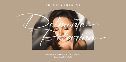 Delmonte Belarina is a romantic and sweet calligraphy typeface with characters that dance along the baseline. It will add a luxury spark to any design project that you wish to create! This font is PUA encoded which means you can access all of the amazing glyphs and ligatures with ease!
 - Stayling Quarters by TM Type,
$12.00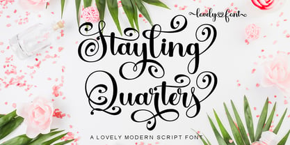 Stayling Quarters is a romantic and sweet calligraphy typeface with characters that dance along the baseline. It will add a luxury spark to any design project that you wish to create! This font is PUA encoded which means you can access all of the amazing glyphs and ligatures with ease!
 - Utily Sans by Latinotype,
$39.00 Utily Sans emerges from the question: "What would the world be like if Paul Renner had had greater inclination towards humanism rather than geometry?" Utily Sans glyph proportions and shapes make it suitable for long-form text. This typeface shows geometric simplicity with humanist shapes. It looks like Futura, but has a feel closer to Garamond. Utily Sans is composed of 6 weights with their matching italics, an alternate character set that brings it back to its geometric origin, uppercase discretionary ligatures for expressive titles, as well as small caps, lining figures and old style numbers. These features make the font well-suited for large and small sized compositions, for short or long text. Utily Sans is the first Latinotype font with Cyrillic support, additional to the usual support for over 200 Latin-based languages.
 - Magnetic Pro by Mostardesign,
$25.00 Magnetic Pro is a typeface inspired by typewriter characters with a mechanical aspect. Equipped for professional typography, this font family has many OpenType features such as small caps, case sensitive forms, tabular and old style figures, pro kerning, circled numerals, ligatures, and extra graphics. It comes in 8 weights with corresponding italics and it's suited for multiple purposes including display and editorial use, especially for advertising, long text, packaging and branding. Magnetic Pro has true italics with a 'mechanical script' aspect to give more style in long texts. It has also an extended character set to support Central and Eastern European as well as Western European languages. Magnetic Pro has also an extra graphics style for those who wants to add catchwords, special titles, arrows and geometric shapes to their creative projects.
 - Poligon by Halbfett,
$30.00 Poligon is a large family of geometric sans serif fonts. It is inspired by classic typefaces from the geometric-sans genre, like Futura and Avant Garde Gothic, whose shapes were constructed from circles and straight lines. Every character has been crafted to give it a distinct and individual feel. The family is an excellent choice for both corporate design and editorial design projects because of its range of weights, as well as its legibility in text. The typeface family ships in two different formats. Depending on your preference, you can install the typeface as two Variable Fonts or use the family’s eight static OpenType font files instead. Those weights run from Thin to Black. While the static-format fonts offer a good intermediary-step selection, users who install the Variable Fonts have vastly greater control over the stroke width in their upright and italic texts. The weight axes in Poligon’s Variable Fonts allow users to differentiate between almost 1,000 possible font weights. That enables you to fine-tune your text’s exact appearance on-screen or in print. But even the static fonts satisfy the need for flexibility, creating harmonious variations of texture and emphasis. Despite their rigid geometry, the fonts have a playful air to them. That playfulness and uniqueness can be dialed up by applying stylistic alternates via the fonts’ four Stylistic Sets. The first of these replaces “G”, “M”, and “&” with alternate, more outgoing shapes. Stylistic Set 2 has an alternate “ß”; Stylistic Set 3 has a “Q” with a longer tail and another “G”. Stylistic Set 3 has alternates for “A”, “K“, “Q”, “R”, “S”, “Y”, and “Z”.
 - Planetype by CozyFonts,
$20.00 The Planetype Font Family is Modern. It has 6 Font Styles: X-Light, Light, Medium, Inline, Bold, & X-Bold. Each style has a consistent weight with a square serif of equal weight to its vertical and horizontal strokes. Planetype™ for short or Planet-Type font styles all have extremely clean edges and are sharply defined. There is a standard kerning applied, however evenly letter-spacing these family members give a distinct personality and continues to command the negative space just as in tight kerned examples. The compatible relationship of these font family members, weight to weight, and X-Light to X-Bold is seamless and the overall design coloring of words and sentences is well balanced and extremely legible. The Planetype Family fonts are matching members glyph to glyph. This family works in modern, contemporary and vintage settings. The Planetype Medium matches the outer weight of Planetype Inline. Their are several unique Glyphs that set the character of this family, such as: Caps B, M, Q, R, X and Lower Case a, e, k, r, z to begin with. The numerals and dingbats also have several unique glyphs that flow with the family Style in every matching weight. These characteristics lend well in designing logos, brands, and even monograms. Starting with Planetype X-Light the designer has a command of the clean lines yet expressing Modernism and a touch of Architectural structure. Planetype Medium & Planetype Inline are a dynamic duo giving a positive/negative readability.
 - Roundhead by Solotype,
$19.95A surprisingly modern looking condensed sans serif issued by Mackellar, Smiths & Jordan foundry in 1887. Its narrow width makes it useful for long copy headlines. Designed by the freelance type cutter Charles Beeler who did many fonts for Mackellar. - Sulawesi by Morganismi,
$12.00 Sulawesi is an adventurous font imitating old map style. The family contains a text typeface, and a picture font with fish, sea creatures, monsters, old sail ships and stuff.
