10,000 search results
(0.039 seconds)
- Roller Poster by HiH,
$12.00 Roller Poster is named after Alfred Roller. In 1902, Roller created a poster to advertise the 16th exhibit of Austrian Artists and Sculptures Association, representing the Vienna Secession movement. The exhibit was to take place in Vienna during January & February 1903. The location is not mentioned because everyone in Vienna knew it would be held at the exhibit hall in the Secession Building at Friedrichstraþe 12, a few blocks south of the Opernring, near the Naschmarkt. Designed by Joseph Maria Olbrich in 1897, the buiilding has been restored and stands today as one finest of the many fine examples of Art Nouveau architecture in Vienna (see vienna_secession_bldg.jpg). Because of its dome, it is called “the golden cabbage.” The poster itself is unique. The word “secession” is in one type style and takes up two-thirds of the elongated poster. At the bottom of the poster are the details in a different lettering style. It is this second style at the bottom that is the basis for the font Roller Poster. In keeping with our regular naming conventions, we were going to call it Roller Gezeichnete (hand-drawn), but the wonderful play on both words and the shape of the three S’s in secession was too compelling. In November 1965 there was an exhibit of Jugendstil and Expressionist art at the University of California. Alfred Roller’s Secession Poster was part of that exhibit. Wes Wilson was designing promotional material at Contact Printing in San Francisco. Among their clients was a rock promoter named Bill Graham, staging dance-concerts at Fillmore Auditorium. Wilson saw the catalog from the UC exhibit and Roller’s lettering. Wilson adapted Roller’s letter forms to his own fluid style. The result was the poster for the August 12-13, 1966 Jefferson Airplane/Grateful Dead concert at Fillmore put on by Graham (BG23-1). Wilson continued to use Roller’s letter forms on most of the posters he did for Graham through May 1967, when he stopped working for Graham. The posters were extremely successful and the lettering style along with Roller’s letter forms were picked up by other artists, including Bonnie MacLean, Clifford Charles Seeley, James Gardner, and others. The Secession poster and the Fillmore posters have inspired a number of fonts in addition to ours. Among them are JONAH BLACK (& WHITE) by Rececca Alaccari, LOVE SOLID by Leslie Carbarga and MOJO by Jim Parkinson. Each is different and yet each clearly shows its bloodlines. Our font differs in two ways: 1) the general differences in the interpretation of the letter forms and 2) the modification of the basic letter form to incorporate the diacriticals within the implied frame of the letter, after the manner of the original design by Roller. We borrowed Carbarga’s solution to the slashed O and used it, in a modified form, for other characters as well to accomplish the same purpose. We recommend that you buy ours and at least one of the other three. According to Alaccari, a version called URBAN was released by Franklin Lettering in the 70’s (and is shown on page 51 of The Solotype Catalog). For comparison of our font to original design, see image files roller_poster_2s.jpg of original poster and roller_poster_2sx.jpg showing reconstruction using our font for the lower portion (recontructed area indicated by blue bar). Please note the consistency of character width. In the lower case, 23 of the basic 26 letters are 1/2 EM Square wide. The ‘i’ is an eighth narrower, while the ‘m’& ‘w’ are one quarter wider. All the Upper Case letters are 1/8 EM wider than the lower case. This is to make it easier to fill a geometrical shape like a rectangle, allowing you to capture a little of the flavor of Wes Wilson’s Fillmore West poster using only a word processor. We have also included a number of shapes for use as spacers and endcaps. If you have a drawing program that allows you to edit an ‘envelope’ around the letters to distort their shape, you can really get creative. I used Corel Draw for the gallary images, but there are other programs that can accomplish the same thing. The image file “roller_poster_keys.jpg” shows the complete character set with the keystrokes required for each character (see “HiH_Font_readme.txt” for instruction on inserting the non-keyboard characters). The file “roller_poster_widths.jpg” shows the exact width of each character in EM units (based on 1000 units per EM square). You will notice that the font is set wide for readability. However, most programs will allow you to tighten up on the character spacing after the manner of Roller & Wilson. In MS Word, for example, go to the FORMAT menu > FONT > CHARACTER SPACING. Go to the second Drop-Down Menu, labeled ‘Spacing’ and select "condensed' and then set the amount that you want to condense ‘by’ (key on the little arrows); two points (2.0) is a godd place to start. Let your motto be EXPLORE & EXPERIMENT. Art Nouveau has always been one of my favorite movements in art -- I grew up in a home with a couple of Mucha prints hanging on the living room wall. Perhaps because of that and because I lived through the sixties, I have enjoyed researching and designing this font more than any other I have worked on. Let’s face it (pardon the pun), Roller Poster is a FUN font. You owe it to yourself to have fun using it.
 - Brasserie by Wilton Foundry,
$29.00Brasserie, the font, is a tribute to all brasseries since they are wonderful places to relax and enjoy food, wine and friends. It is also a salute to Parisian neon sign makers who continue in their difficult quest to adapt type, including script, into fragile, gas-filled, electric glass tubes. I tried to capture the spirit of these neon signs and combined it with the loosely styled handwritten menus written on blackboards that are usually placed outside Brasseries. You will find Brasserie to be very useful in many situations where you need clarity with style in a reasonably compact width. It is also creates an unusually even texture in sentences. Brasserie is a fairly upright script with a large x-height, which helps to save on overall width. Like a brasserie, the font is a relaxed and informal script, useful for logo, packaging, menus, editorial, advertising, invitations, etc and is available for Mac and PC in Opentype, Truetype and Postscript versions. In France, a brasserie is a café doubling as a restaurant with a relaxed setting, which serves single dishes and other meals. It can be expected to have professional service and printed menus (unlike a bistro which may have neither), but has more informal eating hours than a full-fledged restaurant. Typically, a brasserie is open every day of the week and the same menu is served all day. The word 'brasserie' is also French for brewery and, by extension, "the brewing business". - MeninBlue - Unknown license

- Campcraft - Personal use only

- Stern Pro by Canada Type,
$49.95 Originally released in 2008, Stern is the only typeface to be produced and marketed simultaneously in digital and metal. In the twenty-first century, no less. It is also the last typeface Jim Rimmer ever completed. The process he used for its design and manufacture is the stuff of legend, and can be seen in the Richard Kegler documentary, Making Faces: Metal Type in the 21st Century. The design is a delicate upright italic named in memory of Chris Stern, the late artist and printer from Washington State. In 2013, Canada Type remastered and expanded the design's offerings to a glyphset of over 1200 characters, updated programming. Now Stern Pro includes the following features: - Small caps. - Caps-to-small-caps functionality, useful for setting mid-height caps alongside lowercase. - Tall caps. - Historical forms. - A wide variety of alternates for both uppercase and lowercase letters. - Plenty of ligatures. - Seven types of numerals, enclosers, cojoiners and currency symbols. - Automatic fractions. - A complete set of lowercase ordinals, from a to z. - Case-sensitive forms. - Language support for Greek and over 50 Latin languages. 20% of this font's revenues will be donated to the Canada Type Scholarship Fund, supporting higher typography education in Canada.
 - Thalweg Poetica by Ani Dimitrova,
$29.00 Thalweg Poetica is a revival font that comes with a story created in 1993 by the Bulgarian artist Ivan Kyosev. It is a sequel to the Thalweg font family completed in 2020. The construction of characters combines the upright character of the Thalweg font and the handwritten character of Thalweg Italic. The font partners perfectly with the Talweg font family and gives designers a new opportunity for expression. Thalweg Poetica contains 4 widths / Normal, Semi Condensed, Condensed & Extra Condensed / and 8 weights ranging from Thin to Black with small caps versions, each style containing more than 1100 glyphs. The font comes with extended coverage of the Latin, Cyrillic, and Greek Scripts. All of the weights are specifically equipped for complex, professional typography with Open Type Features. These features include Small Caps, Ligatures, Discretionary Ligatures, Superscript, Subscript, Tabular Figures, Old-Style Figures, Circled Figures, Arrows, Matching currency symbols, and fraction. The Thalweg Poetica family is ideally suited for small text, books and magazines, branding, posters, as well as web and screen design, headlines, and more. The Regular and Medium weights are perfect for body text and they give an interesting texture to the text. The range of styles gives good flexibility to this family.
 - Stepback by We Make Font,
$16.00 Our new font family is modern and exclusive, designed for the most varied uses. With sober and sporty lines, it offers a rounded finish with a lot of sophistication. It ranges from ExtraLight to Black, offering 8 weight options, with regular and italic variations. With 499 glyphs, it can be used in over 90 languages, with a crisp layout and strong contours.
 - As of my last update in early 2023, there's no widely recognized or standard font specifically named "teaspoon" within major font libraries or amongst popular custom typeface designs. However, let me...
- Revorioum by Seventh Imperium,
$35.00 Revorioum has a classical bold contemporary typeface with a dynamic and flexibility touch, it is equipped with lots of opentype features making it easy to play with.
 - Moldr Thai by Deltatype,
$59.00 Moldr Thai, a sans-serif with modular grid structure with Thai script, inspired from handmade letter to industrial machine mold, Moldr come with 9 weights in complete family, Support many language with standard Adobe Lain 4 glyphs, world-ready and mark2mark support, especially Thai script.
 - Navaja by Andinistas,
$39.95 Very few letter types with the context of grunge style fonts offer hierarchies to differentiate words in sentences or paragraphs. With Navaja I developed a font family that meets this need. This family is useful to organize the information into a hierarchy with an eroded look. Its central idea mixes grotesque, geometric and humanistic letter conventions. This way, Navaja is a grunge-sans with dense proportions to make graphic design with eroded character. Its main purpose appeared when one of my customers asked me for a t-shirt design for a fan club of an important football player. For this reason its starting point were stained and muddy letters characterizing the toughness and coldness of the sport. Over time their glyphs began to imitate the robustness of "wood type & Tuscan Type" widely used in posters in the late nineteenth century. Its purpose was strengthened in a family with 6 members that when mixed they produce mind catching contrast levels ideal for designing T-shirts, stickers, flyers, brochures, posters, billboards, cinema or TV. Therefore its variants are short up and down height X combined with different widths that by working together produce information that radiates outstanding apparently destroyed controlled violence. Navaja Dingbats consists of 52 illustrations useful for frames and textures. In that vein, the origin of each member comes from skeletons of Roman and Italic calligraphy. The low amount of contrast between thick and thin lines matching the contours apparently gnawed but strictly regulated by optical adjustments equating the sum between full and empty areas. Factors such as finishes, shapes and counter internal and external forms are meticulously planned although its scruffy look which strategic arrangements are offset to provide color typographical homogeneous. And in conclusion, I have plans to continue expanding the family with more complete versions in the future.
 - Kayto by Majestype,
$20.00 Kayto Script is the second collaboration of Erwin Indrawan as the calligrapher and Dexsar Harry Anugrah of Majestype as the typeface designer. Today the resurgence of calligraphy has reached the summit, with social media as the vehicle, we are now familiar with many styles of calligraphy. One of the popular styles is brush lettering, especially the pointed brush calligraphy. Kayto Script is an exploration in pointed brush calligraphy. It’s an interpretation of modern brush calligraphy that combines cursive writing with the East Asian calligraphy flair. Kayto is made with a real brush and held perpendicular to the paper so the brush can twist and turn freely to follow the movement of the hand. This technique gives a natural gesture and energetic look to the strokes. Kayto has a unique rhythm of brush pressure to generate the thick-and-thin strokes... the beating heart of brush calligraphy. Instead of the mechanical thick-and-thin strokes like the regular calligraphy, Kayto is written with a lot of variety of pressure that is somewhat melodic but still conform with the discipline. The result is a script that feels personal and characterized with lively energy. And just like handwriting, every letter in Kayto script is crafted with many varieties of glyphs and ligatures to make an unlimited combination of personalized lettering. Because of its natural letterforms, Kayto Script is best suited to complement anything that is earthy or has nature as the ground. Erwin, the calligrapher, has used Kayto in many of his watercolor illustrations. Another ideas are wedding names on invitations or place cards, logo for any natural products, inspirational quotes, business cards and the list goes on... but in the end, if you wish for something personal and truly one of a kind then Kayto script the one you want. Also, Kayto offer a free version called "Kayto Doodles" designed by Adiet Pramudya.
 - Miss Mable by Cory Maylett Design,
$25.00 Miss Mable is a high-quality, well-proportioned contemporary typeface with variations in thick and thin strokes that contains a hint of previous decades. I wanted to create enough weights and widths to make the typeface suitable for a wide range of uses where a soft, stylish, and friendly look is appropriate. The Miss Mable type family consists of 44 fonts. The family encompasses seven weights across three widths in Roman and italics plus variable versions. Each font contains a complete set of characters for Western and Central European languages. In addition, OpenType features include dynamic fractions, alternate glyphs, ligatures, plus proportional, tabular, and old-style numerals. These high-quality fonts are fully compatible with Windows, Macintosh, and Linux. Also for sale are two Miss Mable variable fonts that include all Roman and italic glyphs of every width and weight plus everything in between. For example, if you need something slightly bolder than bold and a little wider than semi-condensed, the variable fonts make that possible without distortion. Variable technology is new, however. All modern web browsers support variable fonts, but support for most desktop software is still spotty.
 - MVB Diazo by MVB,
$59.00 Mundane information—the sort you might ignore—often appears in the form of very simple, utilitarian lettering, devoid of personality, the sort of industrial lettering you find on old blueprints, park restrooms, and electrical boxes. MVB Diazo is such a thing. It looks like lettering done earnestly with a plastic template. The monoline caps—constructed from straight lines and simple curves—have rounded details as if rendered by a blunt pen on a topographical survey or by a router on a rustic campground sign. The MVB Diazo fonts are compact, available in two widths: Condensed and Extra Condensed. Each width offers four weights from Light to Black. The fonts are perfect for wherever plain and boring letterforms are required. All widths and weights are also available in two distressed textures (#1 and #2) that accentuate the industrial character of the design. Rough #1 is gritty, with finer texture for use at larger sizes. Rough #2 exhibits more damage, the roughness apparent when used at smaller sizes. The Rough fonts include alternates of a number of glyphs so that variation of texture is possible when letters repeat in a word.
 - Draggletail isn't a widely recognized name in the vast expanse of typography where classic, contemporary, and quirky fonts intertwine. However, the mere invocation of its unique name suggests an arti...
- Karika Hypnotica by Deniart Systems,
$20.00 Karika Hypnotica is the 4th volume in the Karika series of swirly circular symbols. The 52 original designs feature hypnotic motifs in circular symmatrical forms. A splendid addition to any illustration or design project such as backgrounds, greeting cards, posters, etc. Karika Hypnotica's characters are symmetrically sized in height and width so they'll work charmingly together with our Karika Hearts , Karika Swirls and Karika Encore symbol fonts.
 - Tobu by Hanoded,
$15.00 Tobu means 'to jump' in Japanese. I came across a haiku by Matsuo Bashô wich reads: The old pond… a frog jumps in… the sound of water (Furu ike ya… kawazu tobikomu… mizu no oto). The font is named Tobu because of its jumpy character: it doesn't have a real baseline, which makes it playful and fun to use. Tobu comes with a pond full of diacritics.
 - DF Staple TXT by Dutchfonts,
$33.00 StapleTXT is a transformation from the monospaced typewriter font Staple mono into a text type. The 'mono' skeleton was used as much as possible but some characters were slightly altered in order to obtain more regularity without losing its specific typewriter atmosphere: little variation in character widths. The font has lining figures and works very well as text system in combination with the Staple mono.
 - Isolde by Linotype,
$29.99There is not much I can tell about Isolde. It is a plain typeface, rather wide and with dominant serifs. Its italics are more slanted than usual. In fact only Caslon's italic can compete about that. Its width makes it more suitable for decorations than for larger amounts of text. The name comes from the medieval tale about Tristan and Isolde. Isolde was released in 1993. - Mayak by ParaType,
$30.00 Mayak is a geometric sans serif inspired by the Soviet constructivist fonts of the 1920s-1930s. It contains traditional upper and lower case characters as well as small caps and a great number of stylistic alternates. The font comes in 12 styles: 4 weights in 3 widths. Mayak was designed by Yana Nosenko with contributions from Dmitry Kirsanov and released by ParaType in 2017.
 - BMF Brohan Black by BuyMyFonts,
$25.00Brohan Black is a monospaced font: each character has the width of the piece of paper from which it was cut with a pair of scissors. The loss is minimal, as the counters are as small as possible while still retaining maximum legibilty. To save ink, print negative. Recommended for cement companies, post-industrial record sleeves and heavy poetry. Also great for temporary signage. - JetJaneButton by Ingrimayne Type,
$15.00 JetJaneButton has letters on a design that looks like a computer button. Its letters are from JetJane Mono, a sans-serif monospaced font. The typeface contains characters that can add color to letters. There are two ways to do this. One uses layers and the other a combination of characters, some with zero width. This pdf file explains the how this can be done.
 - Karika Encore by Deniart Systems,
$20.00 Karika Encore is the 3rd volume in the Karika series of swirly circular symbols. The 52 original designs feature floral and musical motifs in circular symmatrical forms. A splendid addition to any illustration or design project such as backgrounds, greeting cards, posters, etc. Karika Encore's characters are symmetrically sized in height and width so they'll work charmingly together with our Karika Hearts and Karika Swirls symbol fonts.
 - Mechacore by takoliko,
$9.00 Mechacore is a variable modern sans serif display typeface designed by Takoliko Studio. It comes with regular and stencil style, it have 5 weights and expanded width. Its inspired by a mecha cyberpunk sub genre. the modern and unique characteristics makes it suitable for attention grabbing design projects such as a engineering, technology, cyber media, army stuff, headlines, posters, social media displays and editorials.
 - Sentiment JNL by Jeff Levine,
$29.00 From the 1917 sheet music for "The World Has Been So Mean to Me" comes a wonderfully hand lettered chamfered sans with varying widths and character shapes, now released digitally as Sentiment JNL in both regular and oblique versions. This informal bit of lettering retains the stylish elements of the Art Nouveau period without the extreme eccentricities found in some typographic designs of the period.
 - Satchell by Lemonthe,
$13.00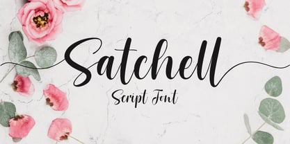 Satchell is a lovely and relaxed handwritten font. It is PUA encoded which means you can access all of the glyphs and swashes with ease! it has a gentle and beautiful flow, and as a result it will elevate each of the designs you wish to create!. It’s the perfect font for wedding invitations, stationery, photography, social media posts, product packaging, greeting cards, and much more!
 - Geonica by Struvictory.art,
$16.00 Geonica is minimalistic geometric sans serif font with different line width. Geonica is suitable for the design on the theme of architecture, game industry, minimalism ect. Geonica includes stylistic alternates for symbols: A, E, K, M, O, Q, T, V, W, g. There are also ligatures: AA, AJ, AM, LA, LM, MA, MM, OO, VV, fi, gg, gi, gj, oo, ri, rr, ti, vv, yy.
 - Rainbowie by Stephan Kamperman,
$18.00 Rainbowie is a font that's ideally used for festivals, artists and logos. It has 3 different widths to make it ideal to use in small and wide spaces. The font has a stencil style that can be used in suprising ways for an unique touch in your design. It also provides several special characters with a star, sun, cloud, trees, guitar, lightning bold and heart.
 - Quebra by Vanarchiv,
$55.00 Quebra is an extend display sans-serif font family with four widths (Extra Condensed, Condensed, Normal and Expanded) and ten weights, italics versions are available. The main strokes contain small breaks simulating modulated variations on the letterforms, these details are more present on large body sizes. All font versions contain Latin and Cyrillic encoding characters and also ligatures, case-sensitive forms, fractions, oldstyle and finally tabular figures.
 - Brandon Grotesque Condensed by HVD Fonts,
$40.00 Eight years after the initial release of Brandon Grotesque , the typeface has grown into a font family of 48 styles, including a version for small sizes and a space saving condensed version. This type family was completely drawn from scratch with the look and feel of the original normal-width version. Today, Brandon supports at least 116 languages, from Latin based languages to Greek and Cyrillic.
 - Fundevogel by Hanoded,
$15.00 Fundevogel is a Brothers Grimm fairytale about a boy who was found in a tree. The story, of course, has all the obligatory characters in it: a fair maiden, a wicked cook, an old forester and lots and lots of shapeshifting. And, yes, a happy end! Fundevogel font is a handmade fairytale font. It comes with extensive language support and all the cuteness you could wish for.
 - Raspberry Sherbet by Hanoded,
$15.00 I have actually never had a sherbet. When I made this font family, I wish I had one, as it was a whopping 38 degrees (Celsius, not Fahrenheit…) outside. Raspberry Sherbet is a cute little font family, consisting of a rounded fat kids font and an inline version. Comes with all the bells & whistles, plus a super duper cooling effect when you use it!
 - Hedgier by Fridaytype,
$15.00 Hedgier - Modern Serif Typeface Hedgier is a modern bold serif typeface called weiss roman. The combination with the width of each letter forms a modern feel and is suitable for various magazines, logos, branding, photography, invitations, wedding invitations, quotes, blog headers, posters, advertisements, postcards, books, websites, etc. Files Includes: - Uppercase & Lowercase - Numerals & Punctuation - Multilingual - Ligature Drop any message if you any question, Thank you! Fridaytype
 - Anglaise by Ladyfingers,
$39.00 Anglaise was designed for display and it likes to be big and present, filling the width of a whole spread. The repetition of vertical black and white space holds the typeface together and the contrasting straight and round shapes add the personality... for even more... use the OpenType features, and Anglaise will start merging and building new characters for you to play around with... Enjoy!
 - Bronto by W Type Foundry,
$29.00 Bronto is a typeface that mutated many times: it went from being morphologically conventional, to have soft features, to finally have some inverted contrasts that made it more dynamical; but all this without losing sight of the meaning of a typefamily, and the aim pursued by this work: Bronto doesn’t behave as a piece of art, but as a tool. In some weights, this typeface possesses fluffy characteristics and is boldly bighead, while in other versions is slightly contrasted and controlled; this in order to maintain the essential features of the typefamily along the versatility and usability of the 20 variations that composed it. Bronto it’s inspired in neo humanists typographies of the 20th century, and in Chilean lettering. This kind of work was made by the spontaneity of the paintbrush, which gave an inverted contrast to some characters. This typeface has plenty of OpenType features, specially an extensive set of ligatures in all weights. Bronto is well suited for motion graphics, letterings, web, advertisings, magazines and books.
 - Jojo by Canada Type,
$24.95 A little more flower and a little less power, please. Fun, friendly, fashionable, and feminine to a fault, Jojo takes display typography to a whole new level, where eyes can’t help but appreciate the day and the design at hand. It takes a graphic designer very little imagination to see these letters on posters, book covers, clothes, and craft paraphernalia. Or how about a sign over a bakery? A music sleeve? A romantic comedy titling? Cosmetics products? Pretty much anywhere! Jojo takes its name from a Beatles song about getting back to where we once belonged. It also takes most of its shapes from vintage photo-setting days, when an art nouveau typeface called Spring, by B. Jacquet, was putting happy times back where they belonged, which was everywhere. The original photo-setting face came in just 26 letters and 10 numerals. This digital retooling optimizes the original forms and expands on them, for a full character set of over 430 glyphs, including ligatures and stylistic alternates, and support for the majority of Latin languages.
 - Ramaskrig by Bogstav,
$17.00 Interesting script font with lovely crunchy details - comes with multilingual support and contextual alternates with 4 different versions of each letter, and they cycle automatically as you type!
 - Danu by Phoenix Group,
$12.00 Danu font is a font with a traditional style with a minimalist approach, this font is inspired by Javanese script with curved letters and some dots in it.
 - Roadie PB by Pink Broccoli,
$16.00 Roadie was inspired by a 1981 Hallmark card with lettering that was full of frolicking fun. Filled with a childish persona and a playful bounce, this Roadie has a lot to offer. As with some of my previous type designs, it is a typographic dance, wonderfully skipping across designs, surprising with each letter typed. With an extensive character set, and clean sharpie marker-like look, Roadie is a joy to typeset with, and it comes with a stylistic alternates feature that shuffles the Capitals and lowercase that share similar unicase forms that add to the quirky playfulness.
 - "Porn Star Academy" is a font that, as provocative as its name might imply, embodies a blend of playfulness, audacity, and a touch of rebellion. Designed with an intention to stand out and capture at...

