10,000 search results
(0.044 seconds)
- Billy Betty by Romie Creative,
$13.00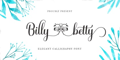 B illy betty - elegant Calligraphy font is a romantic and sweet calligraphy typeface with characters that dance along the baseline. It has a casual and yet elegant touch. It can be used for various purposes such as logos, wedding invitations, headings, t-shirts, letterhead, signage, lables, news, posters, badges etc. The fonts include OpenType features with stylistic alternates, ligatures and multiple language support. To enable the OpenType Stylistic alternates, you need a program that supports OpenType features such as Adobe Illustrator CS, Adobe Indesign & CorelDraw X6-X7, Microsoft Word 2010 or later versions. There are additional ways to access alternates/swashes, using Character Map (Windows), Nexus Font (Windows), Font Book (Mac) or a software program such as PopChar (for Windows and Mac). How to access all alternative characters, using Windows Character Map with Photoshop: https://www.youtube.com/watch?v=Go9vacoYmBw How to access all alternative characters using Adobe Illustrator: http://youtu.be/iptSFA7feQ0 How to use stylistic sets font in Microsoft Word 2010 or later versions: https://youtu.be/x1A_ilsBsGs
 - Splatterpunks by Wing's Art Studio,
$10.00 Splatterpunks - A Halloween Brush Font Introducing a fresh terror this Halloween, Splatterpunks is a hand-drawn brush font inspired by the blood-soaked pages of horror comics from the 1970s and 80s. This textured all-caps lettering evokes a spine-tingling tension that will leave your readers on tenterhooks. With a creeping, stretched look like that of a surprised cat, it offers of set of diabolical tools worthy of any horror fan! The Splatterpunks font family includes all-caps uppercase and lowercase characters, along with numerals, punctuation, symbols and language support. Also included are a complete set of alternative characters and additional paint marks, drips and splashes. Wingsart Studio Design Tip! The uppercase and lowercase characters work great when mixed in an alternating fashion, with shapes that combine to create a dynamic, almost unhinged look that's perfect for the Halloween season. Add the alternatives and paint marks into the mix and you'll have yourself a title or header design that looks truly custom-made.
 - Arabelle Script by madjack.font,
$10.00 Arabelle Script is a sweet, romantic calligraphy typeface with characters dancing along the baseline. It has a casual yet elegant touch. Can be used for various purposes such as logos, wedding invitations, headers, t-shirts, letterheads, signboards, labels, news, posters, badges etc. The font includes OpenType features with alternative styles, ligatures, and multiple language support. To enable OpenType Stylistic alternates, you will need a program that supports OpenType features such as Adobe Illustrator CS, Adobe Indesign & CorelDraw X6-X7, Microsoft Word 2010 or later versions. There are additional ways to alternate / swash, using the Character Map (Windows), Nexus Font (Windows), Font Book (Mac) or a software program like PopChar (for Windows and Mac). How to access all alternative characters, using Windows Character Map with Photoshop: https://www.youtube.com/watch?v=Go9vacoYmBw How to access all alternative characters using Adobe Illustrator: http://youtu.be/iptSFA7feQ0 How to use a stylish font set in Microsoft Word 2010 or later versions: https://youtu.be/x1A_ilsBsGs
 - Authemia by Skinny Type,
$15.00 Authemia is a font duo Script, Sans, and plus Extras typeface with characters dancing along its baseline. It has a casual and elegant touch. Can be used for various purposes such as logos, wedding invitations, headings, t-shirts, letterheads, signage, labels, news, posters, badges etc. OpenType features with alternative styles, ligatures, and multi-language support. To enable OpenType Stylistic alternates, you need a program that supports OpenType features such as Adobe Illustrator CS, Adobe Indesign & CorelDraw X6-X7, Microsoft Word 2010 or a later version. How to access all alternative characters, using the Windows Character Map with Photoshop: https://www.youtube.com/watch?v=Go9vacoYmBw How to access all alternative characters using Adobe Illustrator: http://youtu.be/iptSFA7feQ0 There are additional ways to alternate / swash, using the Character Map (Windows), Nexus Font (Windows), Font Book (Mac) or a software program like PopChar (for Windows and Mac). Need help? If you need help or advice, please contact me via email. Thank you!
 - Hot Pursuit by Wing's Art Studio,
$18.00 Hot Pursuit: A Hand-Drawn Grind-house Roller Derby Font A grungy hand-drawn font with attitude inspired by comic books, Roller Derby and bad Grindhouse movies. Hot Pursuit is a boiling pot of pop-culture references ranging from 70s chase movies to Roller Derby, horror comics to Grindhouse cinema. All combining to create a hand-drawn font for grungy designs with maximum punch. Supplied in regular and italic styles, it creates titles that race off the page, perfectly suited for dynamic movie posters and headlines. Along with the 4 font styles you’ll also find a host of original comic art by Christopher King, plus symbols and underlines to compliment your type. Hot Pursuit contains unique uppercase and lowercase characters, numerals, punctuation and language support. It’s a bad-ass font ready for your t-shirts, posters, stickers, movie titles, YouTube videos and more! Check out the visuals to see it in action for yourself.
 - Glowing Script by Suza Studio,
$12.00 Glowing Script is a romantic and sweet calligraphy typeface with characters that dance along the baseline. It has a casual and yet elegant touch. It can be used for various purposes such as logos, wedding invitations, headings, t-shirts, letterhead, signage, labels, news, posters, badges etc. The fonts include OpenType features with stylistic alternates, ligatures and multiple language support. To enable the OpenType Stylistic alternates, you need a program that supports OpenType features such as Adobe Illustrator CS, Adobe Indesign & CorelDraw X6-X7, Microsoft Word 2010 or later versions. There are additional ways to access alternates/swashes, using Character Map (Windows), Nexus Font (Windows), Font Book (Mac) or a software program such as PopChar (for Windows and Mac). How to access all alternative characters, using Windows Character Map with Photoshop: https://www.youtube.com/watch?v=Go9vacoYmBw How to access all alternative characters using Adobe Illustrator: http://youtu.be/iptSFA7feQ0 How to use stylistic sets font in Microsoft Word 2010 or later versions: https://youtu.be/x1A_ilsBsGs
 - Endless Sunrise by Wing's Art Studio,
$10.00 A hand-made retro script font duo inspired by 80s action movies! This hand-made, retro styled script font was born from a childhood watching countless 80s action movies. Stories of inspirational heroism and competition, all set against impossibly beautiful Summer sunsets. And no self-respecting 80s movie would be without the coolest title design, setting the stage with a seemingly spontaneous glide of the designer’s brush. Endless Sunrise aims to capture this spirit through it’s loose, hand-drawn design and complimentary sans-serif. It comes with a complete set of alternatives and underlines for true customisation, meaning you’ll never have to repeat an E or an I; the tale-tell signs that give away other script fonts. It also features uppercase and lowercase characters, along with numerals, punctuation and language support. An awesome font that will work equally well across film, sports, music, merch and more! Find more from The Video Store Collection at Wingsart Studio
 - Natalic Script by Rastype Studio,
$12.00 Natalic Script is a modern and sweet calligraphy typeface with characters that dance along the baseline. It has a casual and yet elegant touch. It can be used for various purposes such as logos, wedding invitations, headings, t-shirts, letterhead, signage, lables, news, posters, badges etc. The fonts include OpenType features with stylistic alternates, ligatures and multiple language support. To enable the OpenType Stylistic alternates, you need a program that supports OpenType features such as Adobe Illustrator CS, Adobe Indesign & CorelDraw X6-X7, Microsoft Word 2010 or later versions. There are additional ways to access alternates/swashes, using Character Map (Windows), Nexus Font (Windows), Font Book (Mac) or a software program such as PopChar (for Windows and Mac). How to access all alternative characters, using Windows Character Map with Photoshop: https://www.youtube.com/watch?v=Go9vacoYmBw How to access all alternative characters using Adobe Illustrator: http://youtu.be/iptSFA7feQ0 How to use stylistic sets font in Microsoft Word 2010 or later versions: https://youtu.be/x1A_ilsBsGs
 - PM Doorbuster Casual by Paper Moon Type & Graphic Supply,
$17.00 The PM Doorbuster Collection is based on retro hand-painted paper signs primarily seen in grocery stores from the 1940s through today. We meticulously hand-drew each font, modeling the spacing and uneven baseline found in vintage sign painting. The purposely organic ascenders and descenders, along with a huge set of ligatures/contextual alternates to avoid the same letters repeating when paired, give it a real hand-lettered look. PM Doorbuster Casual is perfect for both vintage-inspired and contemporary marketing, branding, and packaging designs. It's a classic uppercase sign painter font that has been used from the 1950s thru today. You've probably seen hand-lettered versions used in tattoo studios, workshops, and chalkboard menus. Now it's available in a digital format with all of the authentic look and feel of actual hand-painted letters. Check out a few of the samples included in the thumbnails to see what can be done with it.
 - Rainbow by Nk Studio,
$20.00 Rainbow is a soft and sweet script typeface, with the characters dancing along its baseline. It has a casual and elegant touch. Can be used for various purposes such as logos, wedding invitations, headers, t-shirts, letterheads, signboards, labels, news, posters, badges etc. OpenType features with alternate styles, ligatures and multi-language support. To activate the OpenType Stylistic alternative, you need a program that supports OpenType features such as Adobe Illustrator CS, Adobe Indesign & CorelDraw X6-X7, Microsoft Word 2010 or a later version. How to access all alternative characters, using the Windows Character Map with Photoshop: https://www.youtube.com/watch?v=Go9vacoYmBw How to access all alternative characters using Adobe Illustrator: http://youtu.be/iptSFA7feQ0 There are additional ways to swap / swap, using Character Map (Windows), Nexus Fonts (Windows), Font Book (Mac) or a software program such as PopChar (for Windows and Mac). Need help? If you need help or advice, please contact me via email. Thank you!
 - Resort by Los Andes,
$39.00 This font collection includes a contemporary casual Script typeface and a sophisticated all caps Sans that features high contrast between thick and thin strokes. When used together, these fonts offer high versatility—perfect for magazines, blogs, mockups, use with social networking sites, logos and headlines as well as greeting cards, invitations, book covers, posters, and web and on-screen use. Resort is a font collection consisting of 12 styles and 3 variants: Script, Sans and Ornaments. The font set is intended to provide users with a wide range of choices for any design project. The collection comes with a relaxing Script of 5 weights and a classic 6-weight Sans, and includes lively floral ornaments. Resort evokes the feeling of relaxing barefoot walks along the beach while enjoying the sunset and a refreshing cocktail. Resort was designed by Guisela "Coto" Mendoza and Luciano Vergara. Digital editing by Rodrigo Fuenzalida. Photos courtesy of Sarah Loven—a popular beauty, travel and lifestyle blogger.
 - Evalfey by insigne,
$35.00 Love at first sight: Evalfey is a script you will find yourself falling for. It has a smooth, sophisticated look to it, but don't be fooled by its elegant appearance – this script is actually very simple and easy to use. The tall x-height, flag like terminals and flame-like smooth, sweeping strokes give this font a fluid, flowing quality that will help enhance your design. Evalfey Script is a great font for a wedding invitation or similar. The elegant, brushed look and strong "nuptial" feel make this the perfect choice for wedding invitations, save-the-date cards, thank you notes, and more. Evalfey is the perfect font for any wedding invitation or ceremony. Simple and elegant, Evalfey is a good choice for the wedding that likes to stand out from the crowd. The tall x height, graceful flag-like terminals, and wavy sweeping strokes give this font a regal appeal. Evalfey is a perfect combination of elegance and simplicity for your wedding invitation, announcement card or other special document. Production assistance from Lucas Azevedo and ikern.
 - The "Joe DiMaggio" font, conceptualized by an artist named Chloe, embodies the swift, elegant essence of its namesake, the legendary American baseball player Joe DiMaggio. Reflecting DiMaggio's smoot...
- Tripper Pro by Underware,
$50.00 Tripper is a rock-hard display font family. The six styles – from Light to Black – of this robust stencil typeface will assure your text grabs all the attention it can get. Instead of settings large amount of texts, just use this font for a small amount of words. Or even better: just one word. But most importantly: make it really, really, really big. The lightest weight is pretty condensed, and slowly expands when the weight increases. The bridges – essential to a stencil font – have the same width across all styles, so you can safely apply all styles in the same size without the risk of stencils falling apart. Due to the absence of curves throughout the whole family, Tripper is suitable for more limited, industrial applications too. Tripper comes in several flavours. Next to the basic flavour, there is a stencil family which automatically creates borders around every letter, word or line. Then there is Tripper Rough, a textured version with that intelligent random, grungy look. Together with the previously released multi-colour font Tripper Tricolor, the complete family consists of 24 styles. Tripper is equipped with a bunch of OpenType features, like different figure styles, fractions, superiors, etc. But if all the OpenType ding-dong is not enough for you, just try the ornaments. The separate ornament font comes with icons, indicators, manicules, banderoles and patterns.
 - Adelle Mono by TypeTogether,
$36.00 The Adelle family continues its stylistic expansion with the release of Adelle Mono and Adelle Mono Flex by Veronika Burian and José Scaglione. Monospaced typefaces are the default choice for developers and programmers and are also an aesthetic choice for many designers and communicators. The Adelle Mono font family has two widths to serve both breeds and a variable font for the flexible spectrum in between. Monospaced typefaces are born of necessity rather than purely aesthetic values. Each glyph is constrained to a strict box, making the naturally smaller ones the same width as the naturally wider ones. While this serves the functional purpose of keeping text aligned in vertical and horizontal rows, it is completely unnatural in terms of readability. A monospaced ‘l, i’ are overblown compromises while ‘m, w’ become compressed mutations. The Adelle Mono family was therefore designed with both the developer and the aesthete in mind. Adelle Mono respects its necessary constraints while still being visually appealing and easily read. Activate it for use in Sublime, Swift, Terminal, or your IDE of choice and see how well it performs. Clarity will lead to less developer mistakes, and its aesthetic appeal will make your work enjoyable. Adelle Mono Flex is the proportional width version that works for any kind of normal text reading or a design intended to invoke “system or information aesthetics”. Opposite the demands of the monospace family, Flex is reader friendly and intended for branding, annual reports, paragraphs, UI, logos, posters, screens, tables, captions, and more. Employ the Mono version where monospace is needed and the Flex version where reading or coherence is priority. Adelle Mono’s experimental 20-style design explores the space between proportional and monospaced types. It boosts creativity and coherence by providing flexible options in the same family, including italics and the variable font format with an axis of weight and a spectrum axis between multi-width and monospaced characters. Combining Adelle Mono with either Adelle or Adelle Sans adds more layers and adaptability to your work.
 - Skullbats by Canada Type,
$24.95Patrick Griffin's sister is a really annoying individual sometimes. Not only is she into theater, but she thinks everyone else in the universe is into it as well. So once in a while tickets to local or provincial Shakespearean plays get delivered to the mailbox or dropped off on the living room's table. And once in a while the tickets just cannot be "lost" or ignored. Three or four times a year, Patrick must be subjected to Olde Englishe Speake, umbrella dresses and squeezetops, featherhats and men in leggings, rhyme and treason, mortality and immorality, drama inflicted by some mama, and it never ends. Last June it was Hamlet. Again. Someone's (wink wink) idea of a good time. There he goes, the Prince of Denmark, holding that skull with the tips of his fingers like it's an alien egg. Alas, poor Yorick! Yadda yadda boop-bop-a-loo-bop. And so the idea of a font made of skulls was born. And what can we possibly be but conduits for such abhorring ideas? Where be our gibes, our songs, our flashes of merriment? Skullbats has more skulls than you'll ever see in your lifetime. At least we hope so. Scary skulls, funny skulls, evil skulls, strange skulls, pixel skulls, fiery skulls, surprised skulls, happy skulls, sad skulls, cow skulls, sketched skulls, profiled skulls, light bulb skulls, cartoon skulls, techno skulls, alien skulls, expressionist skulls, pirate skulls, horned skulls, and skulls with whacky headgear. You name it, it's there. There's even a disco skull there for you. We lost count at 90 skulls, but there's a few more in there. For a complete showing of the skulls in the font, consult the image in the MyFonts gallery. Patrick's sister didn't turn out to be so bad after all. After making this font, he couldn't help but notice that her skull was a bit small compared to his. So now he takes every opportunity to remind her that the size of the cranium is relative to what it houses. Her upcoming halloween present will be a shirt with guess-what on it. Shirts, now there's putting Skullbats to good use! - FS Ostro by Fontsmith,
$80.00 Cosmopolitan Elegance Named after a southerly wind that blows over the Mediterranean Sea, FS Ostro breathes warmth into letterforms with their roots in colder, stark Modern typefaces. FS Ostro is a typeface imbued with balanced and sophisticated elegance. It’s discerning and sensitive, self-assured but understated. One for the well-travelled reader. Thoughtful contrast FS Ostro draws inspiration from a wide range of sources, such as 19th century British Scotch Roman designs, Italian modern style typefaces and highly contrasted display Spanish examples. Its text version offers a consistent rhythm and robust texture that is easy on the eye. This elegant, cosmopolitan typeface is characterised by its thoughtfully modulated contrasts between thick and thin, sharp angles, and sophisticated curves. Exaggerated touches in display “What is more restrained and sober in text, becomes purposefully prominent and more detailed in display,” says Fontsmith designer Alessia Mazzarella. These exaggerated details for the display version can be seen in the letter terminals, such as those in the ‘a’ and ‘g’ and the tail of the ‘Q’, as well as in the set of numerals, fractions, arrows, borders and ornaments, which can be used to build decorative framing elements. Fluid italics The less rigid and curvaceous italics of modern style typefaces were the inspiration for FS Ostro’s own subtle, flowing italic styles. The letterforms are confident and fluid, creating an overall sense of refinement and modernity.
 - FS Ostro Variable by Fontsmith,
$119.99Cosmopolitan Elegance Named after a southerly wind that blows over the Mediterranean Sea, FS Ostro breathes warmth into letterforms with their roots in colder, stark Modern typefaces. FS Ostro is a typeface imbued with balanced and sophisticated elegance. It’s discerning and sensitive, self-assured but understated. One for the well-travelled reader. Thoughtful contrast FS Ostro draws inspiration from a wide range of sources, such as 19th century British Scotch Roman designs, Italian modern style typefaces and highly contrasted display Spanish examples. Its text version offers a consistent rhythm and robust texture that is easy on the eye. This elegant, cosmopolitan typeface is characterised by its thoughtfully modulated contrasts between thick and thin, sharp angles, and sophisticated curves. Exaggerated touches in display “What is more restrained and sober in text, becomes purposefully prominent and more detailed in display,” says Fontsmith designer Alessia Mazzarella. These exaggerated details for the display version can be seen in the letter terminals, such as those in the ‘a’ and ‘g’ and the tail of the ‘Q’, as well as in the set of numerals, fractions, arrows, borders and ornaments, which can be used to build decorative framing elements. Fluid italics The less rigid and curvaceous italics of modern style typefaces were the inspiration for FS Ostro’s own subtle, flowing italic styles. The letterforms are confident and fluid, creating an overall sense of refinement and modernity. - FS Olivia Paneuropean by Fontsmith,
$90.00Antwerp On a visit to Belgium and the Netherlands while still an MA student at Reading University, Eleni Beveratou made some important discoveries. First, there was the letter ‘g’ from the Didot family seen at Plantin Moretus Museum in Antwerp, which seemed “almost like a mistake”. Then there were strange details such as the serifs on the “l”, “h”, “k”, “b” and “d” in Egmont Cursive and other typefaces by Sjoerk Hendrik de Roos, found in volumes of poetry she picked up from a chaotic bookshop in Amsterdam. These were characters that stood out from the text but seemed to blend harmoniously with the rest of the letters. “And there it was, the spark. I decided to design a typeface that would capture the details of the process of writing.” A guiding hand Eleni shared her initial thoughts with Phil Garnham and Jason Smith. They liked what they saw in her tentative first sketches, and gave her the chance to develop her ideas further. Phil, in particular, provided valuable input as FS Olivia took shape. Eleni’s main influence – the handwritten – would give the font its character. “When creating a typeface,” says Eleni, “it’s fair to say that it reflects some of the designer’s personality. And that’s certainly the case with FS Olivia. “Although technology is part of my everyday life. I am a great admirer of traditional graphic design where you can touch and feel paper and ink.” Irregular “What I particularly like,” says Eleni, “is that a printed item can develop its own personality sometimes as a result of imperfections in the print. “FS Olivia has some of these characteristics as it’s inspired by handwriting, and yet it also includes some very modern features.” Feminine and fascinating, FS Olivia captures the expressive twists and turns of (the poet’s?) pen on paper, with low junctions, deep top serifs and semi-rounded edges. Round outstrokes contrast with the rough corners of the instroke, while strong diagonals and inclined serifs create a richly textured pattern. Polytonic It’s only fitting that there should be a version of this poetic font for one of the birthplaces of poetry and song. Eleni, who hails from Athens, developed an extensive range of glyphs that could be used for the Greek language, in both modern and ancient texts. For the latter, there is a version of Olivia for displaying polytonic Greek (a system that utilises a range of accents and “breathings”), which brings the 21st century technology of OpenType to the presentation of poetic texts from Ancient Greece. Just think what Homer could have done with that. - FS Olivia by Fontsmith,
$70.00 Antwerp On a visit to Belgium and the Netherlands while still an MA student at Reading University, Eleni Beveratou made some important discoveries. First, there was the letter ‘g’ from the Didot family seen at Plantin Moretus Museum in Antwerp, which seemed “almost like a mistake”. Then there were strange details such as the serifs on the “l”, “h”, “k”, “b” and “d” in Egmont Cursive and other typefaces by Sjoerk Hendrik de Roos, found in volumes of poetry she picked up from a chaotic bookshop in Amsterdam. These were characters that stood out from the text but seemed to blend harmoniously with the rest of the letters. “And there it was, the spark. I decided to design a typeface that would capture the details of the process of writing.” A guiding hand Eleni shared her initial thoughts with Phil Garnham and Jason Smith. They liked what they saw in her tentative first sketches, and gave her the chance to develop her ideas further. Phil, in particular, provided valuable input as FS Olivia took shape. Eleni’s main influence – the handwritten – would give the font its character. “When creating a typeface,” says Eleni, “it’s fair to say that it reflects some of the designer’s personality. And that’s certainly the case with FS Olivia. “Although technology is part of my everyday life. I am a great admirer of traditional graphic design where you can touch and feel paper and ink.” Irregular “What I particularly like,” says Eleni, “is that a printed item can develop its own personality sometimes as a result of imperfections in the print. “FS Olivia has some of these characteristics as it’s inspired by handwriting, and yet it also includes some very modern features.” Feminine and fascinating, FS Olivia captures the expressive twists and turns of (the poet’s?) pen on paper, with low junctions, deep top serifs and semi-rounded edges. Round outstrokes contrast with the rough corners of the instroke, while strong diagonals and inclined serifs create a richly textured pattern. Polytonic It’s only fitting that there should be a version of this poetic font for one of the birthplaces of poetry and song. Eleni, who hails from Athens, developed an extensive range of glyphs that could be used for the Greek language, in both modern and ancient texts. For the latter, there is a version of Olivia for displaying polytonic Greek (a system that utilises a range of accents and “breathings”), which brings the 21st century technology of OpenType to the presentation of poetic texts from Ancient Greece. Just think what Homer could have done with that.
 - Labernia by Tipo Pèpel,
$22.00 In 1864, a new edition of ‘Labèrnia dictionary’ was published. The book is commonly known under this name as a homage to the author. The typeface used in this publication has been taken as the main reference for the design of a new type family. Labernia is a didone design that includes several variations in width, weight, and contrast. Labernia is a stylish typeface, which pushes its design features to the limit. The high-contrast strokes—seen in most modern typefaces—give a delicate softness to the titling cuts of Labernia. Meanwhile, the characters in the condensed version have a very compact body so they create a highly expressive text. In the italic letterforms, the long terminals aim to connect the characters without touching. And, if we look at the figures we will see a more decorative design, which helps to build a strong personality.
 - Spotlight by ITC,
$29.99Spotlight was created by British designer Tony Geddes in the tradition of the bold serif fonts of early 19th century England. It too is a robust alphabet exhibiting extreme stroke contrasts, however, Geddes gave his font a more relaxed feel by not filling in the strokes completely. Long white rays break up the otherwise dark black strokes, following the form of the outer contours and giving the figures a three dimensional look. Spotlight is also reminiscent of the decorative advertisements of the 1930s and of the glamorous revues and shows of this time. Spotlight is perfect for headlines and display in larger point sizes. - Scala Jewel Pro by Martin Majoor,
$29.00 Scala Jewels is a set of four highly decorative typefaces, based on the bold capitals of Scala. Whereas Crystal and Pearl are modelled on historic examples, Diamond and Saphyr are original designs. Scala Jewels offers the possibility to set decorated borders, designed in the style of each of the four variations. There are corners and different sorts of long and short elements. One of the best ways to use Scala Jewels is as a two- or three-line drop cap at the start of a chapter. The award-winning Scala family (1990-1993) is a worldwide bestseller and has established itself as a ‘classic’ among digital fonts.
 - Enn'agrammaton by Proportional Lime,
$1.99 Trithemius, a 15th century Abbott, and influential counselor to Emperor Maximilian I, was also an author who wrote both histories and the first printed work on cryptography which gained him much adverse notoriety. He has been long regarded as a mystic and some of his works were therefore banned. However, it may have been his intention to cloak his cryptology essays in mystical writing to keep people from easily grasping the subject matter, which it has been recently demonstrated, at heart was really cryptological methodology. This font is based on a printed version of the Polygraphiae a text that included many methods of encryption.
 - Wieynck Fraktur by RMU,
$25.00 Heinrich Wieynck’s blackletter font, carefully redrawn and redesigned for modern use. Due to its proportions, this blackletter font can also be used for body texts. This font contains the letter ‚long s‘ which can be reached in two ways. Either you use the OpenType feature ‚historical forms‘, or you type the summation sign on your keyboard. There are two graphic elements implemented, a corner element and a pearl for framing. The corner can be set by [alt] + [shift] + 1 for the outline, and [alt] + v for the filling. The pearl, set on a path, is accomplished by [alt] + [shift] + p for the outline, and [alt] + p for the filling.
 - ITC Ludwig by ITC,
$29.99ITC Ludwig has an edge. It's nervous, tense - maybe even a little scary. Drawn by Italian designer Giuseppe Errico, ITC Ludwig refuses to be confined to a traditional baseline. Its twisted lowercase g" and an "e" that could double as an upside-down "a" both add to the design's spooky personality. As a young man, Errico studied to be a fine artist. He became a graphic designer only after a “long reflection period,” he says. His early training is evident in many of ITC Ludwig's suggestive qualities. There is far more to this face than cranking up the “distort” knob in Fontographer. Reflection and personal expression are at its core." - M Marker HK by Monotype HK,
$523.99 M Marker is a humanistic script design characterised by its italic, modern, box marker pen-like style. M Marker incorporates features of carton box marker pen, its strokes beginning and ending are rough, parallel without flare. Contrast of strokes is high. Its extra bold stems (豎) make it suitable for large display text to catch attention. Crossbars (橫) and stems (豎) are straight but slanted while angles (折) are smooth and well rounded. Dots (點), ticks (剔), hooks (勾) and downstrokes (撇、捺) are irregular, smooth and long to create softness, liveliness. It is best suited for casual and lively display, illustrations, set upright (naturally slanted), non-condensed.
 - RyuGothic by StudioJASO,
$42.00 RyuGothic Family is a humanistic interpretation of the Hangul Gothic style. It delivers messages in a soft, calm tone that does not overpower. The narrow counter design of consonants in Hangul and the narrow counter of the Latin lowercase letters are connected to create a sense of structural unity between the two sets of characters. This enables you to read long lines and works well in a variety of media and situations. Each font includes: 2,350 Hangul syllables, the smallest unit for expressing modern Korean; Latin Basic; punctuation; symbols for Korean codepage. Cyrillic, Greek, and Kana alphabets were excluded. The punctuation is designed in the preferred location for Korean typesetting.
 - Juicer by Hanoded,
$15.00 We use an old hand juicer at home: a cheap plastic one that we bought a long time ago at a Swedish home appliances and furniture giant. We haven never considered upgrading to an electronic one, as it still works, it doesn’t use electricity and we don’t really use it that often. This font is called Juicer. It was not named after our manual juicer, or any juicer in particular. It was just a word that seemed to fit the font nicely. Juicer font is a handwritten, script-ish kinda font that comes in two great styles and contains a set of double letter ligatures.
 - Cochin by URW Type Foundry,
$35.99 The Cochin font is based on the work of eighteenth-century punchcutter, Cochin. Charles Peignot commissioned the revival of this strong typeface in 1912. The capitals are squarish. The lowercase has long ascenders and sharp serifs, giving Cochin an unusual elegance. The curved ascender in the italic lowercase d is a major characteristic and the p and q lack foot serifs. Cochins overall vivacity derives from the engravings on copper, produced in France in the eighteenth century. Cochin is a trademark of Linotype Corp. registered in the U.S. Patent and Trademark Office and may be registered in certain other jurisdictions in the name of Linotype Corp. or its licensee Linotype GmbH.
 - Mistral by URW Type Foundry,
$89.99 Named after the strong cold winds on Southern France, the Mistral font family is another original creation displaying the panache of the French graphic artist Roger Excoffon. Mistral is an informal script in which all letters link up in vigorous strokes. First issued in 1953, its brush-like stems look spontaneous and fresh. The descenders are fairly long and the whole alphabet has a distinctive and unforgettable effect on the page. Mistral is a good complement to sans serif typefaces. Mistral is a trademark of Heidelberger Druckmaschinen AG, which may be registered in certain jurisdictions, exclusively licensed through Linotype Library GmbH, a wholly owned subsidiary of Heidelberger Druckmaschinen AG.
 - Amaretto by JVB Fonts,
$39.00 AMARETTO, inspired by classic structure of italics, as an original variation of vertical style. Ludovico Arrighi has given us the legacy of classical calligraphic structures that times later lays the foundations of Cancelleresca style and then, the italics as extension of a classic roman serif used in the Renaissance, as main typographic way of expression in Italian printed books. The name Amaretto reminds one of the most representative and delicious liqueur as strong distinctive Italian taste. AMARETTO can be used mainly in titles, long and display texts. Supports East Europe languages. Includes standard and discretionary ligatures, complete small caps, old style numbers, fractions, numerators and denominators and several OpenType features included.
 - China Syndrome by Hanoded,
$15.00 A really, really long time ago, I watched a movie called ‘The China Syndrome’ (starring Jane Fonda, Jack Lemon and Michael Douglas). It was one of those disaster movies that were quite popular at the time (I also recall airports, alien viruses and skyscraper fires). Anyway, when I finished this font, I suddenly (and quite inexplicably) remembered that movie, so I named this font after it. China Syndrome is a legible brush font - ideal for your product packaging and halloween posters. Maybe use it for a metal album cover, a book about nuclear disasters or, dunno, the logo of your really strong coffee brand. Whatever. Just enjoy!
 - Kursivfraktur by RMU,
$25.00 Inspired by Rudolf Engelhardt's Journal-Kursiv, released by Ludwig Wagner, Leipzig, in 1913, Kursivfraktur was freshly drawn and redesigned, and comes as one of those rare beautiful italic blackletter fonts. This font contains the letter long s which can be reached in two ways. Either you use the OT feature historical forms, or you type the integral sign [ ∫ ] on your keyboard. There are two graphic elements implemented, a corner element and a straight element for framing. The corner element lies on the Product sign [ ∏ ], the straight element you will find on the pi-key [ π ]. Furthermore it is recommended to activate the discretionary ligatures OT feature.
 - Caturrita by Armasen,
$12.00 Caturrita is a versatile family for use in both long texts, and can be used in titles. The characters have fluidity, contemplating the principle of continuity. It has structural strength of the glyphs to be drawn by considering aspects calligraphy. The name comes from the similarity between the characteristics of the bird well known in southern Brazil: drawing the loose, fluid that resembles a flying bird. Moreover, a clear reminder that some of the glyphs are the serifs beak of the animal. Prize Winner Bornancini - Porto Alegre RS - Academic Category Selected Project Muestra de Estudiantes for the Ibero-American Biennial of Design - Madrid - Spain
 - Excalibur Stone by Comicraft,
$19.00 After the death of Uther Pendragon, long before Arthur was King of the Britons and before Galahad was destined to find the Holy Grail, the mighty sword Excalibur appeared, thrust into a Stone bearing the inscription; “Whosoever Pulleth Out This Sword of this Stone and Anvil, is Rightwise King Born of England!” While no champion worthy of becoming king was able to pull the sword, England was plunged into the Dark Ages... the legend on the stone aged, and became cracked and weathered... much as one might find on your stone tablet, ipad or mobile device. See the families related to Excalibur Stone: Excalibur Sword.
 - ITC Deli by ITC,
$29.99Jim Spiece has a taste and a talent for reviving type styles from earlier in this century. ITC Deli Supreme is a “futuristic retro” face that would be at home as a logo on a car or a roadside diner from the 1940s or '50s; the lowercase nearly joins, in script style, thanks to the long extenders stretching out from the bottom-right corner of most letters, while the caps have beginning strokes leading in from the top left. ITC Deli Supreme, like ITC Deli Deluxe, features slightly rounded corners on all the letters, for a soft, streamlined look despite the squareness of the letterforms. - Brush Type Standard by Brush Art Design Office,
$39.50I created the brush font named "BrushType Standard" in my unique brush style. I made it for ad designers. I believe this is the only one brush font in the world, so using it will enable them to get easily satisfied on their work. Brush handwriting in Japan has a long and proud Tradition and History. I tried to interject this feeling of Tradition into my font designs for you to comprehend its true meaning. I trust I have succeeded to convey my feelings to you. In addition, I can say each letter of the "BrushType Standard" is truly art. I am a pioneer of Brush Art. - M Marker PRC by Monotype HK,
$523.99 M Marker is a humanistic script design characterised by its italic, modern, box marker pen-like style. M Marker incorporates features of carton box marker pen, its strokes beginning and ending are rough, parallel without flare. Contrast of strokes is high. Its extra bold stems (豎) make it suitable for large display text to catch attention. Crossbars (橫) and stems (豎) are straight but slanted while angles (折) are smooth and well rounded. Dots (點), ticks (剔), hooks (勾) and downstrokes (撇、捺) are irregular, smooth and long to create softness, liveliness. It is best suited for casual and lively display, illustrations, set upright (naturally slanted), non-condensed.
 - Permanent Park by Wing's Art Studio,
$16.00 Permanent Park - 1990s Graffiti Inspired Marker Pen Font A hand-drawn marker pen font inspired by graffiti tags and 1990s Hip Hop. Permanent Park is a marker pen font with a graffiti tag aesthetic inspired by the golden-age of Hip Hop and 1990s TV shows. It’s 100% hand-drawn and comes packed with alternative characters for creating truly natural looking type treatments. No repeated oo’s, ee’s and ll’s that are a dead give-away of lazy lettering! Permanent Park is a highly customisable all-caps design featuring a complete set of uppercase and lowercase characters, along with numerals, punctuation and language support. It also features a complete set of alternatives with additional lowercase characters (for mixing things up even more), and a selection of underlines and symbols for an illustrative flourish. It’s a uniquely fun, urban looking font, typical of 90s music videos and TV shows, and equally suited to sports, travel and food themes. Check out my visuals for ideas on how you might use it on posters, movie titles, product packaging, broadcast and advertising.