10,000 search results
(0.044 seconds)
- Brainoise by Ronny Studio,
$19.00 Punk-looking fonts usually embody the rebellious and edgy spirit of the punk subculture. It is characterized by its bold, jagged, and distorted letterforms, which often feature exaggerated or irregular shapes. This font is perfect for your design needs such as: for posters, magazines, covers, brands, logotypes, band logos, etc
 - PocketWrench by Deniart Systems,
$20.00 Make a bold statement with this modern, angular design - go wild and use it together with it's partner font, PolkaDot Wrench. This typeface features over 90 extended characters for setting European languages such as Czech, Danish, Dutch, Esperanto, Finnish, French, German, Italian, Hungarian, Polish, Portuguese, Romanian, Spanish, Swedish, Turkish & Welsh.
 - Peacher by Edignwn Type,
$12.00 The Peacher perfectly represents crafted stuff of vintage script. This project was inspired by beautiful old labels. The product includes 4 styles (regular, rounded, rough and textured). This matches applies in some designs such as the logotype, poster, label, badge, packaging, branding, quotes and more custom design. Peacher includes : 4 style typefaces (regular, rounded, rough and textured) Uppercase, lowercase, numeral, punctuation and symbol 7 sets of alternates and swashes 25 ligatures Multilingual PUA Encoded Thank you for your support and choosing us.
 - Mellow Sans by ParaType,
$30.00 Mellow Sans is a soft and friendly rounded sans serif. Its bold styles are great for packages of something tasty, while light and regular ones work well in rather long texts, from a children's book to a reading app, or a family restaurant menu. The typeface was created by Natalya Vasilyeva, an expert in designing text and calligraphic typefaces. Mellow Sans’s forms are based on humanist sans serifs. The nobility and liveliness of Renaissance calligraphy reads beneath its curves and makes the typeface even friendlier, while helping the eye to move along the line. The typeface supports extended Latin, extended Cyrillic (all major languages of the Russia’s peoples) and Greek. It also has old style figures, arrows and non-alphabetic signs. With Mellow Sans as a heading typeface (in that case bold styles fit the best), calm open sans serifs, f.e. Vast or Fact, are its optimal text companions on the screen. Calm serifs, f. e., Octava, Scientia or Aelita, will work as its companions on paper. And to create expressive typography, for example, in packaging, you can match Mellow Sans with quirky rounded serifs — Cooper or Epice.
 - Bourton Text by Kimmy Design,
$25.00 Bourton Text is a modern sans-serif typeface family perfect for both text type settings and display purposes. While it’s not a layering type family like its brother, Bourton, it come packed with features, extras and over 2,000 characters that make it stand on its own. HISTORY Bourton Text is a new take of the Bourton family that was one of the best-selling and favorite fonts of 2016. After countless requests for lowercase alphabet, or suggestions for a font pairing with Bourton, this new text setting family is based on the original shapes of Bourton. DESIGN & CREATION In taking Bourton Base was the starting point as they narrowest width and boldest weight. From there, lowercase shapes were designed that matched the aesthetic and details of the popular capitals. As Bourton was a heavy display font, some small tweaks were done to make it more fitting for smaller text settings, including reducing the letter-spacing and reworking some counters. Some areas needed complete reconstruction, such as the figures. The design of those began anew with a style that worked with the capitals and lowercase but also as a standalone set. Currency shapes were updated to match the numerals. Punctuation was also reimagined to work better in smaller type settings. Diacritics and extended language support was also updated and expanded to include full Latin plus language support for 219 latin based language spoken in 212 countries. Once the basic alphabet for Bourton Text Bold Narrow was formed, the font was expanded in both weight and width. Taking the weight from Bold down to Hairline, it allowed for more range in use. The typeface needed to be expanded in order to reach better as a book weight and width, in addition to a regular width, a wider version was create as well. FEATURES Once the extremes were set in place, small capital forms were designed for text and display purposes. These also allow for nested capital letters, lifted small caps and other display features offered in the typeface. One of the most popular fonts in the Bourton layering font family is Bourton Line. This led to an experimentation with rounded Bourton Text completely and thus a complete set of duplicated characters with rounded terminals. By using the Opentype Panel, a rounded font is a single click away. Every feature has been carefully thought out and updated across the entire font. In total, Bourton boasts over 2,300 glyphs, 42 font files with 3 widths and 7 weights in upright and italic.
 - Little Micro Sans by Caron twice,
$39.00 It is 1984 and Ridley Scott’s commercial for Apple tells us, “You’ll see why 1984 won’t be like ‘1984’.” The first Mac comes on the market. The Mac interface includes a font for use in small sizes called Chicago. The first version was designed by Susan Kare. The font’s modern grid-like character was also used for the first iPod screens, which is why this font is also associated with music. Today’s font upgrade, Little Micro Sans, is suited for small-point texts, product labels, lists of ingredients, and small captions in books, magazines, websites or applications. For online use, a variable format is particularly handy as it offers all font styles in a single file, has a faster display time and takes up less memory. Little Micro Sans is a revolution for small sizes. Specimen: http://carontwice.com/files/specimen_Little_Micro_Sans.pdf
 - Mildstones by IKIIKOWRK,
$17.00 Proudly present Mildstones - Modern Bold Sans, created by ikiiko. A contemporary bold condensed sans serif typeface created to breathe life into headlines with its eye-catching presence. Mildstones attracts attention and takes any design project to a new level with its striking and fashionable look. Each letter in Mildstones has undergone meticulous design in order to convey a sense of power, assurance, and beauty. The font has a sense of verticality and compactness due to the condensed proportions, which also make it easy to fit into small places while keeping outstanding readability. The Mildstones experience is more than simply a font. It has been meticulously designed to be a dependable and powerful typographic in terms of both aesthetic and readability. This type is very suitable for making a headline news, sport advetorial, logotype, branding, poster, magazine layout, quotes, or simply as a stylish text overlay to any background image. What's Included? Uppercase & Lowercase Number & Punctuation Multilingual Support Works on PC & Mac
 - Milkan Display by IM Studio,
$20.00 Milkan Display - A modern classic serif font, perfect for creating bold & beautiful designs. Milkan Display is classic and sophisticated typography with 2 weights to captivate your next project. A very versatile font that works in both large and small sizes. This font is suitable for a wide variety of projects such as: headlines, logos, labels, branding projects, magazines, homeware designs, product packaging, mugs, quotes, posters, and more. It can also be more expressive and fun, thanks to the many alternatives and binders that combine harmoniously in this font and make it more interesting and versatile. Try to change alternatives, binders and you will get many options for your project which will make it bold & beautiful. Feature: • Full set of uppercase, lowercase • 14 Ligatures • 80 Alternatives • A wide variety of numbers, symbols & punctuation • Characters with accents • Support Multiple Languages • PUA encoded This type of family has become the work of true love, making it as easy and fun as possible. I really hope you enjoy it!
 - Wonky by Ana's Fonts,
$16.00 The Wonky Font family is a set of 3 handmade fonts, made using three different materials: a pencil, a thin fineliner and a bold marker. Each font includes 3 variations for each letter and number, accessible through contextual alternates, for extra realism and fun. The pencil font is a SVG font, which allows for the texture of the pencil to be captured in a more authentic way, and is complemented with an extra doodles font. Wonky Font looks good at small sizes and will also look great in all caps texts. Use Wonky Font in designs such as postcards and notes, posters, logotypes, social media posts, branding and packaging. This font includes: a Wonky Pencil SVG font, with a vector alternative that preserves the texture a Wonky Thin font a Wonky Bold font a Wonky SVG Extras font, with 26 pencil doodles Software requirements for the SVG font: Photoshop CC2017+ // Illustrator CC2018+
 - SG Larchett by Studio Gulden,
$20.00 SG Larchett is a stunning new sans serif font perfect for display. It features clean, elegant lines and a modern, minimalist design that is stylish and versatile. The font is characterized by its balanced proportions, uniform stroke width, and subtle variations in letterform, giving it a distinctive and sophisticated appearance. The unique features of SG Larchett make it ideal for use in a wide range of design applications, including branding, advertising, packaging, and web design. The font's clean, uncluttered lines and legibility make it easy to read even at small sizes, while its bold, striking appearance ensures that it stands out in any design. SG Larchett is a font that commands attention, yet remains understated and refined. It is the perfect choice for designers looking to make a bold statement with their typography while maintaining a sense of elegance and sophistication. Whether used in headlines, logos, or body copy, SG Larchett is a font that will impress.
 - Ador Hairline by Fontador,
$24.99 Ador Hairline is the high contrast version of Ador . A humanist sans serif that falls in the “evil serif” genre, especially designed for contemporary typography and comes up with 7 weights from extralight to black plus true italics and 293 ligatures and initial letters. A large x-height not only creates space in the letters for extra-bold styles, but also lends Ador Hairline an open and generous character in the more narrow and semi-bold versions. The nice balance between sharp ink trapped and soft, dynamic shapes helps to work in small sizes. Diagonal stress, angled finials and the 4 degree true italic styles give Ador Hairline a dynamic look. The font contains 1,026 glyphs and a wide range of flexibility for Latin language support for every typographical need. Ador Hairline is a contemporary sans serif typeface, special for logotypes, brands, magazines, editorial, and advertising uses. Ador Hairline was on the shortlist of Communication Arts 2020.
 - Arzachel by CAST,
$45.00 Arzachel is a humanistic sanserif with a big x-height and a specific organic look. Its design is scientifically sharp and efficient in small type sizes as well as rugged and dramatic in headlines. Arzachel’s essential feeling comes from several features: all the letters are slightly sloped, stem terminations are flared at the top, and the terminals in letters a, c, e, f… are widening with the inside parts completely flat. The stroke contrast is low in the regular weight while it increases in the black; finally the capitals have an inscriptional flavor. Despite being a sanserif (thus a product of recent typography) Arzachel’s roots stretch back to the Renaissance tradition: Olocco took inspiration from some of the early and rather weird types cut in Venice in the 15th century. Arzachel was conceived during Olocco’s MA in Reading to provide a companion for his Zenon for use in small type sizes. But instead of expanding the Zenon family with optical sizes, the designer decided on a sans with its own personality rather than a sanserif version of Zenon with chopped-off serifs.
 - Body by Zetafonts,
$39.00 Body graphic project at Behance Body is a type family designed for Zetafonts by Cosimo Lorenzo Pancini with Andrea Tartarelli. Conceived as a contemporary alternative to modernist superfamilies like Univers or Helvetica, Body tries to maximize text readability while providing a wide range of options for the designer. It comes in two variants (Body Text and Body Grotesque), each in four widths and four weights: regular and bold for basic typesetting, light and extrabold for display use. Body Grotesque applies to the sans serif modernist skeleton little imperfections and quirks inspired by our research in early 20th century type specimens. Curves are slightly more calligraphic and a light inverse contrast is applied to bold weights, giving the typeface a slight vintage appearance in display use. Body Text, on the contrary, challenges the modernist aesthetics maximizing horizontal lines and using open terminals for letters like “s” and “a” that appear normally dark in modernist grotesques. For both variants, the normal width family is slightly condensed in an effort to maximize space usage; the Slim width is provided for extremely dense texts or side notes while the Fit width is optimized for display usage as in logos, headings or titles. The Large width manages to look elegant in its light weight while becoming a valid heading or subtitle font in its extrabold weights. All the 64 fonts in the Body superfamily include a complete latin extended character set with small caps for over 70 languages, Russian cyrillic, open type positional numbers, stylist sets and alternate forms.
 - Bonyad by Naghi Naghachian,
$98.00 The Bonyad font family, designed by Naghi Naghashian, was developed considering specific research and analysis on Arabic characters and definition of their structure. Bonyad is a modern Sans Serif font family.The Bonyad innovation is a contribution to modernisation of Arabic typography; gives the Arabic font letters real typographic arrangement and provides for more typographic flexibility. Bonyad supports Arabic, Persian, and Urdu and includes proportional and tabular numerals for the supported languages. The Bonyad Font family is available in six weights; Thin, Light, Regular, Demi Bold, Bold and Heavy. Its intuitive design arrangement fulfills the following needs: It is precisely crafted for use in electronic and print media. Bonyad is not based on any pre-digital typefaces and it is not a revival. Rather, its forms were created with today’s ever-changing technology in mind. Bonyad is suitable for multiple applications, and gives the widest potential for acceptability. It is extremely legible not only in its small sizes, but also when the type is filtered or skewed, e.g., in Photoshop or Illustrator. Bonyad's simplified forms may be artificially oblique with InDesign or Illustrator, without any degradation of its quality for the effected text. Bonyad is an eye-catching and classy typographic image that developed for multiple languages and writing conventions. Bonyad uses the very highest degree of geometric clarity along with the necessary amount of calligraphic references. The Bonyad typeface is of a high vibration that is finely balance between calligraphic tradition and the contemporary sans serif aesthetic commonly seen in Latin typography.
 - IJF0100 - Unknown license

- AT Move Billiard by André Toet Design,
$39.95 BILLIARD was born from the numerous sketches André Toet did for the design of a series of postage stamps in 2011. It’s a capital monospaced and ‘fun’ alphabet, based on the classic billiard play with two white and one red ball. Actually snooker and pool were derived from this rather old sport! In Europe it used to be a sport played by elderly people, practiced in traditional bars, including the smell of beer and the at that time prevalent smell of cigarettes and cigars. These days billiard, snooker and pool are quite popular once again with young people. Hopefully our new font will get the same attention the ‘old sport’ deserves and who knows it might even be used in a sportive way. Concept/Art Direction/Design: André Toet © 2017
 - Semantica MF by Masterfont,
$59.00 Formal, yet with very high legibility even in small point sizes. Many weights gives you design alternatives
 - Zarina by BohFonts,
$- Sans serif typeface with calligraphic features and outstanding contrast between curve and line designed for small text.
 - HOON Kkokkachamsae by Ziwoosoft,
$300.00 The final consonant was small designed to express cuteness. The changing writing line added a casual feeling.
 - Rum Soft Serif by Trine Rask,
$30.00 Rum Soft Serif is a soft version of Rum Serif with softly rounded outer corners. Rum Soft Serif is a text & display family suitable for any purpose, any media, any size. A humanistic modular Serif in five weights containing small caps, italic, swashes, alternative characters, old style, lining, tabular & proportional figures. Design date: 2011-2023 The complete family consists of Sans Serif & Serif in both sharp and soft version + the display fonts Rum Plakat & Rum Silhouette.
 - Klik by Fenotype,
$25.00 Klik is a universal sans serif family – clean and timeless. Both iconic and legible, Klik is suited to cover many needs from brand identities to editorial design, advertising, logos and beyond. Cyrillic characters are featured and a wide range of languages is supported. OpenType features are abundant – from built-in small capitals to various numeral styles (linear and old style; tabular and proportional, subscript and superscript). Klik comes in three widths – each featuring eight weights and corresponding italics.
 - Osnova Pro by AndrijType,
$55.00 The common Slavic word Osnova means basis in English and βάση in Greek. This universal but still distinctive typeface can make a good ground for any design project. Osnova has six weights from Thin to Heavy with Italic, Small Caps, Old Style & Tabular Figures, some ligatures, alternatives and letter variations. It supports Central European, Greek and Cyrillic codepages, and will be suited for both display and text use. Look how people use it: http://use.type.org.ua/tagged/osnova
 - Rum Soft Sans by Trine Rask,
$30.00 Rum Soft Sans is a soft version of Rum Sans with softly rounded outer corners. Rum Soft Sans is a text & display family suitable for any purpose, any media, any size. A humanistic modular sans serif in five weights containing small caps, italic, swashes, alternative characters, old style, lining, tabular & proportional figures. Design date: 2001-2021 The complete family consists of Sans Serif & Serif in both sharp and soft version + the display fonts Rum Plakat & Rum Silhouette.
 - TD Balak by Tribox Design,
$10.00 Team Tribox Design created the font to improve the old font print of Doctrina Christiana. Each letter is designed for better readability even in small sizes, particularly for books, and is designed for poets, writers, and anyone who needs a font used in publishing. The font is personally designed and is intended for use by publishers and those seeking publication. Regine Ylaya: Art Director, Research Inu Catapusan: Font/Typeface Designer, Creative Director, Copywriter Faye Penetrante: Copy Editor
 - Yacqui by Jonahfonts,
$45.00 In designing a font that had a Mayan or Aztec quality to it without the usual "Mariachi" look, I decided to make it single weight with some open ends and offbeat rounded serifs to give it a more serious feel which will lend itself to other non ethnic uses. I have added a few discretionary ligatures, which also contain old-style numerals, titling caps and small caps. Usage recommendations: Captions, packaging, cards, posters, ads, book jackets, manuals, and menus.
 - Level by District,
$15.00 Level is a spurless sans serif family that takes a more calligraphic approach to the popular square sans. The subtle swelling and shrinking in the strokes of the curves and terminals contrast with the slight squared corners for a sans family that straddles the line between machine-made and human-crafted. Generous spacing and simple, narrow construction make for airy text that still conserves real estate on the page. Three weights include italics and small-caps + old-style numbers.
 - Haggard Nova by TipografiaRamis,
$39.00 Haggard Nova is the new edition of Haggard fonts (designed in 2011). The new typeface is an upgraded version of an old wedge serif font, with careful refinements to glyph shapes, and the extension of glyph amounts which enabled support of more Latin languages. Haggard Nova is released in eight styles with small caps, and true italics, and contains OpenType features. This typeface can be used for editorials and print designs, as well as text and headlines.
 - Night Wind Sent by Ana's Fonts,
$12.00 Night Wind Sent is an elegant handwritten script font family inspired by old-fashioned handwritten postcards and letters. It includes ligatures (for a true handwritten feel), stylistic alternates, handwritten small caps, and swashes (for an extra bit of drama). Plus! Extra versions of the font: underline and strikethrough, and an ornaments font, to help decorate your text. Night Wind Sent is perfect for any design that needs a handwritten look, such as signatures, notes and quotes, logos and branding.
 - Merisk by Imoodev,
$20.00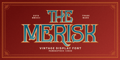 Merisk is old fonts with visual elegance, smooth curves, and beautiful ligatures clear, making your work look true and attractive. A very versatile font that works in both large and small sizes. This font is suitable for a wide variety of projects such as invitations, logos, branding, magazine, photography, card, product packaging, mugs, quotes, poster, labels, signatures, and more. Font which is perfect for all business sectors including personal projects, studio, corporate, creative agency, industrial, company, etc.
 - LT Yorkshire - 100% free

- Township JNL by Jeff Levine,
$29.00 Township JNL is based on French Antique Condensed [a classic wood design] and is available in both regular and oblique versions. Reminiscent of Old West wanted posters and circus broadsides, this ultra-condensed typeface allows for more word copy to fit into a single line’s space.
 - Zephyr by IHOF,
$24.95 Zephyr is a sinuous Roman font available in both Regular and Openface (inline) versions. This classically inspired font set conjures up a gentle, relaxing breeze from the West and Southwest. Subtle and not-so-subtle variations offer a refreshingly modern take on these age-old letterforms.
 - Fd Sunnyside by Fortunes Co,
$14.00 Sunnyside is groovy retro concept typographic come with duo combined, regular and extrude, bring if the old west and the 70s had a lovechild with not a unformal usage, it's the perfect typeface for adding sophisticated playfulness to any design project. fit to logo, brand, apparel, etc
 - TT Phobos by TypeType,
$35.00 TT Phobos useful links: Specimen | Graphic presentation | Customization options TT Phobos is a pliable display serif with a soft and gentle character. The features of the typeface are the moderate contrast between bold and thin strokes, pliable visual compensators, and the counter-clockwise bend of internal ovals. In addition to 6 weights and 6 italic, TT Phobos also includes two original decorative fonts, inline and stencil. Despite its pliability and display character, TT Phobos is dynamic enough and is well suited for text arrays even in large text blocks. The serifs of letters are completely asymmetrical and bring in dynamics when reading the text from left to right. Thanks to the harmonious contrast of black and white forms and internal negative spaces of the letters, as well as its broad letter spacing, the typeface is well read in small sizes. In this case, the character of the letters is completely preserved, partially thanks to the exaggerated elegant visual compensators. The ornamental pattern used in TT Phobos Inline varies for capital and lowercase letters. Capital letters implement a more complex double inline with a rhombic element in the middle, and in the lower case features a simplified form of the inline, made in a single movement. Thanks to the original cutting, TT Phobos Stencil stands out for its expression, and the rounded cuts add even more visual style to the font. TT Phobos consists of 14 faces: 6 weights (Light, Regular, DemiBold, Bold, ExtraBold, Black), 6 Italics, inline and stencil. There are 17 ligatures in TT Phobos, including several Cyrillic ones. The typeface has stylistic alternates, which adds an italic effect to the upright fonts, and a little solemnity of the upright version to the italics. In addition, we have not forgotten about the old-style figures and other useful OpenType features, such as ordn, sups, sinf, dnom, numr, onum, tnum, pnum, liga, dlig, salt (ss01), frac, case.
 - Sicret Mono by Mans Greback,
$29.00 Sicret Mono is a monospaced and geometric typeface family. It was drawn by Måns Grebäck in 2020, and was created by following a strict mathematical pattern consisting of only two basic shapes, in four different combinations, set on a 2 by 3 grid. The resulting product is a font with a serious and solid character, with an official look while yet going towards sci-fi because of its digital nature. The family consists of nine weights: Thin, Extra Light, Light, Regular, Medium, Semi Bold, Bold, Extra Bold and Black. The range of weights makes it very adaptable, and all the weights works very well together to give a sentence or graphic tone and emphasization. As Sicret Mono is a font with over 850 glyphs, it is guaranteed to contain all characters you'll ever need, including all punctuation and numbers. It has a very extensive lingual support, covering Greek, Cyrillic, Hebrew as well as European and American languages.
 - SG Scratter by Studio Gulden,
$30.00 SG Scratter is a dynamic and eye-catching display font that is sure to make any design stand out. With its sharp and crisp edges, this font exudes a sense of boldness and confidence that is perfect for headlines, logos, and branding projects. This font is available in six distinct styles, each with its own unique personality and character. From the sleek and sophisticated SG Scratter Regular to the more daring and adventurous SG Scratter Bold, there is a style to suit any design need. With its clean lines and modern aesthetic, SG Scratter is versatile enough to be used in a variety of design applications, from print to digital media. Its legibility and clarity make it a great choice for everything from posters to websites. So if you're looking for a font that combines elegance and edge, look no further than SG Scratter. With its sharp angles and bold lines, it's sure to make your design pop and stand out from the crowd.
 - Sicret by Mans Greback,
$29.00 Sicret is a perfectly geometric typeface family. It was drawn by Måns Grebäck in 2020, and each one of its glyphs was manually created by following a strict mathematical pattern consisting of only two basic shapes, in four different combinations, set on a three units tall grid. The resulting product is a true monoline font with a solid character, with an official look while yet going towards sci-fi because of its digital nature. The family consists of nine weights: Thin, Extra Light, Light, Regular, Medium, Semi Bold, Bold, Extra Bold and Black. The range of weights makes it very adaptable, and all the weights works very well together to give a sentence or graphic tone and emphasization. As Sicret is a font with over 850 glyphs, it is guaranteed to contain all characters you'll ever need, including all punctuation and numbers. It has a very extensive lingual support, covering Greek, Cyrillic, Hebrew as well as European and American languages.
 - Delwyn by Jorsetype,
$20.00 Delwyn is a Serif font family, which has a condensed and explicit character with 10 variants, namely; Thin, Light, Extra Light, Regular, Medium, Semi Bold, Bold, Extra Bold, Black and Extra Black. Delwyn gives a clear and elegant look to logos, quotes, headings, wedding invitation, t-shirt, letterhead, lable, news, posters, badges, magazines, films. etc. Delwyn is a versatile typography filled with the character you want. with Marston you work.Marston has standard styles, Stylistic Alternates and ligatures. and includes upper and lower case letters, numbers and punctuation marks. Multilingual support for various languages including: French, German, Spanish, Portuguese, Italian, Dutch, Finnish, Swedish, and more. The different weights give you full range to explore a whole host of applications, while the outlined fonts give a real modern feel to any project.OpenType features can be accessed by using OpenType smart programs such as Adobe Photo Shop, Adobe Illustrator, Adobe Indesign, Corel Draw and Microsoft Office. can also be accessed through the character map
 - Brong Geduny by Product Type,
$17.00 Show creativity and urban spirit with the Brong Geduny font, a display-themed masterpiece that presents a bubble graffiti style that is strong, bold, and fun. With uniqueness in every line, this font creates an unforgettable look for your design projects. Brong Geduny offers two complementary styles: regular for a bold look and outline for a lighter but still expressive touch. Its bubble graffiti style provides a touch that is so bold and vibrant, giving unmatched character to every word you write. This font not only provides a unique look but is also very functional. With multilingual support, Brong Geduny allows you to easily express your ideas and messages in multiple languages. Conquer your creativity with Brong Geduny, a font that will not only be the right choice for your design projects but will also be the talk of the online world. Immediately choose the appropriate style and create an extraordinary design with a truly urban touch!
 - Catalina by Kimmy Design,
$10.00 Earlier this year I visited a bakery in Newport Beach, CA and fell in love with the organic design and typography of the place. Hand-drawn menus, table cards, chalkboards, and wall quotes surrounded the charming spot. It inspired me to create a new font family based on the combination of hand drawn fonts. Included in this package are 5 font families, with 2 graphic ornament fonts. Each font family contains at least a light, medium and bold. Here is a breakdown of what's cookin' at Catalina's Bakery: Catalina Anacapa: Tall and skinny, this font comes in 3 weights for both sans and slab serif styles. It includes contextual alternatives (giving 3 versions of each letter), stylistic alternatives for select letters (A, K, P, Q, R, Y) and also includes Small Caps. Catalina Avalon: Based off Anacapa, this sub family has a high contrasting line weight. It comes in light, regular and bold as well as an inline alternative for both sans and slab serif styles. Avalon also includes opentype features such as contextual alternatives (giving 3 versions of each letter), stylistic alternatives for select letters (A, K, P, Q, R, Y) and small caps for each letter. Catalina Clemente: In a more standard width, Clemente is one of the two sub families that can be used for paragraph text as well as headlines. It's organically geometric in style and comes in ALL CAPS and lowercase, includes upright and custom italics, and has the opentype feature giving 3 versions of each letter. Catalina Script: A great compliment with the display sub-families, Catalina Script rounds out the package with a hand-drawn cursive flair. It includes contextual alternatives (giving 2 variations to each letter) as well as stylistic alternatives for many of the capital and lowercase letters. It has special ligatures for some letter combinations, and titling alternatives for all the capital letters. Catalina Typewriter: The second of the paragraph text sub-families, this typewriter inspired hand-drawn font family works great as either a display or paragraph text. It has contextual alternatives with 3 versions of each letter, and comes in both upright and custom italics versions. Catalina Extras! These two fonts go perfectly with the Catalina Family. They includes borders, frames, arrows, banners, flourishes and more. Catalina Flourish has all of it's options in a light and bold style, to use the light version type all lowercase letters, then to make something bold, used it's uppercase (or shift+) characters. For a breakdown of graphic/letter correlation, see the breakdown PDF. All of Catalina was drawn by the same hand, using the same ink and technique. While they contrast in their type styles, they work together perfectly to create one cohesive font family.

