10,000 search results
(0.053 seconds)
- Pennyroyal by Stiggy & Sands,
$29.00 A Historic Revival with a Sophisticated Rustic Edge Pennyroyal began as a Barnhart Brothers & Spindler typeface called Plymouth Bold, first cut in 1900. What began as a straightforward rustic typestyle has been revived to include a more extensive character set. But this font wasn’t just revived, it has come alive with character and personality. Pennyroyal includes 564 characters. The expanded SmallCaps option for gives the typestyle a more sophisticated look, expanding on the original typeface inspiration. Opentype features include: A collection of ligatures. Smallcaps. Full set of Inferiors and Superiors. Proportional figures and Oldstyle figure sets
 - Proteron - Unknown license

- Celebration by RMU,
$35.00 A blackletter font of decorative style and of obscure origin which was rescued for all devotees of these old hot-metal letters. This font contains a bunch of useful ligatures, and by typing 'N', 'o' and period and activating the OT feature Ordinals you get an old-style number sign.
 - Unitext Variable by Monotype,
$155.99Unitext Variable Regular is a single font file that features one axis: Weight. TFor your convenience, the Weight axis has preset instances from Hairline to Black. This Roman (upright) font is provided as an option to customers who do not need Italics, and want to keep file sizes to a minimum. - Enchanted by Borges Lettering,
$29.95 Enchanted is a unique contemporary font that mimics the style of handwriting and brush scripts; yet it is neither. Great for logos, captions and large bodies of text. Paragraphs set in Enchanted are easily read since the letters do not connect; aiding in its legibility. Enchanted contains seven stylistic alternates.
 - Kernig Braille by Echopraxium,
$5.00 This font is the younger sister of HexBraille with which it may be combined to create new patterns. This also explains why their introductory text are similar. Introduction The purpose of this monospace font is to display braille in an original and "steganographic" way. The Kernig prefix means "Robust" in German, this is because of the crank shapes . The core of the glyph design is a flat hexagon which can be read as 3 rows of 2 dots (i.e. regular braille glyph grid). Even if within a glyph, braille dots ("square dots" indeed) are placed on the vertices of a flat hexagon, the difference with HexBraille is that edges connecting vertices are not straight lines but "crank shapes" instead. This can be summarized by saying that the whole glyph is a Hexcrank (a flat hexagon where vertice pairs are connected by a crank shape) NB: The initial design is illustrated by glyphs 'ç' (no dot) and 'û' (6 dots) as shown by poster 6. A. "Kernig Lattice" In KernigBraille, glyphs are connected to each other, thus for each Hexcrank glyph there are 6 connections: 2 on left/right and 4 on top/bottom. In the final design some cranks were removed for esthetical reason (i.e. leave empty space for allowing patterns diversity). In summary, a text using this font won't display a honeycomb but a lattice instead. NB: Please notice that in order to obtain the lattice without vertical gaps, you must set the interline to 0. The lattice is made from 3 kind of shapes: a.1. Hexcrank a.2. Square a.3. Irregular cross (mostly unclosed) The design favored squares over crosses. The whole slightly resembling a PCB. B. Text Frames It's possible to frame the text with 4 sets of frame glyphs (as illustrated by poster 2) b.1. Kernig { € ° £ µ § ¥ ~ ¢ } b.2. Rectangular-High { è é ê ï î à â ä } b.3. Rectangular-Low { Â ù Ä Ê Ë Ô õ ö } b.4. Mixed Kernig+High: a mix of Kernig and Rectangular-High frame glyphs When using frame glyphs, it is advised to show Pilcrow (¶) and Non Breaking Space, which are replaced by empty shapes in this font (e.g. in Microsoft Word, use CTRL+8 or use [¶] button in the ribbon).
 - Classica Pro by URW Type Foundry,
$35.99 Classica Pro by Bernd Möllenstädt A real alternative for letterpress printing A masterpiece It was only after many years, shortly before the end of his life, Bernd Möllenstädt brought out these early drafts of his Classica Light and Light Italic from his drawer, and asked me to produce for him on the computer a Bold and Bold Italic, from which we later wanted to interpolate further cuts like Regular and so on. The boldening of letters with an oblique axis and with hairlines which should not grow to the same extent as the general line widths, is hard to cope with perfectly, even for the smartest computer program, and even more so, when it concerns an as complicated set of data as those conceived by Bernd. The automatically generated result could therefore only be a first step that had to be improved manually later. This was about the stage that we had reached when Bernd died in March 2013, leaving me behind with comprehensive corrections on proofs of this automatically generated Bold. Although I was aware that it would mean a lot of work to complete the project, I did not want to leave it unfinished and decided to finalize and publish the Classica, also in Bernd‘s honor. In the course of the two years that I worked on this font family it somewhat naturally became also my own. New details were added and some of the existing changed. A book typeface requires the supreme and forgives rarely, it represents a true masterpiece. My intention and my ambition were to create a real alternative for letterpress printing, with a font family that contains all the typographic options for an excellent typesetting, and is better readable and has a better appearance than other existing typefaces. Whether this was achieved, the reader may decide. Volker Schnebel, Hamburg, december 2014
 - Lorraine Braille by Echopraxium,
$9.50 This is a decorative and steganographic Braille font based on Lorraine Cross pattern. As the Lorraine cross splits space into six areas, it may be used to represent Braille glyphs. Provided Glyphs * Lowercase letters (a..z): a White cross and Black square dots * Uppercasecase letters (A..Z): a Black cross and White square dots * Special characters (e.g. !#$%*+<>{}()[]...) * Decorative glyphs (provided in black and white as well) Glyph code intervals - Codes 48..57: Bullets (0..9 digits) - Codes 130..150: 'White Stars' - Codes 192..233: 'Black Stars', Black border glyphs and other black patterns. - Codes 214..233: Border/Decorative glyphs (Black) - Codes 235..255: Border/Decorative glyphs (White) - Codes for Cross w/o dots: Black (192), White (235) - Codes for Cross and 6 dots: Black (191), White (234) - Code for 'Half-width space' (166) Posters 1. Logo: illustrates usage of border glyphs 2. Meta: Two big Lorraine Braille glyphs drawn with pattern glyphs 3. Stars: illustrates usage of 'Star' and pattern glyphs 4. Bullets: illustrates usage of bullet glyphs (0..9) 5. Human rights - Article 1 NB: - Encoding is: Windows Latin ("ANSI") - Published in two versions: Commercial and Free for personal use
 - Linotype Punkt by Linotype,
$29.99 Linotype Punkt, from US designer Mischa Leiner, is part of the TakeType Library, chosen from the entries of the Linotype-sponsored International Digital Type Design Contest 1999 for inclusion on the TakeType 3 CD. This font, from US designer Mischa Leiner is available in three weights, light, regular and bold. The basic forms are those of a robust sans serif, however the figures are composed of evenly placed dots, hence the name Punkt, the German word for dot. This distinguishing characteristic lets this font look as though it appears on a background of light. One other unique trait of this font is the nature of the three weights. The figures of each weight have exactly the same measurements, the same width, breadth, etc. The only variable measurements are those of the individual dots making up the forms, making the bold weight much darker than the light while retaining the same outer contours. Linotype Punkt should be used in larger point sizes, as when it is too small the dots blur together and rob the font of its 'light'. The font is therefore best for headlines in large and very large point sizes.
 - Jazm by Arabetics,
$34.00 Jazm is an Arabetic typeface design with connected glyphs. Jazm was the earliest, pre-Islamic, script style of the modern Arabic script, before branching into Kufi and Naskh styles. The initial script had a lot less, position-dependent shapes and ligatures, and was not strictly connected. It occasionally included minuscule dots to distinguish identical shapes. This font family design is a modern visualization by the designer of the historical Jazm letter shapes following the guidelines of the Mutamathil Taqlidi type style with one glyph for every basic Arabic Unicode character or letter, as defined in Unicode Standards, and one additional final form glyph for each Arabic letter that can connect with other letters from both sides in traditional cursive Arabic strings. Jazm employs variable x-height values. It includes all required Lam-Alif ligatures and selected marks. Tatweel (or Kashida) glyph is a zero width space. Keying it before any glyph will display that glyph isolated form, if desired. Keying Tatweel before Alif Lam Lam Ha will display the Allah ligature. Jazm typeface family includes both Arabic and Arabic-Indic numerals; all required diacritic marks, in addition to Standard English keyboard punctuations and major currency symbols. Jazm is available in regular, bold, black, and corresponding italic (slated to the left) styles.
 - Pigeon Street - Unknown license

- Bloesbury by Attract Studio,
$14.00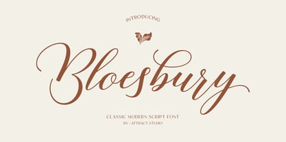 Bloesbury is a modern style script font inspired by handwriting. This font is suitable for your design needs and can be combined with other fonts. Which is perfect for your design needs such as branding, logo design, wedding invitations, decorations, and more. Font Pairing : Kegina Including: Alternates & Ligatures OpenType support Multilingual PUA encoded.
 - Major Pro Extras NF by Nick's Fonts,
$10.00A supplement to Major Production NF, which includes an assortment of symbols and logos for video, web and mobile applications, including the Blu-ray logo with its region designators. Please remember that logotypes are the property of their respective copyright holders, and should be used solely in accordance with the copyright holder’s guidelines. - American Oak by Ian Barnard,
$15.00 I've always been drawn to the beautiful typography of whiskey, gin, rum & bourbon bottle labels, as they enhanced the history that is behind this aged old spirits. A combination of elegant scripts and rugged serifs, these labels give sensibility to the slow process which these spirits go through in the distilling process.
 - Caminito by JVB Fonts,
$15.00 This fontface is inspired on Argentinean classic and traditional art craft named as Fileteado Porteño. Caminito is available in 10 layered styles for compose with multi combinations and a extra of ornaments. Highly recommended to be used for colorized titles and display texts. Fileteado Porteño is a type of artistic drawing, with stylized lines and flowered, climbing plants, typically used in Buenos Aires, Argentina. It is used to adorn all kind of beloved objects: signs, taxis, lorries and even the old colectivos, Buenos Aires’s buses. Filetes (the lines in fileteado style) are usually full of colored ornaments and symmetries completed with poetic phrases, sayings and aphorisms, both humorous or roguish, emotional or philosophical. They have been part of the culture of the Porteños (inhabitants of Buenos Aires) since the beginnings of the 20th century. One of the most highlighted and recognized artists nowadays is Alfredo Genovese, who does a great job of teaching and claim this art and craft. The name Caminito reminds the emblematic and iconic Buenos Aires neighborhood immortalized by Carlos Gardel in music, in the tango.
 - PF Libera Pro by Parachute,
$79.00 PF Libera was designed at a time of leisure with no particular intention for commercial use. In fact it was offered in the beginning as a freeware. In 2001, designer Charis Tsevis was convinced that it may have some commercial value, so Parachute obtained the rights to sell this typeface. At that time, we did not even imagine what would follow. Since then, PF Libera is one of our most successful typefaces. We have seen it being used in very diverse applications. From publishing to advertising to banking, to transportation, to retail applications. Food, beverages, fashion, automobiles, tourism, the list goes on and on. In any way, this typeface is very personal, modern and provocative. It stays with you and definitely it brings along the message. PF Libera comes in 3 styles. One of them, 'Liberissima', was added later and is more loose than the other two. The new 'Pro' version is powered with 7 OpenType features and is carefully designed to include all languages that are based on Latin, Greek and Cyrillic.
 - Sacharon by Konstantine Studio,
$19.00 Are you tired of the same old fonts that everyone's using? Add a touch of nostalgia and personality to your designs with Sacharon, a retro pop font! Whether you're working on a vintage-themed project, designing a catchy poster, or simply want to stand out from the crowd, our fonts will give your work the groovy vibe it deserves. Sacharon takes inspiration from the bold and vibrant styles of the '60s and '70s, bringing back the essence of the good old days. From funky disco fonts to psychedelic lettering, we've got the perfect typefaces to transport your audience to an era of fun and excitement. Perfectly fit for logo, branding, advertising, poster, food and beverages, restaurant, book cover, album artwork, decoration, sign painting, and many more. Don't settle for ordinary typography—take a trip down memory lane with Sacharon! Browse our collection now and transform your designs into eye-catching works of art. Get ready to embrace the vibrant, nostalgic spirit of the past in a modern and trendy way. Get it now and let the grooviness begin!
 - LiebeErika by LiebeFonts,
$29.00 Ever since we started publishing on MyFonts in 2009, we've received requests for a typeface to complement our popular dingbat fonts. So here it is: LiebeErika. Friendly and polite, rather thin, extra narrow, and of course‚ carefully hand-crafted. LiebeErika’s casual and warm style is perfectly suited for invitations and personal correspondence. It’s even in the name: German phrase, Liebe Erika‚ translates to, Dear Erika, the beginning of a personal letter. But LiebeErika is not limited to English or to the German character set. It supports many other languages, too! LiebeErika comes with a stunning variety of ligatures and alternative forms available through OpenType features. (Please make sure your software supports OpenType if you wish to use the advanced features.) The font contains over 500 glyphs, so it’s actually two or three fonts in one. If you like this font, you may want to look at LiebeOrnaments, our perfectly matching set of swashes and curls to complement LiebeErika. By the way: LiebeErika gets along great with our wide range of illustrative fonts such as LiebeCook, LiebeFish, and LiebeTweet.
 - AW Conqueror Std Carved by Typofonderie,
$59.00 Engraving inspired typeface The AW Conqueror Carved encapsulates perfectly the lettering styles in fashion during the 19th century quite often in the frontispieces of books. It wasn’t rare to see these kinds of typefaces, with their variations in depth and relief effects, adorning boxes and other forms of packaging of the time. AW Conqueror superfamily AW Conqueror Didot is part of a larger family, who include 4 others subfamilies with great potential: They’re but based on same structure, with some connection between them (width for example), to offer a great & easy titling toolbox to any designers, from skilful to beginner. Each of the members try their best to be different from the others because of their features. They should work harmoniously in contrast. Club des directeurs artistiques Prix 2010 European Design Awards 2011
 - 2009 Primitive by GLC,
$38.00 This is not an historically accurate font but rather one intended capture the spirit of ancient Roman manual type. It was inspired by various patterns used in documents and books created by Latin scribes between the second and fourth centuries. They used either calamus and ink on papyrus, or a pointed metal stick on wax tablets. We have created the font for contemporary use; distinguishing between U and V, I and J, which had no meaning for ancient Latin scribes, and adding thorn, Oslash, Lslash, W, Y and common accented characters that did not exist at the time. A lot of titlings and contextual alternates complete the set. Available only in TTF and OTF format.
 - Flicker by PizzaDude.dk,
$20.00 Handpainted font with attitude! An attitude which will help you when designing posters, packaging, headline, invitations and alike, that needs that authentic brush-look! I haven't got the count of how many pieces of paper I used to make this font. It was a lot! Comes with “contextual alternates” which means that the font has 6 different version of each letter. These different versions cycle as you type, and makes the font look more realistic!
 - Athletic Condensed by Mandarin,
$19.00 Athletic Condensed was designed to be a must have for any kind of projects. Bold and elegant at the same time, both the regular and slanted styles are super versatile and can be used to dictate a strong message, headlines or just setting casual text. Practical and simple, this font is a classic that will not let you down, as it does an excellent job either as the main character or supporting role.
 - Hann Writing by Hann Welsh,
$12.00 "Oh my goodness, is that your handwriting? It looks like a font!" HannWriting is a hand-drawn casual font based on the designer's own unique handwriting. It is perfect for achieving an organic look that does not sacrifice neatness. HannWriting is great for use in any project, from the home to the classroom to the great outdoors! This font includes basic and advanced Latin characters with multiple glyph options for some letters.
 - Moutarde by Hanoded,
$15.00 Moutarde is French for mustard. At home we don’t eat that much mustard, as it is a condiment that goes well with burgers and hotdogs. We eat Asian food a lot, so our hot sauce of choice usually is sambal. Moutarde is a good name for this fine, handmade font. Moutarde font is a rounded, easy to read, display font that comes with all the condiments - including a set of alternate a’s.
 - Stovepipe Stencil JNL by Jeff Levine,
$29.00 Stovepipe Stencil JNL was not directly designed from a vintage source, but it does draw its influences from classic sans serif lettering of the past. Even its name borrows (somewhat gratuitously) from the "stovepipe" lettering so popular with sign painters. True stovepipe letters tend to be squarer with rounded corners, but the name has also been loosely associated with some tall, condensed type styles. The typeface is available in both regular and oblique versions.
 - Zold by EMME grafica,
$9.90 Zold is the first font designed by EMME Grafica. It's a simple, statuesque, architectural, eye-catcher, tough yet elegant font, particularly suitable for titling, subtitling, branding and typographic amusements. The solemnity of Zold does not affect the the elegance of the curves of the font, but gives it the right visibility and temper, like that of Zold, the surly character who will be the antagonist of a multimedia project currently under development at EMME Grafica.
 - Moskau Pattern by Letter Edit,
$49.00 The design of the typeface Moskau Grotesk and Moskau Pattern is based on the signage created for the Café Moskau in Berlin by the graphic artist Klaus Wittkugel in the beginning of the 1960s. The Café Moskau, across from the Kino International on Karl-Marx-Allee in Berlin Mitte was one of the prestige edifices of the former DDR (German Democratic Republic). Built in the early 1960s, it advanced over the years and changing social developments to a trademark building of the capital. The lettering display on the roof was created by the graphic artist Klaus Wittkugel (October 17, 1910 – September 19, 1985). He had been Professor at the School for Applied Arts in Berlin, and, in addition to the creation of many posters, book covers and postage stamps, he was responsible for the signage of the Kino International as well as for the complete graphic treatment for the Palace of the Republik. The signage for the Café Moskau with the words »RESTAURANT«, »CAFÉ«, »KONZERT« and »MOCKBA« set in capital letters, becomes the basis for the Moskau Grotesk which was developed by Björn Gogalla in 2013. This face should not be seen as an imitation. A few shortcomings were »fixed«. In favor of maintaining the core characteristics some unique features were, however, not relinquished. Lower case letters and the missing capital letters were designed from scratch. It is not surprising that the plain, unassuming geometrical direction of the basic character style forms a bridge to the architecture of the 1960s. Inspired by the then favored, diverse possibilities inherent in the architectural example and wall reliefs, two complimentary pattern fonts emerged.
 - Moskau Grotesk by Letter Edit,
$39.00 The design of the typeface Moskau Grotesk is based on the signage created for the Café Moskau in Berlin by the graphic artist Klaus Wittkugel in the beginning of the 1960s. The Café Moskau, across from the Kino International on Karl-Marx-Allee in Berlin Mitte was one of the prestige edifices of the former DDR (German Democratic Republic). Built in the early 1960s, it advanced over the years and changing social developments to a trademark building of the capital. The lettering display on the roof was created by the graphic artist Klaus Wittkugel (October 17, 1910 – September 19, 1985). He had been Professor at the School for Applied Arts in Berlin, and, in addition to the creation of many posters, book covers and postage stamps, he was responsible for the signage of the Kino International as well as for the complete graphic treatment for the Palace of the Republik. The signage for the Café Moskau with the words »RESTAURANT«, »CAFÉ«, »KONZERT« and »MOCKBA« set in capital letters, becomes the basis for the Moskau Grotesk which was developed by Björn Gogalla in 2013. This face should not be seen as an imitation. A few shortcomings were »fixed«. In favor of maintaining the core characteristics some unique features were, however, not relinquished. Lower case letters and the missing capital letters were designed from scratch. It is not surprising that the plain, unassuming geometrical direction of the basic character style forms a bridge to the architecture of the 1960s. Inspired by the then favored, diverse possibilities inherent in the architectural example and wall reliefs, two complementary pattern fonts emerged.
 - CAL Bodoni Terracina by California Type Foundry,
$47.00 Bodoni Terracina is a legible, fun-formal script face, with lots of curls. Sometimes script faces are hard to read. Sometimes being formal means that there’s no personality and there’s no fun. Enter Terracina: one of the masterpieces of font design. Some of the most personable italics ever carved. Includes powerful new features for: • Dates • Pricings • Addresses Not is only Terracina formal but fun, it’s also fun to use! In a program like Adobe Indesign or Illustrator, just highlight a word and see lots of fun options. Bodoni himself etched these symbols, and his fun-loving personality shines through. As a semi-script, it can go together with many script fonts, but it is more readable. When you need something equal parts elegant and whimsical, Terracina strikes a perfect balance to let the fun shine through, such as for holiday designs or fairytales. Terracina is a subheads font, but Bodoni also used it for paragraphs. So Terracina works well doing subhead paragraphs, especially when contrasting with the mood of the first font. And because of the swash variety, it works well for setting German and other European languages. CAL Bodoni Terracina is a member of our Origins Series. Origin Fonts are designed to be true to the original designer's intentions and fonts. Our Bodoni origin fonts ARE Bodoni fonts, not imitations or interpretations. They were drawn by Bodoni, our team just expanded it for modern use. For Terracina, Bodoni's original weight is the "Quasi-Lite" option, all other weights have been meticulously matched by the CAL Origins Team.
 - Ronsard Crystal by Red Rooster Collection,
$60.00 The original Ronsard Crystal began its life as a single-weight VGC photo display font in the 1950s. We liked it so much, that we decided to design four traditional weights to go with the original inline version.
 - Melody Sunday by Subectype,
$15.00 Melody Sunday is a Chic and Lovely Calligraphy font, described by an Love touch, perfect for your favorite projects. Fall in love with its incredibly distinct and timeless style and use it to create spectacular designs! "Melody Sunday" includes a full set of lovely uppercase and lowercase letters, multilingual symbols, numerals, punctuation and ligatures. Also it includes: Alternates letter for lowercase beginning and ending swashes, lowercase ending heart swashes, which serve to connect two words or letters (This is so perfect for invitations, monograms) Thank You, Subectype
 - Winter Bells by Attype Studio,
$10.00 Winter Bells is a delicate and incredibly distinct Christmas display font with dingbats character of bells. Perfect for christmas promotion and christmas design, Fall in love with its incredibly versatile style and use it to create spectacular designs! Winter Bells is perfect for branding, logo, invitation, stationery, social media post, product packaging, merchandise, christmas font, blog design, game titles, cute style design, Book/Cover Title and more. What's Included : - Winter Bells.otf - Winter Bells Display.otf - Beginning & Ending Dingbats - Multilingual Support --- Hope you enjoy with our font! Attype Studio
 - Montague Script Bold by Stephen Rapp,
$59.00 Montague Script Bold is a beefed up version of the 2009 Type Directors Club Award winning Montague Script. The added weight makes it more ideal for display purposes like book titling, packaging, and headlines. Like the original award winning version, it features an energetic rhythm with loads of swashes and ligatures. Having its origin in fine sable brush lettering done on smooth vellum paper, both versions are ideal for greeting card and invitation text. There are beginning, ending, and alternate versions for almost every letter.
 - Papillon Woodcuts by Celebrity Fontz,
$24.99 Papillon Woodcuts is a digital revival of an ornate alphabet by French engraver Jean Michel Papillon dating back to 1760, when engraving was very fashionable in France. Each letter is displayed with a different themed background, such as a ship at sea; a fancy table topped with a bounty of fruits; flying birds; a parasol with flowers; playful cherubs; rich textured drapes and tapestries; and many more. These woodcut initials are especially beautiful when used at the beginning of a paragraph as in olden texts.
 - Golden Meaning by HIRO.std,
$17.00 Golden Meaning is a handwritten font. This font describes about stylist, fun and elegant, catchy, dynamic, simple, humanist, clean, easy to use and will bring a good harmony when the letters are connected and paired each other. FEATURES - Support Opentype Features - Support Ligatures - Lowercase beginning and ending alternate - Alternate Swash - Numbering and Punctuations - PUA Encoded Characters - Multilingual Support - Works on PC or Mac USE Golden Meaning works great in any wedding invitations, branding, logotype, apparel, and any projects that need simple script taste. Enjoy using! Thanks. HIRO.std
 - Sweetlovers by Lone Army,
$12.00 Sweetlovers Script, a perfectly modern script, creative and casual, together or apart, to make tons of gorgeous typographic designs, just in time for all your Christmas labels, cards, and branding too. Perfect for DIY projects, greeting cards, labels, quotes, posters, invitations, wall art, branding, packaging, websites, photos, photo & photography overlays, signs, window art, tags and so much more. The script has an alternate Capital and Lowercase, beginning and ending set, and swashes that are suitable for your designs project. Thank you and please enjoy!
 - Mesintwa by Ilhamtaro,
$14.00 MESINTWA is a font that is basically a classic serif font then to make it different from other serifs is to give the effect as if it were a letter on a letterpress machine, it will add a vintage impression because remembering that letterpress machines were the beginning of a printing press. To enable the OpenType Stylistic alternates, you need a program that supports OpenType features such as Adobe Illustrator CS, Adobe Indesign & CorelDraw X6-X7. Guides to access all alternates glyphs : http://adobe.ly/1m1fn4Y Cheers!
 - Adora Bella by PeachCreme,
$20.00 We're excited to unveil our new beautiful script font, "Adora Bella." "Adora Bella" was inspired by clean handwriting with a natural flow and works well for various designs, including wedding stationery, Instagram quotes, modern logos, packaging, websites, and many more. "Adora Bella" features fabulous beginning and ending lowercase swashes as well as lowercase heart swashes. A connecting heart swash may be used to tie two words or letters together; however, it is important to remember that this is intended to be used for joining lowercase words.
 - Collaborn by SemutHitam,
$15.00 Introducing Collaborn Script Font. Collaborn Script is modern brush font script. Comes with many opentype feature, upper and lower case standard character, punctuation and numerals, multilingual characters, ligatures, stylistic alternates, beginning and ending, and many more glyph. Perfect for personal and commercial use your company logo, branding, poster, flyers, greetings, invitation, book cover, quotes, and many more. We hope you enjoy with Collaborn Script. Feel free to comment and give any feedback to build more good font. Thanks for your purchasing, and Happy creating... :)
 - RMU Manolo by RMU,
$35.00 Manolo was a Ludwig & Mayer in-house design from the beginning of the 20th century. Though more formal than many others, the design keeps its Art Nouveau air. This beautiful font was completely redrawn and redesigned with giving the numerals more style. Two stippled border elements were added which you can reach by typing [alt] + P and [alt] + p. Like most fonts of this era, RMU Manolo comes with a long s too. RMU Manolo encompasses most European languages, Central and West, plus Turkish.

