10,000 search results
(0.032 seconds)
- Vianova Serif Pro by Elsner+Flake,
$59.00 The font superfamily Vianova contains each 12 weights of Sans and Slab and 8 weights of the Serif style. The design from Jürgen Adolph dates back into the 1990s, when he studied Communication Design with Werner Schneider as a professor at the Fachhochschule Stuttgart. Adolph started his carrier 1995 at Michael Conrad & Leo Burnett. He was responsible for trade marks as Adidas, BMW, Germanwings and Merz. He has been honored as a member of the Art Directors Club (ADC) with more than 100 awards. On February 26, 2014, Jürgen Adolph wrote the following: “I was already interested in typography, even when I could not yet read. Letterforms, for instance, above storefronts downtown, had an irresistible appeal for me. Therefore, it is probably not a coincidence that, after finishing high school, I began an apprenticeship with a provider of signage and neon-advertising in Saarbrücken, and – in the late 1980s – I placed highest in my field in my state. When I continued my studies in communications design in Wiesbaden, I was introduced to the highest standards in calligraphy and type design. “Typography begins with writing” my revered teacher, Professor Werner Schneider, taught me. Indefatigably, he supported me during the development of my typeface “Vianova” – which began as part of a studies program – and accompanied me on my journey even when its more austere letterforms did not necessarily conform to his own aesthetic ideals. The completely analogue development of the types – designed entirely with ink and opaque white on cardboard – covered several academic semesters. In order to find its appropriate form, writing with a flat nib was used. Once, when I showed some intermediate designs to Günter Gerhard Lange, who occasionally honored our school with a visit, he commented in his own inimitable manner: “Not bad what you are doing there. But if you want to make a living with this, you might as well order your coffin now.” At that time, I was concentrating mainly on the serif version. But things reached a different level of complexity when, during a meeting with Günther Flake which had been arranged by Professor Schneider, he suggested that I enlarge the offering with a sans and slab version of the typeface. So – a few more months went by, but at the same time, Elsner+Flake already began with the digitilization process. In order to avoid the fate predicted by Günter Gerhard Lange, I went into “servitude” in the advertising industry (Michael Conrad & Leo Burnett) and design field (Rempen& Partner, SchömanCorporate, Claus Koch) and worked for several years as the Creative Director at KW43 in Düsseldorf concerned with corporate design development and expansion (among others for A. Lange & Söhne, Deichmann, Germanwings, Langenscheidt, Montblanc.”
 - Vianova Slab Pro by Elsner+Flake,
$59.00 The font superfamily Vianova contains each 12 weights of Sans and Slab and 8 weights of the Serif style. The design from Jürgen Adolph dates back into the 1990s, when he studied Communication Design with Werner Schneider as a professor at the Fachhochschule Stuttgart. Adolph started his carrier 1995 at Michael Conrad & Leo Burnett. He was responsible for trade marks as Adidas, BMW, Germanwings and Merz. He has been honored as a member of the Art Directors Club (ADC) with more than 100 awards. On February 26, 2014, Jürgen Adolph wrote the following: “I was already interested in typography, even when I could not yet read. Letterforms, for instance, above storefronts downtown, had an irresistible appeal for me. Therefore, it is probably not a coincidence that, after finishing high school, I began an apprenticeship with a provider of signage and neon-advertising in Saarbrücken, and – in the late 1980s – I placed highest in my field in my state. When I continued my studies in communications design in Wiesbaden, I was introduced to the highest standards in calligraphy and type design. “Typography begins with writing” my revered teacher, Professor Werner Schneider, taught me. Indefatigably, he supported me during the development of my typeface “Vianova” – which began as part of a studies program – and accompanied me on my journey even when its more austere letterforms did not necessarily conform to his own aesthetic ideals. The completely analogue development of the types – designed entirely with ink and opaque white on cardboard – covered several academic semesters. In order to find its appropriate form, writing with a flat nib was used. Once, when I showed some intermediate designs to Günter Gerhard Lange, who occasionally honored our school with a visit, he commented in his own inimitable manner: “Not bad what you are doing there. But if you want to make a living with this, you might as well order your coffin now.” At that time, I was concentrating mainly on the serif version. But things reached a different level of complexity when, during a meeting with Günther Flake which had been arranged by Professor Schneider, he suggested that I enlarge the offering with a sans and slab version of the typeface. So – a few more months went by, but at the same time, Elsner+Flake already began with the digitilization process. In order to avoid the fate predicted by Günter Gerhard Lange, I went into “servitude” in the advertising industry (Michael Conrad & Leo Burnett) and design field (Rempen& Partner, SchömanCorporate, Claus Koch) and worked for several years as the Creative Director at KW43 in Düsseldorf concerned with corporate design development and expansion (among others for A. Lange & Söhne, Deichmann, Germanwings, Langenscheidt, Montblanc.”
 - Vianova Sans Pro by Elsner+Flake,
$59.00 The font superfamily Vianova contains each 12 weights of Sans and Slab and 8 weights of the Serif style. The design from Jürgen Adolph dates back into the 90th, when he studied Communication Design with Werner Schneider as a professor at the Fachhochschule Stuttgart. Adolph started his carrier 1995 at Michael Conrad & Leo Burnett. He was responsible for trade marks as Adidas, BMW, Germanwings and Merz. He has been honoured as a member of the Art Director Club (ADC) with more than 100 awards. On February 26, 2014, Jürgen Adolph wrote the following: “I was already interested in typography, even when I could not yet read. Letterforms, for instance, above storefronts downtown, had an irresistible appeal for me. Therefore, it is probably not a coincidence that, after finishing high school, I began an apprenticeship with a provider of signage and neon-advertising in Saarbrücken, and – in the late 1980s – I placed highest in my field in my state. When I continued my studies in communications design in Wiesbaden, I was introduced to the highest standards in calligraphy and type design. “Typography begins with writing” my revered teacher, Professor Werner Schneider, taught me. Indefatigably, he supported me during the development of my typeface “Vianova” – which began as part of a studies program – and accompanied me on my journey even when its more austere letterforms did not necessarily conform to his own aesthetic ideals. The completely analogue development of the types – designed entirely with ink and opaque white on cardboard – covered several academic semesters. In order to find its appropriate form, writing with a flat nib was used. Once, when I showed some intermediate designs to Günter Gerhard Lange, who occasionally honored our school with a visit, he commented in his own inimitable manner: “Not bad what you are doing there. But if you want to make a living with this, you might as well order your coffin now.” At that time, I was concentrating mainly on the serif version. But things reached a different level of complexity when, during a meeting with Günther Flake which had been arranged by Professor Schneider, he suggested that I enlarge the offering with a sans and slab version of the typeface. So – a few more months went by, but at the same time, Elsner+Flake already began with the digitilization process. In order to avoid the fate predicted by Günter Gerhard Lange, I went into “servitude” in the advertising industry (Michael Conrad & Leo Burnett) and design field (Rempen& Partner, SchömanCorporate, Claus Koch) and worked for several years as the Creative Director at KW43 in Düsseldorf concerned with corporate design development and expansion (among others for A. Lange & Söhne, Deichmann, Germanwings, Langenscheidt, Montblanc.”
 - Fugel by Attype Studio,
$15.00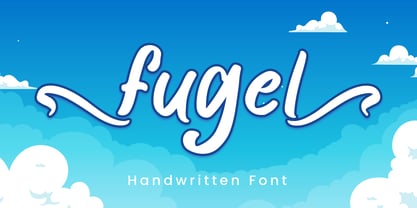 Fugel is a delicate and incredibly distinct handwritten font with beginning & ending swashes. Fall in love with its incredibly versatile style and use it to create spectacular designs! Fugel is perfect for branding, logo, invitation, stationery, social media post, product packaging, merchandise, blog design, game titles, cute style design, Book/Cover Title and more. What's Included : - Fugel.otf - Beginning & Ending Swash - Multilingual Support --- Hope you enjoy with our font! Attype Studio
 - Mauro Poggi Ornamental Caps by Celebrity Fontz,
$19.99Ornamental caps with scrolls and flourishes inhabited by satyrs, mermaids, Medusa heads, birds, cats, dogs, snakes, and other creatures, inspired by designs from Italian Renaissance artists dating back to 1730-1750. Beautifully ornate and perfect for the beginning of paragraphs in publications and texts conveying the feel of the Italian Renaissance, your own fairy tale stories, or religious texts to grab the reader's attention. Includes one set of A-Z ornamental caps conveniently assigned to both the upper and lower case alphabet characters. - Dark Garden - 100% free

- Momentum by Baseline Fonts,
$29.00The Momentum family of typefaces is not for the faint of heart. Although difficult to spot at small point sizes, the glyphs are nothing but dot-to-dot letterforms raggedly, haphazardly placed for a chunky appearance. Brazen and bold in its appearance, Momentum may be EXACTLY WHAT YOU ARE NOT LOOKING FOR in a font family, unless you desire a chiseled, flat, cut-out look. Originally developed for package design requiring a grunge appearance, the Momentum family of fonts creates controversy and speculation wherever it is utilized. Momentum is a modern, chiseled typeface designed with a sense of humor. Perfect for large and small display alike, the extended character set allows flexibility on the fly. - Blaq by Resistenza,
$39.00 Inspired by Henry W. Troy, BLAQ is a new version of Trojan Text not available as font. Is an ornamental blackletter alphabet. Works great in headlines and other ‘masculine’ like design settings. The Victorian Gothic or Neo-Gothic is an architectural movement that began in the 1740s in England. Its popularity grew rapidly in the early nineteenth century. The revived Gothic style was not limited to architecture. We recommend to combine Blaq with: Turquoise Nautica
 - WL Rasteroids Monospace by Writ Large,
$5.00 Rasteroids Monospace is a typographic flashback to computing of the mid 1980s, when 9-pin dot-matrix printers were the state of the art, and most home computer displays were TVs hooked up to RF modulators. Rasteroids not only captures the dot-matrix printer look, but recreates the rasterized appearance of text on those lower-resolution monitors. Because of its fixed character width, Rasteroids Monospace is intended for use in accents or small areas of copy rather than long documents.
 - Persian Grunge by Si47ash Fonts,
$19.00 The only Persian Arabic font featured on Behance [Graphic Design / Typography] Published in multiple books including New Illustration With Type and DesignAndDesign Vol. II Carefully and meticulously designed by selecting, choosing, vectorizing and editing so many different Persian and Arabic calligraphic scripts and old typefaces glyphs forms to create this one of a type [pun intended!] font. And if it's not enough, it's got patterns, textures, artistic elements, ornaments, in a grunge and dirty style. But it not over yet! Persian Grunge [Dirty] font has two styles: Dirty and Neat. Not only the Neat style is cleaner, but also a lot of same glyphs are different from the Dirty style. This Arabic grunge font is a great choice for all graphic designers, typographers and visual artists. Your posters, banners, artistic typographic projects are gonna be awesome with these fonts! Shahab Siavash, the designer has done more than 30 fonts and got featured on Behance, Microsoft, McGill University research website, Hackernoon, Fontself, FontsInUse,... Astaneh text and headline font which is one of his latest designs, already got professional typographers, lay-out and book designers' attention as well as some of the most recognizable publications in Arabic/Persian communities.
 - Cantoni by Debi Sementelli Type Foundry,
$59.99 I have a new baby sister! Check her out in her crib: Cinque Donne The Cantoni Font family is a hand lettered font with a variety of standard and alternate characters that play together well. And with a total of 1265 glyphs, you can play for as long as you like. Now Cantoni and Cantoni Pro also come in BOLD! Additional features include: Roman numerals, Fractions, Ordinals, Ornate and Old Style numbers, Greek symbols, a set of Flourishes, Ornaments and DIY Wedding Words and Images. It also includes Western and Central European, Romanian and Turkish language support. Named after my large Italian family, the unique variety of letters based on my own fluid upright style of brush lettering, reminds me of every family I know. There are creative and conservative siblings, crazy in a good way cousins, affable aunts and corny joke telling uncles who somehow come together and form one cohesive unit. In the same way, using the Open Type features to insert a “wild t”, begin a name with a “flashy f” or end a word with a “rambling r”, the font comes to life. The party starts. The fun begins. And soon they're all laughing and dancing up and down the baseline. Like a family gathering to celebrate a special occasion, there is a palpable sense of joy expressed through the letters and images, not unlike the sharing of good food, memorable stories and lots of laughter. While Cantoni Basic gets the party started, the Cantoni Font Family Total Design offers a complete package of options for your unique creations. On behalf of the whole Cantoni family, thanks for joining in the fun. I'll see you on the dance floor. Enjoy! Debi Check out my other script fonts Belluccia and Dom Loves Mary offered through the Correspondence Ink Foundry here at MyFonts!
 - VLNL Vondelpark by VetteLetters,
$35.00 The Vondelpark is the famous Amsterdam city park, 47 hectares stretching out from Leidseplein to the Amstelveenseweg. It was founded in 1864 when a group of well-to-do Amsterdam citizens got together and bought land at the (then) edge of the city centre in order to create a park ‘for riding and strolling’. Designed by architect J.D. Zocher, it opened officially in 1865. The park received its name two years later when a statue of Dutch writer Joost van den Vondel was placed in the park. In the 1960s and 1970s the Vondelpark became a symbol and epicenter of the hippie flower power era. The park was declared a state monument in 1996. Donald DBXL was intrigued by the handmade iron nameplate lettering on the park’s entrance gates, and decided to design VLNL Vondelpark in its glory. The somewhat clumsy iron letters were not revived as is but optimized to turn it into a useful typeface. The all-caps serif with a deliberate constructed feel, contains a Positional Open Type feature that places half circles on the vertical stems, at the beginning and end of a word, to enliven the rhythm.
 - Sullya by MonoLIne Calligraphy,
$19.00 Sullya is interesting because the typeface is pleasing to the eye, clean, feminine, sensual, glamorous, simple and very easy to read, because there are many fancy letter connections. I also offer a number of decent stylistic alternatives for multiple letters. Classic styles are very suitable to be applied in various formal forms such as invitations, labels, restaurant menus, logos, fashion, make up, stationery, novels, magazines, books, greeting / wedding cards, packaging, labels or all kinds of advertising purposes. . . Sullya has alternative characters, including support for multiple languages. With OpenType features with an alternative style and elegant binding. The OpenType feature does not work automatically, but you can access it manually and for the best results required for your creativity in combining these Glyph / Character variations. Font Features : * Lowercase beginning and ending swash * Uppercase beginning swash * Initials * International Language I heavily use programs that support OpenType features and the Glyphs panel such as Adobe Illustrator, Adobe Photoshop CC, Adobe InDesign, or CorelDraw, so that you can view and access all the variations of the Glyph. Sullya is coded with Unicode PUA, which allows full access to all additional characters without having any special design software. Mac users Mac users, and Windows users can use Character Map to view and copy any of the additional characters to paste into your favorite editor / application.
 - Santhiya by MonoLIne Calligraphy,
$21.00 Santhiya is interesting because the typeface is pleasing to the eye, clean, feminine, sensual, glamorous, simple and very easy to read, because there are many fancy letter connections. I also offer a number of decent stylistic alternatives for multiple letters. Classic styles are very suitable to be applied in various formal forms such as invitations, labels, restaurant menus, logos, fashion, make up, stationery, novels, magazines, books, greeting / wedding cards, packaging, labels or all kinds of advertising purposes. . . Santhiya has alternative characters, including support for multiple languages. With OpenType features with an alternative style and elegant binding. The OpenType feature does not work automatically, but you can access it manually and for the best results required for your creativity in combining these Glyph / Character variations. Font Features : * Lowercase beginning and ending swash * Uppercase beginning swash * Initials * Intenational Language Support I heavily use programs that support OpenType features and the Glyphs panel such as Adobe Illustrator, Adobe Photoshop CC, Adobe InDesign, or CorelDraw, so that you can view and access all the variations of the Glyph. Santhiya is coded with Unicode PUA, which allows full access to all additional characters without having any special design software. Mac users Mac users, and Windows users can use Character Map to view and copy any of the additional characters to paste into your favorite editor / application.
 - Matteya by MonoLIne Calligraphy,
$22.00 Matteya is interesting because the typeface is pleasing to the eye, clean, feminine, sensual, glamorous, simple and very easy to read, because there are many fancy letter connections. I also offer a number of decent stylistic alternatives for multiple letters. Classic styles are very suitable to be applied in various formal forms such as invitations, labels, restaurant menus, logos, fashion, make up, stationery, novels, magazines, books, greeting / wedding cards, packaging, labels or all kinds of advertising purposes. . . Matteya has alternative characters, including support for multiple languages. With OpenType features with an alternative style and elegant binding. The OpenType feature does not work automatically, but you can access it manually and for the best results required for your creativity in combining these Glyph / Character variations. Font Features : * Lowercase beginning and ending swash * Uppercase beginning swash * Initials * Intenational Language Support I heavily use programs that support OpenType features and the Glyphs panel such as Adobe Illustrator, Adobe Photoshop CC, Adobe InDesign, or CorelDraw, so that you can view and access all the variations of the Glyph. Matteya Font is coded with Unicode PUA, which allows full access to all additional characters without having any special design software. Mac users Mac users, and Windows users can use Character Map to view and copy any of the additional characters to paste into your favorite editor / application.
 - Rastilya by MonoLIne Calligraphy,
$17.00 Rastilya is interesting because the typeface is pleasing to the eye, clean, feminine, sensual, glamorous, simple and very easy to read, because there are many fancy letter connections. I also offer a number of decent stylistic alternatives for multiple letters. Classic styles are very suitable to be applied in various formal forms such as invitations, labels, restaurant menus, logos, fashion, make up, stationery, novels, magazines, books, greeting / wedding cards, packaging, labels or all kinds of advertising purposes. . . Rastilya has alternative characters, including support for multiple languages. With OpenType features with an alternative style and elegant binding. The OpenType feature does not work automatically, but you can access it manually and for the best results required for your creativity in combining these Glyph / Character variations. Font Features : * Lowercase beginning and ending swash * Uppercase beginning swash * Initials * Intenational Language Support I heavily use programs that support OpenType features and the Glyphs panel such as Adobe Illustrator, Adobe Photoshop CC, Adobe InDesign, or CorelDraw, so that you can view and access all the variations of the Glyph. Rastilya is coded with Unicode PUA, which allows full access to all additional characters without having any special design software. Mac users Mac users, and Windows users can use Character Map to view and copy any of the additional characters to paste into your favorite editor / application.
 - Mellisthya by MonoLIne Calligraphy,
$21.00 Mellisthya is interesting because the typeface is pleasing to the eye, clean, feminine, sensual, glamorous, simple and very easy to read, because there are many fancy letter connections. I also offer a number of decent stylistic alternatives for multiple letters. Classic styles are very suitable to be applied in various formal forms such as invitations, labels, restaurant menus, logos, fashion, make up, stationery, novels, magazines, books, greeting / wedding cards, packaging, labels or all kinds of advertising purposes. . . Mellisthya has alternative characters, including support for multiple languages. With OpenType features with an alternative style and elegant binding. The OpenType feature does not work automatically, but you can access it manually and for the best results required for your creativity in combining these Glyph / Character variations. Font Features : * Lowercase beginning and ending swash * Uppercase beginning swash * Initials * Intenational Language I heavily use programs that support OpenType features and the Glyphs panel such as Adobe Illustrator, Adobe Photoshop CC, Adobe InDesign, or CorelDraw, so that you can view and access all the variations of the Glyph. Mellisthya Font is coded with Unicode PUA, which allows full access to all additional characters without having any special design software. Mac users Mac users, and Windows users can use Character Map to view and copy any of the additional characters to paste into your favorite editor / application.
 - Bladis Night by Scoothtype,
$10.00 Bladis Night is a font duo between a serif and modern script fonts. Bladis Night is good for logo branding, wedding invitation, typography wedding, quotes text, magazine, or anything you want to do. Bladis Sans Serif includes numbers punctuation, alternates, and it also supports other languages. Bladis Night was built with OpenType features and includes ligatures, beginning and ending swashes , numbers, punctuation, and it also supports other languages. Thank you!
 - Qaylla by MIX.Jpg,
$17.00 Qaylla is a handwritten font inspired by 80s-90s music, retro, disco, grunge, and pop culture. Best used for posters, logos, clothing, books, invitations and more. Qaylla includes a complete set of upper and lower case letters, numbers, various punctuation marks and ligatures. All lowercase letters include the beginning and end of swash, giving your projects a realistic handwriting style. All uppercase letters include the beginning of swash, which makes the font look great!
 - Whitegone by BaronWNM,
$14.00 Thank you for visiting our item. Whitegone is a hand-scratched script font that gives a natural-looking impression that is perfect for those of you who want to use a signature font. Whitegone is very suitable for digital branding, advertising, name cards, product labels, printing t-shirts, greeting cards, invitation cards, etc. Whitegone has several ligatures, alternates, begining and ending swashes to give a sweet touch at the beginning and end of words.
 - JUSTICE LEAGUE - Personal use only

- Hello Crimsons by Gilar Studio,
$16.00 HELLO CRIMSONS was inspired by a recent trip to London, England where I happened upon a bustling pub with beautiful typographic signage. HELLO CRIMSONS delivers a multitude of Opentype features, For a number of capital and lowercase letters, large swashes expand above and below the characters. Contextual swashes are also applied to some characters when placed at the beginning or end of a word. This font is made in a modern style with a very beautiful beginning and ending.elegantly,very casual and suitable for your various design needs I'ts.Perfect for logo,branding, tittle, social media posts, advertisements, product packaging, product designs, label, photography, watermark, special event,magazine,web design. Included: multilingual support beginning and ending swash Check my other Font here https://gilarstudio.com/
 - Bloxen by Schaub Design,
$12.00 Hand-hewn along the banks of the mighty River Raisin in Southeast Michigan, this heavy block typeface is the perfect addition to any design project in need of a stout, yet fun typographical treatment. Before this font made its journey into the outside world, it began its life as a 4B pencil sketch on cheap inkjet printer paper, as many of my projects do. This typeface, not unlike me, doesn't waste its time with finesse, or convention, and truly doesn't mind being a little bit on the thick side. There is a time for refinement and propriety, but this ain't it.
 - Eloise by Wiescher Design,
$39.50 Ever since I first designed Ellida in 2005, that elaborate script in the tradition of the 18th-century English calligrapher George Bickham and the 19th-century American calligrapher Platt Rogers Spencer, I wanted to add a very high contrast cut to the family. I finally did so. But the result looks so much different to Ellida that I had to give it another name, hence "Eloise". Eloise should actually be written with a 'i' that has double dots, but that would be difficult for international use. Eloise is a beautiful first name not only for French girls. Pronounce: Ay-low-eese. If I would have had a daughter, I would have called her "Eloise" (with double dots!). But instead I have two phantastic sons, so I never got the chance to use it. Actually one of my sons discovered it on his little boys sand shovel, it was called Eloise. Your decorative designer with a heart for sand shovels Gert Wiescher
 - Elogy by PizzaDude.dk,
$20.00 Elogy not just a scratchy basic sans serif font - it is a font with a lot of attitude! Every single character is unique! I personally drew every single character - meaning that accented letters are unique! Elogy contains ligatures for both double lowercase, double uppercase and double numers! On top of that, it has got alternate letters for both upper- and lowercase! Talk about unique! You will need to use OpenType supporting applications to use the autoligatures,
 - Amelie by Typadelic,
$19.00This is a connected script font with a trendy flair. You can add little flourishes to the beginning or end letters for a whimsical touch. - Clown Alley JNL by Jeff Levine,
$29.00In the beginning of his typographic design work, Jeff Levine produced a large number of freeware dingbat fonts utilizing very rudimentary font creation software. Although popular in the world of home crafts, there were many issues inherent with those early font files. Jeff has chosen to clean up and update some of these fonts and make them commercially available. PLEASE NOTE: Refer to the license agreement regarding use of Jeff Levine's art-based fonts. Logos and derivative works made from these fonts are not allowed. - Floor Tiles JNL by Jeff Levine,
$29.00In the beginning of his typographic design work, Jeff Levine produced a large number of freeware dingbat fonts utilizing very rudimentary font creation software. Although popular in the world of home crafts, there were many issues inherent with those early font files. Jeff has chosen to clean up and update some of these fonts and make them commercially available. PLEASE NOTE: Refer to the license agreement regarding use of Jeff Levine's art-based fonts. Logos and derivative works made from these fonts are not allowed. - Dingits JNL by Jeff Levine,
$29.00In the beginning of his typographic design work, Jeff Levine produced a large number of freeware dingbat fonts utilizing very rudimentary font creation software. Although popular in the world of home crafts, there were many issues inherent with those early font files. Jeff has chosen to clean up and update some of these fonts and make them commercially available. PLEASE NOTE: Refer to the license agreement regarding use of Jeff Levine's art-based fonts. Logos and derivative works made from these fonts are not allowed. - Enemy Lines by Comicraft,
$19.00 You've been shot down over enemy territory and you've managed to survive for weeks thanks to your training and instincts*... but now you're being ruthlessly pursued by MAPPO's footsoldiers... The ELEPHANTMEN! Will your commanding officer go against orders in an attempt to rescue you or will his mission be abruptly aborted, stranding you behind ENEMY LINES? In order to survive, you may have to betray your own rebel forces, your allies and the entire free world! The future of mankind hangs in the balance! Failure is not an option! Bummer. *This font's modus operandi bears no relation to the story of any other font that may have been shot down behind enemy lines, real or imagined.
 - Ratatatat by Comicraft,
$19.00 So y'think youse gonna whack me, huh? Y'think that font o' yours is packin' enough heat to finish me off? Huh? Is that what youse is thinkin'? Well go ahead, but if y'whack me then every two bit hood in Alphabet City is gonna hunt youse down and kern youse like the rat you are! So go ahead, show them you're the Big Boss, the Kingpin of Crime, the Godfather... but you won't see me beggin' for my life, 'cause I got pride, see? I got --RATATATATATATTATATATATTATAT... Ahhh... fuggedaboutit!!
 - Glupsk by Hökarängens Bokstavsfabrik,
$19.00 Do you remember that kid from Lord of the Flies? Why do I even remember that kid, I’m too young for that. However, his name was Piggy, and I wanted to make a typeface that resembled him. So this is my tribute to Piggy who got killed by that falling plastic rock in the movie. May he live forever through this typeface, on birthday cards, or maybe some sweet candy packaging or why not through an graphic identity for a toy company?
 - Rue Display by Winnie Tan,
$29.00 Rue is an organic, casually ornamental, narrow-faced sans serif. It is a display type structured with random traces of calligraphic tendencies. It does not begin with any noble ideals, other than to mediate between the muse of imagination and the act of realization. The spirited and exploratory design is the materialization of a feeling about fonts as a family of organisms taking on a life of its own, in work and play. Rue is the epitome of vanity and indulgence which seems to purpose itself well in aesthetics, wellness and botanicals. Its whimsical quality also suggests applications in the form of gifts and ornamentation. In retrospect, Rue was conceived as a typeface, used as an image and discovered as an ornament. It comes in 5 weights of light, regular, medium, semibold and bold, and their matching italics. Rue Display was published in 2010 by TypeTogether. http://www.behance.net/gallery/Rue/373854
 - Algaida by Hikhcreative,
$19.00 Algaida is a beautiful modern script font with beginning and ending swashes, All characters that add more beautiful and aesthetic fonts to perfect your extraordinary project.
 - CompassOne by Ingrimayne Type,
$9.00 CompassOne was a design I began in 1990 or so, but did not bother to finish until five years later. Its name comes from the fact that all the letters could have been drawn with a compass (which draws circles) and a straight edge. The typeface Demotte was a further development of this design idea.
 - Denalova by Almarkha Type,
$29.00 Denalova is a modern calligraphy font with a handwritten, sophisticated flow. It is perfect for branding, wedding invites and cards. Denalova includes full set of uppercase and lowercase letters, multi-lingual symbols, numerals, punctuation and ligatures. It also includes: short lowercase, beginning and ending swashes, lowercase ending swashes, long lowercase beginning and ending swashes. The font has smooth texture, so would be perfect for all types of printing techniques, as well as embroidery, laser cut, gold foil, and more.
 - Cantarell - 100% free

- DXOldStandard Grotesk No2 by DXTypefoundry,
$25.00 The font DXOldStandardGroteskNo2 was developed on the basis of the Grotesk Condensed font, which was issued by Russian type foundry from the beginning of the 20th century.
 - Gutter Pigeon by PizzaDude.dk,
$17.00 Gutter Pigeon is not your every-day Ransom-kind-of-font! The prices of making it was really simple: I only used my phone and computer. I took pictures of letter from newspapers, magazines, bookcovers, candybars, movieposters, roadsigns, etc. In the beginning, It was easy to find new letters. But as I had the initial letters, it became quite a search for the missing letters. Not a hard job, you may think - but this font has 8 different versions of each letter! That's 26 lowercase glyphs and 26 uppercase glyphs...8 times! That's more than 400 glyphs! And on top of that comes numbers and punctuation! Go crazy with Gutter Pigeon! Actually, that is not very hard, because the font automatically cycles through the 8 different versions of each letter while you type! Upper- and lowercase in a wild mix!
 - Roka by Thinkdust,
$10.00 Roka is a remix of the original 2010 Rika typeface. This time it's got texture and a lot more attitude.


