10,000 search results
(0.023 seconds)
- Banner by URW Type Foundry,
$39.99 Jan Koller designed the Banner typeface family especially for the creation of animated web banners. Banner is best used at 80p without antialiasing. The family comes in 24 styles which, in combination, create great, unusual screen effects. Three different animation modells provide the basis: extrusion, cutting in/out by ‘pixelation’, outline pixel rotation. The available flash clip listed in the Related Links below demonstrates some of the effects. Take a look! The swf clip runs in any web browser (drag & drop) but you need the flash player plugin. Apart from animation use, Banner also works well in print. Since all 24 styles are identical in width and kerning, you can set several styles on top of each other, maybe using different colours for each style. Look at the nice effects yourself!
 - Mon Petit Cahier by Hanoded,
$15.00 My family and I are stuck in quarantine for a week; my eldest son tested positive for Covid19 (but everyone else tested negative), so we can’t go out. That means that the kids follow classes online. I noticed their notebooks and suddenly realised that a notebook used to be called a ‘cahier’, which is a French word meaning the exact same thing. I guess it sounded sophisticated at the time. Mon Petit Cahier (meaning: My Little Notebook) is a handmade script font. It is not meant to be awe-inspiring, nor do you want to use it for headlines or posters. It is a nice little font that feels at home wherever an unobtrusive script is needed. Comes with all the diacritics you want and a set of cool double letter ligatures.
 - Geometria by Brownfox,
$44.99 Although geometric Sans Serifs have been in vogue for nearly a century, they have never been as ubiquitous. It is not improbable that the old adage would be phrased: “When in doubt, set it in geometric sans”, had it been composed today. Have we not had enough? We think, not. Postmodern times demand a variety of expressions. The vision behind Geometria was to revisit the perennial favorite to lend subtle individuality to its tried and true forms. Geometria stands out in the crowd of similar fonts thanks to its complicated nature. It combines dynamic elements with a certain degree of stability. A slightly higher waistline of the capitals contributes to their distinctive appearance. If the upper case refers to the American grotesques of the 19th century, the lower case tends toward the forms of the Renaissance in its proportions. Geometria is a typeface of clean shapes that is well-suited for continuous reading, and it sets remarkably well. At the same time, it can be friendly, even flirtatious. Its distinct personality combines seeming opposites. At times it may appear serious, at times playful. On occasion, it may be deliberate, other times dynamic. It could seem rigid, then elegant. It is a typeface that could be perceived either as cutting-edge, or as nostalgic. A careful and discerning typographer will bring out and emphasize those aspects of its multifaceted personality that are needed to solve the problem at hand. Geometria consists of 24 fonts — eight weights with matching italics and narrow styles. The font includes multiple sets of figures and currency signs, alternate glyphs, a variety of experimental ligatures, and punctuation marks for the two cases. The 835 glyphs support 72 languages. Granshan 2013 award.
 - f1 Secuencia Quad ffp - Personal use only

- Cordelia by PintassilgoPrints,
$20.00 Impacting and vibrant, Cordelia family draws inspiration from covers of 'cordel literature’, small booklets of popular story-poems that played an essential role on the folk-popular cultural life of Brazil. Printed in coarse paper, usually with an woodcut illustration and lettering in the front, these booklets were sold on the streets, in marketplaces and town squares, hung in a cord - therefore the name ‘cordel’. The work of these humble printers and poet-singers of northeastern Brazil strongly served as source for acclaimed romances and movies and still inspires writers of all genres, movie makers, painters, musicians. And type designers too :) Cordelia doesn’t bring a picture font yet, but it goes pretty well with Chronic and Manicuore illustrations. It goes well with and without them. It definitely goes well. You bet!
 - Zapped by Cool Fonts,
$24.00 Zapped is a grungy font with a sort of extruded look. I was working on a poster for the punk band MAXILLA (they are hot check'm out). It looks like it came out of a war zone. Abuse it!
 - Metroblack #2 by Linotype,
$29.00American graphic designer William Addison Dwiggins' (W.A.D. for short) first typefaces were the Metro family, designed from 1927 onward. The project grew out of Dwiggins' dissatisfaction with the new European sans serif typefaces of the day, such as Futura, Erbar, and Kabel, a feeling he expressed in his seminal book Layout in Advertising. Urged by Mergenthaler Linotype to create a solution for the problem, Dwiggins began a professional relationship that would span over the next few decades. The first Metro family typeface to be released was Metroblack, brought to market by Linotype in 1929 (Metroblack #2™ the only one of the two versions that Mergenthaler Linotype eventually put into production which is available in digital form). With more of a humanist quality than the geometric styles popular in Europe at the time, Dwiggins drew what he believed to be the ideal sans serif for headlines and advertising copy. Metroblack has a warmer character than the Modernists' achievements, and the type is full of mannered curves and angled terminals (Metroblack also has an astoundingly beautiful Q). The weights of the Metro family, Metromedium #2™ and Metrolite #2™, were each designed by Mergenthaler Linotype's design office under Dwiggins' supervision. In 2012 Toshi Omagari reworked the Metro family as "Metro Nova" with many weights into a modern type family that even contains the alternate characters from the origin Metro family from Dwiggins. Despite having been created more than three-quarters of a century ago, the Metro family types have aged well, and remain a popular sans serif family. Although spec'd less often than other bestsellers, like Futura, Metro continues to find many diverse uses. The typeface has appeared throughout Europe and the North America for decades in newspapers and magazines, and can even help create a great brand image when used in logos and corporate identity. Dwiggins ranks among the most influential graphic designers and typeface designers of the 20th Century. He has several other quality fonts in the Linotype portfolio, including the serif text faces Electra™ and New Caledonia™, as well as Caravan™, a font of typographic ornaments. - 486 - Unknown license

- Trumania EEN - 100% free

- BulletHolz - Unknown license

- FT Military Dingbats by Fenotype,
$19.00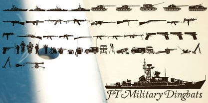 Pictograms of military boats, personnel, firearms and other weapons.
 - Nanami Rounded by Thinkdust,
$10.00 Nanami Rounded is a heavily engineered follow up to the hugely successful Nanami, which debuted at MyFonts #1 Hot New Fonts for over 2 weeks. Nanami Rounded is a carefully engineered take on the original Nanami family. We kept the curve very slight in order to keep the clean corporate balance, and not to go into a style that was too friendly. Nanami Rounded consists of 18 weights ranging from Thin through to Black. It has also extensive support for over 50 languages, and as a font family that works well both in headlines and bodycopy, Nanami Rounded is the perfect choice for a whole variety of creative briefs. The gentler, softer follow-up to the popular Nanami, Nanami Rounded is also motivated by the artistry of Japan. Smoothing the hard lines and definite corners of its predecessor just slightly, Nanami Rounded is still clearly defined and crisp enough to work in whatever context you need. If Nanami is a battle hardened Samurai, Nanami Rounded is the lotus blossom favour handed to him as he leaves his home village to go to war. If Nanami Rounded isn't quite floating your boat why not check out it’s counterparts Nanami and Nanami Handmade.
 - Dobi Hand by Tugrul Peker,
$5.00 Dobi Hand is a fat, bold, fun, cartoon like and has variable contrast handmade typeface. Dobi Hand that can be used for graphic design like food packaging, children books, birthday invitations, greeting cards etc. Dobi means in Turkish "fat, fatty" (in street language)
 - Kuroneko by Hanoded,
$15.00 Kuroneko in Japanese means ‘ Black Cat’. I was working on a Japan itinerary for a friend and I told him about the luggage forwarding service by a company with a black cat in its logo. Wait: Black Cat? What’s that in Japanese? Cool name for a font! Kuroneko font will not forward your luggage, nor was it made in Japan. But it IS a very versatile font family - even if you’re more of a dog person.
 - Wawe by Volcano Type,
$19.00A font for all the surfers and beachboys out there! - Donut by Vladvertising,
$20.00 Yummy dönut ya? Does this type make me look fat?
 - Nutcake CatchWords by Andinistas,
$49.00 INSPIRED BY THE LOVERS OF LETTERS AND ANCIENT ANIMATED DRAWINGS: We present one of our most desired typographical tools of 2019: NUTCAKE CATCH-WORDS! Designed and produced by #carlosfabiancg and #a_freitez at different times and places in Venezuela and Colombia. Each word design was like “travel to the old school of hand lettering of 1930” due to the number of options and alternatives we discarded to solidify meticulous researches and Bezier drawings, based on analysis and synthesis of empty and full calligraphy, first done with a round brush and then perfected with pencil and paper. For this reason, each NUTCAKE CATCH-WORDS design contains a high dose of cursive expressiveness, apparently handwritten, and that is why our customers can take advantage of more than 160 words compiled in a single OTF file. NOTE: if you need any new word with the NUTCAKE CATCH-WORDS style, please write us and we will gladly design it to include it in your file. Below the list of 160 catch words: and, An, All, As, After, Ante, Avec, Break, Bright, Big, Back, Both, Best, Body, Butter, Breakfast, By, Bajo, Coffe, Café, Closet, Can, Cocktail, Cookies, Custom, Cabe, Con, Contra, Could, Crisp, Candy, City, Chocolate, Chocolat, Come, Del, Don't, Deliver, Desde, Di, Durante, Enjoy, Eat, Example, El, En, Entre, Front, Fire, Free, Fashion, For, Fresh, Friday, Family, Going, Great, Go, Heres, Here, Hand, Hacia, Hasta, Have, I'm, It’s, Imagine, It, Join, Just, Jam, Kitchen, Kiss, Know, Keep, Like, Life, Lady, La, Las, Les, Los, Le, Love, Money, More, Master, My, Mediante, Now, now, New, new, next, nuevo, nueva, Off, out, ofertas, oferta, offer, offers, Please, Para, Per, Page, Quality, Queen, Question, Valley, Queso, Right, Road, Save, See, Show, Something, So, Según, Sin, So, Sobre, Sale, Shop, Style, Styles, Sweet, Special, To, the, The, Theres, There, To, This, Three, They, That, Tras, Think, Time, Take, Transfer, Until, Vacation, Value, Vote, What, Hats, With, Welcome, Which, You, Y, You're, you, Zip, Zoom, Zombie.
 - Cosmic Turtle by Hanoded,
$10.00 Cosmic Turtle is the belief that the world is supported by a giant turtle. It is mostly found in Hindu and Chinese mythology and the mythologies of the indigenous peoples of the Americas. I had to think of this, as the idea of the Cosmic Turtle is referenced to in the 1982 book ‘A Wild Sheep Chase’ by Haruki Murakami - my favourite author. Cosmic Turtle is a font that I made using a broken chop stick and Chinese ink. I was actually trying to create something scary for Halloween, but this is what came out and I quite like it. Cosmic Turtle is a fat display font with rough edges, wobbly glyphs and a set of double letter ligatures for you to play with.
 - Cinecav X by Typodermic,
$11.95 Cinecav X is a family of typefaces based on Cinecav™ which is a system of fonts designed for closed caption television (CCTV) applications. Cinecav X cannot be used in closed caption systems that require specialized character sets. Closed caption fonts for television makers can be found at ccfonts.com. Most Latin-based European, and some Cyrillic-based writing systems are supported, including the following languages. A Afaan Oromo, Afar, Afrikaans, Albanian, Alsatian, Aromanian, Aymara, Bashkir (Latin), Basque, Belarusian (Latin), Bemba, Bikol, Bosnian, Breton, Bulgarian, Cape Verdean, Creole, Catalan, Cebuano, Chamorro, Chavacano, Chichewa, Crimean Tatar (Latin), Croatian, Czech, Danish, Dawan, Dholuo, Dutch, English, Estonian, Faroese, Fijian, Filipino, Finnish, French, Frisian, Friulian, Gagauz (Latin), Galician, Ganda, Genoese, German, Greenlandic, Guadeloupean Creole, Haitian Creole, Hawaiian, Hiligaynon, Hungarian, Icelandic, Ilocano, Indonesian, Irish, Italian, Jamaican, Kaqchikel, Karakalpak (Latin), Kashubian, Kikongo, Kinyarwanda, Kirundi, Komi-Permyak, Kurdish (Latin), Latvian, Lithuanian, Lombard, Low Saxon, Luxembourgish, Maasai, Macedonian, Makhuwa, Malay, Maltese, M?ori, Moldovan, Montenegrin, Ndebele, Neapolitan, Norwegian, Novial, Occitan, Ossetian, Ossetian (Latin), Papiamento, Piedmontese, Polish, Portuguese, Quechua, Rarotongan, Romanian, Romansh, Russian, Sami, Sango, Saramaccan, Sardinian, Scottish Gaelic, Serbian, Serbian (Latin), Shona, Sicilian, Silesian, Slovak, Slovenian, Somali, Sorbian, Sotho, Spanish, Swahili, Swazi, Swedish, Tagalog, Tahitian, Tetum, Tongan, Tshiluba, Tsonga, Tswana, Tumbuka, Turkish, Turkmen (Latin), Tuvaluan, Ukrainian, Uzbek (Latin), Venetian, Vepsian, Võro, Walloon, Waray-Waray, Wayuu, Welsh, Wolof, Xhosa, Yapese, Zapotec Zulu and Zuni.
 - Seuchter Experimental by HiH,
$10.00 Seuchter Experimental is a product of the fertile Jugendstil period in Austria. Drawn by Bruno Seuchter, about whom little biographical information is available, the design first appeared in Seuchter’s publication, Die Fläche, in 1902. Die Fläche means “surface or expanse,” presumably a reference to a “tabula rasa” or clean slate. The implication is one of starting anew, rejecting the past and searching for fresh, different modes of visual expression — which is exactly what Art Nouveau attempted to do. Seuchter Experimental is a quirky and light-hearted font. Ligatures include AT, AV, CH, CK, FJ, LO and ST. Although basically an all-cap font, several of the accented letters in the lower case position represent the oft-seen desire to keep the accents below cap-height. The a-umlaut at 228 and u-umlaut at 252 reflect Seuchter’s original design. For a discussion of the difference between a diaresis and an umlaut, see Appendix B of Bringhurst’s The Elements of Typographical Style. In the meantime, give this font room to breathe.
 - TT Bricks by TypeType,
$29.00 TT Bricks useful links: Graphic presentation | Customization options Do you love the early Soviet visual culture as much as we do? We’ve tried going back a hundred years and rethinking the constructivist era. We’ve created an extensive font family that consists of the simplest triangle and rectangle forms. TT Bricks font family includes 16 typefaces: Hairline, Thin, Light, Regular, Medium, Bold, ExtraBold, Black and Italics. Regardless of its Soviet past, TT Bricks is a very fresh and visually powerful font family that perfectly fits the contemporary media landscape. TT Bricks is perfect for mobile apps and corporate websites, as well as for printed press layout. Thanks to the exaggeratedly simple forms of all signs, TT Bricks looks great in very small type sizes. FOLLOW US: Instagram | Facebook | Website TT Bricks language support: Acehnese, Afar, Albanian, Alsatian, Aragonese, Arumanian, Asu, Aymara, Banjar, Basque, Belarusian (cyr), Bemba, Bena, Betawi, Bislama, Boholano, Bosnian (cyr), Bosnian (lat), Breton, Bulgarian (cyr), Cebuano, Chamorro, Chiga, Colognian, Cornish, Corsican, Cree, Croatian, Czech, Danish, Embu, English, Erzya, Estonian, Faroese, Fijian, Filipino, Finnish, French, Friulian, Gaelic, Gagauz (lat), Galician, German, Gusii, Haitian Creole, Hawaiian, Hiri Motu, Hungarian, Icelandic, Ilocano, Indonesian, Innu-aimun, Interlingua, Irish, Italian, Javanese, Judaeo-Spanish, Kalenjin, Karachay-Balkar (lat), Karaim (lat), Karakalpak (lat), Kashubian, Khasi, Khvarshi, Kinyarwanda, Kirundi, Kongo, Kumyk, Kurdish (lat), Ladin, Latvian, Laz, Leonese, Lithuanian, Luganda, Luo, Luxembourgish, Luyia, Macedonian, Machame, Makhuwa-Meetto, Makonde, Malay, Manx, Maori, Mauritian Creole, Minangkabau, Moldavian (lat), Montenegrin (lat), Mordvin-moksha, Morisyen, Nahuatl, Nauruan, Ndebele, Nias, Nogai, Norwegian, Nyankole, Occitan, Oromo, Palauan, Polish, Portuguese, Quechua, Rheto-Romance, Rohingya, Romanian, Romansh, Rombo, Rundi, Russian, Rusyn, Rwa, Salar, Samburu, Samoan, Sango, Sangu, Scots, Sena, Serbian (cyr), Serbian (lat), Seychellois Creole, Shambala, Shona, Slovak, Slovenian, Soga, Somali, Sorbian, Sotho, Spanish, Sundanese, Swahili, Swazi, Swedish, Swiss German, Tagalog, Tahitian, Taita, Tatar, Tetum, Tok Pisin, Tongan, Tsonga, Tswana, Turkish, Turkmen (lat), Ukrainian, Uyghur, Vepsian, Volapük, Võro, Vunjo, Xhosa, Zaza, Zulu.
 - Empyrean by Greater Albion Typefounders,
$16.00 Empyrean is a display Roman typeface which sets out to be deliberately different. Its letterforms explore white space and the art of leaving things out. Empyrean is a futuristic Roman design which builds in respect for typographic tradition with an exploration of design possibilities.
 - Finest Vintage by Din Studio,
$20.00 Choosing fonts for design projects can be a daunting task because there’s thousands of fonts out there all over the web that you could use. Here it is. A font that can add touch of magic whether you’re looking to create a big, bold logo for your business, work on a poster for an event, or whatever your project may be. Finest Vintage-A Retro Script Font Finest Vintage is a beautiful font, employing the iconic bubble style with strong outlines and fat strokes. This font features thick and angular letters that easy on the eyes and nice to look while it’s also easy to read. It is well suited for making your logos really stand out. The font comes with a range of multilingual glyphs and is one of those bubble fonts styles that’s hard to take your eyes off. Finest Vintage becomes more special with extruding version option. Perfect to create amazing headings, logos, menus, social media graphics, and many more. Our font always includes Multilingual Support to make your branding reach a global audience. Features: Ligatures Stylistic Alternates Swashes PUA Encoded Numerals and Punctuation Thank you for downloading premium fonts from Din Studio
 - P22 Barabajagal by IHOF,
$29.95 P22 Barabajagal is a unique take on the display fat face by way of doodling fun. Somewhat informed by the shapes of an early 1970s film type called Kap Antiqua Bold, this font’s aesthetic is the stuff of boundless energy and light humour, where an uncommon “peak” angle drawing perspective results in sturdy trunks, fat bottom curls, and active ascenders eager for mobility in space. This is the kind of font that makes you wonder whether it was drawn with rulers, protractors and compasses, or just by a mad doodler’s crazy-good free hand. Regardless, Barabajagal easily turns the geometry of modern forms into an exercise in sugar-loaded fun. It’s a very good tool to use in design geared at kids and young adults, such as food and toy packaging, books, animation, cartoons and games. Barabajagal comes with over 550 glyphs, lots of alternates, and a few ligatures and swash caps. It also contains extended support for Latin languages.
 - Monologue by Halfmoon Type,
$20.00 MONOLOGUE is a simple, condensed sans serif font with bold and complex personality. It was purposely crafted to be used in large point sizes, although it doesn't lose it's magic in small point sizes. It is perfect for headline, billboard, magazines, website, titles, poster, branding, and logos. With tons of ligatures, alternates, and other features to choose from, you can make your project stand out from the rest. FEATURES: Basic latin characters, numerals, punctuations and symbols. Extensive language support, including slavic languages with cyrillic alphabet. Stylistic Alternates Stylistic Sets (ss01–ss06) 100+ Discretionary Ligatures Ordinals Preconstructed fractions Fractions Superscript and Superscript Numerals Kerned, spaced, and hinted If you have any questions, please don't hesitate to contact me via email at muhtadi.yusril@gmail.com. Check out my other works, such as font design, lettering, and type exploration on Instagram @yusril.muhtadi (https://www.instagram.com/yusril.muhtadi) Thank you for visiting and have a great, great day! Yusril Muhtadi
 - Spills by Comicraft,
$19.00 The infield dirt is raked, the outfield grass is mowed and the baselines chalked. So grab a beer, smother a stadium dog with mustard and relish, take a seat on the bleachers and get ready -- that handsome devil SPILLS is back on the mound and ready for a comeback! It’s true, Manager [the person who coaches a baseball team is a ‘manager’ not a coach] John JG Roshell has coaxed the wily veteran out of retirement, and he’s returned to the field with the wisdom of extra years and the addition of five new pitches (fonts): Stadium, Dugout, Outfield, Infield, Pennant and Base. The stadium is packed to capacity and we're pretty sure the first time he’s at the plate, it’s gonna be strike-out city! [to continue the logic of the baseball pitching ace as font metaphor, the pitcher would hopefully prevent a home run not facilitate one.] See the families related to Spills: SpillProof .
 - Découpe by Sudtipos,
$39.00 Sudtipos is proud to announce the release of Découpe, a display typeface program of eight fonts, designed by María Carla Mazzitelli and born during her Masters in Typography at the University of Buenos Aires (FADU-UBA). Inspired by gestural graphic expressions –like paper cut-outs (découpes) and spontaneous handwriting– from the most diverse postmodern and contemporaneous artists of the design world, Découpe has been created specifically to be used in big sizes. A little bit irreverent and effervescent from time to time, this gestural sans serif family reveals its contrasts and asymmetrical shapes when it breaks through display functions. From Light to Extra Bold, it reaches the most extreme weights, looking for power and impact. This program is meant to catch the eye in typographic compositions, to shout it out loud and clear. Definitely, to be seen. *Découpe has been recently selected to be part of different typography exhibitions such as Tipos Latinos and the Type Directors Club.
 - Bizarries by Typephases,
$25.00 This series, with 104 illustrations in three files, collects original ink drawings with absurdities, bizarre people, whimsical personalities and risky behaviors! There is a very peculiar sense of narrative in the sucession of characters, even if they came out rather spontaneously and their order is random.With a vintage look and feel, these people seem to come out of a time capsule from Victorian times. Almost everything in the Bizarries (and also in their close relatives, our Illustries, Whimsies, Ombres, Absurdies and Genteta dingbats) is invented and drawn with no references —just a handful of images were sketched from historical photography. These illustrations can be very useful for a variety of projects, either in black and white, or colored in a paint or drawing application. You can use them at any size, from a small spot illustration to a huge poster, depending on your needs. The outlines remain crisp and clear no matter how much you enlarge, reduce, distort or tweak their shapes.
 - ITC Adderville by ITC,
$29.99On a cold winter's night, George Ryan, of Galápagos Design Group, began musing on the possibilities for a “truly original” sans serif typeface. What came out of his musing, and his always-present sketchpad, was ITC Adderville, a typeface whose visual impact is immediate and strong. Ryan explains how he did it: “The rounded ends of its strokes and their skewed baseline contact create an illusion of dancing feet. The tops of lowercase stems emit serif buds, suggesting transition into or out of the serifed form. The spear-like lowercase stroke terminators, along with other distinctive elements such as the stylized reticulation of the lowercase 'g' segments, the salute of that same character's spur, and the bold, non-self-conscious 'i' and 'j' dots, all contribute to the playful and unique nature of this design.” The result is a friendly, lively type family whose graduated weights -- book, medium, and heavy -- lend themselves especially well to use at small display sizes and in short blocks of text. - Brecksville by OzType.,
$15.00 Brecksville is a condensed grotesk typeface that takes inspiration from early German designs of the mid-19th century. It was designed as part of my current research into grotesk typefaces and different letterforms, as part of my dissertation research, “Perfected Letters: German Grotesk in the Nineteenth Century”, which focuses on the role of German design in typography. The Brecksville font family provides a wide range of weights, ranging from light to bold for both its rounded display style and more rugged sharp style. Both its styles feature the same horizontal proportions and metrics so they can freely be combined with no spacing issues. Brecksville's visually punchy condensed style and sharp edges, allows it to stand out on the screen – at almost any size. Its black composition also brings out the details needed in magazine and tabloid headlines, while maintaining readability throughout. The rounded display version is ideal for posters and other uses where you want something eye catching but not too hard on the eyes.
 - Infusion by Andinistas,
$39.00 Infusion is a type family designed by CFCG & Fabio Godoy for andinistas.net. The creative process of Infusion evolved throughout a myriad of experiments supported by my font gluten This is why its expressivity comes from the addition and subtraction of its parts by mixing and combining, resulting in a great variety and new versatility of uppercase, lowercase, multiple and different numbers to be applied at the beginning, middle or end of the word. Infusion is used to write sentences in craft contexts that require organic graphic design, with meticulous imperfect look. Infusion offers typographic solutions out of the limits, or out of borders that divide the mechanics of the drawn by hand. Infusion has 6 decorative and legible fonts to write casual messages with organic, friendly and natural personality. Infusion “Script, Mix, Roman, Shadow, Extras, Dingbats” contain unconventional visually appealing ideas to work independently or in group in the design of logos, packaging, presentations, headlines or editorials.
 - TT Drugs Condensed by TypeType,
$29.00 TT Drugs useful links: Graphic presentation | Customization options TT Drugs Condensed—a modern font family which consists of 5 condensed sans serifs with a special contrast formula of lines and stems. TT Drugs Condensed is a condensed version of the TT Drugs font family. These fonts are perfect for design in the pharmaceutical industry: packaging, posters, blissery. However, those fonts can also be used in any other design, for example, in printing, logotypes and websites. Font family includes 10 most popular typefaces: thin, light, regular, bold, black and 5 appropriate italics. TT Drugs Condensed—a versatile tool for any design tasks. FOLLOW US: Instagram | Facebook | Website TT Drugs OpenType features: Case Sensitive Forms, Tabular Figures, Fractions, Numerators, Denominators, Superiors, Scientific Inferiors. TT Drugs language support: Acehnese, Afar, Albanian, Alsatian, Aragonese, Arumanian, Asu, Aymara, Banjar, Basque, Belarusian (cyr), Bemba, Bena, Betawi, Bislama, Boholano, Bosnian (cyr), Bosnian (lat), Breton, Bulgarian (cyr), Cebuano, Chamorro, Chiga, Colognian, Cornish, Corsican, Cree, Croatian, Czech, Danish, Embu, English, Erzya, Estonian, Faroese, Fijian, Filipino, Finnish, French, Friulian, Gaelic, Gagauz (lat), Galician, German, Gusii, Haitian Creole, Hawaiian, Hiri Motu, Hungarian, Icelandic, Ilocano, Indonesian, Innu-aimun, Interlingua, Irish, Italian, Javanese, Judaeo-Spanish, Judaeo-Spanish, Kalenjin, Karachay-Balkar (lat), Karaim (lat), Karakalpak (lat), Kashubian, Khasi, Khvarshi, Kinyarwanda, Kirundi, Kongo, Kumyk, Kurdish (lat), Ladin, Latvian, Laz, Leonese, Lithuanian, Luganda, Luo, Luxembourgish, Luyia, Macedonian, Machame, Makhuwa-Meetto, Makonde, Malay, Manx, Maori, Mauritian Creole, Minangkabau, Montenegrin (lat), Mordvin-moksha, Morisyen, Nahuatl, Nauruan, Ndebele, Nias, Nogai, Norwegian, Nyankole, Occitan, Oromo, Palauan, Polish, Portuguese, Quechua, Rheto-Romance, Rohingya, Romansh, Rombo, Rundi, Russian, Rusyn, Rwa, Salar, Samburu, Samoan, Sango, Sangu, Scots, Sena, Serbian (cyr), Serbian (lat), Seychellois Creole, Shambala, Shona, Slovak, Slovenian, Soga, Somali, Sorbian, Sotho, Spanish, Sundanese, Swahili, Swazi, Swedish, Swiss German, Swiss German, Tagalog, Tahitian, Taita, Tatar, Tetum, Tok Pisin, Tongan, Tsonga, Tswana, Turkish, Turkmen (lat), Ukrainian, Uyghur, Vepsian, Volapük, Võro, Vunjo, Xhosa, Zaza, Zulu.
 - Expressway Free - 100% free

- American Auto by Miller Type Foundry,
$26.99 Hot Dogs, Apple Pie, Baseball and great TYPOGRAPHY are deeply rooted in American culture. American Auto is a Type Family that embodies that culture visually. It joins a robust workhorse sans with a playful script that brings you back to 70+ years ago, while at the same time remaining as contemporary as any new 2019 design. This unique pair work together in harmony to create wonderful designs for a variety of uses. From book covers to posters, web sites to apps, American Auto is an excellent choice to create striking designs that stand out from the crowd! American Auto also features many Opentype Features such as: Alternate Characters, Initial & Final Forms, Contextual Alternates, Old Style Figures, Lining Figures, Numerators & Denominators, Fractions, and more! This typeface has really been designed to meet any challenge that a designer can throw at it!
 - CA Cula by Cape Arcona Type Foundry,
$40.00 CA Cula is standing in the tradition of cool tempered sans serif typefaces like DIN. But at a closer look it reveals a tendency towards rounder reading-friendly forms. The denaturalized ink traps give CA Cula a very special and individual look in display sizes, whereas in smaller sizes the positive aspects of huge ink traps show effect. The text looks clean and bright without black dots in the typographic image. This makes CA Cula suitable even for longer text, while the bold weight makes pretty cool headlines. The choice of weights aims at an easy straight forward use. A set of five well balanced weights ought to be enough to cover most needs without throwing the typographer into questions like: demibold or semibold? If you are looking for the extra kick, look out for CA Cula Superfat.
 - Peterhof by Favorite Fonts,
$17.00 Have you got a dream? I dream of visiting Peterhof. The palace and park ensemble with beautiful architecture, sculptures, and fountains. It is no less beautiful on the inside than on the outside. Huge halls, windows, columns, paintings. Everything is very refined, elegant, and beautiful. Looking at the photos, I enjoy and admire the views. They inspired me to create the "Peterhof" typeface. Elongated letters echo with tall columns and fountains. Serifs and playful glyph corners add grace to the font. It turned out to be refined, aristocratic, and at the same time mysterious and effective. I have created a whole family of "Peterhof" fonts from regular to bold italics for every taste and for every task. The "Peterhof" font will look great in headlines, advertising signs, posters, magazine pages, and prints. It can serve as the main focus of your compositions.
 - OldSansBlack - 100% free

- Athletes - Unknown license

- Nerfect•Cola by Nerfect,
$15.00Nerfect•Cola was created for all you soda lovers out there. - Prat Pinochio MF by Masterfont,
$59.00 Happy doodle font will make your next children book stand out.


