10,000 search results
(0.15 seconds)
- Heralen Antelik by Letterena Studios,
$17.00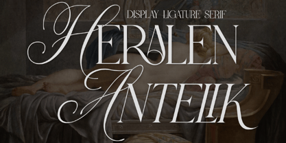 A serif modern and classic typeface that has its own unique style & modern look. This typeface is perfect for an elegant & luxury logo, book or movie title design, fashion brand, magazine, clothes, lettering, quotes, and so much more.
 - Feragie by Muksal Creatives,
$12.00 Feragie is a unique and modern family of sans-serif fonts. Feragie has 9 families, starting from the small thin to the largest black. This typeface is versatile and can be used successfully in magazines, posters, branding, websites,
 - Alibabe by Almarkha Type,
$25.00 Introducing Alibabe Authentic Display Font, Inspired by Food Logo style and combination with Cute Craft style. that will fulfill your design needs for quotes,sporty theme, logotype, wordmark, etc. This has many opentype features and support multi language.
 - Great Dunker by Arendxstudio,
$13.00 Great Dunker Graffiti Font is a free style font that has the characteristics of street art that shows freedom and is filled with unique characters Features : • Character Set A-Z • Numerals & Punctuations (OpenType Standard) • Accents (Multilingual characters) Outline
 - Derriey Vignettes by Intellecta Design,
$15.50 This is the Intellecta’s digitization of the fantastic heritage by Charles Derriey. Besides the original ornaments and fleurons, our collection has new interpretations and new designs based in the original work. A tour-de-force by Iza W.
 - Andora Ardelion by Gittype,
$18.00 Andora Ardelion is a stylish and elegant new calligraphy font, suitable for designs that need both a touch of elegance and modernity. This font has a lot of swashes that can help anchor your projects in ornamental glamour.
 - Rehn Condensed by moretype,
$40.00 With all the features of its wider relative, Rehn Condensed has been specifically designed for those situations where space is a premium. Rehn and Rehn Condensed together offer a complete package suitable for a wide range typographic applications.
 - Cintra by Graviton,
$12.00 Cintra font family has been designed for Graviton Font Foundry by Pablo Balcells in 2014. It is a sans serif, bold, geometric typeface with subtle rounded angles, which provides a soft, pleasent appearence. Cintra consists of 8 styles.
 - Tschicholina by Type-Ø-Tones,
$40.00 Tschicholina is inspired by a project by Jan Tschichold dating back to 1929. It is a unicase "universal" font which has always been considered to have very little future; this is why we have it in our catalogue.
 - Free Zone by Aboutype,
$24.99A Sans serif design that follows a continental style with design characteristics that combine condensed and open counters. The lowercase has tall ascenders. Family includes common capitals and alternate lowercase characters. FreeZone requires subjective display kerning and compensation. - Hebrew Stencil by Samtype,
$49.00 This is a modern Sans Serif font. There are 12 letters This font is for logos, covers and small texts and children books This font has the modern Hebrew punctuation: Shevana, Kamatz Katan, Dagesh Hazak, and Cholam Chaser.
 - Ready for More BB by Blambot,
$10.00 The long-awaited sentence-case version of Blambot's Ready for Anything comic book dialogue font has arrived! Are you...Ready for More? This typeface includes double-letter autoligatures, contextual alternate barred-I correction, and tons of diacritical glyphs.
 - Twigglee by Ingrimayne Type,
$9.95 Twigglee was inspired by the hand lettering on the plates in a 19th century book on ornaments by Owen Jones. It has no lower-case letters; the upper-case letters are simply repeated on the lower-case keys.
 - Ikuta Sans by Leo Kuroshita,
$10.00 This is a geometric font suitable for modern designs. designed according to strict geometry. It's geometric, but it has also humanly rough styles. and added various alternative glyphs. includes ligatures and alternate characters inspired by famous geometric fonts.
 - Conqueror Sans by Letterhead Studio-YG,
$45.00 This sanserif has 18 faces from Light to the Black Italic. Conqueror Sans keeps the vigorous design peculiar to all members of this family, but at the same time it is more neutral, than its having serifs relatives.
 - Benalla by AEN Creative Studio,
$12.00 Benalla is a beautiful, elegant, yet casual and simple font script featuring a natural look & feel. It has beautiful swashes and ligatures and it’s perfect for logos, wedding invitations, posters, social media posts, signatures, quotes and much more!
 - Alipe Script by TeGeType,
$29.00 Alipe Script is a new script typefaces family. Alipe Script family has light, medium and bold fonts, all with ligatures, alternates and a set of ornaments. It can be used for text as well as for titling applications.
 - Aery by Daily Studio,
$13.00 Aery is a Typeface designed by Daily Studio. This font is a slim type font. Every letter has its design, so it makes your projects look professional and outstanding. Aery contains full uppercase, lowercase, punctuation, and multilingual letters.
 - Crassified by Spareartist,
$6.66 Crassified is a modern display font inspired by blackletter typefaces. The typeface has a strong effect that adds a certain elegance and class to both digital and print designs. It’s ideal for crafting logos, posters, covers, and more.
 - Kids Line by Sakha Design,
$10.00 Kids Line is a cute and friendly handwritten font. Whether you’re using it for crafts, digital design, presentations, or making greeting cards, this font has the potential to become your favorite go-to font, no matter the occasion!
 - Adamantium by Comicraft,
$39.00Looking for sharp-looking characters in ferocious action? Then look no further than this font, originally designed by Senior Comicraftsman John Roshell for GHOST RIDER 2099. Adamantium has also been featured in WOLVERINE and THE UNCANNY X-MEN. - Shogi by Attractype,
$14.00 Attractype presents Shogi, a beautiful modern serif font, which has sharp shapes and high contrast. Suitable for easy-to-read text or attractive displays. Shogi comes with some beautiful ligatures that make your letter projects even more special.
 - Winter Cold by Sakha Design,
$10.00 Winter Cold is a sweet and adorable display font. Whether you’re using it for crafts, digital design, presentations, or making greeting cards, this font has the potential to become your favorite go-to font, no matter the occasion!
 - Economica PRO by Underground,
$29.90 Economica Pro is a font specially developed for printing complex situations. It has been tested successfully in very small sizes without losing legibility. It's ink traps ensure its smooth operation even in low quality papers. Ideal for newspapers.
 - Trelink by Letterena Studios,
$17.00 A serif modern and classic typeface that has its own unique style & modern look. This typeface is perfect for an elegant & luxury logo, book or movie title design, fashion brand, magazine, clothes, lettering, quotes, and so much more.
 - Compendium by Sudtipos,
$99.00 Compendium is a sequel to my Burgues font from 2007. Actually it is more like a prequel to Burgues. Before Louis Madarasz awed the American Southeast with his disciplined corners and wild hairlines, Platt Rogers Spencer, up in Ohio, had laid down a style all his own, a style that would eventually become the groundwork for the veering calligraphic method that was later defined and developed by Madarasz. After I wrote the above paragraph, I was so surprised by it, particularly by the first two sentences, that I stopped and had to think about it for a week. Why a sequel/prequel? Am I subconsciously joining the ranks of typeface-as-brand designers? Are the tools I build finally taking control of me? Am I having to resort to “milking it” now? Not exactly. Even though the current trend of extending older popular typefaces can play tricks with a type designer’s mind, and maybe even send him into strange directions of planning, my purpose is not the extension of something popular. My purpose is presenting a more comprehensive picture as I keep coming to terms with my obsession with 19th century American penmanship. Those who already know my work probably have an idea about how obsessive I can be about presenting a complete and detailed image of the past through today’s eyes. So it is not hard to understand my need to expand on the Burgues concept in order to reach a fuller picture of how American calligraphy evolved in the 19th century. Burgues was really all about Madarasz, so much so that it bypasses the genius of those who came before him. Compendium seeks to put Madarasz’s work in a better chronological perspective, to show the rounds that led to the sharps, so to speak. And it is nearly criminal to ignore Spencer’s work, simply because it had a much wider influence on the scope of calligraphy in general. While Madarasz’s work managed to survive only through a handful of his students, Spencer’s work was disseminated throughout America by his children after he died in 1867. The Spencer sons were taught by their father and were great calligraphers themselves. They would pass the elegant Spencerian method on to thousands of American penmen and sign painters. Though Compendium has a naturally more normalized, Spencerian flow, its elegance, expressiveness, movement and precision are no less adventurous than Burgues. Nearing 700 glyphs, its character set contains plenty of variation in each letter, and many ornaments for letter beginnings, endings, and some that can even serve to envelope entire words with swashy calligraphic wonder. Those who love to explore typefaces in detail will be rewarded, thanks to OpenType. I am so in love with the technology now that it’s becoming harder for me to let go of a typeface and call it finished. You probably have noticed by now that my fascination with old calligraphy has not excluded my being influenced by modern design trends. This booklet is an example of this fusion of influences. I am living 150 years after the Spencers, so different contextualization and usage perspectives are inevitable. Here the photography of Gonzalo Aguilar join the digital branchings of Compendium to form visuals that dance and wave like the arms of humanity have been doing since time eternal. I hope you like Compendium and find it useful. I'm all Spencered out for now, but at one point, for history’s sake, I will make this a trilogy. When the hairline-and-swash bug visits me again, you will be the first to know. The PDF specimen was designed with the wonderful photography of Gonzalo Aguilar from Mexico. Please download it here http://new.myfonts.com/artwork?id=47049&subdir=original
 - Badly Stuffed Animal by PizzaDude.dk,
$17.00 I have seen my share of badly stuffed animals. Most of them via pictures, but also on vacations here and there. They all had this really bad handcraft vibe, but at the same time some really ordinary and kind of cute looks. I did my best to capture this look and feeling in my Badly Stuffed Animal font: clumsy letters made with a blobbly pen, with naive and irregular lines - and the conclusion is something super useful for a project that needs an organic handmade look!
 - Pomerans by Hanoded,
$11.00 Pomerans is a redo of an old font of mine called Suco De Laranja. Since the original font had a citrusy name, I decided to name this reincarnation Pomerans, which means ‘Seville Orange’ in Dutch. I doubt that there are many Dutch people who actually know what a pomerans is! Pomerans is a handmade, all caps font. I kept the look and feel of the original font, but I cleaned up the glyphs, added new glyphs and added additional language support (including Vietnamese and Sami).
 - Antique Packaging JNL by Jeff Levine,
$29.00 The box cover of “Drawing Stencils No. 3 for Use on Slate or Paper” [a children’s drawing set produced by Montgomery, Ward & Company of Chicago circa the 1890s] had its title in an elegant spurred Roman type face. Working from the few letters available, a complete character set was created that resulted in Antique Packaging JNL, which is available in both regular and oblique versions. To note, this is the 1500th font release from Jeff Levine Fonts since its inception in January of 2006.
 - Movella by Greater Albion Typefounders,
$8.00 Remember those 1970s science fiction dramas which had such charming futuristic sets and backdrops? Remember the intriguing future lettering and signage the set designers would devise-often coupled with interesting futuristic spellings? Movella is a family of three typefaces inspired by that design ethos. The three faces- regular, italic and the 3D solid form are all capitals faces which combine a feeling of retro-futuristic design with easy legibility. Take your next project into the age of the Apollo Launches, sci-fi action drama and fun!
 - Toms Handwritten by URW Type Foundry,
$49.99 This handwritten font was brought to our attention by one of our customers. Tom Bernard Anyz had offered his handwriting font at dafont.com, a free-font portal for private customers where Toms Handwritten is enjoying great popularity. We liked the design at first glance – it is so innocent and sketch-like, similar to a quick note or message. We reworked and completed Toms Handwritten for professional usage. Apart from the already available Latin character set for West and East, we also added Greek and Cyrillic.
 - Beachfront Hotel JNL by Jeff Levine,
$29.00 The Raleigh Hotel at 18th Street and Collins Avenue on Miami Beach is an Art Deco landmark and part of the city's popular tourist district. A vintage matchbook from the hotel had its name hand lettered in what is now Beachfront Hotel JNL; available in both regular and oblique versions. The lower case letters have been made more traditional, eliminating the Deco-influenced "overhangs" present on the capital letters, and an alternate "E" from the original matchbook design is available on the bar and broken bar keys.
 - Polke by ArtyType,
$29.00 Polke is a single weight display face brimming with style and charm but simultaneously exuding impressive core strength and a vibrant personality. Floating ball terminals rub shoulders with contrasting sharp and rounded letterforms to produce a distinctively decorative headline font built on robust foundations. Polke's name is derived from the striking terminal dots which dominate the character set, creating a Polka-Dot effect throughout. I also had the artist Sigmar Polke in mind which explains the spelling, and so the two ideas simply morphed together.
 - SpillProof by Comicraft,
$29.00Put on your top hat, tie up your white tie, brush off your tails and surrender your serifs at the door! We've popped open a bottle of French Champagne for you, but don't worry, because our latest stylishly handsome, devilishly clever offering doesn't just offer thrills and chills, it’s also Spillproof! So step out and breathe an atmosphere that simply reeks with class and distinction, What a swell font for party invitations, soirees, nightclubs and weddings this is! See the families related to SpillProof: Spills. - Performing Arts JNL by Jeff Levine,
$29.00 The sheet music for "I Used to be Color Blind" (from the 1938 Fred Astaire-Ginger Rogers movie "Carefree") had its title crafted in ornate Art Deco hand lettering. Keeping the original letter forms, the interior embellishment was simplified to a dot-and-line pattern [eliminating a secondary squiggly line] for a cleaner look. The type design is now digitally available as Performing Arts JNL, in both regular and oblique versions. For those who prefer no ornamentation, there are also regular and oblique versions in solid form.
 - Bong God by Loaded Fonts,
$7.50Following rules, perhaps too closely. The first full font created by Ray Mullin who strongly believes a font need not be pretty to be valid. Each capital shares similar angles, as does each lowercase, making for a typeface only a mother could love. The rounded style was the true inspiration for the original, but logically it had to come second. Based entirely around Bong God but losing the harsh edges to become a usable futuristic type. Legible, but not readable, recommended in small doses. - PAG Karogs by Prop-a-ganda,
$19.99Prop-a-ganda offers retro-flavored fonts inspired by lettering on retro propaganda posters, retro advertising posters, retro packages all the world over. This is perfect font for your retrospective project. PAG Karogs is geometric, art-deco font that had been used for a match box. The bowls of this font is based on a positive circle. The contrast of a circle and straight line effective in producing brisk structural rhythms. This is great for branding, packaging and posters or any other kind of display use. - VLNL Irish Stew by VetteLetters,
$35.00 Obviously the Irish Stew font finds its origin in Ireland. During a vacation in West Ireland Donald® fell in love with the famous local dish. In fact, he loved Irish stew so much he couldn't wait to create a font dedicated to the stew from Ballymaloe. He found the inspiration for this font on an old shop front sign somewhere in Dublin. The sign only contained a few characters, but the stew had given him more than enough energy and inspiration to complete the whole alphabet!
 - Cartoon Panel JNL by Jeff Levine,
$29.00 Charles W. "Plot" Plotner was a cartoonist who had developed a template-based cartooning set for kids circa 1952 called "Plot-O". A companion set was called "Plot-O the Clown". "Plot-O" consisted of two plastic templates with pre-cut and numbered cartoon shapes. By following the simple directions and tracing the corresponding parts, any youngster could create basic cartoons of people and finish them off with their own details. The hand-lettered instruction booklet provided the design inspiration for Cartoon Panel JNL.
 - Bayview JNL by Jeff Levine,
$29.00Around the turn of the 20th Century, the Inland Type Foundry produced a display face named Studley. It was a variation on a design by another foundry called Florentine. A condensed face with a bold, clean look, the design resembled the warmth and feel of a classic wood type. Best applied to headlines and titles, the font reads amazingly well at even 18 point renderings. Jeff Levine had added his own personal touch to his digital version of this old favorite and renamed it Bayview JNL.