5,358 search results
(0.018 seconds)
- Horse Puke - 100% free

- Buree Chalk by Nurf Designs,
$16.00 Buree Chalk is a unique handwritten font with a chalk texture. Fall in love with it and bring your projects to the highest levels!
 - Ript Cure by insigne,
$19.99RiptCure is a futuristic, but usable typeface for everything from logotypes to magazine headlines. Several weights are included, including an interesting Ultra Light. - Sure Shot by PizzaDude.dk,
$20.00Sure Shot brings back oldschool grafitti to your desktop! It's got elegant swings and wildstyle curves, perfect for logo's that needs a hip hop flair. Well, it's hip and it's hop - and it won't stop! - Curely Pro by Konstantine Studio,
$15.00 Start from the idea of our free font, Curely, which has hit the milestone - a 70K project views on Behance and a thousand times more download (still going). Now we came up with the Pro version of it. More complex, more features, and absolutely more playful. So, please welcome, Curely Pro. A Versatile casual handmade decorative lettering typeface. Still inspired from the girly things and cuteness overload in every letters. Perfectly fit for your cute, sweet, lovely, and casual branding or logo project. Or any design stuff that need a lovely cute touch on it, let the Curely Pro smooch it all the way baby!
 - Counte by NamelaType,
$19.00 This is our first experience of creating serif fonts. It resulted in a modern slab serif family designed with symmetrical bracketed serifs for uprights and cursive serifs for Italics. Crafted with low contrast strokes, it makes this font versatile and can be used for text and printing. Counte contains many International diacritics and OpenType Features. It consists of 9 weight, going from Thin to Black with matching italics.
 - Pure And Simple Everytime by Weknow,
$25.00 Give a simple rounded fun groovy, fancy, to any text project, also cool for a logotype. I created this font while listening to a lightning seed song, pure and simple, and having fun with it.
 - Foundry Dat by The Foundry,
$50.00 Foundry Dat is created with a common horizontal dash grid structure for accurate layering when characters are superimposed. Foundry Dat’s integrated background aligns vertically and horizontally, when set solid, forming a continuous pattern. Foundry Dat’s companion family Foundry Dit functions as a legible correspondence font, with a ‘typewriter’ feel. Each family contains: light, regular, medium and bold weights. Foundry Dat comes with a series of dashes to extend the background grid. Characters can also be offset to make different patterns – in the process becoming images – a graphic language with total integration of form and function.
 - Foundry Origin by The Foundry,
$90.00 Foundry Origin has an elemental quality hinting at its ‘Egyptian’ roots. Developed out of the desire to create a serif typeface with a difference, Foundry Origin's elegant design and versatile family of weights, with lyrical cursive italic, generous x-height and classical proportions, make it ideal for editorial and information design. A quiet design with a big presence, tipped to become a modern classic.
 - Couturier Poster by Latinotype,
$29.00 Elegance flows through Couturier Poster soul. The new cousin of early launched Couturier, brings higher contrast and an extended family, perfect for big sizes. Inspired by the didones from the 18th century, its design its heavily influenced by contemporary ideas makes it suitable to use for almost anything you can think of. Equipped with swashes, ligatures, small caps and alternates, this typography is very versatile and allows you to set a big range of compositions with discretion or personality. Couturier Poster comes in six weights and matching true italics, from thin to black. It's a good choice to pair with Couturier for smaller sizes and Couturier Poster for the big titles. It has a set of 1248 characters that cover more than 200 languages derived from latin.
 - Foundry Gridnik by The Foundry,
$96.00 The new Foundry Gridnik typeface family features an expressive range of 10 weights – from Light to Extra Bold, each with accompanying Italics. Foundry Gridnik was developed from the single weight monospaced 'typewriter’ face, originally created by Dutch designer Wim Crouwel in the 1960s. Crouwel's devotion to grids and systems led to his affectionate nickname of ‘Mr Gridnik’, and this inspired the new typeface family name. Foundry Gridnik’s distinct geometric design has been described as ‘the thinking man’s Courier’. Crouwel said, ‘I am a functionalist troubled by aesthetics’, and although Gridnik is based on logic, rationality and strict adherence to the grid, it also has a human dimension that sets it apart.
 - Mounthy Script by Mercurial,
$17.00 Introducing by Mercurial, Mounthy Script, A new fresh & modern calligraphy script with a deluxe calligraphy style. The impression is classy, yet modern, making "Mounthy Script" still catchy for all your creativity. A charming typeface and So beautiful on invitation like greeting cards, branding materials, business cards, quotes, posters, and more! The Open Type features can be accessed by using Open Type savvy programs such as Adobe Illustrator, Adobe InDesign, Adobe Photoshop Corel Draw X version, And Microsoft Word. And this Font has given PUA unicode (specially coded fonts). so that all the alternate characters can easily be accessed in full by a craftsman or designer.
 - ITC Coventry by ITC,
$29.99ITC Coventry is the work of American designer Brian Sooy. ITC Coventry is what type would look like if you left a gothic font out in the rain. IF you look close, you'll see the roots of a handsome sans serif font buried under a layer of grime and rust, basically." The low-budget student flyers that Sooy saw in the Coventry section of Cleveland Heights, Ohio, inspired him to design this font and the result is a typeface which looks as though it has been faxed or photocopied many times. "While it looks very irregular in text, it's very carefully spaced to give that effect," says Sooy. ITC Coventry was designed to work just as well in text as in headlines or even on billboards." - Foundry Sans by The Foundry,
$90.00 This humanistic sans serif design was inspired by a conversation that David Quay had with renowned type designer Hans Meyer, during ATypI in Paris, 1989. Meyer revealed that Sabon, designed by Jan Tschichold, was the inspiration behind his Syntax font. This approach formed the basis for the design development of The Foundry's very first sans serif typeface family; the inspiration for Foundry Sans comes from Stempel Garamond. Foundry Sans was the second typeface to be released for The Foundry typeface library in 1990.
 - Foundry Flek by The Foundry,
$99.00 Foundry Flek and Foundry Plek are created on the same dot matrix grid system. Each family includes: light, regular, medium and bold weights – with a selection of dot patterns that can extend the grid vertically and horizontally. The underlying matrix common to each weight allows experimentation with overlays, and mixing weights produces varying effects. Foundry Plek used conventionally works well for serious correspondence, with a 'typewriter font' effect. Foundry Flek has an integral dot matrix grid as a background. With these two fonts a whole new graphic language can be explored.
 - P22 Counter by IHOF,
$39.95 Canadian designer Patrick Griffin made P22 Counter as an exercise in exploring the limits of counter-space and interchangeability between extremely geometric and standard calligraphic forms. Within a field of solid stems and horizontal strokes, parallel lines and curves play the role of counterparts to define square and round shapes, making what’s revealed just as interesting as what’s withheld. Each of the three basic Counter fonts stakes its own aesthetic territory, from clean basic minimalism, through the nostalgia of exuberantly pixel-based design, and on to calligraphic-cum-typographic, all within clear and precise geometric parameters. Counter Pro comes with that entire range included in a single font, giving its user the ability to move freely in a visual space and counter-space that can be defined by more than 1450 glyphs. While all the fonts come with extended Latin language support, P22 Counter Pro includes all three fonts in one font, many alternates, swashes and ending forms that are not available in the basic fonts.
 - Foundry Context by The Foundry,
$90.00 Foundry Context is a sans serif family designed to be universal in many contexts – hence the name. A ‘no-nonsense’ typeface, reminiscent of 19th century sans serif faces, Foundry Context has very round, pure letterforms, crafted without being over refined, and having minimal stroke contrast in the neo-grotesque style. A hint of personality has emerged from the very drawing of the proportions, strokes, and terminals, yet Foundry Context is still neutral enough to compete in the grotesk arena, and at the same time has something new to say.
 - Foundry Journal by The Foundry,
$90.00 Foundry Journal is appropriately named for its intended purpose in journals, magazines and publications, where narrow column measures require a more condensed typeface, for the most economic use of page space. Foundry Journal has a characteristic subtle angularity, accentuated by well-defined curve to stem junctions, facilitating legibility and making it an ideal typeface when set at small point sizes.
 - Counter Attack by Arendxstudio,
$15.00 Counter Attack - Horror Font is a display font that is inspired by horror style because its shape is very unique and is perfect for any project that you will use with this theme. Counter Attack came with opentype features such stylistic alternates, stylistic sets & ligatures good for logotype, poster, badge, book cover, tshirt design, packaging and any more. Features : 1.Uppercase & Lowercase 2.Multilingual support 3.Number 4.Symbol 5.Punctuation. 6.Support in Mac and Windows OS -Support in design application (photoshop, illustrator, and more)
 - Poultry Sign by Ingrimayne Type,
$5.95 While searching through microfilm of an old, 1932 newspaper, I stumbled on the word "Poultry" written with trapezoidal letters. I did not recall seeing lettering like this and it inspired me to design a typeface that could produce a similar result. Poultry Sign has two widths each with three weights giving the family six styles. It is monoline, monospaced, and all caps. The letters on the lower-case keys reverse the trapezoid of those on the upper-case keys. The designer's expectation is that the most common use for this typeface will alternate upper-case and lower-case keys, and to make this effect easy, included in the font is a contextual alternatives (calt) OpenType feature that automatically produces this result if your word processor supports this feature. To get text with all letters with big bottoms or all letters with with big tops, this feature must be turned off. The spacing of the letters is identical within each width so the styles can be layered to produce bi-colored or tri-colored letters. There is a second set of numbers that can be accessed with an OpenType stylistic alternative. Also accessible with OpenType stylistic alternatives are variations of letters T, N, L, Y, and V.
 - Counter Courage by Viaction Type.Co,
$15.00 Counter Courage is a vintage-style sans serif font with an ink effect that’s perfect for industrial and vintage-themed designs. This font is equipped with the opentype feature and supports multilingual. Included in the fonts: Uppercase Lowercase Symbols & Pointing Alternate Characters Multilingual Support Get it now at an affordable price and high value for your needs. Thank You.
 - Quick Counters by Letterhend,
$19.00 Introducing, Quick Counters - A very cool brush script based on manual hand writting. This type of font perfectly made to be applied especially in logo, and the other various formal forms such as invitations, labels, logos, magazines, books, greeting / wedding cards, packaging, fashion, make up, stationery, novels, labels or any type of advertising purpose. Features : uppercase & lowercase numbers and punctuation multilingual swash and ligature alternates PUA encoded We highly recommend using a program that supports OpenType features and Glyphs panels like many of Adobe apps and Corel Draw, so you can see and access all Glyph variations. How to access opentype feature : letterhend.com/tutorials/using-opentype-feature-in-any-software/ Email us to letterhend@gmail.com if you need something! Happy Designing!
 - Foundry Dit by The Foundry,
$50.00 Foundry Dit is created with a common horizontal dash grid structure for accurate layering when characters are superimposed. Foundry Dit functions as a legible correspondence font, with a ‘typewriter’ feel. Foundry Dit’s companion family Foundry Dat has an integrated background grid. Each family contains: light, regular, medium and bold weights. Foundry Dat comes with a series of dashes to extend the grid. Characters can also be offset to make different patterns – in the process becoming images – a graphic language with total integration of form and function.
 - Foundry Fabriek by The Foundry,
$99.00 Foundry Fabriek was inspired by the concepts behind industrial fabrication, where and how parts of materials or structures are united. The systematic grid, formed by stencil shapes, is indicative of the work of Wim Crouwel, consultant on the development of this typeface. The compact character widths of Foundry Fabriek are consistent over the five weight progression, giving flexibility for a variety of applications. The characteristic letterforms have an extra dynamic in large scale, perhaps in cast concrete or laser cut metal, to form integrated components in architectural or signage projects.
 - Foundry Plek by The Foundry,
$99.00 Foundry Plek and Foundry Flek are created on the same dot matrix grid system. Each family includes: light, regular, medium and bold weights – with a selection of dot patterns that can extend the grid vertically and horizontally. The underlying matrix common to each weight allows experimentation with overlays, and mixing weights produces varying effects. Foundry Plek used conventionally works well for serious correspondence, with a 'typewriter font' effect. Foundry Flek has an integral dot matrix grid as a background. With these two fonts a whole new graphic language can be explored.
 - Foundry Sterling by The Foundry,
$90.00 Foundry Sterling is a functional and eloquent typeface family that has its origins in the desire to create a modern sans design with a quintessentially English flavour. The letterforms have been designed with particular attention to classical proportion and purity of form, resulting in the creation of a functional yet graceful typeface with elegant beauty. Foundry Sterling is an eminently versatile font with a carefully chosen weight range equally applicable to identity, editorial and signage use.
 - Counter Attack by Ronny Studio,
$19.00 Counter Attack Font is a typeface that emphasizes a more informal and expressive style. It is often used in designs that require a sense of spontaneity or creativity, such as logos, posters or album covers. Freestyle fonts may feature irregular, hand-drawn letters, often with excessive embellishments or decorative elements. This font is designed to convey a sense of energy and movement, and can be used to evoke a certain mood or tone in a design. There are many freestyle font styles available, ranging from more readable and structured designs to more abstract and experimental ones. Features : - All Caps - numbers and punctuation - Alternate & Ligature - Swash Ornament - multilingual - PUA encoded Please contact us if you have any questions. Enjoy Crafting and thanks for supporting us! :) Thank you
 - Foundry Wilson by The Foundry,
$90.00 Foundry Wilson is a lovingly drawn revival of a 1760 font from Scottish type founder Alexander Wilson, a learned and cultured man who crafted his types with care and skill. Many of Wilson’s fonts were produced exclusively for the Foulis brothers' classics published by Glasgow University Press. This creative relationship produced typography that earned the praise of their peers. A fresh alternative to the contemporary Baskerville, with a taste of the incised letterforms of its time, Foundry Wilson is a robust and lively type design that displays a beautiful colour and texture on the page.
 - Grim Counter by Rekord,
$23.90 Grim is a display family with a lot of room for application, most obvious being the tightly fitted headlines with impact. It works especially well as a counterpart to a serious, refined serif font. Each family member comes with a set of useful pictograms: arrows, triangles, hands, smilies and a heart. Best suited for poster and editorial usage.
 - Foundry Monoline by The Foundry,
$90.00 Foundry Monoline is an elegant, modern typeface family eminently suited for use in identity, editorial, and advertising use. The deceptively simple design, and clean, linear appearance has been created using strong structural elements. Each character has its own subtleties and variations, with the monoline appearance achieved through careful optical adjustment. Since its first release, the family has been extended from 7 to 12 fonts. It now includes a comprehensive choice of 6 weights with accompanying italics - from ultra-light beautiful at large sizes, to extra bold great for headlines. It is also available in OpenType Levels 1, 2 and 3 providing a wide range of language access.
 - Town And Country JNL by Jeff Levine,
$29.00 Town and Country JNL features a mix of block-style characters along with rounded ones found so often in the Art Deco fonts of the 1940s. Modeled from the hand-lettered title on a piece of sheet music from that era, this unusual coupling of two distinct design styles works despite it breaking all of the obvious rules of typography.
 - Orange County JF by Jukebox Collection,
$36.99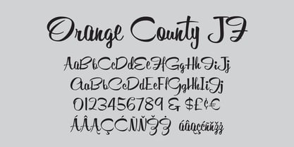
- Eerie Lake County by The Design Speak,
$100.00 This is another scary font by the good fellows at The Design Speak. Meant to be eerie but also had a stylistic rock and roll vibe. We have you covered for things like thriller book covers and movie posters. Or anything you want to have an eerie feel. This was a hand-crafted font using a Wacom tablet and adobe illustrator.
 - County Clerk JNL by Jeff Levine,
$29.00 County Clerk JNL was modeled after the vintage Hamilton wood type design Gothic Special, and is available in both regular and oblique versions. An early grotesk font, this condensed sans serif lends itself well to short headlines and brief body copy.
 - Contra Slab by Wiescher Design,
$16.50 Contra Sans is the slab serif version of my Contra family.
 - Bountiful Signature by Arendxstudio,
$17.00 Bountiful Signature is a high energy signature-style script font guaranteed to make a big impression. Digitally hand-drawn, it's super-clean smooth flow and high-intensity pen strokes make an unmistakeable impact in logo/branding projects, large header text and product packaging. Features: 1.Uppercase & Lowercase 2.Numer & Punctuation 3.Multilingual support 4.Ligatures 5.Alternates There it is! I really hope you enjoy it - comments & likes are always welcome and accepted. More importantly, don't hesitate to send a message if you have a problem or question. Now just read this, go there and make it happen :)
 - Contra Condensed by Wiescher Design,
$16.50 Contra Condensed is the condensed version of my Contra family of fonts. It is very condensed, but not yet narrow. It is well suited in all situations were one needs to save space. Enjoy!
 - AT Bountys by Alandya TypeFoundry,
$18.00 AT Bountys is stylish and beautiful sans serif font with variable file. It will look perfect in photography designs, watermarks, social media posts, advertisements, logos, branding, and various other projects. The main strokes contain small breaks simulating modulated variations on the letterforms, these details are more present on large body sizes. All font versions contain Latin and Cyrillic encoding characters and also ligatures, case-sensitive forms, fractions, oldstyle and finally tabular figures.
 - Contra Flare by Wiescher Design,
$16.50 Contra Flare is the organic design of my Contra family of fonts. It has beautiful curved endings – not serifs – that make it look like it was made out of flowers leafs. But still the font has an elegant look to it. Enjoy!
 - Contra Sans by Wiescher Design,
$16.50 Contra Sans is the base of my Contra family of fonts. It has just sufficient contrast to make for easy reading and an interesting appearance.
