5,358 search results (0.039 seconds)
  1. SF Chrome Fenders Extended - Unknown license
  2. SF Arch Rival Extended - Unknown license
  3. SF Archery Black Shaded - Unknown license
  4. SF Intoxicated Blues Shaded - Unknown license
  5. SF Diego Sans Shaded - Unknown license
  6. SF Shai Fontai Extended - Unknown license
  7. SF Minced Meat Extended - Unknown license
  8. Droeming - Personal use only
  9. SF Automaton Extended - Unknown license
  10. SF Automaton - Unknown license
  11. SF Speakeasy Shaded - Unknown license
  12. SF Pale Bottom - Unknown license
  13. SF Shai Fontai - Unknown license
  14. SF Slapstick Comic - Unknown license
  15. SF Automaton Condensed - Unknown license
  16. SF Minced Meat - Unknown license
  17. SF Intoxicated Blues - Unknown license
  18. SF Slapstick Comic - Unknown license
  19. SF Minced Meat - Unknown license
  20. SF Speakeasy Outline - Unknown license
  21. SF Shai Fontai - Unknown license
  22. SF Chrome Fenders - Unknown license
  23. SF Intoxicated Blues - Unknown license
  24. SF Square Root - Unknown license
  25. SF Proverbial Gothic - Unknown license
  26. SF Chrome Fenders - Unknown license
  27. SF Square Root - Unknown license
  28. Talismanica - Unknown license
  29. Hey Its Red - Unknown license
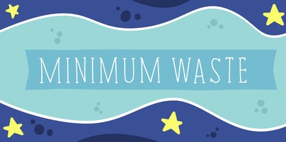
  30. Minimum Waste by PizzaDude.dk, $15.00
    Minimum Waste - the name is taken from a Sade song, but is meant more as a political statement. Please be aware about your everyday use to make sure the planet survives!
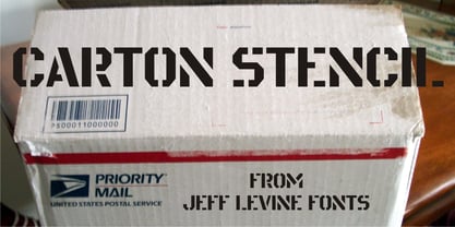
  31. Carton Stencil JNL by Jeff Levine, $29.00
    Antique brass stencils hand-cut for shipping items during the early part of the 20th Century were for sale in an online auction; and are the basis for Carton Stencil JNL.
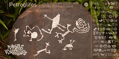
  32. Petroglifos by John Moore Type Foundry, $19.00
    Petroglifos is a dingbats font as a collection of pre-Hispanic petroglyphs of indigenous ethnic Venezuela, most of them are found in signs carved in stone or painted in caves of the pre-Hispanic period, each icon is an accurate representation of these ancestral signs. Forms are very interesting from a visual, anthropological, historical and semiotic point of view.
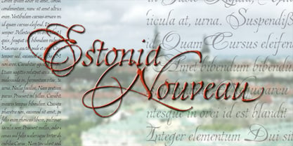
  33. Estonia Nouveau Pro by TypeSETit, $39.95
    Estonia Nouveau is based on the calligraphic style found in the East European country of Estonia. The traditional lowercase forms are combined with the more non-traditional script uppercase alternates to give a truly up-to-date, yet traditional look.
  34. Alan Hand by K-Type, $20.00
    Based on some beautifully blobby lettering, handwritten by printer and mailartist, Alan Brignull. Alan creates amazingly credible artistamps for the virtual countries of Adanaland and the Perfect State of Flatby, lands frozen in boyhood Englishness forever. He writes nicely too.
  35. BLT Portage by Black Lab Type, $12.00
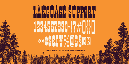
    PORTAGE is a slab serif that carries its own weight. Adventurous and rugged, this typeface that evokes the wild country and makes headlines stand out. The typeface was built from a land and forest journal from the mid-50's.
  36. Tescellations by Ingrimayne Type, $9.95
    Though there are many thousands of digital typefaces available, none seem to be made exclusively of letters that tessellate, a complete tessellating alphabet. This void is now filled with not one typeface, but a group of typefaces, the Tescellations kinship group. Even though I am aware of only one use for this typeface--writing about tessellations--that does not mean there are not hundreds or perhaps thousands of other uses. These typefaces are a byproduct of two maze books I designed, Puzzling Typography and Puzzling Typography A Sequel. I found the challenge of making mazes from tessellations, including letter tessellations, intriguing and these typefaces are a byproduct that endeavor. There are seven members of this typeface kinship group. I tried to select the the glyphs that fit together best to form Tescellations; it is the most readable of the lot. The reason for an Italics version is that I needed one for the maze project. In constructing it, I tried to include as many different lower-case glyphs as I could rather than just skew the regular version. A purist might insist that the tessellation deal with the counters. My approach was to worry only about the exterior of any letter that has an interior, but for anyone who who might object to the counters, versions with filled counters are included. What did not fit into Tescellations was dumped into Tescellations Two, which is somewhat of a ransom-note type of face. It comes in two styles, a regular version and a version in which the counters are removed. TescellationPatterns shows how many of the characters in these typefaces tessellate. It has over 100 tessellation patterns, each on only one character. Simply type several lines with any character and make sure the leading is the same as the font size, and you have an instant tessellation pattern of a letter.
  37. Overseas by Hanoded, $15.00
    I traveled a lot: in the beginning on my own, later as a tour guide. I always used the English word ‘abroad’ to describe a trip to a foreign country, but I noticed that the English, Australians and New Zealanders preferred the word ‘overseas’. I then realised that they all lived on an island, so most of the foreign countries for them were across the sea. I had to think of that when I made this font! Overseas is a brush font with a certain rough elegance to it. I made it using poster paint and a brush. Use if for posters, product packaging and book covers.
  38. Harri by Blancoletters, $39.00
    Harri –“stone” in Basque language– is a display font based on the peculiar letter forms used in signs and fascias all over the Basque Country. This idiosyncratic lettering style, very often used as an identity signifier, evolved from ancient inscriptions carved on gravestones which can still be found in the French part of the Basque Country (Behe Nafarroa, Lapurdi and Zuberoa).Harri takes some of its more significant features from those engraved letter forms, but also from the current overemphasized shapes derived from them, while keeping in sight their antecessors: the Romanesque inscriptions and ultimately the Roman Capitals. Gerard Unger once said “the black version of a font is a caricature of the regular”. This may explain how the odd heavy shapes in use in the Basque Country today might have evolved from their engraved roots, which are already an interpretation of Romanesque and Roman letter forms. This evolution is echoed in Harri through its weights, from the clean formal Roman-inspired light to the extreme expressive Basque-style extra bold.
  39. !Lestatic CSS - 100% free
Looking for more fonts? Check out our New, Sans, Script, Handwriting fonts or Categories
abstract fontscontact usprivacy policyweb font generator
Processing