10,000 search results
(0.036 seconds)
- Francker Paneuropean by Linotype,
$103.99Francker is a sans-serif typeface family based on clean and simple principles of design. The letterforms' curves are inspired by the "super ellipse," a mathematical shape that is about halfway between an ellipse and a rectangle. Francker's lowercase letters appear somewhat reduced, as the a, b, n and u have no spurs. The family is available in nine weights, from Extra Light to Extra Black. Excellent areas of use for Francker signage, posters, magazines, advertisements, or logos; wherever a timeless, modern look is needed. Francker's fonts have a large character set that includes all glyphs in Linotype's W1G specification (World Glyph Set 1). Proportional figures are available as alternatives to the tabular defaults, via an OpenType feature. The Francker type was developed designed by Anders Francker (b. 1972), an engineer and designer living in Denmark. - Mobius Infinity by WAP Type,
$15.00 Font with detailed letters that work great as logos or intricate, attention grabbing titles. Mobius Infinity is a special font for your logo & branding
 - Fribble by Letters by Wordsworth,
$23.00 Fribble is a delightful, frolicking font that works equally well as text and titling. The open type extras provide additional ‘bounce’ for the font.
 - Little Tokyo by Epiclinez,
$18.00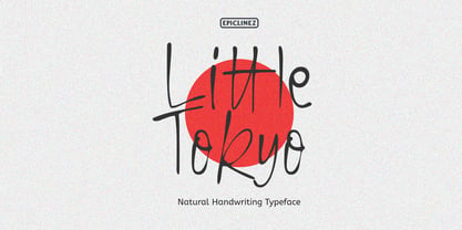 Little Tokyo is an authentic signature script font. This natural style handwritten font is suitable for various projects, such as logos, branding and packaging.
 - Speech Bubbles by Harald Geisler,
$68.00 The font Speech Bubbles offers a convenient way to integrate text and image. While the font can be used to design comics, it also gives the typographer a tool to make text speak – to give words conversational dynamics and to emphasize visually the sound of the message. The font includes a total of seventy outlines and seventy bubble backgrounds selected from a survey of historic forms. What follows is a discussion of my process researching and developing the font, as well as a few user suggestions. My work on the Speech Bubbles font began with historic research. My first resource was a close friend who is a successful German comic artist. I had previously worked with him to transform his lettering art into an OpenType font. This allowed his publishing house to easily translate cartoons from German to other languages without the need to use another font, like Helvetica rounded. My friend showed me the most exciting, outstanding and graphically appealing speech bubbles from his library. I looked at early strips from Schulz (Peanuts), Bill Waterson (Calvin & Hobes), Hergé (TinTin), Franquin, as well as Walt Disney. The most inspiring was the early Krazy Kat and Ignatz (around 1915) from George Herriman. I also studied 1980’s classics Dave Gibbon’s Watchmen, Frank Miller’s Ronin and Alan Moore and David Lloyd’s V for Vandetta. Contemporary work was also a part of my research—like Liniers from Macanudo and work of Ralf König. With this overview in mind I began to work from scratch. I tried to distill the typical essence of each author’s or era’s speech bubbles style into my font. In the end I limited my work down to the seventy strongest images. An important aspect of the design process was examining each artist’s speech bubble outlines. In some cases they are carefully inked, as in most of the 80’s work. In others, such as with Herriman, they are fast drawn with a rough impetus. The form can be dynamic and round (Schultz) with a variable stroke width, or straight inked with no form contrast (Hergé). Since most outlines also carry the character of the tool that they are made with, I chose to separate the outline from the speech bubble fill-in or background. This technical decision offers interesting creative possibilities. For example, the font user can apply a slight offset from fill-in to outline, as it is typical to early comic strips, in which there are often print misalignments. Also, rather than work in the classic white background with black outline, one can work with colors. Many tonal outcomes are possible by contrasting the fill-in and outline color. The Speech Bubbles font offers a dynamic and quick way to flavor information while conveying a message. How is something said? Loudly? With a tint of shyness? Does a rather small message take up a lot of space? The font’s extensive survey of historic comic designs in an assembly that is useful for both pure comic purposes or more complex typographic projects. Use Speech Bubbles to give your message the right impact in your poster, ad or composition.
 - BR Candor by Brink,
$30.00 BR Candor is a geometric sans based on the functional characteristics and raw geometry of early European sans serifs. BR Candor however, is a more modernist interpretation of these classic styles, and its distinctly geometric letterforms produce a strikingly clear and contemporary typographic aesthetic. As the name suggests BR Candor is open, honest and straight talking.
 - FF Irregular by FontFont,
$41.99 Austrian type designer Markus Hanzer created this display FontFont in 1994. The family has 6 weights, ranging from Light to Black (including italics) and is ideally suited for editorial and publishing and poster and billboards. FF Irregular provides advanced typographical support with features such as ligatures and case-sensitive forms. It comes with proportional lining figures.
 - Fashion by ITC,
$29.99Fashion Compressed and Engraved are the works of British designer Alan Meeks. Fashion Compressed is an elegant modern roman typeface suitable for a variety of advertising styles. The capitals can be used as initials or combined with the lower case letters. Fashion Engraved was produced when Meeks reworked Fashion Compressed, resulting in a beautiful, engraved typeface. - Tamiami JNL by Jeff Levine,
$29.00Tamiami JNL is based on a popular old typeface from the early 1900s, best known as "Cuba". 90 miles Northwest of that tropical island is Miami, Florida... and the Tamiami Trail was one of the first connecting routes between the City of Tampa on the West coast of Florida and Miami on the East coast - hence the conjunction "Tamiami". - FF Lancé by FontFont,
$41.99 German type designer Joachim Müller-Lancé created this sans FontFont in 1997. The family contains 3 weights and is ideally suited for advertising and packaging and sports. FF Lancé provides advanced typographical support with features such as ligatures and case-sensitive forms. It comes with proportional lining figures. In 1993, FF Lancé received the Morisawa award.
 - FF Kipp by FontFont,
$47.99 0 Kipp "German type designer Claudia Kipp created this display and sans FontFont in 1993. The family has 7 weights, and is ideally suited for film and tv and music and nightlife. FF Kipp provides advanced typographical support with features such as ligatures and case-sensitive forms. It comes with proportional lining, tabular lining, and proportional oldstyle figures.
 - LTC Record Title by Lanston Type Co.,
$24.95 Record Title was designed by Frederic Goudy in 1927 as a proprietary commission for the Architectural Record magazine. Based on classic Roman letter proportions, Goudy considered this one of his most successful commissions ever. It is an all caps titling face originally digitized by Jim Rimmer for Lanston in 2001. It was remastered in early 2007.
 - Saturday Detentions by Bogstav,
$18.00 Saturday Detentions is based on the classic serif "High School" style. However, this version is handmade and a bit rugged here and there - and loose in a legible/organic way. I've added 7 different versions of each letter and they automatically cycle as you type - or you can manually choose the one you prefer from the glyph menu.
 - Rookie Heat by Bogstav,
$17.00 Based upon classic typefaces such as Bodoni, you might find Rookie Heat familiar. However, the rough outline and handmade look and feel makes it perfect for your craft products. All in all, Rookie Heat is reflecting the beauty of decorative objects. Play around with the swashes for upper- and lowercase to make your designs stand more out.
 - Modal by Schriftlabor,
$42.00 Modal is a sans serif type family intended for corporate, editorial and web design. Each weight comes with around 800 glyphs and supports a large variety of features such as ligatures, small caps, figure sets, case sensitive glyphs and so on. With its two italics, Modal offers new possibilities for designers and creates an additional tool for distinct typography.
 - Mizwinki Display by Tondi Republk,
$31.00 Mizwinki Display is an all caps sans serif font family that seamlessly blends organic elegance with ornate industrial precission reminiscent of the Art Deco period. The typeface has organic forms that give it a clean decorative and somewhat oriental appeal. This trendsetting trio consists of three font styles, all denoted as MD (Mizwinki Display): MD-Base: This style forms the foundation of the font family, featuring smooth stems and geometric terminals. It blends organic and industrial designs, with letterforms like E, F, W, N, and M crafted from continuous flowing geometry. MD-Ink: Building upon MD-Base, this style introduces spurs and slits, evoking the ornate look synonymous with classic tattoo art letterforms. MD-InkLine: A unique offshoot of MD-Ink, this style features an inline aesthetic that enhances the ornate appeal. Tighter spacing between letterforms allows the glyphs to blend into each other while maintaining legibility within the inline letter silhouettes. Ideal for logos, headlines, packaging, digital ephemera, and apparel, Mizwinki Display is versatile. Despite being a display font, it works well at smaller sizes and is suitable for low-count body copy. Technical Specs: _____________________________________________________ 3 Font Styles / 12 Open Type Features / Extended Latin Character set (Basic Latin; Western, Central and South Eastern European Latin) / Currency Symbols / Punctuation and Parenthesis / Arrows / Basic Mathematical Symbols / Special Symbols / Basic Numerals / Circled Numerals / Numerators and Denominators / Table Figures / Inferiors and Superiors & Fractions Support for 112 Languages: _____________________________________________________ Afrikaans / Akan / Albanian / Asturian / Asu / Bafia / Basque / Bemba / Bena / Breton / Catalan / Chiga / Colognian / Cornish / Croatian / Czech / Danish / Duala / Dutch / Embu / English / Estonian / Ewe / Faroese / Filipino / Finnish / French / Friulian / Fulah / Galician / Ganda / German / Gusii / Hungarian / Icelandic / Igbo / Inari Sami / Indonesian / Irish / Italian / Jola-Fonyi / Kabuverdianu / Kalenjin / Kamba / Kikuyu / Kinyarwanda / Koyraboro Senni / Koyra Chiini / Langi / Latvian / Lingala / Lithuanian / Lower Sorbian / Luba-Katanga / Luo / Luxembourgish / Luyia / Machame / Makhuwa-Meetto / Makonde / Malagasy / Maltese / Manx / Masai / Meru / Metaʼ / Morisyen / Northern Sami / North Ndebele / Norwegian Bokmål / Norwegian Nynorsk / Nuer / Nyankole / Oromo / Polish / Portuguese / Quechua / Romanian / Romansh / Rombo / Rundi / Rwa / Samburu / Sango / Scottish Gaelic / Sena / Serbian / Shambala / Shona / Slovak / Soga / Somali / Spanish / Swahili / Swedish / Swiss German / Taita / Tasawaq / Teso / Turkish / Upper Sorbian / Uzbek (Latin) / Vai / Volapük / Vunjo / Walser / Welsh / Western Frisian / Yoruba / Zarma / Zulu
 - Ongunkan Cypriot Linear C Sylla by Runic World Tamgacı,
$100.00 This font is an adaptation of the cyprus syllabic script to a Latin-based font. I tried to assign as many correct letters as possible, but there were too many characters so I had to fit them. Please review the alphabet table of Cypriot syllabic to use the Font. To see all the characters, you can see all the characters and add them to the text by selecting this font from the add character section on the word page. Cypriot syllabary The Cypriot syllabary was used in Cyprus from about 1500 and 300 BC and is thought to have developed from the Linear A. The earliest known inscriptions from between 1500 and 1200 BC are in an unknown language called 'Eteo-Cypriot', or 'True Cypriot', and the script in which they are written is called Cypro-Minoan. From around 1200 BC Cyprus began to be colonised by Mycenaean, Minoan and possibly Cretan Greek settlers, and they probably adapted the existing script to write their own language - the oldest known inscription in Greek dates from the 11th century BC. Cypriot Greek had much in common with Greek dialects of Arcadia and Pamphylia, which corresponds to the province of Antalya in Turkey.
 - Gyllene Elgen by Mans Greback,
$69.00 Gyllene Elgen, created by Mans Greback, is a delicate and captivating handwriting font that exudes romance and charm. With its thin, beautiful lines, and loopy, decorative swirls, this typeface brings a touch of elegance and sophistication to your design projects. Perfect for invitations, personal notes, and other heartfelt communications, Gyllene Elgen captures the essence of delicate, handcrafted beauty. The font was inspired by the golden hues of the Swedish landscape during autumn, as well as the mythical golden elk that roams the forests. Mans Greback sought to bring this enchanting story to life through the graceful curves and fine details of Gyllene Elgen. The font is built with advanced OpenType functionality and has a guaranteed top-notch quality, containing stylistic and contextual alternates, ligatures, and more features; all to give you full control and customizability. It has extensive lingual support, covering all Latin-based languages, from Northern Europe to South Africa, from America to South-East Asia. It contains all characters and symbols you'll ever need, including all punctuation and numbers. Mans Greback is a Swedish typeface designer, celebrated for his innovative and diverse portfolio. With a keen eye for detail and innovative designs, Mans has earned a reputation for creating fonts that resonate with people across the globe, inspiring creativity and capturing the imagination.
 - Indbydelse by PizzaDude.dk,
$20.00 I would like to invite you to a party, wedding, birthday, event, gameshow, baby shower, housewarming ... ehh, what I mean is: this is an invitation to (almost) anything! As you may have read, “Indbydelse” is danish and means “invitation” - why? Well, because these four fonts have enough power to create an exciting invitation! Use them as single fonts, combine one, two, three or all four - that’s totally up to you! They all got multilingual support as well as contextual alternates with several different versions of each letter!
 - Paramaribo by Fontop,
$11.00 Meet Paramaribo, a hand lettered, cute and decorative font. Paramaribo family includes two fonts with stylistic substitutions and 28 ligatures. Perfect for designing ads, logos, prints, social media texts, blogs, wedding branding, quotes and so much more. Stylistic substitutions (those cute swashed end/beginning letters) are controlled by switching on/off OpenType feature as well as being accessible through glyphs panel in Adobe apps. Really very easy to use! Paramaribo has Latin multilingual support as well as uppercase letters, lowercase letters, numbers and basic punctuations.
 - Bell MT by Monotype,
$39.00 Monotype’s hot metal Bell series from 1931 was based on original types made by the punchcutter Richard Austin for the foundry of John Bell in the 1780s. The different sizes of Monotype’s series were not all based on the same model. As type historian James Mosley wrote on Typophile, “For 18 point and above (the metal type was cut in sizes up to 36 point) Monotype’s model was a larger type [than the model used for the text sizes], the ‘Great Primer’ cut by Austin. This has greater contrast in the capitals and a flat foot to letter a.” The digital Bell closely follows the design of the hot metal 18pt version, and is therefore somewhat lighter in color than the text sizes of Monotype’s original metal face. James Mosley’s Typophile article can be found here.
 - Shibe by Linecreative,
$16.00 Shibe - Bold italic font, has a strong, sharp character, and is combined with the font graffiti styles, To make a beautiful combination, simply mix upper and lower case and mix with alternative glyphs Shibe offers you: Shibe- A clean Bold italic font including Upper & Lowercase characters(ALL CAPS), Stylistic alternates Character (2 Character) Supports Multi linguage (Latin Western Europe), Numbers and Punctuation
 - Practish by Gleb Guralnyk,
$10.00 Hello! Introducing a Slab Serif font family named Practish. It's a typefaces set that includes 7 weight variations from Bold to Thin. This font has a strict classic shape and diverce characters thickness makes it useful in lots of cases at any sizes, from visit card to billboard. Practish font family has also a multilingual support of west european languages and 13 ligatures.
 - Harimau Dua by Hanoded,
$15.00 A while back I created a nice font called Harimau. It is a childish font, with a happy feel to it. Harimau had some unusual glyphs, most notably the 'g' and the 'j', which, for some designers, were a little too unusual. Therefore I have created a new font based on the old Harimau: it is similar, but comes with 'normal' glyphs.
 - Magic Lantern by Nick's Fonts,
$10.00One in the series of fonts celebrating the Halcyon Days of Handlettering. Magic Lantern is a caps and small caps font based on an untitled design by Samuel Welo, whose Studio Handbook for Artists and Advertisers appeared in six editions between 1927 and 1960. Both versions of the font include 1252 Latin, 1250 CE (with localization for Romanian and Moldovan). - Lequire by Sarid Ezra,
$13.00 Introducing, Lequire - Modern logo typeface! Lequire is a sans based font with unique lowercase that will make your design looks hi-tech and modern. You can use this font for any purpose, especially to make logotype. You can mix and match the uppercase and lowercase to make your logo more readable. This font also comes with outline style! Happy Creating!
 - Sub Comp by Ech000,
$10.00 SubComp is a carefully constructed font made with over 160+ individual glyphs for English and some Latin based languages. This font is inspired by old fashioned computer and programming fonts with a unique twist to the lettering. Features characters or glyphs for Basic Latin, Some Extended Latin Characters, Some Greek, Some Coptic. Created for web, poster, graphic design, social media and branding.
 - Feast by Great Lakes Lettering,
$40.00 Feast is a calligraphy style font designed by Alissa Mazzenga. Her hand-sculpted letterforms emanate a powerful, yet delicate presence. Their magic resides in the ethereal movement of fluid wisps of ink, forming soft arched lines and design that stands alone. This hand written style font is based on Alissa's signature calligraphy style and pairs beautifully with fonts like Frosted and Icing.
 - Burobu by Hanoded,
$12.00 Burobu, in case you’d like to know, means ‘blob’ in Japanese. I thought it was quite an appropriate name for this blob-like font! Burobu is a messy font and comes with a generous helping of jittery, jumping glyphs, exaggerated strokes and over-the-top arms, ties, bars and counters. Comes with an ultra-cute blob dingbat font and copious amounts of diacritics.
 - DokChampa by Microsoft Corporation,
$49.00DokChampa is a Lao font based on the Arial typeface. DokChampa was created by the Monotype Type Drawing Office to support Lao and Thai scripts. The DokChampa font is a legible sans serif that is good for use on screen and in printed documents. DokChampa is a Lao script font and requires an application program that supports Lao or Thai scripts. - Martie by Canada Type,
$25.00From the heart of the Blue Ridge Mountains, by way of Toronto, comes Martie's handwriting. Martie Byrd is a school teacher in Roanoke, Virginia, and a friend of Canada Type's Rebecca Alaccari. After years of admiring the cheer and clarity of Martie's handwriting, we asked her to write out full alphabets for some cool font treatment. The intent was to do three different versions of her writing in two different pens, then use the auto-magic of OpenType to determine letter sequences and rotate character sets on the fly when the fonts are in use. A successful endeavor it was. Take a look at the images in the MyFonts gallery to see the character rotation in action, along with a visual explanation of why Martie is not just another handwriting font. Unlike other available felt tip and ballpoint handwriting fonts, the regular and bold variations are style-based, not weight-based. They are the handwritten expressions of two different Sharpie pens: The fine point one (Martie Bold), and the ultrafine one (Martie Regular). The style-based variation considerably helps the realism needed in design pieces that take advantage of the contrast of two different handwriting fonts. Weight thickening in handwriting is an obvious mechanical effect that only happens with computers. Weight changing by replacing pens is what happens in the real world. Martie Pro and Martie Pro Bold each contain three different character sets in a single font. Language support includes Western, Central and Eastern European languages for all three sets. This translates into each Pro font containing over 750 characters. Add OpenType code and stir, and you have true handwriting fonts with versatility unavailable out there in anything else of the genre. A software program that supports OpenType features is needed to use the randomization coded in Martie Pro and Martie Pro Bold. Current versions of QuarkXpress and Adobe applications (Photoshop, Illlustrator, InDesign) do contain support for the randomization feature. But if you don't have one of these apps, you can still use the interchangeable Type 1 or True Type fonts and change the characters manually to achieve the appearance of true handwriting. The Martie fonts come in a variety of price packages, from the affordable single fonts to value-laden complete sets. All the proceeds from these fonts received by Canada Type will be donated 50/50 to two primary schools: One in Roanoke (where Martie teaches), and one in Toronto (where the 10-year old, real Canada Type boss goes). So next time a design project needs a handwriting font, do the write thing and use Martie to keep it real. - Festive by TypeSETit,
$49.95 It's Festive! But don't let the name fool you... It's a fun script font (plus a Roman) accompanied by an assortment of exciting ornamental dingbats. In fact, it's the ornamentals that make this font so much fun! At first glance, Festive appears to be suited only for the Christmas holiday season. But wait… you can use the ornamental dingbats for any occasion where festivities abound— New Years, Valentines, St. Patty's Day, Back to School, Graduation, Baby & Wedding Showers, Halloween, Thanksgiving, and much more— even Sports. The base font works well with bodies of copy, while the alternate fonts can be used to swap out individual characters to give a custom, hand written look. Be sure to scroll thru to see all 14 fonts in this package—especially the fun ornamental dingbats. Festive Regular is included with all the alternate fonts (Festive One thru Ten) which are sold as two font sets. The PRO version contains all the glyphs of the family plus OpenType programming to easily access alternates. The Festive family of fonts are PUA encoded, so you can access them easily. So, get in the mood and have FESTIVE fun!
 - Axeo by Asritype,
$13.00 Axeo is a freeform serif typeface. With more than 500 glyphs for each cut, Axeo supporting wide Latin Base Languages. The font structures is sans-serif typeface. Then, the fonts is made into serif (serifed) using rhombus and adapted/modified rhombus (before remove overlaps) placed on its appropriate positions. This fonts is released first, while the sans-serif is being in process. There are 10 fonts; 5 weight in normal width: Light, Regular, Medium, Bold, and Black; and 4 in semi-condensed: Light, Regular, Medium, Bold and Black, too. The fonts has some minor character variations, all are sets in SS01.There are also standard and discretionary ligatures, arrow, some geometric shapes and ornaments. With its sansserif structure, the Medium, Bold and Black fonts is playful with text effect in various applications such MS Word, CorelDraw or others to enhance the appearance. Its serif form will make unique enhancements. Thus, the fonts is suitable for Branding, logos, cards, advertisements, banners, display and more; for the main texts or its companions. While the light, regular and medium fonts can also be used as description text, card text, note, caption and longer non-formal texts or other usages.
 - Midpoint Pro by Mint Type,
$- Midpoint Pro is a soft sans-serif typeface with a modern technical look. Its spurless design creates a perfect balance between static rigid verticals and softened endings. The interplay of open and closed forms suggests increased legibility in small sizes and results in a vivid texture. The typeface will serve for a number of purposes, including posters, corporate branding or screen design of any kind like web or UI layouts. Midpoint Pro comes in 9 weights + oblique styles, each supporting numerous Latin-based languages as well as major Cyrillic languages. It is packed with OpenType features like ligatures, small caps, 4 sets of digits, 2 stylistic sets, superiors and inferiors, fractions, ordinals, respective punctuation varieties including all-cap punctuation, as well as language-specific alternates.
 - Grungy Old Typewriter by FontFuel,
$14.00 Grungy Old Typewriter is based on two typed letters, each on two pages and dated 1901. The results are eroded, rough, irregular and grungy. The final results are a vintage look. As a designer, I wanted as much flexibility as possible, so there are six versions that are designed to work together. Additionally, I decided to keep the grunge and irregularities within the shape and not include surrounding typewriter or paper marks. I leave it to the design to add those elements as desired. One note, the letter spacing is much tighter than an old typewriter. I felt that readability for modern readers suffered from the added space. Of course, you can get that same look by increasing the letter spacing in your favorite design program.
 - Stout Boots by Putracetol,
$24.00 Stout Boots is a bold style serif font with strong character and soft features. Stout Boots is equipped with Swash, Stylistic and Titling alternates as well as with Standard and Discretionary Ligatures And this font Stout Boots is a stylish font that is both retro and bold font. It's thick curves give a groovy vibe with the serifs bringing it slightly back to traditional. Comes with alternatives and ligatures, helps to create stunning logos, quotes, posts, blog posts. branding projects, magazine imagery, wedding invitations, and much more. The alternative characters were divided into several Open Type features such as Swash, Stylistic Sets, Stylistic Alternates, Contextual Alternates, and Ligature. The Open Type features can be accessed by using Open Type savvy programs such as Adobe Illustrator, Adobe InDesign, Adobe Photoshop Corel Draw X version, And Microsoft Word. This font is also support multi language.
 - Behooved by Putracetol,
$25.00 Behooved - Ligature Serif Font. Behooved is equipped with swash, stylistic and titling alternates as well as with standard and discretionary ligatures. Behooved is a ligature serif font with strong character and soft features. Behooved is a stylish serif font that is both retro and great ligature font. It's thick curves give a groovy vibe with the serifs bringing it slightly back to traditional. Comes with alternatives and ligatures, helps to create stunning logos, quotes, posts, blog posts. branding projects, magazine imagery, wedding invitations, and much more. The alternative characters were divided into several Open Type features such as Swash, Stylistic Sets, Stylistic Alternates, Contextual Alternates, and Ligature. The Open Type features can be accessed by using Open Type savvy programs such as Adobe Illustrator, Adobe InDesign, Adobe Photoshop Corel Draw X version, And Microsoft Word. This font is also support multi language.
 - Rosemarine by ahweproject,
$9.00 Rosemarine is an elegant and clean serif font. Whatever the topic, this font will be a wonderful asset to your font library, as it has the potential to enhance any creation.
 - Dagota by ArimaType,
$18.00 Dagota is a cool, brushed display font. No matter the topic, this font will be an incredible asset to your fonts’ library, as it has the potential to elevate any creation.
 - Ps Campen by Fontopia,
$25.00 psCampen is a contemporary font with a medieval experience. The font can be used as a display variant in addition to the font psKampen. It is also useful for short texts.