10,000 search results
(0.035 seconds)
- TRGrunge by Ingrimayne Type,
$9.00 As its name suggests, TRGrunge is a rough, grungy font that is surprisingly readable. Derived in 1997 from a 1989 sans-serif face, it was expanded with additional characters in 2021.
 - Few Grotesk by Studio Few,
$24.00 Tall X-Height, Angled Terminals and Medium Contrast, Few Grotesk is a UI font designed with personality. Originally conceived as a hybrid between Grotesque & Humanist, Few Grotesk pairs legibility with character.
 - Liliming by Cubo Fonts,
$25.00 That font was designed for Liliming, a famous Shanghainese feminine fashion brand. As the brand itself, it shows a solid background - a former typewriter machine feeling - and a fresh creative touch.
 - PR Foxtail 02 by PR Fonts,
$5.00 The bushy weed commonly known as foxtail provides the inspiration for this set of ornaments, and reveals its connection to the prairies. The appearance has an affinity to cowboy themed work.
 - Nugelo by Viswell,
$15.00 Nugelo is a retro modern serif font, comes with stylishtic alternates and ligatures Nugelo will be suitable for your various design needs such as branding, logo, poster, headlines and many others.
 - Jusline by Letterafandi Studio,
$12.00 Jusline is a modern handwritten font. It can be used for various purposes such as logos, wedding invitations, headings, t-shirts, letterhead, signage, labels, news, posters, badges and so much more.
 - Nagarawa by Beewest Studio,
$50.00 Nagarawa is an Asian style font, very suitable for various logotypes for Asian nuanced products, such as Asian food, martial arts clubs, music, novel and comic titles, apharel clothing and others.
 - Twisted System by Hanoded,
$10.00 Twisted System is a nice little China Ink font. It is a bit random, loose, uneven and shaky, but comes with a lot of character and some interesting alternates as well.
 - Ps Campen by Fontopia,
$25.00 psCampen is a contemporary font with a medieval experience. The font can be used as a display variant in addition to the font psKampen. It is also useful for short texts.
 - Liniga by Graphite,
$15.00 A tall, warm and friendly handwritten typeface with a simple structure and low contrast. Works well for both display and body text. It has a serif version as well - Liniga Serif.
 - MBF Future Voyage by Moonbandit,
$15.00 Future Voyage, a clean modern futuristic sans serif display font. This typeface is perfect for minimalist scifi theme. Perfect usage as logo, poster, display, headline, t-shirt design and many more.
 - Algorisma Heart Font by IbeyDesign,
$17.00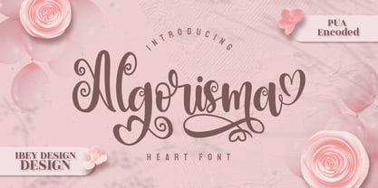 Algorisma Heart Font inspires friendliness and elegance. It is perfect to use for any of your wonderful creations such as branding projects, logos, brochures, business cards, wedding invitations, and many others.
 - Boholah by Sulthan Studio,
$10.00 Old style fonts or also writing from teenagers, as a form of expression for those who are bored or looking for cool and creative ideas by drawing something accompanied by writing.
 - Airborne by Kavoon,
$12.00 Airborne is the font pack. The Normal font combines with the alternate character font to make each word unique. Then add the Splatters font as your tagline and — the ideal logo!
 - Alandria by Goodigital13,
$50.00 This font is perfect for many different projects such as logos & branding, invitation, stationery, wedding designs, social media posts, advertisements, product packaging, product designs, label, photography, watermark, special events or anything.
 - Remaglide by Mabhal Studio,
$18.00 Remaglide is a Brush Handwritten Font. It has several swash and several alternative styles that can be used as needed. Remaglide will do great on invitations, in quotes, ads, and more.
 - Guffie by Dealita Studio,
$9.00 Guffie - a chic & elegant display modern serif with beautiful contrast. Specially designed for fashion-themed projects, perfectly suitable for creating elegant, chic, lifestyle designs such as logos, titles, magazines, and more.
 - Kiddy by Gaslight,
$20.00 Kiddy is simple and slightly rough on one side and light and funny on other side. Kiddy have two set initials (realised as Contextual and Titling Alternates) and numerous decorative elements.
 - Smoot by A New Machine,
$10.00 This all new hand drawn font comes as a serif and a script version. Mix and match to bring your designs whimsy and playfulness. Suitable for headlines, posters and call outs.
 - Garamond Antiqua Pro by RMU,
$50.00 A font classic as a RMU redesign - a small yet mighty family with a West and Central European character set plus Cyrillic. All three styles include small caps and oldstyle figures.
 - DT Skiart Subtle by Dragon Tongue Foundry,
$9.00 ‘Skiart Serif Subtle’ is now available online. Originally inspired by the san serif font ‘Skia’ by Mathew Carter for Apple. ‘Skiart’ was designed to feel more like a serifed font, but without any serifs. It took a step between sans serif and serif fonts. Next on the path towards a serif font came Skiart Serif Mini, with tiny serifs added. This was a true serif font, all be it on the small side. Skiart Serif Subtle is less of a serif than Skiart Serif Mini, in that it doesn’t have actual 'serifs' as such. It has a subtle flare where a serif might normally be found. It remains fully readable and feels as clean and normal as any of the best body copy serifs, and yet still has the strong solid bones of all the other Skiart font families. If compared to one of the more commonly used serifs like ‘Times New Roman’, the ‘Skiart Serif Subtle’ lowercase is more open with a taller x-height, increasing its readability and friendliness. The serifs are smaller and less distracting. They are not pretending to be ligatures. Where ‘Times’ makes its p q b d forms out of a barely touching oval and stem, the ‘Serif Subtle’ forms are much more firmly attached, appearing clearly as single letters. The standard setting for the a’s and g’s are round single story, feeling warmer and more inviting in the ‘Serif Mini’ font. Much more friendly than the stuffy double-storied versions in fonts such as ‘Times’ etc.
 - The Fottina Script by madjack.font,
$14.00 The Fottina Script is a calligraphic script font that comes with beautiful alternative characters. a mixture of copper calligraphy with a zipper style. Designed to bring the elegance of style. The Fottina Script attracts good, clean, feminine, sensual, glamorous, simple and very easy to read fonts. The classic style is very suitable to be applied in various formal forms such as invitations, labels, menus, logos, fashion, make up, stationery, letterpress, romantic novels, magazines, books, greeting / wedding cards, packaging, labels. The Fottina Script has 450 flying machines. including multiple language support. With OpenType features with alternative styles, binders and characters, it allows you to mix and match pairs of letters to suit your design, as well as a touch of ornament to make this font look elegant. To activate the OpenType Stylistic alternative, you need a program that supports OpenType features such as Adobe Illustrator CS, Adobe Indesign & CorelDraw X6-X7, Microsoft Word 2010 or newer. (Windows), Letter Books (Mac) or software programs such as PopChar (for Windows and Mac). How to access all alternative characters using Adobe Illustrator: https://www.youtube.com/watch?v=XzwjMkbB-wQ How to use the font style set in Microsoft Word 2010 or later: https://www.youtube.com/watch?v=NVJlZQ3EZU0 There are additional ways to access alternatives / swash, use Character Map (Windows), Nexus Fonts (Windows) Font Book (Mac) or software programs like PopChar (for Windows and Mac) How to access all alternative characters, using Windows Character Map with Photoshop: https://www.youtube.com/watch?v=Go9vacoYmBw Thank you for your visit.
 - Grayfel by insigne,
$- As designers, we seek perfection and originality. The more we step back and look at our work, the more changes we tend to find necessary. Drastic modifications are inevitable. The same is true of Grayfel. Grayfel began as an exercise at insigne to explore the crowded space of neutral sans. While the world of sans serifs is admittedly crowded, I still managed to find something new and different. The final Grayfel consists of 42 full-featured OpenType fonts containing three widths: Regular, Condensed, and Extended. Every width consists of 14 fonts--seven weights with matching italics, making it a good companion for setting clear text and headlines for print and screen. OpenType features are also available. There’s figure choices, such as proportional and old style figures. Additionally, Greyfel includes sophisticated typographic attributes: ligatures, fractions, alternate characters, small caps, superscripts and subscripts. Its extended character set supports Central, Western and Eastern European languages. Optical compensations also mean the outcome of this family is a hybrid of humanistic proportions. It’s a well-finished design with optimized kerning gives it a friendly look. If you like sans serifs within the tradition of Futura, Helvetica, Avant Garde and Avenir, then you’ll love Greyfel, too. Grayfel works well in a variety of applications. Subtly neutral yet fun, it’s suitable for headlines of all sizes as well as for text. Put it to the task for marketing, packaging, editorial work, branding and even on-screen projects. Try it out: it’s not just fun and playful; it’s Grayfel.
 - Biro Script Plus by Ingo,
$50.00 An authentic script from the tip of the ball point pen. This hasn’t been seen yet: A typeface which truly looks as if it were handwritten. Calligraphy is, actually, the art of fine writing. And actually, written scripts as typeface for the computer are 100% nonsense. And yet, an obvious thought: Create a typeface which truly derives from everyday handwriting. And since we, if we write at all, utilize practically only a ball point pen anymore, then a modern cursive writing form must look like just that. As a counterpart to the artistic ”handwritings“ which have long been available as typeface, the thought of digitalizing a truly ”ugly“ handwriting is appealing. After all, time and again there is the need for a text to look ”handwritten“. Biró Script is written freehand with a ball point pen. Finally a truly individual script! Biró Script includes more than 300 authentic ligatures in addition to the customary alphabet. By the way, the most convincing effect is obtained with a font size of about 18 to 22 points, at which the thickness of the stroke is now about the same as that of a real ball point pen. There's a difference between the anglo-american forms of some characters (esp. the numerals 1 and 7, but also capitals I and F) and how it's written in the rest of the world. For those of us who aren’t used to the world-wide usual forms, Biró Script includes a US version with the appropriate characters.
 - Chocoball by Yumna Type,
$16.00 It is significant to have a unique font to create impressive, impactful designs because people often forget common things which may cause your work to be forgotten as well. You may have lost your candidate customers even before they know your brand and product. Let us introduce you to Chocoball, a font with firm impressions to protrude your designs. Chocoball is an uppercased display font designed in playful, modern concepts. It has firm, attractive impressions because of the inclined square letter shapes making it more unique than the others. Furthermore, it can show off your desired messages on your designs easily with the use of the uppercases. Besides, this font is able to build up a strong, recognizable brand identity. A playful display font is flexible and suitable for various design types as its advantage because it is applicable for either formal or informal designs producing interesting, consistent results. You can apply Chocoball, which gives you a clipart as a bonus, for big text sizes to be legible. You can enjoy the available features here as well. Features: Ligatures Multilingual Supports PUA Encoded Numerals and Punctuations Chocoball fits best for various design projects, such as brandings, posters, banners, headings, magazine covers, quotes, printed products, merchandise, social media, etc. Find out more ways to use this font by taking a look at the font preview. Thanks for purchasing our fonts. Hopefully, you have a great time using our font. Feel free to contact us anytime for further information or when you have trouble with the font. Thanks a lot and happy designing.
 - Algol by Typodermic,
$11.95 Get ready to be transported back in time with Algol—the low-resolution display typeface that takes inspiration from classic computer pixel fonts. But don’t be fooled, Algol is not just your typical pixel typeface– it adds a touch of elegance to the digital age. By overlapping intersections with rounded corners, Algol creates a softened effect that sets it apart from other pixel fonts. Say goodbye to the sharp, precise pixel junctions and hello to a font that works perfectly for vinyl-cut signage systems and other cases where a more gentle look is desirable. With Algol, you have the choice of three members of the family—Algol Regular, Algol VII, and Algol IX. For a truly dramatic look, layer Algol Regular and Algol VII in inventive color combinations that will leave an impact on anyone who lays their eyes on it. Algol IX, on the other hand, is more relaxed in its spacing, allowing the spectator to look directly through it. But don’t be fooled by its simplicity—hidden alternate letters with closed counters open up a whole universe of design options for you to explore. So what are you waiting for? Let Algol take you on a journey to the past, all while creating stunning designs that are sure to impress. Most Latin-based European, Greek, and some Cyrillic-based writing systems are supported, including the following languages. Afaan Oromo, Afar, Afrikaans, Albanian, Alsatian, Aromanian, Aymara, Bashkir (Latin), Basque, Belarusian (Latin), Bemba, Bikol, Bosnian, Breton, Bulgarian, Cape Verdean, Creole, Catalan, Cebuano, Chamorro, Chavacano, Chichewa, Crimean Tatar (Latin), Croatian, Czech, Danish, Dawan, Dholuo, Dutch, English, Estonian, Faroese, Fijian, Filipino, Finnish, French, Frisian, Friulian, Gagauz (Latin), Galician, Ganda, Genoese, German, Greek, Greenlandic, Guadeloupean Creole, Haitian Creole, Hawaiian, Hiligaynon, Hungarian, Icelandic, Ilocano, Indonesian, Irish, Italian, Jamaican, Kaqchikel, Karakalpak (Latin), Kashubian, Kikongo, Kinyarwanda, Kirundi, Komi-Permyak, Kurdish (Latin), Latvian, Lithuanian, Lombard, Low Saxon, Luxembourgish, Maasai, Macedonian, Makhuwa, Malay, Maltese, Māori, Moldovan, Montenegrin, Ndebele, Neapolitan, Norwegian, Novial, Occitan, Ossetian, Ossetian (Latin), Papiamento, Piedmontese, Polish, Portuguese, Quechua, Rarotongan, Romanian, Romansh, Russian, Sami, Sango, Saramaccan, Sardinian, Scottish Gaelic, Serbian, Serbian (Latin), Shona, Sicilian, Silesian, Slovak, Slovenian, Somali, Sorbian, Sotho, Spanish, Swahili, Swazi, Swedish, Tagalog, Tahitian, Tetum, Tongan, Tshiluba, Tsonga, Tswana, Tumbuka, Turkish, Turkmen (Latin), Tuvaluan, Uzbek (Latin), Ukrainian, Venetian, Vepsian, Võro, Walloon, Waray-Waray, Wayuu, Welsh, Wolof, Xhosa, Yapese, Zapotec Zulu and Zuni.
 - Gradl Zierschriften by HiH,
$10.00 Here is another design by jewelry designer Max Joseph Gradl. Zier is a verb, meaning to decorate, adorn or ornament; zierlich means decorative, elegant, fine, neat. Schrift means type. Zierschrift, therefore, means decorative type. Gradl Zierschriften is a decorative type in the Art Nouveau style, rather than the more ornate Victorian style. Very modern, very young, with an elegant simplicity of form. Maria Makela, in her book The Munich Secession (Princeton 1990) suggests that the frequent use of simple, flowing, organic forms that was so characteristic of Art Nouveau was a reaction against the growing complexity and rapid urbanization that resulted from 19th century industrialization. In keeping with that reaction is the hand-drawn quality that intentionally rejects a mechanistic mathematic precision of line rendering. Gradl Zierschriften preserves that hand-drawn quality. Designed with upper case only, this face was obviously intended for short headlines only and is best set at 18 points or larger. However, I don't think you really get to experience the grace of this design until you get to 36 points or more. In the larger sizes, it is simply stunning. Please note that while most of the uppercase letterforms are repeated in the lower case for convenience, the ‘F’,‘L’ and ‘T’ are rendered a little narrower than in the uppercase to provide for visual variety. The font also includes a generous supply of ligatures for just the right fit ... and just for the fun of using them. Three common ways of inserting a ligature, accented letter or other special character are: 1) Key in “ALT”+“0”+[ascii #]; for example ALT+0233 for the e-acute, 2) From within your application program, go to the INSERT menu and look for something like “Insert Symbol,” (this function is NOT available in all application programs) & 3) Cut & Paste from the CHARACTER MAP display that has been supplied by every generation of Windows Operating System that I can recall (All Programs>Accessories>System Tools). Isn't it amazing what you can do? Don't be afraid to experiment. If you back up your work, you have very little to lose and a lot to gain. Not only do you acquire a new tool, but by the very process you have learned how to continually expand your knowledge and skill base.
 - Eskapade by TypeTogether,
$53.50 The Eskapade font family is the result of Alisa Nowak’s research into Roman and German blackletter forms, mainly Fraktur letters. The idea was to adapt these broken forms into a contemporary family instead of creating a faithful revival of a historical typeface. On one hand, the ten normal Eskapade styles are conceived for continuous text in books and magazines with good legibility in smaller sizes. On the other hand, the six angled Eskapade Fraktur styles capture the reader’s attention in headlines with its mixture of round and straight forms as seen in ‘e’, ‘g’, and ‘o’. Eskapade works exceptionally well for branding, logotypes, and visual identities, for editorials like magazines, fanzines, or posters, and for packaging. Eskapade roman adopts a humanist structure, but is more condensed than other oldstyle serifs. The reason behind this stems from the goal of closely resembling the Fraktur style to create harmony in mixed text settings. Legibility is enhanced by its low contrast between thick and thin strokes and its tall x-height. Eskapade offers an airy and light typographic colour with its smooth design. Eskapade italic is based on the Cancellaresca script and shows some particularities in its condensed and round forms. This structure also provided the base for Eskapade Fraktur italic. Eskapade Fraktur is more contrasted and slightly bolder than the usual darkness of a regular weight. The innovative Eskapade Fraktur italic, equally based on the Cancellaresca script previously mentioned, is secondarily influenced by the Sütterlin forms — an unique script practiced in Germany in the vanishingly short period between 1915 and 1941. The new ornaments are also hybrid Sütterlin forms to fit with the smooth roman styles. Although there are many Fraktur-style typefaces available today, they usually lack italics, and their italics are usually slanted uprights rather than proper italics. This motivated extensive experimentation with the italic Fraktur shapes and resulted in Eskapade Fraktur’s unusual and interesting solutions. In addition to standard capitals, it offers a second set of more decorative capitals with double-stroke lines to intensify creative application and encourage experimental use. The Thin and Black Fraktur styles are meant for display sizes (headlines, posters, branding, and signage). A typeface with this much tension needs to keep a good harmony between strokes and counters, so Eskapade Black has amplified inktraps and a more dynamic structure seen in the contrast between straight and round forms. These qualities make the family bolder and more enticing, especially with the included uppercase alternates. The Fraktur’s black weights are strident, refusing to let the white of the paper win the tug-of-war. It also won’t give away its secrets: Is it modern or historic, edgy or amicable, beguiling ornamentation or brutish presentation? That all depends on how the radically expanded Eskapade family is used, but its 16 fonts certainly aren’t tame.
 - Skuntch - Unknown license

- Print Embellishments JNL by Jeff Levine,
$29.00 Print Embellishments JNL gathers together a number of vintage typographic enhancements that can be used as simple spot decorations, rule lines or borders, adding a bit of design elegance to any project.
 - Bendita by Rhythm 'n type,
$25.00 Bendita could evoke the didones of the 19th century. It has an extreme contrast that makes it only suitable as a display typeface, with its characteristic shapes. The fatty type par excellence.
 - Compass TRF Stencil by TipografiaRamis,
$29.00 Compass TRF Stencil is an addition to the Compass TRF family and consists of three styles - Regular, Bold and Alternative. It is recommended for use as a display typeface in large sizes.
 - Courier New OS by Monotype,
$50.99 Designed as a typewriter face for IBM, Courier New was re drawn by Adrian Frutiger for IBM Selectric series. A typical fixed pitch design, monotone in weight and slab serif in concept.
 - Nyctophobia by Hanoded,
$10.00 Nyctophobia - a pathological fear of the dark. Hopefully no fear for this font, as it will add that bit of horror to your projects. Comes with kerning and the most used accents.
 - Public Interest by Bogstav,
$16.00 Public Interest in my all caps fine looking handmade font. Each letter has 5 different versions and they automatically cycle as you type - making your text look even more lively and vibrant!
 - Angelist Heart Font by IbeyDesign,
$18.00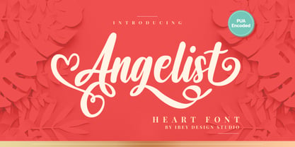 Angelist Heart Font that inspires friendliness and elegance. It is perfect to use for any of your wonderful creations such as branding projects, logos, brochures, business cards, wedding invitations, and many others.
 - Agressiva by 4RM Font,
$20.00 Made in a soft style with inktrap variations, Agressiva font combines authenticity with uniqueness so that it looks different from others. suitable for use in casual themed graphic designs such as logos.
 - Whitehall JNL by Jeff Levine,
$29.00Whitehall JNL is the serif counterpart to Jeff Levine's Wingate JNL - both are strongly influenced by the Art Deco stylings of such condensed typefaces as Huxley Vertical and other narrow titling fonts. - Fantan by Solotype,
$19.95From an early 20th century sign painter's copy book. We gave it a softer treatment than many of the faux-Asian faces have. We also added a lowercase, as is our wont. - Cherrine by Solidtype,
$14.00 Cherrine is a handcrafted font. decorative, fun and friendly. Can used for various purposes. such as the title, logo, quotes, invitations, signage, posters, etc. International support for most Western Languages is included.
