10,000 search results
(0.036 seconds)
- Monton by Larin Type Co,
$12.00 Monton is a wonderful font family that includes from thin to black style as well as in oblique style, a total of 18 fonts. This is a condensed block sans-serif font that is perfect for titles, logos, branding, posters, flyers, website design, advertising, labels, packaging, web titles, text descriptions and much more. It is well readable and irreplaceable in modern design and can be used as a main or additional one.
 - Bill Display by OGJ Type Design,
$29.00 Bill Display is a post-Max Bill font, developed in close cooperation with the Max Bill Georges Vantongerloo foundation. MAX BILL Last universal scholar, most important design teacher of the 20th century: There are superlatives, always very enthusiastic, when the importance of Max Bill is discussed. The trained silversmith studied at the Bauhaus, with personalities such as Josef Albers, Paul Klee and Oskar Schlemmer. He worked as an architect, later as sculptor and designer.
 - Biglove by Lucky Type,
$22.00 Biglove is as a handwritten script with initial letters and ending swash characters. With its alternative characters, you will see a unique, handmade look. Biglove has a few characters for each lowercase characters and you can even use it as a swoosh. You will find it easier for modern designs such as advertising, sales, branding, poster, logos, social media text overlays. Both textured with uppercase and lowercase characters, number, punctuation and extensive language support.
 - Fabriga by LuxTypo,
$50.00 Fabriga speaks a familiar language in a distinctive voice. Ideas around clarity and tone informed all emblematic decisions. Fabriga’s structure and warmth are influenced by how its character set is approached as an ensemble while exploring individual ‘creative’ opportunities as they pose themselves throughout the process. Fabriga sets out to take a supportive role as a font family, understanding that one of its great strengths is its diversity in application and composition.
 - Dempster by Ascender,
$40.99 Dempster is a geometric sans serif design by Jim Ford. It is tall, bold and square with interesting details such as the angled terminals on the lowercase letters and friendly-looking punctuation. This typeface could feel at home with Art Deco and Modernism themes, as well as Sci-Fi and high-tech flavored graphics. Medium to large headline sizes work best when using Dempster. Dempster features include Extended Latin, Greek and Cyrillic support.
 - Skylines by Zamjump,
$19.00 Skylines- a chic modern serif with letters that seem to accentuate their character.Lots of ligatures for both uppercase and lowercase, as well as several alternates, to add typographical style to your designs.To access these OpenType features, you need software that supports Opentype such as: Word, Textedit, Photoshop, Sketch, Pages, Keynote, Numbers, iBooks Author, QuarkXPress, Indesign, and Illustrator. A wide variety of useful glyphs are included - see preview images of all glyphs. Thank you
 - Anatomi by Gatype,
$10.00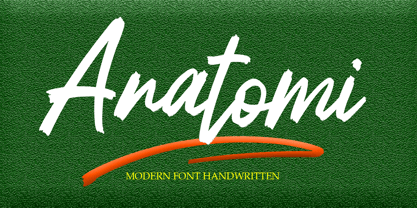 Anatomi is a textured brush font, a contemporary approach to design, naturally handmade and with underscores. It also has ligatures that make your design more attractive. Anatomi includes a complete set of uppercase and lowercase letters, Suitable for use in title design such as clothing, invitations, tittle books, stationery designs,as well as multi-language support, numbers, punctuation, ligatures,extra swash. quotes, branding, logos, greeting cards, t-shirts, packaging designs, posters and more.
 - Chairdrobe by XTOPH,
$25.00 Chairdrobe is minimalistic typeface with a contemporary, urban style. It feels pure, raw and a bit dirty. You can use it as display type as well as in longer text. Try to space it up. It looks super tight with a lot of spacing! Chairdrobe is a sans-serif, condensed typeface. Available in 3 different variations – Normal, Rounded and Grunge. It features upper and lowercase letters and up to 7 Weights and Italics.
 - Astoria Classic by Alan Meeks,
$45.00 The latest addition to the Astoria Range, Astoria Classic has the same basic characteristics as Astoria but with vertical stress. The characteristic subtle top left serif which makes it not quite a Roman and not quite a sans has been retained. Unlike Astoria, the Italics in form are old style yet have a modern look. This is designed specifically as a text face, however it still works very well as a headline font.
 - Modula by Emigre,
$39.00 Modula was the first high resolution headline face that Zuzana Licko designed with the Macintosh computer. In 1985, the computer was very crude as far as being able to produce subtle curves, but it was outstanding at producing perfect geometric elements. As a guide, she used the proportions of her earlier Emperor Fifteen bitmap design and applied the precision of the computer's geometric elements. See also Modula Round and Ribbed. Greek version by Dimitris Arvanitis.
 - Meila by NamelaType,
$19.00 Meila is a cheerful font, visually featuring bold and cute characters. Meila has smooth lines on each side, especially on the outside, almost no sharp corners. On the inside there is only one line that functions as a counter space. We made as little sidebaring as possible on each letter character, so that each character letter would intersect and that made "Meila" look solid, fat but still soft and huggable. Meila consists of several style variants and thickness variants, namely; Lines, Strokes and Solids. Meila is very suitable for children's themed designs or others such as; T-Shirt Designs, Birthday invitations, Product packaging, Logos etc.
 - Niva by PeGGO Fonts,
$29.00 Niva is a display family font with 6 typographical groups in 10 weights each one, including a standard version, 2 italic widths, an alternative version and true small caps with italic version too. The creative idea follows concepts like future, technology, science, the structural principle focus in simplify complex details on letterforms ‘clean corners’ giving a luminous and sophisticated design with a ‘technologique’ touch, built in legible proportions which works as well as ‘display (titles)’ and even at small ‘text’ requirements. Specially recommended to be applied on digital and prints contexts as magazines, books, printed ads, UI & website design, digital graphics, video and TV screen contents as videogames and mobile apps.
 - Bella Copia by Vincenzo Crisafulli,
$29.00 Bella Copia is a font dedicated to the world of childhood, to the writing of primary school children, but can also be used to compose texts or express essential concepts. It can be used for food, fashion, logos and much more. The clarity in the sign wants to express simplicity and immediacy. As far as possible, what is "not needed" has been taken away from individual glyphs. In the illustrations an attempt has been made, by combining images with fonts, to express the concept of cleanliness, simplicity and clarity. It is composed of 314 glyphs to try to embrace as many languages as possible.
 - Spencer by The Northern Block,
$30.99 Spencer is a calligraphic semi-serif type family that has been carefully designed to provide easily distinguishable letterforms that are practical in use, as well as aesthetically appealing. It's natural and organic forms comes from a deep consideration of the efficiency of the visible word and provides the typeface with a distinct and unique voice. Named after Herbert Spencer, an educator and researcher of legibility at the Royal College of Art in the sixties and seventies, and influenced by other early typographers and legibility researchers, such as Walter Tracy and John Harris. Spencer was designed as part of a legibility study by Sofie Beier and Kevin Larson.
 - Corpesh by Typotheticals,
$4.00 Corpesh was drawn in Adobe Illustrator during the wee hours of the night. It is a single weight set of fonts, no bold version. As is/was much of what I have done over the last year, it was created purely to pass time. As a self taught amateur in this field, I only do this for the enjoyment it brings me. This typeface is being released early, at the same time as 'Brainstroke', for exactly the same reason that typeface is, that being a health crisis. I know this typeface is not complete, with, as mentioned, no bold version, and probably never will have.
 - Sassoon Sans US by Sassoon-Williams,
$48.00 North American version for teaching children’s first letterforms With dots and arrows these print script fonts have no ‘exit stroke’ found in the European version. An upright typeface family developed to meet the demand for letters to produce pupil material for handwriting as well as for reading. Upright letters with extended ascenders and descenders are ideal on screen. They facilitate word recognition. Teachers can print desk strips, charts of letter families and alphabet friezes, as well as consistent material across the curriculum. Together these typefaces provide a valuable resource for special needs teachers. Free to download resources How to access Stylistic Sets of alternative letters in these fonts
 - Mollis Gothic by Quatype,
$25.00 Mollis Gothic is inspired by medieval gothic calligraphy. The gothic calligraphy is classical and traditional, I want to add something modern to it. So the letters are simplified as lines and without the handwriting feel, just like a sans font. Meanwhile, the gothic calligraphy visual look remained. It expands the usage area because of the modern feel of this font, such as the package, titles, logo, poster design, etc. In September 2021, we created the thin weight. Although Mollis Gothic Thin is from the font family, the kerning set and capital letters’ height are not as same as the regular weight for suiting the thin font’s usage situation.
 - Seagrass BF by Bomparte's Fonts,
$39.00 Inspired by lettering styles of the 1930s, Seagrass BF is jazzy and jumping as a Lindy Hop. As such it captures I believe, something of the spirit of that age, yet somehow retains a fresh, contemporary feel. Headlines, logos, packaging, signage and branding are just a few of many usages. Seagrass BF contains Stylistic Alternates and Stylistic Sets for uppercase letters Y and Z, as well as ampersand (&). Other OpenType features include Standard Ligatures and Contextual Alternates. These features should at all times be employed to optimize the appeal of your word settings. So whenever your visual communication demands an energetic, vibrant voice please consider Seagrass BF.
 - 1902 Loïe Fuller by GLC,
$45.00 This script font was inspired by the 1900s Art Nouveau style, in tribute to the well known American dancer Loïe Fuller. This font is specially developed for the OpenType possibilities. The TTF and OTF versions contain, besides all accented Western European Latin characters and ligatures, small caps, contextual alternates, more than seventy titling alternates, and others... It is used as variously as web-site titles, posters and fliers design or greeting cards, all various sorts of presentations, menus, certificates, letters. This font supports very strong enlargements as well as small sizes. When printed, it remain perfectly legible and elegant from 7 pts even if using an ordinary inkjet printer .
 - Makro by Tokotype,
$50.00 Makro is a family of extended display sans fonts with an imposing profile with six weights, ranging from Light to Black. This series is distinguished by the excessively contrasting shapes and tones of the shapes on each opening joint and adjusted open counter. This font was designed primarily for large display text that demands more space, such as on out-of-home graphics, headings, titles, or another similar application. The most recent version of Makro supports variable weight and italic axes, as well as OpenType features such as alternatives, circled numbers, etc. In addition, the family has enlarged its linguistic repertoire to incorporate Cyrillic in addition to Latin.
 - Amaretto by JVB Fonts,
$39.00 AMARETTO, inspired by classic structure of italics, as an original variation of vertical style. Ludovico Arrighi has given us the legacy of classical calligraphic structures that times later lays the foundations of Cancelleresca style and then, the italics as extension of a classic roman serif used in the Renaissance, as main typographic way of expression in Italian printed books. The name Amaretto reminds one of the most representative and delicious liqueur as strong distinctive Italian taste. AMARETTO can be used mainly in titles, long and display texts. Supports East Europe languages. Includes standard and discretionary ligatures, complete small caps, old style numbers, fractions, numerators and denominators and several OpenType features included.
 - Nantua Flava by Characters Font Foundry,
$25.00 Nantua Flava XL is a display font by heart. It's preferably seen on posters or flyers. It's inspired by the Op Art style of lettering in the USA from the 1960s and 70s. But it holds also very futuristic elements so it work very well on futuristic techno party flyers and posters. Nantua Flava XLi speeds up your design. It's powerful as a Ferrari engine, strong as a steam locomotive. The very close innerforms and low contract make it perfectly suited for background patterns as well as big headline texts. The stiff little brother of this is simply called Nantua. They are a happy family.
 - Dream Flourish by Putracetol,
$28.00 Dream Flourish is a beautiful, attractive and luxurious font with a very unique swash. Swash in the form of a very beautiful flourish. This font is compatible with various themes and concepts, such as wedding themes, fun, luxury and others. This font can be combined with additional elements such as watercolor designs, clipart and sketches. This font is suitable for your projects such as logos, wedding invitations, branding, landing pages, apparel, posters, headlines, greeting cards, invitation cards, social media, crafting, quote and more. This font can be used and supported in various programs and OS, such as procreate, cricut, windows, macOS and others. This font is also support multi language.
 - Badiya by Linotype,
$187.99Badiya is designed by Lebanese designer Nadine Chahine as a modern and slightly modulated Naskh. The design has open counters that enable it to be used in quite small sizes.The resulting effect is that of a clear, legible, and modern text face. Badiya is especially suited for print in magazines and corporate communication. It combines well with Frutiger Arabic and Janna as a text face with a matching headline. The Latin companion to Badiya is Syntax which is included also in the font. The font also includes support for Arabic, Persian, and Urdu as well as proportional and tabular numerals for the supported languages. - Saturday Moonlight by Kotak Kuning Studio,
$17.00 Saturday Moonlight is a handwritten signature script with a natural & stylish flow. This font has a multitude of natural-looking ligatures in its OpenType features - making the font look as close to natural handwriting as possible. This collection of scripts is perfect for personal branding. This Font is perfect for many different projects such as logos & branding, invitation, stationery, wedding designs, social media posts, advertisements, product packaging, product designs, label, photography, watermark, special events, or anything. We highly recommend using a program that supports OpenType features and Glyphs panels such as Adobe Illustrator, Adobe Photoshop CC, Adobe InDesign, or CorelDraw, so you can see and access all Glyph variations.
 - Johnstemp by Linotype,
$29.99As a spinoff to his Tagesstempel™ design, Georg John created Johnstemp™ in 2008. The Johnstemp family has four weights, as well as a special Mix" variant. Each of the basic fonts (Light, Medium, Bold, and Heavy) contain many alternate glyphs, allowing users to set text that realistically simulates stamped impressions. For even faster design, Johnstemp Mix is the perfect choice; it contains letters with far more stylistic and weight variation out-of-the-box, and was developed to create even livelier impressions. Here as well, many alternates are included in the character set to prevent too much repetition of the same glyphs. " - Punkaholic by Sharkshock,
$115.00 Punkaholic started out as a loopy, all caps display font with a semi condensed feel. Before completion some of the letters such as A and W were given a more traditional look and were penciled in for alternates. In the end, however, they were added as uppercase characters instead. For this reason most words in lowercase vary in appearance from their uppercase counterparts. This dichotomy between straight lined capitals and rounded ones makes for some interesting contrasts. Punkaholic works best in less formal settings such as café menus, t-shirts, or children’s publications. It comes in 3 styles and contains Latin, extended Latin, punctuation, and kerning.
 - Samui Script by Eclectotype,
$40.00 Named for the island that I had the pleasure of calling home for four years, Samui Script is a lovingly made, hand-lettering-style, script font, with a bouncy baseline and exuberant character. Taking mid 20th century commercial lettering as its inspiration, it is no revival, or pale imitation of past forms. This font can be as contemporary as you need it to be, or as retro, or somewhere in between. A wealth of sophisticated OpenType features lie beneath the bouncy exterior, making for a versatile script font that performs well at headline sizes, but is also legible enough to set small amounts of copy.
 - Cal Roman Black by Posterizer KG,
$19.00 Cal Roman Black is one more font from the PKG “Cal” (Calligraphic) group. This time for calligraphic sketches we used a wide brush instead of the iron pen. Instead of minuscule letters, there are Small Caps (which are almost the same weight as capitals). There was an intention to keep the spacing as small as possible, because of that, there is no obvious difference in the stroke thickness of the capitals and the lowercase capital letters. The difference in height is only one-third of the brush-width. Cal Roman Black font is rhythmic, informal, dark and hefty... romantic and strong at the same time (just like Ferdinand). As such, this font is widely used in the typographic creation of shorter and closely packed text forms such as magazine headlines, brochures and book covers, t-shirt designs, logos, posters, movie spots, banners...
 - The Ballpoint by Aminmario Studio,
$50.00 The Ballpoint font was created to look as close to a natural handwritten script as possible by including lowercase alternates, lowercase swash, ligature and underlines. Mix and match lowercase regular with several lowercase alternatives to get your new ligature. Perfect for any awesome projects that need hand writing taste. With built in Opentype features, this script comes to life as if you were writing it yourself. It's highly recommended to use it in opentype capable software - there are plenty out there nowadays as technology catches up with design ... Other than Photoshop, Illustrator and Indesign, many standard simple programs now come with Opentype capabilities - even the most basic ones such as Apple's Text Edit, Pages, Keynote, iBooks Author, etc. Even Word has found ways to incorporate it. Thanks for checking out this font. I hope you enjoy it! AminMario
 - AM Sans One by URW Type Foundry,
$39.99 When designing AM Sans One, it was a great challenge for me to develop a modern sans serif, which despite the large number of existing fonts in this sector has its own unique character. Starting point for the design concept was the cap O, designed as a rectangle with rounded corners, and not as usual as a circle or oval. The O should form the basis for the whole alphabet. Another feature are the characters with oblique starting and end strokes such as "A, V, W". These have not exactly straight, diagonal lines, but have a slight curvature. Thus, these letters do not look too geometric. Also the cap K deviates slightly from the usual shape which makes AM Sans One different from other already existing fonts. I could well imagine applying this font for areas such as engineering or architecture.
 - Aulendorf by Aminmario Studio,
$20.00 Aulendorf font is modern and natural handwritten with a quick stroke pen effect. This font was created to look as close to a natural handwritten script, as possible by including lowercase alternates, ligature and underlines. Perfect for any awesome projects that need hand writing taste. With built in Opentype features, this script comes to life as if you were writing it yourself. It's highly recommended to use it in opentype capable software - there are plenty out there nowadays as technology catches up with design ... Other than Photoshop, Illustrator and Indesign, many standard simple programs now come with Opentype capabilities - even the most basic ones such as Apple's Text Edit, Pages, Keynote, iBooks Author, etc. Even Word has found ways to incorporate it. Don't hesitate if you have any questions. Thanks for checking out this font. I hope you enjoy it! AminMario
 - Atlantica by Jonahfonts,
$35.00 My pet peeve for many years has been with the 'rn' in small texts, especially with my smart phone. I felt that perhaps others may have the same peeve. I decided to try and fix that with Atlantica. As you can see in poster No. 4. "With the combination of 'rn' in small text it tends to appear as 'm'. Therefore it may be read as 's t e m' instead of 's t e r n'. Altalntica has an alternate 'rn'. By invoking the < Contextual-Alternate > feature. Atlantica will replace each 'rn' - or you may individually change them if you desire". Also note the deep cuts to help legibility for smaller texts. This combination apparently does not appear in many words, but when it does it can suggest a different word as in; eastern, stern, tarnish, Tornado, Turn and in some names as well.
 - Hutton by Fettle Foundry,
$10.00 Hutton is a sans-serif typeface with flattened overshoots, such as shoulders, arms, and bowls. There are seven weights, from light to bold, with matching oblique italics. Inspired by using a ruler to write straight lines, and offering additional horizontality to characters, Hutton’s flattened bowls are intended to evoke a sense of flatness and retro influence – as if drawn at a drafting table. Featuring closed counters and low-contrast, Hutton is closely related to grotesque sans serif designs of the 20th Century, but with something a little different. Included is comprehensive European language support with contextual kerning on common diacritic combinations – as well as localised alternatives for languages such as Polish. Also included are two stylistic sets, which feature characters with a more geometric quality or a more humanistic quality, depending on which you would like to bring to your design.
 - Hesse Antiqua by Monotype,
$21.99 Hesse Antiqua is the very first typeface designed by Gudrun Zapf von Hesse. It was a pioneering project originally created by her over 70 years ago as a set of brass punches to stamp into leather book covers and spines at the Bauer Type Foundry in Germany. In celebration of her 100th birthday on 2 January 2018, Ferdinand Ulrich and the Monotype Studio team collaborated with her to bring her brass punches to live as a digital font. Hesse Antiqua was developed with careful considerations and decisions to capture the nuance of the beautiful letterforms as they originally appeared in gold and blind stampings. We are pleased to introduce this modern OpenType typeface featuring a proper set of capitals and small capitals, figures, punctuation and some ornaments as well. Hesse Antiqua is best used at 36 points and above, as the designer intended.
 - State Machine by Barnbrook Fonts,
$30.00 State Machine is a display typeface inspired by lettering applied to American and Russian Cold War-era military vehicles. It also features an alternate character set inspired by 1970s hand-made political banners. The name State Machine is a term found in both political theory and computer programming. The theoretical definition describes the political and bureaucratic organisation of a state as well as the repressive state apparatuses such as the military and police. Max Weber describes the state as "a human community that (successfully) claims the monopoly of the legitimate use of physical force within a given territory". In computer programming, a state machine is a mathematical model of computation used to design computer programs. It is conceived as an abstract machine that is in one of a finite number of states. It can change from one state to another when initiated by a triggering event or condition. Taken at a wider conceptual level, when these two definition are combined the meaning becomes analogous to a tool (such as a philosophical idea) with which to transform a society.
 - PF Adamant Sans Pro by Parachute,
$45.00 Adamant Sans on Behance. Adamant Sans: Specimen Manual PDF. Adamant Sans is a contemporary and very functional typeface. It stands out from the crowd with its uniquely designed rounded corners and beautiful italics. This carefully designed family consists of 18 fonts, including true italics. Its extreme weights, such as hairline and black are ideal for setting big and powerful headlines, while intermediate weights work very well in long texts at small point sizes. Weights are finely balanced so that they can be easily combined, depending on the type of paper and other conditions. Thanks to its proportions, high x-height and wide apertures, this typeface is very legible and suitable for setting books, magazines, newspapers, but is also valuable for use in large sizes, as well as for complex corporate projects. It supports advanced typographic features such as small caps, lining and oldstyle figures in proportional and tabular widths, fractions, ligatures, etc., and provides simultaneous support for Latin and Cyrillic as well as kerning for these languages. Adamant Sans is the ideal companion of the Adamant serif version.
 - Zapfino Arabic by Linotype,
$29.99 Zapfino Arabic is designed by Nadine Chahine as the Arabic companion to Hermann Zapf’s iconic Zapfino typeface, with the approval of Prof. Zapf. The design is an evolution of Arabic calligraphic traditions that combines Naskh and Nastaaliq to form a backward slanted calligraphic style. The character proportions refer to Naskh traditions but the isolated and final forms bring with them an exaggerated swash-like movement that references the extravagant ascenders and descenders of Zapfino. The font contains a large number of contextual variants that work to create a smooth flow of pen movement, as well as 10 stylistic sets. The character set supports the Arabic language as well as basic Latin. Zapfino Arabic is meant to be used as a display typeface, for logos, greeting cards and short headlines. It could also work for short pieces of text, for poetry or chapter introductions, when used in a generous type size and with ample space around it. Its design is soft and elegant, and leaves a lot of room for typographic playfulness.
 - Hydrargyrum by Type Minds,
$15.00 Hydrargyrum is the Latin form of a Greek word meaning "liquid silver" - mercury. The Hydrargyrum typefaces are designed with characteristics both of a metal and a liquid. The basic shapes of the letters are generally rigid and rectangular (particularly in style C), but the forms are enhanced by fluid curves and gently rounded corners. Hydrargyrum is not recommended for use at small sizes or in lengthy passages of text. It performs best in display-sized settings. Hydrargyrum consists of three styles, each in medium and semibold weights with matching obliques. The A style features solid, standard letterforms including the two-story a and g. Style B substitutes the a, g, M, and N (and related glyphs including numero and trademark symbols) for alternate shapes. The third subfamily takes the rectangular theme to an extreme, eliminating as many slanted strokes as possible from the letterforms. This makes some C-style letters ambiguous with one another, such as the U's and V's. As such, the C style is best used carefully even at larger sizes. The Hydrargyrum fonts are style linked within each style subfamily with, for example, Hydrargyrum A Medium as the regular style, Hydrargyrum A Medium Oblique as the italic, Hydrargyrum A SemiBold as the bold option, etc.
 - Franzi Variable by Wannatype,
$211.00 The new sans-serif Franzi typeface family – as neutral as can be, but at the same time individual and striking. Its unmistakable character lies in the detail, with no effect pushing itself to the fore. As a wide-running typeface with a relatively large x-height, the typeface family is perfectly suited to small text sizes but, with its elegant details, it leaves nothing to be desired in display applications either. Originally designed with constructed, often rectangular elements, Franzi has gradually been rounded during the development process and is now less hard in order to guarantee optimal legibility. Franzi Variable is designed alongside the italic and the weight axes. The italics are softly and elegantly drawn, while the upright characters appear much more severe. The design appeal reveals itself in the two-storey ‘a’ – a tribute to legibility in body copy; however, for those who prefer the geometric in applications, an alternative single-storey ‘a’ is also available. All styles have small caps, superscript and subscript lowercase letters, lining, non-lining and small caps figures, fractions as well as several ligatures, alternative fonts, symbols and arrows. The Latin uppercase letters are also available as discreet swash variants. In addition to the extended Latin alphabet, the typeface family also includes the complete Greek, Cyrillic and International Phonetic Alphabet IPA. Franzi was created as a further development of an order to produce a sign for a therapy practice in Vienna’s Franz-Hochedlinger-Gasse – hence the name, which is more common as an abbreviation for Franziska than as a diminutive for the male name Franz: Franzi is therefore a hybrid typeface name which has female tendencies.