10,000 search results
(0.032 seconds)
- Grafika by Alphabet Soup,
$45.00 Grafika is a completely original design, done in an “Art Deco” spirit reminiscent of the 1920s and ‘30s. I designed Grafika many years ago to be typeset for title cards, and both opening and end credits for the Merchant/Ivory feature film “Savages”. After the film, the design languished in my archives until I rediscovered it. I have digitally redrawn Grafika, completing it with all the alternates, ligatures, math, foreign accented characters and punctuation that weren’t required of the original design for film. Grafika is strongest when set in upper and lowercase—its unique caps extending below the baseline—although all caps settings are encouraged as well.
 - Makro by Tokotype,
$50.00 Makro is a family of extended display sans fonts with an imposing profile with six weights, ranging from Light to Black. This series is distinguished by the excessively contrasting shapes and tones of the shapes on each opening joint and adjusted open counter. This font was designed primarily for large display text that demands more space, such as on out-of-home graphics, headings, titles, or another similar application. The most recent version of Makro supports variable weight and italic axes, as well as OpenType features such as alternatives, circled numbers, etc. In addition, the family has enlarged its linguistic repertoire to incorporate Cyrillic in addition to Latin.
 - Rimbomba by Muykyta,
$13.00 Rimbomba is a freehand style font with long ascenders and descenders and a steep slant making it elegant yet casual. It is inspired by writing letters by hand, as it was done before, with strokes that in the normal style imitate the tip of a pen and in the medium and bold styles they imitate a round pen stroke. It is a font with strength in its movements and finesse in its curves, which creates a homogeneous set that is easy to read and which produces a certain reading speed. It is complemented with stylistic alternatives for the beginning and the end of the words.
 - Devoid by Dropper,
$35.00 Devoid is a sans serif typeface with a no frills stripped down design. The design has all the features of the neo grotesk typeface, horizontally cut endings, modern capitals, oval counters, with a bare bones appearance. The typeface comes in three subtle widths, Devoid Slim, which is spaced most narrowly, Devoid and Devoid Set, which have a wider letterspacing. There are regular, medium and bold weights with accompanying italics. The vertical metrics align across weights and widths, this allows for optical size adjustment as well as adjusting for same size text fit. Dutch designer Pier Taylor designed the typeface in 2020 for use in catalogs, lists and registers.
 - Neue Frutiger Hebrew by Linotype,
$79.00 Neue Frutiger Hebrew was created by Yanek Iontef and a team of designers and font engineers from the Monotype Studio, under the direction of Monotype type director Akira Kobayashi. The family is available in 10 weights from Ultra Light to Extra Black, with matching italics. Neue Frutiger Hebrew embodies the same warmth and clarity as Adrian Frutiger’s original design, but allows brands to maintain their visual identity, and communicate with a consistent tone of voice, regardless of the language. It is part of the Neue Frutiger World collection, offering linguistic versatility across environments – suited to branding and corporate identity, advertising, signage, wayfinding, print, and digital environments.
 - Neue Frutiger Georgian by Linotype,
$39.00 Neue Frutiger Georgian was created by Akaki Razmadze and a team of designers and font engineers from the Monotype Studio, under the direction of Monotype type director Akira Kobayashi. The family is available in 10 weights from Ultra Light to Extra Black, with matching italics. Neue Frutiger Georgian embodies the same warmth and clarity as Adrian Frutiger's original design, but allows brands to maintain their visual identity, and communicate with a consistent tone of voice, regardless of the language. It is part of the Neue Frutiger World collection, offering linguistic versatility across environments – suited to branding and corporate identity, advertising, signage, wayfinding, print, and digital environments.
 - Zega Grot by Isaco Type,
$24.00 Celebrate good times with Zega Grot family! This font is the companion of Zega Text but less “serious” than its predecessor. The Grot version has old vertical proportions, with higher capitals and asc-descenders, height difference between capitals and ascenders, beyond the redesign of various glyphs, giving a less formal tone, more rounded and cheerful. The family consists of 14 styles, 7 weights plus their respective italic versions. The fonts are available in OpenType PS and have extended character set to support CE, Baltic, Turkish as well as Western European languages. You can test Zega downloading the free trial font in Extrabold version (TT only).
 - Right Female by Haksen,
$14.00 Right Female is an elegant bold script with natural texture. I designed it with my own hand-writting style. I really hope you will enjoy it so much when using this font. I love using this one with layer masks in Photoshop, really look natural written. Right Female Script includes over couple ligatures to make everything look totally hand-done. What's Included: - OTF files - Ligatures in script - Numbers + Punctuation - Non-English support - Swashes If you are interested in more fonts of mine: https://creativemarket.com/Haksen/3908083-Attention-l-Combine-with-Extra-Bonus Please contact me if anything question, I'm glad to help :) Happy Designing, Haksen
 - Breuer Condensed by TypeTrust,
$30.00 Breuer Condensed is a mechanical sans ideal for captions and headline settings, and may also be suitable for moderate lengths of body copy with its comprehensive offering of OpenType features. The italics are optically adjusted obliques with a selection of augmented lowercase glyphs to provide a warmer read. The overall design ensures a distinct aura of technical precision in a personable tone. This family of eight fonts is designed to accompany the Breuer Text and Breuer Headline sets released in 2007. Breuer Condensed offers a 76% narrower footprint compared to Breuer Text and is fine-tuned to render typographic color equivalent to each sibling Text weight.
 - Ligurino by Typodermic,
$11.95 Introducing Ligurino, the sleek and sophisticated sans-serif typeface that is the epitome of clean design. With its gentle yet elegant appearance, Ligurino is sure to elevate any project it graces. Ligurino’s clean style is its greatest asset, boasting a simple and minimalist aesthetic that maximizes readability. Whether you’re designing a logo or crafting a body of text, Ligurino’s legibility will ensure your message is communicated loud and clear. What’s more, Ligurino comes with an OpenType “stylistic alternatives” function, which allows you to access an austere “Q” for added versatility. Plus, with three widths, six weights, italics, and an all-caps outline style, you have complete creative control over your project. Ligurino’s contemporary design is the perfect blend of form and function. Its modern yet timeless appearance is sure to make a lasting impression on your audience. So why settle for anything less? Choose Ligurino and let your design stand out with its refined and polished look. Most Latin-based European, Vietnamese, Greek, and most Cyrillic-based writing systems are supported, including the following languages. Afaan Oromo, Afar, Afrikaans, Albanian, Alsatian, Aromanian, Aymara, Azerbaijani, Bashkir, Bashkir (Latin), Basque, Belarusian, Belarusian (Latin), Bemba, Bikol, Bosnian, Breton, Bulgarian, Buryat, Cape Verdean, Creole, Catalan, Cebuano, Chamorro, Chavacano, Chichewa, Crimean Tatar (Latin), Croatian, Czech, Danish, Dawan, Dholuo, Dungan, Dutch, English, Estonian, Faroese, Fijian, Filipino, Finnish, French, Frisian, Friulian, Gagauz (Latin), Galician, Ganda, Genoese, German, Gikuyu, Greenlandic, Guadeloupean Creole, Haitian Creole, Hawaiian, Hiligaynon, Hungarian, Icelandic, Igbo, Ilocano, Indonesian, Irish, Italian, Jamaican, Kaingang, Khalkha, Kalmyk, Kanuri, Kaqchikel, Karakalpak (Latin), Kashubian, Kazakh, Kikongo, Kinyarwanda, Kirundi, Komi-Permyak, Kurdish, Kurdish (Latin), Kyrgyz, Latvian, Lithuanian, Lombard, Low Saxon, Luxembourgish, Maasai, Macedonian, Makhuwa, Malay, Maltese, Maori, Moldovan, Montenegrin, Nahuatl, Ndebele, Neapolitan, Norwegian, Novial, Occitan, Ossetian, Ossetian (Latin), Papiamento, Piedmontese, Polish, Portuguese, Quechua, Rarotongan, Romanian, Romansh, Russian, Rusyn, Sami, Sango, Saramaccan, Sardinian, Scottish Gaelic, Serbian, Serbian (Latin), Shona, Sicilian, Silesian, Slovak, Slovenian, Somali, Sorbian, Sotho, Spanish, Swahili, Swazi, Swedish, Tagalog, Tahitian, Tajik, Tatar, Tetum, Tongan, Tshiluba, Tsonga, Tswana, Tumbuka, Turkish, Turkmen (Latin), Tuvaluan, Ukrainian, Uzbek, Uzbek (Latin), Venda, Venetian, Vepsian, Vietnamese, Võro, Walloon, Waray-Waray, Wayuu, Welsh, Wolof, Xavante, Xhosa, Yapese, Zapotec, Zarma, Zazaki, Zulu and Zuni.
 - Sarasori by Typodermic,
$11.95 Introducing Sarasori, a typeface that effortlessly blends modern architecture and high-tech industrial design to bring you a unique and unconventional style. With its rectilinear display and technical serifs, this typeface is perfect for anyone looking to add a touch of precision and surrealism to their message. The machinelike feel of Sarasori is a testament to its precise and clean design. The unconventional letterforms and obscure vector logic come together to create a unique and mesmerizing effect that is sure to captivate your audience. Whether you’re designing a logo, a poster, or any other form of visual communication, Sarasori will help you deliver your message with a voice that is both modern and industrial. Sarasori is available in three different weights and italics, making it a versatile typeface that can be used for a variety of projects. Its sleek and polished appearance is sure to make a lasting impression, and its technical serifs add an extra layer of sophistication to your designs. So why wait? Embrace the boxy mechanical feel of Sarasori and take your designs to the next level with this unique and modern typeface. Order now and discover the surreal and precise voice that Sarasori can bring to your work. Most Latin-based European writing systems are supported, including the following languages. Afaan Oromo, Afar, Afrikaans, Albanian, Alsatian, Aromanian, Aymara, Bashkir (Latin), Basque, Belarusian (Latin), Bemba, Bikol, Bosnian, Breton, Cape Verdean, Creole, Catalan, Cebuano, Chamorro, Chavacano, Chichewa, Crimean Tatar (Latin), Croatian, Czech, Danish, Dawan, Dholuo, Dutch, English, Estonian, Faroese, Fijian, Filipino, Finnish, French, Frisian, Friulian, Gagauz (Latin), Galician, Ganda, Genoese, German, Greenlandic, Guadeloupean Creole, Haitian Creole, Hawaiian, Hiligaynon, Hungarian, Icelandic, Ilocano, Indonesian, Irish, Italian, Jamaican, Kaqchikel, Karakalpak (Latin), Kashubian, Kikongo, Kinyarwanda, Kirundi, Kurdish (Latin), Latvian, Lithuanian, Lombard, Low Saxon, Luxembourgish, Maasai, Makhuwa, Malay, Maltese, Māori, Moldovan, Montenegrin, Ndebele, Neapolitan, Norwegian, Novial, Occitan, Ossetian (Latin), Papiamento, Piedmontese, Polish, Portuguese, Quechua, Rarotongan, Romanian, Romansh, Sami, Sango, Saramaccan, Sardinian, Scottish Gaelic, Serbian (Latin), Shona, Sicilian, Silesian, Slovak, Slovenian, Somali, Sorbian, Sotho, Spanish, Swahili, Swazi, Swedish, Tagalog, Tahitian, Tetum, Tongan, Tshiluba, Tsonga, Tswana, Tumbuka, Turkish, Turkmen (Latin), Tuvaluan, Uzbek (Latin), Venetian, Vepsian, Võro, Walloon, Waray-Waray, Wayuu, Welsh, Wolof, Xhosa, Yapese, Zapotec Zulu and Zuni.
 - Caldense by Tiago Cândido,
$20.00 The typeface was baptized as "Caldense" in order to honor the city of Caldas da Rainha, a small city in Portugal, the typography's birth place. It has three weights, Regular, Demi Bold and Bold and it is a sans serif and grotesque. Each character was based on a grid and was built in modules, having round edges and straight finishes. The font can be used in titles and normal text while being easy to read.
 - Complements by Ingrimayne Type,
$9.00 In the typeface family "Complements" two sets of characters complement each other, so much so that they work together much better than they work separately. The two sets are designed to alternate and this alternating is done automatically in applications that support the OpenType feature Contextual Alternatives. Complements is purely for show and display; it is a horrible choice for text. The spacing is very tight, which works well for very large point sizes. At smaller point sizes the user may want to increase character spacing. The typeface is monospaced. If the spacing between words is too large, substitute the non-breaking space (or the underscore) for the space character. Complements is geometric, bizarre, and hard to read, all characteristics that catch the reader's attention. Complements comes in two styles, regular and outline. The outline style was designed to be used in a layer over the regular style.
 - Luminari by Canada Type,
$29.95 Philip Bouwsma returns with yet another great manifestation of historical calligraphy. Luminari is an amalgam of High Middle Ages writing, a blend that combines the ornate Church hands with the simple Carolingian from the ninth to the fifteenth centuries. Its majuscules are particularly influenced by the versals found in the famous Monmouth psalters, as well as those done by the Ramsey Abbey abbots in the twelfth century. The minuscules also exhibit some influence from the book hand of prolific humanist Poggio Bracciolini from the early fifteenth century. Italian and essentially romanesque in style, Luminari exercises a slight tension between the round forms and the angular “gothic” styling. Luminari was updated with plenty of alternates and expanded language support in 2012. It now supports a very wide range of codepages, including Cyrillic, Greek, Central and Eastern European, Turkish, Baltic, Vietnamese, and of course Celtic/Welsh.
 - Chapman by James Todd,
$40.00 Chapman is the result of spending too many hours staring at the often all-capital engraver typefaces from long-gone foundries. The wide serifs, high contrast, and various widths seem to have so much character but also remain so neutral. From these references, Chapman began to emerge. It seemed natural that the lowercase would be based on a Scotch Roman model, much like the original all-capital faces. Chapman does not pull directly from any one source but from the genres themselves. It was, from the beginning, the goal to create a typeface that would be relatively neutral but not boring; an adaptable solution that works anywhere and, depending on the chosen width, can be squeezed or stretched to fit anywhere. The idiosyncrasies of the original designs are tamed in some places and turned up in others. The result is something familiar but unique and contemporary.
 - Gonk Droid by Edd's Aurebesh Fontworks,
$5.00 Making some Star Wars stuff? This Aurebesh font is designed to look like something you would see on a piece of quick and dirty graphic design in the Star Wars universe, like a wanted poster or a warning sign. The font includes the additional Aurebesh glyphs beyond the 26 basic characters (all in lowercase & uppercase) as well as numbers and symbols.
 - Kari Display by Positype,
$49.00 Kari Display is the product of a long standing idea I had to give the well-received Positype typeface, Kari, plastic surgery. Just referring to giving a typeface plastic surgery, or letter lipo, stuck in the back of my head until I was able to pick the project up. The ultimate objective was to refine Kari Display to a point where each glyph was expressed as simple as possible... and in that simplicity a sexiness would appear. Kari is a beautiful script, but it is very 'controlled' and orderly and I wanted Kari Display to break that mold with much more movement, curviness, greater modulation and a more elegant feel on the page. I did not want to take it too far, limiting the use of the typeface, but rather opted for a delicate balance of thick and thin against the added movement of the glyphs. The wealth of sketches and proposed variants during the concepting phase was encouraging and I really pushed to add as many alternate characters, ligatures, swashes (and more) as I possibly could. Just about every character has at least one or more alternates AND the complete offering of alternates completely covers a wide range of Latin-based language groups including Central European diacritics. If you are using any type of OpenType enabled application, then the Kari Display Pro typefaces are the way to go. They include everything found in the 3 separate variants for each style as well as entirely expanding offering of additional swash and ligature sets.
 - Negotiate by Typodermic,
$11.95 Indulge your senses with the exquisite elegance of Negotiate, a sans-serif typeface that exudes sophistication and style. This alluring font boasts a distinctive blend of rounded and flat stroke ends, creating a striking contrast that is both visually appealing and alluring to the eye. The smooth, curved lines of the rounded stroke ends provide a soft and gentle touch, while the flat strokes add a bold and assertive element that commands attention. This captivating contrast imbues Negotiate with a unique personality, making it a perfect choice for those seeking to convey a message that is both powerful and chic. What truly sets Negotiate apart is its versatility. The typeface is available in five distinct weights, allowing you to customize your design to achieve the perfect balance of grace and strength. Additionally, the italics add a touch of sophistication to your work, giving it a refined and polished edge that is sure to impress. If you’re looking for a font that truly embodies the essence of fashion and elegance, look no further than Negotiate. With its old-style numerals, this typeface is perfect for use in OpenType-capable apps. Its charming design and alluring character are sure to make an impact and leave a lasting impression on all who behold it. Choose Negotiate and let your creativity take flight. Most Latin-based European writing systems are supported, including the following languages. Afaan Oromo, Afar, Afrikaans, Albanian, Alsatian, Aromanian, Aymara, Bashkir (Latin), Basque, Belarusian (Latin), Bemba, Bikol, Bosnian, Breton, Cape Verdean, Creole, Catalan, Cebuano, Chamorro, Chavacano, Chichewa, Crimean Tatar (Latin), Croatian, Czech, Danish, Dawan, Dholuo, Dutch, English, Estonian, Faroese, Fijian, Filipino, Finnish, French, Frisian, Friulian, Gagauz (Latin), Galician, Ganda, Genoese, German, Greenlandic, Guadeloupean Creole, Haitian Creole, Hawaiian, Hiligaynon, Hungarian, Icelandic, Ilocano, Indonesian, Irish, Italian, Jamaican, Kaqchikel, Karakalpak (Latin), Kashubian, Kikongo, Kinyarwanda, Kirundi, Kurdish (Latin), Latvian, Lithuanian, Lombard, Low Saxon, Luxembourgish, Maasai, Makhuwa, Malay, Maltese, Māori, Moldovan, Montenegrin, Ndebele, Neapolitan, Norwegian, Novial, Occitan, Ossetian (Latin), Papiamento, Piedmontese, Polish, Portuguese, Quechua, Rarotongan, Romanian, Romansh, Sami, Sango, Saramaccan, Sardinian, Scottish Gaelic, Serbian (Latin), Shona, Sicilian, Silesian, Slovak, Slovenian, Somali, Sorbian, Sotho, Spanish, Swahili, Swazi, Swedish, Tagalog, Tahitian, Tetum, Tongan, Tshiluba, Tsonga, Tswana, Tumbuka, Turkish, Turkmen (Latin), Tuvaluan, Uzbek (Latin), Venetian, Vepsian, Võro, Walloon, Waray-Waray, Wayuu, Welsh, Wolof, Xhosa, Yapese, Zapotec Zulu and Zuni.
 - Taurunum by Kostic,
$40.00 The initial idea for this font came when a friend of mine asked me to create a logo for a sports team that he was forming. Since it was a martial arts competitive sport, bold and striking lettering was needed to reflect that. When the logo was finished, I was really pleased whith the letters so I decided to create the entire font. Taurunum is made with intention to be used for display design (logos, posters, etc.), and combining the weights should give best results.
 - Materia Pro by Elsner+Flake,
$79.00 Minimal, modular, modern—at first glance, Materia shows a contemporary flair, combining pure, strong geometrical form with a subtle, distinct appearance. Actually, the design was inspired by lettering from the turn of the 19th to the 20th century that still can be found in the East of France. While its formal origins date back as far as this, revived e. g. by the constructivists into the nineteen twenties and later on by Dutch information designer Wim Crouwel in the nineteen-sixties, the visual language of Materia still speaks of the »future«. Following a minimalistic concept the font is formally built on a grid. Wherever optical curves are needed for a smoother, more comfortable shape of letters than a simple rectangular block, diagonals cut off the egdes – like a diamond is cut to achieve more beauty. Thus headlines and texts set in Materia are given a certain »egdy« feeling, whereas their tonality is still kept well-balanced, keeping concentation all on information in a nonconfomist way. Materia comes in eight styles, from elegant Thin to attention-forcing Ultra. Even a regular Italic is available, following the classic type-set-principle. Two of the styles are explicitly designed for display use, Shadow and Code. Both are ready for combinations with Bold or each other respectively, the layering of Shadow and Code e. g. allows astonishing effects or highlighting within the letters. For OpenType-users Materia is a real Pro, containing accented Latin letters for over 70 languages, small caps, old style, tabular and lining figures and special condensed titling all caps for cases in which space is all that counts. How useful all of the above mentioned is may be seen in the book David Lynch – Lithos, designed by Koma Amok, published in 2010 by item éditions, Paris, and Hatje Cantz, Germany, which was typeset completely in Materia.
 - Faber Gotic by Ingo,
$21.00 A ”modern“ Gothic – designed according to principles of modern form in three variations Faber Gotik is a reminiscence of Gutenberg’s first script from around 1450. The heavily broken forms allow further development in the direction of a modern, strongly geometric and less formal type. It should be possible to push the principle of design so far to the limit that a type is created which, from the very start, extinguishes reminders of a dark past. The characters are composed of squares which are lined up straight or in a more or less slanted manner. The resulting corners similar to serifs were removed so that a sans serif type in the true sense without up and down strokes was created. The principle of ”breaking“ was applied according to the historical model. Even the form of the characters is based on the model from the Middle Ages. Only the characters which cannot be created with the principle described were modeled on today's forms. Faber Gotik includes three variations: - Faber Gotik Text — most similar to the historical model - Faber Gotik Gothic — pushes the applied principle of form the furthest - Faber Gotik Capitals —; a Gothic upper case font, contrary to tradition. 555 years after Gutenberg, interest in black-letter typefaces is nearly extinct. They are especially looked down upon in German-speaking countries because they are still associated with ”Nazi“ scripts. But yet, the very forms of blackletter, Gothic, Schwabacher and especially cursive have enormous potential with regard to the development of new advanced font forms.
 - Spleeny by Galapagos,
$39.00A gentle breeze on a warm summer's day. A cozy gathering of friends and family around a crackling fire. The sweet aroma of freshly baked cinnamon bread. A slow walk in the autumn woods, light sparkling down through the multi-colored leaves. Billowing white clouds against a stark azur sky, leisurely floating past the tops of palm trees. What do these idyllic scenes all have in common? A: Most people can never find the time to enjoy any of them. B: These are just some of the things you would never try to describe using a crankish font like Spleeny Decaf GD. Just as ITC Fontoon was designed to be used with the many critters that populate the "Toonie" series of fonts, Spleeny Decaf GD was created by Steve Zafarana for use in the balloned dialogue portions of a new panel cartoon feature currently under development. Spleeny Decaf GD is the first completed font in a family that ranges from the jittery san serif Spleeny Espresso GD to the sedate and serifed Spleeny Asleep GD. Each font in the series appears a little more relaxed and staid than its predecessor. None of them however, will find themselves being used for the text of any legal documents. Spleeny Decaf GD is the perfect font to use when the weight of the message is leaning towards the light and jocular side of things. So remember, if your documents are starting to put you on edge, it may be time to switch to decaf. Spleeny Decaf GD that is. - Regeneration by Comicraft,
$69.00 It’s the end, but the moment has been prepared for... the Time War is over and things are wearing a bit thin, time for a new face, a new body, a new companion for our Timelord font... a REGENERATION! Features: 138 automatic connecting ligatures Language support for Western & Central Europe and Vietnamese Solid Variable Font for complete control of weight and italic Levels Variable font can access any point between Inline, Midline & Outline
 - American Text by SoftMaker,
$9.99 American Text is a condensed American blackletter published by SoftMaker.
 - Bellevue by Berthold,
$39.99 Gustav Jaeger designed Bellevue, which H. Berthold published in 1986.
 - Hagada Mesugnan MF by Masterfont,
$59.00 Custom designed letterforms for the Hagada, published by Gad Ulman.
 - Century PS Pro by SoftMaker,
$14.99 Century PS Pro is a serif typeface published by SoftMaker.
 - Pergamon by SoftMaker,
$9.99 Pergamon is a sans serif decorative typeface published by SoftMaker.
 - Century Schoolbook Pro by SoftMaker,
$14.99 Century Schoolbook Pro is a serif typeface published by SoftMaker.
 - Broadway No2 by SoftMaker,
$9.99 Broadway No2 is a decorative 1920s font published by SoftMaker.
 - Organ Grinder by SoftMaker,
$9.99 Organ Grinder is an art deco typeface published by SoftMaker.
 - Beale Charming by SoftMaker,
$9.99 Beale Charming is an Art Deco font published by SoftMaker.
 - Openface No2 by SoftMaker,
$9.99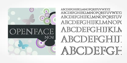 Openface No2 is a decorative serif typeface published by SoftMaker.
 - HU Handwrite by Heummdesign,
$15.00 It is a handwriting-style font for body text that emphasizes gentleness and solidity by using less curvature and making use of a straight feel. The handwriting feeling is emphasized through the style that makes use of the natural bending and stroke order. Softness was added in the shape of a gentle curve, and perspective was applied by setting a vanishing point in the lower left corner.
 - All for you by HOHOHtype,
$28.00 ‘Allforyou’ is an elegant serif type family. The family has 3 different weights. It was designed to have the flexibility of italics in the form of serifs. It has a feminine and elegant feeling due to its smooth curves. It was designed with applications such as advertising and packaging, editorial and publishing, logo, branding and creative industries, poster and social media, and marketing in mind.
 - HU Handwrite KR by Heummdesign,
$25.00 It is a handwriting-style font for body text that emphasizes gentleness and solidity by using less curvature and making use of a straight feel. The handwriting feeling is emphasized through the style that makes use of the natural bending and stroke order. Softness was added in the shape of a gentle curve, and perspective was applied by setting a vanishing point in the lower left corner.
 - Nice Trendy by Arendxstudio,
$13.00 Nice Trendy - A Groovy Typeface is a font with distinctive handwritten characters perfect for branding projects, logos, wedding designs, media posts, advertisements, product packaging, product designs, labels, photography, watermarks, invitations, stationery, and any project who need handwritten dishes. Features : • Character Set A-Z • Numerals & Punctuations (OpenType Standard) • Accents (Multilingual characters) • Ligature Multilingual Support : Afrikaans, Albanian, Asu, Basque, Bemba, Bena, Catalan, Chiga, Cornish, Danish, English, Estonian, Faroese, Filipino, Finnish, French, Friulian, Galician, German, Gusii, Icelandic, Indonesian, Irish, Italian, Kabuverdianu, Kalenjin, Kinyarwanda, Low German, Luo, Luxembourgish, Luyia, Machame, Makhuwa-Meetto, Makonde, Malagasy, Malay, Manx, Morisyen, North Ndebele, Norwegian Bokmål, Norwegian Nynorsk, Nyankole, Oromo, Portuguese, Romansh, Rombo, Rundi, Rwa, Samburu, Sango, Sangu, Scottish Gaelic, Sena, Shambala, Shona, Soga, Somali, Spanish, Swahili, Swedish, Swiss German, Taita, Teso, Vunjo, Zulu
 - Central Display by Prioritype,
$19.00 Central Display - A Display Serif Font (All Caps) This typeface is inspired by fashion magazines. Strong and classy character. For the main display is very suitable. For example in poster design, branding, social media posts, magazine covers and so on. Features: Uppercase, Lowercase, Numeral, Punctuation & Multilingual. Multilingual contained: Afrikaans, Albanian, Asu, Basque, Bemba, Bena, Breton, Catalan, Chiga, Cornish, Danish, Dutch, English, Estonian, Filipino, Finnish, French, Friulian, Galician, German, Gusii, Indonesian, Irish, Italian, Kabuverdianu, Kalenjin, Kinyarwanda, Luo, Luxembourgish, Luyia, Machame, Makhuwa-Meetto, Makonde, Malagasy, Manx, Morisyen, North Ndebele, Norwegian Bokmål, Norwegian Nynorsk, Nyankole, Oromo, Portuguese, Quechua, Romansh, Rombo, Rundi, Rwa, Samburu, Sango, Sangu, Scottish Gaelic, Sena, Shambala, Shona, Soga, Somali, Spanish, Swahili, Swedish, Swiss German, Taita, Teso, Uzbek (Latin), Volapük, Vunjo, Zulu. Thanks :)
 - Aracne by Antipixel,
$15.00 The all-caps Aracne collection features tall, slightly scrawled letterforms, and is available in regular, condensed and ultra condensed styles for maximun functionality. With a spiritted quality and casual character, it will add a personal style to your work. Aracne is a full of energy handwritten font, with light and regular styles, including italics. It provides a wide range of possibilities, including the Aracne Soft and Stamp, which offer softer and cleaner edges. It’s has a glyph coverage supports languages such as English, Spanish, French, German, Polish, Czech, among many others. It’s recommended usage is for display titles, and small ammount of text, because of its good legibility and quality of glyphs. Check out her sisters Aracne Condensed and Aracne Ultra Condensed!
 - Bedroom Diaries by Arendxstudio,
$13.00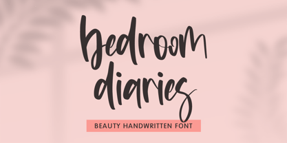 Bedroom Diaries – Beauty Handwritten Font is a font with distinctive handwritten characters perfect for branding projects, logos, wedding designs, media posts, advertisements, product packaging, product designs, labels, photography, watermarks, invitations, stationery, and any project who need handwritten dishes. Features : • Character Set A-Z • Numerals & Punctuations (OpenType Standard) • Accents (Multilingual characters) • Ligature Multilingual Support : Afrikaans, Albanian, Asu, Basque, Bemba, Bena, Catalan, Chiga, Cornish, Danish, English, Estonian, Faroese, Filipino, Finnish, French, Friulian, Galician, German, Gusii, Icelandic, Indonesian, Irish, Italian, Kabuverdianu, Kalenjin, Kinyarwanda, Low German, Luo, Luxembourgish, Luyia, Machame, Makhuwa-Meetto, Makonde, Malagasy, Malay, Manx, Morisyen, North Ndebele, Norwegian Bokmål, Norwegian Nynorsk, Nyankole, Oromo, Portuguese, Romansh, Rombo, Rundi, Rwa, Samburu, Sango, Sangu, Scottish Gaelic, Sena, Shambala, Shona, Soga, Somali, Spanish, Swahili, Swedish, Swiss German, Taita, Teso, Vunjo, Zulu