10,000 search results
(0.064 seconds)
- Quiroga Serif Pro by TipoType,
$29.00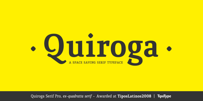 Quiroga Serif began in 2007 with the name Quadratta Serif. This typography was designed for continuous text, legible at medium and small sizes, with great saving of space, optimized for 6, 8, 10 and 12 points. The morphology is a mix between tradition and innovation; it has a vertical axis, thick serifs, tall x-height, light modulation and a lot of internal space between letters: key to improve legibility at small sizes. Formally, my idea was to make a serif type that had a unique color, this is visible due to the light modulation. This is also complemented with the incorporation of not common, alternative signs. Some parts of the letters that are usually curb or diagonal where made horizontal (for example: a, q, p, etc.), this makes the eye of each character to be wide and unique. The serifs (wedge type) suffered diverse variations during the process. At the begining they where thicker and ended vertically, but this caused a great deal of printing errors. And so we decided to modify them by giving them an angle to avoid visible errors in medium and small sizes. The ch, and ll ligatures where rescued because they are a part of our current spanish alphabet. The historic ligatures and stylistic alternates give different options to users who want different alternatives within a text. The accentuation signs were composed in a middle line above all signs to avoid visual shock. We also gave plenty of importance to small caps numbers, mathematical signs and currency signs so that the could interact well.
 - Gabton Malgora by Letterena Studios,
$17.00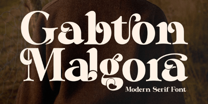 Gabton Malgora is a bold and stylish serif font. This font is PUA encoded which means you can access all of the glyphs and swashes with ease!
 - Taler by Serebryakov,
$40.00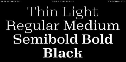 Taler is a serif typeface is represented by seven weights. It was conceived as a continuation of the sans-serif Nekst. In the process of design it became clear that it is a completely different typeface. The rectangular, slightly elongated serifs, the plastic stiffness, and the combination of different styles make Taler a true representative of contemporary. It's old-fashioned and modern, it's for a display titles and for plain text, it's rough and elegant — it's all present in design at the same time. The duality of it nature is it peculiarity.
 - Merlod by Stawix,
$30.00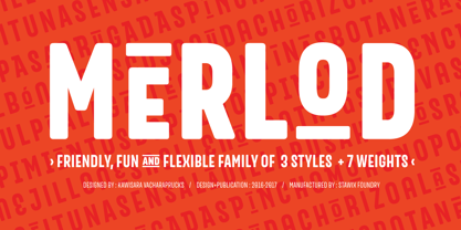 Merlod has depicted its characters from Latin-American sign painting and reinterpreted them into modern approaches. This typeface is a friendly, fun and flexible family that is fun to use, consisting of 3 different styles that each comes with 7 weights. Each style of Merlod – Norme, Autre and Queue, possess a distinctive character but works together compatibly. Merlod also comes with a special stylistic set that allows the user to be creative and playful with the type, it helps enhance many different possibilities that certainly will spice up your design.
 - Sello by Alex Jacque,
$15.00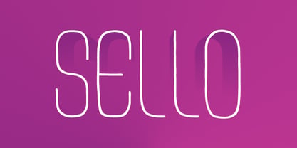 Sello is a hand-drawn, geometric sans-serif with a touch of retro style. It's a unicase typeface inspired by hand-engraved, mid-1960s Spanish postage stamps, hence the name "Sello" – Spanish for "stamp". This font comes in three different weights – light, regular, and bold – with a regular and oblique version of each for a total of 6 styles. Vowels have a special third alternate glyph. Sello also contains the necessary diacritics and special characters to support several different languages. Looks great at the slightly larger point sizes, when used in header or display purposes.
 - Romford Stencil by Paula Minelgaite,
$30.79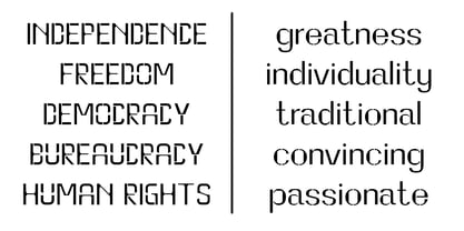 Romford Stencil is a Brexit inspired typeface. It’s letterforms represent the idea of a union splitting apart and the stylistic differences between the upper and lower case symbolise the notion of being different from one another. Research for this typeface started off in Romford which is an area where the majority of UK voters wanted to leave the European Union, hence the name. Romford Stencil is designed to be readable for body copy and look impressive when used as a display typeface. However, the bigger it's size the better it looks, especially in all capitals.
 - Wonders Graf 3d Graffiti by Sipanji21,
$15.00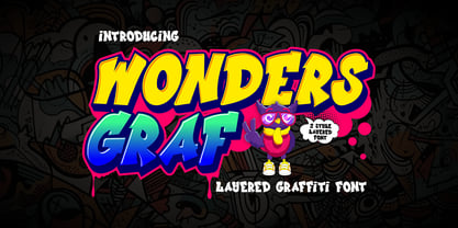 "Wonder Graff" is a graffiti font that features 3 different layers and multiple font styles. With these layers and font style variations, you can create intriguing effects in your design. The use of layers and font styles allows you to achieve more complex and creative looks. Fonts like "Wonder Graff" are often used in street art, posters, or designs that want to emphasize bold and energetic typography. With different layer and style options, you have greater control over the appearance of your text and can customize it to fit your design concept.
 - Syrup by Fenotype,
$35.00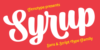 Syrup is a friendly, subtly rounded type family combining sans and script styles. It’s aesthetic roots are in the sign painting of the 1950’s but the execution is distinctly modern. The different styles are designed to work well together so you can have multiple levels of typography all with the same feeling and aesthetic. Try combining the styles in different ways for maximum impact. All styles are packed with Opentype features to enable flexible customisation of your design and the font is especially well suited for branding and packaging typography.
 - Kosumi by Thinkdust,
$10.00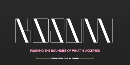 Kosumi is an experimental display typeface. Its juxtaposition of thick and thin catches that gleam in your eye, and leads you by the hand out of your comfort zone with such ease that you'll never look back. Kosumi is comfortable in any of a thousand different places, looking brilliant on posters, and reigning supreme within magazine spreads. All you need to do is let is whisk you away. The eye-catching differences between thick and thin lines serve to capitalise your attention, ensuring your nicely laid out headline is truly the star of the show!
 - Dona by Harbor Type,
$30.00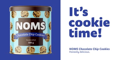 🏆 Selected for Tipos Latinos 9. Dona is a non-boring sans serif. While very legible in text sizes, its friendly details really come to life on headlines, packaging and visual identities. To make it even more interesting, Dona Alt brings a different feeling with just a few different glyphs. The Dona type family comes in 5 weights, from Regular to Black, matching italics and an Alt version, totalling 20 fonts. If you need even more control, variable fonts are also available. Each font contains 528 glyphs and supports over 200 languages.
 - Schuss Sans CG Poster Extrabold by typic schuss,
$33.00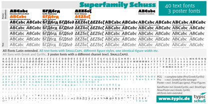 Schuss Sans CG Poster Extrabold 1 upright OTF Font Latin extended, Cyrillic and Greek. Specially developed for headline poster display sizes. A Sans Serif Extrabold Headline-Font in addition to the Schuss superfamily. The heights are optimized for big sizes, different to the text fonts of the Superfamily Schuss. The character set is slightly different to the non poster styles too, but comparable to Schuss Sans CG Poster Black. No italic, no additional figures, no tabular figures, no small Caps. But with maximum manual kerning. Ligatures: fi, fl, ff, ffi, ffl. No special OpenType features.
 - Adverb Mono by Rumors Foundry,
$9.00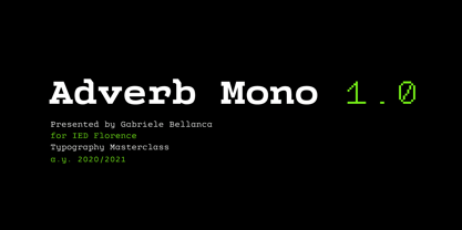 Adverb Mono is an atypical monospaced, squared proportional, slab-serif and low contrast typeface inspired by the American Type Founders' "OCR-A" and the latest work of Adrian Frutiger "OCR-B" designed during the second half of the 20th century. The typeface (in his 1.00 version) counts five different weight, from Thin to Bold, and a pixelated redesign of the regular weight inspired by the retrogaming consoles' graphics. It counts more than 240 different glyphs continuously updated. Designed by Gabriele Bellanca for IED Florence Typography Masterclass 2020/21. All rights reserved.
 - Manchester Condensed by Vástago Studio,
$23.90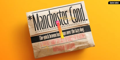 Every day we are faced with designing on small screens and new formats; This is where condensed fonts have great potential, as they make the most of tight spaces in big headlines. Manchester Condensed is a typeface family designed by Vástago to be applied in large headlines in different formats, such as web, editorial or packaging. Just to mention a few. Different Manchester weights enhance performance at large type sizes, providing hierarchy and imposing style with its elongated shapes. Its use in capital letters is remarkable and fits perfectly into very precise diagramming spaces.
 - Auto Pro by Underware,
$50.00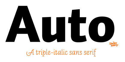 Auto Pro is a warm, humanist sans serif typeface which has three different styles of italics, each with its own flavor. With its three italics, Auto creates a new typographic palette, allowing the user to drive through unknown typographic and linguistic possibilities. Also, because of its four weights and the three different figure styles, it’s a vehicle equipped for many roads of typography. Comes with Underware’s Latin Plus character set with a support for 219 languages. Take a cruise, and let this typeface carry you to business or leisure.
 - Portsmouth Second Fleet by Open Window,
$19.95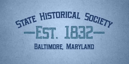 Portsmouth Second Fleet is the rag tag, wild bunch companion to Portsmouth. It is a strong, sturdy typeface with historical character. Its inspiration comes from the height and strength of the wooden tall ships that sailed into port in their day. With caps and small caps, this typeface is great for headlines or subheads for design projects that need a historical or retro feel, such as from the 1940s and earlier. Two different styles that can be layered allow for different colored drop shadows, outlines and fill for even more customization.
 - Revoxa by Almarkha Type,
$29.00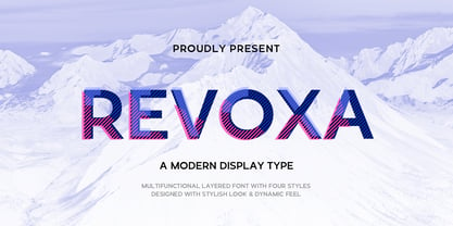 Revoxa – Modern Sans, Display Sans made specifically developed for contemporary design styles, made with three styles; Regular- Cut – line. These styles have been carefully designed to coat each other, creating an alternative third style. This feature allows you to adjust opacity and blending modes and different color settings, giving various possible results. very good for combining your design work with a clear line and a circle with several different weights that are very comfortable in the design area you are easy to read and as a title on a blog or magazine page
 - Crazy Fever by PizzaDude.dk,
$18.00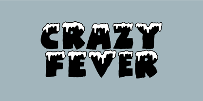 Is it snow? Is it water? Is it slime? Is it from this earth? The questions are many - one thing is certain - with this font you can create cool effects by mixing the layers - and in the end, you decide whether the result is going to be scary, delicious or somewhere in between! Use the different layers and your favourite color scheme and just type ahead - the contextual alternates (with 4 different versions of each letter) automatically cycles the letters and make your text look more lively - or maybe even scary!
 - Noema Pro by DBSV,
$130.00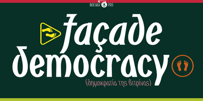 About family “Noema Pro” Steps… The name “Noema” is again borrowed from ancient Greek word, which may have different meanings depending on the phrase: meaning, logic, significance, purpose, reason, value, nod, implied. In this font i tried and here(like in “ErisPro”) to give a different illustration in letters with a reverse dial(…sloping or recline) from Italic, simply because of whims or because the monotony is tiring me… This series is composed and includes twenty-four fonts with 658 glyphs each, with true italics, true Sloping and supports of course: Latin, Greek & Cyrillic.
 - Gliny by Typesketchbook,
$45.00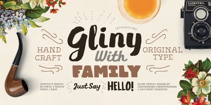 Gliny was created by mixing different styles of handwriting fonts that derived from various tools such as pen, markers, drafting pens, painting brushes, writing brush and etc. In order to develop a new and diverse font styles. We also keep incomplete details and uneven textures that resulted from a writing process. We provide various font styles to help you mix and match them to suit your creative work harmoniously. Gliny comes with different font families such as brush, slab serif, heavy, handmade script for making your amazing work !!
 - Gazeta by Vanarchiv,
$21.00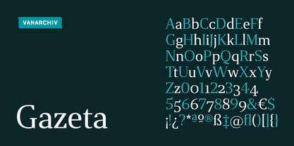 This typeface was designed for editorial purposes (text sizes), where the letterforms contain short serifs (more economical). This font family contains different weights (from Extra Light until to Extra Bold) to create an simple and sequential typographic hierarchy scale. There are two different weights and options designed specifically for text sizes (Regular and Text). The design is classical but contain some contemporary details, which are not distractive for reading, it's simple and clean at small sizes. This font family include italics, small caps, ligatures, old style and tabular figures.
 - Sandena by Polyglyphic,
$40.00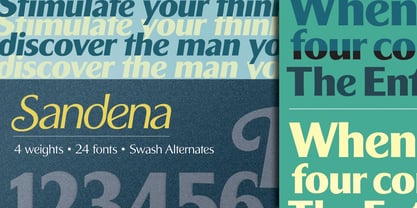 Sandena began as an attempt at a harmonic convergence between the classic lines of Palatino and the curved flair of Optima - both favorites of mine from the great Hermann Zapf. As I’ve always loved the Swash characters of the 50’s and 60’s letterforms, I incorporated these alternatives to offer the more complete package that you see here - a humanist font in the truest calligraphic sense. This OpenType font family comes in four weights and includes condensed and Swash Cap alternates. Sandena offers multiple-character foreign language support and is being offered in a number of packages best-tailored for your unique application.
 - FS Millbank by Fontsmith,
$80.00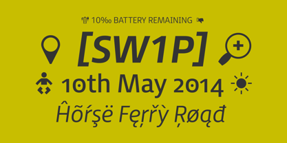 A sign of something better When designer Stuart de Rozario surveyed the fonts used in signage on London’s public transport systems, he reached a dead end. They seemed staid, sterile, lacking in personality, and ill-suited to use by modern brands. He was pointed in another direction entirely. ‘The driving force behind my thoughts was to design something more current and fresh without compromising legibility and clarity. A font with both personality and function, that’s versatile and large and small sizes, and effortless to read, but which also says something new.’ Speed reading Late for a meeting and can’t find your way? Trying to catch a flight? Lost in a hospital? Reading signs is a different business to reading a book or a newspaper. Text on signs needs to be deciphered quickly and effortlessly. So the legibility criteria for signage letterforms are different to those for normal reading, too. Throughout FS Millbank’s uppercase and lowercase alphabets, characters have been given features for extra definition, including: wide ink traps on the A, K, M, V, W, X and Y; a serifed i, accentuated spurs on the a, d, l u; and different x-height shapes on the b, g, p and q. Distinctive forms and generous, open internal shapes all help the quick reading of sign text, and wide, open terminals and counters allow similar letter shapes to be distinguished easily when viewed at different angles. Running down a corridor, maybe... Positive/negative Standard type tends to glow on the kind of dark backgrounds often used for signage, and look heavier than its true weight. To correct the imbalance caused by this optical trick, special weights of the typeface have to be drawn for these ‘negative’, light-on-dark applications. These are lighter than their comparable positive weights to overcome the ‘glow’ effect. After extensive tests of the negative weights, at all sizes, we achieved the right optical balance. Glowing, glowing, gone. Icons This wouldn’t be a signage typeface without its own set of icons, or symbols, to help people find what they’re looking for. So, to sit alongside the positive and negative fonts, we’ve created a comprehensive set of 172 icons, covering a wide range of applications from transport and user interface to information and directional. Designed within the typeface capital height, they sit on the baseline and are spaced centrally.
 - RB Naftalin by RockBee,
$-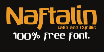 This typeface came out as a side idea while I was working on one logotype. Suddenly I came up with an idea of creating “tuned” version of the typeface, based on that logo. The “tuning” turned me in a completely different direction and in a few hours of haste I was looking at a completely different typeface. A few days later I made this font available for free, since it wasn't meant to be at all :-). A few months later, I saw my typeface used in the menu in one pizzeria. I was amazed and glad and happy and proud, all at the same time. Oh, by the way: the logo I was working on was of different style and even of another stem’s widths. So, this is truly a font of it’s own design. Naftalin has both Latin and Cyrillic sets, since it was used with both.
 - Tramuntana 1 Pro by Vanarchiv,
$50.00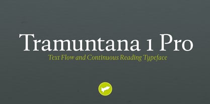 Tramuntana 1 Pro was inspired by the late Renaissance and Mannerist spirit and it was designed by Ricardo Santos during 2009 for his Master in Advanced Typography (Eina-Barcelona). This project was also inspired by Robert Granjon, Garamond and Sabon typefaces. The name tramuntana (Tramontane) is the Catalonian word for the cold wind that comes from the Pyrenees mountains and goes as far as the Balearic Islands. It was designed for editorial purposes (books and magazines). This typeface family contains different font versions for different optical sizes, caption, text, subhead and display, all of them with different x-height proportions and contrast. The serifs are asymmetrical and the letterforms have geometric modulated strokes which simulates the calligraphic variations. Its design approach gives a dynamic feeling, contributing to text flow and continuous reading. The kerning has been optimized for Baltic languages and Western, Southern, and Central European languages.
 - Maus - Personal use only

- Aniron - Unknown license

- Magic Bloom by Pen Culture,
$17.00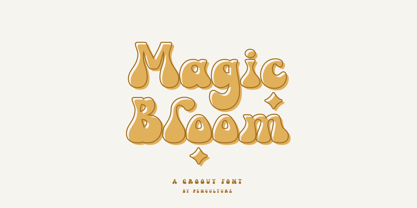 Proudly present our newest and lovely font in 2023 called Magic Bloom. This is a lovely and playful groovy font where you can feel it in every curve of the letters. This font is equipped with full uppercase and lowercase, number and punctuation, alternate and ligature. This font works well in both uppercase and lowercase, so you can use and create in a variety of projects. I really hope you enjoy it – please do let me know what you think, comments & likes are always hugely welcomed and appreciated. More importantly, please don’t hesitate to drop me a message if you have any issues or queries. Thank you
 - Epoca Classic by Hoftype,
$39.00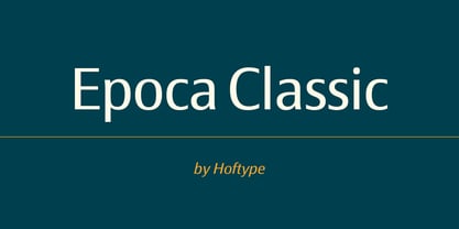 Epoca-Classic, designed in 2012, is the contrasted sister of Epoca, also suited for text and display. As is the case with Epoca, Epoca-classic has economical proportions, a neutral appearance and a discreet elegance. It is fresh, crisp and distinguished. Its well-balanced proportions result in an even text flow which allows for pleasant reading even with large amounts of text. Epoca-Classic comes in twelve weights, in OpenType format and with extended language support for more than 40 languages. All weights contain small caps, standard ligatures, proportional lining figures, tabular lining figures, proportional old style figures, lining old style figures, matching currency symbols, fraction- and scientific numerals.
 - Sabang by Typehill Studio,
$12.00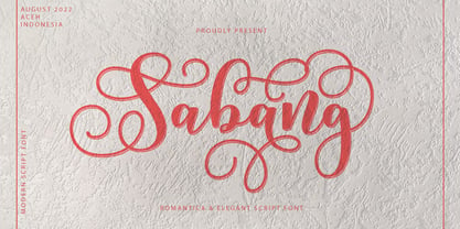 Sabang Script is a new modern script font with an irregular baseline. Trendy and feminine style. Sabang Script looks lovely on wedding invitations, thank you cards, quotes, greeting cards, logos, business cards and more. Perfect for using in ink or watercolour. Including initial and terminal letters, alternates, ligatures and multiple language support. To enable the OpenType Stylistic alternates, you need a program that supports OpenType features such as Adobe Illustrator CS, Adobe Indesign & CorelDraw X6-X7, Microsoft Word 2010 or later versions. There are additional ways to access alternates/swashes, using Character Map (Windows), Nexus Font (Windows), Font Book (Mac) or a software program such as PopChar (for Windows and Mac).
 - Bernandes by Letterday Studio,
$20.00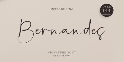 Bernandes is a new modern script font with an irregular base line. Trendy and feminine style. Bernandes looks beautiful in wedding invitations, thank you cards, quotes, greeting cards, logos, business cards, and more. Perfect for use in ink or watercolors. Includes initial and terminal letters, alternatives and support for many languages. To enable the OpenType Stylistic alternative, you need a program that supports OpenType features such as Adobe Illustrator CS, Adobe Indesign & CorelDraw X6-X7, Microsoft Word 2010 or newer versions. There are additional ways to access alternatives / swashes, using Character Maps (Windows), Nexus Fonts (Windows), Font Books (Mac) or software programs such as PopChar (for Windows and Mac).
 - Over the Sunday Slant by Josstype,
$12.00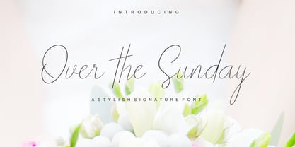 Over the Sunday Signature Font is signature style font with stunning characters, including Regular and Slant. This font is casual and pretty with swashes. Can used for various purposes. such as logo, product packaging, wedding invitations, branding, headlines, signage, labels, signature, book covers, posters, quotes and more. Over the Sunday Signature Font features OpenType stylistic alternates, ligatures and International support for most Western Languages is included. To enable the OpenType Stylistic alternates, you need a program that supports OpenType features such as Adobe Illustrator CS, Adobe Indesign & CorelDraw X6-X7, Microsoft Word 2010 or later versions.How to access all alternative characters using Adobe Illustrator:
 - FF Karbid Text by FontFont,
$58.99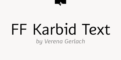 German type designer Verena Gerlach created this sans FontFont in 2011. The family has 10 weights, ranging from Light to Black (including italics) and is ideally suited for book text, editorial and publishing as well as small text. FF Karbid Text provides advanced typographical support with features such as ligatures, alternate characters, case-sensitive forms, fractions, super- and subscript characters, and stylistic alternates. It comes with a complete range of figure set options – oldstyle and lining figures, each in tabular and proportional widths. This FontFont is a member of the FF Karbid super family, which also includes FF Karbid, FF Karbid Display, and FF Karbid Slab.
 - FF Max Demi Serif by FontFont,
$62.99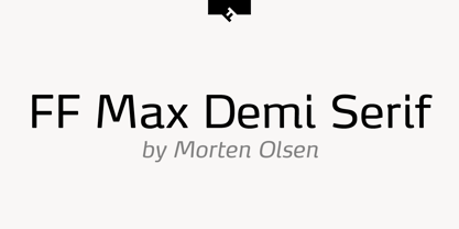 Danish type designer Morten Olsen created this serif FontFont between 2003 and 2004. The family has 14 weights, ranging from Light to Black (including italics) and is ideally suited for advertising and packaging, editorial and publishing, logo, branding and creative industries, software and gaming as well as sports. FF Max Demi Serif provides advanced typographical support with features such as ligatures, alternate characters, case-sensitive forms, fractions, super- and subscript characters, and stylistic alternates. It comes with a complete range of figure set options – oldstyle and lining figures, each in tabular and proportional widths. This FontFont is a member of the FF Max super family, which also includes FF Max.
 - Kara by Mostardesign,
$19.00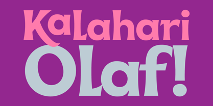 Designed in 2012 by Olivier Gourvat, this font family is inspired by the euskaran (basque language) font. Redesigned with modernism, this new font respects the traditional euskara language with lowercase addition. These nuances give Kara a traditional appearance for both text and headlines, but can be used for many more applications such as titles, decoration, posters, cartoons... Kara Text & Display support a wide range of languages, with more than 500 glyphs and OpenType features like case-sensitive forms, contextual alternatives, stylistic alternates, fractions, proportional and tabular figures. With its 2 fonts, Kara is an ideal font family for text, brand identity, signage, print and web design.
 - Clarina Sans by Asritype,
$24.00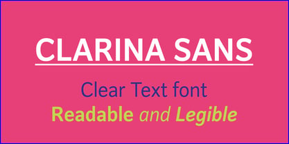 As the name, Clarina Sans is sans serif type family with two weight plus matching italics. Clarina Sans was desinged in 2018/19, influenced by geometrics typeface from handbook and newspapers in 80's during studying that have a good legibility. Clarina sans with medium to high x-heigh and geometric correction and smoothed corner has more elegant visibility, readable, and save space altogether. Its perfect for book, newspaper, web, logos, magazines, posters, and most other design. Equiped with more than 700 glyphs for eachs cut (latin plus, greek, cyrillic), ligatures, kerning, case sensitive for diacritical mark modifier, Clarina Sans has wide range languages coverage.
 - Bobotta Icons by Linotype,
$29.99German designer Roberto Mannella first sketched out the idea for Bobotta Icons during a vacation in 1999. Recently, he fleshed these sketches out into a full-fledged symbol font, which was awarded with an Honorable Mention in the 2003 International Type Design Contest, sponsored by Linotype GmbH. Bobotta Icons presents a lively, spontaneous style of drawing, guaranteed to bring a new voice to your funkiest typographic work. The characters contained in this font are a wide array of comic symbols, word shapes, and fantastical creatures. This font contains both symbols that resemble happy crocodiles, and symbols that resemble a neon sign flashing the word love."" - Validity Script by Mans Greback,
$29.00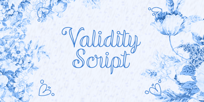 Validity Script is a cute, outlined handwriting font family. The typeface was drawn and developed by Måns Grebäck and Misti Hammers during 2019. With swirly letters and charming wilderness it is perfect for a crafty project or an invitation with a personal touch. It comes in three weights and each weight as Italic, totaling in six styles: Thin, Thin Italic, Regular, Regular Italic, Bold, Bold Italic. Each font of this family is of high-quality and contains OpenType features. The fonts have extensive ranges of glyphs; they support all Latin-based European languages, contain numbers as well as all symbols and characters you'll ever need.
 - PF Reminder Pro by Parachute,
$59.00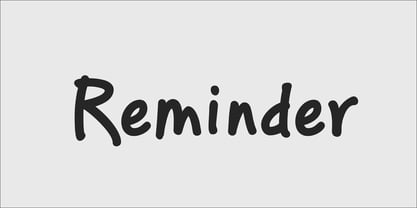 Use Reminder to add a homey and personal touch to your notes and messages. Whether it is a note to your loved ones or a colleague at the office, this is the typeface to use. But don't take our word for it. The applications of this typeface are endless. Since its first release back in 2003, we have seen it being used for anything from banking to automobiles. And now, with this "Pro" version you can communicate with a big part of this world in a way you always wanted. PF Reminder Pro comes loaded with 555 glyphs which support all European languages including Greek and Cyrillic.
 - Esttoria by Zamjump,
$17.00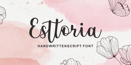 Esttoria Handwritten Script is a modern irregular baseline handwritten script font. Stylish and feminine. Esttoria looks beautiful in wedding invitations, thank you cards, quotes, greeting cards, logos, business cards, and more. Perfect for use in ink or watercolor. Includes initial and terminal letters, alternative and multiple language support. To activate the OpenType Stylistic alternative, you need a program that supports OpenType features such as Adobe Illustrator CS, Adobe Indesign & CorelDraw X6-X7, Microsoft Word 2010 or a later version. There are additional ways to alternate / swash, using the Character Map (Windows), Nexus Font (Windows), Font Book (Mac) or a software program like PopChar (for Windows and Mac).
 - Exec Corners by Wiescher Design,
$35.00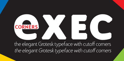 I created the »EXEC« sans font during the years 2018 to mid 2020. The »EXEC«-Corners-family is a very special, unusual design. »EXEC«-Corners has 7 weights, ranging from Thin to Bold (plus 7 italics). This exceptional font is suited for editorial, book text, advertising and packaging, logo, branding, small text as well as web and screen design. »EXEC«-Corners has advanced typographical support including ligatures, small caps, alternate characters, case-sensitive forms, fractions, super- and subscript characters. »EXEC«-Corners comes with a range of figures—oldstyle and lining figures, each in tabular and proportional widths. »EXEC«-Corners supports Basic-, Western-, and Central-European Latin-based languages including Turkish.

