10,000 search results
(0.031 seconds)
- Sutro by Parkinson,
$25.00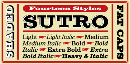 My affection for Slab Serifs began in the early 1960s in Kansas City with Rob Roy Kelly and his fabulous collection of wood type. In the 1970s tried to re-create a Nebiolo Egiziano for Roger Black. Again for Roger, in the 1980s I designed a Slab Serif logo for Newsweek Magazine. Finally, in 2003, designed the Sutro Family. There were things I didn't like about it, so when I did Version 2 for Open Type, I changed it around a little, making it a much nicer Sutro.
 - Kyiv by Apostrof,
$40.00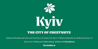 The font Kyiv is an attempt to unite old-style antiqua with the Ukrainian tradition and modern requirements. Besides having usual italics the Renaissance tradition of "semi-italics" renewed, compact weights are also provided. Special charm is added by decorative motives of chestnut leaves and flowers. The weights are included in a way to promote the solution of various tasks both text, and an accidental set in various combinations. The font Kyiv was awarded the 2nd prize in category of text fonts in the first Ukrainian typeface competition Ruthenia in 2010.
 - Fisionada by Graviton,
$24.00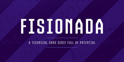 Fisionada font family has been designed for Graviton Font Foundry by Pablo Balcells in 2023. It is a condensed sans serif typeface with sharp edges and a very technical aesthetics. Its condensed design makes it very effective for space economizing and its geometric features make it a very attractive choice for display usages such as futuristics logos, video games and sci-fi content. It has been conceived to be most suitable for headlines and short length text blocks. Fisionada consists of 8 styles. Each containing small caps and glyph coverage for several languages.
 - Calita by Gatype,
$14.00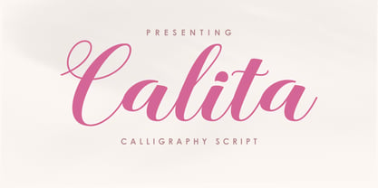 Calita Calligraphy Modern thick and firm style that you can get now! With character replacement styles updated with special glyphs that have been given a combination of fantasy and handwritten ink. This font will look beautiful on all designs, New Year designs, Weddings, branding materials, blog titles, quotes and invitations, and business cards. Open Type includes: Alternative Style Set style Swash To enable the OpenType Stylistic alternative, you need a program that supports OpenType features such as Adobe Illustrator CS, Adobe Indesign & CorelDraw X6-X7, and Microsoft Word 2010, or later.
 - Ghost Writer by Gian Studio,
$10.00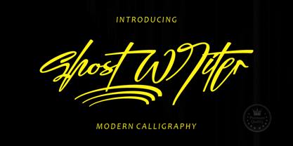 purt number The Ghost Writer font is a dynamic handcrafted font that also features beautiful open type. great for Branding, Logo Design, Fonts, Logotype, Apparel, Posters, magazines and other design projects. Ghost Writer features OpenType style alternatives, ligatures, and International support for most Western Languages included. To enable the OpenType Stylistic alternative, you need a program that supports OpenType features such as Adobe Illustrator CS, Adobe Indesign & CorelDraw X6-X7, Microsoft Word 2010 or a later version. How to access all alternative characters using Adobe Illustrator: Designer: Afri Giani Publisher: Gian Studio Happy Designing!
 - Savant by Characters Font Foundry,
$25.00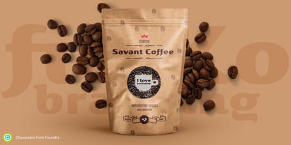 I proudly present Savant, a friendly headline typeface with an attitude. It’s got a slab serif touch and is packed with lots of nice typo-gems. The italic is a perfect companion for the regular. But beside that, it's powerful enough to stand its own ground. Savant is a good mixture of the playful and the classic. You can use it for fashion, food, magazines, packaging, corporate design- and other projects with an attitude. So show me what you’ve got! Savant Regular only is completely free in 2012, so download your free copy today!
 - HGB Bluesband One by HGB fonts,
$23.00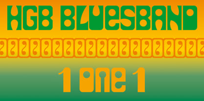 The roots of this font go back to 1967. A book title in trendy letters was created in a completely ingenuous way as a film prop for a Super 8 fun film. I drew the letters with felt-tip pen and poster paint without thinking too much about it. It wasn't until a good 50 years later that I realized, this was a first awkward typeface draft. The flower power vibe was captured here subconsciously. In 2019 I completed the few glyphs and created variants that I would not have thought of at the time.
 - Dark Blades Steel by Tadiar,
$19.00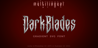 !!! Please note that the font works in Photoshop CC2017 and higher and in Illustrator CC 2018 and higher only. !!! DarkBlades Steel is an unique vintage color gradient vector SVG font you may use in your projects just typing a text in Illustrator or Photoshop. DarkBlades Steel is derivative from DarkBlades Font Family: https://www.myfonts.com/collections/dark-blades-font-tadiar Designed for: - Vintage branding (Clothes, Alcohol, Bikes, Games) - Horror - Music branding - Myth: Vampires, Zombie, Halloween, Werevolves, Magic, Fantasy - Medieval style Well use in vintage labels, headers & titles, Posters, Street Signs and other Outdoor, Package Design.
 - Dodo by Indian Summer Studio,
$49.00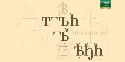 Modern antiqua (Victorian, Scotch Roman) «Dodo», 2008–2019. Named so as a portmanteau of Bodoni – Didot. XIX-th century fonts, especially Victorian antiquas, were almost excluded from the modern use by their XX-th century's descendants. And these new books had lost too much of their former beauty, elegance. Their old noble spirit. This project, «Dodo» was started in 2008 year as the first then modern revival for the Old Imperial Russian book scotch antiqua, used 120–170 years ago in almost every printed book. Still keeping the spirit of the Steam æra.
 - Filson Pro by Mostardesign,
$26.00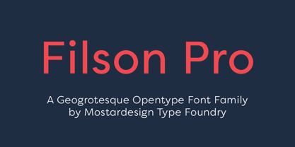 Designed by Olivier Gourvat in 2014, Filson Pro is a new geometric sans serif family with versatility in mind. With its 575 glyphs and its round aspect, this typeface covers all kind of graphic and web design projects. This font family contains 16 fonts from Thin to Black with a professional range of Opentype functions such as pro kerning,lining and oldstyle figures, stylistic alternates, case sensitive forms, localized forms and f-ligatures. For better typographic control, Filson Pro also includes Opentype class kerning with thousands of kerning pairs.
 - 36 Dope by Power Type,
$-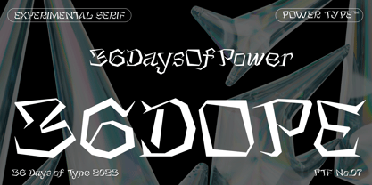 36Dope is a display typeface with an experimental serif design. It draws from the event ’36DaysOfType’ held in 2023. Created as part of the ’36DaysOfPower’ theme, this font showcases unique and unconventional serifs, reflecting the creative and powerful spirit of the event. With its bold and experimental look, 36dope is well-suited for attention-grabbing headlines, titles, or graphic design projects that aim to convey a sense of strength and artistic innovation. This font is intended for eye-catching headlines, titles, or other graphic design projects that require a bold and experimental look.
 - Banret by Ryzhychenko Olga,
$12.00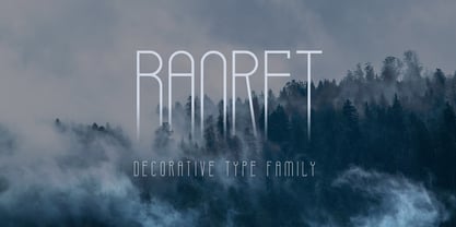 Banret is built using simple geometric shapes. It is mostly the result of my experiments on the other font I made earlier in 2016, called Inventor. Font is inspired by old fonts of the beginning of the 20th century. Capital letters are built with one to four proportions. The font has four weights: normal, and bold, and two alternatives: ribbon, and flag. As far as it is a decorative font, it is not designed for large amounts of text. But it is perfect for creating branding elements, logos, slogans and posters.
 - Overloaded by PizzaDude.dk,
$19.00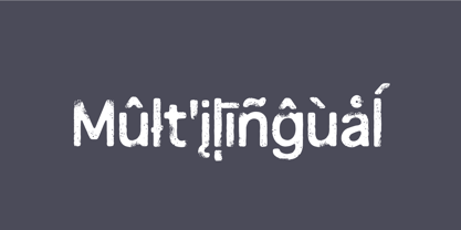 Overloaded is an excellent font for a wide variety of use - most likely something that needs a kind of worn look. Works well in both large and small sizes, that being headlines and/or display. Surprisingly versatile and will fit tons of different purposes. I put in 3 different versions of the lowercase letters for you to pick as you please, and play around with. Comes with multilingual support
 - Muggy Feet by PizzaDude.dk,
$17.00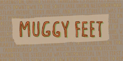 Muggy Feet is my handpainted and layered font. Mix the five different layers for realistic looking results. What makes it even more realistic is that the font uses "contextual alternates", which means that every letter of Muggy Feet has 5 different versions. Also, try to play around with the transparency of each layer of Muggy Feet. Muggy Feet is ready for your invitation, poster, book cover, packaging or signs.
 - Triz by Typeóca,
$30.00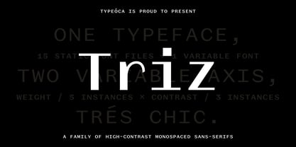 Triz is a high-contrast monospaced sans-serif, bringing together a typewriter rhythm and a fashion magazine look. With 5 different weights and 3 different contrast variations, Triz shines on both footnotes and headlines. With more than 1.000 glyphs, the Triz has an extensive language support and a lot of features, like its distinctive 'thin' alternates for diacritics, symbols and punctuation, small caps, arrows, manicules and much more.
 - KD Hachure by Kassymkulov Design,
$9.95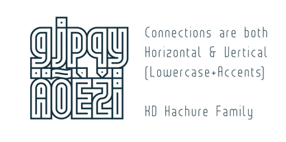 KD Hachure is a display, geometric font with layering possibilities. Combine the two layers to achieve different color combinations or use them separately to achieve a completely different look. Kerning is optimized so that all latin letters are connected. With the default leading 120%, descenders connect with the top of accents. Set the leading to 100% manually if you want to connect descenders with the top of uppercase or ascender letters.
 - Farm Girl by Open Window,
$19.95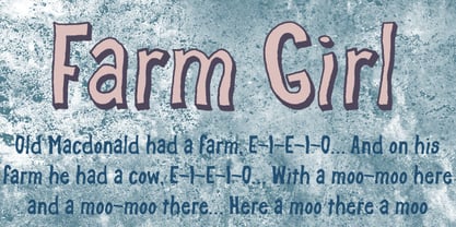 From the lab of Open Window comes Farm Girl. Farm Girl was inspired by old Art Nouveau posters from Toulouse Lautrec and others. Farm Girl utilizes the same 'loosey-goosey' quality as those posters. Farm Girl consists of 3 different styles which are designed to be used in combination with each other. Many different variations are possible. It's fresh cut and contemporary. It's ideal use is as a display font.
 - Tangram by Présence Typo,
$51.00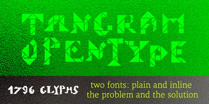 Tangram is the famous Chinese puzzle, perhaps one of the oldest games in the world. It consists of seven pieces called Tans obtained from a square cut up in a certain way. These seven Tans (5 different-sized triangles, a square and a parallelogram) have to be used to form the figures. The Tangram collection represents 1772 different shapes spread in 15 fonts. Each font exists in 2 styles: plain & inline.
 - 1871 Dreamer 2 Pro by GLC,
$42.00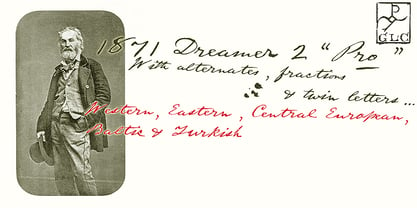 Like our first "1871 Dreamer Script" this script font was inspired from a lot of manuscripts, notes and drafts, written by the famous american poet Walt Whitman. However, it is a very different font, with a higher x-line, numerous different ligatures, alternates and twin letters, including fractions, and, as a real "Pro" font, usable not only for Western European, but also for Eastern and Central European, Baltic and Turkish.
 - I am online with u by Pisto Casero,
$19.00 The "Line" style of "I am online with u" font family was inspired by the idea of the digital connection of two people living in different parts of the world. Later on this idea was expanded, including different styles such as "Dashed" or "Dotted", which built the font family taking the initial idea to another level and keeping the connectivity concept alive. This typeface works best when used in big sizes.
 - Queen Elena by Beary,
$8.00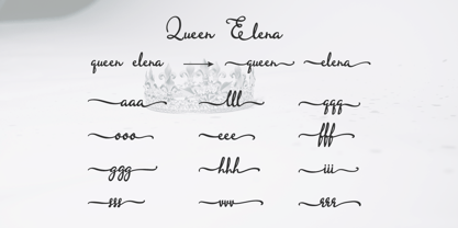 Introducing the elegant new Queen Elena Font! For those of you who are needing a touch of elegance and modernity for your designs, this font was created for you! Queel Elena has the added bonus of having 'multiple personalities'! It has 2 sets of extra alternate lowercase letters, which allow you to create different feels for different projects. Features: - Uppercase Lowercase - Number & Symbol - Alternates for each characters - Multilingual Happy Creating!
 - Graphen by Picador,
$24.00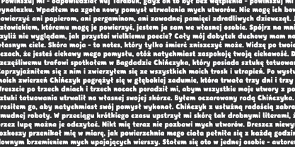 Graphen family is a hand drawn typeface with 5 different weights. This font contains script that replaces glyphs with their alternates. It is based on checking the same glyphs in close range - not on a random appearance. Every weight was designed with attention to detail, so it can be used in small sizes and even on big posters. Weights include different features, such as dingbats or old style figures.
 - Logx 20 by Fontsphere,
$12.00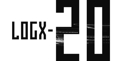 LOGX-20 is a geometric, all-caps display typeface. This is the brother of the LOGX-10 font. It obviously refers to the previous one, but considering the construction it is a different typeface. LOGX-20 is designed to create elements of visual identification, various creative projects and outstanding graphics. It looks great in arrangements with different text sizes, headers, sentences and longer texts. Both on websites, print or applications.
 - Sign Production JNL by Jeff Levine,
$29.00Sign Production JNL somewhat resembles Sign Kit JNL but there are some noticeable differences. The letters and numbers in Sign Production JNL are bolder, wider and have some slightly different character shapes. The common theme is that both fonts were designed from die-cut letters and numbers found in the Webway Sign Cabinet, manufactured by the Holes-Webway Company of St. Cloud, Minnesota until its demise in the 1980s. - Fontenay Fancy - Personal use only

- VTC-Bad Tattoo Hand One - Personal use only

- Sports World - Unknown license

- Designosaur - 100% free

- Web Serveroff - 100% free

- Sigmund Freud Typeface by Harald Geisler,
$29.00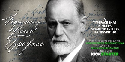 “For those who regret what keyboards and touch screens have done to their penmanship, typographer Harald Geisler has an answer: Sigmund Freud.” — The Wall Street Journal Sigmund Freud was a neurologist who lived from 1856 to 1939. His research and studies led to the foundation of ‘Psychoanalysis’. When I first saw Freud’s century old letters, I was fascinated by the beauty of these historic manuscripts. It made me smile to imagine a person writing his or her shrink a letter set in Freud’s handwriting. I started to plan creating a font based on his manuscripts. I contacted the Sigmund Freud Museum Vienna and Freud Museum London. To start the creation I selected eight handwritten documents from the archive in Vienna – This selection of specimen was my orientation during the design process. The Samples were created between 1883 to 1938 and are of various character such as handwritten scientific papers, personal letters, notes and a telegram. A successful Kickstarter Campaign "The Sigmund Freud Typeface - A Letter to your Shrink" with over 1400 Backers enabled me to visit the archive in Vienna and study the original manuscripts of Sigmund Freud. After a year of preparation and design work, I finished four alphabets based on Freud’s handwriting. What are the different Versions PRO, Kurrent, #1, #2, #3 and #4 about? “This project gives people the convenience afforded by the computer while maintaining the romantic nostalgia, beauty, and character of letter writing with real handwriting.” — Daniel Vahab, The Huffington Post When you write with your hand, every letter looks a little different. When you write a text on your computer every letter looks exactly the same. In order to make type look like handwriting, I chose four different variations of each letter from Freud’s manuscripts, drew and stored them in the font. The font is then programmed to exchange letters while you are typing. This makes the rendered result on your screen or print look like unique handwriting. PRO While you are typing… the PRO Version actively combines all four alphabets and exchanges them automatically. Through this mechanism never the same two o’s will stand next to each other. With every touch a unique look is generated. This works in certain applications i.e. Word 2010(or newer), Pages, TextEdit, Editor(Pre-installed on Windows 7 or newer), InDesign, Illustrator… →Here you can see an animation of what this effect looks like in action. (Please Note: some applications like LibreOffice, OpenOffice do currently not support this feature. Date: December 2013) #1 #2 #3 and #4 The Sigmund Freud Typeface #1, #2, #3 and #4 each hold one individual lowercase alphabet based on Freud’s handwriting. Kurrent Most of Freud’s correspondence was written in German. Until the 1950′s a different handwriting was taught throughout German speaking countries (Switzerland, Austria, Germany). This style is called Kurrent. The name Kurrent and Cursive derive from the Latin word currere - to run, hurry - both styles were designed to write fast. As you can see in the samples above, Freud practiced both Kurrent and when writing english Cursive (Latin script or Joined-up). Kurrent has three significantly different letters (s,h,e). Use Kurrent to render the authentic look of an historic Sigmund Freud letter in German. Bundle On the Top of this page you can get all six fonts of the Sigmund Freud Typeface Family in a bundle. International Typeface All styles of the Sigmund Freud Typeface feature a wide range of accented letters so you can write to all your friends in Sweden (Bjørn) France (Chloé & Zoë), Ireland (Dáirine), Poland (Łucja), Germany (Jörg) and almost everywhere around the globe (Find a complete list in the tech specs). Usage recommendations I hope that this design will be valuable to you and most of all that you have fun with this typeface! 1. Point Size — To reproduce the size of Sigmund Freud’s handwriting adjust the type size between 18-24 point in your word processor. If you are using an imaging software like Photoshop set the resolution to 300dpi and adjust the point size between 18-24. 2. Line Spacing — Narrow the line hight until swashes of capital letters touch the baseline above. This also happens when you write a letter and gives the document a unique handwritten look. 3. Right Aligned — Freud had the habit to write towards the right edge of the page and start loosely on the left. Set your text alignment to ‘right’ to incorporate this dramatic expression also to your documents. What do other People say about the Sigmund Freud Typeface? “Wouldn’t you love to write a letter to your shrink using the Sigmund Freud typeface?” — Dorothy Tan, Design TAXI ''“JUST DON’T WRITE A LETTER TO YOUR MOTHER WITH IT… …until the reader looks a bit closer, and they see 70+ years of modern science weighing in on turn-of-the-century pop psychology."'' — Mark Willson, Fast Company “Doctor, what does it mean if you dream of creating a font of Freud’s handwriting?” — Ayun Halliday, Open Culture “…geekily romantic, at once artistic and scientific” — Edie Jarolim, Freud’s Butcher “…sympathisch” — Jürgen Siebert, Fontblog !WOW! Thank you for reading the complete font description! You are awesome! If you still have a question please contact me through MyFonts or my website haraldgeisler.com. Credits This project was made possible by the help of 1481 Backers on Kickstarter and the kind support of the Sigmund Freud Museum Vienna and the Freud Museum London. Thank you. All of Freud’s Manuscripts shown are © Sigmund Freud Museum Vienna. Poster Image: IN17 - Sigmund Freud, Germany 1932. © Freud Museum London. Flag Image: IN19 - Sigmund Freud 1930’s. © Freud Museum London.
 - Lust Text by Positype,
$29.00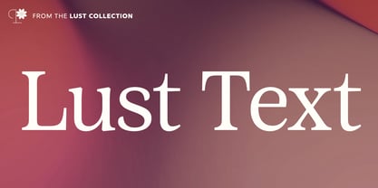 Yes, finally. This one took the most time and the most restarting. Years went into imagining what Lust Text should look like and how it should structurally behave in order to truly improve upon a setting that includes any of the Lust typefaces. I approached it as much from the side of the type designer, as I did a potential user. The flow, the warmth, the personality needed to be there, but all of the excess had to be removed responsibly. In the process, and in need of inspiration, I looked backward to historical artifacts and precedent. In each early Lust Text approach, the solution was lackluster and/or vanilla and not actually a ‘Lust’ typeface. The exercise was not in vain though. By exploring past examples, I found my footing drawing for media now and how it might be used later—all the while, producing seamless, elegant curves and restrained indulgence (that sounds almost silly to say, but I like it). The Lust Collection is the culmination of 5 years of exploration and development, and I am very excited to share it with everyone. When the original Lust was first conceived in 2010 and released a year and half later, I had planned for a Script and a Sans to accompany it. The Script was released about a year later, but I paused the Sans. The primary reason was the amount of feedback and requests I was receiving for alternate versions, expansions, and ‘hey, have you considered making?’ and so on. I listen to my customers and what they are needing… and besides, I was stalling with the Sans. Like Optima and other earlier high-contrast sans, they are difficult to deliver responsibly without suffering from ill-conceived excess or timidity. The new Lust Collection aggregates all of that past customer feedback and distills it into 6 separate families, each adhering to the original Lust precept of exercises in indulgence and each based in large part on the original 2010 exemplars produced for Lust. I just hate that it took so long to deliver, but better right, than rushed, I imagine.
 - Golden Dance by Twinletter,
$12.00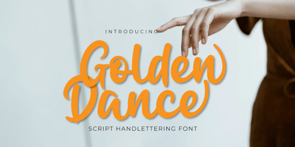 Our newest Font, Golden Dance This font offers beautiful abstract typographic harmony for a wide variety of design projects, including natural handwriting in digital form for designs, quote designs, social media business designs, advertisements, trademarks, promotional banners, posts, posters, signatures, and all. the design requires handwriting or whatever design you want. This font is equipped with uppercase, lowercase, numbers, punctuation marks, swhases, and several variations on each character including multi-language. What’s Included : Standard glyphs Ligature Works on PC & Mac Simple installations Accessible in Adobe Illustrator, Adobe Photoshop, Adobe InDesign, even work on Microsoft Word. PUA Encoded Characters – Fully accessible without additional design software. Fonts include multilingual support for; Afrikaans, Albanian, Croatian, Czech, Danish, Dutch, English, Estonian, Finnish, French, German, Hungarian, Italian, Norwegian, Polish, Portuguese, Slovak, Slovenian, Spanish, Swedish
 - Rhelax by Twinletter,
$18.00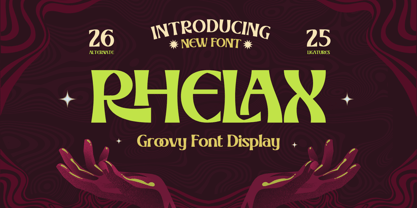 Rhelax is a luxurious font with a modern look and feel. It has a subtle and elegant style that adds a touch of class to your designs. A wide selection of alternate ligatures and fonts means you can use these to create a custom style for your project that creates a beautiful and unique look. This font offers a unique touch to each letter, making it ideal for a wide variety of projects where you want to stand out from the crowd! What’s Included : Standard glyphs Iso Latin 1 Simple installations We highly recommend using a program that supports OpenType features and Glyphs panels like many Adobe apps and Corel Draw, so you can see and access all Glyph variations. PUA Encoded Characters – Fully accessible without additional design software. Fonts include Multilingual support
 - Shakehand Brothers by Arterfak Project,
$24.00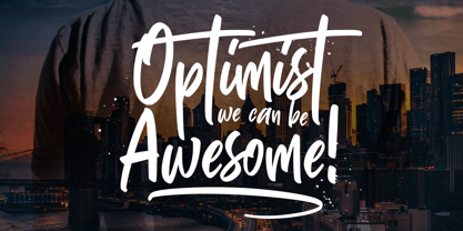 Introducing "Shakehand Brothers"! A playful handwritten font. Created with so much fun and solid brush. This font offers a super cool typographic design for your project because the letterform is so natural, and unique. Shakehand Brothers font is so handy to use with lots of alternate characters that you can mix and match to get a perfect combination. Also with swashes, multilingual support, and custom ligatures that will surprise you while typing the letters. Suitable for many project needs and many themes, you can use for quotes, headlines, titles, motion graphics, posters, flyers, decals, apparel, and more! Here's what you'll get : Uppercase Lowercase Numbers Punctuation Stylistic alternates Stylistic set Ligatures Accented characters Swashes PUA Encoded This font is can't wait to have fun with you. So, happy designing!
 - The Penyet by Twinletter,
$12.00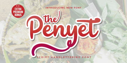 This font is created with original hand drawn strokes for a relaxed, beautiful and elegant impression. This font also offers beautiful abstract typographic harmony for a wide variety of design projects, including natural handwriting in digital form for designs, quote designs, for social media business designs, advertisements, trademarks, promotional banners, posts, posters, signatures, and all designs require handwriting or whatever design you want. This font is equipped with uppercase, lowercase, numbers, punctuation marks, swhases and several variations on each character including multi-language. This font is best suited for open type friendly applications. How to get alternative glyphs from open type fonts: http://adobe.ly/1m1fn4Y PUA Character Code - Fully accessible without additional design software. We hope you enjoy this font. Feel free to send whatever message you want to convey.
 - Swingset by Twinletter,
$12.00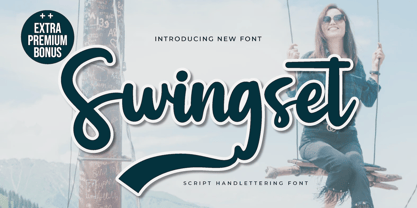 This font is created with original hand drawn strokes for a relaxed, beautiful and elegant impression. This font also offers beautiful abstract typographic harmony for a wide variety of design projects, including natural handwriting in digital form for designs, quote designs, for social media business designs, advertisements, trademarks, promotional banners, posts, posters, signatures, and all designs require handwriting or whatever design you want. This font is equipped with uppercase, lowercase, numbers, punctuation marks, swhases and several variations on each character including multi-language. This font is best suited for open type friendly applications. How to get alternative glyphs from open type fonts: http://adobe.ly/1m1fn4Y PUA Character Code - Fully accessible without additional design software. We hope you enjoy this font.Feel free to send whatever message you want to convey.Thank you Regards
 - Meuga by Ferry Ardana Putra,
$19.00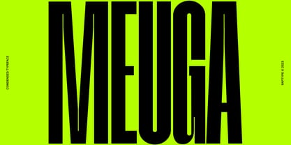 Introducing our sleek and modern condensed sans-serif font - Meuga. Meuga is condensed sans-serif font offers a minimalist design with its narrow width and clean lines, perfect for any branding or design project. This condensed sans-serif font is perfect for anyone looking for a clean and modern look, with its narrow width and elegant lines. Add a contemporary touch to your designs with our condensed sans-serif font, perfect for headlines and titles in digital and print design. This font is perfect for Headlines and titles, digital advertisements, brochures and flyers, infographics and data visualizations, navigation menus and labels, web designs, logotypes, t-shirts, and many more. Meuga features: A full set of uppercase Numbers and punctuation Multilingual language support PUA Encoded Characters OpenType Features Condensed Style +235 Total Glyphs
 - Alt Juk01 by ALT,
$30.00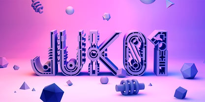 Yet another experimental typeface. I love trying different things I’m very happy with the results here. See the whole presentation here: Behance,net
 - Accord by Soneri Type,
$39.00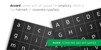 The main difference between Accord Alternate and Accord is in the way curved strokes join with vertical stems in letters such as "bpn".
 - Mango Gothic by BA Graphics,
$45.00A new high contrast gothic; works great for many different applications. This font will add a nice elegant touch to all your designs.


