10,000 search results
(0.032 seconds)
- Spaza by Scholtz Fonts,
$15.00In parts of Africa, in the poorer, rural and peri-urban areas there are many small shops or convenience stores which are called "Spaza" shops. The owners of these shops often don't have access to commercial signwriting and write their signs themselves. The font "Spaza" is based on these hand-lettered signs. This lettering has a refreshing simplicity and spontaneity, yet retains great legibility. In the font "Spaza", there are three styles: - Spaza Regular - with normal upper and lower case; - Spaza Small Caps - in which the lower case is a true "small caps" and not a shrunken version of the upper case (generated by the operating system); - Spaza Double Caps - in which the lower case characters have been replaced by an alternate set of capital letters. The font thus contains two sets of differing upper case characters. You can use characters from both these sets to give a true feeling of randomness because if the same character occurs twice in a word, different versions of the character can be used. Spaza can be used with great effect in a great variety of applications such as advertisements, flyers, posters and in magazine pages. Spaza contains a full character set and has been carefully spaced and kerned. - Wayfinding Sans Symbols by FDI,
$29.00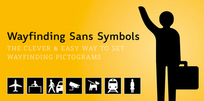 Placing pictograms as single vector images makes designing signage a time-consuming task. But with Wayfinding Sans Symbols and its built-in OpenType intelligence using pictograms becomes as easy as typing words. With Wayfinding Sans Symbols you don’t need to scroll through endless glyph palettes to look for one symbol among hundreds of symbols. Just active ligatures and type in the mnemonic codes like #wheelchair, #parking, #toilet and so on. An overview of these codes can be found in the type specimen PDF. Each pictogram is available in 4 different versions and you can easily assign an additional background color or turn the symbol into a prohibition sign. Wayfinding Sans Symbols has a full coverage of the Unicode range “Transport & Map symbols” and a lot of additional signs that are missing in the typical wayfinding symbol sets. Beside the pictograms, Wayfinding Sans Symbols also has a huge set of arrows for every possible situation and you can easily switch between the different sets using OpenType feature controls. The enclosed letters and figures make it easy to set transport line numbers, room & storey numbers and much more. Wayfinding Sans Symbols is the perfect addition to Ralf Herrmann’s signage typeface Wayfinding Sans Pro, but it can also be used with any other typeface.
 - Preto Serif by DizajnDesign,
$24.00 Preto is an extensive type family, which explores the function of serifs on readability and legibility. Preto consist of three subfamilies: Sans, Semi and Serif. Preto is designed for multilingual typesetting. All of the subfamilies have equal gray value but different texture which can be use to differentiate languages. Preto sub-families have two text weights and two bold styles (Regular -> Bold, Medium -> Black). Every weight has a companion Italic style as well. The serif version has been designed to work best at small point sizes (around 8, 9 points). You will not achieve calm, boring or invisible look of your text with Preto Serif. Its long, spiky and sharp serifs contribute to give the typeface a distinct and energetic character. It is very suitable for magazines, corporate identity, brochures or other print materials where a typeface for continuous reading is required. The ligatures in Preto Serif are very special. You can set them in different tracking values and spacing will increase/decrease consistently in the ligatures as well. Alternative characters in the font files allow you to change the feeling of the text from typical to more special (J, Q, g , &). Each font contains a full set of small caps and many alternative characters for complex typesetting.
 - Epica Pro by Sudtipos,
$49.00 Epica is a contemporary interpretation of the Venetian Renaissance types. A humanist type family with a contemporary design. This family encompasses different typographic scenarios with emphasis in style and functional equilibrium. Its letterforms show the visual richness of Epica that includes some calligraphic reminiscences perfectly legible in small and display sizes. Its strong personality makes it distinguish, because it perfectly combines the elegance of antique typographies and the forcefulness of contemporary ones. This family has been designed in two different moments. Epica Serif, which have a more classical design, was finished 5 years ago in its first version. The first sketches were drew 8 years ago during the Master of Type Design at the University of Buenos Aires. Through the years was re design in several times to the point of reaching its current version. On the other hand, Epica Sans was completed in 2020 and is the counterpart of Epica Serif. A complementary system designed to enrich the serif version and give new options for hierarchy and composition. This is a versatile type family perfectly fit for books, editorial, and usage in print and on screens. It possesses great legibility in body texts, which makes it ideal for extended reading and supports a variety of languages.
 - Mr Orange by Hipopotam Studio,
$28.00 Mr Orange is a typeface based on our handwritten letters which we used in some of our books H.O.U.S.E, D.E.S.I.G.N and Who Eats Whom. It has up to three alternate glyphs for each character, even for every diacritic letter. We do use our fonts in our books so we know that switching alternate glyphs can be a pain in the ass. Thats why we’ve created a very cool Contextual Alternates feature. It automatically sets alternate glyphs depending on frequency of appearance of the same character. The script doesn’t throw random glyphs. It’s checks if lets say letter “A” appears more then once in a sequence of characters. For example in the word “ANAKONDA”, the third “A” and the second “N” would be changed to glyphs from first stylistic set, the second “A” would also be changed but to glyph from second stylistic set. We’ve designed different rules for basic characters and different for diacritics and punctation. It really works great but of course you can always fine tune it by hand. This option has one obvious advantage for web fonts. Browsers that support OpenType calt feature will be able to display alternate characters. And since you can’t put by hand alternate glyphs on your website this is the only way to use them.
 - Phiz by Shinntype,
$29.00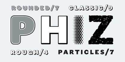 Phiz is a diverse suite of 28 decorative fonts based on Figgins Sans Extra Bold. Classic (10 fonts), Rounded (7 fonts), Rough (4 fonts) and Particles (7 fonts). The Rough and Particles styles emerge as a unique niche—neither imitating distressed printing (e.g. the “rusty” look), nor casual, hand-drawn styles. These type designs are conceived and executed as complex algorithmically-generated graphic procedures, in which repetitive elements have been artfully applied to the Sans capitals, and manually nuanced. As such they also differ substantially from textured glyph shapes that have been cut out from larger pattern fields, for the constituent particles are disposed in relation to the specific shape of each character they define. The caps-with-small-caps format was chosen for two reasons. Firstly, titling display usage is predominantly capitals, and secondly, rather like optical scaling, having the same resolution of texture available in two different “sizes” (upper and lower case) should prove useful in the hierarchy of page layout—not primarily for setting upper and lower case text as caps-with-small-capitals, although this is of course an option. All figures and major symbols (punctuation and currency) are provided in both cap and small cap height.
 - Lopsickles by Ingrimayne Type,
$7.00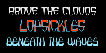 Lopsickles is a family in which the letters are based on lopsided, distorted ellipses. The family has four sets of letters that are combined in six different ways, yielding six fonts. Four of these fonts (styles AB, Ad, Bc, and cd) use the OpenType feature Contextual Alternatives (calt) to alternate letter sets so that top-heavy characters alternate with bottom-heavy characters. The spacing in these fonts is designed for alternating characters and will result in overlap if the characters do not alternate. The other two styles (Ac and Bd) are spaced normally. Style Ac contains the two character sets that are top heavy and style Bd has the two character sets that are bottom heavy. The Ac and Bd fonts have italics and backslanted styles that may be useful to suggest speed. Each of these ten fonts has an inset style designed to be used in a layer above the base font. This layering can be used to give the effect of hollow letters or to add a colored interior. Lopsickles joins several other alternating-characters families in the IngrimayneType library including Snuggels, CloseTogether, and Caltic, but is visually very different from them. It is a strange, unusual family that will get noticed.
 - Wolby by LetterMaker,
$16.00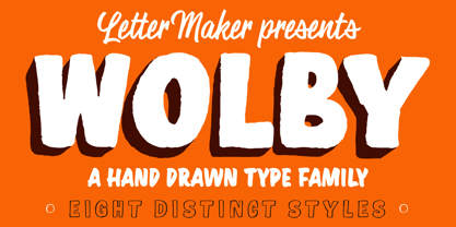 Wolby is a rough and organic hand drawn typefamily which draws inspiration from a variety of sources such as sign painting, hand lettering, comic books, cartoons, health food, sticks and stones to name a few. The letter shapes were all originally created by writing with a pointed brush. The use of one writing tool results in an aesthetical harmony between the very different styles making them all fit together. The family consists of eight styles; upright and slanted caps in regular and bold, a layered block style in fill, outline and shadow styles and a lively script. Wolby is capapble of creating very different moods depending on which style you choose to highlight. Because of it’s aesthetics, range of styles and extensive language support, Wolby is especially suitable for use in advertising, packaging design and gritty branding & fashion design. When using the layered block styles you’ll get the best result by placing the shadow layer on the bottom, the fill in the middle and the outline layer on top. These can also be combined freely so you can use just shadow + fill, shadow + outline or fill + outline. The script style is armed with a set of ligatures and swash capitals which allow you to supercharge your designs.
 - Nasser by Eyad Al-Samman,
$3.00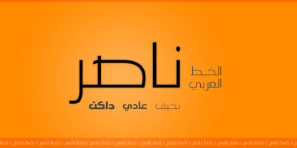 “Nasser” is a Kufic modern Arabic typeface. It is suitable for books' covers, advertisement light boards, and titles in magazines and newspapers. It is very distinctive when used in black and white printout. It decorates colored pages and makes artworks more attractive. This font comes in three different weights. My father’s name is “Nasser”. Consequently, “Nasser” Typeface was designed for eternizing the memory of my late father. He was the person who taught me how to like arts, literature, and languages. Besides, my first cute child is named also “Nasser.” The main characteristic of “Nasser” Typeface is in its modern non-descender style for some of its Arabic characters such as “Sad”, “Seen”, “Sheen”, “Qaf” and others. The shape of the characters' “dot”, “dots”, and “point” is innovative; a triangle with a semi-circle shape. “Nasser” Typeface is suitable for books' covers, advertisement light boards, and titles in magazines and newspapers. Its characters' modern Kufic styles give the typeface more distinction when it is used also in posters, greeting cards, covers, exhibitions' signboards and external or internal walls of malls or metro’s exits and entrances. It can also be used in titles for Arabic news and advertisements appeared in different Arabic and foreign satellite channels.
 - World Pressure by Haksen,
$14.00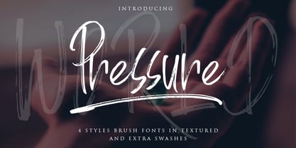 Introducing: World Pressure A rustic, dapper handwritten font with a personal charm. With quick dry strokes and a signature style, World Pressure is perfect for branding projects, homeware designs, product packaging - or simply as a stylish text overlay to any background image. World Pressure includes 4 font styles and additional swashes: World Pressure Regular handwritten script font containing upper & lowercase characters, numerals and a large range of punctuation. World Pressure Alternate This is a second version of World Pressure, with a completely new set of both lower and uppercase characters. If you wanted to avoid letters looking the same each time to recreate a custom-made style, or try a different word shape, simply switch to this font for an additional layout option. World Pressure Slant This is a third version of World Pressure, with a completely new set of both lower and uppercase characters in slant version. If you wanted to avoid letters looking the same each time to recreate a custom-made style, or try a different word shape, simply switch to this font for an additional layout option. World Pressure Alternate This is a forth version of World Pressure, with a completely new set of both lower and uppercase characters in slant version. If you wanted to avoid letters looking the same each time to recreate a custom-made style, or try a different word shape, simply switch to this font for an additional layout option. World Pressure Swashes A set of 26 hand-drawn swashes, the perfect finishing touch to underline your Northwell text. Simply install this as a separate font, select it from your font menu and type any A-Z Uppercase and Lowercase also Number 0-9 character to create a swash. Fonts are provided in OTF formats. Fonts include multilingual support. Ligatures are also available for several lowercase characters (double-letters which flow more naturally). These are only accessible via software with opentype capability or a glyphs panel, e.g. Photoshop/Illustrator.
 - Anglecia Pro by Mint Type,
$-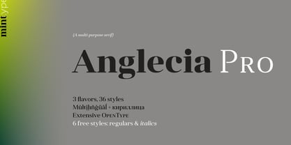 Anglecia Pro is an exquisite and versatile system of three transitional serif typefaces designed to work together in editorial design. Sharing the same skeleton, vertical axis, and trapezoidal uncurved serifs, each of these faces bears different key dimensions and different contrast typical for three different type epochs. Anglecia Pro Text is a typeface designed for general typesetting in average reading sizes. Although it features a vertical axis, its soft skeleton, relatively small x-height and prominent ascenders and descenders give the typesetting a traditional warm texture with a slight contemporary touch. Anglecia Pro Title incorporates proportions of familiar transitional serif typefaces but exposes higher-than-average vertical contrast which makes it useful for setting captions, pull quotes or general purpose text in sizes of 12 pt and above. Anglecia Pro Display, still having non-rectangular serifs and the same soft skeleton as the rest of Anglecia Pro system, features extreme contrast, much thinner serifs and exaggerated ball terminals typical for Didone modern serif families. Its large x-height and tighter letter spacing suggests larger text sizes e.g. in decorative headlines, extra large pull quotes or logos. Altogether these three typefaces form 36 styles – each supporting numerous Latin-based languages as well as major Cyrillic languages. In roman styles the Cyrillic script comes in two flavours accessible via OpenType alternates – to choose either more traditional and curvy (default) or more formal and rigid type texture. In italics this feature affects uppercase and small caps. Also, each style is packed with OpenType features: ligatures, small caps, six sets of digits, superiors and inferiors, fractions, ordinals, and respective punctuation varieties including all-cap punctuation. There are also language-specific alternates for Polish kreska, Romanian Ș/ș, Catalan punt volat, and correct small-cap versions for Turkish/Azerbaijani i/ı. Some of the styles of Anglecia Pro can be found in Mint Type Editorial Bundle together with other fonts which make some great pairs. Check it out!
 - Smallstep Pro by Evolutionfonts,
$-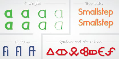 Smallstep - One geometric sans serif with a free spirit. If we presume that geometric typefaces play with the idea of what typography would look like in the future when all unnecessary elements would disappear, than most of their designers seem to envision the future in a rather metropolisque kind of way. We love geometric faces, but the cold and heartless feelings that most of them leave is just not our cup of tea. That is why we are happy to bring some optimism in that genre with our new typeface. We called it Smallstep. Smallstep is a typeface that follows the traditions of classic geometric sans serifs like “Futura”, but is at the same time friendly and whimsical. We took the liberty to deviate from the standard sans serif glyphs while drawing some characters (such as ”a” and ”r” ), others (“w” “k”) are completely redesigned. Probably the biggest trademark of this typeface is the way vertical lines in most lower case characters are “cut” so they end in a 60 degree angle. Smallstep is over all a expressive face, which means it brings some emotions to your design and feelings in itself, and should be used accordingly. Other than that, it is suitable for both headline and body text, print and web. So what kind of name is “Smallstep”? We view the type design process as a form of evolution: There can be no typeface that differs drastically from the current standards, since its characters would be unrecognizable and thus unreadable. But at the same time there are hundreds of faces that differ a little, and still manage to make a difference by moving with small steps towards better and more refined looks. Smallstep consist of 4 weights, that cover all the features, that are expected of a modern Opentype face: kerning pairs, ligatures, true italics and alternative characters, plus a set of symbols, that will help you start off your designs more easily.
 - FS Neruda by Fontsmith,
$80.00 A literary font FS Neruda takes its name from Chilean poet Pablo Neruda, described as “the greatest poet of the 20th century in any language”. As such, it’s a font that references the very best literary typeface traditions. Smart, sharp and classical, FS Neruda bridges the gap between the classical and the offbeat. This font started life in the world of newspapers and books and is the perfect storytelling typeface for savvy, inquiring readers whether in printed journals, hard news, short online missives or poetry. Idiosyncratic precision FS Neruda is clear and legible in body text, while also being a space-saver fitting in more characters on each line than the typefaces that inspired it. In larger sizes it becomes a different beast – livelier, quirkier, but no less sharp. This is a truly classic typeface designed with long text setting in mind, thanks to its large x-heights, and short ascenders and descenders. FS Neruda mixes suave, sharp confidence with a sense of fragility and quirkiness. It’s knowledgeable, informative and idiosyncratic; one for readers and enquiring minds. Subtle weight modifications The construction and details of the letterforms differ across each of the five weights, with each cut separately to evoke different flavours: Thin is typewriter-like, Light is classy, Regular is canonical, Bold is robust, Black is magazine-esque. FS Neruda also boasts a radiant italic companion, a wide set of small caps, lower and uppercase ligatures, case punctuation and spacing, four sets of figures, and some ageless typographic symbols such as manicules, fleurons and teardrop crosses. Suggestive simplicity “The key to success in the current type design landscape is to design a typeface which looks conventional at text sizes but has a few small, suggestive touches visible at bigger sizes that make it distinct,” says designer Pedro Arilla. “Another thing we wanted to achieve with this typeface is simplicity.” FS Neruda is available in ten carefully crafted styles: it’s designed to work perfectly at text sizes, but still glows as a display typeface.
 - Maree by Ashton,
$5.00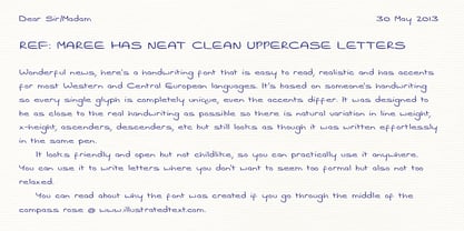 If you want to write something sincere and genuine but not too formal then this is the font for you. It is based on real handwriting, not some artificial calligraphy made to be either too haphazard or spiky or have loads of elegant flourishes but an ordinary person's writing, and designed to look as natural and as close to the original lettering as possible. Like any person's writing it is individual and distinctive, but so easy going on the eye those differences sit comfortably with you. It is friendly and open with easy to read glyphs both as lowercase and uppercase. The letters are relatively wide with clearly shaped distinct outlines. This font may be ideal for projects where you expect a wide readership with different reading abilities from young to old. When you are using this font a slightly bigger point size usually gives a better result so for a standard letter or similar you should size up to 15 points or more. Maree has been individually crafted to the smallest detail. To create a realistic handwriting font that looks relatively simple but works in a wide variety of languages requires a complexity and attention to detail most fonts will never require. This font in any ordinary business environment would never have been made, the effort required to make it too great, the length of time too long. There have been no shortcuts in this font, no automatic scanning or tracing, no automatic generation, no class kerning. Not only is each glyph individual but the width of letters, the height, the accents and the positions of the accents are all different. Even the line weight of the letters is designed to have natural variation but yet similar enough that the font appears as though it were written effortlessly in the same pen. And in order to keep the spacing consistent even though the letters have different widths, heights, lengths of descenders and so on, there are a vast number of kerning pairs, letter to letter, number to number, letter to number... All kerning has been individually assessed with an eye to proportionality taking in character shape, size and weight. For instance if you write a telephone number the numbers all sit close together but if you write a number before a letter such as in a UK post code or before a unit of measurement an extra little bit of space has been added which makes the number more distinct and therefore readable. That space is so natural to the eye that you don’t even know it is there. However even in the spacing allowance has been made for the fact it can’t be too perfect because when you write by hand the spacing is inconsistent. There have to be some letters which are too close or far apart otherwise the font would look artificial. For similar reasons if you are going to print out this font for a letter, etc, check the print version before you make any letter spacing changes because with the zoom functions in modern applications that uneven spacing and lettering can seem more pronounced than it actually is. When this font is printed out you will find it is surprisingly neat. This font is what it is, simple clear handwriting. You will not go wow. But if you want something unique and different and looks good on the page you won’t be disappointed. This font is not a work of art but it is a work of love. This font has a soul. How many fonts can you say that about?
 - DejaVu Sans Mono - Unknown license

- DejaVu Serif - Unknown license

- DejaVu Serif Condensed - Unknown license

- Baldufa by Letterjuice,
$66.00Baldufa is a charming typeface with strong personality, which looks very comfortable in text. There is a search to obtain complicated curves and detailed features, which give the typeface a touch of beauty and elegance. However, this is also a self-conscious design that claims appreciation for quirkiness and human imperfection through the rounded serifs and irregular vertical stems. The typeface family is also a multi script project, containing Latin and Arabic scripts. The Latin consists of Regular, Bold and Italic styles, including Small Caps and many other typographic features. Whereas Arabic Naskh includes Regular and Bold weights. The whole family has been designed to work harmoniously together to help to produce catalogues and small publications of cultural content. We believe that Baldufa is a tiny but nice contribution to build bridges between cultures and this make us very happy. The letterforms in the Latin are inspired by the slight distortions and idiosyncrasies that came with old printing methods. It has distinct, features such as rounded serifs, irregular vertical streams, ink traps and extremely thin junctions. In the Italic, serifs have been removed to enhance movement and expressivity. These experiments in form have not come at the cost of legibility: The typeface remains suitable for both small and display text. To certain extent, the design of the Arabic gathers the same interest for experimentation than its Latin companion. Baldufa Arabic respects the basic features of Arabic script such as thick stokes in the baseline, multiple vertical axis, genuine stem modulation and good linking between words. However, it steps away from traditional Calligraphic Style. It has rounded top terminals and the traditional contrast between curves and straight stokes has been softened. Letter shapes sometimes slightly differs from tradition in order to obtain more expressivity. Overall, Arabic has been designed to acquire the same elegant and quirky aspect of the Latin. - ITC Atmosphere by ITC,
$29.00The Algerian designer Taouffik Semmad created the fonts in 1997. Taouffik Semmad grew up speaking Algerian-Arabic dialect and French, studied Russian, and is now living in Montreal. This could perhaps explain his current passion, to "find a universal writing", which he admits is a Utopian idea. Created with brush and Chinese ink, the characters of ITC Atmosphere came from Semmad's hand but only after they were fully formed in his mind's eye. - Sanchez by Latinotype,
$-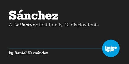 CHECK OUT Sánchez Niu (new, nova, neue, next) Sánchez, designed by Daniel Hernández, is a serif typeface belonging to the classification slab serif, or Egyptian, that bears a strong resemblance to the iconic Rockwell, but with rounded edges— offering contrast and balance to the square structure. Sánchez & Sánchez Condensed comprises 12 variants, ranging from extra light to black, each of the same x-height. Regular and Italic variants are available for free. Download specimen pdf
 - Metro Nova by Linotype,
$57.99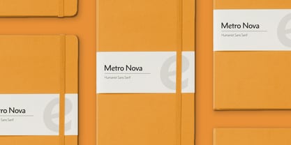 Metro Nova comprises seven weights, from ultra thin to extra black in regular proportions, and six weights as condensed designs. Each has an italic counterpart for a total of 26 fonts. The family is available as OpenType® Pro fonts, which provide for the ability to easily insert typographic features such as ligatures, fractions and alternate characters. Pro fonts also offer an extended character set to support most Central European and many Eastern European languages.
 - Blackson by Arterfak Project,
$25.00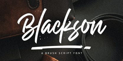 Blackson is an elegant, urban-style brush handwriting font. It’s specifically designed to maximize your design projects that require a dynamic and personal touch. This font offers a unique sense of satisfaction, energetic, and confidence, making it perfect for use in logos, branding, signage, posters, packaging, flyers, merchandise, movies, motion graphics, and more. Blackson also comes with custom ligatures, special characters, and multilingual support to make your designs stand out even more.
 - Oval Monogram by MonogramBros,
$12.00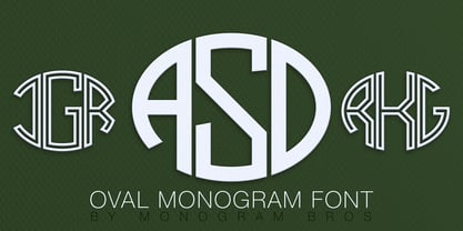 Oval Monogram is a perfect oval shaped monogram font consisting of 78 letters. With just a single font file you will be able to create beautiful monograms in just a matter of minutes after the purchase! Oval Monogram Font comes with font file in OTF format. It features all the modern advanced font features such as Contextual Alternates, effectively eliminating the need to use multiple separate font files for left, center and right letters.
 - Rose Mask by Viswell,
$19.00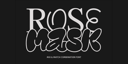 RoseMask is a capvitating combination font with three distinct style that seamlessly complement each other. The uppercase style featured elegant serif for a timeless appeal, the lowercase style offers a playful monoline approach, and the alternates presented in a bubbly gravity font, infuse creativity and dynamism. Mix and macth this versalite font effortlessly transitions between elegance and playfulness, making it a must have for diverse design project, from branding to editorial layout.
 - Tuscaloosa by Greater Albion Typefounders,
$7.00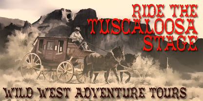 Tuscaloosa is a classic American 'Wild West' Tuscan typeface-we thought it would make a suitable Independence Day tribute to our many American clients. It's ideal for wherever that 'Western' feel is wanted. Posters, signage, the sides of stagecoaches etc... Three faces are offered, a pristine and sharp regular form, a somewhat distressed 'Rustic' face and the rather more distressed 'Extremely Rustic'. So why not mosey on down the saloon with Tuscaloosa!
 - Nicolas Cochin by Linotype,
$40.99Georges Peignot designed the font Nicolas Cochin based on copper engravings of the 18th century and Charles Malin cut the typeface in 1912 for the Paris foundry Deberny & Peignot. The font is named after the French engraver Charles Nicolas Cochin (1715-1790) although its style had little to do with that of the copper artist. Nicholas Cochin is a freer variation of another Peignot font, Cochin, a bit more balanced and elegant. - Young Fighter by Alit Design,
$18.00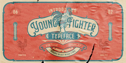 Embrace the timeless charm of the "Young Fighter" Font Family, a carefully crafted vintage display typeface that brings a touch of nostalgia to your designs. This versatile font family features 6 unique styles, each designed to capture the essence of classic typography while adding a modern twist. With a seamless blend of serif, display, sans serif, and dingbat ornament options, the "Young Fighter" Font Family offers unparalleled versatility for your creative projects.
 - Copal by Adobe,
$29.00Inspired by the carvings on meso-American monuments, David Lemon of Adobe's type staff created Copal. It is named after a resin that was burned as incense by ancient cultures and which is used today as a binding agent in printer inks and varnishes. The fonts in Copal can be used individually or combined to achieve chromatic effects. Try the decorated letters in headlines when you are in need of a burst of primitive energy. - Rusulica Antique by Type Fleet,
$- Rusulica Antique distinct aroma & flavor Rusulica Antique is a modification of the erstwhile script. With rough edges it has a distinctive appearance, rich aroma and antique charm. Because of its ornamental and playful design, it offers plenty of possibilities. Rusulica Antique has a high contrast. Its edges are rough and there is an alternate for almost every capital letter. The typeface’s x-height is bigger than usual and it is constructed at a 30° angle.
 - Melville Text by Luhop Creative,
$27.00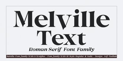 Melville Family is a meticulously crafted font collection that falls under the transitional serif classification. It offers a variety of font styles, including italic and serif old style, with a total of 16 unique styles to choose from Melville is a versatile and flexible solution that can be used in various industries such as stationary office, newspaper, cover book, web design, and text. Discover how Neville can enhance your projects and meet your specific needs.
 - Plus De Vagues NF by Nick's Fonts,
$10.00The original release notes from England’s Stephenson Blake Type Foundry say it all: “a type of some waywardness in design, judged from any typographical standard…a type that seems unable to decide whether to be a roman or a script." Stephenson Blake called their release "Recherché"— sought after or in great demand, which seems quite appropriate. Both versions of the font include 1252 Latin, 1250 CE (with localization for Romanian and Moldovan). - Nautica by Resistenza,
$59.00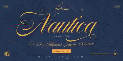 Nautica is a new script typeface based on Copperplate’s ductus. High in contrast, it is a very original type with a strong character. With over 1000 glyphs and extensive language support, Nautica offers full professional typographic features. Ligatures and swashes are more inspired by brush pen strokes. Nautica provides three weights and one set of useful icons and knots to improve your graphics. Nautica works very well with Turquoise ; check it out.
 - Howlett by Greater Albion Typefounders,
$22.95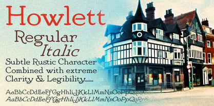 Howlett combines great character with extreme legibility. It's a simple display face that offers a sense of coziness and order, that speaks of all being well with the world. It is a modern design which pays due Acknowledgment to the past. An extensive range of Opentype features, including old-style numerals, terminal forms, ligatures and stylistic alternatives are included. Use it for headings and titles as well as eye catching poster work.
 - Sports Wave by Funk King,
$10.00Sports Wave is a specialty font that can be used for sports-themed projects. Previously available as a free version with only the pictograms, Sports Wave has been a popular download. Now we offer you the added usability of a full and extended character set. Some glyphs have been provided to extend the height of the shorter “banner” glyphs. These glyphs are negatively kerned and appear near the end of the set. - Hesster Mofet by JOEBOB graphics,
$20.00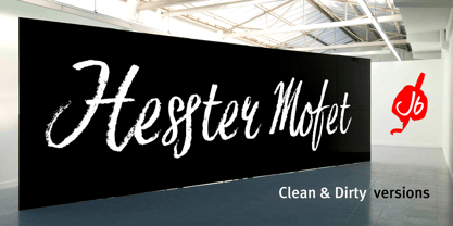 Hesster Mofet is what I got after writing with an old and weathered calligraphic marker on textured paper. The characters were smoothened for a clean result, but since the original sketches had such a nice rough, edgy feel to them, they were also made into a complete font set. A couple of ligatures and a Hannibal Lecter reference were thrown in the mix as well. You can get both versions at a discount.
 - Every by TypeThis!Studio,
$54.00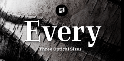 EVERY is designed to be the most valuable typography equipment in your repertoire! Rich in visions, a wide range of features have been created to master all your typographic challenges par excellence: Italics, small caps, old-style figures, ligatures & arrows are just some of the many possibilities that EVERY offers. 28 Styles in three optical sizes gives you the opportunity to create fascinating design with the scent of iconic elegance. Be exceptional – EVERY day. www.typethis.studio
 - Faubourg by Positype,
$39.00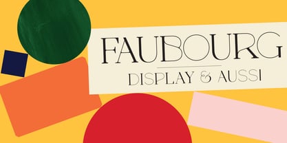 Faubourg marks the first professional typeface release by Marie Boulanger. As much traditional as it is unconventional in its celebration of letterforms, this typeface dances on the page and screen as it moves from a more conventional appearance to monoline and back again. The flowing silk-like undulation only accentuates this distinguishing feature and produces one opportunity after the next for headline settings where the word is as important as the content supporting it.
 - Meduza Collection FJ by Frncojonastype,
$30.00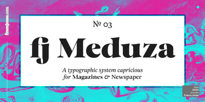 fj Meduza is a new typographical system designed by Franco Jonas Hernández, born as an exploring process from the classic model from —modern or didones style— typhography from XIX century. fj Meduza also explores the posibilities of Optical Adjustments —from 8 or 10 to 72 pts— offering a version to compose preferent reduced sizes —newspapers— and another version to titles with long-standing. Ideally for Branding, Headlines and especially complex editiorial contexts.
 - Ashley Southine by MJB Letters,
$16.00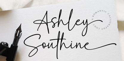 Ashley Southine is a handwritten script font that offers an elegant and personal touch to every character. Inspired by handcrafted strokes, this font presents a natural handwritten feel that is both warm and inviting. Each letter showcases uniqueness in every curve and stroke, creating a relaxed yet refined atmosphere. Ideal for design projects seeking a personal touch, such as wedding invitations, greeting cards, brand logos, and other design elements requiring a warm and elegant ambiance.
 - Buco Nero by Dumadi,
$18.00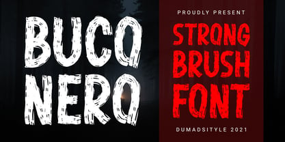 Buco Nero is a modern sensation brush font. Featuring bold in the dark, it offers All Caps font support and multilingual support, Buco Nero is perfect for Movie titles, thrilling titles, distro shirts, spooky content, media socials, and spooky graphic design. Compatible with such as Photoshop, Affinity Design, Adobe Illustrator or Silhouette design studios. Its makes it great for creative projects, whether it’s an inspiring wall poster or for communicating your brand.


