10,000 search results
(0.018 seconds)
- East Village JNL by Jeff Levine,
$29.00 The Federal Art Project division of the WPA (Works Progress Administration) employed numerous artists, musicians, actors and other creative sorts in a effort to help many survive the Great Depression of the 1930s. One of the posters created by this project was for a "Card Party and Barter Benefit" with proceeds going toward the Nassau Art Teachers Benefit Fund - taking place at the Coca-Cola plant in Rockville Centre, New York. East Village JNL was derived from this poster, and is available in both regular and oblique versions.
 - Vow by Thinkdust,
$15.00 Vow is an incredibly stylised font, strutting its stuff on the typography catwalk. Vow does everything to excess, even when cutting down: where it’s curvy, it’s very curvy, but where it’s thin, it’s thin. Vow’s regular weight has a certain boldness at text size, but its ultra-thin alternative is much better used at larger sizes, managing to take up very little space even when scaled up. Using a mix of the two creates a subtle emphasis, especially when coloured, which helps to create stunning messages in elegant ways.
 - Bastina Sindey by HansCo,
$17.00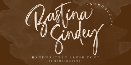 Bastina Sindey is a natural handbrush font. This texture is very detailed. You can get also the swash brushes include in this font pack. This font is suitable for logos, shirts, fashion, blogs, websites, product branding, posters, flyers, any print template or for text overlay to any background image. Comes with a full uppercase, lowercase, numbers and punctuation + standard multilingual support. It’s great for branding, logo designs, lettering, logotype, craft, posters, packaging and much more. We recommend using Adobe Illustrator or Photoshop. Tutorial how to Install & use Alternate / Special Character : https://hanscostudio.com/tutorial/ Enjoy!
 - LTC Goudy Sans by Lanston Type Co.,
$24.95 Goudy Sans Bold was originally designed by Fredric Goudy in 1922 as a less formal "gothic" and finished in 1929. The light was designed in 1930 and the Light Italic in 1931. Alternate letterforms are included in these three Goudy designs which are digitized true to their original design. In 2006, designer Colin Kahn drew "LTC Goudy Sans Regular" which is a medium weight version intended for text purposes. Kahn has also designed an experimental "LTC Goudy Sans Hairline" which has a skeletal almost mono-width stroke and results in a surprisingly elegant display face.
 - Saki by Thinkdust,
$10.00 Saki is big and bold, presenting messages in an easy to understand, pleasant to read manner. Simple straight edges, shallow curves and sans-serif, Saki was created with legibility and minimalism in mind and its thick weight gives it great scalability. It is admirable for maintaining such close attention to form, each character fitting neatly into the space provided and slotting together smoothly for undistracted reading. For use in headlines and similar large text, Saki is the font you need to get your message across loud and clear, no ifs, ands or buts.
 - Azalleia by Intellecta Design,
$26.90 Azalleia is a new exaggerated flourished caps typeface. Well elaborated and unusual design, inspired by old cross-stitch and craft books. Works great when used for display artworks. Entirely designed by hand, without use of auto-tracing and available in two different designs. Buying the two fonts pack you get free the exclusive collection of Azalleia native colored eps vectors, zipped with the font and ready to use. Take a look at the banners in the gallery section to see samples of this nice collection of eps free vectors.
 - Technoda by Figuree Studio,
$18.00 Technoda is a futuristic font that carries uppercase and lowercase characters with a set of numbers that showcase a futuristic unique design in addition to galactic alternates and a cyberpunk theme. Take a trip through time and use it for movie posters set in space or in the future. Very suitable for sci-fi enthusiasts, create cards and personalized artwork, but don’t let the adventure stop with you. Use Technos for UX /UI, and techno projects and allow the rest of the world to get a glimpse of what the future may hold.
 - Taxon by Hoftype,
$49.00 Taxon is a straightlined Sans with a clean, fresh and unsentimental look. Related to classical faces like Optima and Imago, it appears more contemporary and merges the austere linearity of the Grotesk with the elegance of the Antiqua. The Taxon family consists of 12 styles and is well suited for ambitious typography. It comes in OpenType format with extended language support. All weights contain ligatures, superior characters, proportional lining figures, tabular lining figures, proportional old style figures, lining old style figures, matching currency symbols, fraction- and scientific numerals, matching arrows and alternate characters.
 - Jongleur by PintassilgoPrints,
$29.00 Jongleur is a multifaceted hand-drawn display typeface based on a Maury Nemoy lettering from 1957. Packed with handy OpenType features, the font makes automatic substitutions when you turn on the contextual alternates, creating an interesting hand-lettered feel. If you're in a messy mood, use the stylistic alternates instead! The font also brings an extra set of alternate letterforms you can pick by hand to spice up your compositions. Great choice for titles and small amounts of text, perfect for posters, book covers and a wide range of applications.
 - Julienne by Wiescher Design,
$39.50 Cooks call thinly cut - like matchsticks - vegetables "Julienne". I found that was a fitting name for this very narrow typeface. Julienne Slim is the extreme cut of the two. Personally I do not use narrow typefaces very often, but from time to time they come in handy if there is much text to be crammed into little space. I could make a typeface that was even narrower, but I will not do it. This is as narrow as my typefaces get. Enjoy what I cut for you, Gert Wiescher.
 - Concertina by Hanoded,
$15.00 A concertina is a kind of musical instrument, not unlike an accordeon. I just liked the name; I have to admit I’m not a particular fan of accordeon music… Concertina is a beautiful handmade script font. A little rough, but elegant as well. It was made with a small Japanese brush pen on coarse paper. Concertina comes with double letter ligatures and end-letter alternates. To access the end-letter alternates, type the letter you want + space (and make sure to tick the ‘ligatures’ box in your OT environment).
 - Bannikova by ParaType,
$30.00 Designed at Polygraphmash type design bureau in 1946-51 by Galina Bannikova, inspired by Russian Grazhdansky early- and mid-18th century typefaces as well as Roman Humanist typefaces of the Renaissance. With the archaic features of some characters the face is well recognized because of unique shapes. It is one of the best original typefaces of the Soviet typography. The typeface is useful in text and display composition, in fiction and art books. The revised, improved and completed digital version was designed at ParaType in 2001 by Lyubov Kuznetsova.
 - Bonnycastle by Three Islands Press,
$39.00 Sir Richard Henry Bonnycastle (1791–1847) was an English officer and military engineer who served in the War of 1812 and ultimately settled in Canada. I stumbled upon copies of some of his charts and maps, became infatuated with the hand-lettered titles—and the result is the eponymous Bonnycastle. The font has a bold weight and an italic style but is intended as an eye-catching standalone, evocative of its period in history. Use as a titling face on branding materials, event posters, book covers, presentation graphics, historical illustrations, and the like.
 - Fisionada by Graviton,
$24.00 Fisionada font family has been designed for Graviton Font Foundry by Pablo Balcells in 2023. It is a condensed sans serif typeface with sharp edges and a very technical aesthetics. Its condensed design makes it very effective for space economizing and its geometric features make it a very attractive choice for display usages such as futuristics logos, video games and sci-fi content. It has been conceived to be most suitable for headlines and short length text blocks. Fisionada consists of 8 styles. Each containing small caps and glyph coverage for several languages.
 - Racesky by ZetDesign,
$20.00 Racesky is a racing-themed font but is still suitable for other purposes. This font is created in two bevel styles to give different choices to each user. This font is also accompanied by open type features in the form of kerning, ligature, and stylistic alternate to make it easier to choose styles and shapes. Consistent lettering is also an advantage that makes it easier for you to produce a perfect and stylish work. don't hesitate to choose this font as part of your collection ... happy working and enjoy your font ...!
 - Metronic Slab Narrow by Mostardesign,
$26.00 Metronic Slab Narrow is the condensed version of the Metronic Slab font family. This condensed style is designed for space-saving typography but with high legibility and versatility in mind.This Family also improved the needs of developers and graphic designers looking for width-compatible fonts. As the normal style this font family is an innovative and refreshing semi serif design with a contemporary look for text and headlines. It has six versatile weights from Air to Black with an alternative glyph set to improve its use in different graphic contexts.
 - Attic Antique by Three Islands Press,
$29.00 Attic Antique by Three Islands Press. Flipping through a friend’s old hardbound collection of John Burroughs nature essays a while back, I thought it'd be fun to try to develop a typeface with the same uneven, imperfect look to it. I picked and chose among various printed characters, enlarged them somewhat with a photocopier, then hand-rendered each. Had to custom-make some of the accents and symbols, then added a couple goofy dingbats just for the heck of it. The result: an amazingly legible serif family akin to the Century faces.
 - Claudius by RMU,
$25.00 A blackletter font tending towards the gothic which was released by Klingspor, Offenbach am Main, in 1937. Claudius can be used for clerical as well as for secular purposes and shows a strong character of its own. The original esthetic atrocities of placing the dieresis within the letters A and O - due to former German industry standards - were abolished. Allow the font's beauty spread by giving it enough leading between the lines. This font contains various useful ligatures, and by activating the Ordinals feature and typing 'N', 'o' and period you get an oldstyle numbersign.
 - Ramesty by Twinletter,
$12.00 Ramesty is a handwriting bunch of fonts that are charming and elegant in each of their writings. very suitable for all designs that require a touch of handwriting, of course, using this font will make your design charming This font is designed with a natural touch of handwriting which is refined to create a portion and composition that suits your needs. So this font is suitable for craft, children's writing, adventure posters, food banner titles, wedding invitations, product packaging logos, quotes, social media page covers, furniture banner headlines, book covers, and much more.
 - Magallanes Condensed by Latinotype,
$29.00 Say hello to the new Magallanes Condensed Family, a contemporary neo-humanist sans serif font designed by Daniel Hernández. Its strokes and terminals are related to the calligraphic strokes from humanist typefaces. It comes with 8 styles, from Ultra Light to Black, each with its true italics. Every weight comes with alternative glyphs for a more dynamic use. Magallanes is the perfect titling font to complement text faces in magazines, logotypes, etc. Languages supported include Basic Latin, Western European, Euro, Catalan, Baltic, Turkish, Central European, Romanian, Pan African Latin.
 - Blonde Fraktur by ParaType,
$30.00 Blonde Fraktur is a free interpretation of the Gothic theme in Cyrillic. The font is neither Fraktur nor any other Gothic script from the formal point of view, but it makes text look like Gothic script, no matter which language is used. Blonde Fraktur was written with a quill by Alexandra Korolkova and prepared in digital form by Alexandra Pushkova. The font contains a set of alternatives and swashed variations. It suits well for advertising of beer, sausages, pubs and other places where Gothic scripts are commonly used.
 - Koala by Linotype,
$40.99Koala was originally designed in 1999 by Eric de Berranger with an individual, independent character. A distinguishing characteristic of this sans serif font is its marked stroke contrast, typical of Modern Face fonts. The open, airy forms are reminiscent of ancient Roman capitals. The lower case letters display traits similar to those often seen on posters and in advertisements of the 1930s and 1940s. The lively Koala is particularly good for shorter texts and headlines in larger point sizes and combines well with fonts with little stroke contrast. - Mrs Summer by Hipopotam Studio,
$20.00 Mrs Summer is a hand drawn narrow typeface with a Western touch. It has only uppercase characters with alternate glyphs in place of lowercase letters and additional alternate glyph in a Stylistic Set. It has build in OpenType Contextual Alternates feature that will automatically set alternate glyphs depending on frequency of appearance of the same character (even in web font but only in HTML5 browsers). The script doesn’t just throw random glyphs. Additionally Mrs Summer is filled with ornaments, arrows, stars, horses, trees and a lot of other symbols.
 - MVB Hotsy Totsy by MVB,
$39.00MVB Hotsy Totsy is Akemi Aoki’s first typeface design. Aoki created the letters in cut paper. Once digitized, the design was expanded to offer several weights and styles. Exaggerating the triangular serifs and tapering strokes of “Latin” typefaces, MVB Hotsy Totsy is the perfect party face, appearing frequently on board games, product packaging, and in children’s books. It is named for (what was at the time) a dive bar in Albany, California. The bar has since been renovated but its neon sign was preserved, a local landmark of San Francisco’s East Bay. - Melodica by Scholtz Fonts,
$19.95 Melodica was so named because the characters dance easily across the page as music wafts across a room. The font was designed to meet the need of designers that need clarity, sensuousness, a suggestion of the oddball, and a modicum of humor. With its boldly curvy caps, and large x-height lower case characters, Melodica suggests a boldness of purpose while enjoying a well modulated delicacy of line. Use Melodica for any purpose that wants a happy, vibrant, slightly quirky yet "not too far from the norm" solution. Language support includes all European character sets.
 - Arnod by Craft Supply Co,
$20.00 Discover “Arnod – Serif Typeface” Robust and Refined Embark on a journey through the powerful aesthetics of “Arnod.” This serif typeface exudes a masculine aura, characterized by bold strokes and robust forms. Arnod doesn’t just communicate; it declares, ensuring that every design resonates with authority and strength. Industrial Elegance Navigating through the realms of industrial design, Arnod effortlessly aligns with the aesthetics of strength and precision. Here, it finds a space where its mechanical elegance and structured forms become a natural fit, enabling designs to embody an authentically industrial spirit.
 - Cochin by Linotype,
$29.99 Georges Peignot designed Cochin based on copper engravings of the 18th century and Charles Malin cut the typeface in 1912 for the Paris foundry Deberny & Peignot. The font is named after the French engraver Charles Nicolas Cochin (1715–1790) although its style had little to do with that of the copper artist’s. The font displays a curious mix of style elements and could be placed as a part of the typographical Neorenaissance movement. Cochin is especially large and wide and was very popular at the beginning of the 20th century.
 - Parking Lot Sale JNL by Jeff Levine,
$29.00 Here’s a novelty font emulating the plastic pennant streamers that were popular in the 1950s and 1960s used to decorate a store parking lot or used car lot for a sales event. The typeface inside the individual pennants is Manufacturer JNL, which can be used for body copy associated with titles made by this font. Parking Lot Sale JNL is available in regular (black letters on white pennants) and black (with white letters). A blank pennant for word spacing or end caps is available on the backslash key.
 - Baluarte by Tomtype,
$9.00 Baluarte is a display typeface inspired by fortifications and military buildings used to defend and protect a specific place during war times. Its main characteristics are the irregular trace and the solid presence in all its characters. It has 5 weights + obliques It is perfect for titles in big sizes, video game logos, movie titles or credits, posters, and many other visual graphics. Key features Meticulously designed Comes in 5 weights and obliques for each weight Uppercase and lowercase characters Ligatures and fractions Supports a lot of languages Licensed for Personal or Commercial use (OFL)
 - F2F Al Retto by Linotype,
$29.99The Techno sound of the 1990s, a personal computer, a font creation software and some inspiration had been the sources to the F2F (Face2Face) font series. Alessio Leonardi and his friends had the demand to create new unusual faces that should be used in the leading german techno magazine "Frontpage". Even typeset in 6 point to nearly unreadability it was a pleasure for the kids to read and decrypt the messages. About Al Retto: "Al" means "Alessio Leonardi" and Retto "straight", but if you read it as an italian world means "in the a**". - Gabust by Twinletter,
$12.00 Gabust is a beautiful and elegant handwriting script font that has a feminine character and is sweet in its use, besides that this font is also very suitable for use in designs that require handwriting as well as others. This font is designed with a natural touch of handwriting which is refined to create a portion and composition that suits your needs. So this font is suitable for craft, children's writing, adventure posters, food banner titles, wedding invitations, product packaging logos, quotes, social media page covers, furniture banner headlines, book covers, and much more.
 - arnica by Justi,
$15.00 Arnica is a display font based on a simple geometry that uses circles (and modules) as a structure. It is an experimental project where, in place of upercases, has alternate characters and swashes. Furthermore, arnica has 50 discretionary ligatures which, when activated, give a totally different touch to the font and also has the bold weight, which reinforce the experimentalism of the project. Combining lowercases with upercases, plus discretionary ligatures and bolds, you can write the same word in several different ways. The character set offers more than 400 glyphs and support for many languages.
 - Biscuit Boodle by insigne,
$11.00 Biscuit Boodle is a fun and uplifting script from Portland Studios Illustrator Justin Gerard. The characters are brush drawn with a slight texture. The font comes packed with OpenType alternates and ligatures. Included are small caps, old style figures, titling alternates and ending swashes. Sixty-four optional ligatures add a slapdash quality to your copy and make sure that no two letters in a word are alike, and auto replacing word ligatures add to the fun. The Biscuit Boodle family also includes an even more spontaneous alternate and even ornaments for even more creative options.
 - Biscayne by JVB Fonts,
$39.00 Biscayne is inspired by the old and classic Art Deco art and architecture found in some building ads from the 1930's in the Art Deco District of Miami. The name of the font family is one of the most emblematic and representative places in Miami City. Biscayne can be used mainly in titles, display and short texts. This typeface family supports East Europe languages. It also includes standard and discretionary ligatures, alternative style of uppercase, fractions, numerators and denominators, end and/or terminal forms and other OpenType features.
 - Retrofit by Vanderfont,
$29.00 The evocative and original Retrofit is based on typefaces of the 1940s and 50s, which extolled the virtues of American products in glossy magazines for the new suburban consumer. Oversized terminal bulbs and occasional slab serifs lend a rhythm and a bouncing baseline provides just the "zing" to spice up that bland typographic treatise. Retrofit's easy familiarity can be seen on children's books, games, food packaging, and other places where a kid friendly note is needed. Retrofit has been adapted by Quickutz for their punched letter cutting tool, and re-named "Maggie".
 - Doctrine Stencil by Barnbrook Fonts,
$75.00 A display typeface with a muscular character, Doctrine Stencil is the revolutionary comrade of the text typeface Doctrine. Doctrine Stencil was developed from the North Korean national airline livery and, while it retains the idiosyncratic spirit of the original, it has evolved into a more contemporary headline face. Doctrine Stencil draws on elements of neo-grotesque, humanist and geometric styles, and combines them with a playful approach to the stencil model. Doctrine Stencil includes four alternate character sets as well as an array of ligatures and figure styles.
 - Barle by Locomotype,
$18.00 Big is beautiful. Barle font has an extremly heavy weight and wide shape. A sans-serif display font that's perfect for large headlines, posters, packaging and any graphic design that requires a font that will stand out to audiences. Barle font has two faces, a standard character and a sliced version which can be accessed through the Stylistic Alternates feature. This font consists of 4 fonts; upright and italic style in the normal version and the outlined version. If you just want to use the sliced version, you just need to purchase Barle Alt.
 - Haverj by ParaType,
$30.00 An original typeface designed for ParaType in 2004 by Armenian designer Manvel Shmavonyan. Based on the lettering created in 1970s by outstanding Armenian type designer Henrik Mnatsakanyan (1923-2001) of the same name. In Armenian ‘Haverj’ means ‘Eternally’. The face resembles many regular text serif fonts but elements like serifs and terminals make it eccentric and a little bit funny. The shape of diagonal legs in capital K and R resembles book lettering of the 1950s—60s. Using it in text, advertising and display typography may lead to surprising effects.
 - Autumn Field by IKIIKOWRK,
$17.00 Introducing Autumn Field - Handwriting Type created by ikiiko. Autumn Field is rough and exotic handwriting style with unique line curves. Autumn Field is also combine with a ton of stylistic to choose. This typeface is perfect for an elegant logo, poster font, magazine layout, headline font, header page, beauty product, packaging product, quotes, or simply as a stylish text overlay to any background image. What's included? Uppercase & Lowercase Number & Punctuation Alternates & Stylistic Multilingual Support Enjoy our font and if you have any questions, you can contact us by email : ikiikowrk@gmail.com
 - Ravera by Putracetol,
$24.00 Revera is a font inspired european style and the only fonts with shapes and styles that exactly resemble the european characters & Revera is easy to read and can be applied to all media and all can use this font without exception Revera is suitable for your projects such as logo, wedding invitations, branding, landing pages, apparel, posters, headlines, greeting cards, invitation cards, social media, crafting, quote and more. Revera can be used and supported in various programs and OS, such as procreate, cricut, windows, macOS and others. This font is also support multi language.