10,000 search results
(0.026 seconds)
- Mentone by Paragraph,
$18.00 Mentone is a new general purpose typeface, an attempt at extending the line of the great sans-serifs of the previous century, Frutiger - Stone Sans - Myriad. The font has round corners and subtle chamfers, which are all but invisible at text sizes, but add an upbeat, irreverent expression at display sizes. The typeface is named after the beautiful bayside suburb of Melbourne, Australia, where the designer lives. This new version (2.01) was spaced and kerned by Igino Marini of iKern. The semibold cuts are now free!
 - Giza RE by Font Bureau,
$40.00 Giza brings back the colorful power and variety of the original Egyptian letterforms, a glory of the Victorian era. Designer David Berlow based the family on showings in Vincent Figgins’ specimen of 1845, the triumphant introduction of this thunderous style. This version of the family is part of the Reading Edge series of fonts specifically designed for small text onscreen, having been adjusted to provide more generous proportions and roomier spacing, and having been hinted in TrueType for optimal rendering in low resolution environments.
 - SF Change by Sultan Fonts,
$19.00 Change is An Arabic text typeface for desktop applications. Change is freestyle Ruqah and a winner in Horouf Bilingual Typefaces Design Competition. The design is open, calligraphic, and very dynamic. This makes it suitable for large display sizes, especially in the area of advertising, while still functioning well as a text face. The font includes a matching Latin design and support for Arabic, Persian, and Urdu. It also includes proportional and tabular numerals for the supported languages. Change typeface comes with many opentype features.
 - Irakly BT by Bitstream,
$50.99Perhaps one of the more difficult typeface styles to space convincingly, Irakly, a serif-sans by Russian designer Oleg Karpinsky imparts an unfamiliar elegance. The odd mixture of superficial details such as the half serifs and the protruding horizontal strokes confuse your visual senses, yet the simple geometric roots of the letterforms are apparent and ultimately reassuring. Irakly Light and Bold make a great addition to any library. The OpenType versions have alternates that are more conservative in design and broaden the usefulness of the typefaces - HandXpression by SullivanStudio,
$9.95 HandXpression was created with a stylus, imitating the experience of writing on a whiteboard with a marker. Its 646 glyphs cover from the Western to a wide part of Eastern European (Latin) alphabets. It also has all Greek letters for Math usage: yes, HandXpression makes formulas, and they look great, especially with LaTeX/XeTeX systems. The font has true italics, as well as some useful OpenType features: fractions, capital spacing, scientific superiors/inferiors, old style numbers, as well as standard ligatures and localized forms. Enjoy!
 - Voyage by Fenotype,
$35.00 Voyage is a smooth and friendly vintage script family of two weights and ornament sets. Voyage is packed with alternate characters and OpenType features to allow you create customized headlines. To activate the alternates click on Swash, Contextual, Stylistic or Titling Alternates or Discretionary Ligatures in any OpenType savvy program or manually select the characters from Glyph Palette. Always keep on Standard Ligatures for the best outcome. Combine Voyage with Voyage Ornaments to complete your designs. For the best price purchase the Complete Voyage Family.
 - Revolancer Pro by Popskraft,
$18.00 The Revolancer Pro font was designed in addition to the unique Revolancer font, so this font looks more familiar. But this is only at first glance. This typeface combines the simplicity of classic grotesque typefaces with the freedom and independence of a Revolancer typeface. This font will give you freedom. The freedom to be unique, not like everyone else. Each character in Revolancer font knows its place, and it is impossible to achieve such a smooth and organic flow of words using a regular font.
 - Qojarun by Twinletter,
$15.00 Introducing our newest font called Qojarun. With Arabic Style display fonts, you can easily give your designs a genuine Middle Eastern feel. This font features characters in an Arabic style, and goes well with a wide variety of design projects, from posters to logos and beyond. Elegant calligraphy Arabic letters are easy to read, just like writing in general. This download pack contains all the characters needed to translate your project into an Arabic theme, complete with the full character set, punctuation marks, and numbers.
 - Pageantry Hebrew by Jonahfonts,
$42.00 Hebrew alphabets contain 22 Hebrew letters along with five final letters. These final letters are automatically activated when used in Applications such as Apple Pages® and MicroSoft Word®. Some alternate hebrew letters have been added. Pageantry Hebrew letters do not contain cantillation marks very much used in everyday modern Hebrew accompanied with the complete latin alphabet. View my other Hebrew fonts, Newmark Hebrew, Hebron Hebrew, Hanah Hebrew and Komunidad Hebrew which is a handwritten (script font). Pageantry Hebrew requires OpenType-aware software.
 - Lumphong by Letterena Studios,
$10.00 Lumphong is a vintage styled slab serif font. It is PUA encoded which means you can access all of the amazing glyphs and ligatures with ease! This font is neatly crafted and highly detailed.
 - Nathilda by Letterafandi Studio,
$16.00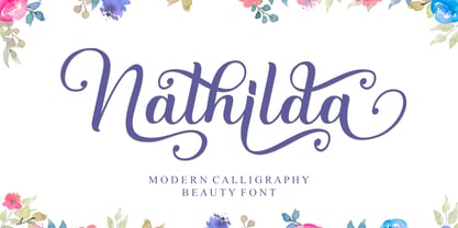 Nathilda is a flowing handwritten font, described by an elegant touch, perfect for your favorite projects. This font is PUA encoded which means you can access all of the glyphs and swashes with ease!
 - Letterink by Abo Daniel,
$15.00 Letterink is a script font with an inky style. It's great for branding, photography, invitations, quotes, watermarks, advertisements, product designs, labels, and much more! It comes with punctuation, multi-lingual support, and PUA encoding.
 - Anti Valentines Day by Aldedesign,
$25.00 Anti Valentine’s Day is a flowing handwritten font, described by an elegant touch, perfect for your favorite projects. This font is PUA encoded which means you can access all glyphs and swashes with ease!
 - Night Forest by Rometheme,
$25.00 Introducing Night Forest – Vintage Font Perfect for logotype, labels and packaging, branding, or any vintage-themed projects! Features: - Basic Latin A-Z and a-z - Numbers - Symbols - Stylistic Set - Ligature - PUA Encode - Multilanguage Support
 - Juvenile Handwriting by Create Big Supply,
$15.00 Darling Moods is a sleek and elegant script font. It has a beautiful, natural handwriting style that will leave an authentic impression on your designs! Features: Uppercase Lawercase Numbers and punctuation Multilingual PUA Encoding
 - Bame by Typebae,
$15.00 BAME is a display typeface. Has a distinct curve and a lively personality. Ideal for projects that require a distinct personality. What's Included? Stylish & Standard Caps Numbers & Punctuation 14 Ligatures Multilingual Support PUA Encoded
 - Hellya by Arkrist Letter,
$14.00 Hellya is an elegant script font with a contemporary atmosphere and impeccable form, inspired by timeless classic calligraphy. This font is PUA encoded which means you can access all glyphs and swashes with ease!
 - Boughies by Rochart,
$18.00 Boughies is modern bold display font. Boughies is great for branding, logo design, lettering, clothing, posters, magazine and other design project and also provides some Stylistic Alternates, Ligatures, Multilingual support and already PUA encoded.
 - Bitcrusher by Typodermic,
$11.95 Bitcrusher is not your ordinary typeface. It is a futuristic, ultra-compact sans-serif font that draws inspiration from the sleek design of automobiles and cutting-edge consumer electronics. Its unique compression capabilities allow you to pack more words into a single line than most techno typefaces can ever dream of. Available in five weights and four widths, Bitcrusher is a versatile font that gives you unprecedented control over your typography. If you need to fit more text into a tight space, Bitcrusher Condensed is the perfect choice. And if you want to push the limits of font compression, Bitcrusher Compressed has already reached the standard limit. For those who demand even more compactness, Bitcrusher Crammed has an abnormally small footprint, while Bitcrusher Crushed has an absurdly high density that defies all conventions. But no matter which variant you choose, you can be sure that Bitcrusher delivers consistent stem, space, and gap widths that allow you to break the rules of scaling and tracking. With Bitcrusher, you have complete control over your typography. Want thicker stems? Simply scale a narrower width to a bigger breadth. Need to go even tighter than Crushed? Make it even thinner. Bitcrusher is a font that cannot be broken. It is the ultimate tool for designers who demand precision and control over their typography. Choose Bitcrusher and discover the power of true compression. Most Latin-based European, Vietnamese, Greek, and most Cyrillic-based writing systems are supported, including the following languages. Afaan Oromo, Afar, Afrikaans, Albanian, Alsatian, Aromanian, Aymara, Azerbaijani, Bashkir, Bashkir (Latin), Basque, Belarusian, Belarusian (Latin), Bemba, Bikol, Bosnian, Breton, Bulgarian, Buryat, Cape Verdean, Creole, Catalan, Cebuano, Chamorro, Chavacano, Chichewa, Crimean Tatar (Latin), Croatian, Czech, Danish, Dawan, Dholuo, Dungan, Dutch, English, Estonian, Faroese, Fijian, Filipino, Finnish, French, Frisian, Friulian, Gagauz (Latin), Galician, Ganda, Genoese, German, Gikuyu, Greenlandic, Guadeloupean Creole, Haitian Creole, Hawaiian, Hiligaynon, Hungarian, Icelandic, Igbo, Ilocano, Indonesian, Irish, Italian, Jamaican, Kaingang, Khalkha, Kalmyk, Kanuri, Kaqchikel, Karakalpak (Latin), Kashubian, Kazakh, Kikongo, Kinyarwanda, Kirundi, Komi-Permyak, Kurdish, Kurdish (Latin), Kyrgyz, Latvian, Lithuanian, Lombard, Low Saxon, Luxembourgish, Maasai, Macedonian, Makhuwa, Malay, Maltese, Māori, Moldovan, Montenegrin, Nahuatl, Ndebele, Neapolitan, Norwegian, Novial, Occitan, Ossetian, Ossetian (Latin), Papiamento, Piedmontese, Polish, Portuguese, Quechua, Rarotongan, Romanian, Romansh, Russian, Rusyn, Sami, Sango, Saramaccan, Sardinian, Scottish Gaelic, Serbian, Serbian (Latin), Shona, Sicilian, Silesian, Slovak, Slovenian, Somali, Sorbian, Sotho, Spanish, Swahili, Swazi, Swedish, Tagalog, Tahitian, Tajik, Tatar, Tetum, Tongan, Tshiluba, Tsonga, Tswana, Tumbuka, Turkish, Turkmen (Latin), Tuvaluan, Ukrainian, Uzbek, Uzbek (Latin), Venda, Venetian, Vepsian, Vietnamese, Võro, Walloon, Waray-Waray, Wayuu, Welsh, Wolof, Xavante, Xhosa, Yapese, Zapotec, Zarma, Zazaki, Zulu and Zuni.
 - Shout by HiH,
$12.00 Shout is a “Hey, Look at ME” font. It is an attention-getting font for posters, flyers and ads. Its lineage includes the Haas Type Foundry’s 19th century advertising font, Kompakte Grotesk, which Jan Tschichold (1902-1974) dryly described as “extended sans serif” and which graphic designer Roland Holst (1868-1938) would have disapprovingly referred to as a “shout,” as opposed to the quiet presentation of information that he believed was the proper function of advertising. In 1963 Letraset released what appears to be an updated variation in multiple weights designed by Frederick Lambert called Compacta. Shout draws heavily on Compacta, as well as other similar fonts of the 50s and 60s like Eurostile Bold Condensed and Permanent Headline. In weight, it falls about halfway between Compacta Bold and Compacta Black, but with a relatively heavier lower case that is not so easily pushed around by the upper case. After all, one can shout while sitting down. Shout is the first font released with our new encoding, as noted in the All_customer_readme.txt. The Euro symbol has been moved to position 128 and the Zcaron/zcaron have been added at positions 142/158 respectively. Otherwise, Shout has our usual idiosyncratic glyph selection, with the German ch/ck instead of braces, a long s instead of the Greek mu and our usual Hand-in-Hand symbol. There are also left and right glyphs of a big mouth ]ing (135/137) and left and right glyphs of an angry man shouting (172/177). Please use Shout with discretion. Folks get tired of being yelled out. After awhile, they stop listening. Shout ML represents a major extension of the original release, with the following changes: 1. Added glyphs for the 1250 Central Europe, the 1252 Turkish and the 1257 Baltic Code Pages. Add glyphs to complete standard 1252 Western Europe Code Page. Special glyphs relocated and assigned Unicode codepoints, some in Private Use area. Total of 355 glyphs. 2. Added OpenType GSUB layout features: pnum, ornm, liga, hist & salt. 3. Added 266 kerning pairs. 4. Revised vertical metrics for improved cross-platform line spacing. 5. Revised hyphen, dashes & math operators. 6. Minor refinements to various glyph outlines. 7. Inclusion of both tabular & proportional numbers. Please note that some older applications may only be able to access the Western Europe character set (approximately 221 glyphs). The zip package includes two versions of the font at no extra charge. There is an OTF version which is in Open PS (Post Script Type 1) format and a TTF version which is in Open TT (True Type)format. Use whichever works best for your applications.
 - Steak by Sudtipos,
$59.00 Here I am, once again digging up 60-year sign lettering and trying to reconcile it with the typography of my own time. The truth is I've had this particular Alf Becker alphabet in my sights for a few years now. But in the typical way chaos shuffles the days, Buffet Script and Whomp won the battle for my attentions way back when, then Storefront beat the odds by a nose a couple of years ago. Nevertheless, revisiting Alf Becker’s work is always a breath of fresh air for me, not to mention the ego boost I get from confirming that I can still hack my way through the challenges, which is something I think people ask themselves about more often as they get older. You can never tell what may influence your work, or in this case remind you to dig it out of dust drawers and finally mould it into one of your own experiences. On my recent visits to the States and Canada, I noticed that quite a few high-end steak houses try their best to recreate an urban American 1930s atmosphere. This is quite evident in their menus, wall art, lighting, music, and so on. The ambience says your money is well spent here, because your food was originally choice-cut by a butcher who wears a suit, cooked by a chef who may be your neighbour 20 minutes from downtown, and delivered by a waitress who can do the Charleston when the lights dim and who just wouldn't mind laughing with you over drinks at the bar later. So Steak is just that, a face for menus and wall art in those places that see themselves in the kind of jazzy, noirish world where one-liners rule and exclamation points are part of a foreign language. As is usual with my lettering-inspired faces, there is very little left of the original Alf Becker alphabet. Of course, the challenges present in bringing typographic functionality to what is essentially pure hand lettering gives the spirit of the original art a hell of a rollercoaster ride. But I think that spirit survived the adventure, and may in fact be even somewhat magnified here. This font is over 850 glyphs. It’s loaded with ligatures, swashes, ending forms, alternates, ascender and descender variations, and extended Latin language support. Steak comes in 3 versions. According to your taste you can choose Barbecue, Braised or Smoked. It’s up to you!
 - Medieval Borders by Aah Yes,
$5.00 This is a large group of typefaces inspired by those borders and patterns you see going across documents from the Middle Ages and Medieval times, eventually becoming this collection of fonts where you can scroll various repeating patterns across a page, for example. You can get a repeating pattern that scrolls seamlessly by repeating the same letter. The default text displaying on the web-page is bbbbbbbb, for example. There's over 2 dozen basic styles, and each style has 52 designs within it, using the characters Upper Case A - Z and lower case a - z, with the lower case being the negative/reverse colour of the Upper Case version, it will be the corresponding design just reverse coloured and with an edging strip. There's also a space - but nothing else. The styles in these fonts usually have groups of six characters (A to F, G to L, M to R, S to X), and where the second group is a variation on the first - usually thicker lines - and the third grouping is another variation on that, usually thicker lines again, making the first 24 letters. (Sometimes there's three groups of eight characters). The pattern within a group normally starts off plain then gets busier as it progresses - such as there'd be a more complex pattern of circles and diamonds as you go through the letters. Then the letters Y & Z are somewhat different to the rest. There's four versions starting with Z, and they're a little bit different, and they're grouped in fives - getting bolder as you progress through the letters, but with similar patterns within each group of 5, and that makes the first 25 characters. The letter Z character is extra busy. Again, lower case is the reverse colour of the Upper Case. Mostly you can get patterns and borders that combine seamlessly by using letters within the same group of 6 or 8 (like maybe abdcedcb). There are a few occasions when that doesn't work out, because there may be circles or diamonds at the sides of the letters that don't match up with another letter that has a different pattern at the side. But you can create a pattern with the exact level of complexity you want perfectly easily. You can see examples of this in the poster images. Neighbouring letters without embellishments at the sides of the letters will usually fit together. Have fun with it, that's what it's there for. aah yes fonts
 - We The People by K-Type,
$20.00 This typeface is extrapolated from the ‘We the People’ calligraphy of the handwritten US Constitution Preamble which employed a style based on German Text and Square Text exemplars from George Bickham’s penmanship copy-books, the most celebrated being The Universal Penman published in 1743. The original Constitution document was transcribed onto parchment by Jacob Shallus, a Pennsylvania Assistant Clerk, over a weekend in 1787. Shallus’s biographer, Arthur Plotnik (The Man Behind the Quill, 1987), notes that he was paid $30, a modest monthly wage at the time. He also suggests that the calligraphic headings, ‘We the People’ and ‘Article’, may have been inserted by Shallus’s 14 year old trainee son, Francis, “The manner in which the ‘Article’ headings are squeezed into the space Shallus allowed for them suggests a second hand—and perhaps not a very experienced one.” The unconventional backslant of the headings would seem to support this contention, and at the end of the document there is perhaps a novice’s inconsistency in the structure of the letter n between that used for ‘done’ and those used for ‘In Witness’. However, one has to admire the elegant swagger of the wavy t, h and l which the K-Type font extends to the b, f and k. Also, the simpler, Schwabacher-style W, an enlarged version of the lowercase w, is a little less flamboyant than the capital W from the German and Square texts in Bickham’s manuals. For designers using OpenType-aware applications, the typeface includes some Alternates, including a Bickham-style W, the letters t, h and n with added flourishes, two simpler forms of the A, and a few roman numerals for numbering articles. Also some ornamental flourishes and a round middle dot/decimal point. Punctuation marks are drawn in square, calligraphic style, but an alternative round period/full stop, for use with currency and numerals, is available at the period centered position (though placed on the baseline), accessed by Shift Option 9 on a Mac, or Alt 0183 on Windows. The full phrase, ‘We the People’, has been placed at the trademark keystroke and can be accessed by Option 2 (or Shift Option 2) on a Mac, or Alt 0153 on Windows. For designers who find the backslant awkward or unpleasant, the licensed typeface also includes two additional fonts which have a vertical aspect that may be more conducive to graphic design layouts. ‘We The People Upright’ and ‘We The People Upright Bold’ both retain the distinctive style, and the heavier weight is only slightly emboldened, just enough to add some punch.
 - Centennial Script by Canada Type,
$24.95 Centennial Script was designed and cut by Hermann Ihlenburg in 1876 (the centennial of American independence, hence the typeface's name) for the MacKellar, Smiths & Jordan foundry in Philadelphia. Ihlenburg was then only 33 years old, and these beautiful forms put him on his way to become the most prolific and innovative deco, ornamental and script typeface designer and punch cutter of the nineteenth century. In trying to be a true homage to the history of the new world, Centennial Script transcends its then-contemporary deco fashion to embrace script elements historically similar to lettering found on maps or political documents of the 18th century. Letters like the p and s extend themselves high and mighty to accentuate words and lines of text in a fancy hand-drawn manner. The dots on the i and j are those of a careful scribe who acknowledges the importance of the document being lettered. The lowercase letters connect with two slight angular motions of the hand, also very carefully and elegantly. Even the ligatures and ending swashes Ihlenburg made for this face were reminiscent of a mapmaker's patient hand, though Ihlenburg's elegant touch in them cannot be mistaken. Although Centennial Script was one of the few Ihlenburg faces to make it to film type technology, the transition was neither credited nor faultless. The film type version was a bit sloppy in the way the connectors were made, so the lowercase needed a lot of manual work to typeset properly. To alleviate such waste of time for the user of this digital version, the connectors were redrawn according to the original metal ones made by Ihlenburg himself, and tested thoroughly in print to ensure the quality of the typeface's flowing cursive nature. This wasn't an easy task, and very time-consuming, since the changing angles on both ends of the connection made it impossible to escape from having to build every lowercase letter with both left and right connectors that would fit with the rest of the letters. This is one typeface that couldn't be revived in any other manner than the way it was originally made, regardless of more than 130 years of technological advances since the face was designed. Centennial Script comes in all popular font formats, and supports most Latin-based languages. Also included is an Alts fonts that contains alternates, ligatures, snap-on swash endings, some ornaments, as well as a complete set of the lowercase without left side connectors, for a more natural combination when following a majuscule, or just in case the user finds it fit to set the copy in a non-connecting script instead of the face's original connected flow. Centennial Script Pro, the OpenType version, combines the main font with the Alts font in a feature-packed single font. Use the ligature feature to set wordmarks like Mr, Ms, Mrs, Dr, and &Co, the stylistic alternates feature to replace some letters with their alternative forms, the contextual alternates feature for better uppercase-lowercase sequences, and the titling feature to set your text in a disconnected script. Centennial Script is the only script we currently know of that can be set connected or disconnected simultaneously, either using the titling feature in the OpenType Pro version, or manually in the other formats.
 - Tuned Rompies by Balevgraph Studio,
$12.00 Tuned Rompies is a retro and bold display font. It would look great on headlines, magazines, logos, branding and so much more! What's Included? Uppercase & Lowercase Numbers & Punctuation Alternates Multilingual Support Regular & Slant PUA Encoded
 - Fondest by Prioritype,
$19.00 Introducing. Fondest: A modern and classic look font that is simple and looks luxurious. Great for branding, social media posts, logos, quotes, magazines etc. Features: Uppercase, Lowercase, Numeral, Punctuation, Multilingual, Ligature, Alternates & PUA Encoded. Thanks.
 - Menthol Signature by Din Studio,
$29.00 Menthol signature is a classy monoline font. Made for any professional project branding. Every letter has a unique and beautiful touch. Includes: Mentol Signature(OTF) Features: Beautiful Ligatures PUA Encoded Multilingual Support Numerals and Punctuation
 - Farland by Rillatype,
$15.00 Introducing, Farland. a bold script font that carries the vintage feel. This font is perfect for logo, headline, signage, packaging, branding, etc. Features : uppercase & lowercase numbers and punctuation multilingual alternates / swashes and ligatures PUA encoded
 - Maron Rose by Balevgraph Studio,
$12.00 Maron Rose is a luxurious and stylish serif font. It will elevate a wide range of crafting ideas, from cards, to branding, labels, logos and much more. Maron Rose Features: Multilingual Ligatures Alternates PUA encoded
 - Christmas Booster by Creaditive Design,
$12.00 Christmas Booster is a flowing handwritten font, described by an elegant touch, perfect for your favorite projects. This font is PUA encoded which means you can access all of the glyphs and swashes with ease!
 - Beautica Dreaming by Letterena Studios,
$9.00 Beautica Dreaming is an elegant script font with a contemporary atmosphere and impeccable form, inspired by timeless classic calligraphy. This font is PUA encoded which means you can access all glyphs and swashes with ease!
 - Valentines Vermouth by Aldedesign,
$25.00 Valentine’s Vermouth is a beautiful and light handwritten font with a unique feel and a stunning impact. This font is PUA encoded, which means you can access all of the glyphs and swashes with ease!
 - Karline by Rillatype,
$17.00 Introducing, Karline! Karline is a reversed contrast font that will fit perfectly into any of your design such as branding, packaging, headline, tshirt, branding, etc. This font also support multilingual support and PUA encoded already.
 - Danielle BF by Bomparte's Fonts,
$40.00 When I first saw the scrapbook pages of Danielle Paradis, I was immediately struck by the funky-cool distinction of her handwriting style. I was inspired and felt moved to ask her for samples, from which to build a complete font. This warm and friendly font is applicable to a wide variety of uses. Use it wherever a casual cool look is desired. It's right at home on trendy restaurant menus, children's publications, organic food labels, correspondence and of course, scrapbooks, to suggest a few. A number of stylistic alternates are included.
 - Barkanon by wearecolt,
$29.00 Barkanon is not your ordinary humanist sans serif typeface. Blending modern styling with classic humanist flow creates a bold and captivating look. Designed to be expressive in the right places and legible where needed. Barkanon is great for headings, body copy, logos, etc. Barkanon was picked to be a part of the 2024 Typodarium and an early version of the font was featured on James Edmonson's (Oh No Type Co) YouTube channel Barkanon covers 96 languages, 9 styles plus italics, with stylistic alternates, ligatures, and other opentype features.
 - Avimode by Cubic Type,
$14.00 Avimode is bold, sharp, and futuristic. An original CubicType design with a design inspired by the holes and tracks on printed circuit boards. Text set in Avimode fills almost all the space available to it, and has small details. CubicType therefore recommends using this type at large sizes and with processes that are faithful to its fine details. It would look great cut 2 metres high on the side of your galactic spaceship. Please be aware that some of the lettershapes have sharp pointy corners: HANDLE WITH CARE!
 - SF Droob7 by Sultan Fonts,
$19.99 Droob7 is An Arabic typeface for desktop applications, for websites and for digital ads. Currently prepared by the weight one has the alignment between the Arabic and Latin letters to serve the articles sites without resorting to other fonts in the page or article each. Droob7 font family contains two weights: normal and bold. This font supports Arabic and Latin, Persian and Urdu. The font (Droob7) is characterized by clarity and readability and ease of being a promising line very carefully to be used in Web sites (best size is 12-bit).
 - Octava by ParaType,
$30.00 PT Octava™ was designed at ParaType in 2001 by Vladimir Yefimov. The first (Cyrillic only) version named Scriptura Russica (1996) consisting of three styles (book, italic, bold) was commissioned by the Russian Bible Society. Lately the Latin letters and bold italic were added. Inspired by Lectura, 1969, by Dick Dooijes and Stone Print, 1991, by Sumner Stone. In spite of large x-height the typeface is both space saving and quite legible at small sizes. Expert fonts including small caps (book) and old style figures are available.
 - Peanut Square Layer by PizzaDude.dk,
$19.00 This is a font that will fit in the "hard to read section" because it may not be super legible at first sight - that is because of the negative space. But when you combine the two layers (Layer and Box) the letter suddenly appears very legible! Play around with your favourite colour palette while adjusting the transparency in order for the colours to blend, giving a really nice handcrafted look! You have 4 different versions of each letter to play around with and of course there is multilingual support!
 - 1917 Stencil by GLC,
$38.00 We have created this family inspired by the old-fashioned stencil letters like those the French army used during the WWI to write on soldiers' clothes, blankets, signals, ammunition, supplies and so on. This is a Didone-style font. We offer two variants for the same font: monospaced or proportionally spaced. Our Open Type specification allows automatic substitution of letters to avoid repeating the same glyph when a letter is repeated (for example “ee” or “bb”)(Not available with accented characters and a few others like “Q” that are never repeated in common use).