10,000 search results
(0.017 seconds)
- P22 Festiva by IHOF,
$29.95 Festiva is based on lettering found on a 1960s kitchen appliance catalog. It evokes ’60s TV and pop culture while still having a contemporary feel. The fun exuberant flavor of this face is perfect for parties and celebrations. The letters dance across the baseline and the lower case wants to be an upper case but just can’t quite make it. P22 Festiva Regular includes a full unicode European Character set (Western, CE, Turkish, Romanian, etc).
 - Homkiges by Edignwn Type,
$16.00 The font collection is called "Homkiges", it is a display font for logotype. These collections contain script and sans serif font. Every font comes with 4 style typefaces (regular, rounded, rough and stamp). Homkiges give more extras 3 pack illustrations (shoe, tailor and barber). This script font includes some alternates and ligatures. The Homkiges matches apply in some designs such as the logo, poster, label, badge, packaging, t-shirt, branding, quotes and more custom design.
 - Aerioz by Letrasupply Typefoundry,
$18.00 Aerioz is a monoline all caps font, comes with over 600 characters including 324 alternate letters. Smooth with rounded lines, simple, elegant, and perfect in any layout project such a headline magazines, custom name, neon sign and more typography work. Aerioz is packed with ornaments and OpenType alternates, you can combine the regular font with the ornament to make it more perfect. How to get access alternate glyphs from open type fonts : http://adobe.ly/1m1fn4Y
 - Enjoy Forest by HansCo,
$15.00 Enjoy Forest font is a retro serif and bold display font. You will get three types of fonts in this pack, Regular, Outline and Shadow version. Use this display font to add that special retro touch to any design idea you can think of! Very suitable for logotype, Stickers, Packaging design, Cricut Project, headlines, brand identity, t shirt or apparel industry, posters, magazines, books, YouTube, Instagram, websites, or any of your creative design projects. Enjoy!
 - Burgundy by Sarid Ezra,
$17.00 Introducing, Burgundy - Curly Sans Serif with a bunch of alternates! Burgundy is a sans serif based typeface that have curly and elegant looks with a bunch of alternates that will make your presentation or logo even more stunning and stand out! This font is so fit for wedding invitation or celebrations. Burgundy also support Multi Language and already PUA Encoded! Features Uppercase & Lowercase Number & Symbol Multi language Alternates for each characters PUA Encoded
 - Gloomy Saturday by Almeera Studio,
$10.00 Introducing our new font Gloomy Saturday Font Duo. Gloomy Saturday is a luxurious paired typography, consisting of an elegant script & stylish Sans that is equipped with ligature.this is perfect for branding, logos, invitation, signature and more. Gloomy Saturday Features : Uppercase Lowercase Number Punctuation Multilingual PUA Encoded Opentype Ligatures Alternates PUA Encoded I really hope you enjoy it, and please don't hesitate to drop me a message if you have any issues or queries. Thank You
 - Augillion by Sarid Ezra,
$17.00 Introducing, new bold serif, Augillion - a soft bold serif with ligatures and alternates! Augillion is a modern and bold serif with a bunch of ligatures and alternates that will make your presentation or logo even more stunning and stand out! Augillion also support Multi Language. and already PUA Encoded! Including a special character "✦", just type A+ to access it! Features Uppercase & Lowercase Number & Symbol Multi language Ligatures Alternates for each characters PUA Encoded
 - Mintaka by Hoperative Design,
$12.00 Mintaka is a gorgeous and retro-styled script font crafted to add tons of stylish character to your designs. This font is PUA encoded, which means you can access all of the glyphs and swashes with ease! This font can be used for logos, branding, invitations, stationery, wedding designs, social media posts, and much more! Mintaka Features : Ligature Kerning Stylistic Alternates Swash PUA encoded which means you can access all glyphs Multilingual Support
 - Jackleen by Create Big Supply,
$15.00 Jackleen is a signature font with ligature. Be mesmerized by its beautiful style and use it to create beautiful wedding invitations, beautiful stationary art, eye-catching social media posts and more! This font is PUA encoded which means you can access all the amazing glyphs and ligatures easily Features: Uppercase & lowercase Numbers and punctuation Multilingual Ligatures PUA Encoding Full Character Set !"#$%&'()*+,-./0123456789:;?@ABCDEFGHIJKLMNOPQRSTUVWXYZ[\]^_`abcdefghijklmnopqrstuvwxyz{|}~¡¢£¤¥§¨©ª«®¯°±²³´¹º»¿ÀÂÃÄÅÆÇÈÉÊËÌÍÎÏÑÒÓÔÕÖ×ØÙÛÜÝÞßàáâãäåæçèéêëìíîïñòóôõö÷øùúûüýþÿ•†‹›‒–ˆˇ˜€“‘ŸœŒš˚”’ıžŠ
 - Diamond Bridge by Sarid Ezra,
$15.00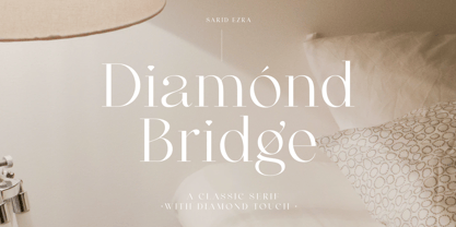 Introducing, Diamond Bridge - a classy serif with diamond touch! Diamond Bridge is an elegant and classy serif with a beautiful details that will make your presentation, logo or your wedding invitations more stunning and classy! You can use this font for several purposes such as a wedding invitations or even your own branding! This fonts support Multi Language and already PUA Encoded! Features Uppercase & Lowercase Number & Symbol Multi language PUA Encoded Thank You!
 - Marchens by Ironbird Creative,
$20.00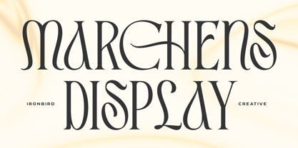 Introducing Marchens, a stylish and modern display serif, making it a versatile and elegant typeface. With a touch of vintage vibes, it will make your presentation looks amazing and sophisticated! You can use this typeface for logo, poster, event, or your social media post. Also support Multi Language and already PUA Encoded! Features: Uppercase & Lowercase Number & Symbol Multi language Ligatures Alternates PUA Encoded Thanks for purchasing and happy creating! Regards, Ironbird Creative
 - Alright, so let's dive into the world of the font "Hard Block" designed by the incredibly talented Måns Grebäck. It's like this font has been pumped up with sheer boldness and is ready to take on the...
- Endorphin by Tall Chai,
$15.00 Endorphin is a stylish oblique sans-serif font family with weights ranging from Thin (100) to Black (900). Features: Available in 9 weights Over 550 glyphs supporting extended Latin Ideal for display texts: Titles, Logos and Headlines etc. Perfect for branding and rebranding Supports OpenTypes features like Ligatures and Stylistic Alternates Symbols for 10 major currencies including Bitcoin provided in all weights Description: The Endorphin font signifies racing forward. Each oblique character manifests that feeling of achievement and happiness that one gets after a great workout or after a refreshing game. Every character effortlessly integrates with modern design standards and interfaces. The fonts are professional and have a strong personality in them. This makes Endorphin perfect for use in modern apps and websites. Endorphin is built for the designing and marketing squads. It has a trendy geometric characteristic which is ideal for any branding and rebranding. Endorphin has lot of OpenType features (like ligatures and alternates) and the Extended Latin character set supports over a hundred languages. Race Forward!
 - Nudista by Suitcase Type Foundry,
$39.00 Nudista is a monolinear, geometric sans-serif based on the proportions of the Purista typeface, released in 2007. The forms are not based strictly on square shape, but rather on a pleasant oval, round shape. The letter outlines are smooth, even technicist, the geometric precision is however compensated in places where it would get in the way of legibility and compromise the desired visual impact. Nudista was originally conceived as a display type, but it is sufficiently legible even in text sizes. Thus, it suits short texts in corporate prints. Carefully chiselled letter curves are sturdy and well suited for the harsh conditions of low-resolution printing devices, they work well on computer screens and mobile phone displays. However, Nudista works best in corporate systems, navigation and orientation systems, where it may be, also thanks to the sufficient range of weights, a good alternative to the well-known and thus a little overused DIN. Naked typeface with no needless decorations humbly serves in all places where too expressive types could be disturbing.
 - Always by Scholtz Fonts,
$19.00 Always is an elegant script font in six styles. Always makes full use of extravagant ascenders and descenders, giving the font a generous, opulent appearance. To use the font to its best advantage, we suggest that the user allows a generous line spacing. (For example: use multiple line spacing of no less than 1.3 when using the MS Word application). Always comes in six styles, condensed light, light, condensed regular, regular, black and fat, giving the user enough variety for all possible uses. Use a combination of styles for product branding, book covers, greeting cards, wedding media, women’s advertising media. The Always combination will enable you to use different styles of the same font for headings, sub-headings and body text. Always makes use of OpenType features and includes a number of automatic and discretionary ligatures, giving the font a varied, handwritten effect. Always contains over 283 characters - (upper and lower case characters, punctuation, numerals, symbols and accented characters are present) as well as characters for ligatures and alternate characters. It has all the accented characters used in the major European languages.
 - Odisseia by Plau,
$20.00 Odisseia: Monospaced Typeface Made on Earth by Plau. Plau presents Odisseia, a monospace type family in 8 styles designed with simplicity of shapes and a humanist touch. We’ve ventured into monospace territory, where all letters must occupy the same amount of space. This style is usually associated with typewriters and computer terminal fonts. Like all monospaced fonts, every letter align vertically in a multi-line setting. The rhythm created is peculiar, since large letters such as m and w occupy the same space as narrow ones like i. Because we have 4 different weights: light, regular, bold and black the design of some characters have to be adapted to fit the same width and achieve a constant light/dark value throughout. These features make Odisseia suitable for a specific yet considerable range of uses, from computer coding to systemized communication such as brand identities. This style has been used from high-end brand identity to cutting edge digital applications. Odisseia sets a little shorter in comparison with other monospaced fonts, and bears a large x-height.
 - Gridlite PE Variable by Rosetta,
$290.00 The two great technical constraints a type designer can tackle are low resolution, which limits detail and dictates proportions between negative and positive shapes, and uniform width, which restricts each letter to a fixed horizontal space. Wrestle with both at once, and each letter becomes a black-and-white chessboard that challenges every design decision. Sometimes battling these constraints gets in the way of a good idea, but other times, tinkering with fewer options can make the job irresistibly easy and lead straight to a grid addiction. Gridlite, an experiment with a modular negative space, is the side effect of such an addiction. It’s simplified, monospaced, and variable: foreground and background alike are ready to be animated, typed, scaled up, scaled down, rounded, or otherwise deformed. Gridlite is primarily a variable font with axes that control the size of the elements, their shape, and the background (one for the rectangular field and one for the compact envelope around the letters). The fonts cover Cyrillic, Greek, and Latin scripts. Small caps are included, for no apparent reason ... and there is a monospaced elephant, too.
 - Manteiga by Plau,
$49.00 Julia Child once said: the secret to great french cooking is butter, butter, butter. Thus, we present to you Manteiga - butter in Portuguese! - a typeface for heart-melting, word-spreading goodness. The idea we had was to play with brush lettering - a style we love - and go as far as we can with the shapes of the letters while finding balance between positive and negative space. We wanted biiiig personality. And small inconsistencies - the ones that add texture and life to lettering. We left extensive OpenType features and technical stuff aside for a moment, adding later only what we thought was necessary, like different shapes for the Q, a and g - for example. All caps setting was something we wanted from the beginning. In text case, the x-height is rather short for a brush script, and this lends a quirky voice. Spacing is ultra tiiiiight so don’t go too small, but make it as big as you want! Ah! And there are some fun dingbats thrown in for good measure.
 - Slatz by CozyFonts,
$20.00 The Slatz Font Family is Vertical. It has a slender, consistent weight that is best used in limited, left to Right, space limitations as to maximize font height. Slatz font variations all have extremely clean edges and even the serif versions are crisply defined with a flat-pointed serif for an added unique character. The designed intent was for a tight kern, however evenly letterspacing these family members give a distinct personality and continues to command the negative space just as in tight kerned examples. The compatible relationship of these font family members, serif to sans serif, and regular to italic is seamless and the overall design coloring of words as sentences is well balanced and extremely legible. The Slatz Family fonts are matching members glyph to glyph yet there is a noticeable difference between the serif and sans serif members. The sans serif works in contemporary and vintage settings. The serif members work particularly well in vintage, period applications. The Bold and Drop versions of Slatz also fit the above descriptions and also work on their own.
 - Stem by ParaType,
$40.00 The thing is that many sans-serif typefaces are usually intended for universal usage. But sometimes faces that work fine in body text look not so good in large point sizes for display purposes when all the contrast in non-contrast sans-serif, or ink traps, become visible to the naked eye. Every designer solves this problem in his own way. We offer a drastic solution in our Stem: a sans-serif with optical sizing. The first part of the type family, Stem Display, is for use in largest point sizes, from 36 pt indefinitely. Stem Display consists of 12 faces of widths from Hairline to Bold, and it has true italics. The development of Stem type family will include Stem Text for body text and “traditional”, universal use, and Stem Caption for small point sizes. Stem is a geometric sans-serif with semi-closed aperture, large x-height and modern proportions of uppercase letters, like in famous Avenir and Gotham. Its important feature is a professionally designed and carefully tested Cyrillic glyph set.
 - Ouido by Hanken Design Co.,
$30.00 The Ouido typeface has tastefully narrow characters with enough default spacing for comfortable reading at small sizes. Equipped with features like letter-spaced small caps and conservatively drawn italics for emphasizing words that maintain the reading speed—providing the reader a pleasant overall experience. Ouido (pronounced as “widow”) is derived from the Portuguese word OUVIR which means to hear or to listen. Ouido refers to the ability to play a song on any musical instrument after listening to it a couple of times and without reading the notes. The Ouido typeface is a modernized nostalgia for music enthusiasts, a whimsical revamp of the classic serif font. It bears resemblance with printed classical music scores, characterized by each letter’s rounded strokes like how one drew clefs with passion. Each dot is a twin of the quarter note minus the stem, so weaving sentences together could feel like composing a melody. Inspired by the astounding phenomenon of absolute pitch, the visual appeal of this typeface may hone your imaginative ability to embellish your creation without needing a reference.
 - Glade by Dear Alison,
$24.00 My latest typeface is a formal, copperplate script named Glade. Beginning as a project for a client who wanted several widths of a formal script style, the project never saw fruition. However, it did get me excited about the idea of a width family of steel nib scripts, ranging from extra narrow to extra wide, and the result is the Glade family. To give Glade a minor modern makeover from the original intent, the lowercase has been scaled up, and the Capitals scaled down for a more friendly personality. The character set has been expanded, and OpenType support has been added for unlimited fractions, ordinals, superiors and inferiors. So if you have the need for a formal connecting script, but are short on space, try Glade Narrow or Glade Extra Narrow. If space is not an issue, then the Regular, Wide or the generously gracious Extra Wide should do nicely. And if you get the whole family, well then you are set for anything that comes your way.
 - Kolaron by IbraCreative,
$17.00 Kolaron – A Modern Condensed Sans Serif Font Kolaron is a contemporary condensed sans-serif font that effortlessly blends sophistication with modernity. Its sleek and streamlined design features condensed letterforms that exude a sense of efficiency and space optimization, making it an ideal choice for projects where legibility and style are paramount. The font’s clean lines and geometric shapes contribute to a polished and professional appearance, making it versatile for a range of applications, from corporate branding to editorial design. Kolaron’s balanced letter spacing and subtle yet distinctive details showcase a meticulous attention to typographic detail, ensuring a harmonious and eye-catching visual experience across various mediums. Whether used for headlines, signage, or digital interfaces, Kolaron stands as a testament to the elegance achievable in contemporary typography. Kolaron is perfect for branding projects, logo, wedding designs, social media posts, advertisements, product packaging, product designs, label, photography, watermark, invitation, stationery, game, fashion and any projects. Fonts include multilingual support for; Afrikaans, Albanian, Czech, Danish, Dutch, English, Estonian, Finnish, French, German, Hungarian, Italian, Latvian, Lithuanian, Norwegian, Polish, Portuguese, Slovak, Slovenian, Spanish, Swedish.
 - Foverdis by insigne,
$22.00 Foverdis is a versatile and powerful ornate script face. Foverdis features flowing hand lettering with tall and graceful ascenders. The face offers a wide array of weights, from the powerful Black weight to the graceful Thin to unique Hairline. Foverdis can get the job done for many unique design tasks. Its wide range of weights at a great price, and OpenType alternates make it a very valuable font for your design toolbox. Foverdis OpenType features include a set of non-connecting alternates, 20 ligatures, and two types of ending letterforms. OpenType features include ornaments, a full set of swashes, swash endings, ending contextual alternates, discretionary ligatures, ligatures and twelve different stylistic sets filled with alternates. In total, there are over 150 alternate letterforms and ornaments. Please see the sample .pdf to see these features in action. OpenType capable applications such as Quark or the Adobe suite can take full advantage of the automatically replacing ligatures and alternates. This family also includes the glyphs to support a wide range of languages. Foverdis is great for a professional designer that wants to maximize design capabilities.
 - Bousni Ronde by Linotype,
$29.99The Bousni family's six faces display links unexpected by most readers of western alphabets. Inspired by both by Arabic calligraphy, and contemporary bitmap design, Bachir Soussi Chiadmi created this playful series of faces. Letters in each of the six typefaces link together, but not in the ways normally expected from script fonts. Suited for a wide array of fun functions, Bousni Carre and Bousni Ronde (each available in Light, Medium, and Bold weights) bring new a style and flavor to your collection. All six fonts in the Bousni family are included in the Take Type 5 collection from Linotype GmbH. The Bousni family espouses similar construction traits with other fonts from Linotype. Specifically, the straight lines and joints in the three Bousni Carre fonts are based off of a grid system similar to Anlinear, another member of the Take Type 5 collection from Linotype GmbH. The letter connections throughout the Bousni family are similar to Arabic kashidas, a typographic feature found recently in many non-Arabic typefaces, such as Linotype Atomatic." - Vialog by Linotype,
$50.99Vialog is a large and versatile sans serif family consisting of four weights of roman with corresponding italics, each with small caps and Old style Figures. Designers Werner Schneider and Helmut Ness based the concept for Vialog on the forms in "Euro Type," an unpublished type designed by Schneider in 1988 for the German Federal Transportation Ministry. For Vialog, Schneider made comprehensive legibility studies of the existing European transportation fonts, and combined and adapted the best features to make a new information system font family. He fine-tuned Vialog's characters and spacing with a special regard to the legibility problems of transportation settings, such as viewing type at distances and while moving. For example: cap I, J and lowercase i, j are common legibility problems in sans serif fonts, so in Vialog, these characters have serifs. In addition to its usefulness to the transportation industry, the Vialog family confidently meets the needs of corporate design and branding systems with its space-saving attributes for text settings, as well as the large number of weights and styles. - Newspoint by Elsner+Flake,
$35.00 The design of the Newspoint typeface is based on the tradition of the American sans serif faces of the last century. This form expression was greatly influenced by the News Gothic type which was created by Morris Fuller Benton in 1908, and has, once again, become very popular. When the development of sans serif types such as Futura and Kabel by Renner and Koch began in 1925, the design of American sans serif types receded somewhat into the background. In the 1950’s, however, they experienced a renaissance which continues to this day. Thanks to its clean design and the relatively large x-height, the Newspoint is well suited for informative texts in newspapers, magazines, and brochures. In packaging design, as well, the Newspoint can display its strength in small print. Newspoint was developed as a customer-specific variation of the News Gothic. In contrast to the News Gothic, however, the face appears to be softer and more appealing thanks to the changed interpunctions. If so desired, the alternative characters give the typeface expanded individuality and a richness of design options.
 - Zierde Grotesk by Lewis McGuffie Type,
$35.00 Zierde is a take on early advertising, small-copy grotesks of the late 19th/early 20th century, and is largely inspired by Miller & Richard’s own range of Grotesques. More importantly, Zierde is accompanied by a large set of ornaments (+200) which hark back to the look-and-feel of the early-modernist arts and crafts movement. The ornaments in, and presentation of, Zierde owe much credit to J.G Schelter & Giesecke’s 1913 type specimen book ‘Die Zierde’. The strong functional uppercase sans-serifs alongside luscious, beautiful patterns in ‘Die Zierde’ make for beautiful combinations. This early-modernist use of grotesk alongside ornament looks bizarre in the eyes of us used to seeing sans-serifs in more formal, sterile settings. The face itself retains some historical flourishes such as the eccentric leaning angle of the italics, the long cross-bar on the ‘G’, the gammy-leg of the ‘R’, a strange ampersand and some irregular terminals across the weights. Zierde is display face meant for headlines, titles, short-copy, labels and logos. It comes in caps and small caps, Latin and Cyrillic.
 - Russell Brush by Tom Chalky,
$11.00 Introducing Russell - An organic and expressive handwritten brush script font designed for versatility. It's legible; making it perfect for product packaging, editorial work, and poster design, and it oozes personality; great for branding, invitations, and more. This font packs a real punch with super duper textures and a ton of useful extras (that line is certainly getting copyrighted!) including custom catchwords, ink splatters, underlining brush strokes, and italics! Take a look below to see everything that's included. ---------------------- What's Inside? ---------------------- - Russell: The original Russell script font boasting a full glyph range with multilingual support. - Russell Alternative: An entirely new font with slightly different lowercase and uppercase letters - perfect for improving the handwritten aesthetic. - Russell Extras: A font full of useful extras (Swashes, strokes, and splatters) that look great with the Russell fonts. Simply select the 'Russell Extras' font and start typing. - Russell Catchwords: Just like the extras above, this font is packed with 23 bonus custom catchwords that beautifully complement the family. - Russell & Russell Alternative Italic: Both Russell and Russell Alternative have italic options included, opening up more design possibilities.
 - FF Kaytek Headline by FontFont,
$50.99 Kaytek™ Headline completes the Kaytek typeface family with seven weights optimized for display purposes. Like the Kaytek Sans it is a fresh take on the correspondence typefaces of the 90s - which were originally designed for the demands of office environments. Just like its predecessors, this text typeface is robust and hard-working - meaning it works well in challenging design or printing environments - but it’s not without personality. Look closer at the lowercase g and a, especially in the italic, and you can see some unexpected elements of subversiveness within the design Every style of the typeface takes up exactly the same amount of space, thanks to the careful creation by Radek Lukasiewicz. This means designers can switch between styles without the text being reflowed, making it particularly useful in magazines, where space might be limited, and also on the internet, where hover links appear in a different style Kaytek Headline comes in seven weights, from Thin to ExtraBlack. Kaytek Sans, Kaytek Slab, and Kaytek Rounded, are also available.
 - Bousni Carre by Linotype,
$29.99The Bousni family's six faces display links unexpected by most readers of western alphabets. Inspired by both by Arabic calligraphy, and contemporary bitmap design, Bachir Soussi Chiadmi created this playful series of faces. Letters in each of the six typefaces link together, but not in the ways normally expected from script fonts. Suited for a wide array of fun functions, Bousni Carre and Bousni Ronde (each available in Light, Medium, and Bold weights) bring new a style and flavor to your collection. All six fonts in the Bousni family are included in the Take Type 5 collection from Linotype GmbH. The Bousni family espouses similar construction traits with other fonts from Linotype. Specifically, the straight lines and joints in the three Bousni Carre fonts are based off of a grid system similar to Anlinear, another member of the Take Type 5 collection from Linotype GmbH. The letter connections throughout the Bousni family are similar to Arabic kashidas, a typographic feature found recently in many non-Arabic typefaces, such as Linotype Atomatic." - Gainsborough by Fenotype,
$30.00 Gainsborough - a clean-cut display pack. Gainsborough is a display combo pack of three styles and extra swooshes. Gainsborough fonts are straightforward with characteristic clarity. All the three fonts are designed to play together. Gainsborough is very easy to use. Gainsborough Pen is a clear script inspired by handwriting with pigment pen but polished clean to be legible and inviting. It’s equipped with Contextual Alternates and Standard Ligatures for smooth flow and connections between letters. In addition there’s Stylistic and Swash Alternates for standard characters. Gainsborough Sans is a sturdy street-sans ready for action. It’s has zero contrast and angular geometric shapes. It’s great for bold headlines. Gainsborough Serif follows pretty much the same proportions but with the serifs and a little bit of contrast and round shapes. Try combining Gainsborough Swooshes with Gainsborough Pen - type one character with Swooshes in the end of a word typed with Pen and you’ll have an ending swash reaching below the word. There’s different shapes and length swooshes + a couple of center balanced ornaments.
 - Langston by Type Innovations,
$39.00 Langston is an original design by Alex Kaczun. It’s part of a series of lettering experiments, manipulating body proportions, characteristic elements and spacing to achieve some dramatic visual effects. It is hard to characterize if Langston is an outline or inline font. The outline has the same thickness and proportions as the stems. And the inter-letter spacing is also visually similar. This creates a dynamic and interesting visual harmony throughout. Furthermore, certain design elements like the accents and punctuation symbols, break with the outline treatment, and morph into an interesting play between inline and outline. The overall effect is stunning and mesmerizing. Langston is a display font not intended for text use. It was designed specifically for display headlines, logotype, branding and similar applications.This attractive display comes in roman with lower case and lining figures.The font is also available with true small capitals and old style figures. A special version was created with decorative initial capitals to further enhance the possibilities. The large Pro font character set supports most Central European and many Eastern European languages.
 - Brownstone Sans by Sudtipos,
$59.00 One design sparks another. As Alejandro Paul experimented with the strokes and curves of the monoline script Business Penmanship, he discovered interesting new forms and shapes that didn't fit the Spencerian theme of that typeface. These forms simmered in Ale’s subconscious over the next three years, during which time he visited New York City, pored over rare type specimen books in the New York Public Library, and explored Brooklyn’s neighborhoods. Brownstone, the face born from these explorations, is an original 21st-century design, yet one subtly infused with historical and cultural references -- keen observers might spot influences from decorative typefaces of 19th-century foundries. And just as faces from that era were influenced by contemporary architecture, the frames included with Brownstone echo the ornate iron railings of Park Slope’s row houses. (There’s also a slight 1960s vibe to Brownstone, of novelty swash-sans photocompositing faces, that can be played up at your discretion.) Influences aside, Brownstone has broad appeal to modern audiences. A soft, monoline sans-serif, with elements of Swiss geometry (see the ‘k’ and ‘x’), its marriage of highly legible, draftsman-like letterforms with decorative swashes and ornaments reflects the old-meets-new aesthetic of the DIY craft culture seen in Brooklyn and other urban centers. It’s ornamental but unfussy, romantic but understated. Brownstone includes character sets for Latin-based languages, including Western and Eastern European, Baltic, Turkish, Maltese, Celtic and Welsh. Over 1500 glyphs, including small capitals, swash characters, alternates, and ligatures, in both Light and Thin weights. Ornamental frames are also included in both weights. The Brownstone Frames fonts are available as separate fonts in the new Brownstone Slab family.
 - Aquawax Fx by Zetafonts,
$39.00 Aquawax FX was developed by Francesco Canovaro as a new variant of the Aquawax family, one of the most beloved Zetafonts classics. This new typefamily is characterised by a contemporary and elegant design, that revisits the original design of 2008 with new geometric inventions, twisted with the current fluid zeitgeist. Aquawax FX builds on the original Aquawax family by adding counter-inktraps to the letterforms and emphasizing the inner contrast of curves and corners creating a smoother, flowing and dynamic look. While inktraps are a design feature that prevents ink from bleeding or filling small spaces in letterforms to achieve a cleaner, more readable look, anti-inktraps characterize the design with a distinctive watery appearance, suitable for logo design and titles. This watery effect is possible through a slight rounding of the inner and outer corners, keeping the original cuts at the letter terminals. A Space variant pushes FX experimentation furthermore, providing an alternate stencil-like style that takes legibility to the extreme, ready for logos and sci-fi headings. This does not limit the usability of Aquawax FX to mere display intent. The Aquawax FX font family includes two versions (Roman and Space), each with nine weights, ranging from Thin to Heavy, and matching italics. With a total of 36 variants plus one variable version, Aquawax FX is a versatile type family that can be used for a variety of design projects, from branding and packaging to editorial design and advertising. Aquawax FX offers a fresh re-interpretation of the original Aquawax letterforms and proportions, with a dynamic and flowing look that is sure to make your projects stand out.
 - Monotalic by Kostic,
$30.00 Monotalic was created as a fun experiment, exploring better solutions for the monospaced type design. Most monospaced (fixed-width) typefaces have the same main design problem regarding the lowercase – filling the empty space around l, f, i, j and r. That usually brings the addition of slab serifs to those narrow characters, causing many monospaced fonts to look and feel alike. Monotalic solves that problem by adopting the handwritten (or cursive) form for those problematic characters, which allows them to be defined in more strokes, thus getting a better distribution of form in that fixed-width space. On the other hand, cursive writing usually lacks the legibility of a Roman (Regular upright) style, so Monotalic was created to be a hybrid, taking the best of both worlds. Monospaced fonts today are mostly used for coding. Modern code editors use colored text in order to differentiate between different kinds of code. So, in that environment there’s actually no need for traditional text styling by adding Italics, Bold or other styles, because the code lines are overstated as it is. That is why Monotalic focuses on one style only, in three widths and four weights. The weights allow users to choose the perfect contrast of text on screen, depending on their monitor resolution and background color in the editor. Movie scripts are almost exclusively set in 12pt Courier. It became the industry standard because when set in the specific “screenplay format" it helps with the breakdown of the schedule and budgeting process of the film production. Although it looks completely different, text set in Monotalic (Normal width) will take the same amount of space as Courier.
 - Gambler by Fenotype,
$25.00 Gambler is a characteristic display type collection of 7 font styles with both clean and textured -making it total 14 fonts designed to play together. Gambler strikes with witty and elegant appeal combining vintage and modern elements. Gambler is an effective set for creating identities for branding, posters, book covers, headlines, logotypes, prints on garments, restaurant menus, beer labels and so on, both offline and online. Gambler Script is a smooth contrasted script that comes in two weights and it is packed with plenty of OpenType features: Standard Ligatures and Contextual Alternates are automatically on and they help to keep the flow and connections smooth. From Stylistic Alternates you’ll find characters with pointed endings and some other small variations. For extra flair try Swash or Titling Alternates. Gambler Script is PUA encoded so you can access the extra characters in most graphic design softwares. Gambler Brush is a soft brush script with low contrast and large x-height. Gambler Brush comes with following OpenType features: Standard Ligatures and Contextual Alternates that are automatically on and that keep the connections smooth. For less uneven word picture try Stylistic or Swash Alternates. Gambler Brush is PUA encoded so you can access the extra characters in most graphic design softwares. Gambler Flare is a flared serif with sharp edges and wide characters Gambler Flare comes in two weights. Gambler Gothic is a rigid condensed sans serif that comes in two styles: Regular and Shadow. Gambler Gothic Shadow has a narrow lining giving a three dimensional expression to the font. Gambler fonts are designed to play together, in pairs, or all together but they also work great as themselves or combined with other Fenotype Fonts.
 - Anjelina by Nandatype Studio,
$12.00 Anjelina is a beautiful and romantic script font. It is PUA encoded which means you can access all of the glyphs and swashes with ease!
 - Dirchave by Rillatype,
$15.00 Introducing, Dirchave, dirchave is a vintage inspired display font that perfect for packaging, branding, headline, quotes, etc. Features: - Uppercase Font - Number - Punctuatuon - Stylistic Alternate - PUA encoded
 - Hatcher by Letterena Studios,
$9.00 Hatcher is a stylish and distinct serif font. This font is PUA encoded which means you can access all of the glyphs and swashes with ease!