10,000 search results
(0.042 seconds)
- Saturday Detentions by Bogstav,
$18.00 Saturday Detentions is based on the classic serif "High School" style. However, this version is handmade and a bit rugged here and there - and loose in a legible/organic way. I've added 7 different versions of each letter and they automatically cycle as you type - or you can manually choose the one you prefer from the glyph menu.
 - Semiramis by Scriptorium,
$18.00Semiramis is based on lettering from the Roycroft movement, but has a Science Fiction/Fantasy feel to it, drawing on elements from antique scripts and the Art Nouveau period to produce a result which is modern and ancient at the same time. There are two different shapes for each character, accessed with the upper and lower case keys. - Saturator Serif FA by Fontarte,
$39.00 Saturator Serif FA is a younger brother of Saturator FA. It comes with upper and lower case letters and with diacritic characters for many Latin languages. Its informal and cheerful character allows for different creative ways of usage. This slab serif typeface is designed to accompany sans serif version. It has three variants: Regular, Italic and Shadow.
 - Kumbaya by Rachel Kick,
$6.00 Kumbaya is a purely hand-drawn, all-caps sans. It's the perfect combo of handmade quirks and clear, legible print. Kumbaya has the ability to hold it's own as a single word headline, or in a paragraph form. It also works well with script compliments. With four different styles, it is the perfect addition to any project!
 - WOODTYPE Collection by Borutta Group,
$19.00 WOOD TYPE COLLECTION from Mateusz Machalski is a set of wonderful, warm, and weathered hand made typefaces designed by Mateusz Machalski. The Inspiration for this collection comes from a wooden letter blocks and other old technologies used for printing. WTC supports 40 different languages and contains over 300 glyphs per style. The Family consists of 20 typefaces. ENJOY!
 - Pencil by Ingrimayne Type,
$9.95 Imagine that you had a bunch of pencils of various sizes and you wanted to make a set of letters with them. You would probably come up with something similar to one of these three typefaces. It is caps only, but some of the characters on the lower-case keys are different from those on the upper-case keys.
 - Observant by PizzaDude.dk,
$15.00 Observant is your true partner when you want something with a handwritten attitude. Works great with invitations, greeting cards, presentations and alike. Each letter has got 7 different versions, which automatically cycles as you type. This is a neat trick to make your text look more random, and avoid repeating letters. Comes with extensive language support!
 - Monthly Issue JNL by Jeff Levine,
$29.00 An Art Nouveau, hand lettering on a Good Housekeeping magazine cover from the 1920s inspired Monthly Issue JNL, which is available in both regular and oblique versions. Prior to the 1940s, it was not unusual to find the covers of many popular magazines hand lettered with either their names and/or content information; often in different type styles.
 - Tarquin AT by Akufadhl,
$15.00 Tarquin is a All-Caps sanserif typeface, inspired by the beautiful hand-painted sign. It has a strong personality, high contrast stem, and widely opened counter to improve the readibility as it designed for display purposes. It's available in 3 different style, REGULAR, STENCIL, and SHADOW designed for display purpose design Crafted beautifully and carefully with hand.
 - Handel Slab by URW Type Foundry,
$35.99 Handel Slab, designed by Ralph M. Unger, is a new offering which ideally enhances and extends the existing Handel Gothic family. Even so, Handel Slab can very well be used on its own. Obviously, Handel Slab is closely based on Handel Gothic, which was designed by Don Mandel in the mid 1960s and which has been popular and successful amongst users from day one. Even today, it is a futuristic sans serif, and it is used for a wide range of typographic tasks, for example in computer games. Handel Slab provides a perfect enhancement to Handel Gothic, and the combination of both families offers more flexibility to designers and typographers.
 - Metal Cry by Fabulous Rice,
$25.00 Metal Cry is a font family that was inspired by countless hours spent playing video games, watching old movies or reading comic books. And even more hours closely analysing the design of all these things. The art of creating beautiful letters has slowly declined with the rise of the digital age and its solid-colour, 2D fonts. And most of the time, the care given to typography in cultural products just isn't what it used to be anymore. This was the inspiration for Metal Cry, a family of 4 layerable fonts that can bring a feeling of depth to its letters, and offers endless possible combinations. Metal Cry Outlands is the basic shape of all the characters, it can be used as the bright side of the bevel. Metal Cry Front is the inline border font that can be used as the front side of the bevel. Metal Cry Shadow can be used as the dark side of the bevel. Metal Cry Depth can be used to flash out the inside shape of the letter. But of course, any font can be combined with any other font(s) to obtain various results. The planets in the above visuals are courtesy of 3D artist Thomas Veyrat / veyratom.com
 - Binate by Monotype,
$49.99 Binate provides a smart and adaptable solution for the modern creative. Designed with functionality at its core, Binate offers a synergetic blend of neutrality and expression — all within a contemporary superfamily. Binate combines the characteristics of a workhorse sans serif and an elegant brush-inspired display style. The Binate family delivers a wide variety of possibilities and combinations for designers with its vast range of weights from Hairline to Black. Built for purpose, Binate offers designers a diverse spectrum of expression, as Binate is as comfortable in the tiny details on packaging as it is in large formats like billboards and posters. Binate’s apertures present a crisp and rigid style that evoke a utilitarian design, yet experimenting with some of Binate’s lower hooks can offer a more approachable and friendly demeanor. All of Binate's companions — like its Italics — can unlock new layers of creativity and tone of voice, and they all feel at home on both digital and print mediums. Binate encourages you to experiment with its impressive weight ranges and arms you with ample tools to refine and tweak endlessly.
 - Loyolliams by Eyad Al-Samman,
$5.00 “Loyolliams” is my first designed Latin typeface which has special meanings and unforgettable memories for me. The font's name, Loyolliams, consists of two mixed syllables stand for two different names. The first syllable is derived from the name “Loyola” and the second syllable is derived from the last five letters of the name “Williams.” These two names are related to “Concordia University”—located in Montreal in Canada—where I studied at a short academic term and spent in a very special period of my life in the late 2005. This renowned Canadian academic institution was created following the 1974 merger of “Loyola College” (1896) and “Sir George Williams University” (1926). This conglomeration formed “Concordia University” and the name Concordia itself was taken from the motto of the city of Montreal, Concordia salus (meaning ‘well-being through harmony’). This font comes in two different weights; light and regular. “Loyolliams” is a square, geometric, techno, and modern font. It is suitable for T-shirts, books' covers, websites’ addresses, advertisement light boards, and titles in technical, artistic, and other types of magazines and signboards. “Loyolliams” can be used also in posters, surfaces of electrical and electronic tools, digital devices and chips, geometrical machines, trucks, tractors, calculators, mobile phones, watches, laptops, personal computers, power equipments, digital cameras, technical magazines, and other digital and electronic tools. This fonts can be effectively used in titles especially when its uppercase and lowercase letters are mixed together and when it is used in its italic mode. "Loyolliams" is suitable for writing and printing small textual paragraphs in cards, magazines advertisements, and also posters. The main characteristic of "Loyolliams" Typeface is its non-curve style in most of its alphanumeric letters. The characters are deliberately designed to have only angular and square shapes.
 - Nomenclatur by Aronetiv,
$9.99 The font was created under the influence of German tabular inscriptions. Especially, DIN font influenced on Nomenclatur graphic. It adds clarity and conciseness in the font. Nomenclatur is intended for use in architectural and design topics. It is also intended for a set of instructions and manuals. The font has the aesthetics of the Bauhaus and other constructivist movements. Characters of font are designed with high intelligibility, which makes it well readable in a small size. The lowercase letter "l" has a tail, so as not to confuse it with the capital letter "I", which has serifs. It avoids confusion in words like "Illinois". The font is well suited for the design of signs and navigation texts. A wide selection of styles allows you to design complex typography. The font family includes 15 styles. The font family has a variable font with two axes of weight and width. The font contains a set of alternative characters that will allow you to create different moods. The font contains Western European Latin and standard Cyrillic. The font has more than 3,600 kerning pairs configured. The font contains beautiful ampersand.
 - Behavior Indihome by Aldedesign,
$15.00 Behavior Indihome is a font with awesome and classy taste, it has a natural touch and many ligatures. We feel this font looks classy, readable, elegant, stylish, catchy and absolutely easy to use. Behavior Indihome is the great choice for a watermark on branding, design, wedding, photography, signature, logo design, album cover, business card, quotes, and many other design projects. This font is for those who want to show something smooth and modern. You may use this font if you want to attract modern buyers. The font design seems to show that you have a passion in the business and give your love to the products and services offered to your customers. Because it is an eye-catching signature font, you can use it for a variety of purposes including wedding invitations, signature, logo, branding, poster, and many more.
 - KG Primary Penmanship by Kimberly Geswein,
$5.00 I come from a family of educators- my mom, husband, stepmom, brother-in-law, and sister are all currently teaching and I have taught in the past. This font was created after speaking to several elementary school teachers who were struggling to find just the right font to use on worksheets and projects in their classroom. They liked many features of other fonts, but needed small things altered in order to make a "perfect fit" for their class. Hand-drawn by me, this font hopefully addresses several of those issues. As penmanship styles vary across the globe, I am sure this font will not work in every classroom. But hopefully this style will work for many teachers to give their early readers a highly legible, neat, accurate font. It is best used with kerning turned on to allow for accurate letter spacing.
 - Mantrap by Twinletter,
$12.00 Introduce Mantrap, a basic sans serif typeface made specifically for those of you who want your project to be seen by a large number of people, fascinate the audience, and win the camp. Your design project will be unique, appealing, and charming if you use this font in it. Because each anatomical shape of this font has been adjusted so that when combined, it can offer a varied impression while being easy to read, the audience that sees it will be captivated and grasp the content of the message you want to express to all audiences. of course, your various design projects will be perfect and extraordinary if you use this font because this font is equipped with a font family, both for titles and subtitles and sentence text, start using our fonts for your extraordinary projects.
 - Latter Slant by Aldedesign,
$15.00 Latter Slant is a font with awesome and classy taste, comes with natural touch, and many ligatures. We hope this font looks classy, readable, elegant, stylish, catchy and absolutely easy to use. Latter Slant is the great choice for watermark on branding, design, wedding, photography, signature, logo design, album cover, business card, quotes, and many other design project. This font is for those who want to show something smooth and modern. You may use this font if you want to attract modern buyers. The font design seems to show that you have a passion in the business and give your love to the products and services you are offered to customers. Because it is an eye-catching signature font, you can use it for a variety of purposes including wedding invitation, signature, logo, branding, poster, and many more.
 - Nadhiratil Mahira by MonoLIne Calligraphy,
$21.00 Nadhiratil Mahira is interesting because the typeface is pleasing to the eye, clean, feminine, sensual, glamorous, simple and very easy to read, because there are many fancy letter connections. I also offer a number of decent stylistic alternatives for multiple letters. Classic styles are very suitable to be applied in various formal forms such as invitations, labels, restaurant menus, logos, fashion, make up, stationery, novels, magazines, books, greeting / wedding cards, packaging, labels or all kinds of advertising purposes. . . Nadhiratil Mahira has alternative characters, including support for multiple languages. With OpenType features with an alternative style and elegant binding. The OpenType feature does not work automatically, but you can access it manually and for the best results required for your creativity in combining these Glyph / Character variations. Font Features : * Lowercase beginning and ending swash * Uppercase beginning swash * Initials * International Language I heavily use programs that support OpenType features and the Glyphs panel such as Adobe Illustrator, Adobe Photoshop CC, Adobe InDesign, or CorelDraw, so that you can view and access all the variations of the Glyph. Nadhiratil Mahira is coded with Unicode PUA, which allows full access to all additional characters without having any special design software. Mac users Mac users, and Windows users can use Character Map to view and copy any of the additional characters to paste into your favorite editor / application. Please send a message if you have questions or problems, and don't hesitate to say hello on Instagram : @monolinecalligraphy Thank you & Happy Designing!
 - Broadway Poster by GroupType,
$15.00 Originally designed by Morris Fuller Benton in 1925, FontHaus's 1995 revival is based on a design named "Novelty Broadway". Characters were referenced from "Commercial Art of Show Card Lettering" by James Eisenberg, published by D. Van Nostrand Company in 1945. This Broadway is classic Broadway but with some charming differences such as a slanted lower case "f" a remarkable lower case "g" and a high-waisted upper case case "R", as only a few examples. It was named "Novelty" because the alphabet incorporated a concave design feature in the tops and bottoms of each letter. These differences allow this version to possess much more personality than that of all other Broadway designs on the market. It looks almost hand brushed, has soft edges and is no where near as sterile looking as all the other digital versions. It feels very 1925!
 - Greatly by Letterhend,
$12.00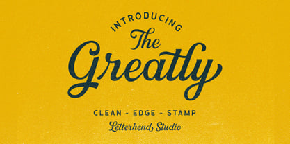 Greatly Script gives you a classic feel and is really perfect for you who needs a typeface for especially logotype, apparel, invitations, branding, packaging, advertising, and more. Greatly comes in uppercase, lowercase, with punctuations, symbols and numerals, stylistic alternate sets, ligatures, also multi-lingual support and is already PUA encoded.
 - Black Sigra by Sign Studio,
$12.00 Black Sigra comes in 3 styles (regular, blur, and shadow) so it can be more versatile. Adapting to a simpler fracture calligraphy style. Has sufficient thickness to dominate a design page. Supports multiple languages and each character has a PUA code which means everything can be accessed on most common software.
 - Goldbrick by Sarid Ezra,
$15.00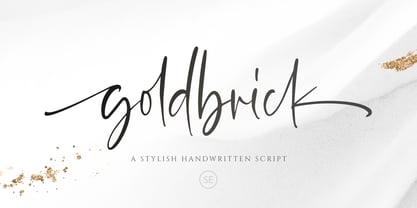 Goldbrick Script is a natural handwritten script that contains lowercase, uppercase, symbol, and also multi-lingual support. Comes with ligature, contextual alternates, stylistic alternates, also initial and terminal swash. Goldbrick Script is suitable for logo branding, beautiful fashion design, suitable for wedding invitation, or handwritten quote. It is already PUA Encoded.
 - Monday Today by Sensatype Studio,
$15.00 Monday Today is a fun and playful cute typeface. It is perfect for logotype, flyer, greeting cards, packaging, book cover, printed quotes, headings, etc. What will you get: All Characters (from A to Z) Numbers and Punctuation Works on PC & Mac Simple installations PUA Encoded Thanks and have a wonderful day. :)
 - John Sans by Storm Type Foundry,
$49.00 The idea of a brand-new grotesk is certainly rather foolish – there are already lots of these typefaces in the world and, quite simply, nothing is more beautiful than the original Gill. The sans-serif chapter of typography is now closed by hundreds of technically perfect imitations of Syntax and Frutiger, which are, however, for the most part based on the cool din-aesthetics. The only chance, when looking for inspiration, is to go very far... A grotesk does not afford such a variety as a serif typeface, it is dull and can soon tire the eye. This is why books are not set in sans serif faces. A grotesk is, however, always welcome for expressing different degrees of emphasis, for headings, marginal notes, captions, registers, in short for any service accompaniment of a book, including its titlings. We also often come across a text in which we want to distinguish the individual speaking or writing persons by the use of different typefaces. The condition is that such grotesk should blend in perfectly with the proportions, colour and above all with the expression of the basic, serif typeface. In the area of non-fiction typography, what we appreciate in sans-serif typefaces is that they are clamorous in inscriptions and economic in the setting. John Sans is to be a modest servant and at the same time an original loudspeaker; it wishes to inhabit libraries of educated persons and to shout from billboards. A year ago we completed the transcription of the typefaces of John Baskerville, whose heritage still stands out vividly in our memory. Baskerville cleverly incorporated certain constructional elements in the design of the individual letters of his typeface. These elements include above all the alternation of softand sharp stroke endings. The frequency of these endings in the text and their rhythm produce a balanced impression. The anchoring of the letters on the surface varies and they do not look monotonous when they are read. We attempted to use these tricks also in the creation of a sans-serif typeface. Except that, if we wished to create a genuine “Baroque grotesk”, all the decorativeness of the original would have to be repeated, which would result in a parody. On the contrary, to achieve a mere contrast with the soft Baskerville it is sufficient to choose any other hard grotesk and not to take a great deal of time over designing a new one. Between these two extremes, we chose a path starting with the construction of an almost monolinear skeleton, to which the elements of Baskerville were carefully attached. After many tests of the text, however, some of the flourishes had to be removed again. Anything that is superfluous or ornamental is against the substance of a grotesk typeface. The monolinear character can be impinged upon in those places where any consistency would become a burden. The fine shading and softening is for the benefit of both legibility and aesthetics. The more marked incisions of all crotches are a characteristic feature of this typeface, especially in the bold designs. The colour of the Text, Medium and Bold designs is commensurate with their serif counterparts. The White and X-Black designs already exceed the framework of book graphics and are suitable for use in advertisements and magazines. The original concept of the italics copying faithfully Baskerville’s morphology turned out to be a blind alley. This design would restrict the independent use of the grotesk typeface. We, therefore, began to model the new italics only after the completion of the upright designs. The features which these new italics and Baskerville have in common are the angle of the slope and the softened sloped strokes of the lower case letters. There are also certain reminiscences in the details (K, k). More complicated are the signs & and @, in the case of which regard is paid to distinguishing, in the design, the upright, sloped @ small caps forms. The one-storey lower-case g and the absence of a descender in the lower-case f contributes to the open and simple expression of the design. Also the inclusion of non-aligning figures in the basic designs and of aligning figures in small caps serves the purpose of harmonization of the sans-serif families with the serif families. Non-aligning figures link up better with lower-case letters in the text. If John Sans looks like many other modern typefaces, it is just as well. It certainly is not to the detriment of a Latin typeface as a means of communication, if different typographers in different places of the world arrive in different ways at a similar result.
 - CHILD & MOMSKY by Rhd Studio,
$15.00 Style and Grace personified - say Child Momsky. This typeface has two main styles, Regular and Italic, that are designed to work elegantly in unison and apart. The serif has a boldy different ' f', which sets it apart from regular serifs.....as Child Momsky likes to stand out from the rest. A regular 'f' is included in its alternates, and a extra font style with a regular f is included for projects that require a more staid elegance. The Italic style is dreamy, sultry and light-footed - a perfect partner for the more serious serif. Use them together or apart for stylish, stand-out type designs and projects. For those of you who do not have access to Opentype Software, such as Canva Users, a separately available 'extra letters' font set will be available for purchase soon. Language Supported : Danish, English, French, German, German (Switzerland), Italian, Low German, Luxembourgish, Norwegian Bokmål, Norwegian Nynorsk, Portuguese, Swedish, Swiss German. Enjoy
 - Merry Bright by Romie Creative,
$12.00 Hello everyone, I would like to introduce my newest font Merry Bright Script is a beautiful modern calligraphy typeface, I hope you will be interested in this font, if you want to use it for your work. This font can be used easily and simply because there are many features in it. contains a full set of lowercase and uppercase letters, a wide variety of punctuation marks, numbers, and multilingual support. font also contains a lot ligatures and contains many alternative Style Sets such as the stroke alternative of the heart to combine with two words, for example: Ashley-Haston. You can see an example in the image above. Merry Bright is perfect for today's emerging market design, this font has a stylish, trendy, natural and soft font, with this font you can take advantage of any opportunity is a great way to highlight the celebration the best of parties, because this font will be an advocate for the cause such as wedding invitations, branding, parties, graduations, birthdays, gatherings, etc. Thank You, Romie Creative
 - Muttung by Haksen,
$12.00 Dear Font Lovers, I really glad to inform You and of course introduce my New Collection Font with the name "Muttung" "Muttung" is beauty font script with more than 40 glyps of alternate to provide beauty types. In this chance I would like to give You 2 variations of this font, what's the variation? You will get : Muttung Solid Muttung with Rustic effect What's the different of couple these font? Muttung Solid is designed for anything brand with beauty type in many alternate to provide your requirement. Muttung with Rustic effect is designed for beauty type with vintage sensation but still looks beautiful. With these fonts I'm hope You will get satisfaction for everything of Your projects or anything for You works. These fonts are support with many software such as : Adobe Photoshop CC, Adobe illustrator CC, Coreldraw, also many more. Finally, I hope with these fonts You will get everything your requirement and get satisfaction. Thanks for Your visit and attention. Success is always for You. Best Regards, Haksen
 - Russell Brush by Tom Chalky,
$11.00 Introducing Russell - An organic and expressive handwritten brush script font designed for versatility. It's legible; making it perfect for product packaging, editorial work, and poster design, and it oozes personality; great for branding, invitations, and more. This font packs a real punch with super duper textures and a ton of useful extras (that line is certainly getting copyrighted!) including custom catchwords, ink splatters, underlining brush strokes, and italics! Take a look below to see everything that's included. ---------------------- What's Inside? ---------------------- - Russell: The original Russell script font boasting a full glyph range with multilingual support. - Russell Alternative: An entirely new font with slightly different lowercase and uppercase letters - perfect for improving the handwritten aesthetic. - Russell Extras: A font full of useful extras (Swashes, strokes, and splatters) that look great with the Russell fonts. Simply select the 'Russell Extras' font and start typing. - Russell Catchwords: Just like the extras above, this font is packed with 23 bonus custom catchwords that beautifully complement the family. - Russell & Russell Alternative Italic: Both Russell and Russell Alternative have italic options included, opening up more design possibilities.
 - Hello Honey by Krafted,
$10.00 Looking for a font that’ll make your branding sparkle? A versatile, modern, and happy font? Introducing Hello Honey - A Bold Script Font. This bold script font can be used for various different promotions or projects. Use it to create standout headings, promote your online sales, Instagram quotes, YouTube vlogs, and even printed materials like business cards, t-shirts, or invitations. Get ready to attract your audience and make your branding bold with Hello Honey. What you’ll get: Multilingual & Ligature Support Full sets of Punctuation and Numerals Compatible with: Adobe Suite Microsoft Office KeyNote Pages Software Requirements: The fonts that you’ll receive in the pack are widely supported by most software. In order to get the full functionality of the selection of standard ligatures (custom created letters) in the script font, any software that can read OpenType fonts will work. We hope you enjoy this font and that it makes your branding sparkle! Feel free to reach out to us if you’d like more information or if you have any concerns.
 - Hey Magnolia by Mytha Studio,
$15.00 Hello everyone, I would like to introduce my newest font Hey Magnolia Script is a beautiful modern calligraphy typeface, I hope you will be interested in this font, if you want to use it for your work. This font can be used easily and simply because there are many features in it. contains a complete set of lowercase and uppercase letters, assorted punctuation, numbers, and multilingual support. font also contains multiple ligatures and many contain alternative Style Stylistic Sets such as a heart swash alternative to combine with two words, for example: Ashley-Haston. You can see an example in the image above. Hey Magnolia is very suitable for market designs being developed today, this font has a stylish, trendy, natural and soft font, with this font you can take advantage of opportunities every moment is a great way to highlight the celebration of the best of the party, because this font will be an advocate for the purposes such as wedding invitations, branding, parties, graduations, birthdays, gatherings, etc. Thank you, Mytha Studio
 - Schism One by Alias,
$55.00 Schism is a modulated sans-serif, originally developed from our Alias Didot typeface, as a serif-less version of the same design. It was expanded to three sub-families, with the thin stroke getting progressively heavier from Schism One to Schism Three. The different versions explore how this change in contrast between thick and thin strokes changes the character of the letterforms. The shape is maintained, but the emphasis shifts from rounded to angular, elegant to incised. Schism One has high contrast, and the same weight of thin stroke from Light to Black. Letter endings are at horizontal or vertical, giving a pinched, constricted shape for characters such as a, c, e and s. The h, m, n and u have a sharp connection between curve and vertical, and are high shouldered, giving a slightly square shape. The r and y have a thick stress at their horizontal endings, which makes them impactful and striking at bolder weights. Though derived from an elegant, classic form, Schism feels austere rather than flowery. It doesn’t have the flourishes of other modulated sans typefaces, its aesthetic more a kind of graphic-tinged utility. While in Schism Two and Three the thin stroke gets progressively heavier, the connections between vertical and curves — in a, b, n etc — remain cut to an incised point throughout. The effect is that Schism looks chiselled and textural across all weights. Forms maintain a clear, defined shape even in Bold and Black, and don’t have the bloated, wide and heavy appearance heavy weights can have. The change in the thickness of the thin stroke in different versions of the same weight of a typeface is called grading. This is often used when the types are to used in problematic print surfaces such as newsprint, or at small sizes — where thin strokes might bleed, and counters fill in and lose clarity, or detail might be lost or be too thin to register. The different gradings are incremental and can be quite subtle. In Schism it is extreme, and used as a design device, giving three connected but separate styles, from Sans-Didot to almost-Grotesk. The name Schism suggests the differences in shape and style in Schism One, Two and Three. Three styles with distinct differences, from the same start point.
 - Schism Three by Alias,
$55.00 Schism is a modulated sans-serif, originally developed from our Alias Didot typeface, as a serif-less version of the same design. It was expanded to three sub-families, with the thin stroke getting progressively heavier from Schism One to Schism Three. The different versions explore how this change in contrast between thick and thin strokes changes the character of the letterforms. The shape is maintained, but the emphasis shifts from rounded to angular, elegant to incised. Schism One has high contrast, and the same weight of thin stroke from Light to Black. Letter endings are at horizontal or vertical, giving a pinched, constricted shape for characters such as a, c, e and s. The h, m, n and u have a sharp connection between curve and vertical, and are high shouldered, giving a slightly square shape. The r and y have a thick stress at their horizontal endings, which makes them impactful and striking at bolder weights. Though derived from an elegant, classic form, Schism feels austere rather than flowery. It doesn’t have the flourishes of other modulated sans typefaces, its aesthetic more a kind of graphic-tinged utility. While in Schism Two and Three the thin stroke gets progressively heavier, the connections between vertical and curves — in a, b, n etc — remain cut to an incised point throughout. The effect is that Schism looks chiselled and textural across all weights. Forms maintain a clear, defined shape even in Bold and Black, and don’t have the bloated, wide and heavy appearance heavy weights can have. The change in the thickness of the thin stroke in different versions of the same weight of a typeface is called grading. This is often used when the types are to used in problematic print surfaces such as newsprint, or at small sizes — where thin strokes might bleed, and counters fill in and lose clarity, or detail might be lost or be too thin to register. The different gradings are incremental and can be quite subtle. In Schism it is extreme, and used as a design device, giving three connected but separate styles, from Sans-Didot to almost-Grotesk. The name Schism suggests the differences in shape and style in Schism One, Two and Three. Three styles with distinct differences, from the same start point.
 - Schism Two by Alias,
$55.00 Schism is a modulated sans-serif, originally developed from our Alias Didot typeface, as a serif-less version of the same design. It was expanded to three sub-families, with the thin stroke getting progressively heavier from Schism One to Schism Three. The different versions explore how this change in contrast between thick and thin strokes changes the character of the letterforms. The shape is maintained, but the emphasis shifts from rounded to angular, elegant to incised. Schism One has high contrast, and the same weight of thin stroke from Light to Black. Letter endings are at horizontal or vertical, giving a pinched, constricted shape for characters such as a, c, e and s. The h, m, n and u have a sharp connection between curve and vertical, and are high shouldered, giving a slightly square shape. The r and y have a thick stress at their horizontal endings, which makes them impactful and striking at bolder weights. Though derived from an elegant, classic form, Schism feels austere rather than flowery. It doesn’t have the flourishes of other modulated sans typefaces, its aesthetic more a kind of graphic-tinged utility. While in Schism Two and Three the thin stroke gets progressively heavier, the connections between vertical and curves — in a, b, n etc — remain cut to an incised point throughout. The effect is that Schism looks chiselled and textural across all weights. Forms maintain a clear, defined shape even in Bold and Black, and don’t have the bloated, wide and heavy appearance heavy weights can have. The change in the thickness of the thin stroke in different versions of the same weight of a typeface is called grading. This is often used when the types are to used in problematic print surfaces such as newsprint, or at small sizes — where thin strokes might bleed, and counters fill in and lose clarity, or detail might be lost or be too thin to register. The different gradings are incremental and can be quite subtle. In Schism it is extreme, and used as a design device, giving three connected but separate styles, from Sans-Didot to almost-Grotesk. The name Schism suggests the differences in shape and style in Schism One, Two and Three. Three styles with distinct differences, from the same start point.
 - Virgolate by Letterhend,
$19.00 Virgolate is a beautiful and classy script based on manual calligraphy ink on a paper. This fnt has many swashes that allows you to create beautiful lettering instantly. it has many stylistic set alternates that you can choose from. This font perfectly made to be applied especially in logo, and the other various formal forms such as invitations, labels, logos, magazines, books, greeting / wedding cards, packaging, fashion, make up, stationery, novels, labels or any type of advertising purpose. Features : uppercase & lowercase numbers and punctuation multilingual ligatures alternates swashes PUA encoded We highly recommend using a program that supports OpenType features and Glyphs panels like many of Adobe apps and Corel Draw, so you can see and access all Glyph variations.
 - Braves Factor by Ditatype,
$29.00 Brave Factor is a display font mixture of the script font features providing capital letters in round, adorable proportions. Such round letters express so smooth, warm, friendly nuances that it is suitable to create attractive, fun nuances. In spite of the big, round shapes, this font maintains the original script font features, which are still legible, such as the smooth curves elements and the unique scratches flowing in some of the letters. Such script elements can add beauty and personal touches to the font. Some of the letters may have curvy curves, while the others have sharp ones to show you interesting visual dynamics and to liven up the font. Furthermore, the font’s letters have been carefully crafted to be as legible as possible without ignoring its aesthetic parts. In addition, you may enjoy the available features here as well. Features: Ligatures Multilingual Supports PUA Encoded Numerals and Punctuations Brave Factor fits best for any design projects requiring prominent, yet friendly displays such as titles, logos, posters, brandings, advertisements, and so on. Find out more ways to use this font by taking a look at the font preview. Thanks for purchasing our fonts. Hopefully, you have a great time using our font. Feel free to contact us anytime for further information or when you have trouble with the font. Thanks a lot and happy designing.
 - Night Scream by Ditatype,
$29.00 Night Scream is a spine-chilling display font that brings a horrifying twist to your designs. With its big letters and bold weight, this font commands attention and instills fear. The details of the letters are carefully crafted to resemble menacing plant roots, adding a nightmarish and eerie touch to the font. Each letter in this font is bold and impactful, demanding to be noticed. The large size of the letters adds to the font's imposing presence. The root-like details in Night Scream give the font an organic and otherworldly appearance, reminiscent of sinister, twisted plant life. These details add an element of the unknown and create an atmosphere of dread, immersing the viewer into a world of dark and chilling horrors. For the best legibility you can use this font in the bigger text sizes. Enjoy the available features here. Features: Multilingual Supports PUA Encoded Numerals and Punctuations Night Scream fits in headlines, logos, movie posters, flyers, invitations, branding materials, print media, editorial layouts, headers, and any project that requires a terrifying touch. Find out more ways to use this font by taking a look at the font preview. Thanks for purchasing our fonts. Hopefully, you have a great time using our font. Feel free to contact us anytime for further information or when you have trouble with the font. Thanks a lot and happy designing.
 - Scary Notes by Ditatype,
$29.00 Scary Notes is a spine-chilling display font designed to evoke fear and horror. With its big letters and bold weight, this font demands attention and is sure to send shivers down your spine. The details of the letters are meticulously crafted to resemble brush strokes, adding an unsettling and handcrafted touch to the font. Each letter in Scary Notes is bold and commanding, creating an impactful presence that cannot be ignored. The big size of the letters adds to the font's intensity. The brush details in this font give the font an organic and chaotic appearance, reminiscent of chilling hand-painted writings. These details add a sense of unpredictability and terror, immersing the viewer into the world of horror and fear. For the best legibility you can use this font in the bigger text sizes. Enjoy the available features here. Features: Multilingual Supports PUA Encoded Numerals and Punctuations Scary Notes fits in headlines, logos, movie posters, flyers, invitations, branding materials, print media, editorial layouts, headers, and any project that requires a terrifying touch. Find out more ways to use this font by taking a look at the font preview. Thanks for purchasing our fonts. Hopefully, you have a great time using our font. Feel free to contact us anytime for further information or when you have trouble with the font. Thanks a lot and happy designing.
 - Matchmaker by Angie Makes,
$30.00 Matchmaker, a modern calligraphy typeface, was inspired by the various works of modern day calligraphers. Its tall, quirky, and juxtaposed letterforms provide a deviation from traditional calligraphy-inspired typefaces. Matchmaker features smart contextual alternates and swashes that add to the front and beginnings of letters (using lowercase letters, enter === before the word then +++ after the word to see the feature in action). Also watch as letters on the end of words magically receive a shortened tail. This font works best in OpenType aware software so that you can take advantage of its many tricks and features. Comes as an .otf (OpenType font) file. Here is a great article on open type aware software: http://www.myfonts.com/info/opentype-support-in-applications/ Chocked full of swashes, alternates, and ordinals, Matchmaker just might be the perfect match for your next project.
 - Minehead by Hanoded,
$15.00 As a family, we love to go camping. We have a big Norwegian tunnel tent (4 season - with room for a wood stove), some really warm down sleeping bags and a primitive field kitchen. Even though our camping trips are usually devoid of luxury, the kids love them! We always choose campsites that are close to nature, like a national park or in the mountains. A couple of years ago, we toured the southern part of England and one of our camping stops was in Exmoor National Park. Minehead is a small coastal town, not far from where we camped, so I named this font after a fond memory! Minehead is a handmade display font. It was loosely based on Haettenschweiler. Use it for your packaging, your tourist information leaflets and your book covers. And do visit Minehead one day!