10,000 search results
(0.036 seconds)
- Rough by SoftMaker,
$10.99 SoftMaker offers its Rough font family in 21 variations.
 - Annabelle JF by Jukebox Collection,
$32.99 A flowing script font named after the designer's mother.
 - Gold by FontMesa,
$29.00 Gold is all new for 2021, the complete family has been rebuilt using the multiple masters technique. In this new version we've removed any alternatives that could not be shared across all weights in the family and we've trimmed a few others that just were not practical in keeping a consistent look to the whole font. All the alternates now have matching accented glyphs across all weights. Case sensitive forms have also been added to all weights. With 14 weights the difference between weights are closer together which may give you the effect of a variable font where variable fonts are not supported. For technical reasons the original Gold family has now been split into two families with Gold having ten weights and the four heavier weights under the Gold Magnum family. The Gold and Gold Magnum font families support accented characters for western, central and eastern European countries. Gold comes with OpenType features to access the alternate glyphs however you will need an application such as Adobe Creative Suite to take advantage of alternate glyphs.
 - Guinevere Pro by Canada Type,
$29.95 Guinevere Pro is a typeface designed by Icelandic art director Sigurdur Armannsson. It started in 2001 as simple hand-drawn sketches of a few letters built from modules, then became an experiment with four goals: - Construct an original alphabet from a specific set of predetermined modules. - See how certain letter forms built without said modules would behave within the totality of the module-constructed alphabet. - See if certain letters would actually enforce their own shapes to be drawn a certain way within the totality of the typeface. Likewise, see if the totality of the alphabet demands that individual letters be drawn in a specific way, and if so, how much room for variation would there be? - See how all of the above reacts/changes to implementing the alphabet across different weights. The experiment was finessed and re-worked over many years of technology changes, and Guinevere Pro is the final outcome, ten years later. The Guinevere Pro set is four cross-platform Open Type fonts, with built-in small caps, alternates, ligatures, and support for a wide range of Latin-based languages.
 - Aeroport by Brownfox,
$45.00 Aeroport is a new typeface in the spirit of both German geometric sans serifs and Swiss neogrotesques. Its deliberately wide proportions and relatively short capitals account for the excellent way the type carries the line. Its short ascenders and descenders allow for very tight leading. When used in large point sizes, Aeroport reveals its industrial ancestry and its unconventional design: the somewhat unbalanced top of the lowercase a, the capital B that has deliberately not been compensated optically, the overly wide capital M. In smaller sizes the type creates a starkly different effect: its measured widths and low contrast make a text setting appear neutral and homogenous. This versatility is what makes Aeroport a multipurpose sans serif suitable for a wide variety of typographic applications. The family includes four weights with their italics and a monospased style. Character set includes an alternate lowercase a, two sets of figures and currency symbols, uppercase punctuation, and a set of arrows. Includes Latin and Cyrillic sets supporting over forty languages. Designed by Gayaneh Bagdasaryan & Vyacheslav Kirilenko, 2017.
 - Conrad by Linotype,
$29.00The award-winning Conrad was created by Japanese type designer Akira Kobayashi. Its design was based on the fifteenth-century type by Conrad Sweynheym and Arnold Pannartz, two German printers active in Rome at that time. They produced a unique, slightly unbalanced yet attractive type. Kobayashi says of his typeface, “I have designed a couple of typefaces inspired from the past, but this time the original print acted merely as a reference. The distinctive lowercase ‘a’ and some other letters were inspired by Sweynheym and Pannartz’s second roman type, but I revived the type in a more informal way. Here I used the historical type as a springboard. The resulting type looks different, taking on a rather temporary and lively look. I assume that the Conrad is the first revival of the Sweynheym and Pannartz type, though it does not closely resemble the original.” Conrad won first prize for the text typeface category in Linotype’s Third International Typeface Design Contest (2000) as well as the Certificate of Excellence in Type Design from the Type Directors Club (2001). - Rocaie by astype,
$37.00 The Rocaie fonts are base on antique Rococo letters from an gilding workshop. I was very lucky to acquire this set of metal letters in early 2018. Each of the letters has ornaments engraved by hand into its cast brass shapes. When drawing the digital outlines, I tried to preserve the handmade look of the original leaf engravings. Each of the letters uses a slightly different ornament pattern: no pattern is repeated identically. I expanded the very limited character set of the original, adding all the missing characters that today’s commercial fonts are expected to contain. I made additional font styles to easily add colour layers, outlines, and 3D shadows to the typeface. It’s up to you to decide how to “build” your colour font! You can combine the predefined font styles Regular, Pearl, Solid, Outline, and Magnum with each other, or with the Fill font styles. But you don't need to use all font styles to compose something nice! Have as much fun as I did with this Baroque beauty and enjoy the vintage.
 - Hand Stamp Slab Serif Rough by TypoGraphicDesign,
$25.00 The typeface “Hand Stamp Slab Serif Rough” was designed for the Typo Graphic Design font foundry in 2017 by Manuel Viergutz. It is a display font with a classic slab serifs based on real rubber stamp letters for a authentic, rough & dirty, stamped-by-hand appearance. It provides a vintage look through state-of-the-art Open Type features such as contextual alternates that cycle automatically through 5 different letter variants for each character to create a varied look, just as if the letters were stamped by hand. The font is intended for use in logos, magazines, posters, advertisements, and as a webfont for decorative headlines. The font works best for display sizes. There are 1031 glyphs with 5× A–Z, 0–9 & a–z and 70+ decorative extras like arrows, dingbats, symbols, geometric shapes, catchwords, and many alternative letters. A range of figure set options including oldstyle figures and additional decorative ligatures (type the word “love” for ❤ … ), Versal Eszett (German Capital Sharp S), symbols, and emojis. Have fun with this font & use the DEMO-FONT (with a reduced glyph-set) FREE!
 - Mayonez by Sardiez,
$29.00 Mayonez is a typeface with rational structure and axis but softened with rounded contours and cupped serifs, getting as result a balance between seriousness and friendliness. The shapes have a soft appearance but without lacking definition. A more fluid structure influenced by calligraphy is proposed for the italic variants, in this case the uppercase letters adopted a simplified semiserif structure that works better with the lowercase letters. Also the figures are very different from the roman version and follow more faithfully the italic style. In an attempt to give Cyrillic lowercase romans a fresh look, symmetrical serifs inherited from the versal tendency are mostly avoided thus getting simpler structures closer to the latin forms. This type is good for commercial and editorial uses like advertising, packaging and pages with showy headlines where a warm touch wants to be given. The character set includes a group of figures and currency symbols with standard height and another suited to match better with lowercase letters. Mayonez was selected to be part of the Communication Arts Typography annual in 2015.
 - Milafleur by ParaType,
$25.00 Milafleur presents the second member in the series of pictorial fonts with calligraphic miniatures by Lyudmila Mikhailova. The first font of the series, Milanette, was released one month earlier. Milafleur contains more than 60 pictures -- mostly flowers which define the origin of its name. In contrast to Milanette the pictures in Milafleur are less abstract and thus can be used as small illustrations in greeting texts, postcards, intimate notes, diaries and even in Christmas cards because some of the pictures show strobiles instead of flowers and coniferous branches instead of leaves. Released by ParaType in 2011.
 - FF Nuvo Mono by FontFont,
$68.99 German type designer Siegfried Rückel created this sans FontFont in 2011. The family has 10 weights, ranging from Regular to Black (including italics) and is ideally suited for film and tv, logo, branding and creative industries, software and gaming as well as web and screen design. FF Nuvo Mono provides advanced typographical support with features such as ligatures, small capitals, alternate characters, case-sensitive forms, super- and subscript characters, and stylistic alternates. It comes with tabular oldstyle, proportional oldstyle, and tabular lining figures. This FontFont is a member of the FF Nuvo super family, which also includes FF Nuvo.
 - Telegraph by ParaType,
$25.00 Telegraph font family was developed on the base of scanned images of telegraph printing machines. It consists of 4 styles: Natural is the most close to original scans with all defects of positioning and dirty print on the rough telegraph paper tape; Clean style uses cleaned contours, but keeps disorder in positioning; Straight is straightened along base line; Clean Straight style has self-explaining name. The fonts can be used for imitation of wire texts and in advertising and display typography. Upgraded version with extended character set was released in 2011 by ParaType. Designer Gennady Fridman.
 - Dimensions by Dharma Type,
$19.99 Dimensions is redesigned font family based on Blackout font released as free font in 2005. The original blackout has been used especially for company or brand logo of fashion and music label in the world. In 2011, Blackout had evolved into this Dimensions font family of seven weights with roman and italics. They are one of the most condensed, black and skinny font in the world. All weights and italics have upper and lower cases, accented characters and small capital glyphs that can be used with OpenType smcp feature. There is high contrast version called Speedometer.
 - FF Legato by FontFont,
$68.99 Dutch type designer Evert Bloemsma created this sans FontFont in 2004. The family has 8 weights, ranging from Light to Bold (including italics) and is ideally suited for book text, editorial and publishing, logo, branding and creative industries as well as small text. FF Legato provides advanced typographical support with features such as ligatures, small capitals, alternate characters, case-sensitive forms, fractions, and super- and subscript characters. It comes with a complete range of figure set options – oldstyle and lining figures, each in tabular and proportional widths. In 2011, FF Legato received the Letter.2 award.
 - Berber by Letterbox,
$50.00 Initially inspired by an untitled typeface from an old hand-lettering book, Berber has been extensively developed over two incarnations to function as a very strong and confident sans. The 2011 Berber revisions have enabled Berber to be used across longer settings as well as its more conventional use on larger applications such as signage. Berber was used as the text face for issue 46 of Eye, the graphic design journal. The typeface now features both king caps and small caps. Extensive additions to the numerals sets and complete opentype sets of international diacritics also extend its usage.
 - Karol by Type-Ø-Tones,
$60.00 Karol was designed in 2011 as a project in the MA in Advanced Typography from EINA/UAB, in Barcelona. It was born as text typeface inspired by the work of East European type designers. Two years later, Karol is ready for public release, in a collection of eight styles (four weights and matching italics) with high readability, strength and character. A few days before its publication, we received the news that Karol had been awarded the Certificate of Typographic Excellence (Judges’ Choice) of the Type Directors Club. Please check the ‘Read me’ file located in the gallery for more specifications.
 - Pariphoom Compressed by Jipatype,
$27.00 ขอแนะนำ Pariphoom Compressed ส่วนเสริมของฟอนต์ Pariphoom ด้วยอักษรอันโฉบเฉี่ยวและทันสมัย เหมาะสำหรับงานออกแบบหลากหลายประเภท ด้วยอักษรแบบ sans-serif condensed และมุมโค้งมน แบบอักษรนี้ให้ความสมดุลที่ระหว่างความเป็นทางการและความเข้าถึงได้ง่าย ชื่อปริภูมิมาจากภาษาไทย แปลว่า “Space” และเช่นเดียวกับชื่อของมัน ฟอนต์นี้สามารถให้พื้นที่มากขึ้นในงานออกแบบของคุณ ไม่ว่าคุณกำลังสร้างสื่อสำหรับสร้างแบรนด์ พัฒนาแคมเปญการตลาด หรือออกแบบเว็บไซต์ Pariphoom Compressed มอบความยืดหยุ่นและความอเนกประสงค์เพื่อให้ได้รูปลักษณ์ที่คุณต้องการ Pariphoom Compressed มาพร้อมกับรูปแบบที่แตกต่างกันถึง 18 รูปแบบ สิ่งนี้ทำให้คุณมีตัวเลือกมากมายและมีความยืดหยุ่นในการใช้งานในหลากหลายบริบท นอกจากนี้ ฟอนต์นี้รองรับหลายภาษาสำหรับภาษาต่างๆ มากมาย แต่นั่นไม่ใช่ทั้งหมด Pariphoom Compressed มาพร้อมกับฟีเจอร์ Opentype เจ๋ง ๆ เช่น Small Caps และ Tabular ซึ่ง Small Caps เป็นวิธีที่ยอดเยี่ยมในการเพิ่มความหลากหลายให้กับงานออกแบบของคุณโดยใช้ตัวพิมพ์ใหญ่แทนตัวพิมพ์เล็ก ในขณะเดียวกัน Tabular ก็สมบูรณ์แบบสำหรับการสร้างตารางและจัดตำแหน่งตัวเลขเพื่อให้ดูเป็นระเบียบมากขึ้น โดยรวมแล้ว Pariphoom Compressed ทำให้เป็นตัวเลือกที่ยอดเยี่ยมสำหรับนักออกแบบที่ต้องการสร้างผลงานการออกแบบที่น่าจดจำและมีประสิทธิภาพ Introducing Pariphoom Compressed, a extended of Pariphoom with sleek and modern typeface that is perfect for a wide range of design projects. With its condensed sans-serif design and rounded corners, this font offers a unique balance of professionalism and approachability. Derived from the Thai language, the name Pariphoom means "Space" and just like its name suggests, this font can give you more space in your design. Whether you're creating branding materials, developing marketing campaigns, or designing websites, Pariphoom Compressed offers the flexibility and versatility you need to achieve your desired look. Pariphoom Compressed comes with 18 different styles. This gives you plenty of options to choose from and the flexibility to use it in various design contexts. Additionally, this font offers multi-language support for a wide range of languages. But that's not all – Pariphoom Compressed comes with some cool Opentype features such as Small Caps and Tabular. Small Caps are a great way to add variety to your design by using small capital letters instead of lowercase letters. Meanwhile, Tabular is perfect for creating tables and aligning numbers for a more organized look. Overall, Pariphoom Compressed making it a great choice for designers who want to create memorable and effective design projects.
 - Really No 2 W2G by Linotype,
$124.99Really No. 2 is a redesign and update of Linotype Really, a typeface that Gary Munch first designed in 1999. The new Really No. 2 offers seven weights (Light to Extra Bold), each with an Italic companion. Additionally, Really No. 2 offers significantly expanded language support possibilities. Customers may choose the Really No. 2 W1G fonts, which support a character set that will cover Greek and Cyrillic in addition to virtually all European languages. These are true pan-European fonts, capable of setting texts that will travel between Ireland and Russia, and from Norway to Turkey. Customers who do not require this level of language support may choose from the Really No. 2 Pro fonts (just the Latin script), the Really No. 2 Greek Pro fonts (which include both Latin and Greek), or the Really No. 2 Cyrillic Pro fonts (Latin and Cyrillic). Each weight in the Really No. 2 family includes small capitals and optional oldstyle figures, as well as several other OpenType features. Really No. 2's vertical measurements are slightly different than the old Linotype Really's; customers should not mix fonts from the two families together. As to the design of Really No. 2's letters, like Linotype Really, the characters' moderate-to-strong contrast of its strokes recalls the Transitional and Modern styles of Baskerville and Bodoni. A subtly oblique axis recalls the old-style faces of Caslon. Finally, sturdy serifs complete the typeface's realist sensibility: a clear, readable, no-nonsense text face, whose clean details offer the designer a high-impact selection. - Really No 2 Paneuropean by Linotype,
$103.99Really No. 2 is a redesign and update of Linotype Really, a typeface that Gary Munch first designed in 1999. The new Really No. 2 offers seven weights (Light to Extra Bold), each with an Italic companion. Additionally, Really No. 2 offers significantly expanded language support possibilities. Customers may choose the Really No. 2 W1G fonts, which support a character set that will cover Greek and Cyrillic in addition to virtually all European languages. These are true pan-European fonts, capable of setting texts that will travel between Ireland and Russia, and from Norway to Turkey. Customers who do not require this level of language support may choose from the Really No. 2 Pro fonts (just the Latin script), the Really No. 2 Greek Pro fonts (which include both Latin and Greek), or the Really No. 2 Cyrillic Pro fonts (Latin and Cyrillic). Each weight in the Really No. 2 family includes small capitals and optional oldstyle figures, as well as several other OpenType features. Really No. 2's vertical measurements are slightly different than the old Linotype Really's; customers should not mix fonts from the two families together. As to the design of Really No. 2's letters, like Linotype Really, the characters' moderate-to-strong contrast of its strokes recalls the Transitional and Modern styles of Baskerville and Bodoni. A subtly oblique axis recalls the old-style faces of Caslon. Finally, sturdy serifs complete the typeface's realist sensibility: a clear, readable, no-nonsense text face, whose clean details offer the designer a high-impact selection. - Robard by Dear Alison,
$24.00 My brother is an architect, and I have always loved his lettering, you know, the style of writing that can be found on architectural drawings. There is a common thread to it, yet each architect or engineer brings their own personality to it. I have seen a similar style being used by some hand-letterers for invitations, place cards and signage. Inspired, I set out to create my own, and the result is my new typeface, Robard! I wanted something compact, somewhat modular, done quickly but with control, and sourced from hand-lettering. Starting out with a handful of pigment ink pens, I settled on a 0.1mm Copic Multi-Liner, and using a light table with a grid underneath the paper, I cranked out grouping after grouping, letter after letter, numbers, punctuation, accents, just trying to zero in on the feeling and the look I was after. There were some ideas that didn't work, like unicase (there would be no regular lowercase), or swash alternates. Ultimately, I ended up with a decent array of glyphs to choose from, and alternates like oldstyle numbers, and an alternate set of caps for the lowercase slots, and even alternative figures so doubles like 88 would be different. In the font, the OpenType ligature code automatically alternates the cap and lowercase (alternate cap) letters, and numbers as you type, lending Robard that hand-lettered look in a digital typeface that I was hoping for. There are also oldstyle figures, and unlimited fractions, ordinals, and a few alternate letters. I hope you like Robard!
 - Really No 2 by Linotype,
$29.99 Really No. 2 is a redesign and update of Linotype Really, a typeface that Gary Munch first designed in 1999. The new Really No. 2 offers seven weights (Light to Extra Bold), each with an Italic companion. Additionally, Really No. 2 offers significantly expanded language support possibilities. Customers may choose the Really No. 2 W1G fonts, which support a character set that will cover Greek and Cyrillic in addition to virtually all European languages. These are true pan-European fonts, capable of setting texts that will travel between Ireland and Russia, and from Norway to Turkey. Customers who do not require this level of language support may choose from the Really No. 2 Pro fonts (just the Latin script), the Really No. 2 Greek Pro fonts (which include both Latin and Greek), or the Really No. 2 Cyrillic Pro fonts (Latin and Cyrillic). Each weight in the Really No. 2 family includes small capitals and optional oldstyle figures, as well as several other OpenType features. Really No. 2's vertical measurements are slightly different than the old Linotype Really's; customers should not mix fonts from the two families together. As to the design of Really No. 2's letters, like Linotype Really, the characters' moderate-to-strong contrast of its strokes recalls the Transitional and Modern styles of Baskerville and Bodoni. A subtly oblique axis recalls the old-style faces of Caslon. Finally, sturdy serifs complete the typeface's realist sensibility: a clear, readable, no-nonsense text face, whose clean details offer the designer a high-impact selection.
 - Garcon Grotesque by Thomas Jockin,
$50.00 From pastiche to sophistication, Garçon Grotesque improves on a classic for today's designer. Designed in a multitude of weights, extended latin character set, small capitals and a working lowercase, Garçon is built for any situation that calls for sophistication, elegance and culture. Built in five weights, Garçon Grotesque allows for great flexibility. Use the Bold weight for beefy headlines. Use the the medium and regular weights for subheads and decks. Use the Light and Thin weights for a softer, more delicate tone. All weights have the same size spurs, so you can mix and match! Right out of the box, Garçon Grotesque offers full language support to most eastern european speaking territories. Most foundries release these accent characters as a "pro" release at an additional fee. Just because you speak Turkish or Croatian, shouldn't mean you have to pay more than a designer who speaks English. Please see the Specimen PDF for more information about languages supported. Accessible as an OpenType Feature, Garçon Grotesque offers alternate forms of the uppercase "J", and the lowercase "a" and "g". Use Stylistic Set 01 for the alternate form capital J. Use Stylistic Set 02 for the alternate form of the lowercase a. Use Stylistic Set 03 for the alternate form of the lowercase g. Also accessible as an OpenType Feature, Garçon Grotesque offers tabular figures in all five weights. Perfect for menus, tabular figures allow for number listings to align easily and without shifting if a different font weight is selected for emphasis.
 - Lust Script by Positype,
$49.00 Boom. You asked for more, um, well just ‘more’—more swashes, more options, more weights, more of everything. I cannot give you more weights. The design just won’t allow it and anything else would be a compromise or a bastardization of the exemplars just to make money that I am unwilling to do. But, I did give you an overly indulgent, 90% cacao bar and espresso, Lust Script Fine. The ending strokes on these glyphs will literally draw blood. Enjoy it as much as I have. The Lust Collection is the culmination of 5 years of exploration and development, and I am very excited to share it with everyone. When the original Lust was first conceived in 2010 and released a year and half later, I had planned for a Script and a Sans to accompany it. The Script was released about a year later, but I paused the Sans. The primary reason was the amount of feedback and requests I was receiving for alternate versions, expansions, and ‘hey, have you considered making?’ and so on. I listen to my customers and what they are needing… and besides, I was stalling with the Sans. Like Optima and other earlier high-contrast sans, they are difficult to deliver responsibly without suffering from ill-conceived excess or timidity. The new Lust Collection aggregates all of that past customer feedback and distills it into 6 separate families, each adhering to the original Lust precept of exercises in indulgence and each based in large part on the original 2010 exemplars produced for Lust. I just hate that it took so long to deliver, but better right, than rushed, I imagine.
 - Hugio by Rockboys Studio,
$23.00 Hugio is a simple and casual serif font with an undeniably clean feel. With its neat and beautiful arrangement of letters, this typeface will look outstanding in both formal and non-formal designs. PUA encoded = Accessible in the Adobe Illustrator, Adobe Photoshop, Adobe InDesign, even work on Microsoft Word. PUA Encoded Characters - Fully accessible without additional design software.
 - Cliona by Create Big Supply,
$15.00 Cliona Bold Script. Perfect for all your design needs such as branding designs, logos, and more. This font is PUA encoded which means you can access all the amazing glyphs and ligatures easily Features: Uppercase & lowercase Numbers and punctuation Multilingual Ligatures PUA Encoding Full Character Set !"#$%&'()*+,-./0123456789:;?@ABCDEFGHIJKLMNOPQRSTUVWXYZ[\]^_`abcdefghijklmnopqrstuvwxyz{|}~¡¢£¤¥§¨©ª«®¯°±²³´¹º»¿ÀÁÂÃÄÅÆÇÈÉÊËÌÍÎÏÑÒÓÔÕÖ×ØÙÛÜÝÞßàáâãäåæçèéêëìíîïñòóôõö÷øùúûüýþÿ•†‹›‒–ˆˇ˜€“‘ŸœŒš˚”’ıžŠ„‚
 - Merry Deer by Yoga Letter,
$15.00 "Merry Deer" is a unique display typeface with a deer horn embellishment added to the font. This will add a unique and funny feel to any writing or work you make. "Merry Deer" is PUA coded which means you can access all the glyphs and sweeps easily! FEATURES: Uppercase Lowercase Swash Numbers & Punctuation Multilingual Support PUA coding open type
 - Wadgres by Rvandtype,
$15.00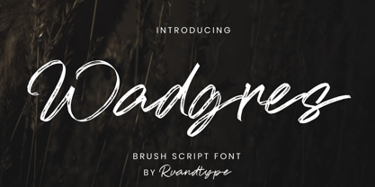 Wadgres is a Script Brush font. Its elegant and cool look makes it the perfect choice for logos, branding, invitations, stationery, wedding designs, social media posts, and so much more. Wadgres Font is PUA encoded which means you can access all of the glyphs. Features : – Uppercase & Lowercase – Alternate Characters – Numbers and Punctuation – Multilingual Support – PUA Encoded Thank You
 - Brooklyn Samuels by Samuelstype,
$30.00 Brooklyn Samuels is a sans-serif family of fonts designed by Hans Samuelson. Based on geometrical shapes it is primarily intended for headline use but also offers excellent legibility in small sizes. Stylistic sets offer a more text-friendly alternative for some letters.
 - Hogfish by PizzaDude.dk,
$20.00 Hogfish comes with contextual alternates that cycles as you type! 6 different versions of each letter for you to play around with!
 - DB Snowflakes by Illustration Ink,
$3.00Let it Snow! DoodleBat Snowflakes are all unique and different to capture that snowy feel that only comes from this winter season. - curlyJoe by JOEBOB graphics,
$19.00 CurlyJoe is a fast, informal handwritten font. A bit in the line of the dearJoe series, with a different style of caps.
 - Fd Catilde by Fortunes Co,
$10.00 Introduce Catilde Modern Elegant come with 5 differents style Variation this is perfect for branding, magazine, logos, invitation, Title, promotion and more.
 - Soft Fleurons by Intellecta Design,
$21.95 Soft Fleurons is a dingbats/decorative display font featuring many different styles of flourishes and ornaments. Great for a vintage antique feel.
 - Printing Press Cuts JNL by Jeff Levine,
$29.00 Printing Press Cuts JNL gathers vintage cartoons, sales helpers and decorative ornaments into one handy collection for embellishing any retro-oriented project.
 - Naylah by Arendxstudio,
$12.00 Naylah is a casual handwritten font with personal charm. With a quick sweep and a very different style, Naylah is perfect for branding projects, household design, product packaging - or as an overlay. Nalyah Alt and Alt 2 contain alternative characters, with lowercase and uppercase characters that are completely new. If you want to avoid the letters that are visible all the time to recreate custom styles, or try different tenses, just switch to this font for additional layout options. Naylah includes ligatures for several lowercase letters (double letters that are more natural). This can only be accessed through software with different devices or flying machine panels, eg Photoshop / Illustrator. Come and say hello on Instagram! https://www.instagram.com/aseprendii.otf/
 - Raiden by Artisticandunique,
$9.00 Raiden - Serif font family - 16 Styles - Multilingual supports ( Glyph count 400 ) Raiden serif font family has a different aesthetic appearance with its unique body structure, character height and width. With its 400 glyphs, multilingual and 16 style different character designs, it can meet your needs in innovative pursuits. This feature makes Raiden a versatile font family that can be used in many different design projects. You can create creative and stylish designs with uppercase and lowercase letter combinations in the title and text. It has a timeless structure where you can create your modern-elegant or classic design alternatives. Great for books and magazines, newspapers, editorials, headlines, websites, logos, branding, advertising and more.
 - VLNL Decks by VetteLetters,
$35.00 Donald DBXL Beekman lives on a ship in Amsterdam’s waters (well, the Amstel river, actually). Living on the water inspired him to design this ‘cruise ship’ typeface VLNL Decks. Available in several variations, it’s a fabulous cocktail of freshly caught fish typography. Decks is recommended for seafood restaurants, speed boats as well as slick city boys wearing overly expensive sunglasses or Ibiza sunset parties. Decks is the tiger prawn amidst sea foods. VLNL Decks has a distinct modern techno look but the rounded corners give it a warm and human feel. It is available in 3 monolinear weights (Light, Medium, Bold) and 3 weights with contrast between horizontals and verticals (Different Light, Different Medium, Different Bold).
 - Sevastian by Adam Fathony,
$12.00 S E V A S T I A N - Seven Layered Fonts Sevastian Typefaces are coming for help the artist who want to create 3D lettering without special effects. Also you can use with different color, different style, and different combinations using 7 layer I've made. Font Naming are important for you to generate where at the top and where at bottom. Sevastian made it so easy because there is a number before the name like Sevastian - 01 inner until Sevastian - 07 3D Shadow. It means, the lowest number are must on top of them. As you can see on the display image I've been made, I use random combinations. So you can experiment what do you like most.
 - Jack History by Ditatype,
$29.00 Jack History is a unique, amazing font inspired by creative, experimental handwritings of which letters are always connected to each other to create surprising, dynamic flows, and adopt unconventional proportions and variations. Some of the letters may actually seem bigger or smaller than the others in free moving and curvy lines to express bravery and freedom nuances of the font. Differences in proportions and letter style changes of the font have become the design’s integral parts. Despite the absence of strict rules, creativity and courage to combine the connected letters in a unique way is all that matters because this script font offers extraordinary attractiveness and uniqueness in all designs. Furthermore, the connected letter flows in various proportions reflect some explorations and innovations in the handwritings. You may then apply this font for big text sizes for a legibility reason and enjoy the available features here. Features: Alternates Ligatures Multilingual Supports PUA Encoded Numerals and Punctuations Jack History fits best for any design projects requiring artistic, elegant displays such as wedding invitations, greeting cards, merchandise designs, and more. For such artistic and elegant displays, this script font is also applicable for logo designs, posters, and packaging. Find out more ways to use this font by taking a look at the font preview. Thanks for purchasing our fonts. Hopefully, you have a great time using our font. Feel free to contact us anytime for further information or when you have trouble with the font. Thanks a lot and happy designing.
 - Bestgift by Nathatype,
$29.00 Bestgift is a striking display font available in regular and outline styles, both featuring a very thick weight and low contrast. With its commanding presence and versatile design, this typeface is the perfect choice for a wide range of creative projects. The very thick weight of Bestgift commands attention and ensures a strong visual impact. Each character is robust and substantial, making a bold statement in any composition. The thick strokes exude confidence and stability, adding a sense of reliability to your designs. With low contrast letters, it offers a balanced and uniform appearance. The consistent stroke width throughout the font creates a cohesive and harmonious visual experience. This display font comes in both regular and outline styles, providing flexibility and versatility to suit different design needs. The regular style exudes solidity and strength, while the outline style adds a touch of modernity and sophistication. This combination allows you to create captivating designs with contrasting elements, adding depth and visual interest to your compositions. For the best legibility you can use it in the bigger text. Enjoy the available features here. Features: Ligatures Multilingual Supports PUA Encoded Numerals and Punctuations Bestgift fits in headlines, logos, attention-grabbing titles, product packaging, branding materials, editorial layouts and website headers. Find out more ways to use this font by taking a look at the font preview. Thanks for purchasing our fonts. Hopefully, you have a great time using our font. Feel free to contact us anytime for further information or when you have trouble with the font. Thanks a lot and happy designing.