10,000 search results
(0.034 seconds)
- Brother XL&XS by TipoType,
$19.00 Brother XL & XS is an expansion of Brother 1816, one of the best sellers of 2016: myfonts.com/fonts/tipotype/brother-1816 We decided to add new widths to the type system, designing a condensed version (XS) that is perfect for narrow spaces without loosing legibility, and an expanded version (XL) with a lot of character for display uses but without abandoning funcionality. Both typefaces where created to adapt in diverse design languages being able to be “retro” or “modern” making it very flexible and working well in texts or titles, in print or screens. Brother XL & XS mixies Geometric shapes with Humanistic strokes at the same time. You can choose between a pure geometric or humanistic style, condensed or expanded, or even mix between XS, XL, or its alternate characters to create the feeling that you need for your projects. Its humanistic nature makes it easy to read, legible in small sizes; perfect for branding, editorial and signage. It has a total of 32 fonts, which are divided into 2 groups: XS (16 condensed weights) & XL (16 expanded weights). Each weight has +460 characters, +20 alternates, angular and straight edges, swashes, fractions, ordinals and much more.... Brother has also been specially designed for web (using hinting instructions), making it work in small and large sizes on different types of screen resolutions.
 - Grandhappy by Journey's End,
$18.00 Have you ever searched for a font that looked like it was really someone's handwriting, only to find that it was too feminine or too hard to read? I used to want a font like that, too, until I discovered that a font like that had been residing in my attic, in letters to me from my late grandfather. Not only was I thrilled to have a font like this at hand, but also one that would be a memory of my grandfather every time I used it. He was a hard-working man, raising a family during the Depression, yet was still fun-loving, kind, and generous. We called him Grandhappy. As a wedding present, I received from him rolling pins and a cutting board made of 8 different kinds of wood that he pieced together. In this font, the bullet is a rolling pin in honor of that! Other than the fact that this is a font from the hand of one greatly loved, my favorite thing is that although a True Type Font, it has some features of an Open Type font. There are many alternative letter choices available through the use of little-used keys on the keyboard and alt codes. This font was chosen to portray Jay Gatsby's handwriting in The Great Gatsby (2013).
 - Prismatic Spirals by MMC-TypEngine,
$93.00 PRISMATIC SPIRALS FONT! The Prismatic Spirals Font is a decorative type-system and ‘Assembling Game’, itself. Settled in squared pieces modules or tiles, embedded by unprecedented Intertwined Prismatic Structures Design, or intricate interlaced bars that may seem quite “impossible” to shape. Although it originated from the ‘Penrose Square’, it may not look totally as an Impossible Figures Type of Optical Illusions. More an “improbable” Effect in its intertwined Design, that even static can seem like a source of Kinetical Sculptures, or drive eyes into a kind of hypnosis. Prismatic Spirals has two related families, its “bold” braided version Prismatic Interlaces and the Pro version. While the default is simpler or easier to use, as all piece’s spin in same way, PRO provides a more complex intricate Design which requires typing alternating caps. Instructions: Use the Map Font Reference PDF as a guide to learn the 'tiles' position on the keyboard, then easily type and compose puzzle designs with this font! All alphanumeric keys are intuitive or easy to induce, you may easily memorize it all! Plus, often also need to consult it! *Find the Prismatic Spirals Font Map Reference Interactive PDF Here! (!) Is recommended to Print it to have the Reference in handy or just open the PDF while composing a design with this typeface to also copy and paste, when consulting is required or when it may be difficult to access, depending on the keyboard script or language. As a Tiles Type-System, the line gap space value is 0, this means that tiles line gaps are invisibly grouted, so the user can compose designs, row by row, descending to each following row by clicking Enter, same as line break, while advances on assembling characters. Background History: The first sketches of my Prismatic Knots or Spirals Designs dates back then from 2010, while started developing hand-drawn Celtic Knots and Geometric Drawings in grid paper, while engage to Typography, Sacred Geometry and the “Impossible Figures” genre… I started doing modulation tests from 2013, until around 2018, I got to unravel it in square modules or tiles from the grid, then idealized it as fonts, along with other Type projects. This took 13 years to come out since the first sketches and 6 months in edition. During the production process some additional tiles or missing pieces were thought of and added to the basic set, which firstly had only the borders, corners, crossings, nets, Trivets connectors or T parts and ends, then added with nets and borders integrations. Usage Suggestions: This type-system enables the user to ornate and generate endless decorative patterns, borders, labyrinthine designs, Mosaics, motifs, etc. It can seem just like a puzzle, but a much greater tool instead for higher purposes as to compose Enigmas and use seriously. As like also to write Real Text by assembling the key characters or pieces, this way you can literarily reproduce any Pixel Design or font to its Prismatic Spirals correspondent form, as Kufic Arabic script and further languages and compose messages easily… This Typeface was made to be contemplated, applied, and manufactured on Infinite Decorative Designs as Pavements, Tapestry, Frames, Prints, Fabrics, Bookplates, Coloring Books, Cards, covers or architectonic frontispieces, storefronts, and Jewelry, for example. Usage Tips: Notice that the line-height must be fixed to 100% or 1,0. In some cases, as on Microsoft Word for example, the line-height default is set to 1,15. So you’ll need to change to 1,0 plus remove space after paragraph, in the same dropdown menu on Paragraph section. Considering Word files too, since the text used for mapping the Designs, won't make any literal orthographical sense, the user must select to ignore the Spellcheck underlined in red, by clicking over each misspelled error or in revision, so it can be better appreciated. Also unfolding environments as Adobe Software’s, the Designer will use the character menu to set body size and line gap to same value, as a calculator to fit a layout for example of 1,000 pts high with 9 tiles high, both body size and line gap will be 111.1111 pts. Further Tips: Whenever an architect picks this decorative system to design pavements floor or walls, a printed instruction version of the layout using the ‘map’ font may be helpful and required to the masons that will lay the tiles, to place the pieces and its directions in the right way. Regarding to export PNGs images in Software’s for layered Typesetting as Adobe Illustrator a final procedure may be required, once the designs are done and can be backup it, expanding and applying merge filter, will remove a few possible line glitches and be perfected. Technical Specifications: With 8 styles and 4 subfamilies with 2 complementary weights each (Regular and Bold) therefore, Original Contour, Filled, Decor, with reticle’s decorations and 2 Map fonts with key captions. *All fonts match perfectly when central pasted for layered typesetting. All fonts have 106 glyphs, in which 48 are different keys repeated twice in both caps and shift, plus few more that were repeated for facilitating. It was settled this way in order for exchanging with Prismatic Spirals Pro font which has 96 different keys or 2 versions of each. Concerning tiles manufacturing and Printed Products as stickers or Stencils, any of its repeated pieces was measured and just rotated in different directions in each key, so when sided by other pieces in any direction will fit perfectly without mispatching errors. Copyright Disclaimer: The Font Software’s are protected by Copyright and its licenses grant the user the right to design, apply contours, plus print and manufacture in flat 2D planes only. In case of the advent of the same structures and set of pieces built in 3D Solid form, Font licenses will not be valid or authorized for casting it. © 2023 André T. A. Corrêa “Dr. Andréground” & MMC-TypEngine.
 - Prismatic Interlaces by MMC-TypEngine,
$93.00 PRISMATIC INTERLACES TYPEFACE! Prismatic Interlaces is a decorative system and ‘Assembling Game’, itself. Settled in squared pieces modules or tiles, embedded by unprecedented Intertwined Prismatic Structures Design, or intricate interlaced bars that may seem quite “impossible” to shape. Although it originated from the ‘Penrose Square’, it may not look totally as an Impossible Figures Type of Optical Illusions. More an “improbable” Effect in its intertwined Design, that even static can seem like a source of Kinetical Sculptures, or drive eyes into a kind of hypnosis. Prismatic Interlaces has two related families, both as a kind of lighter weight versions Prismatic Spirals Default & Pro. While Default is simpler or easier to use, same way as Prismatic Interlaces, Pro provides a more complex intricate Design that requires typing alternating caps. Instructions: Use the Map Font Reference PDF as a guide to learn the 'tiles' position on the keyboard, then easily type and compose puzzle designs with this font! All alphanumeric keys are intuitive or easy to induce, you may easily memorize it all! Plus, often also need to consult it! *Find the Prismatic Interlaces Font Map Reference Interactive PDF Here! (!) Is recommended to Print it to have the Reference in handy or just open the PDF while composing a design with this typeface to also copy and paste, when consulting is required or when it may be difficult to access, depending on the keyboard script or language. As a Tiles Type-System, the line gap space value is 0, this means that tiles line gaps are invisibly grouted, so the user can compose designs, row by row, descending to each following row by clicking Enter, same as line break, while advances on assembling characters. Background History: The first sketches of my Prismatic Knots or Spirals Designs dates back then from 2010, while started developing hand-drawn Celtic Knots and Geometric Drawings in grid paper, while engage to Typography, Sacred Geometry and the “Impossible Figures” genre… I started doing modulation tests from 2013, until around 2018, I got to unravel it in square modules or tiles from the grid, then idealized it as fonts, along with other Type projects. This took 13 years to come out since the first sketches and 6 months in edition. During the production process some additional tiles or missing pieces were thought of and added to the basic set, which firstly had only the borders, corners, crossings, nets, Trivets connectors or T parts and ends, then added with nets and borders integrations. Usage Suggestions: This type-system enables the user to ornate and generate endless decorative patterns, borders, labyrinthine designs, Mosaics, motifs, etc. It can seem just like a puzzle, but a much greater tool instead for higher purposes as to compose Enigmas and use seriously. As like also to write Real Text by assembling the key characters or pieces, this way you can literarily reproduce any Pixel Design or font to its Prismatic Spirals correspondent form, as Kufic Arabic script and further languages and compose messages easily… This Typeface was made to be contemplated, applied, and manufactured on Infinite Decorative Designs as Pavements, Tapestry, Frames, Prints, Fabrics, Bookplates, Coloring Books, Cards, covers or architectonic frontispieces, storefronts, and Jewelry, for example. Usage Tips: Notice that the line-height must be fixed to 100% or 1,0. In some cases, as on Microsoft Word for example, the line-height default is set to 1,15. So you’ll need to change to 1,0 plus remove space after paragraph, in the same dropdown menu on Paragraph section. Considering Word files too, since the text used for mapping the Designs, won't make any literal orthographical sense, the user must select to ignore the Spellcheck underlined in red, by clicking over each misspelled error or in revision, so it can be better appreciated. Also unfolding environments as Adobe Software’s, the Designer will use the character menu to set body size and line gap to same value, as a calculator to fit a layout for example of 1,000 pts high with 9 tiles high, both body size and line gap will be 111.1111 pts. Further Tips: Whenever an architect picks this decorative system to design pavements floor or walls, a printed instruction version of the layout using the ‘map’ font may be helpful and required to the masons that will lay the tiles, to place the pieces and its directions in the right way. Regarding to export PNGs images in Software’s for layered Typesetting as Adobe Illustrator a final procedure may be required, once the designs are done and can be backup it, expanding and applying merge filter, will remove a few possible line glitches and be perfected. Technical Specifications: With 8 styles and 4 subfamilies with 2 complementary weights each (Regular and Bold) therefore, Original Contour, Filled, Decor, with reticle’s decorations and 2 Map fonts with key captions. *All fonts match perfectly when central pasted for layered typesetting. All fonts have 106 glyphs, in which 49 are different keys repeated twice in both caps and shift, plus few more that were repeated for facilitating. It was settled this way in order for exchanging with Prismatic Spirals Pro font which has 96 different keys or 2 versions of each. Concerning tiles manufacturing and Printed Products as stickers or Stencils, any of its repeated pieces was measured and just rotated in different directions in each key, so when sided by other pieces in any direction will fit perfectly without mispatching errors. Copyright Disclaimer: The Font Software’s are protected by Copyright and its licenses grant the user the right to design, apply contours, plus print and manufacture in flat 2D planes only. In case of the advent of the same structures and set of pieces built in 3D Solid form, Font licenses will not be valid or authorized for casting it. © 2023 André T. A. Corrêa “Dr. Andréground” & MMC-TypEngine.
 - Anecdote JNL by Jeff Levine,
$29.00Anecdote JNL gives a serif treatment to Haute Couture JNL, which in turn was modeled after die-cut cardboard letters and numbers used for displays, signs and show cards. - P22 Kaz by IHOF,
$24.95 Kaz is a casual yet sturdy hand lettering font somewhere between architectural hand lettering and "comic sans". Kaz Thin offers a variation for the look of a thinner pen.
 - Metal Gothic by Nirmana Visual,
$22.00 Metal Gothic Inspired by art nouveau Design Era. Metal Gothic offers beautiful typographic harmony for a diversity of design projects, including logos & branding, social media posts, advertisements & product designs.
 - Retro Volt by Nirmana Visual,
$24.00 Retro Volt Inspired by 70s-80s Design Era. Retro Volt offers beautiful typographic harmony for a diversity of design projects, including logos & branding, social media posts, advertisements & product designs.
 - Ps Javier by Fontopia,
$- The font is named after my son Javier. He studies architecture. Font Javier follows architectural principles. Javier 1, Javier 2 and Javier 3 can be combined with each other.
 - Retro Cool by Nirmana Visual,
$22.00 Retro Cool , Inspired by 60s - 70s Design Era. Retro Cool offers beautiful typographic harmony for a diversity of design projects, including logos & branding, social media posts, advertisements & product designs.
 - Biblia Serif by Hackberry Font Foundry,
$24.95 This all started with a love for Minister. This is a font designed by Carl Albert Fahrenwaldt in 1929. In the specimen booklet there’s a scan from Linotype’s page many years ago. They no longer carry the font. I’ve gone quite a ways from the original. It was dark and a bit heavy. But I loved the look and the readability. This came to a head when I started my first book on all-digital printing written from 1994-1995, and published early in 1996. I needed fonts to show the typography I was talking about. At that point oldstyle figures, true small caps, and discretionary ligatures were rare. More than that text fonts for book design had lining OR oldstyle figures, lowercase OR small caps—never both. So, I designed the Diaconia family using the Greek word for minister. It was fairly rough. I knew very little. I later redesigned and updated Diaconia into Bergsland Pro—released in 2004. It was still rough (though I impressed myself). Now, with 4-font Biblia Serif family 13 years later, I’ve cleaned up, made the fonts more consistent internally, added more functional OpenType features, and brought the fonts into the 21st century. I used the 2017 set of features: small caps, small cap figures, oldstyle figures, fractions, lining figures, ligatures and discretionary ligatures. These are fonts designed for book production and work well for text or heads. Finally, in 2021, I went over the fonts entirely and remade them in Glyphs.
 - Technical SCRIPTURE by MMC-TypEngine,
$19.00 ‘Technical Scripture’ 2015-2021 A manuscript look, Pixel labyrinthine Display Type System… Plus, an Optical “Layered Game”, Retro Futuristic Sci-Fi Digital interface evolving placeholder… Now with 3D Styles! It was designed as a pair to its brother font ‘Technical Signature’ a Small Caps Font, both inspired by antique Greek, mosaics zig-zag ornaments “ancient times computer” intentionally as a Romanic variation with same metrics... Searching for Technical Solutions, it resulted in many combined styles by matching the primary ones so there’s plenty variations for multi-purpose texting like layered typesetting or simply monochromatic designs… Plus got accurate streaming resolution, therefore some sub-families like Stamp and Texture implicates greater points for minimum size as Regular and Light is appropriated to Small Optical Text reductions. *The New 3’s Upgraded Edition Improvements consisted of Correct ‘Font Info’ (verified data-debugging) rescaled glyphs, quick design review, better style linking with correspondent renamed fonts, addition of automatic OT features encoding, 3D Styles and Italics. Ps. This actual Typeface was quickly re-edited for technical reasons and hasn’t yet reached the intended design, it will soon receive a more tangible redesign upgrade, mainly in lowercases to enhance cursive style. Due to other priorities. Tip: Give preference to THE LYSERGIC UPPERCASES! Multilanguage Support: Western & Eastern European, Baltic, Turkish, Greek, and Cyrillic. This Type is pleasant to Technician Compositions, Such as Briefs layouts manuscript, Old Engineering & Crafts Logos or Support Text, Op-Art Posters, Stamps, Labels, movies and Cartoons Ludic Scripts, sites and of course Video Games! Try ‘Technical Scripture’ & Have some Power to the Pixel! Padang!
 - Cocomat Pro by Zetafonts,
$39.00 Cocomat has been designed by Francesco Canovaro and Debora Manetti as a development of the Coco Gothic typeface system created by Cosimo Lorenzo Pancini. It shares with all the other subfamilies in the Coco Gothic system a geometric skeleton with open, more humanistic proportions, a sans serif design with slightly rounded corners and low contrast proportions, without optical compensation on the horizontal lines, resulting in a quasi-inverted contrast look in the boldest weights. What differentiates Cocomat from the other subfamilies in Coco Gothic are some slight design touches in the uppercase letters, with a vertical unbalancing reminiscent of art deco design, notably evident in uppercase "E", "A","F","P" and "R" - while lowercase letters have been given some optical compensation on the stems, like in "n","m", "p" and "q". These design choices, evoking the second and third decade of the last century (Cocomat is also referred as Coco 1920 in the Coco Gothic Family) all give Cocomat a slight vintage feeling, making it a perfect choice every time you need to add a period vibe or an historical flair to your design, like in food or luxury branding. The typeface, first published in 2014, has been completely redesigned by the original authors in 2019 as Cocomat PRO to include eight extra weights (thin, medium, black and heavy in both roman and italic form), extra open type features (including alternate forms, positional numerals), and extra glyphs making Cocomat cover over two hundred languages using latin, cyrillic and greek alphabets.
 - Sunrose by Letterafandi Studio,
$16.00 Sunrose is a lovely handwritten font with flower swashes featuring charming, playful characters that seem to dance along the baseline. This font is PUA encoded which means you can access all of the glyphs and swashes with ease!
 - Meliya by Yumna Type,
$16.00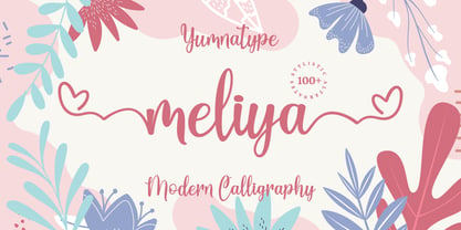 Meliya is a beautiful and modern script that is best used for weddings, branding, logotype, and quotes. Features : Beautiful Ligatures Beautiful Alternates + Swashes PUA Encoded Multi-lingual Support Numerals and Punctuation Beginning Swash and Ending Swashes (a-z)
 - Sheyla by Andrey Font Design,
$12.00 Sheila is a beautiful and romantic script font with multiple heart swashes to suit any of your valentine’s designs! This font is PUA encoded which means you can access all of the available glyphs and swashes with ease!
 - Negoka by Letterena Studios,
$17.00 Negoka is a cool and thick lettered display font. It is PUA encoded which means you can access all of the glyphs and swashes with ease! Add it confidently to your projects, and you will love the results.
 - Lost Castedral by Letterena Studios,
$17.00 Lost Castedral is a modern and stylish serif font. Add it to any of your designs, and enjoy the results! This font is PUA encoded which means you can access all of the glyphs and swashes with ease!
 - Gamata by Rillatype,
$15.00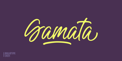 Introducing, Gamata Brush Script. Gamata is a brush script with natural feel that make this font is perfect for branding, packaging, book, logol labels, etc. Features : uppercase & lowercase numbers and punctuation multilingual alternates / swashes and ligatures PUA encoded
 - Amichan by Salamahtype,
$17.00 Introducing our script “Amichan” – An elegant and beautiful monoline typeface is perfect for websites, modern logos, brand identities, social media, quotes, wedding invitations and anything you want! Features : Uppercase & lowercase Punctuation & symbol Alternates Ligatures PUA Encoded Multilingual characters
 - Melyana by Yumna Type,
$16.00 Melyana is a beautiful and modern script that is best used for weddings, branding, logotype, and quotes. Features : Beautiful Ligatures Beautiful Alternates + Swashes PUA Encoded Multi-lingual Support Numerals and Punctuation Beginning Swash and Ending Swashes (a-z)
 - Thanks Mom by Letterafandi Studio,
$12.00 Thanks Mom is a delicate and elegant handwritten font. Its distinct and well balanced letters make this font a masterpiece. Thanks Mom is PUA encoded which means you can access all of the glyphs and swashes with ease!
 - Carlista by Yumna Type,
$16.00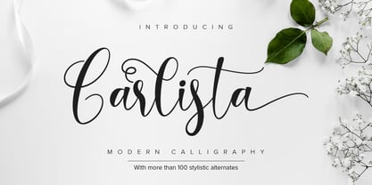 Carlista is a beautiful and modern typeface that is best used for weddings, branding, logotype, and quotes. Features : Beautiful Ligatures Beautiful Alternates + Swashes PUA Encoded Multi-lingual Support Numerals and Punctuation Beginning Swash and Ending Swashes (a-z)
 - Shutter Stone by Sarid Ezra,
$13.00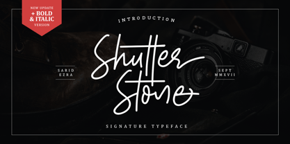 Introducing, Shutter Stone. Another Signature Script Font for you! Shutter Stone is handwritten font that contain stylistic alternate, swash, etc to create your own customised signature. This font is also support multi language. Also Support PUA. Thank You!
 - Run Child by Figuree Studio,
$18.00 Say hello to Run Child font. Made with love and joy. Comic look, so it will make your design more beautiful, cute, fun and colorful. Features: Character Set Numerals and Punctuation (OpenType Standard) Accents (Multilingual characters) PUA Encode
 - Kathiya by Yumna Type,
$16.00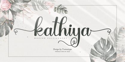 Kathiya is a beautiful and modern script that is best used for weddings, branding, logotype, and quotes. Features : Beautiful Ligatures Beautiful Alternates + Swashes PUA Encoded Multi-lingual Support Numerals and Punctuation Beginning Swash and Ending Swashes (a-z)
 - Aloka Gikairo by Letterena Studios,
$17.00 Aloka Gikairo is a stylish and serif script font. It is PUA encoded which means you can access all of the amazing glyphs and ligatures with ease! Its distinct and well balanced letters make this font a masterpiece.
 - Goat & Qalvigo by Letterena Studios,
$17.00 Goat & Qalvigo is a stylish and distinct serif font. It maintains its classy calligraphic influences while feeling contemporary and fresh. This font is PUA encoded which means you can access all of the glyphs and swashes with ease!
 - Al Crystasea by Aluyeah Studio,
$119.00 Crystasea, a Dawn Seeker Display Serif Font with Stunning 4 weight Style. Very suitable for magazine, headline, website, ads, product package and all type of design project you have. Features: OpenType support Multilingual support (15 languages) PUA Encoded
 - Benaya by Muksal Creatives,
$13.00 Benaya is a Modern displaya serif font. Use it to make your ideas even more realistic and create spectacular designs! This font is PUA encoded which means you can access all of the glyphs and swashes with ease!
 - Salysta Victoria by Letterena Studios,
$9.00 Salysta Victoria is an elegant script font with a contemporary atmosphere and impeccable form, inspired by timeless classic calligraphy. This font is PUA encoded which means you can access all of the amazing glyphs and ligatures with ease!
 - Magis Authentic by Lemonthe,
$14.00 Magis Authentic is a signature style font, with a natural & stylish flow. Magis Authentic Font is perfect for many different project such as logos & branding, invitation, stationery, wedding designs, social media posts, advertisements, product packaging, product designs, label, photography, watermark, special events or anything.
 - Aldersgate by Elemeno,
$25.00Aldersgate was designed as a comfortable, easy-to-read sans serif alternative font for a series of retirement community brochures. It was intended to compliment existing sans serif fonts for subheads and captions and is ideal when a conservative but subtly different font is needed. - Jumbox by Tour De Force,
$25.00 Jumbox is display family containing five weights that are actually layers. Combining them with different colours, Jumbox will bring strong sense of graphicism in your titles, product names, signage, billboards, packaging, web page headings – for wide range of uses. Comes with pack of ligatures.
 - JustTall by OneSevenPointFive,
$10.00 JustTall is an ultra condensed typeface with open type features, 400+ characters with 80+ languages support made for tight spaces. Useful for - Logos for companies with really long names Different texts with very little space available Very tall design types Give feedback: https://bit.ly/3FlmhDS
 - Schattig by Aisiv,
$39.00 Schattig was designed by Alexis Carrillo, published by Aisiv. Schattig is ideal for titles, booklets, and old photograph-style designs, the font contains Basic Latin and Latin-1 (ISO 8859-1) characters, along with 53 different ligatures for more realism to your titles and designs.
 - Marceta by Fine Fonts,
$29.00 Marceta is based upon the uncial & half-uncial scripts of the fourth to eighth centuries. The font has been designed with different capital and lowercase characters which can be intermixed to give variation to the text and to enable pleasing word patterns to be created.
 - Mrs Berry by Hipopotam Studio,
$30.00 Mrs Berry is a hand drawn typeface designed for one of our books. You can use it as a regular monochrome typeface or layer different styles to achieve colorful combinations. Mrs Berry has upper and lowercase characters and supports both Latin and Cyrillic scripts.
 - Dikta Neue by Atasi Studio,
$16.00 Dikta Neue is a neo-grotesque sans serif typeface inspired by Swiss Design in The 1960s. With a solid and minimalist letterform make this typeface suitable for text and display. Dikta Neue is available in 18 different styles from thin to black including italics.
 - Crocante by PintassilgoPrints,
$24.00 Crocante is an energetic and good-humored display font. Although being an all caps alphabet, it counts two versions for each letter, easily accessed through keyboard upper and lower keys. These slightly different letterforms will bring spontaneity and vitality to your designs. Crunching noises guaranteed!