10,000 search results (0.027 seconds)
  1. Black - Unknown license
  2. Durer Gothic - Unknown license
  3. KleinsFirstScript - Unknown license
  4. Espania - Unknown license
  5. PlatformOne by The Northern Block, $12.80
    PlatformOne is a 10 font family consisting of 5 weights with italics. A clean geometric font with precise corners inspired by commuter travel on Britain's public transport networks.
  6. Gambero by Typoforge Studio, $29.00
    Say hi to new member of Typoforge zoo! Gambero family consists of 18 styles (including italics) with a subtle rounded finished details. Gambero is a stable, slab cousin of Kapra, Kapra Neue adn Kapra Neue Pro. It is ideally suited for advertising, editorial and publishing, offering new design potential. Font Gambero is inspired by a "You And Me Monthly" published by National Magazines Publisher RSW "Prasa" that appeared from May 1960 till December 1973 in Poland.
  7. American Text by SoftMaker, $9.99
    American Text is a condensed American blackletter published by SoftMaker.
  8. Bellevue by Berthold, $39.99
    Gustav Jaeger designed Bellevue, which H. Berthold published in 1986.
  9. Hagada Mesugnan MF by Masterfont, $59.00
    Custom designed letterforms for the Hagada, published by Gad Ulman.
  10. Century PS Pro by SoftMaker, $14.99
    Century PS Pro is a serif typeface published by SoftMaker.
  11. Pergamon by SoftMaker, $9.99
    Pergamon is a sans serif decorative typeface published by SoftMaker.
  12. Century Schoolbook Pro by SoftMaker, $14.99
    Century Schoolbook Pro is a serif typeface published by SoftMaker.
  13. Broadway No2 by SoftMaker, $9.99
    Broadway No2 is a decorative 1920s font published by SoftMaker.
  14. Organ Grinder by SoftMaker, $9.99
    Organ Grinder is an art deco typeface published by SoftMaker.
  15. Beale Charming by SoftMaker, $9.99
    Beale Charming is an Art Deco font published by SoftMaker.
  16. Openface No2 by SoftMaker, $9.99
    Openface No2 is a decorative serif typeface published by SoftMaker.
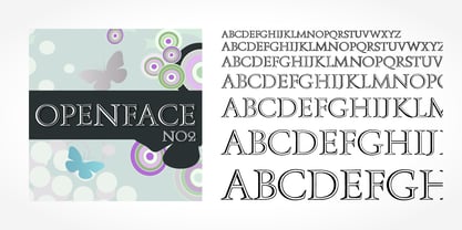
  17. Casual Signage JNL by Jeff Levine, $29.00
    Alf Becker was a talented sign writer and a prolific contributor of unique alphabets to Signs of the Times magazine. More than one hundred of his designs were showcased in monthly installments with each new issue of the publication. One in particular is a casual, free form sans serif design which has been recreated digitally as Casual Signage JNL, and is available in both regular and oblique versions. Thanks to Tod Swormstedt of ST Publications for providing the reference material for this font.
  18. Basic Sans Cnd by Latinotype, $29.00
    Basic Sans Cnd: A new sans. Designed by Daniel Hernández Basic Sans Cnd is a narrower version of Basic Sans. It is a family of Grotesque features with a functional, neutral and seeming clean style that looks to keep a neutral (or basic) appearance on paper, but including lots of details that give it a unique personality. Basic Sans Cnd is a sans-serif typeface well-suited for publishing projects, medium-sized text, branding, posters, headlines and more! This font family comes in 7 weights—ranging from Thin to Black—plus matching italics and it has a set of 416 characters that support 206 different languages.
  19. Mijas by Eurotypo, $42.00
    Mijas Ultra font was designed specially as a headlines and caption text for advertising, packaging and Publishing design. It has strong visual impact, a persuasive personality and seduction appeal throughout its organic shapes. This versatile typeface is quite useful for creating logotypes, a variety of alternates and swash tails in three different styles and length were drawn for most letters, plenty of vowel-focused ligatures, it covers all Latin-based languages. Please refer to quick reference manual included. Mijas is a little white town located at a mountainside above the blue Mediterranean Sea, in the heart of the Costa del Sol. It has high contrast, small counterforms and friendly climate.
  20. Mittelhorn by High Peak, $23.00
    Mittelhorn is a clean, readable, distinctive neo-grotesque. Use it for logotypes, web, signage, or editiorial design. Make a statement and choose one of the alternate sick glyphs… Main features: The family comes in three weights and matching italics Reinterpreted numbers and punctuation Comprehensive character sets for Western and Central European language Selected alternate uppercase sick glyphs for extra character Each glyph in this family was crafted with intention and care. It is a creative yet versatile and very readable font that you can easily use on a range of applications - headlines, billboards, signage, web copy, editorial, publishing… Most of all, have fun with it!
  21. AZ Ultra by Artist of Design, $20.00
    AZ Ultra was inspired from a need to develop an easily changable worn italic headline. This font was designed for use as a display headline or sub headline.
  22. Bobbin by Typoforge Studio, $19.00
    To design a font Bobbin I was inspired by a You And Me Monthly published by National Magazines Publisher RSW Prasa that appeared from Mai 1960 till December 1973 in Poland. In the Bobbin family, every variety contains 3 alternative characters with automatic replacement.
  23. Maverick BE - Unknown license
  24. Relaxation JNL by Jeff Levine, $29.00
    Amongst the pages of a 1946 foreign publication entitled "100 Alphabets Publicitaires" ("100 Advertising Alphabets") is the casual brush stroke sans that was the design basis for Relaxation JNL.
  25. Arco Web by Okaycat, $29.95
    The Arco Web font sets a friendly mood with casual artistic flair. Arco Web features extended characters, and contains West European diacritics & ligatures. Highly suitable for international environments & publications.
  26. Reaver - Personal use only
  27. Bernhard Condensed No2 by SoftMaker, $9.99
    Bernhard Condensed No2 a freely drawn heading typeface published by SoftMaker.
  28. Lektorat by TypeTogether, $35.00
    Florian Fecher’s Lektorat font family is one for the books, and for the screens, and for the magazines. While an editorial’s main goals are to entertain, inform, and persuade, more should be considered. For example, clear divisions are necessary, not just from one article to the next, but in how each is positioned as op-ed or fact-based, infographic or table, vilifying or uplifting. From masthead to colophon, Lektorat has six concise text styles and 21 display styles to captivate, educate, and motivate within any editorial purpose. Magazines and related publications are notoriously difficult to brand and then to format accordingly. The research behind Lektorat focused on expression versus communication and what it takes for a great typeface to accomplish both tasks. In the changeover from the 19th to 20th century, German type foundry Schelter & Giesecke published several grotesque families that would become Lektorat’s partial inspiration. Experimentation with concepts from different exemplars gave birth to Lektorat’s manifest character traits: raised shoulders, deep incisions within highly contrasted junctions, and asymmetrical counters in a sans family. After thoroughly analysing magazine publishing and editorial designs, Florian discovered that a concise setup is sufficient for general paragraph text. So Lektorat’s text offering is concentrated into six total styles: regular, semibold, and bold with their obliques. Stylistic sets are equally minimal; an alternate ‘k, K’ and tail-less ‘a’ appear in text only. No fluff, no wasted “good intentions”, just a laser-like suite to focus the reader on the words. The display styles were another matter. They aim to attract attention in banners, as oversized type filling small spaces, photo knockouts, and in subsidiary headings like decks, callouts, sections, and more. For these reasons, three dialed-in widths — Narrow, Condensed, and Compressed — complete the display offerings in seven upright weights each, flaunting 21 headlining fonts in total. If being on font technology’s cutting edge is more your goal, the Lektorat type family is optionally available in three small variable font files for ultimate control and data savings. The Lektorat typeface was forged with a steel spine for pixel and print publishing. It unwaveringly informs, convincingly persuades, and aesthetically entertains when the tone calls for it. Its sans serif forms expand in methodical ways until the heaviest two weights close in, highlighting its irrepressible usefulness to the very end. Lektorat is an example of how much we relish entering into an agreed battle of persuasion — one which both sides actually enjoy.
  29. SavingsBond - Unknown license
  30. Okay Berry by Okaycat, $29.50
    Okay Berry is a connected script with naturally beautiful handwritten style. Okay Berry is extended, containing is extended, containing West European diacritics & ligatures, making it suitable for multilingual environments & publications.
  31. TXT Jubulation by Illustration Ink, $3.00
    Download this cool "Jubilation" font when you want to express a happy feeling. Its curly, handwritten character is perfect for light-hearted scrapbook pages, journaling, greeting cards, and other publications.
  32. Lynda by Sudtipos, $39.00
    Lynda is a post-modern, monoline rounded sans ideal for club flyers, music covers and fashion publications. The fonts were designed by Ariel Di Lisio and digitized by Alejandro Paul.
  33. LD Bohemian Filigree by Illustration Ink, $3.00
    Dress up your handmade greeting cards, newsletters, programs, scrapbook journaling, and other desktop publications with this vintage style true type font. It gives a Bohemian feel to your paper creations.
  34. Bobbin Cyrllic by Typoforge Studio, $25.00
    To design the font Bobbin Cyrillic I was inspired by the You And Me Monthly published by National Magazines Publisher RSW Prasa that appeared from Mai 1960 till December 1973 in Poland. In the Bobbin Cyrillic family, every variety contains 3 alternative characters with automatic replacement.
  35. Merlo by Typoforge Studio, $25.00
    Font Merlo is the younger sister of Cervo. Font Merlo is characterized by eight different varieties – lower and uppercase characters. It is inspired by a You And Me Monthly published by National Magazines Publisher RSW "Prasa” that appeared from May 1960 till December 1973 in Poland.
  36. Gruenewald VA - 100% free
  37. Niju by MikaeleBiana, $5.00
    Niju was designed and published by Mikaele Biana. Niju contains 1 style.
  38. Stencil Gothic BE - Unknown license
  39. Australian Sunrise - Unknown license
  40. Right Hand by Okaycat, $19.50
    Right Hand is a legible naturally written script. Tidy pen writing with a casual slant. Right Hand is extended, containing West European diacritics & ligatures, making it suitable for multilingual environments & publications.
Looking for more fonts? Check out our New, Sans, Script, Handwriting fonts or Categories
abstract fontscontact usprivacy policyweb font generator
Processing