8,826 search results
(0.04 seconds)
- Bahiyoh by Twinletter,
$18.00 Take a trip down memory lane with the Bahiyoh retro font. This vintage font combines classic appeal with contemporary design sensibilities to create a unique yet professional look. Use this font in any design project to add your own sense of nostalgia.
 - Urban Philosopher by Umbra95,
$28.00 Urban Philosopher is a experimental font, its kind of mix of vintage typography with 80 s grunge. The font have a little messy and dirty texture, which gives it a little "horror" effect. The font includes almost all letters of the Latin alphabet.
 - Ovalie by Typefactory,
$14.00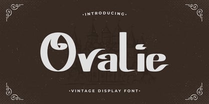 Ovalie is a vintage display font that was made by hand and inspired by classic posters. Ovalie comes with uppercase, lowercase, numerals, symbols & punctuations, alternate, ligature and multilingual support. Perfect to use for Logotype, Letterhead, Poster, Apparel Design, Labels, and many more designs.
 - Bortolotto by Edcreative,
$15.00 Bortolotto is a pretty, elegant, clean and vintage-style font completed with several series of ligatures to make this font more attractive to complement your design. This font is perfect for wedding cards, T-shirts, branding logos, posters, mug designs and more
 - Stripy Matey by Gleb Guralnyk,
$14.00 Hello! Introducing a geometric style font — Stripy Matey. It's a vintage look smooth typeface built of dashed flowing lines. Stripy Matey font has multilingual support (check out a screenshot with available letters and signs). Thank you and wish you a peaceful sky!
 - Common Stencil JNL by Jeff Levine,
$29.00 Common Stencil JNL takes a vintage lettering stencil from the 1980s with imperfectly bent cutting dies [which unintentionally gave the characters a distressed or "grunge" look] and recreates it in a digital form. The design is available in both regular and oblique versions.
 - Kingsman Dual Style! by Mindtype Co.,
$25.00 Proudly presenting our latest product: Kingsman! Kingsman is a simple font, comes with alternate characters and some ligatures. This font looks elegant, readable, stylish, and catchy. The fonts are great for products, logos, wedding cards, clothing brand logos, vintage designs and much more.
 - Tall Order JNL by Jeff Levine,
$29.00 The condensed style and square character shapes of a vintage typeface originally known as Raleigh has been re-interpreted by Jeff Levine Fonts as Tall Order JNL. There is an alternate A, K, M, N and S on the respective lower case keys.
 - HV Constantine by Harmonais Visual,
$10.00 Constantine - an exquisite display modern serif, inspired by classic roman arts and vintage cars aesthetics. Specially designed for luxury, clean, high-end projects, perfectly suitable for creating elegant, classy design such as magazine, social media, and more. The font features standard ligatures.
 - ST Titan by ShimanovTypes,
$20.00 ST Titan is a retro futuristic display font with vintage vibes, inspirated by old sci-fi book's headers and posters. It's good for social media, headlines, large-format print, branding, posters, fashion designs and websites. Extended Latin and Cyrillic support. 30+ languages
 - So Nouveau JNL by Jeff Levine,
$29.00 Three of the four letters of the name “Jane” on the cover of a vintage piece of sheet music inspired So Nouveau JNL. The free-form swoops emulating the pen lettering of the early 1900s adds a nostalgic charm to this typeface.
 - Albion's White Christmas by Greater Albion Typefounders,
$14.00 “Albion’s White Christmas” can only be described as a snowy blackletter. In the tradition of old childrens' comics, yuletide magazine mastheads and vintage Christmas cards, it is a snow draped blackletter ideal for the winter holidays and letting in the spirit of Christmas.
 - Golden Signer by Letrasupply Typefoundry,
$20.00 Golden Signer was inspired by vintage and tattoo letters. The font family comes with Regular and Serif type, completed with alternates characters, deboss style, shapes and also free ornaments. Golden Signer is a perfect package for any project that needs display lettering.
 - Morl by Typesketchbook,
$55.00 Developed from condensed san serif families of the 90’s to 00’s, Morl brings together the distinctive features of the time but presented in a simpler design. Its potential is increased with Original, Sans, and Rounded options which offer varied moods. Suitable for publications, web and product designs, Morl can fit either headlines or body. It’s also effectively supported in various devices. The family comes in 10 weights, making it available to use for your required tasks in 60 styles.
 - LOLO Cursive by Okaycat,
$32.50LOLO Cursive is sweet & funky lettering written with distinct character. Create a memorable look with this flowering, freehand script. In this font I envisioned a style with a grassroots flavor, yet a fashionista's edginess. Small, distressed detailing contrasts beautifully with the rolling curves of this feminine hand-style. The strokes are punky yet refined - for widest appeal. LOLO Cursive is extended, containing West European diacritics & ligatures, making it suitable for multilingual environments & publications. Go ahead and have fun with it! - Milk Cursive by Okaycat,
$29.50 Milk Cursive is the healthy choice. Fortify your designs & fulfill your daily textual needs with these flowing, bubbly letters. Enjoy the refreshingly natural look of an every-man's calligraphy with a fat & wide style. Milk Cursive is extended, containing West European diacritics & ligatures, making it suitable for multilingual environments & publications. It also contains some icons as extra characters, such as a star, a heart, an arrow, flowers, a butterfly, and manicules (pointing hands). Go ahead and have fun with it!
 - Partizano Serif by deFharo,
$22.00 Geometric typography with serif, extra condensed retro look and very elegant for use in publications, graphic design and advertising where you need an exclusive typography with great horizontal space saving for headlines and paragraph texts. It has a complete set of capital letters and numbers and monetary symbols in small caps, also alternative letters such as the 'A' capital letter or the lowercase 'a' type alpha. Use the following keys to write the bitcoin symbol and the partisan icon: b #, a #
 - Agile Sans by Fenotype,
$25.00 Agile Sans is a contemporary humanist font family with classicist roots. Hence its name, Agile Sans suits many occasions from branding to publications, web and applications. From formal to casual, bold to refined, this font covers it all. Agile Sans comes with nine weights with corresponding true-italics. Built-in small capitals and several numeral styles are included as well. If you’re seeking for an alternative to more common humanist sans serifs, look no further and grab a future classic.
 - Mauro Poggi Ornamental Caps by Celebrity Fontz,
$19.99Ornamental caps with scrolls and flourishes inhabited by satyrs, mermaids, Medusa heads, birds, cats, dogs, snakes, and other creatures, inspired by designs from Italian Renaissance artists dating back to 1730-1750. Beautifully ornate and perfect for the beginning of paragraphs in publications and texts conveying the feel of the Italian Renaissance, your own fairy tale stories, or religious texts to grab the reader's attention. Includes one set of A-Z ornamental caps conveniently assigned to both the upper and lower case alphabet characters. - Malva by Harbor Type,
$35.00 🏆 Selected for Tipos Latinos 8. 🏆 Selected for the 12th Biennial of Brazilian Graphic Design. Malva was designed to perform as a branding element, providing a clean look for visual identities and publications. It brings a touch of friendliness to the communication without compromising the professional look every brand strives for. Legibility was one of the top concerns during the development of Malva, so we took special care to differentiate the naturally ambiguous characters I, i, l and 1.
 - Santerini Initials by Celebrity Fontz,
$24.99Elaborate high-quality three-dimensional initials, with shadows, in various styles including numerous exotic letters, incorporating vignettes, flourishes, stems, flowers, vines, and other decorative elements. These masterpieces of typographic art were inspired by Italian hand-etched designs dating back to 1839. Includes one set of A-Z ornamental initials conveniently assigned to both the upper and lower case alphabet characters. Perfect for starting off the beginning of paragraphs in artistic publications, storybooks, fairy tales, and texts conveying the feel of the 1800s. - ZionTrain by AndrijType,
$33.00 Originally ZionTrain was built as a Cyrillic typeface for public transport navigation system. We wanted comprehensible, distinctive letterforms, that can help everybody on the way from Babylon to Zion. Here, on MyFonts, we present the ZionTrain STD versions with western latin including smallcaps and oldstyle figures in some faces in TrueType format; also western, central, baltic and turkish latin charsets, smallcaps, oldstyle numerals, few alternates, some arrows and fractions in ZionTrain OT OpenType format. Look how people use it: http://use.type.org.ua/tagged/ziontrain
 - Red Top by Studio K,
$45.00 Red Top is the UK name for the tabloid press, the scandal sheets of journalism, scourge of royalty, errant politicians and public figures, and celebrants of sex, celebrity and astrology: all human life is there as they used to say in the now defunct News of the World. For the budding media moguls amongst you – or for designers who want to make their headlines shout a little louder – here at last is Red Top the font. Splash it all over!
 - Dotage by ParaType,
$30.00 This decorative caps-only type family was designed in 2004 by Vladimir Pavlikov and licensed by ParaType. Its letterforms are imitating low resolution display letters used at railway stations, airports, and other public places. Regular, Inline, Shadow Left, and Shadow Right styles are available. An additional set of symbols and pictograms is included in each style to increase its decorative abilities. The face is good in magazine advertising, posters, and industrial graphic design in the fields of science and technology.
 - Clarendon BT by Bitstream,
$50.99 The new Clarendon BT Pro typeface family features 450 glyphs in each font with expanded support for Central and Eastern European languages, and enhanced OpenType features including ligatures, diagonal fractions, superscript/subscripts and Case-Sensitive Forms. Clarendon BT is an updated revival of the square serif (also called Ionic or Egyptienne styles) with bracketed serifs, ball terminals and high xheights. These attributes give Clarendon BT a timeless appearance for a wide range of contemporary uses from websites, ads, publications and signage.
 - Chutpen by Graphicfresh,
$9.00 Introducing our Handwriting Font Editorial: a classic yet modern and elegant typeface inspired by the charm of hand drawn letters. This versatile font is perfect for adding a touch of sophistication to your magazine layouts. With its meticulously crafted curves and stylish strokes, our Handwriting Font Editorial will elevate your designs and captivate your readers, making it an essential tool for any editorial project. Embrace the artistry of handwritten fonts and bring a timeless appeal to your publications with our Font.
 - Retro Checkbook JNL by Jeff Levine,
$29.00 By the 1990s, the availability of font creation software opened the door to an explosion of creativity, experimentation and exploration into the world of digital typography by amateur and professional alike. The undisputed king of the freeware fonts was Ray Larabie through his Larabie Fonts website. It seemed at the time that Ray’s output was endless, and he amassed dozens upon dozens of fonts that ranged from the ridiculous to the sublime. In fact, Ray was the driving force of encouragement and a behind-the-scenes “mentor” who helped Jeff Levine Fonts get underway in January of 2006. As Larabie’s focus changed to higher-quality commercial type design with the launch of Typodermic, Inc., many of his “less than perfect” font experiments were withdrawn and shelved. Ray eventually turned those lost (and sometimes questionable) typefaces into a bundled zip archive released into the public domain through Creative Commons. One particular design “Boron” (circa 1996) featured computer-oriented lettering as if etched onto a circuit board. Running with this idea, and with Ray's approval, the electronic elements were stripped away, the characters cleaned up and modified, and the font reworked in Retro Checkbook JNL, which is available in both regular and oblique versions.
 - Afical by Formatype Foundry,
$30.00 Afical update 2.0 version Afical Composed of 3 set families, consists of 35 fonts matching italic: Afical Std, Afical Neue, Afical Stencil. families all with distinctive qualities and features but share the same basic construction and proportions. Afical has been carefully crafted to focus on Text sizes and legibility with a high x-height, we developed it with Manual TrueType Hinting. Afical It's a perfect choice for publication, Packaging, logo, branding, Signage, wayfinding design systems, as well as web and screen design OpenType features: Alternate Characters SS.01, SS.02, SS.03, SS.04, SS.05, Denominators Case-Sensitive Forms, Tabular Lining, Fractions, Ordinal, Ligatures, Discretionary Ligatures, Subscript, Superscript, Language Support: 63+ (Latin based) languages Afrikaans, Albanian, Asu, Basque, Bemba-language, Bena, Danish, Dutch, English, Estonian, Faroese, Filipino, Finnish, French, Friulian, Gaelic (Irish, Scots), German, Gusii-language, Hungarian, Icelandic, Indonesian, Irish, Italian, Kabuverdianu, Kalenjin, Cornish, Luhya, Luo-Language, Machame, Madagascan, Makhuwa-Meetto, Makonde, Malayan, Manx, Morisyen, North-Ndebele-Language, Norwegian, Bokmål, Nynorsk, Nyankore, Oromo, Pare, Portuguese, Rombo, Rwandan, Rukiga, Rundi, Rwa, Samburu, Sango, Sangu, Swedish, Swiss German, Sena, Shambala, Shona, Soga, Somali, Spanish, Swahili, Taita, Teso, Vunjo, Zulu Behance Looking for custom Afical? Please send us an email at hello@formatypefoundry.com Designed 2017 Published 2021 2021 Copyright © Formatype Foundry All rights reserved
 - Universo by PeGGO Fonts,
$12.00 Universo and Universo Stencil by Mauro Andrés and Peggo Fonts is a display font family for “Caos Sagrado” specially designed for informative fanzine and magazines. Its name “Universo” comes from the quote “we have to talk about the horrible things of Universe” with the main idea of supporting and help to expose social problems. Inspired on Retro-Futuristic fonts and poster design and old scientific publications that is becoming a new design trend nowadays, and strongly influenced by the Italian type designer Aldo Novarese’s work, developed in the 50’s. "Universo CS" and "Universo CS Stencil" were produced between mid-September and October 2018 by Mauro Andrés under the creative direction of Victoria Rivas and those versions were publicly showed at “Impresionante” (a massive independent printing expo in Chile) with a printed specimen. That phase of the project was updated and completed in March 2019 and was lastly finished between November 2019 and April 7, 2020, developing it in six styles, under the co-production of Peggo Fonts. "Universo" and "Universo Stencil" are both suitable for headlines and short text lines, music and concert posters, books and magazines covers, branding, logotype and graphic design. All stylistic alternates are accessible via OpenType features or character map.
 - FF Signa Slab by FontFont,
$72.99 FF Signa is a typically Danish typeface, rooted in architectural lettering rather than book typography. Originally designed for signage—hence the name—FF Signa is now a typographic family with three widths. All weights include italics, small caps, and several styles of figures. Because of the quality of this “vernacular-lettering-into-typeface” conversion, FF Signa received a Danish Design Prize in 2002. FF Signa is radically different from most sans serif text typefaces that were published during the 1990s. It neither belongs in the “humanist sans” category, nor is it on the list of typefaces based on 19th-century grotesques. Its concise letterforms and a minimum of detail produce clear and harmonious word images. Yet its proportions are classical, and the underlying geometry has been subtly adjusted in order to create letterforms which are at once interesting, harmonious, and contemporary. These features make FF Signa pleasant for reading, even at very small sizes. The typeface has developed into a versatile family, with Condensed, Extended, and Correspondence versions. Later on Signa Serif, Stencil variants and a Signa Slab family added even more versatility. The resulting FF Signa type system may be used for corporate identities, brochures, magazines, communication, books, and on-screen publications.
 - Typist Slab Prop by VanderKeur,
$25.00 The Typist SlabSerif is part of a big family, the Typist Family. The family consists of a monospaced, a SlabSerif and a SansSerif version. The idea behind this family originated from the research into the design of typewriter typestyles, which is also the reason why the monospaced version was released first. Since it was decided from the start to make a SlabSerif and a SansSerif version of these monospaced fonts, it was also a logical consequence that the proportional variants also became available in these versions. The monospaced SansSerif fonts have been given the name 'Code' since they are designed to be used while writing code for a software program, for example. The proportional variants with each 6 weights of the Typist Slab Serif and Code (SansSerif) are now available. Although the name may seem a bit strange, it is a logical consequence from the monospaced variant. The SlabSerif variant therefore has Typist Slab Prop, written in full the Typist SlabSerif Proportional. After all, who wants to be bothered with long font names in their font menu. The entire Typist family is designed as a font for use in editorial and publishing publications. A lot of attention has been paid to the spacing and kerning of the fonts. Due to the many variants and weights, this font is versatile. Typist Font Family was designed by Nicolien van der Keur and published by vanderKeur design. Typist Slab Prop and Typist Code Prop contains each 6 styles (Thin, Light, Regular, Medium, SemiBold and Bold, each weight also designed as a true italic) and has family package options. The links to the monospaced version of The Typist are here: https://www.myfonts.com/collections/typist-slab-font-vanderkeur https://www.myfonts.com/collections/typist-code-font-vanderkeur
 - Typist Code Prop by VanderKeur,
$25.00 The Typist Code SansSerif is part of a big family, the Typist Family. The family consists of a monospaced, a Slab Serif and a SansSerif version. The idea behind this family originated from the research into the design of typewriter typestyles, which is also the reason why the monospaced version was released first. Since it was decided from the start to make a SlabSerif and a SansSerif version of these monospaced fonts, it was also a logical consequence that the proportional variants also became available in these versions. The monospaced SansSerif fonts have been given the name 'Code' since they are designed to be used while writing code for a software program, for example. The proportional variants with each 6 weights of the Typist Slab Serif and Code (SansSerif) are now available. Although the name may seem a bit strange, it is a logical consequence from the monospaced variant. The SansSerif variant therefore has Typist Code Prop, written in full the Typist Code Proportional. After all, who wants to be bothered with long font names in their font menu. The entire Typist family is designed as a font for use in editorial and publishing publications. A lot of attention has been paid to the spacing and kerning of the fonts. Due to the many variants and weights, this font is versatile. Typist Font Family was designed by Nicolien van der Keur and published by vanderKeur design. Typist Slab Prop and Typist Code Prop contains each 6 styles (Thin, Light, Regular, Medium, Semi-Bold and Bold, each weight also designed as a true italic) and has family package options. The links to the monospaced version of The Typist are here: https://www.myfonts.com/collections/typistslabfont-vanderkeur https://www.myfonts.com/collections/typist-code-font-vanderkeur
 - Samman by Eyad Al-Samman,
$- Samman is a Kufic simple Arabic typeface. It can be used to decorate public signs in streets, airports, hospitals, schools, malls, hotels, mosques, and other public places. My family's surname is "Samman" which stands for the person who sells fat especially the one produced by cows ("Samn" in Arabic). Consequently, "Samman" Typeface was designed for eternizing the memory of my family. The main characteristic of "Samman" Typeface is the leaf-shaped style for some of its Arabic characters such as "Dad", "Sad", "Faa", "Meem" and others. The distinguishing artistic design of its "Haa" character adds a unique feature to this typeface especially when connected with other characters. The shape of the characters' "dot", "dots", and "point" is innovative; a triangle with a semi-circle shape. "Samman" Typeface is suitable for books' covers, advertisement light boards, and titles in magazines and newspapers. Its characters' modern Kufic styles give the typeface more distinction when it is used also in posters, greeting cards, covers, exhibitions' signboards and external or internal walls of malls or metro's exits and entrances. It can also be used in titles for Arabic news and advertisements appeared in different Arabic and foreign satellite channels.
 - Crescendo by Canada Type,
$29.95 A year after the tremendous success of Memoriam in the "Lives They Lived" issue of the New York Times magazine at the end of 2008, Patrick Griffin and Nancy Harris Rouemy teamed up once more to tackle the same project for the 2009 issue. This time the magazine's design concept revolved around a typeface they created specifically for custom vertical malleability, and that can play just as well in single- or multi-color environments. The result was another iconic commemorative issue that shows exotic tri-line letters merging, swashing, extending and flourishing in stunning gold, silver and blue on black on the cover, and in black on white on the inside pages. Just like in the previous year, the issue won multiple publication design and typography awards. Crescendo is that typeface, finally issued for retail by public demand. Just turn your setting into outlines in your favorite vector program, grab single strands and extend away, and do your best alternating colours between strands. Crescendo comes with a limited punctuation set, but accented characters for Western Latin languages are included, and there many, many alternates and ligatures in there as well. This typeface is best used in large display sizes.
 - Expreso by JVB Fonts,
$19.00 EXPRESO was inspired by the extinct art and craft of urban Lettering applied to buses and other kind of cars for public service of transportation. Since the mid of last century, main cities of Colombia - as Bogotá, Medellín and others - were growing in population and brought urban area expansion with it and serious traffic problems due to the lack of political will and urban planning. The problem of urban transport in Colombia's largest cities has not yet been resolved, despite adopting some examples of mass transit system in other cities in the region. Before these actions, public transport in cities such as Bogotá was quite varied, leaving space for popular culture that survived for a couple of decades, until the massive dieback of these old buses early this decade, either by practices associated with Lettering it was displaced by some technological, some expressions of art street and city that evolved or disappeared. EXPRESO can be used mainly in titles and display texts. You have a multitude of options using combination of layers from the basics of the font family to the various textures and shades. Supports East Europe languages.
 - Nassim Latin by Rosetta,
$60.00 Nassim is a contemporary typeface for multilingual text-setting. With its lively texture and balanced rhythm, Nassim is a proven workhorse for a vast array of applications, from literature to the sciences, scholarly publications to contemporary news. Nassim Latin is stout in colour and resolute in its construction, standing up to the demands of long-form reading. But the heartiness that keeps it going is balanced with lively details: the asymmetric serifs and calligraphic modulation allude just enough to broad-nib flourishes to keep the reader alert and looking for what comes next. Nassim has always been ahead of the curve, bridging the distinct typographic traditions of Arabic and Latin without forcing the typographer into compromise. Nassim Latin offers upright and true italic styles across five weights, supporting more than 110 languages, and designed to pair harmoniously in multi-script settings with Nassim Arabic. Beyond that, it is equipped with smart OpenType features like small caps, case-sensitive punctuation, and a full palette of ranging numerals, fractions, and superior and inferior figures ensure that Nassim Latin is up to any task, be it print publications or delivering late-breaking online news.
 - Sky Clipper JNL by Jeff Levine,
$29.00 Sky Clipper JNL is a bold, Art Deco sans serif typeface derived from the hand lettered title on a 1940s-era “Big Little Book” entitled “Flying the Sky Clipper with Winsie Atkins”. The design is available in both regular and oblique versions. “Big Little Books” were published by the Whitman Publishing company and featured short stories printed in a tiny sized book format for young children.
 - Foot Print by Bureau Bunk,
$14.95 While Walking along the shore of our Main Port to Europe in Rotterdam, The Netherlands, my 14 year old son Jules first hardly dared to step in the mud for he was wearing his brand new sneakers. Concentrating in where he put his feet, he noticed he made a character! The FootPrint-Regular was born! The FootPrint-Regular is a powerful header-typeface, but funny enough it's usable as small copy too! Blaze your Trail! Anything you can imagine on Police investigations, Bloodhound Thrillers, Trails, Tracks and Traces, anything about Outdoor Stores, Tracking or even maybe Pedestrian Clubs, or things like Survival Sports, Walking Events or Hiking Gear; Blaze'm your FootPrint-Regular Trail on all Banners, Blimps, Ads and Doormats!
 - Dusky Pub by Gleb Guralnyk,
$14.00 Introducing a vintage typeface named Dusky Pub. It's a layered font set made in classic western style. Bold shape with slab serifs makes it perfect for various labels and product designs. Wide range of languages support is available, including west european and cyrillic characters.
 - Retroactive by profonts,
$51.99 profonts Retroactive Pro is an all-caps texture font with four variations for each letter. This enables the user to create letter graphics that seem to have a unique handmade texture. Ideal for applications which are supposed to have a vintage or distressed look.