6,074 search results
(0.03 seconds)
- Mechanikschrift by Victory Type,
$12.00 - Yalta Sans by Linotype,
$29.00
- Stempel by Linotype,
$29.99 - Pepperwood by Adobe,
$29.00 - Giulio No2 by SoftMaker,
$9.99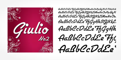
- Hubert by SoftMaker,
$9.99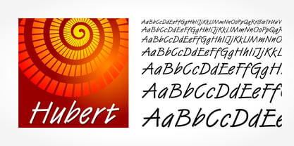
- Eller Initials by SoftMaker,
$7.99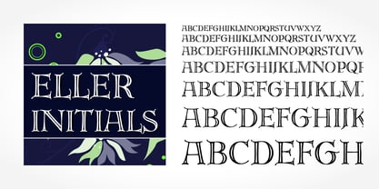
- Cristoforo by SoftMaker,
$9.99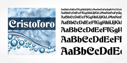
- Rosa by SoftMaker,
$9.99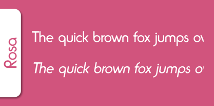
- Zephyr by SoftMaker,
$9.99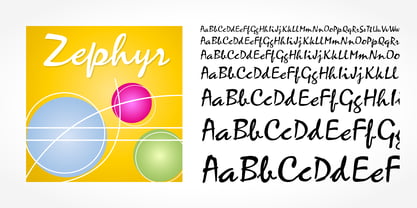
- Kalligraphia by SoftMaker,
$9.99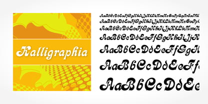
- Rovinj by SoftMaker,
$9.99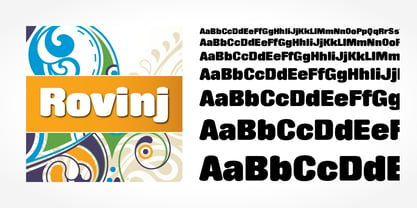
- Greyhound by SoftMaker,
$9.99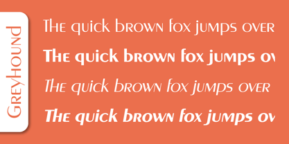
- Pinocchio by SoftMaker,
$9.99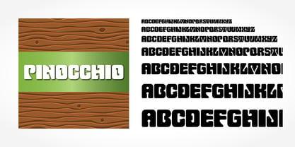
- Shotgun by SoftMaker,
$9.99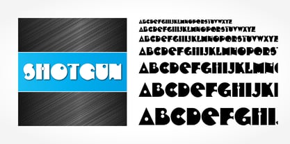
- Angelo by SoftMaker,
$9.99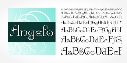
- Ingrid by SoftMaker,
$9.99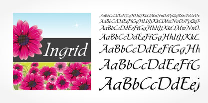
- Inverserif by SoftMaker,
$9.99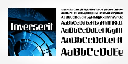
- Pretoria by SoftMaker,
$9.99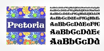
- Slager by SoftMaker,
$9.99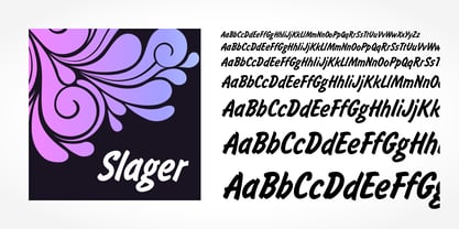
- Egyptian Wide by SoftMaker,
$9.99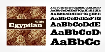
- Reflex by SoftMaker,
$9.99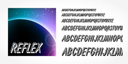
- Tico by SoftMaker,
$9.99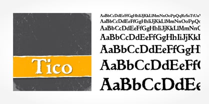
- Quartz by SoftMaker,
$9.99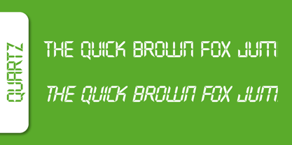
- Balzac by SoftMaker,
$9.99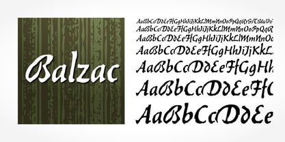
- Unziale by SoftMaker,
$9.99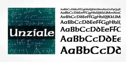
- Siegfried by SoftMaker,
$9.99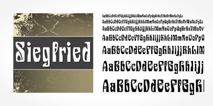
- Paladin by SoftMaker,
$9.99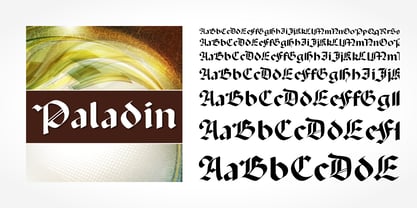
- Status by SoftMaker,
$9.99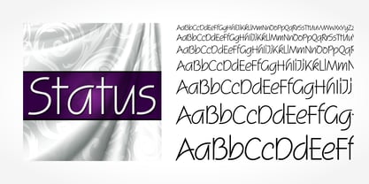
- Legend Script by SoftMaker,
$9.99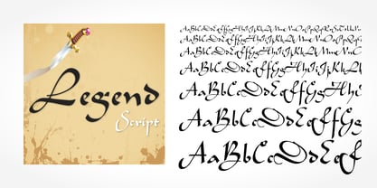
- Sprint by SoftMaker,
$9.99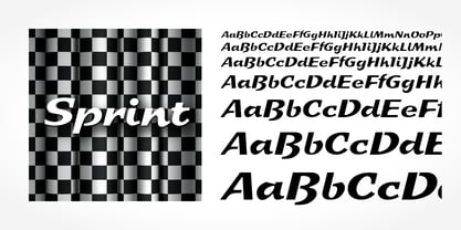
- Dillon No2 by SoftMaker,
$9.99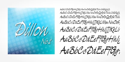
- Rough Script by SoftMaker,
$9.99
- Station Script by SoftMaker,
$9.99
- Regency Script by SoftMaker,
$9.99
- Shentox by Emtype Foundry,
$69.00
- Media Gothic is a contemporary font that embodies a sleek and modern aesthetic, drawing inspiration from the principles of geometric design and minimalist styles. It falls within the category of sans...
- Goth Stencil Premium, the brainchild of the talented designer Juan Casco, is a font that marries the essence of gothic design elements with the practical utility of stencil typefaces. At its core, Go...
- We The People by K-Type,
$20.00
- The font D3 Littlebitmapism Square, created by the entity known as D3, is a distinctive typeface that evokes the essence of early digital graphics and retro gaming aesthetics. As its name suggests, i...