10,000 search results
(0.034 seconds)
- Normerif by Invasi Studio,
$19.00 Introducing the Normerif Font, the perfect typeface for those seeking a touch of elegance and vintage style in their designs. With its display serif style and elegant alternates, Normerif provides a fashionable and sophisticated look to any project. This font is specially designed for classic-themed projects and is perfect for creating simple, clean, and stylish designs. Whether you're looking to create logos, titles, magazines, or any other design project, Normerif is a perfect choice. Its elegant and refined serif style makes it suitable for a wide range of design applications, including print materials, websites, and more. The font features stylish alternates, which add a touch of sophistication and elegance to your designs. So if you're looking to add a touch of class and sophistication to your next project, look no further than Normerif Font. With its elegant and fashionable style, this font is perfect for creating simple, clean, and stylish designs that will make your projects stand out.
 - Full Slab by Bülent Yüksel,
$19.00Full Slab is the younger brother of original Full Sans, FullNeue and Full Tools. Ideally suited for advertising and packaging, editorial and publishing, logo, branding and creative industries, poster and billboards, small text, wayfinding and signage as well as web and screen design. Full Slab provides advanced typographical support for Latin-based languages. An extended character set, supporting Central, Western and Eastern European languages, rounds up the family. The designation “Full Slab LC 50 Book” forms the central point. The first figure of the number describes the stroke thickness: 10 Thin to 90 Bold. Full Slab LC comes 5 weights and italics also Full Slab SC comes 5 weights and italics total 20 types. The family contains a set of 485 characters. Case-Sensitive Forms, Classes and Features, Small Caps from Letter Cases, Fractions, Superior, Inferior, Denominator, Numerator, Old Style Figures just one touch easy In all graphic programs. Full Slab is the perfect font for web use. You can enjoy using it. - Aesthetic Bingo by Absonstype,
$20.00 Aesthetic Bingo is the Unique Serif display typeface with combine uppercase and lowercase looks and feel nice balanced. Provide with alternates and ligatures font in variant style make the design letter looks nice. Honestly it works perfectly for headlines, logos, posters, packaging, T-shirts and much more. Recommended to use in Adobe Illustrator or Adobe Photoshop with opentype feature. Ligatures feature is default setting in Adobe Illustrator or Adobe Photoshop in Uppercase character. So when you want not to use the ligatures. Open glyphs panel : In Adobe Photoshop choose tool Window >> Character and then please click fi symbol In Adobe Illustrator choose tool Window >> Type >> Open Type and then please click fi symbol How to access Alternates Character? Open glyphs panel : In Adobe Photoshop choose tool Window glyphs In Adobe Illustrator choose tool Type glyphs If you have questions, just send me a message and I’m glad to help. Have a great day, Absonstype
 - Liquidity by Heyfonts,
$15.00 Liquidity fonts are typography designs that imitate or simulate the appearance of liquids. They are often fluid and dynamic in nature, providing an illusion of movement and flow in letters and characters. Liquid fonts can be created using different design techniques, including hand-drawn illustrations, digital effects, or 3D modeling software. Some common features of Liquidity fonts include: Fluid and dynamic appearance: Liquidity fonts have a free-flowing and organic appearance, mimicking the look and movement of liquids such as water, ink, or paint. Variations in thickness: The thickness of the lines and curves in liquid fonts can vary, creating an uneven and organic appearance. Versatile use: Liquidity fonts are commonly used in creative designs such as logos, album covers, and advertising campaigns to create an eye-catching and memorable visual impact. Overall, Liquidity fonts are a unique and creative way to portray text, giving a sense of energy, motion, and fluidity to design projects.
 - Linotype Textra by Linotype,
$40.99Linotype Textra is a clever twist on the sans serif genre, designed by Jochen Schuss and Jörg Herz in 2002. Schuss says this about Linotype Textra: "Two in one! The same Linotype Textra, which is so neutral and practical for long text passages turns into an eye-catching headline type when used in larger point sizes. The trick? It's all in the details. The type's clear, robust forms give it a high degree of legibility when used in smaller point sizes for texts. When used in larger sizes, the angular, slightly irregular forms that give the type its strong character become apparent. Hence the name Linotype Textra: pure text with a little something extra!" With 15 weights, the Linotype Textra family provides graphic designers with a good basis for almost any type of work. The five regular weights have matching true italics and old style figures, and the five small cap weights include tabular figures. - Brecksville by OzType.,
$15.00 Brecksville is a condensed grotesk typeface that takes inspiration from early German designs of the mid-19th century. It was designed as part of my current research into grotesk typefaces and different letterforms, as part of my dissertation research, “Perfected Letters: German Grotesk in the Nineteenth Century”, which focuses on the role of German design in typography. The Brecksville font family provides a wide range of weights, ranging from light to bold for both its rounded display style and more rugged sharp style. Both its styles feature the same horizontal proportions and metrics so they can freely be combined with no spacing issues. Brecksville's visually punchy condensed style and sharp edges, allows it to stand out on the screen – at almost any size. Its black composition also brings out the details needed in magazine and tabloid headlines, while maintaining readability throughout. The rounded display version is ideal for posters and other uses where you want something eye catching but not too hard on the eyes.
 - Blackline by Rhd Studio,
$19.00 Black line style - New modern & fresh script with handwritten and script style makes this font look elegant, natural, stylish and perfect for any extraordinary project that requires a handwritten feel. I am made with love and unique!! Blackline includes a full set of beautiful handwritten upper and lower case letters, numbers, assorted punctuation marks and bindings. All lowercase letters include starting and ending strokes, providing a realistic handwriting style. What did you get, honey? You will get : - Alternative Ligatures & Styles - Fonts include multilingual support for; Afrikaans, Albanian, Catalan, Danish, Dutch, English, Icelandic, Italian, Spanish, Portuguese, German, Swedish, Norwegian, Polish, Indonesian, Zulu To use beautiful strokes, you need a program that supports OpenType features such as Adobe Illustrator CS, Adobe Photoshop CC, Adobe Indesign, and Corel Draw. but if your software doesn't have Glyphs panel, you can install additional font swash file: If you have any questions about the latest fonts, please give us a short message thank you Rhd Studio
 - Resort by Los Andes,
$39.00 This font collection includes a contemporary casual Script typeface and a sophisticated all caps Sans that features high contrast between thick and thin strokes. When used together, these fonts offer high versatility—perfect for magazines, blogs, mockups, use with social networking sites, logos and headlines as well as greeting cards, invitations, book covers, posters, and web and on-screen use. Resort is a font collection consisting of 12 styles and 3 variants: Script, Sans and Ornaments. The font set is intended to provide users with a wide range of choices for any design project. The collection comes with a relaxing Script of 5 weights and a classic 6-weight Sans, and includes lively floral ornaments. Resort evokes the feeling of relaxing barefoot walks along the beach while enjoying the sunset and a refreshing cocktail. Resort was designed by Guisela "Coto" Mendoza and Luciano Vergara. Digital editing by Rodrigo Fuenzalida. Photos courtesy of Sarah Loven—a popular beauty, travel and lifestyle blogger.
 - Kaput Black - Personal use only

- Kaput Black Black - Personal use only

- Globet - Personal use only

- Optima Cyrillic by Linotype,
$65.00Many typefaces are distinctive or attractive at the expense of legibility and versatility. Not so the Optima® family. Simultaneously standing out and fitting in, there are few projects or imaging environments outside of its range. Although Optima is almost always grouped with sans serif typefaces, it should be considered a serifless roman. True to its Roman heritage, Optima has wide, full-bodied characters – especially in the capitals. Only the E, F and L deviate with narrow forms. Consistent with other Zapf designs, the cap S in Optima appears slightly top-heavy with a slight tilt to the right. The M is splayed, and the N, like a serif design, has light vertical strokes. The lowercase a and g in Optima are high-legibility two-storied designs. Optima can be set within a wide choice of line spacing values – from very tight to very open. In fact, there are few limits to the amount of white space that can be added between lines of text. Optima also benefits from a wide range of letter spacing capability. It can be set quite tight, or even slightly open – especially the capitals. If there are any guidelines, Optima should be set more open than tight. It’s not that readability is affected that much when Optima is set on the snug side; it’s just that the unhurried elegance and light gray typographic color created by the face are disrupted when letters are set too tight. Optima is also about as gregarious as a typeface can be. It mixes well with virtually any serif design and a surprisingly large number of sans serif faces. The Optima family is available in six weights, from roman to extra black, each with an italic counterpart. In addition, the family is available as a suite of OpenType® Pro fonts, providing for the automatic insertion of small caps, ligatures and alternate characters, in addition to offering an extended character set supporting most Central European and many Eastern European languages. When you’re ready to find its perfect pairing, browse these fantastic matches: Monotype Century Old Style™, Dante®, Frutiger® Serif, Joanna® Nova, Malabar™, and Soho®. - Alisal by Monotype,
$29.99 Matthew Carter has been refining his design for Alisal for so long, he says, that when he was asked to complete the design for the Monotype Library, it was almost as if he were doing a historical revival of his own typeface. The illusion even extended to changes in his work process: although he now does all his preliminary and final drawing on screen, the first trial renderings of Alisal were done as pencil renderings. Alisal is best classified as an Italian old style design. Originally created between the late 15th and mid-16th centuries in northern Italy, the true Italian old styles were some of the first roman types. They tend to be the most calligraphic of serifed faces, with the axis of their curved strokes inclined to the left, as if drawn with a flat-tipped pen or brush. These designs offer sturdy, free-flowing and heavily bracketed serifs, short descenders, and a modest contrast in stroke weight. Alisal has nearly all the classic Italian old style character traits, plus a few quirks of its own. It is calligraphic in nature, with more of a pen-drawn quality than faces like Palatino or Goudy Old Style. It is more rough-hewn than either Goudy's Kennerley or Benton's Cloister, and is generally heavier in weight than most of the other Italian old style designs. One place where Alisal makes a clean break with traditional old style designs is in the serifs. While sturdy and clearly reflecting pen-drawn strokes, Alisal's serifs have no bracketing and appear to be straight strokes crossing the main vertical. Like Caslon or Trajanus, Alisal is a handsome design when viewed as a block of copy. Ascenders are tall and elegant, and serve as a counterpoint to the robust strength of the rest of the design. Alisal is available as a small family of roman and bold with a complementary italic for the basic roman weight, providing all that is needed for the majority of text typography. Alisal is not as well-known as some of Carter's other typefaces, but this lovely and long-incubated design was certainly worth the wait.
 - Pistacho by Estudio Calderon,
$20.00 Are you looking for an appropriate typeface for coffee shops concept? We want to introduce Pistacho, the new type family of Estudio Calderon that contains 18 fonts to design great illustrations and to be applied, especially, in coffee shops, bakeries, ice-cream shops, candy stores, pastry shops, fruit shops and all those places where food is the center. Pistacho was designed by hand using pencils and markers that let us get a handcrafted and rough texture. Below, a brief description of each style: Display: A fresh and modern type, perfect to be used in coffee shops outdoor signs. The logotype of “Central Perk”, the coffee shop of the tv show “Friends” was our inspiration to develop this beautiful font that contains 317 characters and three variables: Display 1, Display 2 and Display 3, each one has specific characteristics that will be an excellent resource for your designs. Sans: Style that contains 7 fonts that can be mixed to get interesting finishes in your designs, each variable has 363 characters with standard ligatures and stylistic alternatives. You can find this styles as: Sans 1, Sans 2, Sans 3, Sans 4, Sans 5, Sans 6 and Sans 7. Good news, you can get Sans 5 DEMO for free. Script: Script 1 and Script 2, two monolineal fonts with a generous spacing that provides contrast and movement, being a suitable complement for the rest of the types of Pistacho family. Serif: Font with a lot of style and personality, inspired in the interlock alphabets shown in «Photo-Lettering´s One Line Manual of Style». Serif 1, Serif 2, Serif 3 and Serif 4 contain a great number of ligatures that generate nice compositions by combining them. One of the characteristics of this style is the combination of upper case and lower case giving as a result a different touch in each design. Soft: Humanist type with a rustic texture and geometric forms ideal for long texts and small sizes. Dingbats: We have designed a package of 244 graphics, illustrations and ornaments that are the perfect complement to combine with each font of this family. Get Pistacho type family, enjoy using it… and do not forget your cup of coffee.
 - Optima by Linotype,
$45.99 Many typefaces are distinctive or attractive at the expense of legibility and versatility. Not so the Optima® family. Simultaneously standing out and fitting in, there are few projects or imaging environments outside of its range. Although Optima is almost always grouped with sans serif typefaces, it should be considered a serifless roman. True to its Roman heritage, Optima has wide, full-bodied characters – especially in the capitals. Only the E, F and L deviate with narrow forms. Consistent with other Zapf designs, the cap S in Optima appears slightly top-heavy with a slight tilt to the right. The M is splayed, and the N, like a serif design, has light vertical strokes. The lowercase a and g in Optima are high-legibility two-storied designs. Optima can be set within a wide choice of line spacing values – from very tight to very open. In fact, there are few limits to the amount of white space that can be added between lines of text. Optima also benefits from a wide range of letter spacing capability. It can be set quite tight, or even slightly open – especially the capitals. If there are any guidelines, Optima should be set more open than tight. It’s not that readability is affected that much when Optima is set on the snug side; it’s just that the unhurried elegance and light gray typographic color created by the face are disrupted when letters are set too tight. Optima is also about as gregarious as a typeface can be. It mixes well with virtually any serif design and a surprisingly large number of sans serif faces. The Optima family is available in six weights, from roman to extra black, each with an italic counterpart. In addition, the family is available as a suite of OpenType® Pro fonts, providing for the automatic insertion of small caps, ligatures and alternate characters, in addition to offering an extended character set supporting most Central European and many Eastern European languages. When you’re ready to find its perfect pairing, browse these fantastic matches: Monotype Century Old Style™, Dante®, Frutiger® Serif, Joanna® Nova, Malabar™ and Soho®.
 - Seddon Penmans Paradise Capitals by Intellecta Design,
$29.50 John Seddon (1644-1700), was a famous English writing master, the leading calligrapher of his time, and master of Sir John Johnson’s Free Writing School in Priest’s Court, Foster Lane. His portrait was drawn by William Faithorne and was engraved by John Sturt as the frontispiece for his copy-books, such as ‘The Ingenious youth’s companion’ of c.1690 and 'The pen-man’s paradise' of c.1695. These were engraved after his work by others. Your extra-rare book - "The Pen-mans Paradise Both pleasent & Profitable OR Examples of all ye usuall hands of this Kingdome. Adorn'd with variety of ffigures an Flourishes done by Command of hand. Each ffigure being one continued & entire Track of the pen most where of may be struck as well Reverse (or to answer bothwayes) as Forward", London (1965). - (YES, that is the title of the book!) was the starting point to these new extra accurated works of Iza W, a series of revivals of the penmanship Seddon’s artworks, like this highly ornamented animal kingdom inspired capitals and alphabets: the Seddon Penmans Paradise Capitals typeface. And, on the other hand, you can get the animal and human kingdon inspired penmanship forms in the Bestiario font. The “SeddonsFleurons” will complete the collection. Fantastic choice to elaborated barocque/renaissance inspired and historical accurated layouts.
 - Maggies Luck by Gleb Guralnyk,
$15.00 Hello! Introducing a layered display font — Maggie's Luck. It's a vintage style bold typeface with layered feature. Maggie's Luck Font has five "fonts-layers" for more convenient recoloring. This font has a multilingual support (check out a screenshot with available letters and signs). Thank you and wish you a peaceful sky!
 - Badger Pro by Red Rooster Collection,
$60.00 Badger Pro has been completely redrawn and remastered by Steve Jackaman and Ashley Muir. The new Badger Pro family has been fleshed out with a glyph set that is over 40% larger than the original Badger release, and contains all the high-end features expected in a quality OpenType Pro font.
 - Peanut Bite by PizzaDude.dk,
$15.00 A highly decorative and playful font, inspired doodle drawings. It has this Scandinavian vibe in a funny and lively way. If you don't fancy the decorative thingies, you can use the Regular version, which is a classic cartoonish font. The Decorative version has 4 different versions of each lowercase letter
 - Angoli by Mashiu,
$12.99ANGOLI is characterized by line geometric and simple. This font is ideal for titles and text in large sizes. The font has two uppercase versions. To realize this character I was inspired by angular shapes of the buildings. Each character has the characteristic of being formed by a single continuous line. - Plug by Superfried,
$32.50 Plug is an experimental, curvy, display typeface designed by Superfried. As its name suggests, it features ‘plugs’ within all the glyph counters. Plug has a very retro feel and its chunky structure leads to a distinct, high-impact display font. Plug has been featured on the Behance curated typographic gallery TypographyServed.com.
 - Glasgow Pro by Red Rooster Collection,
$60.00 Glasgow Pro has been completely redrawn and remastered by Steve Jackaman and Ashley Muir. The new Glasgow Pro family has been fleshed out with a glyph set that is over 40% larger than the original Glasgow release, and contains all the high-end features expected in a quality OpenType Pro font.
 - Kings in Disguise by Elemeno,
$25.00Kings in Disguise is a chunky, balloon font of the sort used extensively during the 1970s. It has a retro, disco feel and is ideal for signs and logos. The name comes from a great comic book series published in the late 1980s. The engraved style has a limited character set. - Street Scribe by Vozzy,
$10.00 Introducing hand made label font named Street Scribe. This font family has an additional characters and multilungual support (check out all available characters on previews). Typeface has two styles Regular and Italic. This font will look good on any sport styled designs like a poster, T-shirt, label, logo, etc.
 - Deco by Open Window,
$19.95 Deco is an Art Deco inspired chunky font. It has the irregular charm of a hand drawn font but the elegance of a classic Art Deco style font. It has enough humor and grace to be used in a wide range of applications. Its ideal use is as a display font.
 - Label Machine JNL by Jeff Levine,
$29.00 Label Machine JNL is Jeff Levine's take on the embossed labels popularly used for years as a marking and identifying method. This font has a limited character set. On the left bracket is a wide blank for label ends, and the right bracket has a narrower space for use between words.
 - Asia by Superfried,
$32.50 Asia by Superfried is an ornate, display typeface inspired by trips throughout the continent. Its distinct, bold style has been designed to evoke the curves and beautiful intricacy of Asian typographic characters and patterns. Asia has been featured on Creative Boom and named font of the day by Creative Bloq.
 - Black Sigra by Sign Studio,
$12.00 Black Sigra comes in 3 styles (regular, blur, and shadow) so it can be more versatile. Adapting to a simpler fracture calligraphy style. Has sufficient thickness to dominate a design page. Supports multiple languages and each character has a PUA code which means everything can be accessed on most common software.
 - Elektrakution by Comicraft,
$19.00 SHE'S DEAD, FRANK It's the year 1991, BC (Before Comicraft) when REM were still making records and Frank Miller’s memorable run on Marvel Comics’ DAREDEVIL was just over ten years old. Comicraft’s Richard Starkings found himself working in Anaheim, California for Graphitti Designs. Graphitti had produced the first hardcover edition of Miller’s Batman tale, DARK KNIGHT RETURNS and was now putting together the sequel to Miller’s DAREDEVIL — ELEKTRA LIVES AGAIN! Richard was not engaged to letter this book, the pages of Frank’s incredible original art that came through Graphitti’s studio were already lettered by Marvel Stalwart, Jim Novak. However, there were some cover elements that needed to be added, based on the logo originally rendered by Frank’s brother, Steve. Starkings set about the task of creating an alphabet that could be used to develop Steve’s idea for the trade dress -- the cover elements, the back cover copy and credits on the interior pages. This was long before Macintosh computers and font programs made this work considerably easier, so Rich sat down with a pencil and a sheet of vellum and rendered an alphabet that could be used as the basis for the text that was needed... Those sketches have languished in a drawer for nearly thirty years, but now, finally, Comicraft’s John Roshell has dusted off those old letterforms and Elektrakuted a font based on those designs, a font we HAD to call ELEKTRAKUTION! As for Elektra; she’s dead, Frank. Features: Ten weights (Light, Regular, Bold; Rough Light, Regular & Bold; Inline, Inline Rough, Outline & Outline Rough) with upper & lowercase characters, Western & Central European accents and Greek characters.
 - Lazy Fox by Pixel Colours,
$18.00 Lazy Fox is a handwritten font that has an imperfect look, great for texts!
 - Zany by BA Graphics,
$45.00A unique font that falls in that extreme catagory, Zany has that happy look. - WarpLetunical by Ingrimayne Type,
$9.00 A warped version of the font Letunical, WarpLetunical has a Halloweenish feel to it.
 - Pieslay by Nissa Nana,
$29.00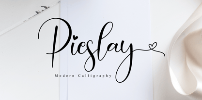 Pieslay is a beautiful script font that has a classy, elegant, and modern look.
 - Retra by Dima Pole,
$36.00 Retra is unusual serif high-contrast font family in Bodonian style. Some elements has not classical forms, so the font looks interesting and unusual. It is suitable for headlines and some texts. Font family Retra has as bright a display font style and a relaxed textual font styles, and sans-serif font styles. There are many OpenType features, also all the 104 European languages and all Slavic languages. Retra also has an alternative set of Slavic natural lowercase. Text, typed Retra, of course, attracts attention. Overall, Retra leaves a memorable and attractive experience.
 - CA No Dr. by Cape Arcona Type Foundry,
$30.00 No Dr. was inspired by an old movieposter lettering for the 1962 movie "James Bond: Dr. No". Just like the original Dr. No, No Dr. has a diabolical charm. It was developed into a font family that combines distinctiveness with versatility. It has a good readibility as a textfont but also looks great as a Headline. The two widths and the two weights give you a big choice. Intended to become an interesting alternative to the much used DIN Schrift, it has now developed into a highly functional family of it's own.
 - Moritat by Comicraft,
$39.00 It's unpredictable! It's enigmatic! It has a winning smile and a devil-may-care personality. It can be charming and obliging and yet also elusive and impractical. It is the doer of deadly deeds, it is the dextrous hand of ELEPHANTMEN artist Justin Norman. It is swift and decisive, hesitant but packed with Talent. Ladies and... uh, More Ladies... Moritat has entered the building. Whoops, actually Moritat has LEFT the building. Moritat is the alias of Justin Norman, comic book artist and illustrator. The font is based on his pen lettering.
 - Cobalt 27 by Lee Iley,
$29.00 A typeface based on early Constructivism Design and Early 20th Century Type form the Modernist Movement. Cap Height for the font has been extended to represent early 20th century typography more closely, while rounded shoulders add a contemporary, modern feel, allowing the design to bridge both centuries. Cobalt Bold works best for headers and titles, while Cobalt Medium and Regular lend themselves to body text. Cobalt Text has smaller Cap Heights, Ascenders, and Descenders, and has been designed where smaller leadings in a body of copy is needed.
 - Mechanic Gothic DST by Red Rooster Collection,
$60.00 Based on character shapes with origins rooted in the work of 19th Century American wood type makers, DST Mechanic Gothic draws influence from the poster types found in the impactful advertising during the Industrial revolution. It has several classic condensed sans-serif elements, and although Darren Scott has injected a contemporary twist to refresh the character shapes, this typeface does not deny its roots. Darren Scott's original Mechanic Gothic design has been adapted and re-crafted to give a more conventional range of weights and italics for this exclusive re-release.
 - Hesia by Ardyanatypes,
$17.00 Introducing Hesia Typeface Style which has a unique and very strong character that makes all designs look unique and have a modern feel. Hesia has its own charm, so it will be very suitable to be combined with any style. Has Lots of Alternatives and ligatures to add a great interactive feel to every design. Hesia also comes with multilingual support and is very easy to use. Hesia is interesting to use in designs such as books, movie posters, logos, branding, business cards, and more that can be combined with Hesia Typeface.
 - Happy Trails by Breauhare,
$35.00 Happy Trails is a font that is based on the lettering (all upper case) used on most Trailways buses from 1936 through the very early 1960s. It also has a newly created set of lower case letters which never existed before. The font was tweaked and digitized by Bob Alonso & John Bomparte. Happy Trails has not only the flavor of the early Trailways buses but also a folksy, Western feel to it, and it’s even a bit silly or goofy, a fun font that has a variety of uses.


