10,000 search results
(0.093 seconds)
- Fatigue by Typesthetic Studio,
$13.00 Heroic is a bold and playfull handwritten brush font. This font is very unique because sometimes it can look fierce like in modern street art graffiti if with capital letters, but sometimes it can look cute if it is included with the lowercase letters. As a result, this font can matches a wide pool of designs.
 - Bomber Urban by Nirmana Visual,
$22.00 Bomber Urban Inspired by Graffiti Street Art, Bomber Urban is a fun, urban-style display font. This font is suitable for designs like logos, advertising, apparel, jerseys, sportswear, skateboard designs, and more. Take your concepts to the next level with this stunning font! Make your designs stand out with the urban and edgy look of our Graffiti font.
 - McCadden JNL by Jeff Levine,
$29.00 McCadden JNL was inspired by the hand-lettered credits for the George Burns and Gracie Allen Show [1950-1958]. Its casual theme offers a lighthearted approach to titling and display work. The font gets its name from McCadden Productions (the company started by George Burns), which itself was named after a street Burns' brother William once lived on.
 - Chave - Personal use only

- Just Pixo by Latinotype,
$29.00 Inspired by the streets of Brazil, Just Pixo is a display typeface that mimics pixação, Brazilian graffiti. In his book Pixação: São Paulo Signature, François Chastanet says, “This alphabet, with its vertical inscriptions axis, is to be directly classified in the king-size, monumental category; the systematic use of capitals, meticulously aligned and justified, their extreme verticality, are symptomatic of this architectural dimension”. As such, we designed Just Pixo for monumental type sizes and vertical alignments—a family with seven weights, alternate glyphs, multiple ligatures and is provided as a Variable Font too. Unique decorative serif capitals and lowercase sans serif versions make Just Pixo the perfect option for large displays, strong headlines, urban logos, and contemporary concepts. Despite its controversial use on the streets, this often politically charged style will typeface will take your next project to the next level.
 - LiebeChristmas by LiebeFonts,
$19.90 LiebeChristmas is a hand-crafted collection of Santas, Rudolphs, gifts, treats and more Christmas items in countless variations and sizes. Create pretty Christmas greetings with a personal touch. Surprise your family and friends by printing individual cards for everyone. Decorate your blog or website for the holiday season. More than 100 carefully crafted drawings are included in this single font and can be used in any text or graphics application. How about creating your own wrapping paper with LiebeChristmas patterns? Or how about making Christmas cards in combination with our popular typeface LiebeErika?
 - Wisely by Mili + Wise,
$12.00 Perfect for writing out uplifting quotes for instagram posts, wall art or greeting cards. It will also be there for you if you need to design some charming packaging or branding. Suitable for short and sweet quotes, as well as longer meaningful paragraphs. Designed and kerned with care and love to make using it a breeze. Wisely is packed with lovely features: contextual alternates to give the text this hand-written look you need many stylistic alternates for uppercase and lowercase ligatures multilingual support with accented characters for international designers
 - Winter Break by Supersemarletter,
$10.00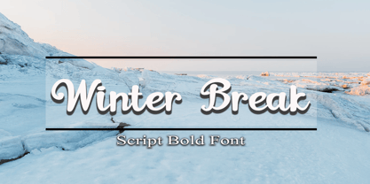 Winter Break is a sweet and flowing handwritten font. It looks stunning on wedding invitations, thank you cards, quotes, greeting cards, logos, business cards and every other design which needs a handwritten touch. Honestly it works perfectly for headlines, logos, posters, packaging, T-shirts and much more. Font Features : • Regular version • Character set A-Z in uppercase and lowercase • Numerals & Punctuation • Accented Characters • Multiple Languages Supported Recommended to use in Adobe Illustrator or Adobe Photoshop with opentype feature. If you have questions, just send me a message and I'm glad to help.
 - Vododeo JNL by Jeff Levine,
$29.00 Vododeo JNL is directly named for the free-form sheet music title lettering from Jack Yellen and Milton Ager's "Vo-Do-De-O". The term itself was a catchphrase made popular during the era known as the "Roaring 20s". Yellen and Ager were responsible for such hits as "Ain't She Sweet" (1927) and "Happy Days Are Here Again" (1930) along with countless others. During his career, Jack Yellen provided lyrics to over 200 songs. As a side note, Yellen was married to a distant cousin of type designer Jeff Levine's late mother.
 - Aima Font Duo by Areatype,
$15.00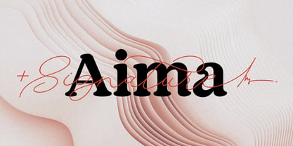 Aima Font Duo A sweet signature font, casual and dynamic with a dancing baseline. Also available Aima Display to help you mix and match it to fit your creative work in harmony. all to add an authentic touch to your designs. perfect for Branding, Logos, Greeting Cards, Wedding Stationery, Quotes etc. Files included: Numerals & Punctuation Stylistic Alternates & Ligatures PUA Encoded Characters Thanks so much for looking, I really hope you enjoy it and please don't hesitate to drop me a message if you have any issues or queries :) Happy using
 - Verdana by Microsoft Corporation,
$49.00The Verdana™ Family of fonts was created specifically to address the challenges of on-screen display. Designed by world renowned type designer Matthew Carter, and hand-hinted by leading hinting expert, Tom Rickner, these sans serif fonts are unique examples of type design for the computer screen. The generous width and spacing of Verdana's characters is key to the legibility of these fonts on the screen. Despite the quality of the Verdana font family at small sizes it is at higher resolutions that the fonts are best appreciated. In the words of Tom Rickner, ‘My hope now is that these faces will be enjoyed beyond just the computer screen. Although the screen size bitmaps were the most crucial in the production of these fonts [their] uses should not be limited to on screen typography. Character Set: Latin-1, WGL Pan-European (Eastern Europe, Cyrillic, Greek and Turkish). - Verdana Ref by Microsoft Corporation,
$29.00The Verdana™ Family of fonts was created specifically to address the challenges of on-screen display. Designed by world renowned type designer Matthew Carter, and hand-hinted by leading hinting expert, Tom Rickner, these sans serif fonts are unique examples of type design for the computer screen. The generous width and spacing of Verdana's characters is key to the legibility of these fonts on the screen. Despite the quality of the Verdana font family at small sizes it is at higher resolutions that the fonts are best appreciated. In the words of Tom Rickner, ‘My hope now is that these faces will be enjoyed beyond just the computer screen. Although the screen size bitmaps were the most crucial in the production of these fonts [their] uses should not be limited to on screen typography. Character Set: Latin-1, WGL Pan-European (Eastern Europe, Cyrillic, Greek and Turkish). - DMV Printer by E-phemera,
$12.00DMV Printer is a detailed replica of the type produced by the computer printer at the California Department of Motor Vehicles. It was created in order to make prop documents for movies and television shows. - Anachronic by PintassilgoPrints,
$20.00 Anachronic is the polished version of our Chronic font family and preserves its libertarian dna. It's kind of strong, while friendly. Because sometimes you've just got to be bold — pero sin perder la ternura jamás!
 - Vulcano by Type-Ø-Tones,
$40.00 Vulcano is the mesmerising creation of Salvador –Tori– Alimbau, the one-type-man who gave us this maze. José Manuel Urós took months to devise a negative-positive system for these characters. Hypnotic, charming sophisticated.
 - Sigmund Freud Typeface by Harald Geisler,
$29.00 “For those who regret what keyboards and touch screens have done to their penmanship, typographer Harald Geisler has an answer: Sigmund Freud.” — The Wall Street Journal Sigmund Freud was a neurologist who lived from 1856 to 1939. His research and studies led to the foundation of ‘Psychoanalysis’. When I first saw Freud’s century old letters, I was fascinated by the beauty of these historic manuscripts. It made me smile to imagine a person writing his or her shrink a letter set in Freud’s handwriting. I started to plan creating a font based on his manuscripts. I contacted the Sigmund Freud Museum Vienna and Freud Museum London. To start the creation I selected eight handwritten documents from the archive in Vienna – This selection of specimen was my orientation during the design process. The Samples were created between 1883 to 1938 and are of various character such as handwritten scientific papers, personal letters, notes and a telegram. A successful Kickstarter Campaign "The Sigmund Freud Typeface - A Letter to your Shrink" with over 1400 Backers enabled me to visit the archive in Vienna and study the original manuscripts of Sigmund Freud. After a year of preparation and design work, I finished four alphabets based on Freud’s handwriting. What are the different Versions PRO, Kurrent, #1, #2, #3 and #4 about? “This project gives people the convenience afforded by the computer while maintaining the romantic nostalgia, beauty, and character of letter writing with real handwriting.” — Daniel Vahab, The Huffington Post When you write with your hand, every letter looks a little different. When you write a text on your computer every letter looks exactly the same. In order to make type look like handwriting, I chose four different variations of each letter from Freud’s manuscripts, drew and stored them in the font. The font is then programmed to exchange letters while you are typing. This makes the rendered result on your screen or print look like unique handwriting. PRO While you are typing… the PRO Version actively combines all four alphabets and exchanges them automatically. Through this mechanism never the same two o’s will stand next to each other. With every touch a unique look is generated. This works in certain applications i.e. Word 2010(or newer), Pages, TextEdit, Editor(Pre-installed on Windows 7 or newer), InDesign, Illustrator… →Here you can see an animation of what this effect looks like in action. (Please Note: some applications like LibreOffice, OpenOffice do currently not support this feature. Date: December 2013) #1 #2 #3 and #4 The Sigmund Freud Typeface #1, #2, #3 and #4 each hold one individual lowercase alphabet based on Freud’s handwriting. Kurrent Most of Freud’s correspondence was written in German. Until the 1950′s a different handwriting was taught throughout German speaking countries (Switzerland, Austria, Germany). This style is called Kurrent. The name Kurrent and Cursive derive from the Latin word currere - to run, hurry - both styles were designed to write fast. As you can see in the samples above, Freud practiced both Kurrent and when writing english Cursive (Latin script or Joined-up). Kurrent has three significantly different letters (s,h,e). Use Kurrent to render the authentic look of an historic Sigmund Freud letter in German. Bundle On the Top of this page you can get all six fonts of the Sigmund Freud Typeface Family in a bundle. International Typeface All styles of the Sigmund Freud Typeface feature a wide range of accented letters so you can write to all your friends in Sweden (Bjørn) France (Chloé & Zoë), Ireland (Dáirine), Poland (Łucja), Germany (Jörg) and almost everywhere around the globe (Find a complete list in the tech specs). Usage recommendations I hope that this design will be valuable to you and most of all that you have fun with this typeface! 1. Point Size — To reproduce the size of Sigmund Freud’s handwriting adjust the type size between 18-24 point in your word processor. If you are using an imaging software like Photoshop set the resolution to 300dpi and adjust the point size between 18-24. 2. Line Spacing — Narrow the line hight until swashes of capital letters touch the baseline above. This also happens when you write a letter and gives the document a unique handwritten look. 3. Right Aligned — Freud had the habit to write towards the right edge of the page and start loosely on the left. Set your text alignment to ‘right’ to incorporate this dramatic expression also to your documents. What do other People say about the Sigmund Freud Typeface? “Wouldn’t you love to write a letter to your shrink using the Sigmund Freud typeface?” — Dorothy Tan, Design TAXI ''“JUST DON’T WRITE A LETTER TO YOUR MOTHER WITH IT… …until the reader looks a bit closer, and they see 70+ years of modern science weighing in on turn-of-the-century pop psychology."'' — Mark Willson, Fast Company “Doctor, what does it mean if you dream of creating a font of Freud’s handwriting?” — Ayun Halliday, Open Culture “…geekily romantic, at once artistic and scientific” — Edie Jarolim, Freud’s Butcher “…sympathisch” — Jürgen Siebert, Fontblog !WOW! Thank you for reading the complete font description! You are awesome! If you still have a question please contact me through MyFonts or my website haraldgeisler.com. Credits This project was made possible by the help of 1481 Backers on Kickstarter and the kind support of the Sigmund Freud Museum Vienna and the Freud Museum London. Thank you. All of Freud’s Manuscripts shown are © Sigmund Freud Museum Vienna. Poster Image: IN17 - Sigmund Freud, Germany 1932. © Freud Museum London. Flag Image: IN19 - Sigmund Freud 1930’s. © Freud Museum London.
 - GAU_font_modern - Unknown license

- Huron by Solotype,
$19.95A Barnhart Bros. & Spindler type from the late victorian period. We have been faithful to the spirit of the original buy "calmed down" a few of the lowercase letters to make the lines read more smoothly. - Longbranch by Solotype,
$19.95A modern cutting designed to give the appearance of an old wood type. The letters were cut as linoleum blocks about 2 inches high, then duplicated as copper electrotypes. Used for some Ringling Bros. circus work. - Via Roma Display by Font&Co.,
$19.00 A font inspired by regime propaganda inscriptions found in Italian institutional and civic architecture of the 20’s and 30’s. Bold, severe lettering, suggestive of pre-war Italian Art Deco and American Depression Modern aesthetics.
 - Pacifica by Solotype,
$19.95This is really Congo from Barnhart Bros. & Spindler, but we felt it would be improved if we smoothed out some of the curves slightly. Conjures up visions of Pacific Islands and other exotic ports of call. - P22 Constructivist by P22 Type Foundry,
$24.95 Font mavens of the world unite! Constructivist recreates the bold graphic design of early Soviet Era Russian Artists such as Rodchenko and Popova. The Constructivist family contains 5 fonts plus a set of decorative extras. Constructivist Pro is an Opentype adaptation of the P22 Constructivist Set font system which combines the 5 font styles and adds Opentype features such as alternate Latin and Cyrillic letterforms, full Central European Language support and changes in line spacing and optical sizing of some characters for improved harmony. In all over 1200 Glyphs for maximum flexibility and design choices. Seize control of the means of desktop production with this revolutionary font collective!
 - Essylla by Tegaki,
$16.00 Essylla was created with stylish and modern handwritten characters. This font is PUA encoded. Essylla is a modern handwritten style that comes with Extended Latin Characters. Essylla works perfectly for logos, display, product branding, wedding invitation card, stationary, packaging, clothing, flyer, apparel, magazines, brochures, labels, posters, badges, etc. Essylla comes with 281 glyphs and 52 alternate characters contain with OpenType features (supported with contextual alternates mode). Essylla also comes with 11 extended ligatures that allowing you to make stuff looks more exclusive and pro standard. If you need help or advice, please contact me by e-mail "tegakiscript@gmail.com" Thank you for your purchase!
 - Havel by T4 Foundry,
$39.00Havel is an updated interpretation of a Czech type design from the 1930s. It is powerful and very condensed. At a quick glance you might find kinship with other condensed typefaces of the same period, like Spire (Sol Hess, 1937), Onyx (Gerry Powell for ATF, 1937) or Quirinus Bold (Alessandro Butti, 1939). But Havel has its very own look, rooted in the rapidly disappearing "Eastern European Type", a typographical tradition where poster and packaging design were the highlights. Torbjörn Olsson has revived this classical Czech beauty, and the Open Type version, Havel Pro, can also be used for Czech, Hungarian, Polish, Estonian, Latvian and Lithuanian. - Politica by Sudtipos,
$39.00 Describe the 21st century politician. Left or right? Fat or thin? War or peace? Straight or gay? Hard or soft? Male or female? Pro or con? Young or old? East or west? Now look at the Politica super-family and see which font they may be. The overused sans serif faces don’t cut it anymore. This day and age requires a sturdy, modern and straight-to-the-point sans to cover the issues. The Politica family also come in OpenType variations which extend the character set to include Cyrillic, Greek, Baltic, Turkish and Central European languages. You have no excuse: the globe is yours with Politica.
 - Berling Nova Sans by Linotype,
$40.99Berling Nova Sans Pro is the companion famous Berling Nova type family. Made by Pangea design, the sans family consists of seven fonts: Light, Regular, and Bold - all with true italics - and the additional weight of Extra Bold for real impact. The original Berling spirit was transfered into this sans design so it functions well as a pairing with its serifed counterpart. Useful for anything from text through display sizes, this clear and modern humanist design is sure to add just the right amount of personality to your project. For more information on this extended type system, be sure to check out the Berling Nova family! - Plywood by Canada Type,
$24.95 Plywood is based on a long lost American film classic: Franklin Typefounders's Barker Flare from the early 1970s. Plywood is a surprisingly effective mix between the rigid confidence of nineteenth century wood types and the smooth feminine curves of twentieth century art nouveau ideas. With many variations on almost every letter in the alphabet, it's a versatile typeface that can make itself timelessly at home in multiple design environments, with motifs ranging from the strong and western to the crafty and artsy. Plywood's very expanded character set comes in all popular font formats, including a Pro version that takes advantage of OpenType's many character alternating features in supporting programs.
 - Fantasy by Typesenses,
$49.00 Fantasy draws on a series of historical calligraphic traditions: Roman capitals, Lombardic initials, enlightenment era ornamentation and refinement. The user is invited to deploy their imagination playing with the alternates, ornaments and frames in different universes like publications and stationery. Fantasy Pro is the fully-featured OpenType version with two styles of capitals and plenty of swash alternates and ornaments. Each of these varieties is available as a separate font in addition to Fantasy Std, a set of unadorned standard characters for smaller settings. Use professional software that widely support Open Type features. Otherwise, you may not have access to some glyphs. Give a touch of magic to your work!
 - 1672 Isaac Newton by GLC,
$42.00 Isaac Newton, father of the theory of gravity, used several forms of handwriting in his life, in numerous texts about numerous scientific subjects. Here, we propose a handwritten font, using a particularly legible script form, coming from texts written in 1672, the year he presented a new reflecting telescope to the Royal Society. It is a Pro font containing Western, Eastern, Central and Northern European, Icelandic, Baltic, and Turkish diacritics. The alternates and ligatures allow the font to look as closely as possible to the real thing. The features allow OTF software to vary the characters of a word automatically, with no more work than selecting contextual alternates and standard ligatures.
 - Garden Collection by Cultivated Mind,
$25.00 Introducing the Garden Collection. A new Garden Grown font family by Cultivated Mind Type. This hand-painted collection includes four scripts, two caps fonts, plant art, extras art and free words. Garden Grown Pro scripts includes 260 alternates and 46 ligatures. Ligatures are programmed to pop up when specific letter pairs are typed. Try the alternates and ligatures together to give your designs a realistic hand-painted look. The all caps fonts and basic scripts do not include alternates or ligatures. Use the free words font for keyword and hashtag ideas. Garden Grown works great for cookbook covers, product design, packaging design, restaurant marketing, magazines and film.
 - 1792 La Marseillaise by GLC,
$42.00 This font, was created -- inspired from the original manuscript of the French revolutionary song “La Marseillaise”, becoming later the French national anthem, composed in one night (1792 April 25th) by the 32 year old French captain, Rouget de Lisle. It is a “Pro” font containing Western (including Celtic) and Northern European, Icelandic, Baltic, Eastern, Central European and Turkish diacritics. The numerous alternates and ligatures make the font look as close as possible to the real historic hand. Using an OTF software, the features allow variations of each character without anything to do but to select contextual alternates and standard ligatures and/or stylistic alternates options.
 - P22 Slogan by IHOF,
$24.95 P22 Slogan is a non-connecting script font that captures the essence of the lettering used in 1950s European advertising. Bold strokes of this brush-drawn face make this design a great choice for both retro design and contemporary work. The font is based on the 1957 design Slogan by Aldo Novarese for the Italian Nebiolo Type Foundry. At the time of its original release, it was touted for "striking publicity work". This new digitization accurately reproduces the outlines of the original not found in previous digital versions of this design. P22 Slogan is a non-Pro Opentype font that includes Central European characters.
 - Macha by Positype,
$16.00 Macha shares the same DNA as its sibling Anago, but is a completely different species than the former or any of my other sans serifs (Aaux Next, Air, Akagi Pro or Wasabi). It's no-nonsense construction bears many influences from Gill Sans and Frutiger while stubbornly blending my own humanist touch. The focus on developing Macha was just to get to the point with each letterform and discard the rest. Macha takes a little but gives a lot. A fully-loaded character set includes: Small Caps, Proportional Lining and Oldstyle Numerals, Tabular Lining and Oldstyle Numerals, Fractions, Ordinals, Inferiors, Superiors, Stylistic Alternates, Ligatures, Case-sensitive, and more.
 - Namaste by Latinotype,
$49.00 With open palms, place your hands together at the center of your chest, close your eyes and bow the head slightly. Namaste! Welcome to a beautiful spiritual journey. Namaste is a font collection, designed by Coto Mendoza, consisting of two variants: a capital sans and a script font (based on watercolor calligraphy strokes). Each variant comes in 5 weights—Thin, Light, Regular, Bold and Black—and 2 versions: Essential and Pro. The script font, in its Pro version, provides a wide range of OpenType features such as swashes, alternates, ligatures and different stylistic sets. The Namaste family also includes a set of ornaments inspired by Hindu and Buddhist symbols—that Coto Mendoza saw virtually everywhere on her trip to India—like Mandalas and Yantras, and others found in textiles and monuments. Namaste is the perfect choice for wellness, healing and therapy oriented products. Its smooth shape and soft curves allow the user to create beautiful designs for essential oils, bath salts, quartz crystals, mindfoodness, candles, incense and aromatherapy products packaging. The font is well-suited for publishing design (short text); self-help and healing handbooks; tarot and divination cards; and women’s empowerment and spirituality publications. Namaste is an ideal typeface for yoga (and other body disciplines) center branding; holistic centers; and group meditation, womb blessing and circle of women invitations. Namaste is a beautiful journey full of love and inspiration. Namaste: a spiritual journey.
 - Demetria by Andinistas,
$39.95 Demetria is a font created in 2012 by Carlos Fabián Camargo and works to form words and headlines with medieval expressiveness. Thus his concept mix uncial, Roman and italic letters resulting serifs some here and there, extended width and high amount of contrast between thick and thin strokes. That way its vigorous ups and downs are higher than its “x” height, highlighting it as a font with regular caliber,outstanding to design headlines with strong proportions and texture. Consequently, typographic and aesthetic possibilities of Demetria are visually appealing by its chaotic forms that are embedded and remain fixed in the minds of its viewers; also, “Demetria Pro” has OpenType features such as “Swash”, “Titling”, “Discretionary Ligatures”, “Standard Ligatures”, Ordinals, Fractions and Superscript that make shine what is written by their abstract shapes resembling elongated paths of black ink diluted in water. This font also works in software without opentype features, so it is recommended to use the remaining files NON-PRO. In short, the expressiveness and mysticism of Demetria is reaffirmed with some capital letters with lower height designed to be interchangeable with similar metrics to lowercase but aesthetically different.Thus the font mimics strong imperfections and splashes that get slim or grow depending on their degree of spontaneity. In that sense Demetria is recommended to compose words, phrases and typographic textures in graphic design projects related to epic, historical or legendary matters.
 - ENYO Serif Light - Personal use only

- Aracne Regular - Personal use only

- Montgova Script by Mercurial,
$22.00 Say hello to Montgova! a lovely elegant calligraphy with adorable ornaments. more than 120 included Opentype Stylish Alternate letters and ligatures, allow you to mould your type design any way you like:) It also includes a fancy little bonus ornaments font. A delicate modern calligraphy script ideal for weddings, elegant branding like greeting cards, sublimation, wedding invitation, branding materials, business cards, quotes, posters, aheadings, signature, logos, t-shirt, letterhead, signage, lable, news, posters, badges and adding a lovely feel to your projects What's new ? This font is equipped with Latin pro. which covers various languages in the world with a wider range and can be used easily. For Opentype capable software ( Photoshop CC or any version of Illustrator/ Indesign), Montgova also comes with Opentype features such as access to all the alternate letters and double letter ligatures. And this Font has given PUA unicode (specially coded fonts). so that all the alternate characters can easily be accessed in full by a craftsman or designer. Don't forget to check out other cool fonts on our store and wait for new fonts. Follow our shop for upcoming updates including additional glyphs and language support. feel free to send me a message, comment, like and share. Thanks
 - Gato - Personal use only

- Dangerfield by Solotype,
$19.95The Barnhart Bros. & Spindler foundry put out a caps-only face called Dante. We liked it, but felt it needed a lowercase. The result here is a rather nice square design, which has become a personal favorite.


