4,919 search results
(0.023 seconds)
- Braveold by Trustha,
$25.00 Braveold is a serif font family with swashes, making it multifunctional. It is inspired by classic and retro fonts in the 70 and comes with 5 weights which can be selected for body text or headlines. Alternative swashes will be an attractive choice, so that your project becomes more beautiful and dynamic.
 - Fondly Yourz by Outside the Line,
$19.00 Fondly Yourz is a less than serious, hand drawn serif font. This headline font has nice thick and thin lines. Pair it with a sans serif font for body copy for a fresh contemporary look. Fondly Yourz can be seen in the 2012 Typodarium Page-A-Day Calendar on 8-13-2012.
 - General Merchandise JNL by Jeff Levine,
$29.00 Antique X Condensed is a condensed slab serif font found with the pages of a Rob Roy Kelly book of wood type designs. It was introduced around 1840 by Wells and Webb, and the example served as the model for General Merchandise JNL, which is available in both regular and oblique versions.
 - Nuff Said by Comicraft,
$19.00Comicraft's President and Tiger Rank-and-File (recently demoted from First Tiger for kissing a girl) stayed up all night with a big box of crayons and created a unique series of illustrations which, we confidently predict, will be widely known as the last word in comic book lettering fonts... 'NUFF SAID! - Palm Honey by PeachCreme,
$19.00 We were quite often asked to create heart font with modern letters, stepping back a little from a calligraphic look (Hi, Sophia Ronald!) Palm Honey beautifully works for modern wedding stationery projects. Palm Honey has beginning lowercase, ending lowercase, connecting heart lowercase alternates. You can test your custom text in the box above!
 - Nirvanium NB by No Bodoni,
$39.00 If John Baskerville had been born in Seattle in the 1960s his type would have looked like Nirvanium: a wide, extended body with chunky Dr. Martin serifs, an assertive inelegance and a sense of rebelliousness. It�s a display face, too big, too chunky and too rambunctious for text, but always friendly.
 - Holokai by Heyfonts,
$18.00 Holokai Typeface is a category of typeface specifically designed for use in larger sizes, typically for headings, titles, logos, and other prominent design elements. Unlike text or body typefaces, which prioritize readability in smaller sizes for extended reading, display typefaces are crafted to make a visual impact and convey a distinct aesthetic
 - Rosalita by Forberas Club,
$16.00 The Rosalita font is a cute and playful font. This font was born for crafter, you can use it as T-Shirt Design, merchandise, greeting card, invitation card, cricut design, decorative, or making some artwork. Lighter weights are well-suited for body text while heavier ones are ideal for high impact headlines.
 - Tabita BT by Bitstream,
$50.99The creation of designer Boris Mahovac, Tabita is a fun, freeform display typeface. The whimsical swirls and marks within the characters impart a childlike playfulness. There are many great glyphs in this typeface that lend themselves to expressive phrasing. The lowercase “q”, is especially animated! The extended glyph set supports Central Europe. - Braxter by Slex Studio,
$12.00 Braxret is a classic and elegant retro serif with a modern twist. With its decent readability, Braxter is perfect for display and body text. Inspired by all the retro aesthetics that are making a comeback, Braxter is perfect for creating nostalgic but clean and elegant designs such as logos, packaging, editorials, and more.
 - Weedy Beasties NF by Nick's Fonts,
$10.00In Issue Number 84 of Push Pin Graphic, Seymour Chwast offered up this rather odd variant of his own extrablack, superbold in-your-(type)face, Blimp. Not recommended for body copy, but makes interesting and unusual headlines. Both versions of the font include 1252 Latin, 1250 CE (with localization for Romanian and Moldovan). - Zerno by Pepper Type,
$25.00 Zerno is a glyphic typeface with geometric roots. Its symmetrical flared serifs are reminiscent of stone carving techniques. With weights ranging from Thin to Black, it is versatile enough to be used in any environment - from screen to literal stone carving, as well as from posters to body copy that stands out.
 - Rolleston by Pepper Type,
$40.00 Rolleston is a rigid 42-style serif font family with peculiar spiky serifs. It comes in three optical sizes: Text, Title, and Display. Rolleston features extensive language support including Cyrillic, contains a variety of Opentype features, and an abundance of ligatures and alternative to choose from – for fancy headlines and elegant body copy.
 - Frank Reaction by Will Stewart,
$40.00 A high quality hand rendered pencil script that includes a variety of contextual alternates to ensure the best handwritten look. Frank Reaction works brilliantly when used for both display and body copy and it is available for both print and web application. Use Frank Reaction to give your work personality and life.
 - Brillany by Solidtype,
$14.00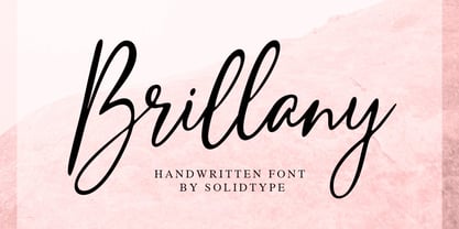 Brillany is a simple handwritten script font, modern and fashionable. This elegant font is legible and looks great as a headline or in body text. This font will perfect for many different project for blogging, social media, branding, wedding invites, cards etc. Including ligatures, uppercase and lowercase, punctuation and multiple languages support.
 - Caliny by Marc Lohner,
$21.00 This cheerful font family combines cuteness and fun, making it a great choice for any kid’s app, book, toy, packaging, movie, theme park and so much more. Caliny’s curves are drawn with care and love. It covers more than 200 languages and has some advanced typographic features, like case sensitive forms to offer.
 - Monoela by Interfont,
$40.00 Inspired by the mechanical typewriter, Monoela interprets its characteristics in a contemporary way — whether in body text or emphasis. Despite being a non-proportional typeface, Monoela guarantees good legibility, both for man and machine. Matter-of-factly and rational at first sight, Monoela's character becomes visible in striking shapes and unexpected proportions.
 - Meltdown by Comicraft,
$19.00 Misshapen Muck Monster Mutations are on the loose... Their creepy hyper-irradiated bodies have emerged from the blasted desolate wastes of The Forbidden Zone! Could this be Doomsday... or did we just leave one of our typefaces on the radiator? Either way, Meltdown is the perfect font for monstrous inhuman atrocities everywhere.
 - Toffee Display by Vástago Studio,
$20.00 Toffee Display is a sans serif project inspired on Gill sans, Helvetica and Eurotstile italics. This project is designed for food packaging, candies, commercial, and fast food. I recommend combining it with a light and calligraphy font to get absolute contrast. That is it, Thanks for buy it and work with it!
 - Lastik by That That Creative,
$120.00 Lastik is a real work horse of a font. It includes 5 styles that cover all you need from Display Fonts to body copy. This font comes from the idea of an approachable, friendly fun serif font. The font takes inspiration from old scholastic materials from the late 90s and early 2000's.
 - Mental Duck by PizzaDude.dk,
$17.00 Drawn with a thick marker, I present to you: Mental Duck! A loose and laid back comic book font, suitable for both comics, posters, products for children, toys ... in fact anything that needs a legible and handdrawn look. Comes in three different versions: Regular, Fill and Shadow. Mix them for great results!
 - Digital Dream Fat by PizzaDude is a font that expertly brings the future to your fingertips, encapsulating the essence of technology and innovation in its design. Created by the talented font designe...
- ITC Cinderella by ITC,
$29.99Some typefaces are staid, somber design tools. Then again, there's ITC Cinderella from Patricia Lillie: a typeface that's light-footed as a ballerina and joyful as a child at play. “There is a group of display faces that I simply love. Type that just seems to dance, type that makes me smile, designs that, when I see them, I say, "Boy, do I wish that was one of mine" says Lillie. “Although I never wanted to imitate these designs, when Cinderella started to emerge, I felt like it was the closest I've come to that quality.” ITC Cinderella projects gaiety and freedom. Capitals harmonize with a lowercase that bounces along with a lively, carefree attitude. Stroke weight stress is, well, all over the place. Curlicues abound. This delightful design is just that: brimming with delight. - Altra Two by Hackberry Font Foundry,
$24.95AltraTwo is a complete redraw of a family based on a tracing of a clip art font from an old printed book. The AltraTwo family adds italic, black, and black italic. I liked the gentle calligraphic look. Consider it a sans serif with style. This is a typical NuevoDeco OpenType pro font with caps, lowercase, small caps, lining, oldstyle, and small cap figures, numerators, denominators, fractions, swashes, and so on. There aren't many unusal ligatures for this one, though. It does have the Latin 2 character set or what Adobe calls CE, Central European characters. Altra has been my preferred header face for sevral years. it also works very well for body copy. I usually use it for my contrasting tip and quote paragraphs with Bergsland Pro as my normal body copy. - Lonarue by Twinletter,
$13.00 Introducing “Lonarue Font” – Where Playfulness Takes Center Stage! Lonarue Font is your passport to a world of creativity and fun in typography. This whimsical typeface is carefully crafted to bring joy and a touch of playfulness to your designs. With its lively and distinctive characters, Lonarue Font is the ideal choice for projects that demand a dash of imagination. Whether you’re designing children’s books, cheerful greeting cards, or vibrant logos, this font adds a delightful charm that captivates your audience. Embrace the playful spirit of Lonarue Font and let your creativity shine. Elevate your designs, capture attention, and create lasting impressions effortlessly with this versatile typeface. Experience the magic of Lonarue Font and infuse your projects with the joy of playful typography today! – PUA Encoded Characters – Fully accessible without additional design software.
 - Perfectly Nineties by Jen Wagner Co.,
$17.00 Introducing Perfectly Nineties – a brand new serif with all the nostalgic vibes! I've started seeing classic, tightly spaced serifs of the 80s & 90s making a comeback, and wanted to create the perfect one for you too! Perfectly Nineties is a beautifully nostalgic upper and lowercase typeface that looks incredible in both large and small settings as a display and body text. It's gorgeous used on its own, or paired as you see above with Aguafina Script (free from Google Fonts: https://fonts.google.com/specimen/Aguafina+Script ) One thing to note about Perfectly Nineties is the letter spacing. It was intentionally spaced for clean reading if you wanted to use it for body type, so I recommend setting the spacing a little tighter for display use (around -20 should do!).
 - Rocket Pop Outline by astroluxtype,
$20.00 Rocket Pop Outline and Rocket Pop are influenced by product packaging and cereal box art from the 1960’s and 1970’s. The fonts will work as companions or separate. Best used over 36pt as a headline display face, these fonts will bring a bold playfulness to any project where a vintage or retro style is in the concept. The style reflects the era when things were indeed, mad, where men (and some women) did crazy art for vinyl records, food packaging and kiddie products. This outline font will bring a snap and crackle and a pop to any of your vintage design projects. Watch for the Cerealboxx Set coming soon that will include the astroluxtype fonts, Sugarbang! Koo Koo Puff and Rocket Pop together in one delicious box.
 - Shopping Guide by Jeff Levine,
$29.00 While watching the 1947 holiday classic “Miracle on 34th Street”, one scene in particular presented a chance to develop a retro type design. ‘Kris Kringle’ suggests to a mother visiting with her child in the Macy’s toy department to try Gimbel’s for a toy she couldn’t find at the store. The news of this behavior reaches Mr. Macy himself, who embraces the practice as a brilliant marketing strategy. A number of departments are then presented with reference books containing competitor ads, and the visual of the cover stating “R.H. Macy & Co. Shopping Guide for the Convenience of Our Customers” shows on screen. The thin, Art Deco sans serif monoline with a few serif-like hooks added onto some characters became the basis for Shopping Guide JNL, which is available in both regular and oblique versions.
 - HU Basic Round by Heummdesign,
$15.00 English HU Basic Sans is a body text font with simple Sans structure. It is well used in medias that are appropriate to use sensible font types. yet, its shows it's stylish aspects with it's wide main body. Greek Το HU Basic Round είναι μια γραμματοσειρά κειμένου σώματος με απλή δομή Sans. Χρησιμοποιείται καλά σε μέσα που είναι κατάλληλα για χρήση λογικών τύπων γραμματοσειρών. Ωστόσο, δείχνει ότι είναι κομψές πτυχές με το μεγάλο κύριο σώμα του. Υπάρχουν 1 βάρη του HU Basic Round : light Cyrillic HU Basic Round - это шрифт основного текста с простой структурой Sans. Он хорошо используется в средствах массовой информации, которые подходят для использования разумных типов шрифтов. тем не менее, это показывает его стильные аспекты с его широким основным корпусом. HU Basic Round имеет 1 толщины: light
 - Kernig Braille by Echopraxium,
$5.00 This font is the younger sister of HexBraille with which it may be combined to create new patterns. This also explains why their introductory text are similar. Introduction The purpose of this monospace font is to display braille in an original and "steganographic" way. The Kernig prefix means "Robust" in German, this is because of the crank shapes . The core of the glyph design is a flat hexagon which can be read as 3 rows of 2 dots (i.e. regular braille glyph grid). Even if within a glyph, braille dots ("square dots" indeed) are placed on the vertices of a flat hexagon, the difference with HexBraille is that edges connecting vertices are not straight lines but "crank shapes" instead. This can be summarized by saying that the whole glyph is a Hexcrank (a flat hexagon where vertice pairs are connected by a crank shape) NB: The initial design is illustrated by glyphs 'ç' (no dot) and 'û' (6 dots) as shown by poster 6. A. "Kernig Lattice" In KernigBraille, glyphs are connected to each other, thus for each Hexcrank glyph there are 6 connections: 2 on left/right and 4 on top/bottom. In the final design some cranks were removed for esthetical reason (i.e. leave empty space for allowing patterns diversity). In summary, a text using this font won't display a honeycomb but a lattice instead. NB: Please notice that in order to obtain the lattice without vertical gaps, you must set the interline to 0. The lattice is made from 3 kind of shapes: a.1. Hexcrank a.2. Square a.3. Irregular cross (mostly unclosed) The design favored squares over crosses. The whole slightly resembling a PCB. B. Text Frames It's possible to frame the text with 4 sets of frame glyphs (as illustrated by poster 2) b.1. Kernig { € ° £ µ § ¥ ~ ¢ } b.2. Rectangular-High { è é ê ï î à â ä } b.3. Rectangular-Low { Â ù Ä Ê Ë Ô õ ö } b.4. Mixed Kernig+High: a mix of Kernig and Rectangular-High frame glyphs When using frame glyphs, it is advised to show Pilcrow (¶) and Non Breaking Space, which are replaced by empty shapes in this font (e.g. in Microsoft Word, use CTRL+8 or use [¶] button in the ribbon).
 - Xpress by Wiescher Design,
$12.00 »XPress« is a very distinct, expressive, typical new Sans. »XPress« is my new Sans-Serif that impresses – especially in small sizes – with its outstanding readability. Seven precisely calibrated weights from »Thin« to »Heavy« and its corresponding italics make this font-family universally usable. »XPress« got its bearings from the fabulous American »Gothic« fonts of the twenties of last century. Modern, present day elements, high lowercase letters and infinitesimal elegant slight curves in start- and end strokes make the font family not only great for body copy, but also very useful in advertising. »XPress« ist eine individuelle, expressive, typische neue Sans. »XPress« ist meine neue Serifenlose die – speziell in kleinen Schriftgraden – durch aussergewöhnliche Lesbarkeit auffällt. Sieben präzise aufeinander abgestimmte Schnitte von »Thin« bis »Heavy« und dazu passende Kursive machen die Schriftfamilie vielseitig einsatzfähig. »XPress« orientiert sich bewusst an den grossen amerikanischen Groteskschriften der zwanziger Jahre des letzten Jahrhunderts. Durch moderne Formelemente, große Mittellängen und unendlich leichte, elegante An- und Abstriche ist die Schrift jedoch nicht nur als Textschrift, sondern auch im gesamten Bereich der Werbung vielseitig einsetzbar.
 - Klang MT by Monotype,
$29.99Will Carter, well known in connection with his private press in Cambridge, has combined the skills of a calligrapher with a practical knowledge of printing. His mastery of pen-drawn letterforms was put to practical use in the design of Klang. Klang is a slightly inclined and calligraphically shaped sans serif with short ascenders and descenders. The Klang font is useful for informal applications, such as invitations, greetings cards and posters, but can also be used in advertising. - Vine Street by Proportional Lime,
$9.99 VineStreet a place somehow familiar to everyone in the English speaking world. It might be just around the corner or the next town over. This font gives that aged feel of comfort and familiarity and the authority of tradition. The example for this font was derived from a ecclesiastical history published by the Caxton Press of the Sherman & Co. of Philadelphia and was originally developed prior to 1867. This font has over 1000 defined glyphs and small caps included.
 - Lunatique by The Flying Type,
$20.00 Lunatique is a highly decorative font, available in three widths, with extended language coverage as well as alternates for some glyphs. This font is inspired by Lucky typeface, designed in 1972 by André Pless for the Mecanorma permanent type contest. The style was later released as Letter-Press transfer sheets. Transfer sheets... Sounds quite nice, definitely. But hey, these digital ones will be way smoother to use, you bet. Give them a go and make your text shine!
 - Californian FB by Font Bureau,
$40.00 In 1938, Frederic W. Goudy designed California Oldstyle, his most distinguished type, for the University of California Press. In 1958, Lanston Monotype issued it as Californian. Carol Twombly digitized the roman 30 years later for the University of California; David Berlow revised it for Font Bureau with italic and small caps; Jane Patterson designed the bold. In 1999, assisted by Richard Lipton and Jill Pichotta, Berlow designed the black and the text and display series; FB 1994–99
 - LTC Goudy Extras by Lanston Type Co.,
$24.95 A set of over 50 ornaments, connecting borders, flourishes and decorative motifs originally designed by Frederic Goudy throughout his career. Many of these designs were used by Goudy at his Village Press and offered by his Village Foundry in the 1920s. The styles range from complex title page illustrations to simple linking borders, but all have the unique Goudy style. This set is completely different from the Goudy Ornaments found in the P22 Goudy Aries Set.
 - Leppertrez by Ilhamtaro,
$14.00 LEPPERTREZ is a font that is basically a classic serif font then to make it different from other serifs is to give the effect as if it were a letter on a letterpress machine, it will add a vintage impression because remembering that letterpress machines were the beginning of a printing press. To enable the OpenType Stylistic alternates, you need a program that supports OpenType features such as Adobe Illustrator CS, Adobe Indesign & CorelDraw X6-X7. Cheers!
 - LUCKY TYPEWRITER - Personal use only

- Child's Play Trial Version - Unknown license

- Stencil Label JNL by Jeff Levine,
$29.00 In the 1943 Three Stooges comedy short “Higher than a Kite”, Curly reaches into a box with the label “hand grenades” painted on its side and pulls out one of the devices. The bold, squared stencil hand lettering on that prop inspired Stencil Label JNL, which is available in both regular and oblique versions.

